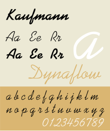
Kaufmann is the name of a brush script typeface drawn in 1936 by Max R. Kaufmann for the American Type Founders (ATF). The stroke weight is monotone. Uppercase characters are freely drawn, while lowercase is more regular in height and width, recalling cursive handwriting. Lowercase characters are close-fitting, affecting the look of a connecting script. The d is looped.
 | |
| Category | Casual script |
|---|---|
| Designer(s) | Max R. Kaufmann |
| Foundry | American Type Founders |
| Re-issuing foundries | Bitstream, Elsner+Flake, Linotype, Adobe Type, Scangraphic, Tilde, SIA, URW |
The fluid forms of both the uppercase and lowercases, combined with an even weight of stroke, have made Kaufmann popular in neon sign fabrication.
Usages
editA slightly modified form of the typeface has been used since 2001 for the logo of the Pop Idol series and various international spinoffs. The most notable change is the long stylised flick added to the capital "A" in the American Idol, Australian Idol and Asian Idol logos. The "Z" featured in the NZ Idol logo is also very different from a standard Kaufmann "Z".
Kaufmann was also used to display the players' names on Topps baseball cards from 1970 and 1994, and is featured on the marquee of the Ed Sullivan Theater in New York City, in the Late Show with David Letterman logo.
A version of the typeface's lowercase r is used in the undergraduate electrodynamics book by David J. Griffiths. It is used to denote the distance from the source point to the field point - commonly represented as in other texts.[1][2]
References
edit- ^ Griffiths, David J. (2017). Introduction to Electrodynamics. Cambridge University Press. pp. xii. ISBN 978-1-108-42041-9.
- ^ "David J. Griffiths - Physics - Reed College".
- Jaspert, W. Pincus, W. Turner Berry and A.F. Johnson. The Encyclopedia of Type Faces. Blandford Press Ltd.: 1953, 1983. ISBN 0-7137-1347-X.
External links
edit