Wikipedia:Featured picture candidates/September-2005
| Featured picture tools |
|---|
Please cut and paste new entries to the bottom of this page, creating a new monthly archive (by closing date) when necessary.

Its surprising that so far we only have one featured picture of a waterfall. This one in Canada looks rather impressive and illustrates Takakkaw Falls. Perhaps more surprising, given that they are apparently the highest falls in Canada, the article at Della Falls has no illustration at all. -- Solipsist 12:11, 16 August 2005 (UTC)
- Nominate and support. - Solipsist 12:11, 16 August 2005 (UTC)
- Is there a higher resolution version available? Enochlau 13:58, 16 August 2005 (UTC)
- I found a larger version and uploaded it with the same filename (compare the current picture with the original pic). Coffee 16:13, 16 August 2005 (UTC)
- Oppose. The details of the trees seems to be lost. Enochlau 06:19, 21 August 2005 (UTC)
- I found a larger version and uploaded it with the same filename (compare the current picture with the original pic). Coffee 16:13, 16 August 2005 (UTC)
- Support, even though it's not that big, because it's just so pretty. ^_^ Coffee 08:16, 20 August 2005 (UTC)
- Support. Striking image.--May the Force be with you! Shreshth91($ |-| r 3 $ |-| t |-|) 16:36, 20 August 2005 (UTC)
- Support - Wonderful shot. Sango123 16:42, August 20, 2005 (UTC)
- Support Wow. Great photo. --Barista | a/k/a マイケル | T/C 06:21, 21 August 2005 (UTC)
- Deserving of support. - Mgm|(talk) 10:07, August 22, 2005 (UTC)
- Support--Looks good. --ZeWrestler Talk 17:43, 22 August 2005 (UTC)
- Support. The comment on trees being lost is not that relevant, the camera simply isn't supposed to be focused there. -- user:zanimum
 Support Great photo, but really should be in higher res. --Fir0002 08:10, August 24, 2005 (UTC)
- Weak Support. It looks too busy to me. From the trees to the rainbow to the actual falls i just think its too...busy. --ScottyBoy900Q∞ 14:28, 25 August 2005 (UTC)
- Promoted Image:TakakkawFalls2.jpg This link is Broken 21:19, 1 September 2005 (UTC)

We have several good featured pictures of birds, but this photo of a Snowy Egret is rather nicely staged. Taken by David Hall of the US Fish and Wildlife Service and uploaded by Factumquintus on the Commons. Previously the article had been illustrated with a modified version of the original. -- Solipsist 11:56, 16 August 2005 (UTC)
- Nominate and support. - Solipsist 11:56, 16 August 2005 (UTC)
- Good shot of the mother, although, the babies tend to be blocked by the nest. Is there a shot with a clear view of the chicks?--ZeWrestler Talk 12:59, 16 August 2005 (UTC)
- Support even with the children obscured. This link is Broken 12:59, 20 August 2005 (UTC)
- Support - I think the adult snowy egret and nice contrast between the whites and greens make up for the obscured chicks. Sango123 16:47, August 20, 2005 (UTC)
- Support. Nice!!! If only the chicks were visible.--May the Force be with you! Shreshth91($ |-| r 3 $ |-| t |-|) 17:02, 20 August 2005 (UTC)
- Support. I like the feathers sticking out. Enochlau 06:15, 21 August 2005 (UTC)
- Support. A great picture. It's a pity about the chicks being obscured, but it looks to be high up a tree. (Donovan|Geocachernemesis|Interact) 12:26, 21 August 2005 (UTC)
- Support-- ZeWrestler Talk 17:28, 21 August 2005 (UTC)
 Neutral Can't see what happens to the egret's legs and that is a little disconcerting. The head could also be in better focus. Still quite a nice photo --Fir0002 08:08, August 24, 2005 (UTC)
- Oppose. Background is a wee bit too dak for me. The bird looks nice but te dark backgound ruins it totally for me. I'd like to be able to see the chicks a bit better as well. --ScottyBoy900Q∞ 14:26, 25 August 2005 (UTC)
- Promoted Egretta thula1.jpg This link is Broken 21:19, 1 September 2005 (UTC)

A very nice image with a typical gull, a guano encrusted pier and the water behind with some nice reflections.
- Support Self Nom. --Fir0002 08:53, August 17, 2005 (UTC)
- Support. It's as good a picture of a seagull as I've ever seen. Raven4x4x 04:08, August 20, 2005 (UTC)
- Support. I certainly agree with Raven--I haven't seen a better picture of a seagull (not in flight, at least), and I think it easily qualifies both as striking and as a good illustration for the Seagull article. Jwrosenzweig 10:55, 20 August 2005 (UTC)
- Support - Certainly. Sango123 16:49, August 20, 2005 (UTC)
- Support. Echidnae 04:08, 21 August 2005 (UTC)
- Support. I think everyone's said it all already. Enochlau 06:13, 21 August 2005 (UTC)
- Support. Yes, very nice. (Donovan|Geocachernemesis|Interact) 12:23, 21 August 2005 (UTC)
- Support - simply perfect - Adrian Pingstone 13:39, 24 August 2005 (UTC)
- Support[ even though I tend to not like bird pictures. This one is very nice. --ScottyBoy900Q∞ 14:24, 25 August 2005 (UTC)
- Support - great detail, great posture. --tomf688<TALK> 14:28, August 25, 2005 (UTC)
- Promoted Image:Seagull on sale pier.jpg This link is Broken 21:20, 1 September 2005 (UTC)

A very detailed picture of an Fruit Bat. There are currently no bat pictures as Featured Pictures, so i decided to nominate this picture as a canidate. The bat itself shows great detail, while the background is present, but blurry/defined enough to cause a distraction. I also think there is great lighting in the picture.
Add your reasons for nominating it here; say what article it appears in, and who created the image.
- Nominate and support. - ZeWrestler Talk 12:05, 17 August 2005 (UTC)
- Nice, even though that is one ugly bat. Phoenix2 20:26, August 17, 2005 (UTC)
- (that comment gets a laugh out of me) --ZeWrestler Talk 23:55, 17 August 2005 (UTC)
- I like the little guy, not creepy at all. — Xiong熊talk* 07:36, 2005 August 18 (UTC)
- Uploaded a more contrasty image but for me it still isn't quite good enough --Fir0002 12:29, August 18, 2005 (UTC)
- I don't feel at this point that I can support the image (although I'm still deciding), but I do want to note that, if we were to feature the image, I prefer the original to the contrasted pic that Fir did. Fir's work is usually an improvement to photos, but in this particular case, I feel that the contrasting actually loses some detail in the shadowier portions of the photo (at least on my monitor). The bat's head, in particular, is very distinct from the tree trunk in the background in the original photo, but I feel that it is much harder to see where bat ends and tree begins in Fir's version. Jwrosenzweig 10:52, 20 August 2005 (UTC)
- support. I agree the bat is pretty ugly, but it is a good pic.say1988 02:59, August 20, 2005 (UTC)
- Oppose. Certainly a good picture and a good addition to articles, but not quite striking enough for FP. Coffee 04:56, 21 August 2005 (UTC)
- Oppose. Agree with Coffee. Enochlau 06:13, 21 August 2005 (UTC)
- Support. The wing sells this for me. This vote can be shouted down if the vote becomes hinging. --Kizor 14:38, 22 August 2005 (UTC)
- Oppose - The bat and the tree in the background are too similar in either version. --CVaneg 18:55, 22 August 2005 (UTC)
- Oppose - I'd want to see the point where the bat is clinging on - Adrian Pingstone 13:38, 24 August 2005 (UTC)
- Oppose. The bat doesnt stand out from the rest of the picture to me. Adrian Pingstone's point I would also like to see. --ScottyBoy900Q∞ 14:23, 25 August 2005 (UTC)
- Oppose. Definitely not striking enough.--May the Force be with you! Shreshth91($ |-| r 3 $ |-| t |-|) 15:30, 27 August 2005 (UTC)
- Not promoted This link is Broken 21:23, 1 September 2005 (UTC)

Well, I took this picture a few nights ago outside my building and everybody who saw it loved it. On Wiki I found that it illustrates perfectly the Cloud-to-ground lightning wheather phenomenon. If you watch at 100% zoom you can actually see where the lightning strikes the earth.
Author: Ioan Mircea Madau ; August 2005
- Nominate and support. - Nelumadau 00:59, 18 August 2005 (UTC)
- Conditional Support-- Its an awesome shot alright, but the picture ought to be rotated a little to make the ground seem flat instead of tilted to the left. TomStar81 01:51, 18 August 2005 (UTC)
- If tilted back to square, then the picture would either lose some critical detail near the edges, or end up very tightly cropped. Was the original larger? --Surgeonsmate 02:32, 18 August 2005 (UTC)
- Yes, of course I noticed it's tilted, the wind must have moved the rig, but then again, I feel it adds to the authenticity of the picture. It was 3 a.m. and I was on top of the building. If most people think it should be straightened out, I'll have a corrected version. No, it is not cropped, it's straight off the CF card.Nelumadau
- I might well support a rotated (or as I think of it, derotated) version. Adroit Photoshopping might maintain a reasonable aspect ratio. I'm quite good at that sort of thing; if you need help, ask. — Xiong熊talk* 07:34, 2005 August 18 (UTC)
- I'm thinking more like a skew/free transform in PS, where the lower right corner would go lower and the oposite corner would go higher, so as to level out the horizon without losing detail in he middle as you would by a simple rotate/crop. --Nelumadau 15:18, 18 August 2005 (UTC)Nelumadau
- Support. Stunning pic. However, it could do with a bit of rotation.--May the Force be with you! Shreshth91($ |-| r 3 $ |-| t |-|) 17:07, 20 August 2005 (UTC)
- OK, the more I looked at it, the more I feel it needs to be corrected. So I did, but for the love of all things dear, I can't figure out how to change the old with the new. I uploaded the new at http://madau.net/photo/lightning_over_Oradea_Romania_2.jpg and I'd be grateful if someone of the more experienced users here were to add it to this page. I promise I'll take the time to read the Wiki tutorial one of these days:). Nelumadau 21:02, 20 August 2005 (UTC)
- Comment. I'll take a look at it again when it's rotated. You might also want to crop off the black mark on the top left corner, whatever it might be. Enochlau 06:12, 21 August 2005 (UTC)
- Support. Enochlau 12:10, 21 August 2005 (UTC)
- Support. Great picture, definitely illustrates its subject well.
- Nelumadau, I've uploaded the rotated image to Wikipedia and added it here. I've put the appropriate tags on the image (hope that's OK for me to do that), but as you're the author you are probably the one who should give it any more info it needs. This rotated version is one of my favourite ever lightning pictures, and I've looked at a lot. I definately Support the rotated version. Raven4x4x 07:18, August 21, 2005 (UTC)
- Support.Wow! A great picture however it's edited.:) (Donovan|Geocachernemesis|Interact) 12:30, 21 August 2005 (UTC)
- Support--ZeWrestler Talk 17:30, 21 August 2005 (UTC)
- Support The rotated version overcomes my only objection. Great picture! --Surgeonsmate 21:22, 21 August 2005 (UTC)
- Support rotated image. - Mgm|(talk) 09:55, August 22, 2005 (UTC)
- Support rotated image. --Kizor 14:38, 22 August 2005 (UTC)
- Support. Wow. --tomf688<TALK> 06:12, August 24, 2005 (UTC)
- ( + ) Support Edited version --Fir0002 08:03, August 24, 2005 (UTC)
- Support rotated image. An oustanding pic, one of the best candidates for Featured pic ever. Well done! - Adrian Pingstone 13:32, 24 August 2005 (UTC)
- Support. Very striking (no pun intended). --ScottyBoy900Q∞ 14:22, 25 August 2005 (UTC)
- Support rotated version -- Chris 73 Talk 12:20, August 26, 2005 (UTC)
- Promoted Image:Lightning_over_Oradea_Romania_2.jpg This link is Broken 21:21, 1 September 2005 (UTC)

I added this image becaus I found it to be very striking, almost otherworldly, is of a very famous site, and would be difficult to duplicate. I took it in Summer 2004 while on a high school trip.
- Nominate and support. - Theshibboleth 02:10, 18 August 2005 (UTC)
- While the image is certainly beautiful (though I have to put doubts whether it was voluntary), it does not illustrate the article quite that well. Particularly considering Image:Tour eiffel at sunrise from the trocadero.jpg is already featured. Circeus 04:25, August 18, 2005 (UTC)
- Oppose, when I look at that all I see is the blurry trees, person and structure in the background and other hard to identify things sticking accross the image. I find it an interesting picture once I know what it is, but not particularly striking. Also I don't think it demonstrates the subject very well. say1988 02:56, August 20, 2005 (UTC)
- I'm afraid I'll have to Oppose. It does look a little blurry to me, and while it is an interesting idea I don't think it will add to the article all that much. Raven4x4x 04:00, August 20, 2005 (UTC)
- Oppose. Can't make out what it is.--May the Force be with you! Shreshth91($ |-| r 3 $ |-| t |-|) 06:42, 20 August 2005 (UTC)
- Well I guess I understand. I believe the blurriness is actually fog--it was a very overcast day, and it is a rather high altitude. Perhaps I should have better explained what you're looking at. This is one of the legs of the Eiffel Tower, looking down at a platform that is part of a long flight of stairs you can climb. Theshibboleth 22:45, 20 August 2005 (UTC)
- Oppose. Too blurry. Echidnae 04:06, 21 August 2005 (UTC)
- Oppose. The blurriness/fog makes me think my eyes are watering, and it's hard to make out what's what. Also, sorry, but it's no real match to the Eiffel picture above. Enochlau 06:10, 21 August 2005 (UTC)
- Neutral. It a strikingly beautiful image, and you should be very proud of it (I really like the mistiness :). But, you are up against tremendous competition to be the best, simply because it's a very popular subject. This can also be a really tough room. Maybe you would have more luck nominating it as a FP on the Commons? (Donovan|Geocachernemesis|Interact) 12:44, 21 August 2005 (UTC)
- Support. This is a beautiful, evocative image. Very nicely done.—Encephalon | ζ 04:59:47, 2005-08-22 (UTC)
- Oppose - can't make out anything. Trees are at an odd angle, stairs look strange. Makes one dizzy. =Nichalp «Talk»= 06:47, August 22, 2005 (UTC)
- Oppose - sorry but "arty" photos don't fare well on Featured Pics. Or maybe you shook the camera as you took it. Either way, it has no hope of being Featured - Adrian Pingstone 13:29, 24 August 2005 (UTC)
- Oppose. I was in France all summer so I can appreciate how hard it is to get a good artistic shot if the tower. --ScottyBoy900Q∞ 14:20, 25 August 2005 (UTC)
- Not promoted This link is Broken 21:22, 1 September 2005 (UTC)
I don't want to hear anybody claim this nomination is in bad faith, a joke, or to prove a point. You may not like it, but I sincerely believe this photo represents the very best this project has to offer. I stand by that comment in total seriousness, and would say so anywhere -- the Pump, ArbCom, public square, or the sidewalk in front of my home.
I won't attempt to summarize the tremendous outpouring of support this photo has gathered; I refer interested parties to the many testaments given each time the narrow-minded nominate it for deletion. (See: here, here, and here.)
This photo is linked from Autofellatio, and was produced by Hornyboy.com / RudeBox Media, Inc.
Please note that all copyright issues have been resolved; this photo is licensed on a basis even less restrictive than GFDL. It is definitely not a copyvio or fair use.
Wikipedia is not a gay porno site, but then, this is not gay porno; and Wikipedia may be the only place where a person seriously interested in the topic might ever get this education outside of a gay porno site or a smelly corner of the "other" kind of bookstore. We are here to educate and inform, and our ability to do this without fear or bigotry is our finest quality. Perhaps no other photo we have is as deserving of the honor of FP.
- Nominate and support. — Xiong熊talk* 07:21, 2005 August 18 (UTC)
- Support. Excellent image, clearly illustrates the article. Zoe 07:36, August 18, 2005 (UTC)
- Support --SPUI (talk) 14:58, 18 August 2005 (UTC)
- Oppose -- I found the black lines of the chair somewhat distracting in the composition; had to look several times to determine that they weren't attached to the person. Smerdis of Tlön 15:34, 18 August 2005 (UTC)
- I agree with you, and I'm glad someone shares my opinion. Ask, and it shall be done. — Xiong熊talk* 06:30, 2005 August 23 (UTC)
- Oppose. This photo is gay porn, and while it's informative and encyclopedic, that doesn't make it not prurient. Wikipedia is not censored, but that doesn't mean Wikipedia lacks propriety and decorum. Making this image a featured picture will display it to many people who would choose not to view it—it's simply a matter of common courtesy not to flaunt this picture by prominently displaying it. Furthermore, despite the poster's claims to the contrary, this nomination is transparently a bad faith nomination—the user who nominated it and those who support it should be ashamed of themselves for the ignominy that they would bring upon Wikipedia. Nohat 17:40, 18 August 2005 (UTC)
- Comment: While this image is probably pornographic, I'd have to disagree about it being called gay. Homosexuality is the sexual attraction of someone to people of their own gender, to which the act of autofellatio has absolutely no bearing. - Mgm|(talk) 10:02, August 22, 2005 (UTC)
- This comment is so ridiculous that it's hardly worth responding. But I respond anyway because I want to be clear that I think it's a stupid comment, lest anyone think I tacitly acknowledge the claim made here. Nohat 05:38, 23 August 2005 (UTC)
- Comment: While this image is probably pornographic, I'd have to disagree about it being called gay. Homosexuality is the sexual attraction of someone to people of their own gender, to which the act of autofellatio has absolutely no bearing. - Mgm|(talk) 10:02, August 22, 2005 (UTC)
- Oppose. Image cannot be displayed inline; thus there is no point adding it to the FP gallery. —Cryptic (talk) 18:05, 18 August 2005 (UTC)
- What do you mean, Can't be displayed inline? It certainly can, if the censors wouldn't keep deleting it. Zoe 19:43, August 18, 2005 (UTC)
- It's on the bad image list. shows up as . —Cryptic (talk) 20:12, 18 August 2005 (UTC)
- Well, that page seems to be Tim Starling's personal opinion, it certainly isn't policy. Zoe 20:34, August 18, 2005 (UTC)
- It's on the bad image list. shows up as . —Cryptic (talk) 20:12, 18 August 2005 (UTC)
- What do you mean, Can't be displayed inline? It certainly can, if the censors wouldn't keep deleting it. Zoe 19:43, August 18, 2005 (UTC)
- Oppose. Images that have been subject to several VFDs and cause division and anger in the community, and which are specifically prevented from being directly shown are clearly not suitable for becoming featured. In my opinion, any reasonable person would understand that nominating this image for featured would be controversial and divisive, so either the nominator is not a reasonable person, or specifically intends to cause controversy and division. Worldtraveller 21:40, 18 August 2005 (UTC)
- Oppose - i'd rather vote for the girls whose breasts were posted the other month. --ZeWrestler Talk 23:51, 18 August 2005 (UTC)
- Support - that's a really great photo. It clearly demonstrates what's to be demonstrated, without being any more obscene that necessary, and it's probably the only free-as-in-speech photograph of autofellatio. It is not a pornography of any kind. Taw 02:28, 19 August 2005 (UTC)
- If you want to get technical, the image is pornography. HornyBoy.com, the source of the image, is a porn site. You might claim that pornography is defined by intention and setting, and I would agree with you that as used on Wikipedia it is not porn. But the photo itself is porn, at least in its native setting. LizardWizard 04:26, August 19, 2005 (UTC)
- Oppose. In bad faith, a joke, WP:POINT, and I don't like it. -- Curps 03:12, 19 August 2005 (UTC)
- Did you intentionally call it everything that Xiong said it wasn't? Please, either assume good faith or accept good faith when it is openly declared. Furthermore, jokes and WP:POINT are not very compatible - please explain how this nomination both is a joke and disrupts Wikipedia to make a point, or withdraw one of those objections. LizardWizard 04:26, August 19, 2005 (UTC)
- Yes I intentionally called it everything Xiong said not to call it. -- Curps 04:44, 19 August 2005 (UTC)
- Did you intentionally call it everything that Xiong said it wasn't? Please, either assume good faith or accept good faith when it is openly declared. Furthermore, jokes and WP:POINT are not very compatible - please explain how this nomination both is a joke and disrupts Wikipedia to make a point, or withdraw one of those objections. LizardWizard 04:26, August 19, 2005 (UTC)
- Support. One of Wikipedia's greatest assets is that it isn't censored. Where else can a curious person turn for information and images of autofellatio? It's easy to find a picture of The Blue Marble or Lake Tanganyika, and harder than you'd think to find such a clear informative shot of autofellatio. We should show off what makes Wikipedia special, not what makes it exactly equal to National Geographic. LizardWizard 04:26, August 19, 2005 (UTC)
- Oppose. This nomination is making a WP:POINT; it's a point I don't really disagree with, but it's disruptive to make that point in this way nonetheless.--Pharos 04:38, 19 August 2005 (UTC)
- Oppose, might as well put it now since no one else is abiding by the "wait two days guideline", and with good reason, of course. Phoenix2 04:55, August 19, 2005 (UTC)
- I don't see what the problem is here. Wikipedians don't seem to be worried about having an article on autofellatio. The image adds significantly to the article by clearly illustrating the act. Isn't that the main criteria by which featured pictures are supposed to be judged? It doesn't seem that way here, because many of the votes above seem to be based on nothing more but the voter's personal distaste for the image. Also, what happened to the mandatory two day wait before voting? These premature votes will probably have to be disregarded. (Donovan|Geocachernemesis|Interact) 05:26, 19 August 2005 (UTC)
- Oppose. A fake. Clearly Photoshopped and the chair arm doesn't line up properly. Oh, and grossly offensive to many of our readers. Clair de Lune 07:54, 19 August 2005 (UTC)
- Can I ask how you're so certain it's fake? The chair arm looks fine to me. LizardWizard
- It's clearly been photoshopped. Blow it up and you'll see that there's no gradient where the guy is bent over. His right arm throws a shadow but his chest doesn't, and the join is light but no shadows the other way. The chair arm at top slopes slightly upward or to the left (because it's a 2D image you can't say for sure which) but the bottom art of the arm slopes both to the right and downward. Look closely at his left arm. It should be almost in the same scale as his leg (just as his right arm is). But if it is, he must only lift weights with his right arm, because the left is very thin in comparison. I have my doubts it could meet his shoulders too. Among other things, I find these suspicious. Clair de Lune 05:54, 23 August 2005 (UTC)
- Can I ask how you're so certain it's fake? The chair arm looks fine to me. LizardWizard
- Oppose. There's nothing beautiful or striking about it, and it's only marginally informative. Despite Xiong's disclaimer, I can't see this as anything other than disruption. — Dan | Talk 16:22, 19 August 2005 (UTC)
- Oppose like it or not, if it can't be displayed inline it's useless for FP. Also the image isn't particularly well lighted IMHO (although some phtososhopping could fix that. What is the black part on the upper left?). This link is Broken 12:57, 20 August 2005 (UTC)
- Oppose. I'm quite happy with its inclusion in the project, but that doesn't mean I think it's a shining example of our image collection, which it really isn't. Oh and I think there might be some WP:POINT pushing for this conveniently-timed nomination too. ;) GarrettTalk 14:21, 20 August 2005 (UTC)
Support, illustrates autofellatio well, and by my reading of the definition that should be sufficient. Damn. I was planning to do this next April Fools' Day, if the image is still around then. ~~ N (t/c) 14:35, 20 August 2005 (UTC)Oppose as per Phoenix2. ~~ N (t/c) 13:16, 21 August 2005 (UTC)- Oppose. No, no, definitely not. It clearly illustrates the article, but isn't Wikipedia meant to have a certain amount of decorum as said above by Nohat--May the Force be with you! Shreshth91($ |-| r 3 $ |-| t |-|) 17:05, 20 August 2005 (UTC)
- Support. It's informative and accurate. Good enough for me! There are equally "pornographic" images stored on Wikipedia without contest. --Jacj 20:45, 20 August 2005 (UTC)
- That, actually, has nothing to do with why people, including me, are voting oppose. As is clearly evident, not too many folks are complaining about pornographic content being on Wikipedia, since it has already been established that Wikipedia isn't censored, and rightfully so.
- Concerning this pretentious image, allow me to momentarily refer to the criteria for featured pictures: the picture must add significantly to its article. Yes, it can be argued that this picture indeed does so, but if this is the only criterion considered, then there are many more featured pictures on this Wiki than have been presented on this page, or ever will be. One must also taken into consideration if the image is striking, beautiful, serene, or whatever it may be. Ignoring the fact that this image, no matter how good the photography, may never be beautiful, serene, or heartwarming, It is simply not featured material when compared to images like Chestnuts, or any other featured picture for that matter that do actually look nice.
- Consider for a moment that this man was just sitting in the chair doing nothing. We would not then say that the picture significantly added to Chair, there would merely be a lot of comments stating that the photo is nothing special. Just because it is pornography, It shouldn't be judged differently than the pictures below, and by that I mean people should not basically disregard the fact that the image actually has to be good. All I'm saying is that the topic of the image should not affect the balance of how you vote on a photo: both criteria should be looked at equally, and that is obviously not the case here. Phoenix2 00:05, August 21, 2005 (UTC)
Support - Weakly, because there is potentially some WP:POINT, it's on its third VfD. But, I think that it's a mistake to support only those images that are beautiful, serene, or heartwarming, otherwise, we will only ever feature pictures of animals.;) Wikimedia Commons already exists for images like that. I was under the impression that for pictures to be featured here, they also had to add significantly to the article that they appeared in. So, in that way, I think the picture has merit, even if not technically perfect. Perhaps we shouldn't get so hung up on the technicalities, and consider more images if its type. I think that arguing that the current image can't be displayed inline is a a bit of a red herring, because that can easily be changed. (Donovan|Geocachernemesis|Interact) 02:35, 21 August 2005 (UTC)
- Oppose. Weakly. You make a good point Pharos, this particular image probably wouldn't be one of Wikipedia's finest, but I still don't accept that this kind of image should be excluded from being a FP. Modesty and discretion are so culturally loaded and POV. (Donovan|Geocachernemesis|Interact) 06:52, 21 August 2005 (UTC)
- Please look over WP:FP. There is a huge line between "it's crazy to censor this image on Wikipedia" and "this is one of Wikipedia's absolute finest pictures". There is hardly any requirement that FPs be "heartwarming", but they should be visually exceptional; I should hope Image:1936NurembergRally.jpg wasn't selected for its "heartwarmingness".--Pharos 02:59, 21 August 2005 (UTC)
- Pharos has done well, but be advised that I don't think that an image has to be heartwarming to be featured, I just said that it might be taken into consideration, or in other words, it helps an iamge if it is actually visually appealing. Also, if one looks at the current featured pictures, you will see that a majority are not of animals. The whole point of my post was that "A picture should add significantly to its article" is not the only criterion for photos, as stated above. Phoenix2 05:26, August 21, 2005 (UTC)
- Oppose I voted to keep the photo on Wikipedia, but IMHO, it's not worthy of being a Featured Picture. --Barista | a/k/a マイケル | T/C 04:31, 21 August 2005 (UTC)
- Oppose. I really don't like it. On a more objective measure, it's of little informative value and doesn't quite make anyone looking at it to find out more about the subject. Enochlau 06:07, 21 August 2005 (UTC)
- Oppose. If it is real, it is a vanishingly rare ability at best. Most humans don't bend that way (pardon the pun). Modesty and discretion aren't necessarily equivalent to fear or bigotry. Fire Star 06:19, 21 August 2005 (UTC)
- Oppose. The bend in the subjects torso makes it impossible to determine with certainty that it is not two individuals. Hipocrite 22:49, 21 August 2005 (UTC)
- Oppose, like featured articles, featured images should be uncontroversial. If this ever gets featured status, it should not be used as pic of the day, as many users, including myself, would not want it included on their userpage like the other featured images even if they approve of its existence in Wikipedia. - Mgm|(talk) 10:02, August 22, 2005 (UTC)
- I can't let that statement stand. FA and FP should indeed sometimes be controversial. If Wikipedia is the Free Encyclopedia of Uncontrovery Only, I'm outta here -- and taking a good fraction of the Community with me, too. — Xiong熊talk* 04:04, 2005 August 23 (UTC)
- Wikipedia certainly needs fewer people who actively try to stir up controversy, so goodbye then. Don't let the door hit you in the ass on the way out. Nohat 05:41, 23 August 2005 (UTC)
- You do me too much honor, Sir. I cannot possibly take credit, unearned, for the resolution of the community in support of the subject against the forces that would reduce us to some miserable grade-school primer. I am only too proud to have defined my position, but this controversy is simply not mine alone. — Xiong熊talk* 06:14, 2005 August 23 (UTC)
- I can't let that statement stand. FA and FP should indeed sometimes be controversial. If Wikipedia is the Free Encyclopedia of Uncontrovery Only, I'm outta here -- and taking a good fraction of the Community with me, too. — Xiong熊talk* 04:04, 2005 August 23 (UTC)
- Oppose, only in fear that it might actually end up on the frontpage. Had a good laugh with the nomination, though. --tomf688<TALK> 03:53, August 23, 2005 (UTC)
- oppose because somebody's going to get inspired and try it and end up with thousands of dollars of chiropracter bills and sue wikipedia. Gzuckier 16:19, 23 August 2005 (UTC)
- Oppose. due to front page. -- user:zanimum
- FPs don't have to be POTDs, do they? ~~ N (t/c) 01:57, 24 August 2005 (UTC)
- Are you sure is not a fake ? IMO it's a gay 69... Ericd 22:33, 23 August 2005 (UTC)
- We've been over this before: Talk:Autofellatio#Fraudulent photo? ~~ N (t/c) 01:15, 24 August 2005 (UTC)
- I thought it would be a picture of a guy sucking a car's exhaust pipe. Gzuckier 01:50, 24 August 2005 (UTC)
- We've been over this before: Talk:Autofellatio#Fraudulent photo? ~~ N (t/c) 01:15, 24 August 2005 (UTC)
- Oppose. Did you see how you were framing back there? Subject matter or no, the arrangement of this photo makes it informative, but not beautiful. The lighting is also particularly un-striking, or whatever the antonym for striking is. -- Elfer
- Oppose. Sorry, but this is a joke, and a violation of WP:POINT. Isn't it ironic that this image is also on WP:VFD? Andrew pmk 03:50, 24 August 2005 (UTC)
- Support. Would make a wonderful addition to the FP gallery. —RaD Man (talk) 07:46, 24 August 2005 (UTC)
 Oppose I haven't even looked at the photo as the subject is so repulsive. There is no way such an image can be one of the best wikipedia has to offer. It's unthinkable what it would do to wikipedia's reputation if it ever made it to the main page. --Fir0002 08:06, August 24, 2005 (UTC)
- It never would. FPs don't have to be POTDs. But it's just not FP-worthy anyway. ~~ N (t/c) 13:28, 24 August 2005 (UTC)
- Nick is right. Although I believe that pictures with such content should be eligible for FP, I don't really think that this picture exhibits a high enough degree of skill in photography or other elements which would make it a decent FP candidate. It seems the person who nominated it only nominated it to prove the point that wikipedia is an uncensored source of information. Unfortunately, he didn't select a picture which was actually good enough to become an FP. Anyway, what I was going to say was that although you would probably oppose the picture if you took an objective analysis of the photo itself, you still shouldn't vote on a photo you haven't even seen.
- It never would. FPs don't have to be POTDs. But it's just not FP-worthy anyway. ~~ N (t/c) 13:28, 24 August 2005 (UTC)
Support - 7 ~~ Oppose - 26 thus far. Phoenix2 04:23, August 25, 2005 (UTC)
- Oppose. I agree totally with the other objections above. While I appreciate the openness of Wikipedia, there are some standards we need to maintain. --ScottyBoy900Q∞ 14:17, 25 August 2005 (UTC)
- Oppose As far as I can see, the only reason this is being considered is its controversy. The image just doesn't have any of the technical and aesthetic excellence I look for in a FP. ~ Veledan • Talk + new 11:46, 27 August 2005 (UTC)
- Support for two reasons: It shows that it is possible to suck your own dick, and Wikipedia is not censored for the protection of minors.
- Why are we even having this vote? Oppose. Linuxbeak | Talk | Desk 17:10, August 27, 2005 (UTC)
- Oppose Many people who support this say it "illustrates the article" -- yes, it does, but that's not necessary, what can possibly be ambiguous about "the act of oral stimulation of one's own penis"? Would a photo of someone eating fecies be necessary to illustrate coprophagia, by the same logic? I don't think it's necessary, and, as long as people are allowed to have opinions, I will say I personally find it offending. It's just another opinion, equal to the one stating that it's not offending, or that it's beautiful, or whatever else -- feel free call me narrow-minded if you need to call me something for speaking my mind. --Gutza 19:01, 27 August 2005 (UTC)
- ( − ) ( − ) Strong Oppose. Any picture that is divisive enough to cause three IFDs, a 224 KB long VfD, several WikiFactions to form, and to put it simply, a total fragmentation of the Wikipedia community should never be a FP. Even though I'm assuming good faith, I move for speedy delisting of this nomination, as it is incredibly disruptive. --Titoxd 23:03, 30 August 2005 (UTC)
- Oppose 'nuff said. --Janke | Talk 06:05:12, 2005-08-31 (UTC)
- Oppose. Any nomination which starts by denying that it is in bad faith, a joke, or to prove a point has a high chance of being so. This one is. --Audiovideo 21:46, 31 August 2005 (UTC)
Not promoted Jtkiefer T | @ | C ----- 03:07, September 2, 2005 (UTC)
_grazing_-_20050809.jpg)
A trio of deer that happened to wander near my house. Used on Herbivore
- Nominate and support. - →Raul654 04:49, August 20, 2005 (UTC)
- A little bright, or is there too little contrast? Phoenix2 16:18, August 20, 2005 (UTC)
- Oppose - The second deers head is a bit blurry.ZeWrestler Talk 19:03, 22 August 2005 (UTC)
- Oppose - The second deer is out of focus, and the third deer is kind of distracting. --CVaneg 18:54, 22 August 2005 (UTC)
- Oppose - most of this pic is out of focus - Adrian Pingstone 13:22, 24 August 2005 (UTC)
- Oppose for reasons listed above. --ScottyBoy900Q∞ 14:15, 25 August 2005 (UTC)
- Oppose, as per above. Enochlau 05:32, 26 August 2005 (UTC)
- Oppose, while it's a great amateur pic, especially since they wandered near your house (therefore I assume you weren't all set up for a photo shoot), I just don't feel it's "exemplifying Wikipedia's very best work", sorry... --Gutza 20:50, 27 August 2005 (UTC)
- Support ver 2 - a lot better that previous version. Tekana | Talk 12:09, 2 September 2005 (UTC)
- Not promoted This link is Broken 15:49, 4 September 2005 (UTC)

I found it very hard to take this photo, but although it is slightly blurry I still think it is pretty good. To give an idea of the speed they (bees) beat their wings, I took this photo at 1/3200 sec and they still were blurry with motion!
- Support Self Nom. --Fir0002 10:08, August 20, 2005 (UTC)
- Perhaps it would be better if the image was centered more on the bee. Raven4x4x 10:14, August 20, 2005 (UTC)
- I like it that way because the bee is leaving that bunch of rosemary. What do others think? --Fir0002 12:01, August 20, 2005 (UTC)
- Support. Beautiful shot.—Encephalon | ζ 04:45:59, 2005-08-22 (UTC)
- Support - I like it too. It adds a nice touch. --ZeWrestler Talk 20:44, 20 August 2005 (UTC)
- vote struck out as per policy, please do not vote before the two day comment period is over -- Jtkiefer T | @ | C ----- 00:20, August 22, 2005 (UTC)
- My mistake, i originally was thinking that it could be voted on. misread it. --ZeWrestler Talk 00:31, 22 August 2005 (UTC)
- Support. Especially because of the off-centredness. -- user:zanimum
- Support. If you've ever heard of the rule of thirds (aka one of the most basic rules of composition in photography) then you'd know that the bee is exactly where it's supposed to be. -- Elfer
- Support. Very Cool. --ScottyBoy900Q∞ 14:14, 25 August 2005 (UTC)
- Support. Spectacular. Enochlau 05:38, 26 August 2005 (UTC)
- Support Superb photo! Fir, you've done it again! -- Chris 73 Talk 12:17, August 26, 2005 (UTC)
- Support Beautiful shot! ~ Veledan • Talk + new 09:57, 27 August 2005 (UTC)
Promoted Image:Bee mid air.jpg ~ Veledan • Talk + new 19:29, 7 September 2005 (UTC)

A detailed, appealing photo of a Red Panda. Currently a Featured Picture on the Wikimedia Commons. Illustrates Red Panda and French Centre National de la Recherche Scientifique.
- Nominate and support. - Sango123 17:00, August 20, 2005 (UTC)
- Support.—Very nice detail --ZeWrestler Talk 17:35, 22 August 2005 (UTC)
- Brilliant. Phoenix2 14:52, August 21, 2005 (UTC)
- Support -As others have said, "awwww fluffeh". :) Do you have bigger? --Deglr6328 16:34, 21 August 2005 (UTC)
- Resolution shouldn't be an issue here, looks big enough for me. Phoenix2 17:30, August 21, 2005 (UTC)
- While it is 'supportable' in its current size, bigger would be better, allowing us to see more detail.--Deglr6328 18:41, 21 August 2005 (UTC)
- Resolution shouldn't be an issue here, looks big enough for me. Phoenix2 17:30, August 21, 2005 (UTC)
- Support. Cute, fluffy and detailed. I don't see how this should not be featured. The image is already 1024x683 pixels, so I don't think anything larger is needed. - Mgm|(talk) 09:53, August 22, 2005 (UTC)
- Support.—Encephalon | ζ 17:28:15, 2005-08-22 (UTC)
- Support - no-one said we couldn't have a cute wiki. And this ought to diversify things. Rob Church Talk | Desk 00:45, 23 August 2005 (UTC)
- Support. I certainly don't think the size is a problem. Raven4x4x 09:48, August 23, 2005 (UTC)
CuddleSupport. Cute fluffy endangered animal. Collabi 09:03, 23 August 2005 (UTC)- Support and Eat. That is a delicious looking red panda... Coffee 13:07, 23 August 2005 (UTC)
- <Pulls out a knife and fork> yummy -ZeWrestler Talk 18:03, 23 August 2005 (UTC)
- Support. Why don't things featured in the Commons become featured on each individual Wikipedia, automatically? -- user:Zanimum
- Because we require that a Featured picture on the Wikipedia has to highlight and illustrate an article. From the top: Featured pictures is a list of images that add significantly to articles, either by illustrating article content particularly well, or being eye-catching to the point where users will want to read its accompanying article. --AllyUnion (talk) 10:38, 2 September 2005 (UTC)
- Support Sensational --Fir0002 08:02, August 24, 2005 (UTC)
- Support: love at first sight! nice picture. --Bhadani 14:36, 24 August 2005 (UTC)
- Support. Great pic. --ScottyBoy900Q∞ 14:13, 25 August 2005 (UTC)
- Support. Enochlau 05:41, 26 August 2005 (UTC)
- Support can I have one? -- Chris 73 Talk 12:16, August 26, 2005 (UTC)
- Support. — BRIAN0918 • 2005-09-4 17:32
- Support Nice Pic Kerowyn 10:12, 5 September 2005 (UTC)
- Support We must support this little commie panda. Jobe6
 07:31, September 5, 2005 (UTC)
Promoted Image:Red Panda.JPG ~ Veledan • Talk + new 20:10, 7 September 2005 (UTC)

I know a slightly disproportionate amount of space pictures show up in this article, but this one in particular struck me as worthy of featured picture status. The color contrast between the lake and the surrounding plain draws the eye to the picture, and the slight cloud cover and the other four lakes in the background contribute to the beauty and (in a sense) to the exoticism of the shot. The picture is from NASA, so it is in the public domain- hence, no need to worry about copyright.
- Nominate and support. - PatadyBag 19:14, 21 August 2005 (UTC)
- Unacceptable, unless a larger resolution image is available. Preferably upwards of 800 by 600 pixels. Phoenix2 01:35, August 22, 2005 (UTC)
- ( − ) Oppose Too low res --Fir0002 08:01, August 24, 2005 (UTC)
- Oppose: It's unfortunate that a larger image is not available, but regardless of size the picture does not stike me as particularly beautiful or interesting. Raven4x4x 10:14, August 24, 2005 (UTC)
- Oppose. Agree with above. Enochlau 11:17, 24 August 2005 (UTC)
- Oppose for same reasons as listed as above. --ScottyBoy900Q∞ 14:10, 25 August 2005 (UTC)
Not promoted ~ Veledan • Talk + new 20:44, 7 September 2005 (UTC)

This is an image of the massive NOVA laser at LLNL taken in 1984. It is used in the article on inertial confinement fusion. I remember this (rather historically important, I think) image being very widely published in the '80's popular scientific literature and then it seems like it virtually disappeared and can now only be found in very low quality images on the internet. So at work the other day, I scanned the image at very high resolution from the '84 LLNL annual laser program report, its grainy up close but the image is so big I think it is negligible when at normal size. Here's where I need some help, obviously the color is faded quite a bit and there is a seam running down the center where the pages meet. But the thing is, I do not see certain colors terribly well and can't really fix it myself. If someone could correct this in the image I would be extremely grateful!! For some idea of what the color SHOULD be like, I think the Roger Ressmeyer images [1] in the Corbis archives and this PDF [2] from LLNL are likely more accurate.
![[1]](http://pro.corbis.com/images/RR008998.jpg?size=67&uid=%7B9a482acd-85ef-48a1-a0e3-3dbd2d40ccca%7D)
- Nominate and support. - Deglr6328 17:12, 21 August 2005 (UTC)
- Oppose. Extremely boring picture, regardless of historical importance of the subject. Mark1 06:50, 24 August 2005 (UTC)
- Support. It's unique and definitely helps the article. I don't think it's boring at all. Aside from being a little fuzzy, its shows the size and impressiveness of the machine. --ScottyBoy900Q∞ 14:12, 25 August 2005 (UTC)
- Oppose. Good that the image has been put on Wikipedia but not worthy of featured picture status. Oska 23:19, August 25, 2005 (UTC)
Oppose.I think the picture's contents are quite spectacular, but I oppose because of the quality of the picture. Enochlau 05:45, 26 August 2005 (UTC)- Neutral. Good work in fixing up the picture. However, a seam down the middle? That's a bit of a problem. Enochlau 11:02, 29 August 2005 (UTC)
- Support. I've uploaded a modified version with increased contrast. Fredrik | talk 14:50, 26 August 2005 (UTC)
- WOW COOL! looks great! Thank you so very much Fredrik! :oD --Deglr6328 01:26, 27 August 2005 (UTC)
- Wow, I can't believe how much better the modified image looks. It's a pity about the seam though the centre, but I suppose you'd need to be really good at photo editing to do anything about that. Raven4x4x 00:45, August 27, 2005 (UTC)
- Support -- SWEET!! Someone worked a photoshop miracle on this pic!TomStar81 02:50, 28 August 2005 (UTC)
- After a bit of deliberation, I'll support. The seam may work against it but it is barely noticable. Raven4x4x 12:42, August 28, 2005 (UTC)
- Oppose. It's just too... too... too something. I can't quite put my finger on it, but something is lacking. --Lord Voldemort (Dark Mark) 13:59, 29 August 2005 (UTC)
- Support. I like it. Compositionally, it's perfect. Everything is centered and aligned and carefully balanced. It's a formal photograph, and it works quite well as a formal photograph. Plus the subject matter is very impressive. Nohat 02:37, 31 August 2005 (UTC)
- I have uploaded a new vesion of this photo that removes the fluorescent yellow cast. I also edited out a couple scanning artifacts. I think the photo looks better now. Nohat 07:08, 31 August 2005 (UTC)
- Best revision yet. Many thanks.--Deglr6328 06:57, 1 September 2005 (UTC)
- I have uploaded a new vesion of this photo that removes the fluorescent yellow cast. I also edited out a couple scanning artifacts. I think the photo looks better now. Nohat 07:08, 31 August 2005 (UTC)
- Oppose. Everyone knows break-even is impossible with these energy hogs. — BRIAN0918 • 2005-09-4 17:31
- ?? Scaled implosions show ignition and high gain will be easily achieved on NIF...--Deglr6328 01:34, 5 September 2005 (UTC)
- Neutral. The composition sucks. Balance everything symmetrically and a photograph becomes boring. The brain skips over it because there's nothing happening. I like the little guy looking up at the big science. --Surgeonsmate 23:32, 4 September 2005 (UTC)
- Not promoted Close, submit again soon with the cleaned up version to start with and i bet it'll pass. This link is Broken 21:50, 7 September 2005 (UTC)


A beautiful and striking bust of Antinous, this image graces the Antinous article. I am the photographer.
- Nominate and support. - RyanFreisling @ 03:21, 23 August 2005 (UTC)
- It looks too ... Can't describe it. The wall and the bust have too much of a similar color for the bust to stand out. - Mgm|(talk) 09:48, August 23, 2005 (UTC)
- I did a level adjust on the background - a bit darker, to accentuate the bust. Also higher-resolution, from the original. How does it now strike your fancy? :) -- RyanFreisling @ 14:27, 23 August 2005 (UTC)
- Please use the new version that is lightened for contrast, it looks better.Voice of All(MTG) 18:59, August 23, 2005 (UTC)
- I did a level adjust on the background - a bit darker, to accentuate the bust. Also higher-resolution, from the original. How does it now strike your fancy? :) -- RyanFreisling @ 14:27, 23 August 2005 (UTC)
- support. Gzuckier 16:17, 23 August 2005 (UTC)
- support. Good topic and good image quality. These kind of things look great on the front page of encyclopedia's. :) Voice of All(MTG) 16:43, August 23, 2005 (UTC)
- If I had a critic to make, I'd say that the dark corner in the upper right tends to attenuate the volume of the photograph, and also brings the attention from the statue; it's be intersting to try and attenuate the background, or blank it completely. Apart from this, a very godd photograph indeed. Congratulations. Rama 16:07, 23 August 2005 (UTC)
- Please wait with your support votes until it's in the voting period. I'm still wondering if I find this featured material, but the edit has stopped me from opposing it, even if I may not support. - Mgm|(talk) 18:37, August 23, 2005 (UTC)
- I'll support the top image as a featured picture.--MONGO 20:00, August 23, 2005 (UTC)
- Very poorly framed, the flash lighting is unflattering, and if it were feature-worthy on its own merits, you wouldn't have needed to spam a dozen of your friends' talk pages. [3] [4] [5] [6] [7] [8] [9] [10] [11] [12] [13] [14] [15] [16] -- User:Cryptic 15:53, 23 August 2005
- Is asking for comments here spamming? I don't think it's at all bad faith to elicit comments. Thanks for your opinion, though... it's as valid as anyone else's. And also - they are not all my friends - some are, some are users I just met in recent talk, and some are users I've disagreed strongly with before - to get as many valid comments as possible. On your original point, if you'd like better cropping, let me know... -- RyanFreisling @ 21:02, 23 August 2005 (UTC)
- I posted another variant, with the bust shifted left, and the tip of the shoulder retouched in. -- RyanFreisling @ 06:31, 24 August 2005 (UTC)
- Please note that I have updated the user pages above with the correct image under consideration. I hope you do not take offense. -- RyanFreisling @ 07:07, 25 August 2005 (UTC)
- I posted another variant, with the bust shifted left, and the tip of the shoulder retouched in. -- RyanFreisling @ 06:31, 24 August 2005 (UTC)
- I like the top image but the photoshopping is a little too obvious - the black areas around the edges look obvious if you look at the high-res image. I'm not sure what the criteria are to make this a featured picture. --csloat 21:12, 23 August 2005 (UTC)
- Hi Sloat. The available criteria from the main pages are:
- "images and charts that we find beautiful, striking, shocking, impressive, titillating, fascinating, incredible, or in short just brilliant. It is the visual equivalent to Featured articles and, as such, even more subjective." Featured pictures
- "Featured pictures is a list of images that add significantly to articles, either by illustrating article content particularly well, or being eye-catching to the point where users will want to read its accompanying article. Taking the common saying that "a picture is worth a thousand words", the images featured on Wikipedia:Featured pictures should illustrate a Wikipedia article in such a way as to add significantly to that article. " Featured picture candidates
- Regardless of your opinion, thanks for your opinion. And I'll see about doing a better mask on the level adjustment, to get rid of any visible 'halo' or 'glow'. :) -- RyanFreisling @ 21:20, 23 August 2005 (UTC)
- I've performed this retouch/remasking, it's the current 'big' thumb. Thoughts? -- RyanFreisling @ 06:03, 24 August 2005 (UTC)
- Don't have a problem with it. Retouching in this way is just like recompensating for poor lighting when taking a picture with a camera. Support. - Ta bu shi da yu 07:55, 24 August 2005 (UTC)
- I've performed this retouch/remasking, it's the current 'big' thumb. Thoughts? -- RyanFreisling @ 06:03, 24 August 2005 (UTC)
- Oppoose. I have a minor in art history so don't think i don't appreciate the work, i just think there are way beeter busts and statues out there that are more striking and impressive. --ScottyBoy900Q∞ 14:10, 25 August 2005 (UTC)
- Oppose. Agree with ScottyBoy900Q. Enochlau 05:46, 26 August 2005 (UTC)
- Would you folks point a few of them out to me? Are they on Wikipedia? I do not mean to challenge your votes by asking. -- RyanFreisling @ 05:55, 26 August 2005 (UTC)
- I'm definitely not saying it's a bad picture...on the contrary, I think its very nice (especially the touched up version). It just doesn't stand out to me as especially striking. I couldn't really even find one that I would consider a stand out among the bust pictures on Wikipedia. --ScottyBoy900Q∞ 02:12, 30 August 2005 (UTC)
- I understand, that lack of gorgeous bust pictures was something I too noticed (I have been getting a few more ready, mostly of Italian statua). and thanks for your opinion, regardless of pro/con. :) -- RyanFreisling @ 02:54, 30 August 2005 (UTC)
- I'm definitely not saying it's a bad picture...on the contrary, I think its very nice (especially the touched up version). It just doesn't stand out to me as especially striking. I couldn't really even find one that I would consider a stand out among the bust pictures on Wikipedia. --ScottyBoy900Q∞ 02:12, 30 August 2005 (UTC)
- Would you folks point a few of them out to me? Are they on Wikipedia? I do not mean to challenge your votes by asking. -- RyanFreisling @ 05:55, 26 August 2005 (UTC)
- Oppose Looks very anonymous at first glance, so it must have a great story behind to be worth featuring -- in other words, it would need a featured article for support, which is obviously not the point when picking a featured picture. Of course, just my 2c. --Gutza 20:43, 27 August 2005 (UTC)
- Support (late vote lets just pretend I did this like 3 days ago) --kizzle 15:44, September 8, 2005 (UTC)
- Sadly, I think that ship has already sailed. Although the image technically met the criteria as stated, two other users have concluded it shouldn't be promoted, and I respect their opinions and don't want to appear the sore loser. Thanks for your vote, though. I'll re-list it, and refrain from posting comparative images or otherwise introducing imprecision. -- RyanFreisling @ 15:50, 8 September 2005 (UTC)
Image not promoted, 6-3. Neutralitytalk 23:09, September 7, 2005 (UTC)

Image of Cyclone Catarina taken by the Astronauts aboard the International Space Station. Previously, a hurricane image was rejected as an FP because it was an image created by a computer, but this is the real deal. Simply put: beautiful. Just look at the amazing detail, such as the shadows of the clouds cast onto the ocean.
- Nominate and support. - tomf688<TALK> 06:30, August 24, 2005 (UTC)
- Support. I'm lost for words! Thelb4 10:46, 26 August 2005 (UTC)
- Support - Previous candidate with the space station in the foreground was distracting, this one is good. -- Chris 73 Talk 12:11, August 26, 2005 (UTC)
- Support - great picture - Adrian Pingstone 20:38, 26 August 2005 (UTC)
- Oppose.. Maybe if the eye were more centered and the entire storm was in the field of view. --ScottyBoy900Q∞ 03:27, 27 August 2005 (UTC)
- Support: spectacular. Raven4x4x 09:54, August 27, 2005 (UTC)
- Oppose-- It just doesn't do a good job of showing the storm as a whole. I still like the other one better, despite the fact that a part of the space station was in the photo. TomStar81 02:46, 28 August 2005 (UTC)
- Comment: I'm not really sure what you mean by the storm not being shown "as a whole". Check this satellite image which seems to have been taken at around the same time; unless you want the clouds that continue for hundreds of miles, I'm not sure how much better it could be. --tomf688<TALK> 03:14, August 28, 2005 (UTC)
- The satellite picture is more of what I look for in a hurricane, it looks more authentic to me, and in my opinion it does a much better job of illistrating Hurricane. TomStar81 01:32, 29 August 2005 (UTC)
- Support - Great cloud coverage. --ZeWrestler Talk 03:39, 29 August 2005 (UTC)
- Support, we'll probably never have another chance to get a picture of a hurricane in the Southern Atlantic again. At least not from this perspective anytime soon. Titoxd 07:06, 5 September 2005 (UTC)
Promoted Image: Cyclone Catarina from the ISS on March 26 2004.JPG TomStar81 04:43, 8 September 2005 (UTC)

I found this picture when I was taking a look at the Koala article. At first glance, I found the picture very visual striking to the article, and decided to look more at the picture. Fully magnified, the picture shows great detail. The lighting looks great, and the picture is full of rich color. Definitely feature picture material.
- Nominate and support. - ZeWrestler Talk 12:17, 23 August 2005 (UTC)
- support Gzuckier 16:16, 23 August 2005 (UTC)
- Question for you ZeWrestler... what are those red lines? -- user:zanimum
- I was guessing a flower. --ZeWrestler Talk 19:05, 23 August 2005 (UTC)
- It's something tied on the enclosure with red rope by the look of it.--nixie 13:48, 24 August 2005 (UTC)
- You know, if those red lines seem too distracting, I could probably edit them to a less distracting colour if anyone cares. --Elfer 22:23, 24 August 2005 (UTC)
- I think they're phone wires. He seems to be listening to the telephone.Gzuckier 17:44, 25 August 2005 (UTC)
- You know, if those red lines seem too distracting, I could probably edit them to a less distracting colour if anyone cares. --Elfer 22:23, 24 August 2005 (UTC)
- It's something tied on the enclosure with red rope by the look of it.--nixie 13:48, 24 August 2005 (UTC)
- I was guessing a flower. --ZeWrestler Talk 19:05, 23 August 2005 (UTC)
- Support great pic! -- AlexR 21:48, 23 August 2005 (UTC)
- Strong support. Really good pic. --tomf688<TALK> 06:05, August 24, 2005 (UTC)
- Support, I didn't even notice the lines until they were mentioned because my attention was drawn to the Koala. I would support an edited version where the lines are edited away too. - Mgm|(talk) 12:24, August 25, 2005 (UTC)
- Support. --ScottyBoy900Q∞ 14:08, 25 August 2005 (UTC)
- Support, stunning. Phoenix2 18:47, August 25, 2005 (UTC)
- Support. Aww so cute. FPC is accumulating quite a lot of good-quality cute animal pics, and it's hard to say no! Enochlau 05:48, 26 August 2005 (UTC)
- Support Very catchy -- and yes, very cute too :-) --Gutza 20:40, 27 August 2005 (UTC)
- Support. Neutralitytalk 23:14, September 7, 2005 (UTC)
Promoted Image:Australia Cairns Koala.jpg TomStar81 04:42, 8 September 2005 (UTC)

Spring is coming and the jonquils are out and looking great. This photo captures them quite well.
- Support Self Nom. --Fir0002 08:36, August 24, 2005 (UTC)
- I don't think this pic will get much support because only one of the five flowers is in focus. Sorry to be negative - Adrian Pingstone 13:17, 24 August 2005 (UTC)
- I still like it, even with the other flowers out ojyujkyuiukuijkujuukf foucs. Phoenix2 19:53, August 24, 2005 (UTC)
- I agree, it's a very pleasant pic but is it Featured quality? - Adrian Pingstone 15:14, 25 August 2005 (UTC)
- I have some similar photos: Image:Jonquil flowers05.jpg which has degrees of jonquils in focus - starting from the right to the left. Image:Jonquil flowers at f32.jpg Shot at low aperture, mainly for the aperture page as IMO I don't think it looks as good without the background blur --Fir0002 07:21, August 25, 2005 (UTC)
- Generally, with bokeh, isn't it that the subject is very much in focus, while the background is blurred? Here the subject would be all 5 flowers... sorry, oppose, a bit too much out of focus for me. Enochlau 05:52, 26 August 2005 (UTC)
- Support. Very nice. --ScottyBoy900Q∞ 03:28, 27 August 2005 (UTC)
Not promoted Image:Jonquil flowers06.jpg TomStar81 05:22, 8 September 2005 (UTC)

The value of this photograph is in its recontextualising a commonly viewed image: Bush greeting crowds with a wave. The three children waiting to greet the president are thrust into the foreground, but we can still make out the figure of GWB at the top of the steps performing a characteristic wave. The viewer is forced to consider common elements of such occasions such as security guards and children with flowers, which are usually marginal to photojournalism.
The picture appears here and is public domain as a work of the Executive Office of the President of the US.
- Nominate and support. - TreveXtalk 20:52, 25 August 2005 (UTC)
- Nuetral --Is there by chance a higher resolution shot available? TomStar81 22:10, 25 August 2005 (UTC)
- I can't find anything higher than this 514x342 shot, unless there is a standard procedure for getting hold of high-res copies of images taken by the White House? TreveXtalk 15:30, 26 August 2005 (UTC)
- Oppose. The President and Mrs. Bush are a little blurry and too far away. I also don't think it does anything particularly important for the article Foreign relations of Uganda, which is an important aspect of FP's. --ScottyBoy900Q∞ 03:18, 27 August 2005 (UTC)
- Oppose. A good picture, but it doesn't add significantly to a Wikipedia article. It would be better to submit it as a featured picture on Wikimedia Commons. Burn the asylum 09:19, 27 August 2005 (UTC)
- Oppose. You can't see Bush, and the image is too small. --62.255.32.12 16:52, 27 August 2005 (UTC)
- Oppose. It's hard to see the president and first lady since they're blurry and in the background also doesn't add a lot to the article. Jtkiefer T | @ | C ----- 04:47, August 28, 2005 (UTC)
- Oppose, nice composition, but the flowers distract from the actual focus of the picture and Bush is too far away to be easily recognized. - Mgm|(talk) 19:18, August 28, 2005 (UTC)
- Oppose - ZeWrestler Talk 03:37, 29 August 2005 (UTC)
- Oppose and impeach. -- Darwinek 08:41, 30 August 2005 (UTC)
- Oppose --AllyUnion (talk) 10:36, 2 September 2005 (UTC)
- Support -- It's not about Bush - it's about the Office of the President and the huge (and recognizable) Air Force One that he(/she) travels in - this could be any US President and that is part of the magic of this image. (Nice composition, too!) Leonard G. 02:51, 3 September 2005 (UTC)
- Oppose - Snoozer. --Deglr6328 03:05, 4 September 2005 (UTC)
- Oppose. — BRIAN0918 • 2005-09-4 17:27
- Oppose. It's too small, and if I didn't know it was Bush beforehand, I wouldn't have a way of figuring it out just by looking at the image. Titoxd 07:03, 5 September 2005 (UTC)
- Support: excellent juxtaposition of the Ugandan children against the massive form of Air Force One. Jdhowens90 09:13, 5 September 2005 (UTC)
Not promoted Image:GWBushEntebbe.jpg TomStar81 05:34, 8 September 2005 (UTC)

This image appears in the article "Sakura", and I feel that this image perfectly describes those cultural aspects that are commonly associated with Sakura trees, which are described in the main article. Plus, isn't it just beautiful to look at? I realize that the picture is very artistic and probably not viable from a scientific point of view, but the article isn't about the technical aspects of Sakura trees.
- Nominate and support. - PiccoloNamek 20:54, August 26, 2005 (UTC)
- Support, beautiful shot --Gutza T T+ 05:14, 28 August 2005 (UTC)
- support. It gives a wonderful idea of why the Japanese might partake in blossom viewing, and why the Japanese have been writing waka, renga, and haiku on cherry blossoms for 1,000 years. I may even use the photo in the kigo article. BlankVerse ∅ 08:42, 28 August 2005 (UTC)
- Support. Beautiful - it surely captures the true essence of sakura trees. Enochlau 11:21, 28 August 2005 (UTC)
- Support per Enochlau and BlankVerse. - Mgm|(talk) 19:19, August 28, 2005 (UTC)
- Support. Breathtakingly beautiful.--Eloquence* 23:47, August 28, 2005 (UTC)
- Support -- Awe-inspiring picture. TomStar81 01:24, 29 August 2005 (UTC)
- Support. Sweet - Darwinek 08:42, 30 August 2005 (UTC)
- Support - It makes me want to go to Japan... --AllyUnion (talk) 06:46, 1 September 2005 (UTC)
- Support - I love it. -Haon 12:56, 4 September 2005 (UTC)
- Support. James F. (talk) 13:00, 4 September 2005 (UTC)
- Apresort. Check plus. — BRIAN0918 • 2005-09-4 17:25
- I hate to do this, and I know everyone disagrees with me, but oppose. I wish I could describe why I don't like this one. It looks a little, well, lurid? It just doesn't look natural to me. Raven4x4x 05:07, September 5, 2005 (UTC)
- Not looking natural is the whole point. This is an artistic shot, not a picture for a science book. When I edited the picture, I intentionally went for an unnatural, glowing, "fairyland" sort of look. The original picture was boring and unremarkable in all respects. This is also how I saw the picture in my mind's eye when I was standing among the trees. You don't think the picture fits the theme of the article? Now you've made me cry! ;)PiccoloNamek 05:48, September 5, 2005 (UTC)
- It's not just that I don't think it's natural, I don't really care for the effect either. I don't know how to explain why. I'm sorry, but that's how I feel. Raven4x4x 12:41, September 6, 2005 (UTC)
- Now I understand why I didn't really like this photograph when I first saw it. I had not realisd you had used a filter to jazz it up (in retrospect it is obvious). I was half squinting at it to try and figure out the detail, however, it is not there to see. Have you considered describing the filter you applied to the photograph to get this effect on the image page. I think it would be useful for others to know.David D. (Talk) 17:43, 6 September 2005 (UTC)
- It's not just that I don't think it's natural, I don't really care for the effect either. I don't know how to explain why. I'm sorry, but that's how I feel. Raven4x4x 12:41, September 6, 2005 (UTC)
- Not looking natural is the whole point. This is an artistic shot, not a picture for a science book. When I edited the picture, I intentionally went for an unnatural, glowing, "fairyland" sort of look. The original picture was boring and unremarkable in all respects. This is also how I saw the picture in my mind's eye when I was standing among the trees. You don't think the picture fits the theme of the article? Now you've made me cry! ;)PiccoloNamek 05:48, September 5, 2005 (UTC)
- Well hmph to you guys. =P At any rate what I did was duplicate the bottom layer and then set it to partial transparency (around 50-65%) and then I applied a light gaussian blur to the photograph to make it look more dreamlike. I also bumped up the red highlights as well. As for the photo itself, I still say it works perfectly in the article. It isn't a scientific article like Prunus Serrulata, (where I would never use such a picture) but rather, the cultural significance of sakura trees and their meaning to the Japanese, and I think the picture gets this feeling down perfectly. But that's just me. I'll add the technique I used on the image to its page. Well, no hard feelings, I can't win 'em all. :)PiccoloNamek 18:55, September 6, 2005 (UTC)
- Don't get me wrong, it's a great picture but i thought I was looking at a photo and something didn't quite click (excuse the pun). The effect you have created is stunning as is obvious from the support above. Thanks for the info David D. (Talk) 19:18, 6 September 2005 (UTC)
- Support. I think a significantly altered image (however subtle) has to be very special and make a more-than-usually relevant contribution to its article to be worthy of FP, and this fits those criteria! With your addition to the image page explaining that an effect has been applied it can't cause any confusion (although personally I don't think you were under any obligation to reveal your exact method!) ~ Veledan • Talk + new 21:59, 6 September 2005 (UTC)
- Oppose - a nice pic, but camera shake and blurring on the full-size make it not good enough to feature - MPF 16:13, 7 September 2005 (UTC)
- There is no camera shake. The shutter speed I was using was something like 1/320 at full wide angle zoom.PiccoloNamek 18:07, September 7, 2005 (UTC)
Twelve support votes (not including mine) and two oppose? I think we have a featured picture on our hands!PiccoloNamek 01:52, September 9, 2005 (UTC)
Promoted Image:SakuraHealed.png

I've looked all over and I can't find this image on wikipedia. That amazes me. This is a photograph of a sunsent on Mars, taken May 19th, 2005 by NASA's Mars Exploration Rover: Spirit at Gusev crater. This image was taken from JPL.
- Nominate and support. - Semiconscious (talk · home) 07:38, 25 August 2005 (UTC)
- I'm glad people liked this image. It is such an inspiring image--there is so much meaning encoded within this one simple photograph of a sunset. Semiconscious (talk · home) 03:44, 30 August 2005 (UTC)
- Support. Very nice. I had never seen that shot before.
You'll have my support when voting is enabled.--Lord Voldemort (Dark Mark) 14:07, 29 August 2005 (UTC)
- Support. Wow....very cool. --ScottyBoy900Q∞ 23:08, 29 August 2005 (UTC)
- Spectacular. Very evocative.—Encephalon | ζ 02:29:04, 2005-08-30 (UTC)
- Support. Powerful. --Titoxd 22:47, 30 August 2005 (UTC)
- Support - ZeWrestler Talk 12:12, 31 August 2005 (UTC)
- Support. Enochlau 03:46, 1 September 2005 (UTC)
- Support. Great shot of something that very few (if any) of us are ever going to see for real. Raven4x4x 00:36, September 2, 2005 (UTC)
- Support. But why is the sunset blue? Needs supporting interpretation or documentation. Posted unsigned by 208.252.114.94
- Sunport. Oh yes its-a very nice-a. — BRIAN0918 • 2005-09-4 17:22
- Support. It looks appropriately alien. Awe-inspiring when you consider the prodigious effort required to take that shot. --Surgeonsmate 22:52, 4 September 2005 (UTC)
- Support. Beautiful --Romeo Bravo =/\= 04:02, 9 September 2005 (UTC)
Twelve supporting and no opposing votes; I'm promoting this image. Thanks everyone! Semiconscious (talk · home) 06:59, 9 September 2005 (UTC)
Promoted Image:MarsSunset.jpg

I have to say I'm somewhat supprised that this picture is not featured, its one of the most famous shots of the Second World War. It was uploaded by User:Stan Shebs, and cleaned up by Minesweeper and Neckro. Aside from it appearence on the USS Pennsylvania (BB-38) page it is also used on the pages Battleship and Crossing the T.
- Nominate and support. - TomStar81 02:39, 24 August 2005 (UTC)
- Support. Great picture. It does a great job in depicting the sheer power of these ships. --ScottyBoy900Q∞ 14:06, 25 August 2005 (UTC)
- Support. A little unclear, but it's an old photo... see if we can find a clearer one still. Enochlau 05:50, 26 August 2005 (UTC)
- Support -- Chris 73 Talk 12:13, August 26, 2005 (UTC)
- Oppose version 1. Too blurry, and the horizontal line running through the image at one third from the top is a very distracting artefact, presumably from some postprocessing. The version linked at the image description page is slightly larger (800×600px) and much sharper. I have taken that version, removed the text and uploaded it as Image:Pennsylvania Lingayen.jpg; I would prefer and support that version.
Maybe someone could even postprocess the sky (and only the sky!) to lessen the pixellation there?(Figured out how to this myself and did it.) Lupo 10:11, August 31, 2005 (UTC)- Support version 2 (Image:Pennsylvania Lingayen.jpg). Lupo 06:55, September 1, 2005 (UTC)
- Agree with Lupo. New image gets my support. Can we vote on that image instead?—Encephalon | ζ 14:41:49, 2005-08-31 (UTC)Support version 2.—Encephalon | ζ 00:17:24, 2005-09-01 (UTC)
- Yes, we can vote on the other one. I cases like this the procedure is to place the new, photoshop corrected, or other version in with the original, and let people decide on the version they like best. I have placed your new picture in the article as "Version 2", if you wish to support this version please specify version 2. TomStar81 20:55, 31 August 2005 (UTC)
Support Both--ZeWrestler Talk 11:57, 1 September 2005 (UTC)
- Support version 2. James F. (talk) 12:58, 4 September 2005 (UTC)
- Support version 2. That's a mighty photo! --Surgeonsmate 23:07, 4 September 2005 (UTC)
- Support Striking image. Not high-quality picture, but that's not really expected given the time period. Kerowyn 10:15, 5 September 2005 (UTC)
- Support. Amazing!!!--May the Force be with you! Shreshth91($ |-| r 3 $ |-| t |-|) 04:31, 6 September 2005 (UTC)
- Support. Neutralitytalk 23:15, September 7, 2005 (UTC)
- Promoted Image:Pennsylvania Lingayen.jpg (version 2) This link is Broken 02:14, 10 September 2005 (UTC)

Although the Moon keeps the same side towards Earth, careful observations will reveal you can actually see 59% of the Moon's surface. These variations are caused by the fact that the Moon rotates at a constant rate, but travels around Earth at a variable rate, being in an elliptical orbit and moving faster when it is closer. This animation shows a set of 50 simulated views of the Moon from the center of the Earth over one draconic month.
This is a striking animated image--created by Tom Reun using NASA/USGS images--that illustrates an effect few people know about (including myself until reading its source article, Libration).
- Nominate and support. - CapeCodEph 17:14, 25 August 2005 (UTC)
- Very cool picture, but presented uglily. As I pointed out on the talk page, there's a skip in the dark period (It just looks black on this CRT, but it moved a lot more smoothly when I removed a few frames on my LCD at home.) Also the borders and cross in the middle and fonts should be cleaned up. — Omegatron 17:41, August 25, 2005 (UTC)
- Here is what I think it should look like: User:Omegatron/libration. Remove all of the text except the time (images should have as little text as possible), remove the crosshairs, remove the Windows borders, and fix the skip in the animation. — Omegatron 23:05, August 25, 2005 (UTC)
- Agreed, Omegatron. I've contacted the image creator in hopes of making your suggested changes. CapeCodEph 01:03, 26 August 2005 (UTC)
- Here is what I think it should look like: User:Omegatron/libration. Remove all of the text except the time (images should have as little text as possible), remove the crosshairs, remove the Windows borders, and fix the skip in the animation. — Omegatron 23:05, August 25, 2005 (UTC)
- Interesting, most definitely. Is there a higher resolution image available? Phoenix2 18:43, August 25, 2005 (UTC)
- Support. Very good! Thelb4 07:46, 5 September 2005 (UTC)
- Remove the crosshair and resolve the skipping animation, and this is an excellent candidate, imho. -- RyanFreisling @ 19:24, 25 August 2005 (UTC)
- I love this one and will give my support when voting starts - Adrian Pingstone 20:24, 26 August 2005 (UTC)
- Awesome. I think the crosshairs make the type of motion clearer. Elf | Talk 21:13, 26 August 2005 (UTC)
- For me, it's one of the best ever pictures I got in touch in Wikipedia, if not the best. Svest 22:08, August 26, 2005 (UTC) Wiki me up™
- Oppose. Although I really like it, i think the animation is too fast. Maybe if it were a slower animation I would find it less distracting. --ScottyBoy900Q∞ 03:20, 27 August 2005 (UTC)
- This could be used to create a better version: The Solar System Discovery Kit. You can see that the path of the sun actually moves up and down over time, too. So one cycle is not the same as the next. — Omegatron 04:15, August 27, 2005 (UTC)
- I really liked the image, and the idea. Here's an animation I did using a solar sim. It's 1.2 mb in size, and has a tiny hiccup (caused by the very observation above) but it's an illustration of what's good (and bad) about a plainer approach. It currently has no shadow calculation applied, so the moon's phases are not visible. It's slow until it finishes loading, necessitating an optimized version (if folks here find it valuable, I'll get to it :)
- See http://en.wikipedia.org/wiki/Image:Libration-noshad2b.gif
- Right to high-res version: http://upload.wikimedia.org/wikipedia/en/e/e6/Libration-noshad2b.gif
- The Libration of the Moon, roughly Jan 13-Feb 12 2005 -- RyanFreisling @ 04:19, 28 August 2005 (UTC)
- support -- Chris 73 Talk 07:55, August 28, 2005 (UTC)
- Support Interesting subject and the video composition is fairly unique for POTD Kerowyn 10:18, 5 September 2005 (UTC)
- Okay, cleaned it up a bit, re-formatted the time to UTC, and updated the caption to include lost information. CapeCodEph 11:04, 28 August 2005 (UTC)
- Support several times over. This new version is fantastic. Raven4x4x 12:40, August 28, 2005 (UTC)
- Support without reservation. This obviously took a lot of work and clearly explains the article. This link is Broken 16:19, 28 August 2005 (UTC)
- Oppose. Agree fully with ScottyBoy900Q, it's much too fast. I'd support a quarter-speed version. - MPF 20:52, 28 August 2005 (UTC)
- Here is a slower version of the animation: http://en.wikipedia.org/wiki/Image:Moonc-slow.gif Personally, I feel the faster version is more striking, but if consensus is that it is too confusing, we could switch to the slower one.
CapeCodEph 21:14, 28 August 2005 (UTC)
- I much prefer the faster version, however they both do a good job of illustrating the article. I would be happy with either, but I'd prefer the faster one. Raven4x4x 00:19, August 29, 2005 (UTC)
- Greetings from: Tom Ruen 06:38, August 30, 2005 (UTC)
- I got an email from CapeCodEph. I can remake the animation, cleaned up, if there is a consensus on what we should do. (I wrote my own program, but it's not automated, interactive on each frame capture, so takes a little work...)
- Questions for consideration:
- How many total frames? (Currently ~30 I think, ~1/day)
- How many frames/second? (Unsure current, probably ~10?)
- How many pixels? (Obviously bigger is slower, but multiple versions could be made from a higher resolution image)
- Do we want to include the light phase? (Not directly important for the Libration article)
- Any text/symbols? Crosshairs, time, location, field of view?
- Also there's different lunar bitmaps available for projection:
- Albedo? - http://astrogeology.usgs.gov/Projects/Clementine/images/albedo.simp750.jpeg
- Topographic? - like http://www.lunarrepublic.com/atlas/sections/farside.shtml (I couldn't find full map online now)
- Incidentally the "skipping" from start to end is "real" since the libration doesn't repeat each month the same way. No easy way to hide it.
- Well, I don't expect agreement, but if someone wants to be dictator/unifier, I can try whatever is suggested, probably Friday night...
- I think you can still get a version that doesn't skip. Like taking pictures at a different interval than exactly a day apart? — Omegatron 13:27, August 30, 2005 (UTC)
- I'm sure it can't match exact because there's different periods involved:
- Node period: 27.2122d (N/S Librarion)
- Perigee period: 27.5546d (E/W Libration)
- New moon period: 29.5306d (Phase)
- I used the phase period. If I drop the phase rendering and use the node or perigee period, it should be much more smooth, although still some jump in one or the other. But agreed MUCH smaller. Tom Ruen 19:07, August 30, 2005 (UTC)
- I'm sure it can't match exact because there's different periods involved:
- Tomruen, why did you revert to the old version with the text on it? I thought we agreed the new version was better? Raven4x4x 05:10, September 3, 2005 (UTC)
- Support: it's educational and interesting. Jdhowens90 10:33, 3 September 2005 (UTC)
- Support the fast version. — BRIAN0918 • 2005-09-4 17:29
- 'Question: What does "Center of the Earth" mean? When I hear that phrase I think of the Earth's core, which doesn't seem right. Does it just mean that we are following the moon as it rotates around the Earth? Can the caption be clarified or at least an explanation be put on the image description page? --Fastfission 17:49, 4 September 2005 (UTC)
- I think it actually means the core of the Earth. Obviously in this simulation the Earth is transparent. — Omegatron 18:53, September 4, 2005 (UTC)
- YES, My program has 3 view mode: Center of earth (Geocetric), surface of the earth (topocentric), and hovering over the earth. The label is generic, but still valuable to know all the motion is due to the moon's motion and not the earth spinning. Tom Ruen 20:32, September 4, 2005 (UTC)
Promoted Image:Lunar_libration_with_phase2.gif CapeCodEph 03:00, 10 September 2005 (UTC)
Candidate(s) for replacement image
edit- [Image:Lunar-libration.gif]
- No phase, 50 frame.
- Since perigee distance varies the most between periods, I started the sequence on apogee.
- I used the Draconic period (27.21222 days)
- Comments?
- Tom Ruen 05:55, September 5, 2005 (UTC)
- Is it just me or is the crosshair wiggling? I actually liked the wildly changing date and time, but not the other window stuff. — Omegatron 06:06, September 5, 2005 (UTC)
- No, I much prefer the other one (the version without text). The wiggly crossair is rather annoying, and because the animation no longer shows the phases of the Moon, it just looks unnatural. I would not support this version. Raven4x4x 07:30, September 5, 2005 (UTC)
- Okay, here's another option:
- [Image:Lunar libration with phase.gif]
- Added phase back, added time, and removed crosshair
- I made it smaller (~1M) partly because I'm on a slow modem connection at the moment!
- Note the phase jumps a bit because I'm using the Draconic 27.21 day period of the libration rather than than the phase period (29.53 days), but overall it is pretty smooth.
- Tom Ruen 16:50, September 5, 2005 (UTC)
- The second file is an amazing image, and a great improvement! I think the lack of phases and huge size of the first replacement option make it unattractive, though you're right on the money with the second one. Two suggestions: adjust the text so that it doesn't overlap the image at all (you may have to expand the image size a bit), and switch to 24-hour time (including leading zeros and without am/pm) to eliminate the jumpiness of the text. 1 meg is definitely large enough, so if you try to eliminate that phase skip, stretch it out of the current number of frames. You may try a slightly slower version as well, as it doesn't detract much from the effect, and it makes the animation easier to absorb. CapeCodEph 21:34, 5 September 2005 (UTC)
- I like that one! Can you space the time and date so that they are always in the same exact place, instead of the line getting shorter and longer? That is my only complaint about this one. — Omegatron 23:34,
September 5, 2005 (UTC)
- Cool, I like this one. Support this new version. Raven4x4x 23:54, September 5, 2005 (UTC)
- Another option:
- [Image:Lunar libration with phase2.gif]
- One more attempt - a bit smaller (954k), fixed-width font stays aligned, 24 hr time
- Brightened source bitmap a bit before projecting.
- Capecodeph, in regards to "eliminate the phase skip", if you mean going to a 29.53 day period, it would cause more motion jumping on the libration orientation.
- Tom Ruen 00:52, September 7, 2005 (UTC)
- Well done, Tom! Trust your judgment on the "phase skip" I mentioned, and the new font and speed are a lot nicer. Tomorrow is the end of the 14-day voting period for this Featured Picture, though, so you should update the main photograph with your final version. CapeCodEph 21:58, 7 September 2005 (UTC)
- Support this final version. — BRIAN0918 • 2005-09-8 00:20
Final replacement
editI substituted this image for all the image:moonc.gif images on wiki:
- Image:Lunar libration with phase2.gif
Tom Ruen 03:27, September 8, 2005 (UTC) Promoted Image:Lunar_libration_with_phase2.gif CapeCodEph 03:00, 10 September 2005 (UTC)

I think this is an amazing picture. They only show up every 17 years, and the photo is good. From [17]. Photo by Arthur D. Guilani. The photographer stated on the external link given above at the time of the upload: "Please feel free to use any picture in this library... just give credit to my name... thank you." I'm not sure if this disqualifies it though.
- Wow, I can already tell this won't garner much support here, but nominate and support nonetheless. - Lord Voldemort (Dark Mark) 20:18, 24 August 2005 (UTC)
- Although this is a nice photograph, it's a bit too busy for my liking at the moment. Perhaps if you cropped it down to just the bush or the part of the bush that is focused the best it would make it so the picture better revolves around the actual subject.--Elfer 21:26, 24 August 2005 (UTC)
- I had thought about it, but I liked the craziness of the background. Somehow when I think "cicada", I think craziness. Sometimes busy-ness is a way to focus your attention, not distract from it. Just my thoughts. I already know this won't have a lot of support. --Lord Voldemort (Dark Mark) 21:30, 24 August 2005 (UTC)
- Well, craziness can be ok for photography in general, but for encyclopedic photography, it just detracts from the picture, since the picture is supposed to focus on one thing specifically. --Elfer 22:21, 24 August 2005 (UTC)
- I had thought about it, but I liked the craziness of the background. Somehow when I think "cicada", I think craziness. Sometimes busy-ness is a way to focus your attention, not distract from it. Just my thoughts. I already know this won't have a lot of support. --Lord Voldemort (Dark Mark) 21:30, 24 August 2005 (UTC)
- I wouldn't say the background is too distracting, but focusing more on the cicadas would be more informative. Raven4x4x 08:47, August 25, 2005 (UTC)
- Oppose because of this, though only just. Raven4x4x 10:43, August 26, 2005 (UTC)
- Support - very interesting for someone like me from the UK who's never seen a Cicada - Adrian Pingstone 20:33, 26 August 2005 (UTC)
- Support — wow! Andrew pmk 20:46, 26 August 2005 (UTC)
- Support as is - Focusing just on the cicadas would lose the impression that they're on every leaf off to the horizon--which they well might be. Elf | Talk 21:16, 26 August 2005 (UTC)
- Oppose, although I really want to support. It's a cool picture but it is too distracting for me. I agree that maybe if more attention was on the cicada's it would work for me...but as it is, the background ruins it.--ScottyBoy900Q∞ 03:26, 27 August 2005 (UTC)
- Comment only: note that the external source where I got this one from has many more similar images of these Magicicadas. Maybe there is an even better one there that would address the comments made about the background here. Lupo 13:42, August 29, 2005 (UTC)
- Oppose. It's a rather busy picture. The background is annoying especially the very white parts. (unsigned comment by Enochlau at 03:48, 1 September 2005)
- oops sorry. Enochlau 21:35, 1 September 2005 (UTC)
- Support. James F. (talk) 12:58, 4 September 2005 (UTC)
- Oppose. Non-insect elements of image are too distracting, especially the areas where the sky shows through. If it were cropped down to just the part of the bush with the cicadas, I might support. Andrew Levine 18:46, 4 September 2005 (UTC)
- Not promoted +5/-4 This link is Broken 02:46, 10 September 2005 (UTC)
I nominate this photo because the flames are so spectacular and the lights really make it appear that it is shining on every member of the audience. It appears in 2004 Summer Olympics. Photo by Lucretious. POKEMON ..MUNCH..OOPS MY BAD
- Nominate and support. - Thelb4 16:09, 25 August 2005 (UTC)
- Very nice.—Encephalon | ζ 23:36:38, 2005-08-25 (UTC)
- Hmm, think you might be able to rotate or skew it a little? Picture seems a bit slanted the way it is right now. --Elfer 04:31, 26 August 2005 (UTC)
- True. Right tilt.—Encephalon | ζ 05:28:10, 2005-08-26 (UTC)
- I can't do anything about that. Thelb4 08:12, 26 August 2005 (UTC)
- Definitely tilted, I wouldn't support it until that had been corrected - Adrian Pingstone 20:26, 26 August 2005 (UTC)
- I can't do anything about that. Thelb4 08:12, 26 August 2005 (UTC)
- True. Right tilt.—Encephalon | ζ 05:28:10, 2005-08-26 (UTC)
- This could be a trademark violation (of the Olympic trademark). Andrew pmk 20:42, 26 August 2005 (UTC)
- Support as long as its not a trademark violation. --ScottyBoy900Q∞ 03:21, 27 August 2005 (UTC)
- I'm 99.9% positive that this falls under fair use, since it's for commentary purposes. --Elfer 05:45, 27 August 2005 (UTC)
- In that case I changed the tag from Template:PD to Template:fairuse, I still think we should be careful though since the Olympic Comittee is very litigious. Jtkiefer T | @ | C ----- 04:51, August 28, 2005 (UTC)
- I'm 99.9% positive that this falls under fair use, since it's for commentary purposes. --Elfer 05:45, 27 August 2005 (UTC)
I don't know much about copyrights etc., but if it is correctly stated above that this is fair use, I will have to oppose as this is stated in the 3rd paragrahp of featured picture candidates page that fairuse images are not appropriate.like i said I know nothing of copyright stuff. supportsay1988 14:35, August 28, 2005 (UTC)- Support. This is not "fair use". Fair use only applies to copyright. This is just a photograph that happens to include a logo. If the photographer has released the photo into the public domain, then this photo is in the public domain. Nohat 06:59, 29 August 2005 (UTC)
- Support in the spirit of the Olympic Spirit. - Darwinek 08:47, 30 August 2005 (UTC)
- Support
This vote will change to a support upon the correction of the image's tilt problem--Elfer 07:18, 31 August 2005 (UTC)- Fixed. Good catch. It was only 0.5% tilted. Nohat 08:01, 31 August 2005 (UTC)
- Support.—Encephalon | ζ 08:26:54, 2005-08-31 (UTC)
- Support - now that the tilt has been corrected. nice pic! - Adrian Pingstone 14:31, 31 August 2005 (UTC)
- Support. James F. (talk) 12:58, 4 September 2005 (UTC)
Promoted Image:Opening Ceremony Athens 2004 Fire rings.jpg.JPG Raven4x4x 05:04, September 10, 2005 (UTC)

.png)

I took this image and added it to the Washington Monument (Baltimore) article. It is my first time submitting an image as a Featured Picture so give it to me easy. I think it does a good job of illustrating the subject and really makes the article more vibrant than it was without a picture. It was originally pretty dark so I lightened it a bit. If that's an issue and it would look better a little darker, I can manage that. I didnt use a tripod or anything when I took it...so i'm pleasantly surprised its aligned so well.
- Support & Nominate. --ScottyBoy900Q∞ 04:08, 27 August 2005 (UTC)
- How about this? PiccoloNamek 02:20, August 28, 2005 (UTC)
- That actually looks similar to my original photo...I just wasnt sure if it was too dark in certain spots.--ScottyBoy900Q 06:40, 28 August 2005 (UTC)
- I prefer the original. The second version is a bit too dark for me. However, the image needs to be rotated just a bit, I notice the tower isn't perfectly straight. Raven4x4x 09:38, August 28, 2005 (UTC)
- According to the grid and rulers in Photoshop, the horizon is straight. If you fix the tower the rest of the picture will be tilted. And about the brightness, well, therin lies the problem of people with different monitor settings. It doesn't look dark at all to me. Anyway, I fixed it a little. How's this one? PiccoloNamek 10:01, August 28, 2005 (UTC)
- I think either my monitor, my chair and/or myself must be tilted, because it still doesn't look straight to me. I'll take your word for it, I'm sure it's just me. It is a very nice picture. Raven4x4x 12:37, August 28, 2005 (UTC)
- I prefer the original. The second version is a bit too dark for me. However, the image needs to be rotated just a bit, I notice the tower isn't perfectly straight. Raven4x4x 09:38, August 28, 2005 (UTC)
- That actually looks similar to my original photo...I just wasnt sure if it was too dark in certain spots.--ScottyBoy900Q 06:40, 28 August 2005 (UTC)
- Support, it's definately my monitor or the desk: I can't believe I didn't notice this before. Great image, and sorry for saying your image was tilted when it's really my fault. Raven4x4x 02:33, August 29, 2005 (UTC)
- Support. James F. (talk) 12:59, 4 September 2005 (UTC)
- Support, it particularly demonstrates the surrounding grounds very well and shows the area in modern times. --Noitall 05:32, September 7, 2005 (UTC)
- Oppose. These types of monuments are intensely boring however good the photograph. If I was going to be rude I'd say something about how a good name for it might be 'Phallus in Blunderland'. But I won't. Oska 22:57, September 8, 2005 (UTC)
- Too late. --ScottyBoy900Q 01:18, 9 September 2005 (UTC)
Promoted Image:Converted.png
-- Enochlau 06:13, 10 September 2005 (UTC)

A truly spectacular image of one of a really unexpected subject. I was just getting into bed when I looked out my window (which fortunately faces south) and I saw this wierd red glow over the hills. I looked it for about a minute judging whether or not it would be worth taking a photo or if my eyes were just playing tricks. Anyway it suddenly flared up and there was these beams of green and red and yellow light going up into space. Naturally I jumped out of bed and went for the camera and tripod. Unfortunately I couldn't find the tripod and by the time I had got all my equipment ready the best of the aurora had died down. So considering this is the tail end of the aurora I think it is pretty good, especially since it was taken in Swifts Creek, Victoria, Australia which is about 100km north of the coast.
- Support Self Nom. --Fir0002 09:44, August 25, 2005 (UTC)
- I'd noticed there weren't any featured aurora pictures (that I noticed, anyway). It looks good and it's big. I like this one a lot. Raven4x4x 10:13, August 25, 2005 (UTC)
- I'm not a fan of self nominations, but I always like panoramas.;) This one is especially interesting, because of the story behind it (you should consider adding your story to the image description page too). The framing feels a bit lopsided, but that's difficult to avoid with some panoramas.;) (Donovan|Geocachernemesis|Interact) 11:07, 25 August 2005 (UTC)
- I could see myself support this when the commenting period is over. - Mgm|(talk) 12:19, August 25, 2005 (UTC)
- Nice shot, but I am not keen on the large amount of ground in shot at the expense of the upper parts of the aurora. While any aurora is thrilling to see, this one is not one of the most spectacular examples. I think that, from the aurora article, Image:Auroraborealissm.jpg and Image:Aurora-SpaceShuttle-EO.JPG are more striking and featurable. Worldtraveller 15:22, 25 August 2005 (UTC)
- I disagree. Those pictures are far too low resolution. While they do have the potential to be better FPs, currently, I think Fir's is better. --CVaneg 16:02, 25 August 2005 (UTC)
- Outstandind pic, very impressive, will support when voting starts - Adrian Pingstone 20:29, 26 August 2005 (UTC)
- Neutral. Beautiful...but I would like to see a bit more aurora and less ground. --ScottyBoy900Q∞ 03:23, 27 August 2005 (UTC)
- Support--ZeWrestler Talk 14:38, 29 August 2005 (UTC)
- Support. James F. (talk) 12:58, 4 September 2005 (UTC)
Promoted Image:Image:Aurora australis panorama.jpg
-- Enochlau 06:11, 10 September 2005 (UTC)
I like the Darth Maul-like coloring of this creature and the way it blends with the blood-red foliage. The photograph was taken by the U.S. Fish and Wildlife Service, and is used to illustrate the American Burying Beetle article.
- Nominate and support. - EZ-SpelChek 01:23, 14 September 2005 (UTC)
- Count on my support. I saw this on DYK and thought it was a stunning close-up of an interesting colored subject. - Mgm|(talk) 22:19, 16 September 2005 (UTC)
- Support. Excellent. Enochlau 03:31, 18 September 2005 (UTC)
- Oppose. Blah. And just what is going on to the right of the beetle (I guess the beetle's left)? --Lord Voldemort (Dark Mark) 20:37, 21 September 2005 (UTC)
- Support - great picture JoJan 21:02, 22 September 2005 (UTC)
- Comment - I think what's going on to the beetle's left is severe posterization.PiccoloNamek 09:21, 23 September 2005 (UTC)
- We could perhaps crop off the offending edges. Enochlau 11:03, 23 September 2005 (UTC)
Oppose- I agree the colouring is dramatic and desirable but otherwise this doesn't match the standard of our (mostly wonderful) FP bug photos. You can't crop it even more and still have an acceptable level of beetle and I'll be impressed indeed if anyone can replace the missing detail from the leaf ~ Veledan • Talk + new 20:47, 23 September 2005 (UTC)
- Leaf bad, but beetle & colour good. Withdrawing my vote & staying out of it due to indecisiveness. ~ Veledan • Talk + new 20:48, 25 September 2005 (UTC)
Promoted Image:American burying beetle.jpg ~ Veledan • Talk + new 16:19, 28 September 2005 (UTC)


I took this picture one morning when I saw a fawn wandering around in the woods. It approached until it was about 10 feet from me, making for some great shots. Appears on deer.
- Self Nom. --Elfer 17:13, 24 August 2005 (UTC)
- The deer is in a strange position! I think it is brilliant! Thelb4 18:56, 25 August 2005 (UTC)
- Support! Thelb4 10:49, 26 August 2005 (UTC)
- Support - It has obviously seen you, too ;) -- Chris 73 Talk 12:10, August 26, 2005 (UTC)
- Actually, yeah, I think the reason the deer came so close was because it saw me. It was somehow separated from the mother deer. It actually started following me when I started to leave. I didn't want to be right near the baby when the mother turned up --Elfer 22:36, 26 August 2005 (UTC)
- Support - lovely picture - Adrian Pingstone 20:36, 26 August 2005 (UTC)
- Support. I wonder where the mother deer is though. --Lord Voldemort (Dark Mark) 21:06, 26 August 2005 (UTC)
- We'd seen this fawn before, but with another fawn and the mother deer with it. I guess it got separated from the mother deer for a while somehow, but it was a great opportunity to get some pictures. I have another picture, where the deer is in more of a "stereotypical cute fawn" pose, but in that photo, the fawn's rear legs are obscured by a tree that was closer to the camera. --Elfer 22:37, 26 August 2005 (UTC)
- No, I think this picture is as good as I've ever seen. It is a perfect representation of a fawn. Seriously, nice work. --Lord Voldemort (Dark Mark) 01:00, 27 August 2005 (UTC)
- Well, here's the other picture anyway, in case you wanted to take a gander at it. TREEEEEEEE! --Elfer 03:17, 27 August 2005 (UTC)
- Heh, come to think of it, this picture had something that almost ruined it, but a quick once-over with photoshop took it out quite convincingly. --Elfer 05:28, 27 August 2005 (UTC)
- Well, here's the other picture anyway, in case you wanted to take a gander at it. TREEEEEEEE! --Elfer 03:17, 27 August 2005 (UTC)
- No, I think this picture is as good as I've ever seen. It is a perfect representation of a fawn. Seriously, nice work. --Lord Voldemort (Dark Mark) 01:00, 27 August 2005 (UTC)
- We'd seen this fawn before, but with another fawn and the mother deer with it. I guess it got separated from the mother deer for a while somehow, but it was a great opportunity to get some pictures. I have another picture, where the deer is in more of a "stereotypical cute fawn" pose, but in that photo, the fawn's rear legs are obscured by a tree that was closer to the camera. --Elfer 22:37, 26 August 2005 (UTC)
- Oppose. The fawn's left ear, the bark of the trees and general parts of the background appear too blue, or at least off-colour somewhat. Burn the asylum 09:24, 27 August 2005 (UTC)
- Err... I'm not sure why they would seem off-colour, because these colours are pretty accurate to the location. I'm sorry, but that's the colour of the bark where those trees are. --Elfer 16:49, 27 August 2005 (UTC)
- Comment It is a lovely pic! But I'd like to see more detail in the background, and some more red in the mix: (see edit) ~ Veledan • Talk + new 10:33, 27 August 2005 (UTC)
- What program did you use for that? The colour is somewhat more vibrant in that one, but it looks like the background has gotten really grainy. --Elfer 16:46, 27 August 2005 (UTC)
- Photoshop CS. It's the auto shadow/highlight levels corrector and then an auto colour balance followed by a manual tweak to add more red and yellow. I don't think it has come out grainy myself - the colour variation you can see in the edited background is the detail of the forest floor which was all quite dark in the original. I'm too undecided to vote for either version though. I do like the pic, (sufficiently strongly to have played with it and uploaded a new verson!), but I have to agree with Raven4x4 below that it isn't quite sharp / detailed enough to be outstanding. ~ Veledan • Talk + new 19:47, 30 August 2005 (UTC)
- What program did you use for that? The colour is somewhat more vibrant in that one, but it looks like the background has gotten really grainy. --Elfer 16:46, 27 August 2005 (UTC)
- I hate to do this, but I have to oppose. It's a lovely picture but the sharpness isn't there on either version. Raven4x4x 00:29, August 28, 2005 (UTC)
- Oppose. Lighting makes the whole picture look a bit bland. Enochlau 03:50, 1 September 2005 (UTC)
- Support second version. James F. (talk) 12:58, 4 September 2005 (UTC)
Promoted Image:Fawn_in_Forest_edit.jpg
-- Enochlau 06:09, 10 September 2005 (UTC)

Nice lighting on this pine forest. I would love to take a similar shot but when its misty!
- Support Self Nom. --Fir0002 11:23, August 28, 2005 (UTC)
- You know Fir, normally I like your photos, because they're generally of really high quality and beautiful composure, but this time, I've got to say that this one is just a bunch of trees. --Elfer 02:24, 30 August 2005 (UTC)
- But a beautiful bunch of trees, captured in a very well composed photograph. :) —Encephalon | ζ 02:31:58, 2005-08-30 (UTC)
- Oppose, doesn't really capture a pine forest well. Phoenix2 17:03, August 30, 2005 (UTC)
- Oppose. I would have liked to have seen some ground in the shot. Also, I agree with Phoenix. Not one of your best shots, Fir0002. Sorry. --Lord Voldemort (Dark Mark) 20:34, 30 August 2005 (UTC)
- Oppose. Composition is a problem... some ground would be better. Enochlau 03:35, 1 September 2005 (UTC)
- Oppose. Agree with other opositions. --ScottyBoy900Q∞ 15:31, 10 September 2005 (UTC)
Not promoted

It's got a kind of "looking out into the void" quality which I like. If you don't like this one I have a smilar one: Image:Ant on mosshill.jpg
- Support Self Nom. --Fir0002 11:23, August 28, 2005 (UTC)
- Nice, but it isn't linked to on any articles. I'd reccomend commons FPC process, if this picture isn't being used anywhere. This link is Broken 13:21, 28 August 2005 (UTC)
- So, it was slapped into a couple of articles. What does this picture add there? Do we know what kind of ant it is (species)? Does it serve a purpose in the Ant or Moss article which no other picture is currently filling? I'd be inclined to say no. The picture is very artisitc and dramatic so, I'd vote for a resubmission to the commons. This link is Broken 23:34, 31 August 2005 (UTC)
- It's good, but the background might be too unfocused for me. The alternate picture isn't as good, I think. --Lord Voldemort (Dark Mark) 16:46, 29 August 2005 (UTC)
- What User:BrokenSegue said.—Encephalon | ζ 02:33:06, 2005-08-30 (UTC)
- Oppose. Agree with Lord Voldemort. Enochlau 03:36, 1 September 2005 (UTC)
- Support. Fredrik | talk 19:16, 1 September 2005 (UTC)
- Oppose. Too much bokeh; not enough focus. —Cryptic (talk) 05:44, 3 September 2005 (UTC)
- Oppose - I admit, it is a very beautiful and striking picture, I love the focus and the colours are beautiful and vibrant. It is a photo i really do lilke. But aswell as being a great photo, it doesent really contribute to any article. Something likt this would suit better in an art gallery over FP ;) Tekana | Talk 08:40, 3 September 2005 (UTC)
- Support Very nice pic, makes a very, very nice desktop background for me. If a smaller aperture (bigger number) was used the image will just be too busy. --antilived 11:59, 3 September 2005 (UTC)
- Oppose Unfortunately. Agree with Enochlau. --ScottyBoy900Q∞ 15:30, 10 September 2005 (UTC)
Not promoted


A lovely image of a pine cone on the forest floor
- Support Self Nom. --Fir0002 11:23, August 28, 2005 (UTC)
- Very, very nice. I'd support this.—Encephalon | ζ 02:30:29, 2005-08-30 (UTC)
- Support. Phoenix2 17:00, August 30, 2005 (UTC)
- Support- Great picture. --ZeWrestler Talk 17:26, 30 August 2005 (UTC)
- Support. It would have been nice if the whole thing was in focus, but I think the photo is a good representation of a pine cone, and thus gets my support. --Lord Voldemort (Dark Mark) 20:31, 30 August 2005 (UTC)
- Support. Good and sharp. Enochlau 03:35, 1 September 2005 (UTC)
- Support either original or edited. Enochlau 13:26, 4 September 2005 (UTC)
- Oppose unless the grey-ish area of blurring can be removed from the top right. Sorry, it's a nice photo otherwise, but I can't tell if the top right is part of the background or something in front of the lens, and I find it distracting. ~ Veledan • Talk + new 20:48, 1 September 2005 (UTC)
- It's got to be background. If it were something blocking the lens, I don't think it would look like that. Enochlau 10:36, 2 September 2005 (UTC)
- Of course it's the background. Sorry for taking so long to reply but I've been on camp in Canberra for the last week. I've uploaded an edited version. --Fir0002 02:23, September 4, 2005 (UTC)
- It's got to be background. If it were something blocking the lens, I don't think it would look like that. Enochlau 10:36, 2 September 2005 (UTC)
- Support. James F. (talk) 12:59, 4 September 2005 (UTC)
- Supropt. Very nice indeed. — BRIAN0918 • 2005-09-4 17:21
- Neutral. As a photograph, it is a good quality photo. But as an example of a pine cone, it isn't a good specimen, very old, heavily weathered and half-decayed. I wouldn't pick this one up to keep as a herbarium specimen, as many of the features (colour, surface texture, etc) of a fresh mature cone are already lost. In terms of encyclopaedia use, I'd only use it (alongside with a fresh specimen) to illustrate an article on decay or weathering; I'm afraid it isn't much use for either the conifer cones or the Monterey Pine articles - MPF 11:28, 6 September 2005 (UTC)
- Oppose depth of focus is a little to small for my taste. It would have been nice to see some seed too. David D. (Talk) 03:07, 9 September 2005 (UTC)
- Oppose. Boring. --ScottyBoy900Q∞ 15:32, 10 September 2005 (UTC)
- Promoted Image:Pine cone edit.jpg This link is Broken 21:48, 11 September 2005 (UTC)

Something different for FPC—a diagram. I drew this diagram and I think it clearly and simply explains how this unusual type of interchange works.
- Self-nominate and support. - Nohat 06:39, 29 August 2005 (UTC)
- Clear, large and informative. Very good work indeed. Raven4x4x 13:07, August 29, 2005 (UTC)
- Well done, pefectly represents a SPUI. Phoenix2 16:11, August 29, 2005 (UTC)
- Interesting.—Encephalon | ζ 02:29:43, 2005-08-30 (UTC)
- Looks nice, informative. Ask SPUI what he thinks about this. --Titoxd 22:45, 30 August 2005 (UTC)
- Comment. It's both attractive and informative (I hope you'll do a whole family of these diagrams, as it's nice to have things all in the same style). I've a few suggestions which may improve it a tad. There are a few places where the green line is misaligned (where it splits from the eastbound carriageway; where its northeast bound fork splits; where its southwest fork splits). The choice of red and green won't be apparent to someone with RG colourblindness - can I suggest that (in addition to the colours) a different line style be used for both (e.g dotted for red, dashed for green). Can the horizontal vectors be extended into the four shadow area? Also, would it be possible to fill the field of the diagram (everything that isn't road) with a lightish gray; I think that would make the diagram a bit easier to read, particularly when it's thumbnailed. -- Finlay McWalter | Talk 10:42, August 31, 2005 (UTC)
- Comment. Some of the lines could be aligned better. Enochlau 03:34, 1 September 2005 (UTC)
- There's an awful lot of blank space. Maybe crop a bit off the top and bottom? —Cryptic (talk) 06:36, 1 September 2005 (UTC)
- When the red and green lines cross... does that indicate there is a overhead and the traffic doesn't cross? --AllyUnion (talk) 06:45, 1 September 2005 (UTC)
- If red-line traffic is moving, green-line traffic is stopped at a traffic light, and vice-versa. Nohat 16:45, 1 September 2005 (UTC)
- Support, though if the alignment would fixed that'd be even better. :-). James F. (talk) 12:59, 4 September 2005 (UTC)
- Oppose. Just to keep with my previous standpoint that I just don't like diagrams and charts as FP's. Featured Diagrams would be better. --ScottyBoy900Q∞ 15:34, 10 September 2005 (UTC)
- Perhaps you should read What is a faetured picture?. Where it is detailed that diagrams are good FP candidates (note, I wrote those standards and you are welcome to comment on them). I think it is a set precedent that diagrams should be judged on their own merits (as we have many featured diagrams) and not opposed simply for being diagrams. This link is Broken 23:19, 13 September 2005 (UTC)
Not promoted
Unfortunately not enough positive votes. Raven4x4x 00:01, 14 September 2005 (UTC)

This is a very detailed and informative diagram from the WWII era that I saw when looking at the s-mine peer review. I believe that a picture like this would make a great addition to the featured pictures gallery.
- Nominate and support. - ZeWrestler Talk 12:24, 31 August 2005 (UTC)
- I think a picture LIKE this COULD make a nice addition too but this one is much much too small and blurred I think.--Deglr6328 06:55, 1 September 2005 (UTC)
- Oppose. Quality concerns - it's too small and unclear, and there's a white horizontal line going through it. Enochlau 00:53, 3 September 2005 (UTC)
- ( − ) Oppose Far too small --Fir0002 07:46, September 6, 2005 (UTC)
- Oppose. --ScottyBoy900Q∞ 15:38, 10 September 2005 (UTC)
Not promoted Raven4x4x 08:16, 14 September 2005 (UTC)

A picture of a couple of North American River Otters taken in San Francisco Zoo. The Northern River Otter was one of the major animals hunted and trapped for fur in North America after contact with Europeans. They are one of the most playful and active, making them a popular exhibit in zoos and aquaria.
- Self-nom. - Azov 09:05, 29 August 2005 (UTC)
- Support- That is a great picture. --ZeWrestler Talk 14:37, 29 August 2005 (UTC)
- Spectacular. Phoenix2 16:17, August 29, 2005 (UTC)
- Did you take this picture? The image page doesn't make that clear. This link is Broken
- Oh, I missed the categry at the bottom. I assume now that you are Dmitry Azovtsev. This link is Broken 19:01, 29 August 2005 (UTC)
- Yep, it's me :) Azov
- Oh, I missed the categry at the bottom. I assume now that you are Dmitry Azovtsev. This link is Broken 19:01, 29 August 2005 (UTC)
- Support. Beautiful.—Encephalon | ζ 02:26:43, 2005-08-30 (UTC)
- I would definitely like to support this during the voting period. - Mgm|(talk) 08:57, August 30, 2005 (UTC)
- And so I will. Support. - Mgm|(talk) 09:16, September 5, 2005 (UTC)
- Support. Great. Enochlau 03:33, 1 September 2005 (UTC)
- Support - Wow... Sango123 19:30, September 1, 2005 (UTC)
- Support with no hesitation. Outstanding. :-) ~ Veledan • Talk + new 20:27, 1 September 2005 (UTC)
- Support. James F. (talk) 12:59, 4 September 2005 (UTC)
- Support. awww--May the Force be with you! Shreshth91($ |-| r 3 $ |-| t |-|) 04:29, 6 September 2005 (UTC)
- Neutral I'd almost oppose this photo, but it is beautiful on the resized version. Unfortunately the noise on the full sized one ruins it for me. Sorry! --Fir0002 07:48, September 6, 2005 (UTC)
- Support. Awesome! -Haon 13:42, 6 September 2005 (UTC)
- Support. Sweet photo of otter lovers. :) - Darwinek 11:37, 7 September 2005 (UTC)
- Support --Yodakii 07:13:45, 2005-09-10 (UTC)
- Neutral. Cute, but there's just something about it I don't like. And I don't want to oppose, so neutral. --ScottyBoy900Q∞ 15:36, 10 September 2005 (UTC)
- Support. Cute and good focus. The image is very good quality too. -- Thorpe talk 14:29, 11 September 2005 (UTC)
- Support Eraserhead 20:21, 12 September 2005 (UTC)
Promoted Image:LutraCanadensis_fullres.jpg
Congratulations Azov on a wonderful pic. Raven4x4x 09:00, 14 September 2005 (UTC)
This picture of a Red Army soldier flying this flag is very symbolic about the fall of Nazi Germany. It also seems like it is foreshadowing what would happen over the next 50 years. It was uploaded by User:AndyL and is in the public domain.
- Nominate and support. - Jobe6 07:37, August 30, 2005 (UTC)
- It is a very famous photograph, but this is a very unfortunate crop of Yevgeny Khaldei's image. See e.g. [19]. Interesting: there's a similar (but not identical!) photograph, and also note these comments! There seem to exist various retouched versions of this image, see e.g. "missing officer in bottom right corner", or "with smoke, two watches clearly visible" (also here). As to its copyright status: I guess this should be {{PD-USSR}}? And I take it that this is the source of the version uploaded to Wikipedia? Also note: we also have Image:YEVGENY KHALDEI - RAISING THE SOVIET FLAG OVER THE REICHSTAG.jpg. Lupo 11:46, August 30, 2005 (UTC)
- Very intersting to read is also this German page (with larger copies of all these versions), which has been published in the Frankfurter Allgemeine Zeitung ([20]). Lupo 11:58, August 30, 2005 (UTC)
- Somebody has now re-uploaded Image:YEVGENY KHALDEI - RAISING THE SOVIET FLAG OVER THE REICHSTAG.jpg over the originally nominated Image: Reichstag tn.jpg. Unfortunately, that one is a poor reproduction. Lupo 13:42, August 30, 2005 (UTC)
- Very intersting to read is also this German page (with larger copies of all these versions), which has been published in the Frankfurter Allgemeine Zeitung ([20]). Lupo 11:58, August 30, 2005 (UTC)
- Is there a larger version of this? --Lord Voldemort (Dark Mark) 20:28, 30 August 2005 (UTC)
- Yes. See this German page (with larger copies of all these versions), which I had mentioned already above. It has 567×414px reproductions. The largest ones I've found are 800×589px, officer removed completely, 800×577px, with officer, two watches, and smoke, and 866×607px, one watch removed, with smoke. I have not found any larger reproduction, but versions of the image have been reproduced in countless print publications. If someone could scan it in (maybe even different versions?), we could produce larger reproductions ourselves. Lupo 06:46, August 31, 2005 (UTC)
Oppose the currently displayed version (Image:YEVGENY KHALDEI - RAISING THE SOVIET FLAG OVER THE REICHSTAG.jpg). Poor reproduction, funny white streak.Let's figure out first which version we want to use. Personally, I'd prefer the original, unaltered photograph, i.e. "no smoke, with officer with two watches". Voting on this image to become "featured" is premature. BTW, I think we should have an article about this famous photograph, its history, and the various alterations it has been subjected to. Lupo 07:10, September 1, 2005 (UTC)
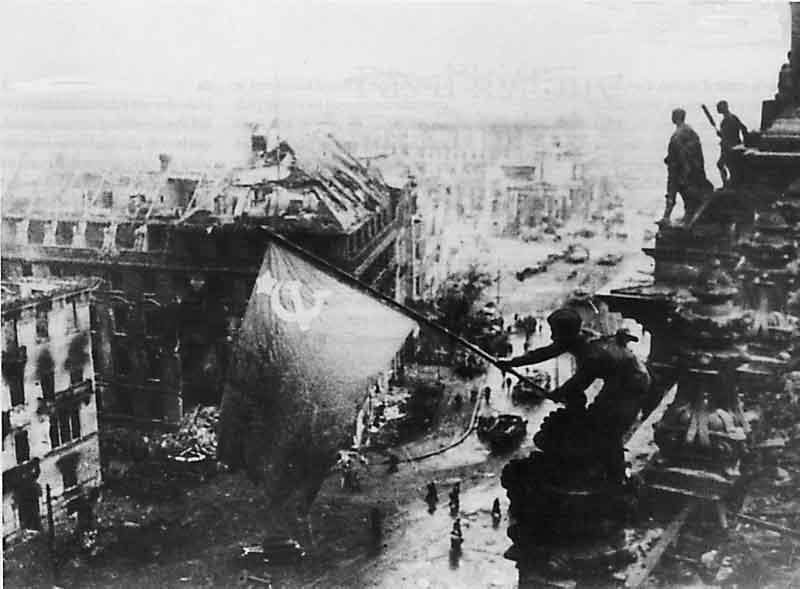
- Support the original, unaltered version. It just looks better. TomStar81 01:47, 2 September 2005 (UTC)
- Support--Markomagare 21:06, 3 September 2005 (UTC)
- Support. James F. (talk) 13:00, 4 September 2005 (UTC)
- Asport. Excelentado. — BRIAN0918 • 2005-09-4 17:19
- Support Great photo --Fir0002 07:46, September 6, 2005 (UTC)
- Support the orginal, unaltered version only. Neutralitytalk 23:12, September 7, 2005 (UTC)
- Support Zscout370 (Sound Off) 05:20, 8 September 2005 (UTC)
- Support. Very nice. --ScottyBoy900Q∞ 15:37, 10 September 2005 (UTC)
- Strong Support This is a great picture. Eraserhead 20:32, 12 September 2005 (UTC)
Promoted Image:Reichstag flag.jpg Raven4x4x 11:56, 14 September 2005 (UTC)
- Support. IMHonestOpinion ALL versions should be preserved, and "featured picture" for this picture should include the "original" and the doctored version. Doctored versions are good material to a future article about doctored pictures, I made a comparation of both versions and identified the tank at the bottom left at [21] Randroide 12:04, 10 April 2006 (UTC)Randroide

The picture shows a high resolution view of eye in the recent city killer hurricane katrina. The quality of the clouds in the image just stuck out in my mind. After reviewing it a couple of times, I decided to nominate it for fpc.
- Nominate and support. - ZeWrestler Talk 19:10, 1 September 2005 (UTC)
- There is a reflection in the upper left hand area of the photo that really ought to be corrected. 129.108.25.68 19:34, 1 September 2005 (UTC)
- Much better. BTW, the above anon is me; I forgot to log in ealier. TomStar81 01:46, 2 September 2005 (UTC)
- How about this? I healed it up in Photoshop. Some of the highlights were clipped, I tried to fix that as well.PiccoloNamek 22:14, September 1, 2005 (UTC)
- Out of curiosity, what's the link to the NOAANEWS story which uses this image? Or a page that has the image on it? I'd like to send someone a link to it, but I'd rather not link directly to the file. However, their website is tortuous to navigate. Excellent picture, anyway, and I'm not too troubled by the reflection. -Ashley Pomeroy 22:24, 1 September 2005 (UTC)
- Support the edited version TomStar81 02:15, 3 September 2005 (UTC)
- Support second version. I personally wouldn't want to be up in that plane, but it's a spectacular view. Raven4x4x 05:05, September 3, 2005 (UTC)
- Second version is a big improvement, but the sky's still quite grainy. —Cryptic (talk) 05:25, 3 September 2005 (UTC)
- support I tweaked the image a bit more to make it look nicer. --antilived 11:48, 3 September 2005 (UTC)
- Support second version. James F. (talk) 13:00, 4 September 2005 (UTC)
- Support. I think it's the subject matter here that's the key; probably wouldn't have voted support otherwise because the bits of the aircraft visible are distracting. Enochlau 13:23, 4 September 2005 (UTC)
Antilived, I think you put a little too much compression on that image. The 8x8 JPEG blocks are visible even in the thumbnail.PiccoloNamek 17:27, September 4, 2005 (UTC)
- How about the version I've just uploaded? Is it better? --antilived 08:12, 5 September 2005 (UTC)
- Support. I think the "Hurricane Hunter" probe reaching out towards the eye adds to the drama and understanding. --Surgeonsmate 22:31, 4 September 2005 (UTC)
- Oppose. artefacts in the clouds. - Mgm|(talk) 09:13, September 5, 2005 (UTC)
- Support Amazing that someone could take this pic --Fir0002 07:45, September 6, 2005 (UTC)
- Support second now. —Cryptic (talk) 07:51, 6 September 2005 (UTC)
- Comment. You know what's funny? Photoshop is now being used to create great pictures. Isn't it weird that we have to use PS to make a picture good? The photographer no longer needs to be skilled... everything can be taken care of in processing. Just my thoughts. --Lord Voldemort (Dark Mark) 22:06, 6 September 2005 (UTC)
- Reply:I don't think that's fair. Using Photoshop is no different than working in the darkroom. It's just more vertisle. Do you think Ansel Adams' pictures looked as good as they do straight out of the camera? And what if Photoshop is the only way the photographer can realize what is in their imagination?PiccoloNamek 23:20, September 6, 2005 (UTC)
- Well then let them be an artist. Stop having them try and pass off a photoshopped image as a great picture. A picture should be a real, true representation of the subject. Not what the photoshopper wants it to be. Oh well. --Lord Voldemort (Dark Mark) 13:37, 7 September 2005 (UTC)
- I disagree. Film photographers have been fixing their photos in the darkroom since photography has first existed, it shouldn't be any different for digital photographers with their "pixelroom". Many of the most commonly used Photoshop techniques have darkroom equivs' such as doding and burning, cloning (spotting), brightness/contrast, etc. Perhaps you just can't get it.PiccoloNamek 14:05, September 7, 2005 (UTC)
- Nah, I get it. I just think there is a huge difference between a darkroom and Photoshop. If you think they are the same, you might be smokin' something. You probably would like to see the entire world computer-generated. Someone could PS the most beautiful mountain view or anything they could imagine... but that does not make it real. I just like the "real world", I guess. --Lord Voldemort (Dark Mark) 15:07, 7 September 2005 (UTC)
- I disagree. Film photographers have been fixing their photos in the darkroom since photography has first existed, it shouldn't be any different for digital photographers with their "pixelroom". Many of the most commonly used Photoshop techniques have darkroom equivs' such as doding and burning, cloning (spotting), brightness/contrast, etc. Perhaps you just can't get it.PiccoloNamek 14:05, September 7, 2005 (UTC)
- Well then let them be an artist. Stop having them try and pass off a photoshopped image as a great picture. A picture should be a real, true representation of the subject. Not what the photoshopper wants it to be. Oh well. --Lord Voldemort (Dark Mark) 13:37, 7 September 2005 (UTC)
- Reply:I don't think that's fair. Using Photoshop is no different than working in the darkroom. It's just more vertisle. Do you think Ansel Adams' pictures looked as good as they do straight out of the camera? And what if Photoshop is the only way the photographer can realize what is in their imagination?PiccoloNamek 23:20, September 6, 2005 (UTC)
- Support - MPF 16:15, 7 September 2005 (UTC)
- Support (second version) Absolutely stunning pic! -- Chris 73 Talk 07:50, September 9, 2005 (UTC)
- Support: Shows the intensity of a hurricane. Rentastrawberry 01:38, 17 September 2005 (UTC)
- Promoted Image:HurricaneEye.jpg This link is Broken 04:42, 17 September 2005 (UTC)

I am nominating this one because it is, in my opinion, one of Clement Meadmore's best works. This photo is also located in the Columbia University article. I took this photo and released it into the public domain.
- Nominate and support. - Haon 03:00, 4 September 2005 (UTC)
- Do you have a larger version? —Cryptic (talk) 03:41, 4 September 2005 (UTC)
- Yes, I just uploaded it. -Haon 12:36, 4 September 2005 (UTC)
- Oppose, it's a bit overexposed. Look at the concrete and grass underneath the sculpture. That and the fact it's not a particularly spectacular subject.
- Oppose vote was removed, can be replaced after comments phase. Phoenix2 01:27, September 5, 2005 (UTC)
- I know that we've had the copyright status of pictures of sculptures discussed before. Can someone summarise for us the outcome? Mark1 00:48, 6 September 2005 (UTC)
- Oppose. Not striking enough to be FP.--May the Force be with you! Shreshth91($ |-| r 3 $ |-| t |-|) 04:18, 6 September 2005 (UTC)
- ( − ) Oppose Overexposed grass is a problem - and I've never been a fan of that kind of abstract art --Fir0002 07:14, September 6, 2005 (UTC)
- Oppose. Ordinary; also some parts overexposed. Enochlau 09:35, 6 September 2005 (UTC)
- Oppose I don't think I will ever understand why people thought this kind of art was interesting in the least. --Deglr6328 00:04, 7 September 2005 (UTC)
- Oppose, neither striking nor informative for the articles it illustrates. Also has overexposure. - Mgm|(talk) 12:33, September 8, 2005 (UTC)
- Support -- TomStar81 00:35, 8 September 2005 (UTC)
- Oppose. Neutralitytalk 23:14, September 11, 2005 (UTC)
- Support: bold design and colourful 'photo.
- Comment I would support if it had been cleaned before the photo was taken, over-exposure can be easily fixed with a photo editor... --Wulf 20:35, 17 September 2005 (UTC)
Not promoted Raven4x4x 05:10, 18 September 2005 (UTC)

- Nominate and support. This is just beautiful geology. It is public domain from the US government: [22]. [[User:JonMoore|— —JonMoore 20:24, 29 May 2006 (UTC)]] 20:15, 3 September 2005 (UTC)
- The thumbnail looks better than the actual picture to me. It seems a little blurry or fuzzy. Is there a bigger version available?
Raven4x4x 00:24, September 4, 2005 (UTC)
- This is the only version the US government had available. [[User:JonMoore|— —JonMoore 20:24, 29 May 2006 (UTC)]] 21:06, 5 September 2005 (UTC)
- Oppose, grainy. - Mgm|(talk) 09:00, September 5, 2005 (UTC)
- Of course its grainy...it's a big flat land covered in salt! Those are salt grains, I think you are describing. [[User:JonMoore|— —JonMoore 20:24, 29 May 2006 (UTC)]] 21:06, 5 September 2005 (UTC)
- ( − ) Oppose Too small and way to compressed (29kb!) - which is probably what Mgm is referring to --Fir0002 07:29, September 6, 2005 (UTC)
- Oppose: yeah, the compression is probably the thing. The sky looks 'grainy' to me as well. Raven4x4x 08:56, September 6, 2005 (UTC)
- Oppose. Nowhere near detailed enough. Enochlau 09:35, 6 September 2005 (UTC)
- Oppose. Neutralitytalk 23:18, September 7, 2005 (UTC)
Not promoted Raven4x4x 05:11, 18 September 2005 (UTC)
Appears in Freckle. Photo found at Flickr. By Johnny Driftwood aka "Sol Dust Love"
- Nominate and support. - Dunc|☺ 18:11, 3 September 2005 (UTC)
- Oppose Awkward shot and the freckles aren't very clear. Is there a different pic of a person with freckles? Kerowyn 10:24, 5 September 2005 (UTC)
- Oppose, is this supposed to be featured because it represents freckle well? Phoenix2 19:42, September 5, 2005 (UTC)
- Oppose. Puhleez!!--May the Force be with you! Shreshth91($ |-| r 3 $ |-| t |-|) 04:19, 6 September 2005 (UTC)
- ( − ) Oppose Face shouldn't be in shadow --Fir0002 07:30, September 6, 2005 (UTC)
- Oppose. Poor composition. Enochlau 09:36, 6 September 2005 (UTC)
- Oppose. - MPF 16:42, 7 September 2005 (UTC)
- Oppose. Neutralitytalk 23:18, September 7, 2005 (UTC)
- Oppose. Comes across like a publicity shot for a tortured singer/songwriter. Freckles not very defined. --bodnotbod 19:01, 14 September 2005 (UTC)
Not promoted Raven4x4x 05:12, 18 September 2005 (UTC)
Really captures the essence of Luton's atmosphere in a way the article's text simply can't.
- Nominate and support. - afterword 13:09, 3 September 2005 (UTC)
- Oppose. Tiny, artifact-ridden, and miscropped. Sorry. —Cryptic (talk) 16:37, 3 September 2005 (UTC)
- Luton is a hole, so atleast this terrible photograph is true to its roots. So that was the idea of the joke, right? Dunc|☺ 22:17, 3 September 2005 (UTC)
- Oppose. Normally, I tell people off for requesting larger versions, but not only is this tiny, it's also grainy and far too dark to show any interesting details. - Mgm|(talk) 09:01, September 5, 2005 (UTC)
- Oppose - Worst picture EVAR.--Deglr6328 20:21, 5 September 2005 (UTC)
- Oppose, I feel almost as if there should be a screening process for FP candidates. Phoenix2 02:59, September 6, 2005 (UTC)
- Oppose. Uh - huh--May the Force be with you! Shreshth91($ |-| r 3 $ |-| t |-|) 04:20, 6 September 2005 (UTC)
- ( − ) Oppose Agree with previous comments --Fir0002 07:30, September 6, 2005 (UTC)
- Oppose. Agree with above. Enochlau 09:36, 6 September 2005 (UTC)
- Comment ehehe, you people have no sense of humour. If it wasn't for the fact you were all deadpan bores about the nomination I'd have said BJAODN. --zippedmartin 01:45, 18 September 2005 (UTC)
Not promoted Raven4x4x 05:12, 18 September 2005 (UTC)

I thought this was a good on stage shot, she's got a nice shape to her. Appears in Nicola Roberts and Girls Aloud. The author is "James" from rokfoto.net (PS please you can help me identify her bandmates at talk:Girls Aloud). Dunc|☺ 01:30, 3 September 2005 (UTC)
- Nominate Dunc|☺ 01:30, 3 September 2005 (UTC)
- and support Dunc|☺ 01:30, 3 September 2005 (UTC)
- and concur Dunc|☺ 01:30, 3 September 2005 (UTC)
- Oppose. Would be better cropped, though that won't help with the iffy focus. It's also overexposed. —Cryptic (talk) 01:40, 3 September 2005 (UTC)
- Yeah, i don't like what ever is blocking her left leg. --ZeWrestler Talk 14:30, 3 September 2005 (UTC)
- er, I think you mean right leg(?) Dunc|☺ 17:57, 3 September 2005 (UTC)
- Not very interesting or eye-catching. — BRIAN0918 • 2005-09-4 17:13
- Nice pic, but not nice enough to be a FP. Sorry. Oppose. Titoxd 06:59, 5 September 2005 (UTC)
- Oppose. Thelb4 07:23, 5 September 2005 (UTC)
- Oppose, overexposed and not stunning. - Mgm|(talk) 09:04, September 5, 2005 (UTC)
- Support Nicely composed. Not many shots of people in FP. Kerowyn 10:23, 5 September 2005 (UTC)
- Support: eye-catching and well-structured. Good use of contrast. Jdhowens90 09:04, 5 September 2005 (UTC)
- Neutral I quite like this photo but the out of focus face spoils it. --Fir0002 07:36, September 6, 2005 (UTC)
- Oppose. Overexposed front of shirt; also, not particularly striking. Enochlau 09:38, 6 September 2005 (UTC)
- ( − ) Oppose Nothing special, technical quality is low. — Sverdrup 20:50, 6 September 2005 (UTC)
- Oppose -Poor focus, not terribly striking or interesting.--Deglr6328 15:20, 7 September 2005 (UTC)
- Oppose - Yukk. MPF 16:37, 7 September 2005 (UTC)
- Oppose. Uninteresting.—encephalonέγκέφαλος 15:34:26, 2005-09-10 (UTC)
- Oppose. I'd support if the face had been in focus. --Rebroad 17:21, 15 September 2005 (UTC)
Not promoted Raven4x4x 05:12, 18 September 2005 (UTC)


Appears in Kinkaku-ji. From the Commons. I think this picture really highlights an essense of Japan.
- Nominate and support. - AllyUnion (talk) 10:28, 2 September 2005 (UTC)
- Breathtaking. Simply wonderful. Raven4x4x 00:01, September 3, 2005 (UTC)
- Comment: Good clear image, detailed and well balanced; characteristic architecture. Okay on reflection the sky is washed out, this one (#2) is better --Nantonos 01:36, 4 September 2005 (UTC)
- Comment: Although I like this, I don't think it's the best photo on Commons or Wikipedia. Check Kinkaku-ji and commons:Kyoto#Kinkaku-ji temple 金閣寺 and see which one you like. I'm partial to the photo by Stephane d'Alu: the bright blue sky complements the gold very nicely. Fg2 06:44, September 4, 2005 (UTC)
- Oppose. The washed out sky is a little unforgiveable. Enochlau 13:06, 4 September 2005 (UTC)
- It looks to me like it was just cloudy. I'd support either, but perfer the first one, the second could do with being closer focused on the building itself. Raven4x4x 05:02, September 5, 2005 (UTC)
- The second picture's dimensions are acceptable, but the building itself occupies too small a portion of it, leaving out many details. Enochlau 09:40, 6 September 2005 (UTC)
- Oppose - First one is ruined by sky and second one is too small.--Deglr6328 20:24, 5 September 2005 (UTC)
- ( − ) Oppose Agree with Deglr6328 --Fir0002 07:37, September 6, 2005 (UTC)
- Support. Prefer the first, as the second has that crowd of gawping tourists at the right edge, but both are very nice - MPF 16:29, 7 September 2005 (UTC)
- Oppose. The sky in the first image misses color and the tourists in the second one, together with the bigger distance don't make that one ideal either. - Mgm|(talk) 12:37, September 8, 2005 (UTC)
- Support second one -- Chris 73 Talk 07:44, September 9, 2005 (UTC)
- Support the first one. Renata3 18:29, 9 September 2005 (UTC)
Not promoted though it breaks my heart. Raven4x4x 05:13, 18 September 2005 (UTC)

Found in the Commons as a FP, added to tiger.
- Nominate and support. - AllyUnion (talk) 10:05, 2 September 2005 (UTC)
- Nice, higher resolution perhaps. Not all FP's on commons need to have that status here as well. Phoenix2 16:11, September 3, 2005 (UTC)
- Oppose -Unsharp focus, too small. --Deglr6328 03:02, 4 September 2005 (UTC)
- Oppose -Looks like it is shot in a zoo. Posted unsigned by 195.1.50.73
- Oppose. Ordinary. Enochlau 13:14, 4 September 2005 (UTC)
- ( − ) Oppose Agree with Deglr6328 --Fir0002 07:41, September 6, 2005 (UTC)
- Oppose. Agree with 195.1.50.73, the zoo background spoils it - MPF 16:20, 7 September 2005 (UTC)
- Oppose. Intensely boring. --bodnotbod 19:10, 14 September 2005 (UTC)
Not promoted Raven4x4x 05:13, 18 September 2005 (UTC)

Found on Jaguar. I noticed this is a FP on the Commons as well.
- Nominate and support. - AllyUnion (talk) 10:04, 2 September 2005 (UTC)
- Support. James F. (talk) 13:00, 4 September 2005 (UTC)
- Support. Enochlau 13:15, 4 September 2005 (UTC)
- Support The focus around the face is a bit soft but excusable --Fir0002 07:42, September 6, 2005 (UTC)
- Oppose - ugly background. - MPF 16:24, 7 September 2005 (UTC)
- Oppose, concur with MPF. Neutralitytalk 23:11, September 7, 2005 (UTC)
- Support. I like the background. I know its not in one but the colors kind of make it look jungle-ish. Chuckos 20:27, 10 September 2005 (UTC)
- Oppose - perfectly adequate illustration of its subject but lacks the qualities I associate with featured pictures. --bodnotbod 21:53, 14 September 2005 (UTC)
- Oppose. Not perfect cropping, colour, setting, focus, pose. There could easily be a better picture of a Pantha. --Rebroad 17:29, 15 September 2005 (UTC)
Not promoted Raven4x4x 05:13, 18 September 2005 (UTC)
.jpg)
.jpg)
Public domain, user created image created by commons:User:Solkoll. I like the top one better, but both are equally pretty. The top one is in Julia set but the bottom one doesn't have an article attached to it. I'm nominating the top one, but I figured as an alternate, add the other one as well. The multi-colored one is a featured picture on Commons.
- Nominate and support. - AllyUnion (talk) 09:45, 2 September 2005 (UTC)
- Support first. I don't like the banding or the garish colors on the second. —Cryptic (talk) 02:32, 4 September 2005 (UTC)
- Oppose -Don't think we need more than one FP fractal. Seen a few and you've seen em all IMHO. --Deglr6328 02:56, 4 September 2005 (UTC)
- Oppose. We can have a few, but I've seen more stunning ones before. Enochlau 13:16, 4 September 2005 (UTC)
- Aprose. The current FP fractals are better. — BRIAN0918 • 2005-09-4 17:16
Not promoted Raven4x4x 05:13, 18 September 2005 (UTC)

Commons image, taken by Chinese Wikipedian, zh:User:Captmjc. I added it to Marco Polo. It's a featured picture on the Commons, and I think it's a great picture.
- Nominate and support. -- AllyUnion (talk) 09:26, 2 September 2005 (UTC)
- It's very dark and hard to make out the details on the statue and to distinguish it from the trees. I wonder what Commons liked about it enough to feature it? Elf | Talk 21:36, 2 September 2005 (UTC)
- Oppose. I agree with Elf. The picture's also on the small side, has definite compression artifacts, and looks slightly tilted. —Cryptic (talk) 05:29, 3 September 2005 (UTC)
- Oppose -Too small, blurry etc.--Deglr6328 03:03, 4 September 2005 (UTC)
- Oppose. Technical issues. Enochlau 13:20, 4 September 2005 (UTC)
- ( − ) Oppose --Fir0002 07:43, September 6, 2005 (UTC)
- Oppose - Intensely pedestrian. --bodnotbod 19:17, 14 September 2005 (UTC)
Not promoted Raven4x4x 05:14, 18 September 2005 (UTC)

Television news is always running stories on obesity. To illustrate the story, they go outside, and film fat people walking down the street, but crop their faces out. I think there's a fundamental lack of respect in presenting the issue that way. So I give you Image:Fatmouse.jpg. It clearly illustrates obesity, and it's cute, without being disrespectful. Uploaded by Ta bu shi da yu from Oak Ridge National Laboratory.
- Nominate and support. -- Norvy (talk) 03:48, 2 September 2005 (UTC)
- You know, I've think I've seen this picture in the news before... --AllyUnion (talk) 10:33, 2 September 2005 (UTC)
- If I remember correctly where I saw this picture before, the fat one was injected with a growth hormone and the thin one wasnt. Just an extra tidbit of info about this picture.
- On the small side and overcompressed; artifacts are visible in the blue cloth. —Cryptic (talk) 21:31, 3 September 2005 (UTC)
- It's not being used to illustrate anything. Can we also confirm that it was administered with growth hormone rather than being genetically engineered? Dunc|☺ 00:17, 4 September 2005 (UTC)
- The site where the image is from gives no explanation of the image- it could just be an obese mouse and a regular mouse, however the could also be mice used for leptin research which may or may not be mutants. Unless it can be verified one way or another it doesn't illustrate anyting other than obesity. It may also be the case that this is a copyrighted image that is just used on a US gov site, there is nothing there to suggest that this image is in the PD.--nixie 00:38, 4 September 2005 (UTC)
- Oppose. Mice are overexposed. Enochlau 13:20, 4 September 2005 (UTC)
- ( − ) Oppose Small and I don't like the blue background - makes the mice too blue. --Fir0002 07:45, September 6, 2005 (UTC)
Help! Someone who knows how to download the real picture, please do so! While the current picture is stunning, it is not properly categorized. Dan Watts 13:17, 9 September 2005 (UTC)
- Done. This is the second time I've reverted vandalism to this picture. Raven4x4x 13:25, September 9, 2005 (UTC)
- Oppose. Not up to FP image quality. - Bevo 01:01, 16 September 2005 (UTC)
Not promoted Raven4x4x 05:14, 18 September 2005 (UTC)

I am nominating this for the detail in it and the sheer skill (or luck) of the photographer to capture the casing in mid-flight. It appears in the M4 Carbine article and was taken on March 23, 2005 by Staff Sgt. Suzanne M. Day, U.S. Air Force.
- Nominate and support. - —Vanderdecken ℘ζξ 12:42, 3 September 2005 (UTC)
- Oh yes. Very nice indeed. Raven4x4x 00:25, September 4, 2005 (UTC)
- Support. Not much luck required if you have fast film transport. Most professional cameras can take upwards of 8 frames per second. --MarkSweep✍ 13:09, 4 September 2005 (UTC)
- Right, new version. No cropping needed, but remove graininess, halved dpi and corrected contrast & levels. Howzat? —Vanderdecken ℘ζξ 14:12, 4 September 2005 (UTC)
- The new version is quite nice. This link is Broken 15:48, 4 September 2005 (UTC)
- Support. Personally, I prefer the warmer (or more saturated?) colors in the first version. But my support goes for either one. --Gutza T T+ 19:54, 4 September 2005 (UTC)
- Support first version. Oppose half-size version. —Cryptic (talk) 01:51, 5 September 2005 (UTC)
- Support -- either version. TomStar81 02:13, 5 September 2005 (UTC)
- Support either version'. Raven4x4x 04:59, September 5, 2005 (UTC)
- Support first one. Thelb4 07:20, 5 September 2005 (UTC)
- Support first image. Half-size wasn't neccesary. - Mgm|(talk) 09:03, September 5, 2005 (UTC)
- Support first version. Really nice.--May the Force be with you! Shreshth91($ |-| r 3 $ |-| t |-|) 04:22, 6 September 2005 (UTC)
- Support Either version. I like the colors on the second one more, but I like higher res on the original (even if it does get a little noisy). Suprisingly low shutter speed - 1/500 sec --Fir0002 07:34, September 6, 2005 (UTC)
- Support. Exceptional capture of the bullet. Enochlau 09:37, 6 September 2005 (UTC)
- That is actually the casing, hence 'M4 Carbine Casing'. Phoenix2 23:08, September 6, 2005 (UTC)
- or casing or whatever... Oska 22:37, September 8, 2005 (UTC)
- Preference for second picture. Enochlau 06:03, 10 September 2005 (UTC)
- or casing or whatever... Oska 22:37, September 8, 2005 (UTC)
- That is actually the casing, hence 'M4 Carbine Casing'. Phoenix2 23:08, September 6, 2005 (UTC)
- Support either version. Phoenix2 23:08, September 6, 2005 (UTC)
- Oppose I don't like the composition and the bullet is blurry. Oska 22:36, September 8, 2005 (UTC)
- Of course it's blurry! I'm no expert but I'd guess it's travelling at about 200kph! One of the things I like about the shot is that I get the impression that it wasn't taken very professionally, or with the strict intention of capturing the case in flight. Re: Fir0002 - I could also do a higher dpi, say midway between the two? And the reason that I lowered the res was because, as this was taken on a 35mm film camera, the graininess was not digital noise - it's the particles of silver hallides on the film. I realise that the background in the first version looks better, warmer, but the uniform and the lighter parts of the gun were too yellow (look at the lapels). The second one looks more natural, although natural sometimes means less pleasing to the eye. —Vanderdecken ℘ζξ 15:32, 9 September 2005 (UTC)
- Support either version, preference for the second -- Chris 73 Talk 07:39, September 9, 2005 (UTC)
- Support - Both versions look great --ZeWrestler Talk 14:31, 13 September 2005 (UTC)
- Support. either version, preferably the first (the color seems richer). exceptional capture, but what really makes it cool is the smoke trail that illustrate the path of the casing... very cool. and by the way, vanderdecken, my car goes 200kph. that bullet is moving closer to 3400kph (905 m/s). Hojimachong 02:31, 18 September 2005 (UTC)
- Support any, prefer the second. =Nichalp «Talk»= 09:02, 13 September 2005 (UTC)
Promoted Image:Casing.jpg
Found as a FP in the Commons. Nice HQ picture, used to replace the old Strasbourg photo in European Parliament.
- Nominate and support. - AllyUnion (talk) 10:30, 2 September 2005 (UTC)
- Support. Beautiful. —Cryptic (talk) 02:30, 4 September 2005 (UTC)
- Support. James F. (talk) 13:01, 4 September 2005 (UTC)
- Neutral. Good composition and subject, although if you look at the full sized image, the lines and trees and other elements are less than sharp. Enochlau 13:08, 4 September 2005 (UTC)
- Support. I love how the canoer in the foreground provides a size comparison. Andrew Levine 18:31, 4 September 2005 (UTC)
- He's actually a sculler! Dunc|☺ 19:01, 4 September 2005 (UTC)
- Support -- TomStar81 22:44, 4 September 2005 (UTC)
- Support from member country. - Darwinek 11:31, 7 September 2005 (UTC)
- Support. - MPF 16:32, 7 September 2005 (UTC)
- Support. Great shot -- Chris 73 Talk 07:42, September 9, 2005 (UTC)
- Oppose - Nice picture, but I don't think it adds significantly to the article. --Yodakii 06:59:24, 2005-09-10 (UTC)
- Support.—encephalonέγκέφαλος 15:36:31, 2005-09-10 (UTC)
- Support. It's a lovely view and good camera shot. For all those who can't see it in real life must see it as a featured picture. -- Thorpe talk 14:24, 11 September 2005 (UTC)
- Oppose. Unless someone can manipulate the canoeist out of the image. He's annoying. If he goes I'll support. --bodnotbod 19:13, 14 September 2005 (UTC)
Promoted

I took this image in February 2005 and thought the position of the clouds made the image look more interesting (it always looks beautiful anyway!), without detrimentally obscuring the valley itself. It appears in the Lauterbrunnen article.
- Nominate and support. - Halsteadk 21:00, 4 September 2005 (UTC)
- Wow. This is one of those 'I wish I was there' images. Raven4x4x 04:54, September 5, 2005 (UTC)
- Support like I've never supported before. Congratulations on taking such a great picture. Raven4x4x 08:53, September 6, 2005 (UTC)
- I will definately support this when voting is allowed. Brilliant! Thelb4 06:36, 5 September 2005 (UTC)
- Fine image. Count my support as soon as voting starts. - Mgm|(talk) 08:57, September 5, 2005 (UTC)
- ( + ) Support Great photo. --Fir0002 07:12, September 6, 2005 (UTC)
- Support. Very much impressive. Enochlau 09:33, 6 September 2005 (UTC)
- Support, stunning. Phoenix2 23:04, September 6, 2005 (UTC)
- Support. Cold :) - Darwinek 11:29, 7 September 2005 (UTC)
- Support. - MPF 16:48, 7 September 2005 (UTC)
- Support. Neutralitytalk 23:21, September 7, 2005 (UTC)
- Support -- TomStar81 00:33, 8 September 2005 (UTC)
- Support. I like these sort of images. Beautiful. -- Thorpe talk 14:17, 11 September 2005 (UTC)
- Support =Nichalp «Talk»= 08:59, 13 September 2005 (UTC)
- Support: Wow. Rentastrawberry 00:41, 15 September 2005 (UTC)
- Support – brilliant. --Bhadani 14:55, 15 September 2005 (UTC)
Wow - I wasn't expecting anything like this much support - thanks everybody! It was taken on an £80 Canon 35mm compact camera btw... Halsteadk 18:54, 15 September 2005 (UTC)
Well, I say it deserves all the support it has got.
Promoted Image:Lauterbrunnen-valley.jpg Raven4x4x 05:31, 19 September 2005 (UTC)

I think this is one cool image, I like how low the cloud deck is, and the remarkable detail of the bustle of the city 75 floors below.; I photographed this image .
- Nominate and support. - Cloveious 05:11, 4 September 2005 (UTC)
- Once the tilt is corrected and it is cropped, then... maybe. Thelb4 06:38, 5 September 2005 (UTC)
- I can't see much details and the color is really flat. Can someone touch up the colors in the image? - Mgm|(talk) 08:58, September 5, 2005 (UTC)
- Hmmm, I'm not sure about it. Even when I view the full-size picture (and especially in the thumbnail), Qwest Field seems too small in this photo--there's very little observable detail of the building. I think it's a very nice shot (and a perspective I don't think I've seen in a photograph of Seattle) -- I'd be far more willing to consider it as a photograph of the SoDo district (or whatever other names we have for Seattle south of Yesler Way) than as a photograph of the stadium. Of course, that would require an article about that neighborhood that is illustrated by this photo, and I'm not sure if one exists. What does everybody else think? Jwrosenzweig 17:07, 5 September 2005 (UTC)
 Oppose Drab --Fir0002 07:13, September 6, 2005 (UTC)
- Oppose. Dull. Enochlau 09:34, 6 September 2005 (UTC)
- Oppose. Makes Seattle look nearly as bad as Luton [see below] - MPF 16:46, 7 September 2005 (UTC)
- Seattle gets 36 inches of rain per year, Luton (well, London) only 23 inches. So really Seattle is much worse than Luton :) -- Finlay McWalter | Talk 21:00, September 7, 2005 (UTC)
- There's worse things than rain. ;) - Mgm|(talk) 04:53, September 8, 2005 (UTC)
- I have uploaded an enhanced and cropped image that removes most of the surrounding city, I only have basic graphical editing software so I really can't change the tilt so if someone could fix that for me and address that concern I would appreciate it. Its not like I had much of a choice when I snapped the photo of the angle. As for the drabness of Seattle, I think it turned out remarkably well . I only had one chance to take the picture as me and my friend were escorted out of the tower for being somewhere we were not supposed to be. This was not intended to make Seattle look bad, its just how it looks in that direction. As for buidling details, my camera does not have that great of zoom, and the stadium is a few miles away at least. Compared to the Luton photo below, I think its leaps and bounds beyond that. As for use as a greater seattle photo, Im all for it. --Cloveious 05:13, 8 September 2005 (UTC)
- The color has improved tremendously, but the resolution isn't too well. Do you have a higher resolution image? (I can't believe I'm asking, I usually slap people with a wet fish for that) - Mgm|(talk) 12:31, September 8, 2005 (UTC)
- Oppose. uninspiring and way to small. David D. (Talk) 03:01, 9 September 2005 (UTC)
- Oppose. Looks a little blurry to me, and the new version especially is far too small. Raven4x4x 10:42, September 9, 2005 (UTC)
- You both missed the point completely, Its not supposed to be a close up, because it was taken from really far away at a unique vantage. There a tons of close ups of the stadium, but very few from far away, showing it in relation to the rest of the Seattle scape. --Cloveious 16:15, 9 September 2005 (UTC)
- The full size picture is only 1300 pixels wide. That is quite small. The detail is poor since the dull day causes low contrast. Likewise for the colour. I would support this picture if there was the added interest of an actual Seahawks game going on on the field and preferably a brighter day, although I realise the later might not be as easy. David D. (Talk) 18:40, 9 September 2005 (UTC)
- I think you've missed my point completely as well, Cloveious. No matter what the focus of the image is, both seem rather blurry to me, as well as more than a little dull. Raven4x4x 00:22, September 10, 2005 (UTC)
- The full size picture is only 1300 pixels wide. That is quite small. The detail is poor since the dull day causes low contrast. Likewise for the colour. I would support this picture if there was the added interest of an actual Seahawks game going on on the field and preferably a brighter day, although I realise the later might not be as easy. David D. (Talk) 18:40, 9 September 2005 (UTC)
- You both missed the point completely, Its not supposed to be a close up, because it was taken from really far away at a unique vantage. There a tons of close ups of the stadium, but very few from far away, showing it in relation to the rest of the Seattle scape. --Cloveious 16:15, 9 September 2005 (UTC)
- Oppose. To dark and looks too miserable to be a featured picture. -- Thorpe talk 14:20, 11 September 2005 (UTC)
- Oppose. It's really depressing... This picture better represents the field. Hojimachong 02:23, 18 September 2005 (UTC)
Not promoted 0/7/0 -- Jtkiefer T | @ | C ----- 18:06, 19 September 2005 (UTC)
This is a Joel-Peter Witkin self-portrait and i included it in the Joel-Peter Witkin article. I believe is a really good picture and that the article needed a portrait.
- Nominate and support. - Eraserhead 18:30, 6 September 2005 (UTC)
- Invalid nomination - fair use pictures cannot be featured. Dunc|☺ 22:29, 6 September 2005 (UTC)
- As well as low resolution. Phoenix2 22:45, September 6, 2005 (UTC)
- Invalid nomination, doesn't give a fair use rationale either. - Mgm|(talk) 10:54, September 7, 2005 (UTC)
- Oppose as above. Enochlau 08:39, 8 September 2005 (UTC)
- Oppose as above. Shivu § Mesg 4 Mè § 03:58, September 12, 2005 (UTC)
- Removed, unsuitable license. ed g2s • talk 22:01, 19 September 2005 (UTC)

I stumbled across this one day, and thought: wow, that needs to be featured! Ingoolemo talk 08:09, 2005 September 7 (UTC)
- Quite nice, but is there a bigger version available? Raven4x4x 10:12, September 7, 2005 (UTC)
- It's a very nice picture, but I'm not sure it illustrates an article very well. It's used on C-141 Starlifter, but it really doesn't show us very much about that aircraft. It's also used on Pratt & Whitney and Pratt & Whitney JT3D, but we can barely see P&W's engine in the photo. I guess an FP for the P&W articles would be a nice big clear image (either a photo or a diagram) showing the engine, with the casing removed so we could see all the stuff inside. It would be a better fit for contrail, but even then the images there are really better for that purpose that this. -- Finlay McWalter | Talk 19:48, September 7, 2005 (UTC)
- Support -- What about placing the picture in the article Exhaust gas? TomStar81 00:32, 8 September 2005 (UTC)
- Good idea, I've just done it. - Mgm|(talk) 12:27, September 8, 2005 (UTC)
- Bad idea, it's a clearly vapour trail rather than exhaust gas. Dunc|☺ 20:26, 8 September 2005 (UTC)
- Good idea, I've just done it. - Mgm|(talk) 12:27, September 8, 2005 (UTC)
- Unfortunatly, I am not real familar with jet engine, so this is just speculation on my part, but I would imagine that its probably both. A jet engine relies on a mix of avaition fuel and air to combust, so the vapor trail most likely contains exhaust gas. In either case, because we are all agreed that the trail originates in the engine it is going to contain exhaust gases.TomStar81 03:07, 9 September 2005 (UTC)
- But, AFAIK CO2 is a colourless gas, blackness in smoke for example from steam locomotives or diesel cars is caused by unburnt or partially burnt hydrocarbons. You only get black smoke from a steam locomotive (driven properly) when it's running on bad quality fuel. Aeroplanes on the other hand have to fly on very high quality aviation fuel. Dunc|☺ 18:51, 11 September 2005 (UTC)
- I agree. You can see that the trail starts some distance behind the engines, therefore it's vapour, and not the visible exhaust, although there would be exhaust gases mixed in. Possible addition for vapour trail?
- Though a great pic, I don't think it demonstrates much of anything about all the ideas put forward (aircraft, engines and/or exhaust/vapour trail) all of which could probably be demonstrated in better images. Also the setting sun is not only distracting, but hurts my eyes and from what I see (just by resizing my window and scrolling to remove the sun from view) adds nothing.woops, forgot to put oppose in here.say1988
- Oppose. It's kind of nice, but it's a little too small, has a sloping horizon, and as per the comments above, doesn't really illustrate much. Enochlau 11:15, 15 September 2005 (UTC)
Not promoted Raven4x4x 05:12, 21 September 2005 (UTC)

I took this in the summer of 2003 -- it's a housing development in (or very near) Amsterdam on (if I remember correctly) a relatively new man-made island. The architecture is all the more striking for being made available to low-income people.
- Self-Nominate. - Tlogmer 00:53, 7 September 2005 (UTC)
- Maybe it's because I live in the Netherlands, but I don't find the architecture particularly striking. - Mgm|(talk) 10:52, September 7, 2005 (UTC)
- I agree with Mgm; it's not particularly striking. The image quality is also lowered by the bland left-hand side: especially the bottom corner. Jdhowens90 19:17, 7 September 2005 (UTC)
- Oppose. Cropping would help. Illustrates Java Island Architecture well, but not striking enough to be FP. - Jpo 00:10, September 8, 2005 (UTC)
- Oppose - not a particular striking shot, sorry -- Chris 73 Talk 07:34, September 9, 2005 (UTC)
- Oppose - it does not clearly show architecture. That huge grey-brown area is very distracting from the houses. Renata3 18:16, 9 September 2005 (UTC)
- Oppose - as the others say, too much road in the pic - MPF 21:40, 10 September 2005 (UTC)
- ( − ) Oppose As MPF --Fir0002 09:00, 13 September 2005 (UTC)
Not promoted Raven4x4x 05:21, 21 September 2005 (UTC)

I think it's a great picture. Used in Eyjafjallajökull. From the Commons.
- Nominate and support. - AllyUnion (talk) 10:25, 2 September 2005 (UTC)
- hmmm, pizza's not sure how to explain why pizza don't like this one very much. Firstly pizza's not sure how natural all that blueness is, and this photo doesn't leap out and grab pizza. Can pizza have a picture explaining how to pronounce the name? :) pizza 07:09, September 3, 2005 (UTC)
- taco's agree that the blue monotony doesent look very natural, but who says that has got to be a bad thing? Its a beautiful photo and the detail of the ice in the foreground is just stunning! Taco | User talk:Taco 20:21, 3 September 2005 (UTC)
- Neutral. Wtf:ice cream)]] 21:28, 3 September 2005 (UTC)
- Support. fried chicken loves the colour of the ice, but fried chicken believes that that is natural, just the way the light reflects and refracts through the water and it. fried chicken do, though, agree with ice cream in the fact that it is tilted a bit to the left. Although glaciers do slope, this is a floe on a lake. Not counting waves, the surface of water is usually flat, therefore if the piece of ice is not sloping itself (which it does not appear to be) then it would be horizontal. fried chicken might be able to fix the tilt though. —User:fried chicken ℘ζξ 11:29, 4 September 2005 (UTC)
- Support. James F. (talk) 13:00, 4 September 2005 (UTC)
- Neutral. Looks good zoomed out, but the focus and colours when viewed full size are less than optimal. Enochlau 13:13, 4 September 2005 (UTC)
- Oppose. cheeseburger agree with Enochlau, although the focus bugs cheeseburger more than the colours. Raven4x4x 05:04, September 5, 2005 (UTC)
- ( − ) Oppose ribs know it's not compressed, as the file size is large, but the mountains just have the appearance of low quality jpeg compression. Focus is also a problem --Fir0002 07:52, September 6, 2005 (UTC)
- Support. - Darwinek 11:35, 7 September 2005 (UTC)
- Support. - MPF 16:26, 7 September 2005 (UTC)
- Support -- TomStar81 00:36, 8 September 2005 (UTC)
- Support - That picture looks great. --ZeWrestler Talk 17:36, 8 September 2005 (UTC)
- Support -- Chris 73 Talk 07:45, September 9, 2005 (UTC)
- Support. Color looks spectacular on my monitor. At full size, mountain backdrop slightly less sharp than steak would like, but this is too small a defect for steak to vote oppose.—encephalonέγκέφαλος 15:42:50, 2005-09-10 (UTC)
- Support. Lovely ice, lovely image. -- Thorpe talk 14:32, 11 September 2005 (UTC)
- Support. Dramatic colours. --bodnotbod 21:48, 14 September 2005 (UTC)

Not only is this a particularly striking example of a building fire, but it provides an excellent illustration for the Effect of Hurricane Katrina on New Orleans article. Photo credit is due to DirectNIC.com. Originally posted on Interdictor blog mgno.com with notice "Media has permission to use the photos with credit to DirectNIC.com."
- Nominate and support. - Thryduulf 09:22, 8 September 2005 (UTC)
- Comment: If only the "media" is allowed to use this image if they credit it, it's not free for commercial use and thus too restrictive for use on Wikipedia and therefore not a valid FPC candidate. I doubt it belongs on the commons too, because they have even more restrictive licenses than Wikipedia does. - Mgm|(talk) 12:23, September 8, 2005 (UTC)
- I have emailed the contact address given for media enquiries asking about this, linking to both the image page on the commons and to this page, asking for replies either here or by email to me. Thryduulf 12:48, 8 September 2005 (UTC)
- Does Wikipedia count as part of the "media"? Probably not, but it's arguable. Enochlau 08:01, 13 September 2005 (UTC)
Not promoted
- I think the reason that no-one voted is that they were waiting for the copyright issue to be cleared up. Once you have an answer, I think it should be resubmitted as a candidate if the license allows it. Raven4x4x 10:20, 22 September 2005 (UTC)

It's so hard to get a good freeway image that shows the congestion and yet is well composed, too. I found this in San Francisco Bay Area and it struck me immediately as not only clearly representing the traffic situation on I-80 at this location but also as being an excellent photo. It is also used in Freeway, which it also adds to, showing the urban background as well. The cars are in focus and there's just a hint of the smog that they're contributing to. Taken by User:Minesweeper, GFDL.
- Nominate and support. - Elf | Talk 19:16, 1 September 2005 (UTC)
- Well-composed and striking as you say, but there are a few lens / scanner faults in the sky and a pair of heavy dark specks over the water that could do with being removed before voting starts. ~ Veledan • Talk + new 20:42, 1 September 2005 (UTC)
- Support - comment: those dark spots are pilings in the bay mud - one of which for a long time held aloft a large model of the Red Baron's aircraft. The "fault" in the sky looks like an antenna to me. Leonard G. 02:15, 3 September 2005 (UTC)
- Support Cheers for explaining the pilings, and apologies to Minesweepeer for thinking they were an error. I didn't mean the antenna! The sky smudges might be birds. I never doubted it's a great pic though ~ Veledan • Talk + new 22:34, 3 September 2005 (UTC)
- Support. Won't find too many photos like this, but this is a good one. Raven4x4x 05:02, September 3, 2005 (UTC)
- Support. I used to drive down there every day, it's a good pic. Note the locals 'short cut' on the right. The roads seem very crowded, especially for a Saturday. Was there some special event on that day? Possibly the kite festival? David D. (Talk) 18:09, 4 September 2005 (UTC) (forgot to sign earlier)
- Support. James F. (talk) 13:00, 4 September 2005 (UTC)
- Support. And I thought traffic in Sydney was bad... Enochlau 13:22, 4 September 2005 (UTC)
- Support. From an artistic point of view, it might look better with some of the area on the left removed, but as an illustration of the subject, it is superb. --Surgeonsmate 22:23, 4 September 2005 (UTC)
- Question. As a purely legal reason, could we get a version that slightly blurs the plate numbers? I think the only problem ones are the couple on the right. --Lord Voldemort (Dark Mark) 16:00, 7 September 2005 (UTC)
- Is that necessary? They look blurry enough: even on the biggest version they are very hard to read. Anyway, I didn't know this was required for any picture. Raven4x4x 23:57, September 8, 2005 (UTC)
- Well, I'm not sure it is totally necessary, but the plate number on the white truck is easily readable. I don't know the California laws about making information public or anything, but as I recall, I thought you had to blur the numbers unless you got permission from the owner. That's why you see them blurred on TV news reports, reality shows, etc. Perhaps I am wrong. I just thought I might mention it. --Lord Voldemort (Dark Mark) 17:33, 9 September 2005 (UTC)
- If you notice, they only blur out plates when the name of the subject who owns the car is also given when this is done on TV. It doesn't make much sense to make it illegal to show license plates numbers when you can go outside and record as many as you'd like, eh? Semiconscious (talk · home) 07:24, 10 September 2005 (UTC)
- Well, I'm not sure it is totally necessary, but the plate number on the white truck is easily readable. I don't know the California laws about making information public or anything, but as I recall, I thought you had to blur the numbers unless you got permission from the owner. That's why you see them blurred on TV news reports, reality shows, etc. Perhaps I am wrong. I just thought I might mention it. --Lord Voldemort (Dark Mark) 17:33, 9 September 2005 (UTC)
- Is that necessary? They look blurry enough: even on the biggest version they are very hard to read. Anyway, I didn't know this was required for any picture. Raven4x4x 23:57, September 8, 2005 (UTC)
- Support -- Chris 73 Talk 07:48, September 9, 2005 (UTC)
- Support—This picture does it's job. Not to be a traffic snob, but I live about a mile from where this photo was taken and the traffic around here is nothing compared to the traffic on the 405 freeway in Los Angeles. Forty-five minutes to go 6 miles, each and every day, twice a day, for two years... ugh... Semiconscious (talk · home) 07:24, 10 September 2005 (UTC)
- Oppose. A kind of collective madness seems to have descended on you. Whilst this picture is clear and will, I'm sure, illustrate something useful on related articles it is only as interesting as a picture of traffic conditions can be. Which is not very. I would ask voters to consider this picture in the context of all the natural and man-made wonders of the world and the universe beyond and then look back at their support for a picture of traffic conditions on a day with pleasant weather. A couple of the supporting votes seem to be because the picture says "yep! I know that feeling!" when identifying with the drivers. Well, sorry, I don't drive and there is nothing in this picture that makes me care about it and I'm sure most people with a lack of empathic links to the subject will be left equally disinterested. --bodnotbod 19:35, 14 September 2005 (UTC)
- Oppose. There's nothing special here. - Bevo 00:59, 16 September 2005 (UTC)
- Promoted Image:I-80 Eastshore Fwy.jpg Broken S 21:27, 22 September 2005 (UTC)

I look at this picture and I say... Wow... Found on Segovia. --AllyUnion (talk) 09:31, 2 September 2005 (UTC)
- Nominate and support. - AllyUnion (talk) 09:31, 2 September 2005 (UTC)
- What a great and enchanting shot. Raven4x4x 00:17, September 3, 2005 (UTC)
- Neutral leaning towards oppose. Somewhat on the small side, and the car in the lower left and brown whatever-it-is in the upper left are minuses. I'm undecided whether perspective correction would benefit the picture. —Cryptic (talk) 02:36, 4 September 2005 (UTC)
- Oppose- Sadly, too small. --Deglr6328 02:59, 4 September 2005 (UTC)
- Neutral. It's bordering on small, but it's ok here. It's very enchanting especially the lighting (really captures the mood of a gothic cathedral), but the car is a problem. Enochlau 13:19, 4 September 2005 (UTC)
- Support: it's a magical picture! Jdhowens90 09:09, 5 September 2005 (UTC)
- Neutral, I love the image, but hate the cars. Would support a version with the cars cropped out. - Mgm|(talk) 09:10, September 5, 2005 (UTC)
- Support Nice lighting on the cathedral. Kerowyn
- Strongly Support: Stunning, beautiful. User:Lofty 10:21, 5 September 2005 (UTC)
- Support. I can't understand why people are calling the image small (it looks plenty big to me). The cars are in the shadows off in the corner, and frankly the mesmerizing light on the cathedral walls captured my gaze completely enough that I barely noticed the cars, and when I did, they didn't trouble me at all. A car that obscured the image in a distracting way is an objection--that I understand--but I think if we want pictures of buildings in an urban environment, I believe we need tobe at peace with a barely visible or noticeable car in the extreme corner of the frame that is otherwise filled with a gorgeous shot. Jwrosenzweig 17:16, 5 September 2005 (UTC)
- Exactly the reason why I voted neutral instead of oppose. - Mgm|(talk) 12:39, September 8, 2005 (UTC)
- Comment Jwrosenzweig, the image may look large to you because you may have a small monitor or your computer may be set to a low resolution. The image is 800x600 pixels, which provides very little detail, especially for a subject as large as this one. Secondly, if one were to print this image at (a conservative) 150dpi, this would only just be enough for a so-so 4x6 print. Personally, I think at minimum featured pictures should be at least 1024x768, if not 1600x1200 or larger. --mdd4696 00:30, 3 December 2005 (UTC)
- I can't agree more. Support.Raven4x4x 23:51, September 5, 2005 (UTC)
- Support. Stunning.--May the Force be with you! Shreshth91($ |-| r 3 $ |-| t |-|) 04:17, 6 September 2005 (UTC)
- Support. - MPF 16:17, 7 September 2005 (UTC)
- Jwrosenzweig said it best. Support. Neutralitytalk 23:20, September 7, 2005 (UTC)
- Support. If possible, crop or photoshop the cars, but support in any case -- Chris 73 Talk 07:47, September 9, 2005 (UTC)
- Support. Have some sympathy with quibbles about the cars, however you could argue that they give you a sense of scale. --bodnotbod 19:21, 14 September 2005 (UTC)
- Support – Kpalion (talk) 23:23, 14 September 2005 (UTC)
- Support Anr 18:11, 21 September 2005 (UTC)
- Support, and very much so! --High(Hopes)(+) 18:00, 22 September 2005 (UTC)
- Promoted Image:Catedral de Segovia.jpg Broken S 21:47, 22 September 2005 (UTC)

A very nice high res image of a common dandelion.
- Nominate and support. - AllyUnion (talk) 09:36, 2 September 2005 (UTC)
- Neutral. It's ok, but I don't like the close crop on the flower - positioning of flower in frame is a little awkward I feel. Enochlau 13:17, 4 September 2005 (UTC)
- Support I love the focus, very sharp and detailed on the dandelion. Love the vibrant colours too! Tekana | Talk 13:15, 5 September 2005 (UTC)
- Neutral It's not a bad picture but it looks a bit dishevelled. I would like to see more symmetry of the dandelion parachutes in a featured picture. Example photo and drawing/photo. David D. (Talk) 17:29, 6 September 2005 (UTC)
- Support Oska 22:41, September 8, 2005 (UTC)
- Support -- Chris 73 Talk 07:46, September 9, 2005 (UTC)
- Comment I could swear I'd seen a dandelion as featured pic before. However, I would imagine it would be up at dandelion if I were right, so perhaps I'm imagining it. --bodnotbod 21:51, 14 September 2005 (UTC)
- I think you mean Wikipedia:Featured picture candidates/DandelionMacro, which wasn't promoted. —Cryptic (talk) 17:06, 22 September 2005 (UTC)
- Oppose. Distinctly average. --Rebroad 17:31, 15 September 2005 (UTC)
- Support. Strongly. - Bevo 01:04, 16 September 2005 (UTC)
Promoted Image:Dandelion clock.jpg (5/1/2) ~ Veledan • Talk + new 23:46, 23 September 2005 (UTC)
- A tough call this one - the figures don't add up to much, and the only really expressive comments (other than one supported support) are attached to neutral comments. I trust the people who voted neutral with an opposing comment (instead of oppose with an opposing comment) were at least accepting of the image in this form but would simply have liked to see an improved version uploaded if possible... ~ Veledan • Talk + new 23:46, 23 September 2005 (UTC)

Used in many articles, including India and Taj Mahal. FP image from the Commons. It really has striking colors, highlighting how nice the Taj Mahal looks. --AllyUnion (talk) 10:31, 2 September 2005 (UTC)
- Nominate and support. - AllyUnion (talk) 10:31, 2 September 2005 (UTC)
- This is a very famous image: perhaps featured pictures should be about bringing new images to light? Jdhowens90 10:28, 3 September 2005 (UTC)
- The criteria don't mention anything about that. It illustrates the article well, and is certainly striking. Support. Raven4x4x 08:35, September 4, 2005 (UTC)
- I do agree with Jdhowens90; It seems rather cliche. -Haon 12:44, 4 September 2005 (UTC)
- The criteria don't mention anything about that. It illustrates the article well, and is certainly striking. Support. Raven4x4x 08:35, September 4, 2005 (UTC)
- Support - Yes, perfect. Thanks for the reminder, time for a vindaloo. :) --Deglr6328 02:53, 4 September 2005 (UTC)
- Support. James F. (talk) 13:01, 4 September 2005 (UTC)
- Support. Beautiful. Enochlau 13:06, 4 September 2005 (UTC)
- Asport. — BRIAN0918 • 2005-09-4 17:14
- Support -- TomStar81 22:43, 4 September 2005 (UTC)
- Support, as cliché as it may be. It's a stunning image that adds lots to the Taj Mahal article. - Mgm|(talk) 09:06, September 5, 2005 (UTC)
- Support. cliché--May the Force be with you! Shreshth91($ |-| r 3 $ |-| t |-|) 04:24, 6 September 2005 (UTC)
- Support Good image, does it's job perfectly --Fir0002 07:35, September 6, 2005 (UTC)
- Support. I think Taj Mahal Badalandabad from Van Wilder would vote support too. - Darwinek 11:33, 7 September 2005 (UTC)
- Support. - MPF 16:36, 7 September 2005 (UTC)
- Support - have seen similar pictures by the dozends, but I am still very impressed by the building. -- Chris 73 Talk 07:41, September 9, 2005 (UTC)
- Support, despite the fact that there are probably hundreds of uploaded picture of the Taj Mahal this is a great photo and works well in the article. Jtkiefer T | @ | C ----- 19:46, September 10, 2005 (UTC)
- Neutral Well taken, but me & every other visitor has this exact photo, maybe a photo that captures it in a different way. I dont know how you can photograph this any other way, but I'd like to see it done. --User:Rakkar
- Support =Nichalp «Talk»= 09:04, 13 September 2005 (UTC)
- Oppose. Off-centre. Mark1 03:47, 14 September 2005 (UTC)
- Oppose. Would support if the view had been from the centre. --Rebroad 17:25, 15 September 2005 (UTC)
- Support- beautiful. As some people think of the assymetricality (if that's not a word, it should be) as a bad thing, I think that is what makes the picture great. Hojimachong 02:38, 18 September 2005 (UTC)
Promoted Image:Taj Mahal in March 2004.jpg ~ Veledan • Talk + new 00:06, 24 September 2005 (UTC)

A self drawn map showing a number of interesting government facilities and their extensive ranges in the southern part of the U.S. state of Nevada. The map was originally intended for Area 51, but it's also used in Nellis Air Force Base, Tonopah Test Range, Yucca Mountain, Mercury, Nevada, Nevada Test Site, Nellis Air Force Range, and Desert National Wildlife Range. I think it illustrates all these articles pretty well, and it's as attractive as I can make it. Answers to some predicted objections are listed at Image:Wfm_area51_map_en.png#Design_rationale. Once the FPC process is done (and I've integrated any suggestions I receive) I'll upload the SVG source to commons.
- Nominate and support. - Finlay McWalter | Talk 00:22, September 6, 2005 (UTC)
The location map in the lower left isn't very sharp. Also, Esmeralda County is mislabelled as being in California along the left edge of the main map.Support. —Cryptic (talk) 01:59, 8 September 2005 (UTC)- Thanks. Both problems are fixed now. -- Finlay McWalter | Talk 20:12, September 6, 2005 (UTC)
- Support Brilliant, clear, effective. -- Rmrfstar 23:21, 8 September 2005 (UTC)
- Support: Good illustration -- Chris 73 Talk 07:35, September 9, 2005 (UTC)
- Support. Very nice map, very useful. --Fastfission 15:02, 9 September 2005 (UTC)
- Support if you promise to make much more of such maps ;) Renata3 18:19, 9 September 2005 (UTC)
- ( − ) Oppose Its a good map as maps go - only a few problems: Scotty's Junction seems to have an outer glow while no other word does (is it especially important?), looks very busy (though that probably can't be helped - although maybe making things like Amargosa Desert in a more muted color (not black) and leaving only towns in black would probably help). The real reason is that I just can't appreciate a map enough for it to be featured. I mean its basically no different to any number of maps, and although making that map obviously took a while, I think it would be easy enough to make another similar map for another area (and would that then deserve to be featured?). So good map, but to me it just doesn't seem all that special (maybe I just can't appreciate good maps :-)!) --Fir0002 10:13, 13 September 2005 (UTC)
- Thanks for your detailed comments. Scotty's Junction does indeed have a glow, as do the labels for Mercury and the National Wildhorse thingy: these were the ones for which it wasn't practical to position the label where it wouldn't overlap roads or border lines. The glows are something of an afterthought (the previous versions of the image didn't have them). When I'm able to change the image (not for a week or so) I'll experiment with making glows more uniform, and with label colours. -- Finlay McWalter | Talk 10:48, 13 September 2005 (UTC)
Promoted Image:Wfm area51 map en.png ~ Veledan • Talk + new 00:25, 24 September 2005 (UTC)

Kathoey working as Go-Go dancers in Bangkok's Nana Plaza
This illustration for the Kathoey article was taken by myself in 2004. I believe it captures quite well the eroticism exuded by these dancers.
- Self-nominate and support. - AxelBoldt 04:24, 10 September 2005 (UTC)
- Oppose, won't be as controversial as one picture we had recently on FPC, but the same issue about 'what is considered a featured picture' can be looked at here. It does indeed well illsutrate the Kathoey article, but the picture isn't really that great. Simple pictures of individuals tend to have a hard time on FPC. Phoenix2 18:20, September 10, 2005 (UTC), voted 22:08, 13 September 2005 (UTC).
- Actually, I think it is as controversial as that other recent pic referred to, and should be treated similarly, as a link only (rather than an embedded pic), and with a similar comment that some may find the picture offensive - MPF 21:28, 10 September 2005 (UTC)
- Its not as bad as the other (the people in this pic are clothed), but this picture and the other one both air from the same nerighborhood, so I imagine that this picture will be treated similarly. TomStar81 23:44, 10 September 2005 (UTC)
- The only thing I find shocking here is the fact that there are actually people who think this image is so offensive it needs to be linked to and not seen immediately. That is so laughably ludicrous and immature I think it sould be featured for that reason alone. It is a fascinating image which allows the viewer insight into a culture which they may never see otherwise. That is practically the definition of a good Wiki article. It is technically acceptable with regard to framing, color, focus and exposure. I see no reason not to support this image. --Deglr6328 03:33, 11 September 2005 (UTC)
- I have to agree with Delgr6328 about not showing this image. Nowhere near as controversial as the previous one. Really it's nothing worse than you would see if you went to the beach. Raven4x4x 08:43, September 11, 2005 (UTC)
- Hiding this image is absurd, and it's certainly nice to have a photograph of Kathoey. However, featured pictures, in my opinion, shouldn't simply be of an interesting subject -- they should be a technically brilliant illustration of said subject. It's good that the red eyes have been filtered, but the feet of two models are cut off at the bottom, the tilted camera makes it look as if they are sliding down, the left model has its fingers crossed for some reason, the right model looks like she wants to arrest the center one, and the left one has a distracting blue/white number sign on her. It looks more like a personal snapshot than something that strikingly illustrates the topic at hand. Seeing the photo did not make me interested in the article, which is the killer criterion for a featured picture, I think.--Eloquence* 11:41, September 11, 2005 (UTC)
- If it is going to be hidden here why bother having it as a featured picture? -- Thorpe talk 14:41, 11 September 2005 (UTC)
- Oppose. Firstly, I note the discussion above regarding the potential inability to show the picture. Also, it's an ok picture, but by no means brilliant. Enochlau 07:59, 13 September 2005 (UTC)
- Oppose. Controversy should be a non-issue here; the photo is uninteresting and awkwardly posed.CapeCodEph 02:10, 14 September 2005 (UTC)
- Oppose. I don't understand why anyone would consider men in bikinis to be offensive, but I don't see anything particularly interesting about the picture either. Mark1 03:39, 14 September 2005 (UTC)
- Oppose per Eloguence, CapeCod and Mark. The image is not offensive at all, but it's also not particularly visually interesting.--Pharos 16:17, 14 September 2005 (UTC)
- Oppose. I don't find it controversial at all. However, I think a picture of them unawares and not facing us as if they're friends of ours on holiday with us would have been infinitely preferable. --bodnotbod 18:48, 14 September 2005 (UTC)
- Support. I like the idea of many viewers looking at this image and not getting the gender the first time. Being surprised is queer and cool. Nixdorf 09:59, 22 September 2005 (UTC)
- Oppose An FP should draw you in to an article. You shouldn't need to have to read the article to find out that the pic is in fact interesting. ~ Veledan • Talk+ new 21:10, 23 September 2005 (UTC)
- Comment I think the other pic in the article is much better from every technical and aesthetic point of view (except resolution) but it's still not FP quality. For what it's worth though, I really do agree with AxelBoldt and a few others above that a good (and tasteful) photo of Kathoey would make a really worthwhile addition to FP. Can anyone in Thailand start snapping please? :-) ~ Veledan • Talk + new 01:11, 24 September 2005 (UTC)
Not promoted Raven4x4x 01:25, 24 September 2005 (UTC)

California, USA is famous for its abundance of sunlight. This photograph, which shows a laundromat in California, illustrates how solar power makes use of this advantage. The laundromat is powered by solar power, as we can see from the solar collectors on the rooftop. At the right-hand upper corner of the photograph is a close-up view of the solar collectors.
The photograph was taken by Alan Mak in September, 2005. It appears in the articles "Solar power", "Solar panel", "Solar collector" and "Laundromat".
- Nominate and support. - Alanmak 00:34, 11 September 2005 (UTC)
- Support:the content is interesting, why not? --K.C. Tang 06:41, 11 September 2005 (UTC)
- Conditional support. This picture is so sharp in colour -- I like it. It would be nice if the close-up can be taken away. -- Jerry Crimson Mann 07:30, 11 September 2005 (UTC)
- Sorry, I don't think it is a good idea to remove the close-up. Without the close-up, the area that is originally for the close-up would be just the plain, blue sky and nothing else. It is not a good idea to have half the area in a photograph just for a plain, blue sky. Also, without the close-up, the solar collectors are not very clearly shown. That is what the close-up is here for. - Alanmak 07:45, 11 September 2005 (UTC)
- I see...but to me, it would be a bit of an oddball to have a close-up there... -- Jerry Crimson Mann 07:51, 11 September 2005 (UTC)
- Neutral
Comment: Although this picture is very nice, I don't think it shows clearly what type of installation is on the roof (and therefore it does not add significantly to the articles) : the photographer/nominator himself thought those were phtovoltaic cells before I pointed to him that they rather were thermal pannels. Besides, in the nomination introduction, the sentence the laundromat is powered by solar power... is misleading. It would be better to say : the laundromat's hot water is produced by solar power. I would vote oppose for a modified version without the close up, because without it, it would become even less representative of solar power/panels... Glaurung 06:15, 12 September 2005 (UTC)
- You said you would oppose "a modified version without the close up." So, this is not an "oppose" for the current picture, right? - 68.227.83.44 07:28, 14 September 2005 (UTC)
- Exactly, it is only a comment because I posted it during the 2-day commenting period. I now turned it in a neutral vote Glaurung 09:48, 14 September 2005 (UTC)
- Oppose. It's ok, but it doesn't really make me go wow. Enochlau 07:57, 13 September 2005 (UTC)
- Oppose. Nice idea, but the interesting portion of the picture (the panel-clad roof) is thin and crammed because of the tight angle of the shot. Simply not striking enough to qualify as FP, even with the explanatory inset (which should be unnecessary--the photo itself should be good enough to illustrate the topic)CapeCodEph 01:57, 14 September 2005 (UTC)
- Support. I think the photographer has already tried to show the solar collectors on the rooftop as well as possible. It seems to be a place makes it very difficult to take the photograph directly showing the rooftop. Anyway, the zoom-up works out perfectly though. - 68.227.83.44 07:28, 14 September 2005 (UTC)
- It is clear that it was impossible for the photographer to take a better picture of the pannels without a ladder or without climbing on a tree, and that what makes this picture not so representative of solar collectors...(on a side note : do anonymous votes count?) Glaurung 09:48, 14 September 2005 (UTC)
- No, but their input is welcome. Broken S 00:31, 23 September 2005 (UTC)
- Oppose - Solar power is interesting and all but this just doesn't do it for me.--Deglr6328 07:42, 24 September 2005 (UTC)
- Not promoted Broken S 01:48, 25 September 2005 (UTC)

This is from the article Dandelion. I'm nominating this because as a picture of floating dandelion seeds, it perfectly demonstrates that part of the dandelion life cycle, while also being artisticly interesting. A picture like this had been requested, and I fufilled the request. I took this photograph. It was taken with an Olympus C-720UZ with a close-up lens on the end. The picture was taken at full zoom, (8x) which explains the shallow DOF. I did the best I could, but I was working with only about 1/3 of an inch of DOF. Besides, the blurred background gives it character. :D
- Nominate and support. - PiccoloNamek 04:20, September 11, 2005 (UTC)
- I like this, although I'm sure there will be some who will complain about only one being in focus. Raven4x4x 05:19, September 11, 2005 (UTC)
- You can't expect all three to be in focus. Looks fine, although I would've appreciated a more natural background. - Mgm|(talk) 11:52, September 12, 2005 (UTC)
- Support. Magical. Enochlau 07:55, 13 September 2005 (UTC)
- Support. Really interesting and original shot. Raven4x4x 08:49, 13 September 2005 (UTC)
- ( + ) Support Nicely done --Fir0002 09:00, 13 September 2005 (UTC)
- Support -Looks great -- ZeWrestler Talk 14:23, 13 September 2005 (UTC)
- Support. I suppose I was wrong when I said that people would complain. Shows what I know. Raven4x4x 23:48, 13 September 2005 (UTC)
- Support -- TomStar81 00:45, 14 September 2005 (UTC)
- Oppose Looks nice (if a bit arty) at 800x600 plus, but the scaled down version used in the article (currently 180x135) looks terrible. For the purposes of illustrating dandelion seeds, I don't think it's doing its job. --zippedmartin 01:54, 18 September 2005 (UTC)
- The size of the picture in the article can always be changed, you know. You might also want to check your monitor, because the size looks fine to me. ;-)PiccoloNamek 02:20, 18 September 2005 (UTC)
- Is the fact that very fine white lines on a black background looks a bit pantsy at low resolutions that hard a concept to grasp? The foreground 'lion goes all jaggedy and horrible, emphasising the jpeg compression, and the background ones blur into themselves. Unless you're suggesting the image should be 800x600 in the article (...don't), the objection stands. Nice as a picture on its own, but thumbnail in article isn't that great. --zippedmartin 05:31, 18 September 2005 (UTC)
- I suppose it is a hard concept to grasp when it doesn't look that way to me. Sorry, I'm just not seeing it. It must be you. Sure, some detail is lost, but it always is when resizing, and it just doesn't look as bad as you describe on my monitor. I can still make out all of the seeds just fine, and they look neither too blurry nor too jagged. Besides, judging the worth of an image solely on your perception of the thumbnail seems a little harsh. But everyone is entitled to their opinion. No hard feelings, ne?PiccoloNamek 05:54, 18 September 2005 (UTC)
- Support Full size looks great, and the thumb in the article is still plenty striking enough to make me look at the full size ~ Veledan • Talk + new 21:03, 23 September 2005 (UTC)
- Support - Superb. --Deglr6328 07:39, 24 September 2005 (UTC)
Promoted Image:Photos-photos_1088103921_Floating.jpg ~ Veledan • Talk + new 10:06, 25 September 2005 (UTC)

This image is displayed on the page Mantodea. I was going to add it to the actual page for Chinese mantis, but there was already a fairly good picture there, and I didn't want to just change it out of the blue. Mantodea had a very sub-par picture, so I chose to replace it instead. This photograph deserves featured picture status because it displays the main subject of the article, that is, Praying Mantises (Manti?) in razor-sharp detail. The mouth, the eyes, even the teeth of the arms are all in vivid focus. Also of note is that the refractions in the Mantis' eyes make two black dots that look like pupils, which makes the picture even more engaging, as it gives the Mantis a somewhat distracted look. The light source on the head defines the detail of her face and eyes as well.
- Nominate and support. - PiccoloNamek 08:55, September 11, 2005 (UTC)
- Wow. That's a great picture. There is another featured mantis picture, but I prefer this one. Well done. Raven4x4x 09:47, September 11, 2005 (UTC)
- Nice. This is superior. -- Thorpe talk 14:37, 11 September 2005 (UTC)
- Very sharp, detailed shot of the head. However, the picture seems a bit dark, and I'm not too crazy about the composition: the mantis' limbs are "cut" by the frame, and the depth of field is really shallow. Also, the high-res picture is grainy on my monitor.
Phils 17:31, 11 September 2005 (UTC)
- I tried lightening the picture in Photoshop, but I couldn't do it without blowing out the highlights on her head. As for the depth of field, when you're working at 1:1 macro or greater, there's not a whole lot of DOF to work with. It was either the claws or the head. I chose the head. I did my best, I think. As for the grain, I have no excuse, other than it's simply an inherent fault of the C-5050 camera. The shot was taken at ISO64. You don't want to see what ISO 400 looks like.PiccoloNamek 18:07, September 11, 2005 (UTC)
- Excellent shot, but please upload in a jpeg format - this takes too long to load --Fir0002 08:59, 13 September 2005 (UTC)
- About that, the reason some of my images are PNG files is that much of the time I don't have the original version, and some of them have already been saved as JPG three or four times, so I'm reluctant to do it again. I guess I'll have to, though.PiccoloNamek 16:23, 13 September 2005 (UTC)
- Support. Although would be better in jpeg... Enochlau 11:14, 15 September 2005 (UTC)
- Support: looks very good, and I don't feel it needs to be lightened at all. Raven4x4x 23:55, 16 September 2005 (UTC)
Support great detail, doesn't look too dark to me. --Wulf 20:50, 17 September 2005 (UTC)
Promoted Image:Zorak-Mantis.png
- I realise that with this being a self-nom by Piccolo we are technically one short of bolded Supports, but with no opposes, only one neg comment and another strongly supporting comment left before voting was allowed, I've judged the consensus to be for promotion ~ Veledan • Talk + new 10:46, 25 September 2005 (UTC)

This image captures a number of features of the pollenation process. These include, the collection of pollen by the bee on its hidlegs, the degree to which the pollen covers the animal, both sexual structures of the flower. Furthermore it is a nice visual example of the closeness of the interactions between insects and plants, and the color and composition are striking in my opinion. The image appears in the pollination article currently but would also be appropriate for other articles such as those on bees, stamens, pistils, roses, or coevolution. I took the photograph.
- Nominate and support. - Debivort 18:37, 11 September 2005 (UTC)
- Support. I enjoy the colour and composition, and the crispness of the pollen. Enochlau 11:12, 15 September 2005 (UTC)
- Support. Beautiful color and detail. Trés bee-ien! CapeCodEph 20:05, 21 September 2005 (UTC)
- Support - bright and refreshing photo. --Celestianpower hab 20:27, 21 September 2005 (UTC)
- Support. Is that really a rose? And isn't it "pollinating" not "pollenating"? --Lord Voldemort (Dark Mark) 20:42, 21 September 2005 (UTC)
- Oppose. - not original, I've seen too many insects. Nixdorf 22:15, 21 September 2005 (UTC)
Promoted Image: Bee pollinating a rose.jpg ~ Veledan • Talk + new 11:08, 25 September 2005 (UTC)

This is the Golden Gate Bridge at night which is recognised by many people internationally. It's one of the world's most beautiful bridges and when people think of San Francisco they think of this bridge. The image is on the Golden Gate Bridge, San Francisco Bay Area and San Francisco, California articles. I chose to put up a picture from an evening environment since most are from daylight and this would be a great change. Thanks to Daniel Schwen for uploading such a beautiful image.
- Nominate and support. - Thorpe talk 20:00, 11 September 2005 (UTC)
- The thumbnail looks promising, but the high res picture is disappointing: very
grainyand slightly overexposed. Phils 22:15, 11 September 2005 (UTC)
- After reading the subsequent comments, I guess I should have taken the technical difficulty of the shot into account more. However, even as a night shot, I don't consider this picture exceptional. The long exposure makes the water look very unnatural (almost like snow), and the (car?) lights further up the bridge seem too bright and clogged. Phils 10:31, 12 September 2005 (UTC)
- Water looks more like wet concrete or blacktop than snow to me :P --Wulf 19:50, 17 September 2005 (UTC)
- I wouldn't say it was very grainy, but a bit more sharpness would probably make this a really great image. Raven4x4x 04:57, September 12, 2005 (UTC)
- I like this. To me, it doesn't seem to be particularly grainy for a long exposure night shot.PiccoloNamek 07:08, September 12, 2005 (UTC)
- Yeah night shot is not easy to keep down noise. Good photo --Fir0002 08:58, 13 September 2005 (UTC)
- Support -- I love the fact that the picture was taken at night, it makes the shot seem more romantic somehow. TomStar81 04:41, 14 September 2005 (UTC)
- Support. Impressive. Enochlau 11:11, 15 September 2005 (UTC)
- Support. This is high-tech civilization at its most beautiful. Nixdorf 22:11, 21 September 2005 (UTC)
- Support - Why not?--Deglr6328 07:43, 24 September 2005 (UTC)
Promoted Image:Ggb by night rotated.jpg ~ Veledan • Talk + new 11:24, 25 September 2005 (UTC)
This picture picture clearly illustrates the description from the article: "A variety of bright colors are known, often in complicated patterns," as well as "glossy iridescent colors." It is a nice closeup that even shows individual ommatidia of the eyes. It appears in the Jewel Beetle / Buprestidae article, and was taken by me - Debivort.


- Nominate and support. - Debivort 18:29, 11 September 2005 (UTC)
- Well, I don't know if it will be possible to clear up the left side of the image because it seems blurry compared to the right side. -- Thorpe talk 20:12, 11 September 2005 (UTC)
- Yeah - you are totally right about the focus on the left side. Another example of the depth of field issues associated with macro lenses, and it applies to the right hand side too. The head of the specimen is about 7mm across, so I had to restrict the focussed regions to the head and pronotum. Here is a cropped version as an alternative. Of course, one could argue that having some regions unfocused helps draw attention to interesting focused details, such as the reticulation. --
- Vivid colors, but the cloth/denim background doesn't fit, and the portion of the image in focus is extremely small (with the rest being very blurry). Phils 21:16, 11 September 2005 (UTC)
- About the nature of working in macro mode: Unless you want to stop down to F/64, (only possible with a good SLR macro lens) you're going to have to make some sacrifices concerning DOF. Although I understand perfectly well his reasoning concerning the blurriness and the picture's worth as a featured picture, I still think people should take into consideration the fact that sometimes such things are beyond a photographer's control, and perhaps be a little more forgiving in their judgements. However, I do agree about the cloth, it's totally out of place.PiccoloNamek 07:11, September 12, 2005 (UTC)
- I am really sorry if I was too harsh; I don't want to masquerade as a great photo expert, because really I'm not, but the photograph in question really gave me the impression the DOF was not used optimally. Maybe it was taken at an odd angle, but there is a real imbalance in sharpness between the right and left sides of the shot. For example, look at the portion of cloth in sharp focus on the right, the cloth on the left is not as sharp. Why have any cloth in such sharp focus, with the rest so blurry? Phils 10:46, 12 September 2005 (UTC)
- I've taken a new picture and edited it to a simple off-white background. Another possibility, though it still has the focus issues.
- Would it be possable to crop the image with the white backgroud so it looks the same as the other image, the one titled 'cropped version'. Having the out-of-focus rest of the beetle there really doesn't look all that great. I would suggest taking the cropped version, editing the backgroud and doing nothing else to it. Raven4x4x 08:47, 13 September 2005 (UTC)
- This can be done, but only after I get back from work (around 21:00 UTC on 13.xi.2005), which is after voting should start. I don't know if that's illegal or immoral or what not, but until then you all can imagine a cropped one with a white background. --
- Please remember to sign and date your nominations using --~~~~. Thanks. --AllyUnion (talk) 04:13, 14 September 2005 (UTC)
- This can be done, but only after I get back from work (around 21:00 UTC on 13.xi.2005), which is after voting should start. I don't know if that's illegal or immoral or what not, but until then you all can imagine a cropped one with a white background. --
- Would it be possable to crop the image with the white backgroud so it looks the same as the other image, the one titled 'cropped version'. Having the out-of-focus rest of the beetle there really doesn't look all that great. I would suggest taking the cropped version, editing the backgroud and doing nothing else to it. Raven4x4x 08:47, 13 September 2005 (UTC)
- Oppose. I don't like the background in the first two, and in the second, the position is just awkward, and the upper half being out of focus doesn't really help. Enochlau 11:09, 15 September 2005 (UTC)
- Oppose, distracting non-natural background. Prefer to see life specimen. This one appears dead. - Mgm|(talk) 09:41, 17 September 2005 (UTC)
- Support - I support the first picture. I don't mind a certain degree of blur. It's the picture as a whole that counts. JoJan 21:10, 22 September 2005 (UTC)
Not promoted ~ Veledan • Talk + new 11:46, 25 September 2005 (UTC)

Contributed to the article of the Rose-ringed_Parakeet.
- This subpage was listed on WP:FPC at 04:47, 13 September 2005 (UTC). —Cryptic (talk) 07:14, 15 September 2005 (UTC)
- Nominate and support. -- Shivu § Mesg 4 Mè § 13:00, July 17, 2005 (UTC)
- Besides cropping less closely, can you also not compress the image so much (start with the original uncompressed picture, and set the JPG image quality higher). This will make the file size larger but the image will be better.
--brian0918™ ![]() 16:47, 16 July 2005 (UTC)
16:47, 16 July 2005 (UTC)
- Oppose. Non-notable parrot picture. --bodnotbod 19:58, 14 September 2005 (UTC)
- I'm not sure that 'non-notable' is the right word for what you have to say. Perhaps 'not interesting' is more what you meant? As for my opinion, I will oppose as it is quite low-quality. Raven4x4x 00:10, 15 September 2005 (UTC)
- "Notable: Worthy of note or notice; remarkable:". I repeat. A non-notable picture of a parrot. I make no judgement, being no kind of parrot expert, as to whether that individual parrot made an outstanding contribution to the field or will be remembered (when it becomes an ex-parrot) for its metaphysical poetry or for producing critically acclaimed social realist cinema .bodnotbod 21:46, 15 September 2005 (UTC)
- Yeah, I know your meaning. I'm just used to seeing notability mentioned more in Votes for Deletion, not here. It's a slightly different use of the word. Raven4x4x 10:46, 16 September 2005 (UTC)
- "Notable: Worthy of note or notice; remarkable:". I repeat. A non-notable picture of a parrot. I make no judgement, being no kind of parrot expert, as to whether that individual parrot made an outstanding contribution to the field or will be remembered (when it becomes an ex-parrot) for its metaphysical poetry or for producing critically acclaimed social realist cinema .bodnotbod 21:46, 15 September 2005 (UTC)
- I'm not sure that 'non-notable' is the right word for what you have to say. Perhaps 'not interesting' is more what you meant? As for my opinion, I will oppose as it is quite low-quality. Raven4x4x 00:10, 15 September 2005 (UTC)
- Oppose. A little too tightly cropped. Enochlau 11:11, 15 September 2005 (UTC)
- Hmm, the new version is better in terms of the framing and I like the new colour, but I can't get over the lack of sharpness, especially in the head. I suppose you would need the original image, and not the compressed jpeg version, to do anything about that, but I'm not sure if you have that or not. Raven4x4x 05:13, 17 September 2005 (UTC)
- The v2 is without compression, I have just uploaded with more sharpening (v3). Shivu § Mesg 4 Mè § 03:17, 19 September 2005 (UTC)
- Good work, it looks much better. Still not an FP for me, but is now a much better picture. --bodnotbod 18:15, 23 September 2005 (UTC)
- The v2 is without compression, I have just uploaded with more sharpening (v3). Shivu § Mesg 4 Mè § 03:17, 19 September 2005 (UTC)
Not promoted ~ Veledan • Talk + new 15:50, 28 September 2005 (UTC)
After an epic quest to find free images for music of Nigeria, I finally received three photos that Afropop.org was willing to license appropriately. I thought this was a great photo, very striking, and illustrates well both music of Nigeria and King Sunny Ade. If the images needs to be tweaked to make it better, I can supply the jpg I was originally e-mailed, but converting from jpg to png is about the limit of the image manipulation I know how to do, so I'd appreciate if someone else could make any necessary changes. I also considered nominating Image:FemiKuti.png, but decided this one was better (just in case someone disagrees).
- Nominate and support. - Tuf-Kat 05:55, September 13, 2005 (UTC)
- Comment An out cry from those suffering with dial up! Please have mercy! Uncompressed PNG's are all very well but you are not gaining any quality by converting from JPEG to PNG. And the resulting file takes AGES to load!!! --Fir0002 08:58, 13 September 2005 (UTC)
- I thought I was obligated to convert from jpg to png? Should I replace it with the jpg file? Tuf-Kat 17:09, 13 September 2005 (UTC)
- Use PNG only for diagrams. Enochlau 11:07, 15 September 2005 (UTC)
- I thought I was obligated to convert from jpg to png? Should I replace it with the jpg file? Tuf-Kat 17:09, 13 September 2005 (UTC)
- Oppose. Firstly, as Fir0002 noted, PNG doesn't really make the quality any better. Overall, it's ok, but there's nothing particularly noteworthy about it. Also, it's not that sharp, especially near the guitar. Enochlau 11:07, 15 September 2005 (UTC)
- Oppose. Ditto Enochlau. CapeCodEph 20:02, 21 September 2005 (UTC)
Not promoted ~ Veledan • Talk + new 15:57, 28 September 2005 (UTC)

Yes I know only one flower is in focus, and someone is going to complain about it, but what the hell, I think it's a nice photo - and I have purposely kept the lean on the flower!
- Support Self Nom. --Fir0002 09:08, 13 September 2005 (UTC)
- I've never seen a lavender flower so clearly up close before. Very nice image. Raven4x4x 10:58, 13 September 2005 (UTC)
- Support. Raven4x4x 23:45, 15 September 2005 (UTC)
- Support. Heh, last time I was one of those who complained that only one flower was in focus, but this time, it looks a lot better :) Enochlau 11:01, 15 September 2005 (UTC)
- Support - I like the fact that only one flower is in focus. Really beautiful picture. --Celestianpower hab 20:24, 21 September 2005 (UTC)
- Support - strikingly beautiful JoJan 21:04, 22 September 2005 (UTC)
- Support - The bokeh on this picture is perfect. PiccoloNamek 09:22, 23 September 2005 (UTC)
- Support Wow so that's what it looks like! ~ Veledan • Talk + new 20:52, 23 September 2005 (UTC)
- Support.—encephalon 02:41, 28 September 2005 (UTC)
Promoted Image:Single lavender flower02.jpg ~ Veledan • Talk + new 16:02, 28 September 2005 (UTC)
I like the Darth Maul-like coloring of this creature and the way it blends with the blood-red foliage. The photograph was taken by the U.S. Fish and Wildlife Service, and is used to illustrate the American Burying Beetle article.
- Nominate and support. - EZ-SpelChek 01:23, 14 September 2005 (UTC)
- Count on my support. I saw this on DYK and thought it was a stunning close-up of an interesting colored subject. - Mgm|(talk) 22:19, 16 September 2005 (UTC)
- Support. Excellent. Enochlau 03:31, 18 September 2005 (UTC)
- Oppose. Blah. And just what is going on to the right of the beetle (I guess the beetle's left)? --Lord Voldemort (Dark Mark) 20:37, 21 September 2005 (UTC)
- Support - great picture JoJan 21:02, 22 September 2005 (UTC)
- Comment - I think what's going on to the beetle's left is severe posterization.PiccoloNamek 09:21, 23 September 2005 (UTC)
- We could perhaps crop off the offending edges. Enochlau 11:03, 23 September 2005 (UTC)
Oppose- I agree the colouring is dramatic and desirable but otherwise this doesn't match the standard of our (mostly wonderful) FP bug photos. You can't crop it even more and still have an acceptable level of beetle and I'll be impressed indeed if anyone can replace the missing detail from the leaf ~ Veledan • Talk + new 20:47, 23 September 2005 (UTC)
- Leaf bad, but beetle & colour good. Withdrawing my vote & staying out of it due to indecisiveness. ~ Veledan • Talk + new 20:48, 25 September 2005 (UTC)
Promoted Image:American burying beetle.jpg ~ Veledan • Talk + new 16:19, 28 September 2005 (UTC)

Stumbled across this when looking into Easter eggs on DVDs. I think it's a very clear and decorative image; It appears in the article Easter egg (quelle surprise).
- photo by Carl Fleischhauer, 1981
- source: http://www.loc.gov/folklife/images/Ukrainskie pisanki.jpeg
- Nominate and support. - bodnotbod 18:35, 14 September 2005 (UTC)
- comment. Nice picture indeed, but is there a higher res/better color version available, perhaps from the photographer? The current version has been brightened and color corrected a bit from the original, but without a higher quality version I fear this nomination will fail. Secondly, and perhaps more importantly, what is the copyright status of the image? Simply because it was originally posted on the Library of Congress website does not mean the author has released it into the public domain. CapeCodEph 21:54, 14 September 2005 (UTC)
- comment. Yeah, will certainly need a higher quality image. Raven4x4x 00:00, 15 September 2005 (UTC)
- comment. OK, I've invited the user that uploaded the later version to respond as I have no involvement with the image. --bodnotbod 21:34, 15 September 2005 (UTC)
- I know nothing about the original image. It was sorta greyish so I downloaded it, tinkered with it, and uploaded it again. Sorry. Can't help. I'm not the photographer. Dpbsmith (talk) 23:01, 15 September 2005 (UTC)
- 'D'oh:' - I went off to chase up the chap who uploaded the image originally (not, I should make clear, Mr Dpbsmith of the previous comment). Looks like there could be problems with the user's whole image background, see the bottom of his talk page, seems there's a lot of stuff of his that has been removed. Annoyingly, my enjoyment of the image may well lead to its removal from Wikipedia. At any rate, I made my nomination as a newcomer to the page - and accept that it is much lower resolution/detail than is normally seen as fit for a featured picture...and he doesn't seem to be around to provide an improvement or help us. --bodnotbod 04:19, 16 September 2005 (UTC)
- I know nothing about the original image. It was sorta greyish so I downloaded it, tinkered with it, and uploaded it again. Sorry. Can't help. I'm not the photographer. Dpbsmith (talk) 23:01, 15 September 2005 (UTC)
- comment. OK, I've invited the user that uploaded the later version to respond as I have no involvement with the image. --bodnotbod 21:34, 15 September 2005 (UTC)
- comment. Yeah, will certainly need a higher quality image. Raven4x4x 00:00, 15 September 2005 (UTC)
- support. It's gorgeous and original. Nixdorf 22:08, 21 September 2005 (UTC)
- Neutral. The different patterns are quite intricate and delightful to look at; however, the size and relatively low colour depth act against it. Enochlau 11:05, 23 September 2005 (UTC)
- Oppose Great picture, but too many jpeg artefacts. --jacobolus (t) 20:57, 25 September 2005 (UTC)
- Oppose - Unconvinced the copyright problem has been addressed (see my comment above), and without improved color and resolution, the quality is far too low. CapeCodEph 20:59, 25 September 2005 (UTC)
Not promoted ~ Veledan • Talk + new 16:36, 28 September 2005 (UTC)

Photographed by an unkown photographer on August 3, 1965. PD photo from National Archives and Records Administration. View it in 100% size and look to eyes of this soldier. I think that this photo has an emotional power. Looking at this young boy you can understand the frustration of his generation and absurdity of Vietnam War. - Darwinek 11:51, 15 September 2005 (UTC)
- Nominate and support. - Darwinek 11:51, 15 September 2005 (UTC)
- He's not a young boy. He's in his late teens at least. And in 1965 there was very little "frustration and absurdity". He's just arrived on the beach in Vietnam at the very beginning of the ten year conflict. He hasn't been in combat, he's just gotten off a landing craft. He's probably seasick and wondering who the jerk is taking his photograph and whether his girl back home will see pictures of him throwing up. --EZ-SpelChek 21:59, 15 September 2005 (UTC)
- You are right. But one thing is clear, he knows shit about his future. I would like to know what was his future. - Darwinek 22:21, 15 September 2005 (UTC)
- This is a great picture qualiy wise an emotionally wise. However, I don't think that it should be a featured picture. This boy doesn't have any idea what he is going to experience in the rest of the war. I think it would be better to have a picture of a soldier coming out of battle rather than going into or have a before and after, but I don't think you can have a featured picture set. Rentastrawberry 01:34, 17 September 2005 (UTC)
- Support. There is no reason why a 'before the war picture' and an 'after the war picture' can't both become featured pictures. Yes, this boy doesn't have any idea what will happen to him, but I think it's a great picture because of that. The photo illustrates the fear and uncertainty he, and all in his position, must be experiencing. A photo like Rentastrawberry is suggesting would illustrate a completely different set of emotions and experiences. Finding a great photo like that and placing them together in an article could be extremely powerful. Raven4x4x 07:17, 17 September 2005 (UTC)
Oops, just remembered I can't support yet, so I've stuck it out. But I will support, certainly. Raven4x4x 12:23, 17 September 2005 (UTC)
- Support. There is no reason why a 'before the war picture' and an 'after the war picture' can't both become featured pictures. Yes, this boy doesn't have any idea what will happen to him, but I think it's a great picture because of that. The photo illustrates the fear and uncertainty he, and all in his position, must be experiencing. A photo like Rentastrawberry is suggesting would illustrate a completely different set of emotions and experiences. Finding a great photo like that and placing them together in an article could be extremely powerful. Raven4x4x 07:17, 17 September 2005 (UTC)
- Comment. Could someone with better Photoshop skills than I have please attempt to edit out the blotches on the top left and top right of the image? Enochlau 03:33, 18 September 2005 (UTC)
- Support. Powerful photographs. (Thanks to Cryptic for editing it!) Enochlau 11:02, 23 September 2005 (UTC)
- Support. Excellent and powerful photograph. CapeCodEph 20:10, 21 September 2005 (UTC)
- Support. I've cleaned up the blotches Enochlau mentioned and slightly blurred the background to deal with the graininess. (If you're still seeing them, go directly to the image file and force a reload there.) —Cryptic (talk) 14:26, 22 September 2005 (UTC)
- Support - Great picture. JoJan 20:59, 22 September 2005 (UTC)
- A bit small, but Support nonetheless. Another portrait with that certain something: it captures a haunting expression which might be capable of ungenerous explanation (*ahem* see above) but it still makes for a powerful illustration in the context of Vietnam War and soldier which must give readers pause for thought and deepen the emotional impact of the subject. ~ Veledan • Talk + new 20:30, 23 September 2005 (UTC)
- Support -- Ericd 14:35, 26 September 2005 (UTC)
- Support -- TomStar81 03:05, 27 September 2005 (UTC)
- Support Powerful photograph, conveys apprehension and bewilderment in equal measure. --Cactus.man>Reply 08:02, 27 September 2005 (UTC)
- Support Powerful photograph.—encephalon 02:40, 28 September 2005 (UTC)
- support Wery powerful Richardkselby 00:17, 29 September 2005 (UTC)
Promoted Image: Marine da nang.jpg ~ Veledan • Talk + new 08:07, 29 September 2005 (UTC)