Wikipedia:Featured picture candidates/April-2006
| Featured picture tools |
|---|
Please cut and paste new entries to the bottom of this page, creating a new monthly archive (by closing date) when necessary.


An incredible NASA photograph from the space debris article. Brilliant and adds significantly to the article.
- Nominate and support. - CapeCodEph 00:56, 18 March 2006 (UTC)
- Support nice. -Ravedave 05:30, 18 March 2006 (UTC)
OpposeAn incredibly dirty scan, dust, smudges, etc. Check it in full-size before voting! Needs a major photosoup job to be a FP. (Looks like somebody already tried and botched it, see the black "brush marks" in the upper & lower right corners.) --Janke | Talk 08:40, 18 March 2006 (UTC)- It almost seems like those brush marks are hiding logos/symbols/atribution information. --vaeiou 15:35, 18 March 2006 (UTC)
- Support Adds significantly to the article. However, I also agree with Janke that quality should be improved. Yet it is a very rare shot and a good illustration that is helping to grasp the destructiveness of a hypervelocity impact. Mikeo 09:03, 18 March 2006 (UTC)
- I'll try a cleanup on it, but don't expect a sudden transformation. I agree the mark in the bottom right corner is awful, that doesn't even look like a cleanup - somebody scribbling there for fun. I'll try smartening up the NASA original, although I can't see any difference visually. And the scribble isn't a botched Wikipedia job, it's on the NASA one too. There's also no way it needs to be that kind of resolution - about 3/4 of that'll do, probably. —Vanderdecken∴∫ξφ 15:36, 18 March 2006 (UTC)
- Edit added. Not too good if I do say so myself, but as good as I could do in a pinch. Looks great at thumbnail and image page, but even I notice imperfections when you download the full version. —Vanderdecken∴∫ξφ 17:51, 18 March 2006 (UTC)
- Weak support for 1st edit. Heavy cloning stamp artifacts in upper right corner. --Janke | Talk 18:09, 18 March 2006 (UTC)
- Second edit added - not meaning to insult Vanderdecken as that edit seems good, I had made this when there was only one copy but had been unable to upload it. It's not perfect, and I left some of the flecks in as I think they are reflections of the flash but they could be removed. Open to the vote, |→ Spaully°τ 14:53, 19 March 2006 (GMT)
- Oppose 2nd edit - too heavy filtering smudges details. --Janke | Talk 15:29, 19 March 2006 (UTC)
- Again, not doing this just because I have a rival edit, but I do also believe that too much detail is lost with the blurring - one of the reasons I just selectively blurred the walls of the tunnel etc. And I see what you mean by those clone stamp marks, I'll have another bash tomorrow. —Vanderdecken∴∫ξφ 15:52, 21 March 2006 (UTC)
- Fair points, I'm not that hot with pic editing so was a bit of a learning process. If you have another go though there are still a few scan errors in your edit that might bear cloning and some more cloning marks in the bottom left corner where the curve of the tunnel becomes straight. Otherwise I agree that yours preserves more of the detail. |→ Spaully°τ 17:14, 21 March 2006 (GMT)
- Again, not doing this just because I have a rival edit, but I do also believe that too much detail is lost with the blurring - one of the reasons I just selectively blurred the walls of the tunnel etc. And I see what you mean by those clone stamp marks, I'll have another bash tomorrow. —Vanderdecken∴∫ξφ 15:52, 21 March 2006 (UTC)
- Oppose 2nd edit - too heavy filtering smudges details. --Janke | Talk 15:29, 19 March 2006 (UTC)
- Second edit added - not meaning to insult Vanderdecken as that edit seems good, I had made this when there was only one copy but had been unable to upload it. It's not perfect, and I left some of the flecks in as I think they are reflections of the flash but they could be removed. Open to the vote, |→ Spaully°τ 14:53, 19 March 2006 (GMT)
- Support which ever one wins. Or has the most votes. Which ever happens first. TomStar81 07:57, 27 March 2006 (UTC)
- Hypervelocity support - This is awesome! It's like straight out of science fiction!
--Cyde Weys 07:38, 28 March 2006 (UTC)
- Support Awesome photo. Leidiot 03:32, 29 March 2006 (UTC)
Promoted Image:Hypervelocity Impact Demonstration.jpg This nomination was well liked. However, the first one had some visual flaws. The third image seemed to have some slight opposition by Janke and Spaully, so that leaves the 2nd image. --PS2pcGAMER (talk) 09:48, 1 April 2006 (UTC)

One of the more memorable portaits of President George Washington, this one depicting him crossing the Delaware River during the American Revolutionary War.
- Nominate and support - TomStar81 00:37, 18 March 2006 (UTC)
- Support. Beautiful historic work of art and illustrates an article.--Dakota ~ ° 07:59, 18 March 2006 (UTC)
- Oppose We should get a better scan than this for FP. It looks like it is scanned from a book, with raster aliasing, and a light bar in front of GW's head that might be the white space between two pics on the other side of the page, also, a bit small - it is just under the "magic 1000" - but here, I think details are so important that it needs to be at least 1600 or even 2000.--Janke | Talk 08:43, 18 March 2006 (UTC)
- Weak oppose for version 2 - only a tad larger, much better general quality, but it is less sharp. Can we do even better? --Janke | Talk 07:14, 19 March 2006 (UTC)
- ’Fraid not. This was the largest size I could find on the net. TomStar81 22:35, 19 March 2006 (UTC)
- Oppose per above Anchorage 12:19, 18 March 2006 (UTC)
- I found a larger version, but I am not sure about the copyright status for it. In any case it has been uploaded as version 2. —This unsigned comment was added by TomStar81 (talk • contribs) 20:52, 18 March 2006.
- The copyright status for an identical image of higher resolution will be the same. ~MDD4696 05:40, 19 March 2006 (UTC)
- I found a larger version, but I am not sure about the copyright status for it. In any case it has been uploaded as version 2. —This unsigned comment was added by TomStar81 (talk • contribs) 20:52, 18 March 2006.
- Oppose. Version 2 has been heavily edited and looks very queer.--ragesoss 07:56, 19 March 2006 (UTC)
 Oppose Agree with ragesoss. Looks like a good painting but image quality is letting it down. --Fir0002 www 23:12, 19 March 2006 (UTC)
- Support origional A great painting. And it has history because the Deleware river rarely freezes today like it did back then because of the effects of the Little ice age. If it becomes featured picture just make sure the thumbnail displayed on the front page is bigger than it's size on this page. BWF89 16:03, 27 March 2006 UTC
Not promoted --PS2pcGAMER (talk) 09:25, 1 April 2006 (UTC)

This mathematics picture depicts the chaotic nature of fractals. In my opinion, this image is flawless and deserves to hold the featured picure status. I am well aware that other images of the Mandelbrot set are featured, however, this is a worthy addition.
- Nominate and support. - J.Steinbock 02:55, 19 March 2006 (UTC)
- Weak oppose — (1) Doesn't belong to any article. (2) Not particularly striking. (3) As mentioned, other mandelbrots are already featured. Good that it's reasonably zoomed out, so displays more features of the fractal. deeptrivia (talk) 04:14, 19 March 2006 (UTC)
- Comment. It is now located on the Mandelbrot set article. J.Steinbock (Talk)
- Oppose. This is nice, but there are more striking images of the MB set. --Janke | Talk 07:07, 19 March 2006 (UTC)
- Oppose Since it's just a fractal, a higher res image should be easy to create. As it is, the pic is too low res IMO--Fir0002 www 23:10, 19 March 2006 (UTC)
- Oppose on grounds of size although I would support if it could be re-uploaded far larger. We have fractal FPs of this size or less already

 and I think our next ought to be very large indeed ~ Veledan • Talk 23:14, 20 March 2006 (UTC)
Not promoted --PS2pcGAMER (talk) 04:03, 2 April 2006 (UTC)

I nominated this photograph due to its great historical relevance. This picture was taken in the observatory that Percival Lowell established in Flagstaff, Arizona. In addition, there is proper copyright information.
- Nominate and support. - J.Steinbock 02:42, 19 March 2006 (UTC)
- Support, not very big, but I really like it.--Lewk_of_Serthic contrib talk 06:28, 19 March 2006 (UTC)
- Weak oppose because of the small size. A larger one would get my immediate support. --Janke | Talk 07:08, 19 March 2006 (UTC)
- The original image came from the Lowell Observatory. I would suggest contacting them (or the Friends of Lowell, since they provided an email address) and explain that you are requesting a large version of the image for encyclopedic use. It looks like they have a lot of archives on the man, so they doubtless have a photo to scan. For an image this famous, though, they probably have a good online version for people who ask. — 0918BRIAN • 2006-03-19 07:47
- Oppose too small. -Ravedave 03:35, 23 March 2006 (UTC)
Not promoted There wasn't a consensus one way or the other. --PS2pcGAMER (talk) 04:03, 2 April 2006 (UTC)
FYI, this picture is on a "History of America" trading card (Card # 57-06, offered by subscription only In 1979-1981) with the following caption: "Lowell The Gifted Author & Astronomer Observing The Planet Venus During The Daytime." Great Story Of Him On The Back Of The Card.


Articles: Alphabet, Language, Typography, Writing, Writing system, Typeface, Written language, Letter (alphabet)


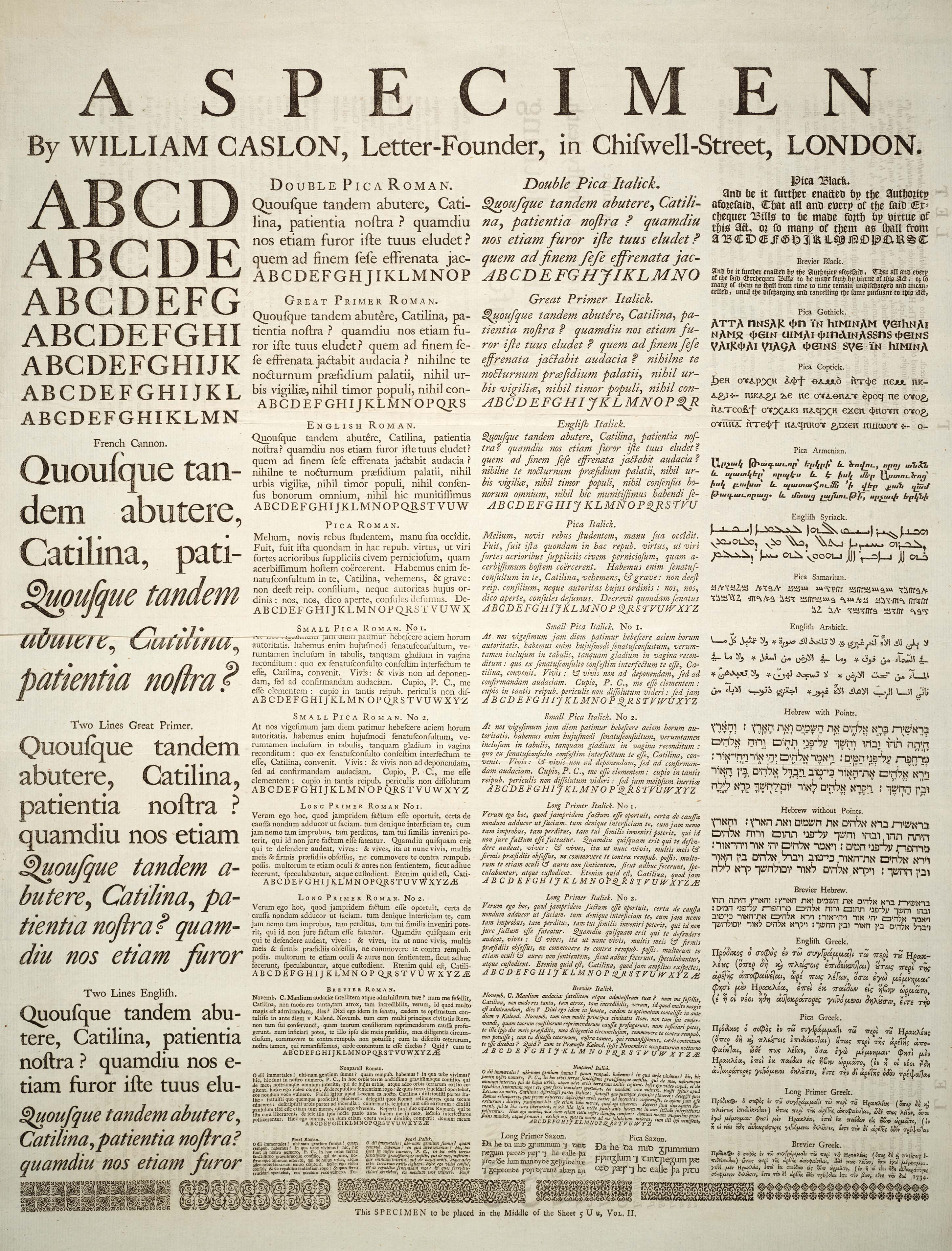
I found this highly informative plate in the 1728 Cyclopaedia. It seems that the author asked a letter-founder to provide him with a specimen of typeset fonts and writings systems to illustrate his encyclopedia entry on letters. It is used in several Wikipedia articles which were without pictures, and provides perfect examples for all of them.
- Nominate and support. - BRIAN0918 05:05, 19 March 2006 (UTC)
- Support great example of old style typesetting formats. Pegasus1138Talk | Contribs | Email ---- 05:45, 19 March 2006 (UTC)
Support.See below, re original color scan. Of great interest to people perusing the subjects above. --Janke | Talk 07:05, 19 March 2006 (UTC)- Support. Totally sweet.--ragesoss 07:53, 19 March 2006 (UTC)
- I definitely support the 4th (original) version; it provides the visual context to make sense of the fonts, which look odd in the cleaned-up version.--ragesoss 18:06, 23 March 2006 (UTC)
- Support Clear,, high-res, readable, and important. What more can you want? Msoos 15:23, 19 March 2006 (UTC)
- Support Having been involved with fonts, this is a remarkable picture. --Thermos 15:53, 19 March 2006 (UTC)
Support<!-still supporting but comment updated below--> Again, a superb entry ~ Veledan • Talk 19:25, 19 March 2006 (UTC)Support, nice find! :) - Mailer Diablo 20:40, 19 March 2006 (UTC)Support original colour scan, better of the best! :) - Mailer Diablo 23:03, 23 March 2006 (UTC)
![]() Support Have uploaded an edit, but wouild support either --Fir0002 www 23:50, 19 March 2006 (UTC)
Support Have uploaded an edit, but wouild support either --Fir0002 www 23:50, 19 March 2006 (UTC)
- Still prefer edit's but would support any version --Fir0002 www 09:49, 25 March 2006 (UTC)
- Support original color scan The nominator forgot to mention that the author of this specimen, William Caslon, is one of the most famous type designers. –Joke 23:33, 21 March 2006 (UTC) (edited to support original color scan Joke 15:39, 23 March 2006 (UTC))
Oppose. Does no one see the error (paper fold) near the left side? --Dante Alighieri | Talk 01:15, 22 March 2006 (UTC)- It's in the "French Cannon.", second line from the bottom. The "fixed" version from Fir masks the fold and makes it appear (perhaps) as a scanner error. In the original it is clear that the paper is folded. --Dante Alighieri | Talk 01:18, 22 March 2006 (UTC)
- Support. Apparently it was a tear, not a fold, but it's been fixed. Nice work. --Dante Alighieri | Talk 06:07, 22 March 2006 (UTC)
- Clarification. My support vote is currently for Version 4, the true color version, on account of the high level of detail. --Dante Alighieri | Talk 16:41, 23 March 2006 (UTC)
- Support. Apparently it was a tear, not a fold, but it's been fixed. Nice work. --Dante Alighieri | Talk 06:07, 22 March 2006 (UTC)
- It's in the "French Cannon.", second line from the bottom. The "fixed" version from Fir masks the fold and makes it appear (perhaps) as a scanner error. In the original it is clear that the paper is folded. --Dante Alighieri | Talk 01:18, 22 March 2006 (UTC)
- Comment: I've uploaded a fixed version. I found another copy of the page and pasted its undamaged section over the original damaged section. — 0918BRIAN • 2006-03-22 02:20
- Comment. I prefer the "tone" of the original (first image), actually. I think the "fix" (second and third) loses some important details. Look at the "faded" part above the tear on the original and the same spot on the fixed copy... see? --Dante Alighieri | Talk 06:11, 22 March 2006 (UTC)
- I cannot figure out what you're talking about. — 0918BRIAN • 2006-03-22 06:24
- The faded text reads "consules defumus", it is above the tear area, a little to the right. It is above the "Q R S T" in Pica Roman. If you compare the first and second (or first and third) images, you will see that there is some loss in the fine detail. Also, the "fixed" version just seems "stark" to me... it looks more like a poorly digitized scan than a photo-realistic representation. --Dante Alighieri | Talk 08:49, 22 March 2006 (UTC)
- It's also quite possible that I'm nuts. ;) --Dante Alighieri | Talk 08:53, 22 March 2006 (UTC)
- The faded text reads "consules defumus", it is above the tear area, a little to the right. It is above the "Q R S T" in Pica Roman. If you compare the first and second (or first and third) images, you will see that there is some loss in the fine detail. Also, the "fixed" version just seems "stark" to me... it looks more like a poorly digitized scan than a photo-realistic representation. --Dante Alighieri | Talk 08:49, 22 March 2006 (UTC)
- I cannot figure out what you're talking about. — 0918BRIAN • 2006-03-22 06:24
- Comment - I'd really like to see the color scan of the old document here (see my comment in Warship), too - these edits are good, but too clean, for images being from 1728. --Janke | Talk 10:19, 22 March 2006 (UTC)
Oppose agreed, it looks far too clinical and artificial at the moment. The third version is better but not perfect. chowells 13:39, 23 March 2006 (UTC)- Support the fourth version only. chowells 19:15, 23 March 2006 (UTC)
- The problem with the original is that the back of the page can be seen, something that can only be drown out in the way that has been shown. I think the cleaned up versions are better, because the coloring is as it was originally intended to be, not browned and damaged with time. — 0918BRIAN • 2006-03-23 14:01
- I do not consider it a problem chowells 19:15, 23 March 2006 (UTC)
- Support original color scan. As seen in Warship above, after the original color scan was uploaded, voters favored that. So, I upload and support the original again. The imperfections in the paper and printing are of historical significance, and should not be edited out. Nuff said... --Janke | Talk 14:29, 23 March 2006 (UTC)
- What historical purpose do they serve? To show that the text is old?? I highly doubt Caslon wanted to present a browned, damaged, see-through page as his best work. This picture is used in articles about alphabets, languages, and fonts, not articles about water damage and paper aging. — 0918BRIAN • 2006-03-23 15:35
- In this case I'm not sure that they are significant. Since the candidacy focuses on the typefaces themselves, I'm not certain that the age of the paper itself is an issue. Nevertheless I'm supporting that 4th version as it is unquestionably the clearest and most detailed of the available options. --Dante Alighieri | Talk 16:41, 23 March 2006 (UTC)
- I agree that they are not necessarily particularly significant. On the other hand, they don't detract from understanding the image as a type specimen, and give it historical context. The sample was printed with lead type on paper almost three hundred years ago. It is pointless and dishonest trying to make it look as though it was laser printed yesterday on unnaturally white paper, and looking closely at the processed image is off-putting: the letters are rough but the contrast is so high it seems like a black and white image and it is difficult to register they are rough because it was printed with metal type. I don't like the lack of any texture in the three other versions. I say, unless there is a clear argument to the contrary, it is best to use the least manipulated image. (With that said, it is regrettable that the text behind is visible in this image.) –Joke 17:53, 23 March 2006 (UTC)
- Support original colour scan I mean, Wow! the detail is beautiful, the depiction of the early typefaces loses nothing whatsoever from the ageing of the paper, and the cross-print from the other side of the page is neither ugly nor encyclopedically irrelevant. There is no contest here, it has to be this version IMO ~ Veledan • Talk 21:44, 23 March 2006 (UTC)
Promoted Image:Caslonsample.jpg After weighing everyones' opinions, it seems that the last one was the favorite. --PS2pcGAMER (talk) 08:37, 2 April 2006 (UTC)


Articles: Warship, Naval warfare
Another great find from the 1728 Cyclopaedia. It's like an anatomy chart for 18th century warships. The image could probably handle a little more cleanup, but as it stands, it's a highly detailed and informative diagram.
- Nominate and support. - BRIAN0918 07:19, 19 March 2006 (UTC)
Support.See below! Funny perspective, though, those cannons point straight forward and could hit one another... Brian, are you going to nominate all the plates in the 1728 Cyclopaedia? ;-) --Janke | Talk 07:29, 19 March 2006 (UTC)- Nope. The rest of the plates are just collections of figures. See the 2nd page of Category:Cyclopaedia for the other plates (I still have a couple more to upload). — 0918BRIAN • 2006-03-19 07:31
- Support. Rad.--ragesoss 07:52, 19 March 2006 (UTC)
- I prefer the colored original.--ragesoss 01:44, 26 March 2006 (UTC)
- Support Pegasus1138Talk | Contribs | Email ---- 08:32, 19 March 2006 (UTC)
- Comment: I don't want to rain on the parade, but I find the JPEG compression artifacts distracting. Do we have a lossless or low compression source image for this?--Eloquence* 09:45, 19 March 2006 (UTC)
- This is the best there is. I've tried asking the University of Wisconsin for larger versions before, but was turned down. I'm not sure what other Universities have this book; the only way to get a better image would be go to there and scan the book. — 0918BRIAN • 2006-03-19 16:20
- Actually, it appears that my school's library has a more recent copy. I'll see what I can find... — 0918BRIAN • 2006-03-19 16:32
- Support Great picture, great clarity and resolution, it is very hard to do a better picture than this of a page, congratulations! Msoos 15:23, 19 March 2006 (UTC)
SupportStill supporting but updated vote below. Excellent diagram & a wonderful find. If you can scan a better version, all well and good, but I think the original is already every bit good enough. It's a diagram, not a photograph, and in any case the details are as clear as I've ever seen them on plates of this age ~ Veledan • Talk 19:14, 19 March 2006 (UTC)- Support Has alot of information. --Lewk_of_Serthic contrib talk 22:40, 19 March 2006 (UTC)
![]() Support Have uploaded an edit, but wouild support either --Fir0002 www 23:34, 19 March 2006 (UTC)
Support Have uploaded an edit, but wouild support either --Fir0002 www 23:34, 19 March 2006 (UTC)
- Levels --Fir0002 www 21:38, 21 March 2006 (UTC)
 Support the edit. These old diagrams that were created w/o computers are so astounding.. drumguy8800 - speak? 02:54, 21 March 2006 (UTC)
* Comment: You all realize that this picture is not used in any article? It can't really be a featured picture until that happens. Mstroeck 10:52, 21 March 2006 (UTC) Sorry, I looked at the edit instead of the original picture :-) Mstroeck 10:55, 21 March 2006 (UTC)
- Support. Both informative and stunning. Would support having the initial image replaced with the edited version (without the artefacts). - Mgm|(talk) 11:09, 21 March 2006 (UTC)
- Support color original per above. –Joke 23:30, 21 March 2006 (UTC) (added "color original" Joke 18:02, 23 March 2006 (UTC))
- Strong Support. Stunning (both pictures). — Webdinger BLAH | SZ 02:34, 22 March 2006 (UTC)
- -
 Support ~Linuxerist L / T 05:25, 22 March 2006 (UTC)
 - Support edited - cool. Ha, they called it a "cock pit". --Deglr6328 05:37, 22 March 2006 (UTC)
- Support original color file only. You know, I'd really prefer the the original file, showing the faded, brownish paper. The edits are just so clinically antiseptic looking! If a document is old, I'd like to see it in the scan, too. Struck out my vote further above. --Janke | Talk 10:16, 22 March 2006 (UTC)*
- Support colour version only. Agree with Janke, gives more character. |→ Spaully°τ 14:10, 22 March 2006 (GMT)
- Support colour original only I knew it looked wrong for some reason. Much better. chowells 13:37, 23 March 2006 (UTC)
- I think the cleaned up versions are closer in appearance to what the image was originally intended to be, not browned and damaged with time. The image is supposed to be for educational purposes, not historic purposes. — 0918BRIAN • 2006-03-23 14:06
- Personally, I find the color version the most legible, and the most "cleaned up" version the least. –Joke 18:08, 23 March 2006 (UTC)
- Support original colour scan Per my vote on the typefaces, there is no contest here IMO. The edits sharpen at an unforgiveable cost in detail ~ Veledan • Talk 22:12, 23 March 2006 (UTC)
- Support edit. Artifacts are basically gone in the edit; the "character" of the original color version is only nice at huge size, while at the size it is in the article, the grey is just hard on the eyes. zafiroblue05 | Talk 03:49, 24 March 2006 (UTC)
- I think we're discussing the images here, though, not the thumbnails! With that said, for some images (such as this one) it would be nice to have a different crop and levels for the thumbnail sized reductions. –Joke 16:59, 24 March 2006 (UTC)
- Support original only. - Mailer Diablo 00:20, 25 March 2006 (UTC)
- Support original only. The edit is not that bad, I compared the versions side by side for quite some time. But still some characters with very fine lines are more legible in the original and the tones of the fill patterns look nicer in the original. --Dschwen 09:16, 26 March 2006 (UTC)
- Support any version; it's a wonderful plate. A "translation" of the descriptions in the image into wiki-text on the image page would make it even better. –Gustavb 23:18, 27 March 2006 (UTC)
- Support, awesome pic! --Cyde Weys 07:32, 28 March 2006 (UTC)
- Support. Nice detail. Prefer the original. Covington 08:55, 29 March 2006 (UTC)
- Comment: not a fan, While it's a beautiful diagram, the huge number of labels are unworkable. For this to be useful in learning it would need mouse-over labels. I don't know how you'd do that within the MediaWiki framework. Note: I'm being slightly hypocritical here as I've been doing the labels for Haeckel's images in commons. —Pengo 09:01, 1 April 2006 (UTC)
Promoted Image:Warship diagram orig.jpg The colored version seems to have the edge. --PS2pcGAMER (talk) 08:51, 2 April 2006 (UTC)

Articles: Motorcycle, Grand Prix motorcycle racing and KTM
I nominate this photograph as a featured picture. Enlarged to full size (the details are not too apparent while viewing the image as less than full size), it contributes to various articles by showing good technical details of contemporary racing motorcycle like the extensive use of carbon, "cut off"-footpegs, adjustable gear lever, data gathering system, steering damper and the like. Hence, it should be informative in various contexts. In addition, being able to see such details of contemporary world championship level factory (KTM) bike is pretty rare.
I also belive that considered just as a picture, this should be rather interesting. The bright orange paintwork should be eye-catching with various articles. When enlarged, the reflections created by spotlights in the steel platform and the fairing of the bike should make it a bit different photograph of a motorcycle.
Although I do have the original file, the full JPG converted from RAW is 5.5 MB. As I do not want to waste Wiki's disk space for nothing, I decided not to upload that file. However, if somebody thinks that such full file would be beneficial for postprocessing or like uses, please leave me a note. The image on nomination page has been compressed with "save for web"-function and resized from original dimensions of 3519 x 2345 pixels.
- Nominate and support. - Thermos 09:22, 19 March 2006 (UTC)
- Oppose The background is distracting, one of the stripes looks like it's coming from the cycle, there's a corner of a brochure in the lower left corner, and some other MCs messing up the rear end. Sorry, this is something only a MC afficionado could love... ;-) --Janke | Talk 14:34, 19 March 2006 (UTC)
- Oppose I don't care for the reflections of the steel on the motorcycle or the wall. That line is also distracting. --vaeiou 17:18, 19 March 2006 (UTC)
- Oppose Pretty good pic, but the location spoils it. --Fir0002 www 23:09, 19 March 2006 (UTC)
- Oppose. I also find the reflection of the ground on the body of the bike distracting. --PS2pcGAMER (talk) 23:24, 19 March 2006 (UTC)
- Oppose I agree with PS2, reflectoin is distracting, picture is a little bland aswell. Fir0002 has a good point about the location too. --lightdarkness (talk) 03:33, 21 March 2006 (UTC)
- Oppose The reflection is a bit distracting and there is something in the bottom left corner Leidiot 03:25, 29 March 2006 (UTC)
Not promoted --PS2pcGAMER (talk) 09:12, 2 April 2006 (UTC)
This is a good photo that I took with great colour
- Nominate and support. - Kunalkarki 22:26, 24 March 2006 (UTC)
- This is poor. Please consider the criteria before submitting further nominations ~ Veledan • Talk 22:43, 24 March 2006 (UTC)
- Oppose, not featured material, unfortunately. Phoenix2 23:07, 24 March 2006 (UTC)
- Oppose - Good compo. incredibly horrible artefacting. --Deglr6328 01:24, 25 March 2006 (UTC)
- Oppose It's a pretty image, but the angle you chose to shoot from makes the flower's make-up incredibly confusing, so it really doesn't add much to the article in terms of displaying the flower. Staxringold 07:29, 25 March 2006 (UTC)
Not promoted As per discussion on Wikipedia talk:Featured picture candidates. Also, the image will most likely be deleted very soon since it lacks any source info after a week. However, if the image does get the correct source info, the image may be relisted on FPC. --PS2pcGAMER (talk) 09:26, 2 April 2006 (UTC)
I took this photo.
- Nominate and support. - Kunalkarki 22:16, 24 March 2006 (UTC)
- Comment. I've left a message on this user's talk page about the lack of licensing and the lack of it being included in an article. --PS2pcGAMER (talk) 22:29, 24 March 2006 (UTC)
- Comment This would have a good place at Crocus but I don't think it's striking enough for FP status ~ Veledan • Talk 22:40, 24 March 2006 (UTC)
- Oppose - Good compo. very bad artefacting. --Deglr6328 01:23, 25 March 2006 (UTC)
- Oppose Not sharp enough for FP - Adrian Pingstone 05:51, 25 March 2006 (UTC)
- Oppose. No license. YAFP. Little encyclopedic value since the inside of the flower is not visible. Bad filename. --Dschwen 20:49, 28 March 2006 (UTC)
- Support This is a great photo. Tobyk777 05:45, 2 April 2006 (UTC)
Not promoted As per discussion on Wikipedia talk:Featured picture candidates. Also, the image will most likely be deleted very soon since it lacks any source info after a week. However, if the image does get the correct source info, the image may be relisted on FPC. --PS2pcGAMER (talk) 09:26, 2 April 2006 (UTC)
Nice Photo
- Nominate and support. - Kunalkarki 21:59, 24 March 2006 (UTC)
- Comment. Hi there. I noticed that you are pretty new to Wikipedia. So, welcome! For featured images, we need to see them included in any article, otherwise they can't be considered. Alternatively, you can upload the image to the Wikipedia Commons where I don't believe that it needs to be associate with an article, but it still can be considered a Featured Picture. If you have any questions, leave them for me on my talk page. Nice image. --PS2pcGAMER (talk) 22:19, 24 March 2006 (UTC)
- Comment This is an attractive pic but I'm afraid it isn't eligible for FP because it doesn't illustrate an encyclopedic topic. Please see the criteria for guidance as to what we look for in featured pictures ~ Veledan • Talk 22:30, 24 March 2006 (UTC)
- Oppose. Agree with above, plus, it doesn't have a license. Alr 00:30, 25 March 2006 (UTC)
- Oppose Not FP material in any way, in my opinion. Not sharp, not interesting, shows nothing well not even the tree - Adrian Pingstone 05:53, 25 March 2006 (UTC)
- Oppose No description; not encyclopedic matter; not used on any page; no reason given for upload/nomination; no license tag; user has 17 contributions, all of which (except for two to Flower) are to FPC or that image; and I just don't think it's a FP quality picture. I'd be happy to keep it on Wikipedia or Commons, just not as an FP. —Vanderdecken∴∫ξφ 12:52, 25 March 2006 (UTC)
- Oppose, not used in any article, and all of the above. --Dschwen 20:51, 28 March 2006 (UTC)
Not promoted As per discussion on Wikipedia talk:Featured picture candidates. Also, the image will most likely be deleted very soon since it lacks any source info after a week. However, if the image does get the correct source info, the image may be relisted on FPC. --PS2pcGAMER (talk) 09:26, 2 April 2006 (UTC)

Articles: Bill Clinton, People's Republic of China , Jiang Zemin , Sino-American relations , and 1996 U.S. campaign finance scandal.
This very dramatic picture has a lot of personality to it. On the one side is the serious looking Clinton addressing the audience, while the other side shows the pervading smile of Jiang. Behind the two leaders are the flags of their perspective countries standing in line as a symbol of cooperation and friendship. This amazing picture captures the emergence of a peaceful China as a key player in global affairs; seeking the friendship of countries around the world. The picture is in the public domain because it is a work of the United States federal Government.
- Nominate and support. - Ryz05 22:09, 19 March 2006 (UTC)
- Oppose Unless you can find a larger version. --Lewk_of_Serthic contrib talk 22:35, 19 March 2006 (UTC)
 Oppose Too low res. For the record i think you set up your nomination wrong. I've fixed it for you though. --Fir0002 www 23:06, 19 March 2006 (UTC)
- Oppose. The resolution is much too small. -- PS2pcGAMER (talk) 23:09, 19 March 2006 (UTC)
- Comment. So far, it seems much of the problem stems from the resolution. As I'm not so good at photo editing, maybe someone talented in this area might feel obliged to improve the picture and nominate it in place of the present picture? That would be greatly appreciated. Thanks.--Ryz05 23:43, 19 March 2006 (UTC)
- Its not possible to 'improve' that picture to featured picture quality without a much higher resolution original source image. Photo editors can't create detail that isn't there in an image. Diliff | (Talk) (Contribs) 00:45, 20 March 2006 (UTC)
- Oppose, no source or verifiable copyright information, in addition to size and quality problems.--nixie 02:10, 20 March 2006 (UTC)
- Oppose. Definitely too small. Also, if its Government copyright, a verifiable source should be given. --Janke | Talk 07:04, 20 March 2006 (UTC)
- Oppose Hopelessly too small - Adrian Pingstone 20:26, 20 March 2006 (UTC)
- Oppose copyright issues, and I don't think the image is particularly striking or informative. - Mgm|(talk) 11:03, 21 March 2006 (UTC)
Not promoted --PS2pcGAMER (talk) 23:14, 2 April 2006 (UTC)

Articles: Venus de Milo, Louvre, Marble
I would like to nominate this photo as a featured picture. The Venus de Milo is one of the most famous and beautiful sculptures in the world, and this image shows it off to its best. Few featured pictures are actual works of art, and this picture is an excellent showcase for the work itself, the Louvre museum and the medium of sculpture as a whole.
The Venus de Milo must be one of the greatest examples of classical sculpture in the world, and is surely a fantastic example of Wikipedia's articles and portal on the Arts.
- Nominate and support - Arco Acqua 18:56, 19 March 2006 (UTC)
- Oppose. It's only 183 px wide, faaaaar too low for a FP. --Janke | Talk 19:05, 19 March 2006 (UTC)
- Oppose. While certainly a great piece of art, there are thousands of far more unique and interesting photos that should be featured instead of one that can be found in any high school European history textbook. — Preceding unsigned comment added by 65.182.51.67 (talk • contribs)
- Oppose Too low res. --Fir0002 www 23:03, 19 March 2006 (UTC)
- Opppose. Resolution is much too low. Also, as per 65.182.51.67, I don't feel that the image is unique or stunning enough. --PS2pcGAMER (talk) 23:13, 19 March 2006 (UTC)
- Oppose, has people in background which is distracting. - Mgm|(talk) 11:04, 21 March 2006 (UTC)
- Oppose Sure the art's nice... but the picture is lacking. --Lewk_of_Serthic contrib talk 21:22, 22 March 2006 (UTC)
Not promoted --PS2pcGAMER (talk) 23:13, 2 April 2006 (UTC)

Articles: Iguassu Falls
I really like the persepctive of this picture, it gices a sense of the size of the waterfalls. I took this photo while on Holiday in August 2004.
- Nominate and support. - Merlinthewizard 14:45, 19 March 2006 (UTC)
- Weak oppose. Foreground almost a featureless mist, a bit too dominating. Grain and/or artifacts in sky. Do you have a less compressed version you might upload? --Janke | Talk 15:19, 19 March 2006 (UTC)
- Oppose. Amazing location, poor picture. —This unsigned comment was added by 65.182.51.67 (talk • contribs) .
- Oppose Just a "happy snap" --Fir0002 www 23:08, 19 March 2006 (UTC)
- Oppose. The picture isn't very stunning to me. I think Image:Iguacu-004.jpg does a better job of illustrating the article. --PS2pcGAMER (talk) 23:17, 19 March 2006 (UTC)
- Oppose. It's a subject that should have FP, but this one isn't particularly outstanding. I'd nominate the much superior image Image:Iguacu-004.jpg, but I think it'd get shot down for graininess... zafiroblue05 | Talk 07:54, 20 March 2006 (UTC)
- Support Nice background and a nice picture Leidiot 03:23, 29 March 2006 (UTC)
Not promoted --PS2pcGAMER (talk) 23:13, 2 April 2006 (UTC)
{{Aprilfools}}
User:Samguana took this all-too-common scene of a cat poking through the ceiling, and with one stroke (no pun intended) created a masterpiece. We need to make this the POTD soon, to remind the world that we can all still agree on some things - such as this caption being fucking hilarious! What would Colbert say?
- Nominate and support. - Harro5 08:18, 1 April 2006 (UTC)
- Support - but only because of the upload date. Tomorrow, I'll change that to oppose ;-) --Janke | Talk 08:46, 1 April 2006 (UTC)
- SUPPORT: THIS REALLY SHOWS SHOW AWESOME THE WIKIPEDIA REALLY IS! -- CAPS LOCK IS CRUISE CONTROL (FOR COOL) 08:57, 1 April 2006 (UTC)
- Strongly oppose - a meaningless "joke" that doesn't seem funny at all. - Alan 08:59, 1 April 2006 (UTC)
- Strong oppose - Picture is not in any article, and is not very pleasing to my eye. Kilo-Lima|(talk) 11:48, 1 April 2006 (UTC)
- Redirect to Every time you masturbate… God kills a kitten CanadianCaesar Et tu, Brute? 13:25, 1 April 2006 (UTC)
- Redirect to Template:Every time you masturbate… God kills a kitten ~ 13:52, 1 April 2006 (UTC)
- Strongly oppose - utterly pointless. A FP should show the best Wikipedia has to offer, this most definitely isn't. Arco Acqua 14:53, 1 April 2006 (UTC)
- -1 Troll Cyde Weys 16:33, 1 April 2006 (UTC)
- Support OMG lolz! -Ravedave 15:29, 1 April 2006 (UTC)
- Strong support, I'm just glad I don't have one of those in my house. --Cyde Weys 16:33, 1 April 2006 (UTC)
- -1 Overrated Cyde Weys 16:33, 1 April 2006 (UTC)
- Made me lol. Is ceiling kitty an internet meme yet?--Deglr6328 21:27, 1 April 2006 (UTC)
- Oppose- It is funny, but it's small and just not good enough for a featured picture. --TheAlphaWolf 22:07, 1 April 2006 (UTC)
- Oppose - Fun, but not a featured pic -- Chris 73 | Talk 22:57, 1 April 2006 (UTC)
- Oppose I guess this was never seriously intended as a nomination --Fir0002 www 23:04, 1 April 2006 (UTC)
- Oppose. Is this a joke? Leidiot 02:40, 2 April 2006 (UTC)
- April 1. April Fool's 2006. Read up. Harro5 04:16, 2 April 2006 (UTC)
- Speedy neutral. I'm fully in favor of this image remaining promoted or being successfully unlisted at WP:FP. It is a prime example of what pixels can look like when placed near eachother. — 0918BRIAN • 2006-04-2 03:02
- Indeed, it does look like Pixel, The Cat Who Walks Through Walls - even though it's a ceiling, here! --Janke | Talk 09:56, 2 April 2006 (UTC)
- Oppose. Cat abuse. pschemp | talk 05:47, 2 April 2006 (UTC)
- Cute, but April 1 has gone and passed. Oppose. =P — TheKMantalk 05:55, 2 April 2006 (UTC)
- Strong Oppose. No artistic value. Covington 06:10, 2 April 2006 (UTC)
- Oppose I thought pics had to be used in an article? Congrats on an excellent April Fools joke - Adrian Pingstone 12:29, 2 April 2006 (UTC)
Not promoted Closing the joke nom. --PS2pcGAMER (talk) 01:53, 3 April 2006 (UTC)


Articles: Great Wall of China
This breath taking photograph captured almost a hundred years ago by Herbert Ponting (1870-1935) is a wonderful depiction of the wonders of the great wall. The Chinese in the foreground are all wearing hanfu and the Great Wall is in need of repair. The wall's lack of care represents how vulnerable China is at the time to invading forces. It is also clearly shown in the photograph that the Great Wall is no ordinary wall in that it rises and falls; following the curvature of the mountains. This amazing photograph is "re-encoded, color corrected, resized and sharpened" by Zanaq, which is released under the Wikipedia:Text of the GNU Free Documentation License.
Source: http://www.geocities.com/blackinkal4/RoyalGeographicalSociety_Asia_2.html
- Nominate and support - --Ryz05 02:01, 20 March 2006 (UTC)
- Support original, larger version. Why reduce the size? The original is sharp enough. I only adjusted the brightness & contrast, nothing else. I think the first upload is too brightly colored, too. --Janke | Talk 06:52, 20 March 2006 (UTC)
- Conditional Support "Original, larger size" version.. The coloring of the first nom is too distracting. The 2nd does a better job. If this version is used in the Great Wall of China article I'll support. --PS2pcGAMER (talk) 06:15, 21 March 2006 (UTC)
- If the larger version is chosen here, I'll put that version in the article. --Janke | Talk 09:19, 21 March 2006 (UTC)
- Support larger, per above. –Joke 23:29, 21 March 2006 (UTC)
- Support the original version only. The color on the upper one is hard on the eyes.--Looper5920 11:31, 22 March 2006 (UTC)
- Support per above, though the figures in the photo appear to wear contemporary Manchu-based dress and not Hanfu--Jiang 04:38, 27 March 2006 (UTC)
Promoted Image:Greatwall large.jpg --PS2pcGAMER (talk) 07:06, 3 April 2006 (UTC)

Gandhi and Jinnah together in Bombay, September 1944. This is an important historical photograph, with the Father of the Nation of India and Pakistan together ; The historical importance of this image makes it a good FP candidate. The image appears in Muhammad Ali Jinnah, Pakistan and Attempts to assassinate Mahatma Gandhi.
- Nominate and support. --Dwaipayanc 09:42, 20 March 2006 (UTC)
- Oppose Sorry but it's too small and the quality is poor even at this small size. I don't deny its historical relevance but photographs of Gandhi with other politicians are not rare enough to excuse the defects. Also, it has no source info and nothing to substantiate its copyright tag. Is there any evidence that the publication of this picture was subject to Indian copyright law? Was it published before 1946? ~ Veledan • Talk 22:58, 20 March 2006 (UTC)
- Oppose Way too small, people need to start familarizing themselfs with featured pictures before they nominate them. Importance isn't enough, it needs to be high quality and stunning.--Lewk_of_Serthic contrib talk 21:16, 22 March 2006 (UTC)
- Oppose Too small, too dusty, not sharp at all Search4Lancer 03:01, 26 March 2006 (UTC)
- Oppose -- I love Gandhi, but as a photo it is kindof boring --T-rex 23:32, 30 March 2006 (UTC)
Not promoted --PS2pcGAMER (talk) 14:49, 3 April 2006 (UTC)
Alicia Ghant one of Gandhi's helpres


This image illustrates the Woolworth Building in New York City, which is of great historical importance and generally considered to be the first skyscraper. It was the tallest building in the world for 17 years, and almost a century later, it's still in the top 50 highest buildings in the US. The picture is striking: the streets are full of horses, and the building fits in architecturally with 19th century New York, but it just dwarfs everything else - truly the dawn of a new age. Take a look at the resolution and level of detail - it's stunning.
- Nominate and support. - Zambaretzu 14:05, 20 March 2006 (UTC)
- Conditional Support. The image page says that the picture uses a copyright tag that should no longer be used. If this is resolved, I will support. RyanGerbil10 02:27, 21 March 2006 (UTC)
- I tried to look into it, but I'm not sure if this image can be tagged with {{PD-old}}. It was copyrighted and published by a company c1913. Anyone know? ~MDD4696 03:05, 21 March 2006 (UTC)
- Comment Pretty sure its copyrighted - Check out the library of congress legal page, the page the image is on says "NOTES: J178523 or 24 U.S. Copyright Office. Copyright by The Pictorial News Co., N.Y. " Though if that company is gone, does that mean its in the public domain?
- This page says the company went under in the 20s, so does that mean that the image is in the public domain? -Ravedave 03:19, 21 March 2006 (UTC)
- I posed the quetion here: Wikipedia_talk:Image_copyright_tags#Company_that_no_longer_exists.3F
- According to Simetrical, it's fine, and someone updated the tag. --Zambaretzu 09:07, 21 March 2006 (UTC)
- I posed the quetion here: Wikipedia_talk:Image_copyright_tags#Company_that_no_longer_exists.3F
- This page says the company went under in the 20s, so does that mean that the image is in the public domain? -Ravedave 03:19, 21 March 2006 (UTC)
Conditional Support. Very historic. Assuming the questions about copyright are resolved, I'll support it.Support the2nd3rd version, but the original would be ok. --PS2pcGAMER (talk) 06:12, 21 March 2006 (UTC)- Comment I uploaded a version that I think looks better. I cleaned up the speckles (only in the sky), cropped it and adjusted the levels. I can do any combination of the three modifications, but I think the cleaned up sky, at least, is a must. I can't figure out how to make the new image's page look like the original's (PD tag, etc), so maybe someone can help me.--Zambaretzu 09:58, 21 March 2006 (UTC)
- Support A great picture with suprising quality. --Lewk_of_Serthic contrib talk 22:21, 21 March 2006 (UTC)
- Support no question. –Joke 23:24, 21 March 2006 (UTC)
Support original upload only. The edit is washed out, and appears to be leaning slightly to the left. --Janke | Talk 10:31, 22 March 2006 (UTC)- It's definitely not leaning any more than the original - the fact that the leaning black frame was cropped out might give that impression. As for being washed out, I thought the original was too dark, especially in the lower left; I can upload a darker edit if that's the consensus though.--Zambaretzu 06:19, 24 March 2006 (UTC)
- Support "fixed" version. Selective brightening of LL corner, rotated 0.3 deg. CV, border cropped out, smudges in sky removed, slight sharpening. --Janke | Talk 07:26, 24 March 2006 (UTC)
- Support although I'm not sure which is better. The second one looks too washed out to me. I think the original is better as an image of an artifact and the third one is better as a picture. It's a great illustration of how the financial district used to look (and one of my favorite buildings). Makemi 22:53, 24 March 2006 (UTC)
- Support 2nd version. GUÐSÞEGN – UTEX – 22:16, 25 March 2006 (UTC)
- Support Fixed Conveys subject clearly and concisely. Tobb 23:22, 25 March 2006 (UTC)
- 'Oppose Doesn't have that "wow" factor to me. —This unsigned comment was added by Spizzma (talk • contribs) 18:35, 25 March 2006.
- Support fixed - I like it. -Ravedave 02:58, 3 April 2006 (UTC)
Promoted Image:View of Woolworth Building fixed.jpg The "fixed" version. --PS2pcGAMER (talk) 20:13, 3 April 2006 (UTC)

.jpg)
Whenever people think of peafowl the immage that comes to mind most often is that of the male of the species, the peacock. The most prominent feature of the peacock is it's amazing tailfeathers, especially the eye like patterns. I think that the picture is very visually pleasing and quite interesting. It appears in both the Peafowl and Indian Peacock articles.
- Nominate and support. - RyGuy17 00:15, 26 March 2006 (UTC)
- Oppose - Too small, poor focus. --Deglr6328 00:25, 26 March 2006 (UTC)
- Oppose. Resolution is low (criteria) and as Deglr6328 pointed out, it is out of focus. --PS2pcGAMER (talk) 00:30, 26 March 2006 (UTC)
(I revised the image based on the criticism it received) RyGuy17 00:55, 26 March 2006 (UTC)
- Yikes, the sharpening has grossly oversaturated the color. --Deglr6328 01:02, 26 March 2006 (UTC)
- COMMENT. The nominee blanked this nomination, so I assume that meant s/he is withdrawing it. However, I am not sure of the normal procedure, if there even is one, for this situation. I posted a comment on the FPC talk page. Either this nomination will be archived or the closing date will need to be extended. --PS2pcGAMER (talk) 08:14, 4 April 2006 (UTC)
Not promoted Closing withdrawn nomination per discussion --PS2pcGAMER (talk) 19:04, 4 April 2006 (UTC)

This is a self-nomination for a picture of the Soldiers and Sailors monument on top of East Rock in New Haven, Connecticut, USA. I think the picture is eye-catching and adds substantially to the quality of the East Rock article.
- Nominate and support. - StAkAr Karnak 14:12, 21 March 2006 (UTC)
- Oppose An OK pic but not sufficiently special or interesting for Featured - Adrian Pingstone 19:04, 21 March 2006 (UTC)
- Oppose I'm sorry but this won't pass. It is a good picture and a worthy contribution to its article but an extremely high standard has been set on this page for pictures of static objects, cities, monuments and the like. This pic could be improved fairly easily with regards to contrast and accutance but even then it would need to be much larger and stunningly sharp to be a match for our existing similarly themed FPs ~ Veledan • Talk 19:54, 21 March 2006 (UTC)
- Comment How large is a good size for consideration?--StAkAr Karnak 13:58, 22 March 2006 (UTC)
- Reply Check out File:Notre-Dame de Montréal Basilica Jan 2006.jpg


 . Not all the older FPs are of that quality, of course, but I think we have been privileged more recently to have photography to match or better the finest examples found in the world's periodicals, but one consequence is that it makes the competition extremely stiff! ~ Veledan • Talk 20:19, 23 March 2006 (UTC)
- Reply Check out File:Notre-Dame de Montréal Basilica Jan 2006.jpg
- Oppose. Boring. It's just a monument, I'm afraid. Alr 00:08, 22 March 2006 (UTC)
- Oppose Ack all above. --Janke | Talk 10:29, 22 March 2006 (UTC)
- Oppose Composition. Bertilvidet 15:36, 22 March 2006 (UTC)
- Oppose. Hasn't got the sparkle. --Thorpe | talk 19:12, 22 March 2006 (UTC)
- Oppose as per all above. --Lewk_of_Serthic contrib talk 21:17, 22 March 2006 (UTC)
- Oppose, not good enough. --Terence Ong 15:50, 24 March 2006 (UTC)
- Oppose Not exceptional. --Philopedia 22:16, 25 March 2006 (UTC)
Not promoted --PS2pcGAMER (talk) 19:09, 4 April 2006 (UTC)

Thought I'd try this and see what people think. A high-resolution image of a small detail of a famous painting, I think it really enlivens the otherwise bare Insanity article.
- Nominate and support. - zafiroblue05 | Talk 23:34, 21 March 2006 (UTC)
- Support, high res version looks great. Frightening every time I see this image. Really conveys the message well. Phoenix2 01:10, 22 March 2006 (UTC)
Oppose.Fine image, but it doesn't portray insanity. See Venus, Cupid, Folly and Time. --Dante Alighieri | Talk 01:13, 22 March 2006 (UTC)
- If by insanity you mean Insanity as a capitalized, symbolized concept, parallel to Truth or Time or Folly, then it probably doesn't portray insanity. (But it might - the article states that the image is unidentified, but may symbolize syphilis, which can cause insanity!)
- If by insanity you mean not a corporeal symbol of it but the state of mind, the mental disorder - well, insanity is not a concept in the discipline psychology or psychiatry. It's a everyday term (or a legal one), and, in this respect, the image also fits. I think it's fair to say that the person depicted is clearly, in popular parlance, insane. zafiroblue05 | Talk 03:13, 22 March 2006 (UTC)
- The common interpretation seems to be jealousy rather than insanity. --Dante Alighieri | Talk 06:05, 22 March 2006 (UTC)
- Support. The incredibly high resolution and detail add considerably to the Venus, Cupid, Folly and Time article, where this image now resides. --Dante Alighieri | Talk 00:31, 24 March 2006 (UTC)
- The common interpretation seems to be jealousy rather than insanity. --Dante Alighieri | Talk 06:05, 22 March 2006 (UTC)
- Support Very good detail and amazing clear Bertilvidet 15:38, 22 March 2006 (UTC)
- Support Looks insane to me... --Lewk_of_Serthic contrib talk 21:02, 22 March 2006 (UTC)
- Look, I don't dispute that the image could be USED to illustrate insanity. But, quite frankly, doing so would constitute Original Research. The image is an allegoric representation of Jealousy, NOT insanity. This makes it inelligible as an FPC for insanity. --Dante Alighieri | Talk 22:40, 22 March 2006 (UTC)
- Comment. Not to be a jerk, but I've removed this image from the insanity article and replaced it with an engraving by William Hogarth. --Dante Alighieri | Talk 23:47, 22 March 2006 (UTC)
- Perfectly reasonable. ~MDD4696 00:18, 23 March 2006 (UTC)
- Fair enough. As it happens, this image was originally on the German featured version of the Insanity article, with the same usage. Should it be removed from there as well? zafiroblue05 | Talk 00:20, 24 March 2006 (UTC)
- Probably. I'd suggest that someone who is "fluent enough" in German do it so that they can explain the reasoning. --Dante Alighieri | Talk 17:06, 28 March 2006 (UTC)
- Oppose I would prefer to see the entire painting, unless someone can make the point that there is some encyclopedic value to examining this portion of it only. Also, this image does not currently support an article. ~MDD4696 00:20, 23 March 2006 (UTC)
- Support why isnt it on the Venus, Cupid, Folly and Time page? -Ravedave 03:11, 23 March 2006 (UTC)
- It is now. ~MDD4696 04:04, 23 March 2006 (UTC)
- Conditional support if placed in an article which represents the usual interpretation of the emotion in the portrait, which according to above, is not insanity. Also, I would support if it was in a section discussing the individual at Venus, Cupid, Folly and Time. — 0918BRIAN • 2006-03-23 17:46
- Support Since it now appears to have found its home. –Joke 17:57, 23 March 2006 (UTC)
- Support now. Staxringold 07:37, 25 March 2006 (UTC)
- Oppose It doesn't give me much of a feeling. --
 Mac Davis] ⌇☢ ญƛ. 12:35, 25 March 2006 (UTC)
 - Oppose Wouldn't Edvard Munch's 'The Scream' be the natural candidate to fill this niche? --Philopedia 22:15, 25 March 2006 (UTC)
- Heh, I think that'd fit better under Existential crisis than Insanity. But that's my personal opinion - at any rate, this image isn't on Insanity anymore, it's on Venus, Cupid, Folly and Time. zafiroblue05 | Talk 22:58, 25 March 2006 (UTC)
- Pet peeve warning. The more "scholarly" interpretations of Munch's piece are that the Scream referenced is not any sound made by the figure, but rather a scream to which the figure is reacting (a metaphorical scream resounding throughout the world). Also, as stated, the figure isn't represented as insane but as filled with despair, anxiety, and angst. YMMV. --Dante Alighieri | Talk 07:43, 27 March 2006 (UTC)
- Oppose - Not wowed. sorry.--Deglr6328 00:24, 26 March 2006 (UTC)
- Support Scary. A great illustrator of the subject. —This unsigned comment was added by Spizzma (talk • contribs) 01:33, 26 March 2006.
- Oppose I find it unattractive and disturbing.--Andeee 22:58, 27 March 2006 (UTC)
- Support - Quality Art. --ZeWrestler Talk 03:10, 29 March 2006 (UTC)
Promoted Image:Angelo Bronzino 003.jpg --PS2pcGAMER (talk) 00:32, 5 April 2006 (UTC)
Not promoted This was a huge oversight by me. This nomination should not have been promoted. 11/16 is NOT a consensus. I will make a much better effort to avoid mistakes like this in the future, but it is still good for others to double check closed nominations. Thank you Mdd4696 for catching my error. --PS2pcGAMER (talk) 01:00, 5 April 2006 (UTC)
- condiitonal Support. If slight zoom out is possilbe. furthermore it's far better than the current article's picture.

A striking photograph of a Kĩkũyũ woman in traditional dress. According to a message left on my talk page, this is not often seen in modern-day Kenya, most Kikuyu people wearing Westernized clothes. Image is by wayfaring stranger on Flickr and released under a cc-by-2.0 license.
- Nominate and support. - howcheng {chat} 18:34, 21 March 2006 (UTC)
- The picture is fascinating, but it's in the shadow... Sorry, but I have to oppose. Circeus 19:34, 21 March 2006 (UTC)
- Comment I want to support this image, but technically the quality isn't great (bit unsharp, highlights blown out) and I think it's too cropped (it looks like it's meant to be a portrait of the individual rather than an encyclopedic illustration of the people) and it's a bit small. If it were a fairly unique image those factors could be forgiven but a google image search on kikuyu shows very many images of Kĩkũyũ people in traditional dress - although I admit I haven't noticed any superior to this picture. Does the photographer have a less cropped version, or any other we could consider? Only a relatively minor improvement in any area might justify supporting this for me ~ Veledan • Talk 19:42, 21 March 2006 (UTC)
- Weak oppose... ack Veledan. --Janke | Talk 10:28, 22 March 2006 (UTC)
- Oppose as per Veledan. --Lewk_of_Serthic contrib talk 21:00, 22 March 2006 (UTC)
- Support. Quality may be a little behind other FP, but it would be one of the firsts about Africa. --Bernard Helmstetter 20:05, 24 March 2006 (UTC)
- Support per nom and Bernard. GUÐSÞEGN – UTEX – 21:59, 25 March 2006 (UTC)
- Supporto; slightly different shadowing would be ideal, yes, but even without I think this deserves promotion. Mike1024 (t/c) 23:25, 26 March 2006 (UTC)
- Weak Support I will support it on the basis of its rarity, although I would like to see an improved photo myself. TomStar81 08:02, 27 March 2006 (UTC)
- Oppose Hahahahahahahaha - BWF89 15:49, 27 March 2006 UTC
- Suppoprt --Chris 73 | Talk 23:02, 1 April 2006 (UTC)
Not promoted No consensus either way. --PS2pcGAMER (talk) 00:32, 5 April 2006 (UTC)

I understand this isn't the Eiffel Tower or anything, but I don't think it's going to be possible to get a picture of this subject that's much better than this one. Suggestions on how to do so are welcome, however. I have the original TIF, so if there are JPEG artifacts or something like that, they should be fixable. Illustrates Harold and Inge Marcus Department of Industrial and Manufacturing Engineering.
- Self-nominate and support. - Spangineer[es] (háblame) 04:40, 22 March 2006 (UTC)
- Oppose - Dullsville, baby. I'm sorry but this picture has no chance of passing. Now that there is a featured picture visible on the front page every day and we're really getting alot more 'meh' pictures here I propose we put a note at the top of the page STRONGLY urging potential submitters to look through already featured pictures, see what's FP 'material' before they post one thier own. --Deglr6328 05:21, 22 March 2006 (UTC)
- Obviously, you're right, this is a rather boring picture, but if this is the way that FPC runs here, why do we bother? Aren't we just duplicating the effort of commons:COM:FPC? The only nominal difference I can see is that images here must appear in an article, but that's easily solved for virtually anything by jamming the picture into a semi-relevant article. Wouldn't a model consistent with FAC be preferred, where any subject that isn't deletable be potentially featurable? We're here to write an encyclopedia, not create an image gallery. The images we feature should be the ones that best describe articles, not necessarily the ones that are the most beautiful. The main page issue is a potential concern, obviously, but again, why not just use the commons POTD for that purpose? </soapbox> I have a feeling I'm proposing a radical shift in the way WP:FPC works, so I'll stop now =). Anyway, sorry for wasting people's time, but in my four previous FPCs, I've never had one rejected for not being interesting. I guess I thought this was more like FAC than it really is. —Spangineer[es] (háblame) 21:14, 22 March 2006 (UTC)
- Oppose Maybe, as you say, it is not possible to get a better picture of this building. But This building is uninteresting and unimpressive. To be featured, not only must the picture be well composed, but the subject should of some interest. Glaurung 07:09, 22 March 2006 (UTC)
- Oppose Dull subject, just a building. --Janke | Talk 10:26, 22 March 2006 (UTC)
- Oppose Sorry, this a really nice pic, dead upright, well-exposed etc. but just not special enough for FP - Adrian Pingstone 18:26, 22 March 2006 (UTC)
- Thanks for the encouragement; I'll plan on continuing to attempt to take excellent pictures of boring subjects, but you won't see me any more on FPC =). —Spangineer[es] (háblame) 21:14, 22 March 2006 (UTC)
- Don't be annoyed, FP is for pictures that are a bit special. Your pic has no faults at all as a picture but it's not special to me. I have to judge if it agrees with the FP criteria and I (and the responders here) don't think it does. Don't take the FP process too seriously, only 5 of us have commented out of the worlds population of 6,500,000,000 so not much of a sample! Best Wishes - Adrian Pingstone 10:16, 23 March 2006 (UTC)
- No, no, I'm not annoyed; my pride isn't hurt at all. No one has said that the picture is bad or whatever, it's just that no one is interested. Can't do much about that. —Spangineer[es] (háblame) 11:16, 23 March 2006 (UTC)
- Well, a photo of a building which looks like similar to buildings I see every day is not particularly exciting :) Take photos of unique buildings, for instance, and you have more chance of support. chowells 13:33, 23 March 2006 (UTC)
- Right, though again, I fail to see the difference between WP:FPC and COM:FPC. But don't worry about it, I don't care much about FP status. The fact that people think the picture itself is good is enough approval for me.—Spangineer[es] (háblame) 13:50, 23 March 2006 (UTC)
- There is certainly a great overlap between COM:FPC and WP:FPC, but I don't see why this is a problem. WP:FP might almost be thought of as a subset of COM:FP: those pictures aesthetically striking enough to deserve Featured Status, which also make a significant encyclopedic contribution ~ Veledan • Talk 21:07, 23 March 2006 (UTC)
- Right, though again, I fail to see the difference between WP:FPC and COM:FPC. But don't worry about it, I don't care much about FP status. The fact that people think the picture itself is good is enough approval for me.—Spangineer[es] (háblame) 13:50, 23 March 2006 (UTC)
- Well, a photo of a building which looks like similar to buildings I see every day is not particularly exciting :) Take photos of unique buildings, for instance, and you have more chance of support. chowells 13:33, 23 March 2006 (UTC)
- No, no, I'm not annoyed; my pride isn't hurt at all. No one has said that the picture is bad or whatever, it's just that no one is interested. Can't do much about that. —Spangineer[es] (háblame) 11:16, 23 March 2006 (UTC)
- Don't be annoyed, FP is for pictures that are a bit special. Your pic has no faults at all as a picture but it's not special to me. I have to judge if it agrees with the FP criteria and I (and the responders here) don't think it does. Don't take the FP process too seriously, only 5 of us have commented out of the worlds population of 6,500,000,000 so not much of a sample! Best Wishes - Adrian Pingstone 10:16, 23 March 2006 (UTC)
- Thanks for the encouragement; I'll plan on continuing to attempt to take excellent pictures of boring subjects, but you won't see me any more on FPC =). —Spangineer[es] (háblame) 21:14, 22 March 2006 (UTC)
- Oppose. Nothing too special, like other people have said. --Thorpe | talk 19:06, 22 March 2006 (UTC)
- Strong support I agree with the nominator. We must be careful not to turn FP into an art exhibition where an informative photo of a boring topic has no chance to be featured. I think we have to judge primarily on (1) informative (2) technically excellent execution, incluidng composition, exposture, etc. (distant 3rd) how striking or unique the subject matter is. As the nominator says, it would be very difficult to take a better picture of this subject: no distracting cars or people, sky is not quite bland yet doesn't distract from building... There is just that one shadow to the right, and a slight wide angle effect on the vertical walls. Worthy of FP in my opinion. Johntex\talk 01:37, 24 March 2006 (UTC)
- Support, Building is average, picture is superb. I think this is featureworthy.-- Chris 73 | Talk 13:13, 24 March 2006 (UTC)
- Oppose Too boring... Bertilvidet 15:13, 24 March 2006 (UTC)
- Oppose I'm opposing not becuase of its boring subject, but becuase the picture isn't eye catching or striking in any way, which is criteria for a featured picture.— Preceding unsigned comment added by Spizzma (talk • contribs)
- Strong oppose I can't see any reason whatever in favour of this candidate. The building is architectually uninspired; the photo itself in no way exceptional. If the building were the site of some exceptional important discovery, that might add lustre. But (as near as I can tell), it is in no way distinguished from similar facilities at any universities in the United States. --Philopedia 22:09, 25 March 2006 (UTC)
- Oppose. I'm sorry, but I don't think this meets any of the feature criteria. Even the most masterful photography (and this comes close) can only do so much with a prosaic subject. I'm a Lover, Not a Fighter 06:45, 26 March 2006 (UTC)
- Oppose, it is a pretty good picture, I wouldn't go as far as calling it superb. To nit-pick a bit: it could use some slight perspective correction (while the left edges of the building are perfectly vertical, the right edges lean to the left). Also the resolution is good, not superb. We had some recent examples which warrant this distinction. --Dschwen 07:05, 27 March 2006 (UTC)
Not promoted --PS2pcGAMER (talk) 03:30, 5 April 2006 (UTC)

A strange and unique building would make a great featured picture. Have you ever seen a building like this before?
- Nominate and support. - Thorpe | talk 18:34, 22 March 2006 (UTC)
- Weak oppose Larger would be better, also the sky is burned out on the right side. Difficult lighting, sure, but it could be better... Best photo in the article, though! --Janke | Talk 19:54, 22 March 2006 (UTC)
- Support although it's not the most stunning composition... --Lewk_of_Serthic contrib talk 20:58, 22 March 2006 (UTC)
- Oppose nice vacation shot but uninteresting composition. --P199 18:30, 23 March 2006 (UTC)
- Oppose. Somewhat intriguing structure, but the picture is not particularly striking. bcasterline t 23:02, 23 March 2006 (UTC)
- Support. Interesting building are always feature worthy in my wiki. sikander 04:37, 24 March 2006 (UTC)
- Oppose per P199 and bcasterline. Ziggur 05:30, 24 March 2006 (UTC)
- Oppose. It is a good picture, but I personally don't like the lighting. --PS2pcGAMER (talk) 20:59, 24 March 2006 (UTC)
- Support. Not the finest in terms of sharpness but quite interesting. I have seen it (California one) and it's as unusual looking for real as it is in the picture.--Dakota ~ ° 08:07, 25 March 2006 (UTC)
- Oppose - Good, not good enough though. --Deglr6328 23:59, 25 March 2006 (UTC)
- Oppose The text is quite distracting and the lighting is not very good, either. Freedom to share 15:57, 30 March 2006 (UTC)
Not promoted --PS2pcGAMER (talk) 21:16, 5 April 2006 (UTC)

Great shot of the plane, great background, very high res, best pic in article, also fits in the backgrounds category.
- Nominate and support. - Ravedave 03:52, 23 March 2006 (UTC)
- Support looks excellent, can't really see any way to fault it. chowells 13:28, 23 March 2006 (UTC)
- Support Had to look close to see that the wing tip wasn't cut off... ;-) --Janke | Talk 14:13, 23 March 2006 (UTC)
- Support Majestic picture. --Thermos 16:55, 23 March 2006 (UTC)
- Support. The classic SR-71 photo. — 0918BRIAN • 2006-03-23 17:43
- Support Looks good. It would perhaps be wise not to rely too heavily on pictures provided by the American military (or NASA) when building a portfolio of featured images. It is another kind of systemic bias encountered in Wikipedia. –Joke 17:56, 23 March 2006 (UTC)
- Until you can come up with a source that rivals the US govt for good pictures I think its bound to happen. -Ravedave 18:52, 23 March 2006 (UTC)
- I agree. But it is best to be aware of it. –Joke 21:05, 23 March 2006 (UTC)
- Support. Excellent detail and background. --Aude (talk | contribs) 22:10, 23 March 2006 (UTC)
- Support - wonderful image, informative, striking, excellent detail - Johntex\talk 01:30, 24 March 2006 (UTC)
- Support, I really like the colours and the background. --Terence Ong 14:59, 24 March 2006 (UTC)
- Support, nice one! - Mailer Diablo 00:18, 25 March 2006 (UTC)
- Support incredibly nice image of a very famous plane. Staxringold 07:34, 25 March 2006 (UTC)
- Support - striking photo JanSuchy 09:01, 25 March 2006 (UTC)
- Support - Great image, wonderful background --Scott 11:26, 25 March 2006 (UTC)
- Support - Striking. -- Mac Davis] ⌇☢ ญƛ. 12:36, 25 March 2006 (UTC)
- Support Excellent background, highly detailed, nice shadowing Search4Lancer 02:58, 26 March 2006 (UTC)
- Support Great action, colors, background.--Mr. RX99 20:01, 26 March 2006 (UTC)
- Support How could I oppose? Great picture. --Lewk_of_Serthic contrib talk 23:58, 26 March 2006 (UTC)
- Support, and there ain’t no more to say. TomStar81 08:04, 27 March 2006 (UTC)
 Support It's all been said --Fir0002 www 10:31, 27 March 2006 (UTC)
- Support Excellent photo, great quality showing the influential aircraft in the sky.--Andeee 22:43, 27 March 2006 (UTC)
- Support Great image, I currently use it as my desktop background! -- Snailwalker | talk 13:01, 28 March 2006 (UTC)
- Support Great picture. Leidiot 03:21, 29 March 2006 (UTC)
- Support Excellent composition. Covington 08:57, 29 March 2006 (UTC)
- Bandwagon. Another one of my long-time favorites. --Golbez 07:04, 4 April 2006 (UTC)
Promoted Image:Lockheed SR-71.jpg --PS2pcGAMER (talk) 03:54, 6 April 2006 (UTC)
I'm going to move the featured picture tag to Image:Lockheed SR-71 Blackbird.jpg, which is the same image, except it's 2.8 times larger, and it's on the Commons. How is it that no one who voted noticed that the picture that was nominated was only a thumbnail? Anyway, I'm then going to update links to the thumbnail and nominate it for deletion. User:dbenbenn 19:45, 16 April 2006 (UTC)


May not be a photographically gleaming shot. But thought it would have some encyclopedic importance.(Pl. see the large image)
The hut of a Toda Tribe of Nilgiris, India. Note the art at the front wall, and the unusually small door. The huts, of an oval, pent-shaped construction, are usually 10 feet high, 18 feet long and 9 feet wide. They are built of bamboo fastened with rattan and thatched over this. Each hut is enclosed within a wall of loose stones. The front and back of the hut is usually made of dressed stones (mostly granite). Hut has only a tiney entrence at the front – about 3 feet wide , 3 feet tall. This unusually small entrance is a means of protection from the wild animals. The front portion of the hut is decorated with the Toda art forms, a kind of rock mural painting.
- Nominate - Pratheepps 07:24, 23 March 2006 (UTC)
- Awesome, Renata 12:29, 23 March 2006 (UTC)
- Emphatic Yes --Soumyasch 12:33, 23 March 2006 (UTC)
Conditional support: It need to be in a suitable article! As far as I can see, it's not.Fix that, and you have my support. --Janke | Talk 14:11, 23 March 2006 (UTC)- The image is now attached with the article Toda people
- The color was bothering me a bit, and the hut seemed a little oddly framed, so I've uploaded an alternate version. — 0918BRIAN • 2006-03-23 16:53
- Support Nice image. –Joke 17:34, 23 March 2006 (UTC)
- Support but not sure which version... Brian I think you improved the whitebalance but you made it just a bit too warm for my taste, and I don't support your crop. I agree the crop strengthens the focus, but I don't think it justifies losing any of the surrounding detail: I want to see the rest of those terraces to the right. And Pratheepps please find or create an article for this to be useful in, or I'll have to withdraw my vote ~ Veledan • Talk 20:50, 23 March 2006 (UTC)
- The image is now attached with the article Toda people
- Support for original. Crop is not necessary because the front of the hut (and the most interesting part) is centered in the photo. BTW, photo is used in Toda people article. --P199 22:43, 23 March 2006 (UTC)
- Supportoriginal--K.C. Tang 02:03, 24 March 2006 (UTC)
- Support original. It'd be nice if the original photo was not cropped so tightly at the left and the bottom, but cropping the right doesn't help, and I don't like the color change. zafiroblue05 | Talk 03:51, 24 March 2006 (UTC)
- Support original --Janke | Talk 06:31, 24 March 2006 (UTC)
- Support. Original version, cropped version is too bright. Question, what is the approximate height and width of the hut?--Dakota ~ ° 07:33, 24 March 2006 (UTC)
About 6-7 feet tall & wide10 feet high, 18 feet long and 9 feet wide.
- Support the original version. --Terence Ong 15:40, 24 March 2006 (UTC)
- Support original. - Mailer Diablo 00:17, 25 March 2006 (UTC)
- Support original I like it's general tone a lot more. Staxringold 07:33, 25 March 2006 (UTC)
- Support modified The warmness is much more appealing. -- Mac Davis] ⌇☢ ญƛ. 12:31, 25 March 2006 (UTC)
- Support modified Compelling image, clear encyclapedic value. Either version could do. --Philopedia 22:00, 25 March 2006 (UTC)
- Support original version. GUÐSÞEGN – UTEX – 22:11, 25 March 2006 (UTC)
- Support original. --PS2pcGAMER (talk) 00:37, 26 March 2006 (UTC)
- Support original. Now this is a perfect FPC candidate. Informative and adds value to the article. deeptrivia (talk) 16:19, 26 March 2006 (UTC)
- Support original This is a great picture.--Mr. RX99 19:58, 26 March 2006 (UTC)
- Suppport either one An excellent picture but they both look too similar to favor one over the other. BWF89 15:55 27 March 2006 UTC
- Support original. A very informative picture. --Lewk_of_Serthic contrib talk 00:49, 28 March 2006 (UTC)
- Support original. Excellent, excellent photo. Jdfoote 21:36, 31 March 2006 (UTC)
- Support Great encyclopedic value. Excellent compostion. Covington 06:21, 2 April 2006 (UTC)
Promoted Image:Toda Hut.JPG ~MDD4696 23:29, 6 April 2006 (UTC)

This image is eye-catching, uses a nice color combination!
- Nominate and support. - Oblivious 16:55, 23 March 2006 (UTC)
- Oppose Nice image, but it doesn't seem particularly encyclopedic to me. Vexel is not exactly a high-prominence article. –Joke 17:38, 23 March 2006 (UTC)
- Oppose skillful but not superb. --P199 18:26, 23 March 2006 (UTC)
- Oppose Small, too... --Janke | Talk 20:27, 23 March 2006 (UTC)
- Oppose on size, if a > 1000px version was added I would support it. -Ravedave 00:52, 24 March 2006 (UTC)
- Oppose If it was a real picture like I thought at first glance I would've strongly supported it. -- Mac Davis] ⌇☢ ญƛ. 12:30, 25 March 2006 (UTC)
Not promoted ~MDD4696 23:32, 6 April 2006 (UTC)

This amazing shot of Hurricane Isabel was taken by astronaut Ed Lu on board the International Space Station on September 13, 2003. I believe it speaks for itself. It's being used in Hurricane Isabel and List of Category 5 Atlantic hurricanes. Public domain NASA image from [2].
- Nominate and support. - howcheng {chat} 07:45, 23 March 2006 (UTC)
- Support detailed, novel, interesting. –Joke 22:11, 23 March 2006 (UTC)
- Oppose, sides of hurricane are cut off, and is really a rather bland picture. Angr (talk • contribs) 01:04, 24 March 2006 (UTC)
- Oppose, per Angr. Johntex\talk 01:29, 24 March 2006 (UTC)
- Oppose Not striking - there are many much better hurricane images available. --Janke | Talk 06:43, 24 March 2006 (UTC)
- Support impressive picture from a novel viewpoint. Gets the point across effectively. --Philopedia 21:58, 25 March 2006 (UTC)
- Oppose In comparison with other hurricane photos out there, not exceptional at all. It's the hurricane's fault, not the photographer, but still. Search4Lancer 02:56, 26 March 2006 (UTC)
Not promoted ~MDD4696 23:35, 6 April 2006 (UTC)
- SupportVery good picture. It clearly shows detail, and from what I can tell, the picture has good resolution. I was going to nominate this picture myself until I found this page. I am glad that this picture is an FAC. Juliancolton 17:43, 12 November 2007 (UTC)


Two of J.J.'s other creations, Mad scientist caricature.png and Villianc.jpg are already at featured status, but I've always thought this his finest work. It functions in the same way "Mad Scientist" and "Villain" do: a perfect realization of the stereotype, illustrative in all senses of the word. As you can see from the list of links, it's already quite popular on Wikipedia, far beyond the piracy article from whence it came.
- Nominate and support. - StarryEyes 09:45, 24 March 2006 (UTC)
- Support. Agree that this is even better than J.J.'s current two featurees. For this type of image, the size isn't a concern. Raggaga 09:53, 24 March 2006 (UTC)
Comment. Why is this a JPG and not PNG or SVG?—Pengo 11:26, 24 March 2006 (UTC)- Support vector version. —Pengo 01:36, 29 March 2006 (UTC)
- Support
despite small size and jpg format.Gustavb's edit. J.J. is a true artist. --Janke | Talk 13:04, 24 March 2006 (UTC) - Oppose I hate to oppose on technical rather than encyclopedic merit, but this image is too small. If it had been an SVG, the size would not be an issue. Graphics like this really deserve to be vector images. ~MDD4696 17:43, 24 March 2006 (UTC)
- Support per Raggaga. The pirate stereotype is perfectly illustrated; and for this type of image, size matters not. Nothing's lost because there's no more detail to see. bcasterline t 18:45, 24 March 2006 (UTC)
Support Resolution isn't a concern; in the unlikely event that someone wanted to reproduce this at poster size they could redraw it without loss of information ~ Veledan • Talk 21:44, 24 March 2006 (UTC)- Support SVG version, and congratulations & thanks to both J.J. and Gustavb! ~ Veledan • Talk 18:49, 28 March 2006 (UTC)
- Support. Just the right size. Another great user-created illustration. — 0918BRIAN • 2006-03-25 00:12
- Support A bit small, but an animation does not need to be bigger. GizzaChat © 01:56, 25 March 2006 (UTC)
- Er... this is not animation, even though it's a cartoon... --Janke | Talk 06:23, 25 March 2006 (UTC)
- Sorry I sometimes mix up the terms "cartoon" and "animation". GizzaChat © 10:51, 27 March 2006 (UTC)
- Support Heh, lots of fun. Staxringold 07:32, 25 March 2006 (UTC)
- Support Arrrrr ! sikander 08:24, 25 March 2006 (UTC)
- Support - Mailer Diablo 11:52, 25 March 2006 (UTC)
Oppose because of wo things: jpg formatand some strange grey rectangular in the back. Once these are fixed, you got my support. Renata 12:52, 25 March 2006 (UTC)- The grey rectangle is part of the art. Now art has to be "fixed"??? This is nonsense. — 0918BRIAN • 2006-03-25 22:23
- It is very much distracting and completely unneccesary. Renata 03:06, 26 March 2006 (UTC)
- It is entirely necessary for light-dark contrast. I'm a Lover, Not a Fighter 06:37, 26 March 2006 (UTC)
- It is art. Either you like it, or you don't. You're never going to prove that something is incorrect about it; that would be impossible, so don't even bother. Just say you don't like it. — 0918BRIAN • 2006-03-26 15:24
- Neutral - changing vote per conversion to vector image. I still hate the grey rectangular. Renata 02:29, 29 March 2006 (UTC)
- It is very much distracting and completely unneccesary. Renata 03:06, 26 March 2006 (UTC)
- The grey rectangle is part of the art. Now art has to be "fixed"??? This is nonsense. — 0918BRIAN • 2006-03-25 22:23
Oppose. Wrong image format. This is a knock-out criteria for me.--Dschwen 18:06, 25 March 2006 (UTC)- We have dozens of FPs in jpg format. What is "wrong" about it? — 0918BRIAN • 2006-03-25 22:24
- I think he referring to the fact that its animated and in jpg, really should be SVG or PNG-Ravedave
- Animated? Again, this is a cartoon, but not an animated cartoon. I don't see it move. Do you? ;-) --Janke | Talk 10:58, 26 March 2006 (UTC)
- This type of image content, plain colors, sharp edges can ideally be represented as an SVG image. It was probably created using a vector-based program. JPG is the format of choice for Photos or photorealistic images. due to the nature of its compression algorithm. I'll try and find the pages where this matter has been discussed already and link back. --Dschwen 11:47, 26 March 2006 (UTC)
- While it can ideally be represented in another formatted, it can be represented just fine in JPEG as long as the compression is very low. This isn't a valid complaint, since the image doesn't have JPEG artefacts. — 0918BRIAN • 2006-03-26 15:27
- Please read Wikipedia:Image_use_policy#Format, hope this alleviates the need for further discussions. --Dschwen 19:52, 26 March 2006 (UTC)
- It says "preferably" and "should", not "must" nor "shall". That leaves some room for judgement by voters. --Janke | Talk 10:10, 27 March 2006 (UTC)
- Yeah, well, obviously it is not a felony to upload in a wrong format ;-). And neither am I voting to remove the nomination or let alone delete the image. Let me quote myself: This is a knock-out criteria for me. So I really do not get why there is so much discussion about the voicing of my opinion going on here :-). And replying to Brian with a quote from Janke: That leaves some room for judgement by voters, so it is a valid complaint. --Dschwen 10:44, 27 March 2006 (UTC)
- You would have a case if the image was grainy due to high compression. This is not the case here, so I don't know what your rationale is beyond using an efficient format. The guideline you cite also says: "In general, if you have a good image that is in the wrong format, convert it to the correct format before uploading. However, if you find a map, flag, etc in JPEG format, only convert it to PNG if this reduces the file size without causing artifacts." — 0918BRIAN • 2006-03-27 19:51
- Let me cite what is a featured picture: [It should...] Be of a sufficiently high resolution to allow quality reproductions.. I just don't get why you are so unruly insisting on JPG beeing the appropriate format for an image most likely created using a vector-based drawing program. This is counterproductive. I'll go ahead and assume that it would be easy for the original author to provide an SVG version (if not I'm sure he could convince me otherwise). Just accepting a tiny image which could benefit so much from an appropriate format sets a wrong precedent. Just think poster-size prints without visible pixeleation. It is not just about artifacts! --Dschwen 20:56, 27 March 2006 (UTC)
- I am not being "unruly", nor am I insisting it be in the JPEG format. I am simply saying that there is nothing wrong with the current JPEG version. If you can find a problem with it, beyond its 3 letter extension, feel free to let me know. — 0918BRIAN • 2006-03-28 14:43
- Timeout, fellows! You both have a right to your own opinion - and FP voting is mostly opinions, anyway... Of course it would be nice if this could be in SVG, and in fact, I've asked J.J. if he can supply it in that format, but if not - well, consensus will rule. --Janke | Talk 22:05, 27 March 2006 (UTC)
- Let me cite what is a featured picture: [It should...] Be of a sufficiently high resolution to allow quality reproductions.. I just don't get why you are so unruly insisting on JPG beeing the appropriate format for an image most likely created using a vector-based drawing program. This is counterproductive. I'll go ahead and assume that it would be easy for the original author to provide an SVG version (if not I'm sure he could convince me otherwise). Just accepting a tiny image which could benefit so much from an appropriate format sets a wrong precedent. Just think poster-size prints without visible pixeleation. It is not just about artifacts! --Dschwen 20:56, 27 March 2006 (UTC)
- You would have a case if the image was grainy due to high compression. This is not the case here, so I don't know what your rationale is beyond using an efficient format. The guideline you cite also says: "In general, if you have a good image that is in the wrong format, convert it to the correct format before uploading. However, if you find a map, flag, etc in JPEG format, only convert it to PNG if this reduces the file size without causing artifacts." — 0918BRIAN • 2006-03-27 19:51
- Yeah, well, obviously it is not a felony to upload in a wrong format ;-). And neither am I voting to remove the nomination or let alone delete the image. Let me quote myself: This is a knock-out criteria for me. So I really do not get why there is so much discussion about the voicing of my opinion going on here :-). And replying to Brian with a quote from Janke: That leaves some room for judgement by voters, so it is a valid complaint. --Dschwen 10:44, 27 March 2006 (UTC)
- It says "preferably" and "should", not "must" nor "shall". That leaves some room for judgement by voters. --Janke | Talk 10:10, 27 March 2006 (UTC)
- Please read Wikipedia:Image_use_policy#Format, hope this alleviates the need for further discussions. --Dschwen 19:52, 26 March 2006 (UTC)
- While it can ideally be represented in another formatted, it can be represented just fine in JPEG as long as the compression is very low. This isn't a valid complaint, since the image doesn't have JPEG artefacts. — 0918BRIAN • 2006-03-26 15:27
- I think he referring to the fact that its animated and in jpg, really should be SVG or PNG-Ravedave
- We have dozens of FPs in jpg format. What is "wrong" about it? — 0918BRIAN • 2006-03-25 22:24
- Oppose - size & not encyclopedic (maybe a kids encyclopedia) I am dispmayed that all of the size-ists suddenly disseapeared. In my opinion the above buffalo picture is much more interesting, yet it is being opposed on size. -Ravedave 22:51, 25 March 2006 (UTC)
- For a photo, low resolution means a loss of detail. For an illustration, it usually does not. In this case, the relatively small size of the image doesn't result in any loss of information. bcasterline t 23:12, 25 March 2006 (UTC)
- Oppose - I'm glad we have contributors to make stuff like this but I don't see this particular image as being that notable. --Deglr6328 01:15, 26 March 2006 (UTC)
- Support. It is notable in its flawless realization of the stereotype. As for the sally that this belongs in a kids' encyclopedia, the stated criteria for featured pictures include "add significantly to articles...by illustrating article content particularly well". The caricature idiom is encyclopedic in this case because, as with villain and mad scientist, this is an illustration of stereotypes. An actual picture of a pirate or a quote-unquote "more serious" depiction would detract from the purpose. I'm a Lover, Not a Fighter 06:37, 26 March 2006 (UTC)
- Oppose Top job on the artistry (is that even a word?), but the res is too small, especially considering this is probably a vector. --Fir0002 www 10:31, 27 March 2006 (UTC)
- Oppose - as per Deglr6328. --P199 21:26, 27 March 2006 (UTC)
OpposeSupport vector version. I will change to support if a vector version is provided. It's a great illustration but the low-resolution rasterization makes it hard to reuse (especially for printing). Furthermore, a minor problem with jpeg is that artifacts appear when the image is resized as in the thumb above—even if it's free of artifacts at its original resolution. –Gustavb 22:45, 27 March 2006 (UTC)
- Is there no way for someone to convert this image to SVG format? Surely this is possable? Raven4x4x 01:22, 28 March 2006 (UTC)
- I'm willing to do it (i.e. redraw it), but only if J.J. can't provide the original in vector format. It takes some work to make a good conversion, so I don't want to redo something that already exists. –Gustavb 01:51, 28 March 2006 (UTC)
- If you're going to redraw it, perhaps consider using a tracing tool like poTrace (available within InkScape, which could cut down your work. Though redrawing completely may give better results. I've uploaded an example of a traced image I made in Inkscape, but I had some trouble getting it to keep all the detail, and yes, the original does have JPG artifacts. —Pengo 04:07, 28 March 2006 (UTC)
- I actually prefer redrawing it from scratch. Maybe it's just me being bad at tracing, but I always end up with too many nodes in the wrong places and too few where I actually need them. Another drawback with tracing is that strokes are lost (everything ends up as unstroked paths). Since it seems like J.J. hasn't got a better version [3], I redrew it — It's not a perfect match compared to the JPG, but it might be close enough… –Gustavb 13:34, 28 March 2006 (UTC)
- If you're going to redraw it, perhaps consider using a tracing tool like poTrace (available within InkScape, which could cut down your work. Though redrawing completely may give better results. I've uploaded an example of a traced image I made in Inkscape, but I had some trouble getting it to keep all the detail, and yes, the original does have JPG artifacts. —Pengo 04:07, 28 March 2006 (UTC)
- I'm willing to do it (i.e. redraw it), but only if J.J. can't provide the original in vector format. It takes some work to make a good conversion, so I don't want to redo something that already exists. –Gustavb 01:51, 28 March 2006 (UTC)
- Is there no way for someone to convert this image to SVG format? Surely this is possable? Raven4x4x 01:22, 28 March 2006 (UTC)
- Support redrawn vector version. Great job! Now if you have time there are Image:Mad_scientist_caricature.png and Image:Villianc.jpg who could use some of your magic. --Dschwen 14:05, 28 March 2006 (UTC)
- Information: J.J., the artist, informed me thus: "I don't have any other versions, unfortunately. I never really anticipated it would be this popular, alas. User:J.J." So, now we know that. Gustavb's version is an almost perfect copy, so yes, I support that (changed above). Well done, Gustavb!!! --Janke | Talk 14:35, 28 March 2006 (UTC)
- I've fixed the copyright tag on the vector version. Gustavb marked it PD-self when it should be GFDL-user|J.J. — 0918BRIAN • 2006-03-28 14:49
- Oops, thanks for fixing! –Gustavb 14:54, 28 March 2006 (UTC)
- To really pick the nit, J.J. originally released it without a license, and others added a PD tag... --Janke | Talk 15:31, 28 March 2006 (UTC)
- Support - I think it accurately portays the stereotype of a pirate. --Mushroom King 09:27, 29 March 2006 (UTC)
- Oppose. The image impressive, but I feel should not be featured due to -
1.Size, 2.Odd grey rectangle, 3.No scar ;). |→ Spaully°τ 14:18, 30 March 2006 (GMT)
- Regarding 1, is infinite resolution not enough for you? ;) –Gustavb 19:34, 30 March 2006 (UTC)
- Support any version of the pirate. Go One Piece! TomStar81 08:10, 1 April 2006 (UTC)
- Support. I really don't care what extension it has as long as I can see it (check) and as long as I can edit it (erm... not everyone is an artist, and like me, not everyone has a vector drawing program). JPG will do me just fine. No artefacts in sight, so there's nothing wrong with the original. - Mgm|(talk) 08:47, 3 April 2006 (UTC)
- Support. Vector version only, mateys! ARRRR! --Dante Alighieri | Talk 15:47, 5 April 2006 (UTC)
- Oppose. Nothing unusual. David R. Ingham 06:42, 7 April 2006 (UTC)
Promoted Image:Piratey.svg Deciding if I should promote this nomination or not was very difficult. I spent quite a bit of time reading everyone's comments and taking every opinion into account in making a decision. There were 18 support votes, 7 opposes and 1 neutral. 18/25 = 72%. With 72%, I probably wouldn't have promoted this. However, two opposes cited the image size as the only problem. Since the image was redrawn as a SVG after these votes, I have chosen to discard them. Fir0002 said "Oppose Top job on the artistry (is that even a word?), but the res is too small, especially considering this is probably a vector." MDD4696 also opposed because of the small size and it was a vector, however both of these issues have been fixed. So, that brings the vote total to 18/23 = 78.26%. Wikipedia:Consensus states that 60-80% and above is usually a consensus. However, the people who promote FPCs tend to be much stricter and be on the high end of the scale. I for one don't think I have ever promoted anything under 75%. In the end, I decided to promote the image. If anyone disagrees, feel free to bring it up on Wikipedia talk:Featured picture candidates instead of the talk page for this nomination as that page is more visible. --PS2pcGAMER (talk) 23:53, 7 April 2006 (UTC)

This image appears in the article "Mainland China" in the English Wikipedia, as well as the corresponding articles in several other languages. It clearly illustrates that the terminology "Mainland China" refers to the actual area controlled by the People's Republic of China, excluding the special administrative regions (Hong Kong and Macau).
- Nominate and support. - Alanmak 09:15, 25 March 2006 (UTC)
- Oppose for the time being, until the problem mentioned at image talk:mainlandChina.png are addressed. — Instantnood 20:24, 25 March 2006 (UTC)
- Oppose - Illustrative but nothing particularly remarkable. Look at this [4] or this [5]. A LOT of work and detail went into those, I don't see the same here. --Deglr6328 00:39, 26 March 2006 (UTC)
- Comment: Don't think those details are necessary. The map only illustrate what mainland China is, with respect to Hong Kong, Macao and the Republic of China. — Instantnood 12:41, 1 April 2006 (UTC)
- Oppose. Agree that this is useful, but falls short of featured quality. I'm a Lover, Not a Fighter 06:31, 26 March 2006 (UTC)
- Oppose. A good map for the article, but not a strikingly good image worthy of FP status. --Janke | Talk 10:53, 26 March 2006 (UTC)
- Oppose Per above. Also, borders of neighboring countries are not depicted in a very NPOV way. deeptrivia (talk) 16:13, 26 March 2006 (UTC)
- Comment: For example? — Instantnood 12:41, 1 April 2006 (UTC)
- I'm guessing he's referring to the border between India and Pakistan. --Golbez 07:02, 4 April 2006 (UTC)
- Comment: For example? — Instantnood 12:41, 1 April 2006 (UTC)
- Oppose Dull, not eye catching. Sorry.
![[4]](https://en.wikipedia.org/wiki/Image:Ph_physical_map.png)
![[5]](https://en.wikipedia.org/wiki/Image:Ph_map_manila_large.png)
Not promoted --PS2pcGAMER (talk) 10:17, 8 April 2006 (UTC)

I'm nominating it because, even though it's not what I would call an aesthetically pleasing picture, it is relevant to the article on the Gray Wolf insofar as it demonstrates how they behave and how the pack dynamic functions for them in the wild. I have been fascinated with it for some time.
The image was created by: User:Sango123 but is actually the work of a National Park Service official and exists in the public domain.
- Nominate and support. - Matthew 08:15, 25 March 2006 (UTC)
- Oppose, sorry. It's too small. - Mailer Diablo 11:50, 25 March 2006 (UTC)
- Oppose as per above. Resolution too low. Is there a higher res image available Phoenix2 18:07, 25 March 2006 (UTC)
- Weak oppose due to size. Too bad, because it is a fascinating picture. bcasterline t 18:08, 25 March 2006 (UTC)
- Oppose - Too small, awkward/poor angle. --Deglr6328 00:16, 26 March 2006 (UTC)
- Weak Oppose love the picture, but not sharp enough :-( Search4Lancer 02:53, 26 March 2006 (UTC)
- Support I think the picture shows very well the mechanics of the wolf pack's attack and the bison's reaction. -- Mac Davis] ⌇☢ ญƛ. 04:42, 27 March 2006 (UTC)
- Weak Oppose. Alas, if only it was larger. — Webdinger BLAH | SZ 06:27, 27 March 2006 (UTC)
- Oppose Too small means the file itself, not the thumbnail here... ;-) I changed the thumb back to "normal" size. --Janke | Talk 06:43, 27 March 2006 (UTC)
- Oppose Too low res --Fir0002 www 10:30, 27 March 2006 (UTC)
- Support Not only does the picture illustrate the pack's tactics, it also demonstrates the size difference between the wolves and their prey. The snowy background helps to demonstrate the native climate of both creatures, and implies the scarcity of easier food that leads the wolf pack to attack such a formidable beast. --talkie_tim 08:38, 29 March 2006 (UTC)
- Support -- you don't see this kind of picture everyday --T-rex 23:28, 30 March 2006 (UTC)
- Support Very interesting as well as informative. —This unsigned comment was added by Freedom to share (talk • contribs) .
- Oppose. Too small. --Dante Alighieri | Talk 00:13, 7 April 2006 (UTC)
Not promoted --PS2pcGAMER (talk) 10:18, 8 April 2006 (UTC)

.jpg)
A very important person of American history. Illustrates George Washington, United States , created by Gilbert Stuart.
- Nominate and support. - Anchorage 12:12, 18 March 2006 (UTC)
- Oppose both Unfortunately, much too small - a postage stamp, compared to what nowadays is required for a FP. If you can find a version some 1000 px in size, that would surely be supported. --Janke | Talk 17:54, 18 March 2006 (UTC)
- Oppose Hopelessly too small for Featured Pic - Adrian Pingstone 21:56, 18 March 2006 (UTC)
- Oppose So small, only 12kb. GizzaChat © 02:54, 19 March 2006 (UTC)
- Oppose Again this photo is too low res. I would think that a higher res scan of such an important president would be availible. --Fir0002 www 23:11, 19 March 2006 (UTC)
- Oppose both of them are too small chowells 23:21, 20 March 2006 (UTC)
- COMMENT. This nomination was blanked by an ip. It went unnoticed for 6 days. Therefore, I think it is only fair to extend the nomination period by 6 days. Therefore, it should really close on April 8, 2006, 6 days from now. --PS2pcGAMER (talk) 03:58, 2 April 2006 (UTC)
Not promoted --PS2pcGAMER (talk) 10:18, 8 April 2006 (UTC)

I took this picture at Pearl Harbor on Ford Island in Hawaii, USA, on 8/9/2005. People told me the image was spectacular, so hey, I decided to nominate it for the featured picture candidate. I hope it gets in!! I would be so happy. :D This picture is seen in the article Crepuscular rays.
- Nominate and Support -- Mac Davis] ⌇☢ ญƛ. 12:06, 25 March 2006 (UTC)
- Are you aware that there are already TWO featured pictures in that article of the exact same thing? And I hate to tell you, but both are probably more spectacular than this one. Diliff | (Talk) (Contribs) 13:52, 25 March 2006 (UTC)
- Oppose, sorry, but I agree with Diliff. The gallery in that article should be moved to commons anyway, no matter how pretty those pics look. --Dschwen 18:03, 25 March 2006 (UTC)
- I see you moved the gallery, so, technically, this image isn't even eligible for FPC anymore... However, I do like the rays diverging in all directions. --Janke | Talk 08:15, 30 March 2006 (UTC)
- Yeah, but lets still wait till the official end of the voting period. And this particular picture can be reinserted in any case, I just thought two pics (both featured) were enough for this amount of text. --Dschwen 09:56, 30 March 2006 (UTC)
- Comment I feel strongly that this image deserves a place in the article, even if it has to be at the expense of one of the existing FPs. I went along to move the gallery myself a few days ago, but didn't because I concur that the article can't really support more than 2 pics, and given my support for this one I had too much of a conflict of interest to trust myself to remove one of the existing FPs (effectively debarring it from featured status). But I still disagree with the removal of this picture from the article, when the two images left behind (though super quality) are less informative ~ Veledan • Talk 19:45, 31 March 2006 (UTC)
- Why can't there be more than two pics in the article? After all, the subject is a visual phenomenon! I'd say, put the gallery back... --Janke | Talk 13:34, 2 April 2006 (UTC)
- Comment I feel strongly that this image deserves a place in the article, even if it has to be at the expense of one of the existing FPs. I went along to move the gallery myself a few days ago, but didn't because I concur that the article can't really support more than 2 pics, and given my support for this one I had too much of a conflict of interest to trust myself to remove one of the existing FPs (effectively debarring it from featured status). But I still disagree with the removal of this picture from the article, when the two images left behind (though super quality) are less informative ~ Veledan • Talk 19:45, 31 March 2006 (UTC)
- Yeah, but lets still wait till the official end of the voting period. And this particular picture can be reinserted in any case, I just thought two pics (both featured) were enough for this amount of text. --Dschwen 09:56, 30 March 2006 (UTC)
- I see you moved the gallery, so, technically, this image isn't even eligible for FPC anymore... However, I do like the rays diverging in all directions. --Janke | Talk 08:15, 30 March 2006 (UTC)
- Oppose - all has been said. --Deglr6328 00:14, 26 March 2006 (UTC)
- Support I agree this isn't quite as striking as the other two, but I give this one the ticket for encyclopedic value because (unusually) you can see crepuscular rays in both directions at once. I remember reading the article last time we had a crepuscular ray pic nominated, and after seeing the previous two FPs wondering how crepuscular rays could appear to diverge from a point only about a mile above the earth's surface when they ought to look parallel coming from the Sun: it was this picture that made me understand the perspective illusion. ~ Veledan • Talk 17:54, 26 March 2006 (UTC)
 NeutralIt's a lovely image but I have to agree with the above comments. It's very similar. --Fir0002 www 10:30, 27 March 2006 (UTC)
- Oppose Too boring to be a featured picture. BWF89 16:47, March 27 2006
- Oppose as per Diliff. --P199 21:30, 27 March 2006 (UTC)
Not promoted --PS2pcGAMER (talk) 12:20, 8 April 2006 (UTC)

I'm not the originator of this image, I happened to come across it in the Dollar article, and found it striking and appropriate.
- Nominate and support. - Fieari 19:40, 28 March 2006 (UTC)
- Oppose Highlights blown out, only center in focus- (Why is that "3" so important? ;-) Sure, this is a good way of circumventing the restrictions of imaging currency, but that alone doesn't make it a FP. --Janke | Talk 19:47, 28 March 2006 (UTC)
- Oppose. Artsy, low DOF, not particularly encyclopedic. --Dschwen 20:20, 28 March 2006 (UTC)
- Oppose .... its just too.... crappy? is that a valid reason for oppose? 'Not pleaseing' If it's not valid. -Mask
 20:38, 28 March 2006 (UTC)
 - Oppose due to angle, I'd be much more inclined to support if it were a straight-on closeup shot. Pegasus1138Talk | Contribs | Email ---- 20:46, 28 March 2006 (UTC)
- Oppose per Mask... :/ The government images on United States one-dollar bill are just better IMO. Staxringold 21:21, 28 March 2006 (UTC)
- Oppose. Agree with above. Alr 23:20, 28 March 2006 (UTC)
- Oppose per above. Artsy to the point that its encyclopedic value suffers. bcasterline t 23:43, 28 March 2006 (UTC)
- Oppose The subject has potential, but it simply must be possible to find a better quality image. --Philopedia 01:34, 29 March 2006 (UTC)
- Oppose The dollar bill needs more green in it. The green has alot to do with the history of the United States fiat currency system. --Mushroom King 09:14, 29 March 2006 (UTC)
- Oppose per philopedia. Procrastinator-General 23:48, 29 March 2006 (UTC)
- Oppose A great early April Fool joke - Adrian Pingstone 17:51, 30 March 2006 (UTC)
- Oppose. washed out. pschemp | talk 06:02, 2 April 2006 (UTC)
- Oppose per above. -- King of Hearts talk 01:14, 6 April 2006 (UTC)
Not promoted by nominator via the snowball clause.

A striking image conveying the exoticness of Chinese cuisine. This image was created by User:Kowloonese and appears in Thousand year egg.
- Nominate and support. - Philopedia 22:57, 25 March 2006 (UTC)
- Oppose. Interesting, but the photo is small and blurry, so the image is difficult to make out. bcasterline t 23:38, 25 March 2006 (UTC)
- Oppose - Very small, very poor focus. --Deglr6328 00:10, 26 March 2006 (UTC)
- Oppose too small and a bit blurred. Search4Lancer 02:50, 26 March 2006 (UTC)
- Oppose Only 415 pixels, no chance. --Janke | Talk 10:50, 26 March 2006 (UTC)
- Can't support on grounds of size and quality, although the topic is interesting. I feel quite nauseated now I've read the article :-P ~ Veledan • Talk 13:17, 26 March 2006 (UTC)
- Oppose -- Too small. deeptrivia (talk) 16:08, 26 March 2006 (UTC)
- Oppose as per others. Sounds kind of like lutefisk, *ugh. --Lewk_of_Serthic contrib talk 00:43, 27 March 2006 (UTC)
- Oppose. too smelly. pschemp | talk 06:12, 2 April 2006 (UTC)
Not promoted --PS2pcGAMER (talk) 02:12, 9 April 2006 (UTC)

It's not the most artistic or high-quality of images, but it is of fairly high resolution, pretty big size, and it is incredibly illustrative and very interesting, to say the least. Let's see what people think. Depicts Bird strike.
- Nominate and support. - zafiroblue05 | Talk 23:12, 25 March 2006 (UTC)
- Oppose - Extremely grainy/noisy and full of dust etc. due to origin. Chopped off subject and suboptimal angle detract greatly. --Deglr6328 00:31, 26 March 2006 (UTC)
- I wouldn't say the subject is chopped off, because the subject isn't the airplane. It's the window. But it is, obviously, extremely grainy and noisy. zafiroblue05 | Talk 01:13, 26 March 2006 (UTC)
- Oppose - Mainly because the camera is too low. Walter Siegmund (talk) 03:14, 26 March 2006 (UTC)
- Oppose Dirty, grainy. Good for the article, but not a FP. --Janke | Talk 10:51, 26 March 2006 (UTC)
- Oppose. Not very interesting. Confusing at first. David R. Ingham 06:34, 7 April 2006 (UTC)
Not promoted --PS2pcGAMER (talk) 02:12, 9 April 2006 (UTC)

This is a great picture of the monorail pulling into the Sahara station on a beautiful desert spring day. This image appears in the Las Vegas Monorail article. It was taken by Robert Misiak. It would be a great featured picture not only because of the quality of the picture, but because it would link to some interesting topics, such as Las Vegas and Transit (transportation).
- Nominate and support. - Rmisiak 20:07, 25 March 2006 (UTC)
- Oppose. I actually think the image is pretty good, but unfortunately the resolution is much too low. See criteria. --PS2pcGAMER (talk) 20:58, 25 March 2006 (UTC)
- Oppose - Too small, buildings chopped, not interesting. --Deglr6328 00:11, 26 March 2006 (UTC)
- Oppose - Subject in shadow. Walter Siegmund (talk) 03:43, 26 March 2006 (UTC)
- Oppose Only 640x480, lighting and composition could be better. --Janke | Talk 10:52, 26 March 2006 (UTC)
- Oppose I don't like the lighting. Its too dark. Because it's in the shadows of buildings, the yellow of the train doesn't stand out as much, which would have been great to see paat 19:13, 26 March 2006 (UTC)
- Oppose per above. - Mailer Diablo 10:39, 27 March 2006 (UTC)
- Oppose not enough contrast --T-rex 23:25, 30 March 2006 (UTC)
Not promoted --PS2pcGAMER (talk) 02:12, 9 April 2006 (UTC)

I, Christopher Erickson (aka User:Guðsþegn), took this photograph of my beloved Weimaraner puppies. In the article it helps communicate what is said in the section on temperament, particularly the Weimaraner's fast, powerful, playful, and energetic nature. One dog illustrates well the "silver ghost" moniker given to Weimaraners, and the other pictures the steely and striking stare that is so unique and characteristic about Weimaraners. I took the picture with a cell phone camera. It is less than the standard resolution, but I think that its other qualities (artful composition, striking content, etc.) make it a worthy featured pic.
- Nominate and support. - GUÐSÞEGN – UTEX – 18:20, 25 March 2006 (UTC)
- Oppose low resolution and poor background. Ziggur 18:26, 25 March 2006 (UTC)
- While the background is not beautiful, it does not take away from the subject, and it helps communicate the temperament of weimaraners, specifically their powerful and playful nature. The ceiling fan makes it clear that the photographer is looking up with the dogs standing over him (they were waking me up from sleep). GUÐSÞEGN – UTEX – 19:56, 25 March 2006 (UTC)
- Weak oppose I like the picture, but what I don't like is that there is too much movement. It would be best if the picture could be more steady, to show the playfullness of the dogs paat 19:15, 25 March 2006 (UTC)
- Oppose - Very small, isn't very grabbing. --lightdarkness (talk) 20:06, 25 March 2006 (UTC)
- Oppose - i find the blurly image irritating. picture is not exceptional in any way.--Philopedia 21:53, 25 March 2006 (UTC)
- Opppose to much movement and the resolution is too low. --PS2pcGAMER (talk) 21:58, 25 March 2006 (UTC)
- Oppose. Hopelessly too small, at 320 pixels. Left dog totally unsharp and overexposed. This is a snapshot, not a FP. --Janke | Talk 22:27, 25 March 2006 (UTC)
- Well, it's obviously not going to pass, but for the record that is not overexposure from any flash (it was a cell phone, duh), just natural light in from the window; and it's not "unsharpness" but movement (more of that Weim temperament) GUÐSÞEGN – UTEX – 22:43, 25 March 2006 (UTC)
- Overexposure is overexposure no matter what causes it. Standards are high for FPC and as the photographer, you are ultimately in control of the environment so you can't just say "Oh, but I didn't use a flash, it isn't my fault". As for "unsharpness", movement is one of the things that CAUSES unsharpness, along with lack of focus. Janke was completely correct. You just have to be realistic. We're not saying that the photo contributes nothing to the article, but you need to appreciate the high standards set for a featured picture, and that this photo is simply not good enough according to a number of criteria. Diliff | (Talk) (Contribs) 10:42, 26 March 2006 (UTC)
- Well, it's obviously not going to pass, but for the record that is not overexposure from any flash (it was a cell phone, duh), just natural light in from the window; and it's not "unsharpness" but movement (more of that Weim temperament) GUÐSÞEGN – UTEX – 22:43, 25 March 2006 (UTC)
- Oppose - Postage stamp size, highly distracting background, blown highlights, excessive blurring, noisy, compression artefacts.--Deglr6328 00:12, 26 March 2006 (UTC)
- Oppose entirely too small. I'm sure the blur might have been intentional, but it is too much. Search4Lancer 02:52, 26 March 2006 (UTC)
- Oppose. The intentional blur is a great artistic effect, but it doesn't belong in a featured picture in an encyclopedia. I'm a Lover, Not a Fighter 06:29, 26 March 2006 (UTC)
- Opppose no chance, starting with the fact that it's tiny. chowells 13:07, 26 March 2006 (UTC)
- Oppose Is this a joke? A picture taken by a cell phone as a FPC? Low resolution and very poor optics qualitiy makes most cell phone pictures unsuitable as FP. Glaurung 05:52, 27 March 2006 (UTC)
- Sarcastic insult has no place in votes for featured picture candidates while constructive criticism does. Guðsþegn obviously worked hard to take this photograph, and kicking away his effort as such will get him nowhere. — Webdinger BLAH | SZ 06:22, 27 March 2006 (UTC)
- Excuse me for butting in, but I don't see the comment as "sarcastic". It is obvious the nominator is unfamiliar with the accepted criteria for FP, or he would not have nominated this. "Working hard" - that's a joke - it's a cellphone snapshot! Nice for dog lovers and thus for the article, but not a FPC in any conceivable way. Even the colors are weird, due to the cheap lens & CCD chip in the cellphone. Look at the archived FPs in full size and you'll understand - no offense intended. --Janke | Talk 07:09, 27 March 2006 (UTC)
- That is exactly what I meant. The question is not about the subject of the picture, but the material used to make it. Camera on cell phones are very handy to take every day pictures as you always have it with you, but you have no chance of taking pictures with the quality standards of a FP. This is absolutely not an insult or sarcasms. If Guðsþegn has access to a better camera (which souldn't be too difficult. If he does not have one, I am sure he has some friends who do), he will be able to take a very nice picture of his Weimaraner puppies which could be nominated here. (Though I would recommand to find a better background). Oh, and one last thing about the Working hard term : as a dog owner, I do agree that you have to work quite hard to take nice photos. It is indeed not easy to have them stand still long enough, especially when they are young. Apparently this wasn't a concern here... Glaurung 12:18, 27 March 2006 (UTC)
- One small point - I don't believe those dogs are staying very still. Strongly Oppose as per virtually everyone else. —Vanderdecken∴∫ξφ 09:01, 28 March 2006 (UTC)
- One small point - I don't believe those dogs are staying very still.
- That is exactly what I meant. The question is not about the subject of the picture, but the material used to make it. Camera on cell phones are very handy to take every day pictures as you always have it with you, but you have no chance of taking pictures with the quality standards of a FP. This is absolutely not an insult or sarcasms. If Guðsþegn has access to a better camera (which souldn't be too difficult. If he does not have one, I am sure he has some friends who do), he will be able to take a very nice picture of his Weimaraner puppies which could be nominated here. (Though I would recommand to find a better background). Oh, and one last thing about the Working hard term : as a dog owner, I do agree that you have to work quite hard to take nice photos. It is indeed not easy to have them stand still long enough, especially when they are young. Apparently this wasn't a concern here... Glaurung 12:18, 27 March 2006 (UTC)
- Excuse me for butting in, but I don't see the comment as "sarcastic". It is obvious the nominator is unfamiliar with the accepted criteria for FP, or he would not have nominated this. "Working hard" - that's a joke - it's a cellphone snapshot! Nice for dog lovers and thus for the article, but not a FPC in any conceivable way. Even the colors are weird, due to the cheap lens & CCD chip in the cellphone. Look at the archived FPs in full size and you'll understand - no offense intended. --Janke | Talk 07:09, 27 March 2006 (UTC)
- Sarcastic insult has no place in votes for featured picture candidates while constructive criticism does. Guðsþegn obviously worked hard to take this photograph, and kicking away his effort as such will get him nowhere. — Webdinger BLAH | SZ 06:22, 27 March 2006 (UTC)
- Oppose It does not show the full body of the animal, extremely blurry pictures where detail is absent is useless wikipedia. You may love your dogs but I do not feel this is an appriopriate place for them to be.--Andeee 22:54, 27 March 2006 (UTC)
Enough already. At this point it's just piling on. GUÐSÞEGN – UTEX – 18:59, 28 March 2006 (UTC)
- Hey, take it easy! We're not criticising you personally, we criticise the image and the techique by which is was created. FPC is a hard test, and it goes on for two weeks. In the past, other images have been shot down much more brutally than this. In fact, you can learn a lot on this page - it's a free course in photography! Take note of what is said, for and against any picture, and use what you learn to shoot better pictures in the future - yes, you may one day have a featured photo on WP! --Janke | Talk 20:02, 28 March 2006 (UTC)
Oppose. Bad background Leidiot 03:19, 29 March 2006 (UTC)
- Oppose. Try taking a bigger picture, and use a faster shutter speed to cut down on the blur. Covington 09:00, 29 March 2006 (UTC)
- Oppose. I actually quite like the pic, if only it was bigger! Try again with a camera that isn't on a cellphone, but go for the same effect. (and for a cellphone pic it is good, all mine suck). --Midnighttonight 09:51, 29 March 2006 (UTC)
- Oppose'. Blurry picture of special interst subject (I have birds.). David R. Ingham 06:38, 7 April 2006 (UTC)
Not promoted --PS2pcGAMER (talk) 02:12, 9 April 2006 (UTC)

5 photos showing a line-out in the sport of rugby union.
- A featured picture should:
- Be a photograph, diagram, image or animation that exemplifies Wikipedia's very best work. It should represent what Wikipedia offers that is unique on the Internet. Haven't seen a photo like this on any other website
- Be available under an acceptable free license (i.e. not fair use). I took the photos
- Be useful, accurate, and pleasing to the eye. Yes, it accuratly shows stages.
- Useful: Adds value to an article and helps complete readers' understanding of an article in ways other pictures in the article do not. Yes, shows how complex a line-out is in that article
- Accurate: Supported by facts in the article or references cited on the image page. Yes
- Pleasing to the eye: Taken or created in a manner which best illustrates the subject of the image. The picture should make a reader want to know more. I think a reader would be interested by this image
- Be displayed with a descriptive, informative and complete caption. Have a look, click on the image
- Be of a sufficiently high resolution to allow quality reproductions. (Currently, images under 1000 pixels are seldom supported, unless they are of historical significance.) I think it is big enough.
- Nominate and support. - --HamedogTalk|@ 02:37, 26 March 2006 (UTC)
- Oppose Not pleasing to the eye at all - entirely too busy, 5-in-1 Search4Lancer 02:48, 26 March 2006 (UTC)
- Oppose Messy, even in full size. --Janke | Talk 10:49, 26 March 2006 (UTC)
- Oppose Too fragmented. Maybe a picture of just stage 4 would be good, but it would have to be a more interesting line-out, say maybe one between two good teams. It would also have to be at a better angle- straight down the tunnel?--Mr. RX99 19:55, 26 March 2006 (UTC)
- Oppose doesn't flow well. --Lewk_of_Serthic contrib talk 00:29, 27 March 2006 (UTC)
- Oppose This doesn't seem to be a photo, rather it is a story; a very confusing story. --Philopedia 18:19, 27 March 2006 (UTC)
- Oppose Good idea, confusing execution. Procrastinator-General 22:54, 27 March 2006 (UTC)
- What layout would you suggest; would you like to see the full size individual photos? --HamedogTalk|@ 13:15, 28 March 2006 (UTC)
- Oppose very confusing Leidiot 11:19, 30 March 2006 (UTC)
- Oppose Confusing, and not exactly striking. Maybe one of them would be okay, but this juxtaposition just doesn't do it for me.Agent Aquamarine
- Oppose . too busy. pschemp | talk 06:12, 2 April 2006 (UTC)
Not promoted --PS2pcGAMER (talk) 02:43, 9 April 2006 (UTC)

I took this photo of Lake Barrine, Queensland, Australia in 2004 from the lake's cruise. I personally think it's got a great view - the sky and water are a lovely blue and the surrounding trees give it a feel of a beautifully secluded natural environment.
- Nominate and support. - Chris1219 09:47, 27 March 2006 (UTC)
- Oppose I'm not sure what it would take to make a lake look more interesting - perhaps clouds, scenery, canoing? but as it is it's just too ordianary. --Fir0002 www 10:25, 27 March 2006 (UTC)
- Oppose. A nice snapshot, but this could be almost any lake, anywhere. Not very encyclopedic. --Janke | Talk 10:52, 27 March 2006 (UTC)
- Oppose. Per Janke -- Glaurung 12:24, 27 March 2006 (UTC)
- Oppose. FPs should be snapshots of the night you slept over with Helen of Troy, but this photo is just a pleasant day out with the girl next door. --Philopedia 18:29, 27 March 2006 (UTC)
- Comment hahaha. Procrastinator-General
- Oppose per above -Mask 19:32, 27 March 2006 (UTC)
- Oppose As per others. Too me, it's just a lake. Maybe if it were more clear/sharp. --Lewk_of_Serthic contrib talk 01:51, 28 March 2006 (UTC)
- Oppose - This....this is not a good photograph.--Deglr6328 02:56, 28 March 2006 (UTC)
- After reading all of your critiques I understand my photograph, while looking good, is too ordinary for a featured picture. It really takes a lot of technique and experience in photography to gain recognition and become featured. Thanks for giving me such a good lesson, and for being so kind not to violently bash me. :) Chris1219 11:59, 30 March 2006 (UTC)
- Oppose Just ordinary, its an OK pic but doesn't have the extra eye appeal for FP - Adrian Pingstone 18:00, 30 March 2006 (UTC)
- Oppose it is a good picture of a lake, but it's just a picture of a lake --T-rex 23:23, 30 March 2006 (UTC)
- Oppose Ack above. Mikeo 19:21, 31 March 2006 (UTC)
- Oppose. bored. pschemp | talk 06:08, 2 April 2006 (UTC)
Not promoted Withdrawn by nominator. --PS2pcGAMER (talk) 03:41, 9 April 2006 (UTC)


I think this is a great image. It was taken by Scaengel on the German Wikipedia from the Maintower. It is used in both the Germany and Frankfurt articles. The only flaw I see is that the first skyscraper on the left is partially cut off on the top. The aspect ratio may make this article a little tricky to put it on the front page, but if it is supported, we could probably figure out a way to do it.
- Nominate and support. - PS2pcGAMER (talk) 04:57, 26 March 2006 (UTC)
- Support Nice Pic. What camera/stitching software did you (Scaengel) use? Have uploaded an edit with some color correction - I felt the original too blue. --Fir0002 www 07:14, 26 March 2006 (UTC)
- I'm not sure what s/he used as far as software. I just happened to notice the image while browsing the Frankfurt image. I like your edit too. --PS2pcGAMER (talk) 07:20, 26 March 2006 (UTC)
- Support - Finally! thought we'd never have another one here again for a while there. shame about the top of that building but nothing's perfect.--Deglr6328 10:15, 26 March 2006 (UTC)
- Oppose - Sorry but it's just too wide. Too much is happening and there's no focus. At this aspect ratio, it doesn't work in a thumbnail at all and it doesn't look great in the articles it's illustrating. This could be chopped down to 1/3 or so of the width and make for the ultimate Frankfurt pic and a good FPC.--Zambaretzu 11:05, 26 March 2006 (UTC)
- Weak support for the second. Panoramas are great, but this isn't the best of them, especially since the city is mostly in shadow. The picture does illustrate its subject most effectively, however, and it is interesting. bcasterline t 17:48, 26 March 2006 (UTC)
- Support I love panoramas because there's always more than meets the eye. In particular, I like how you can see the trainyards in the background of this one. Anyway, I think this is a pretty good picture. --Lewk_of_Serthic contrib talk 00:15, 27 March 2006 (UTC)
- Weak oppose - that cut-off building... --Janke | Talk 06:54, 27 March 2006 (UTC)
- Weak oppose - a interesting approach. But why Frankfurt? A city world famous for it's sterility. --Philopedia 18:23, 27 March 2006 (UTC) (who lives near Frankfurt)
- Support - Ravedave 03:51, 28 March 2006 (UTC)
- Oppose. The horizon is wavy and warped. It could be improved with better stitching and I may support then. Diliff | (Talk) (Contribs) 09:14, 29 March 2006 (UTC)
- Weak Oppose I don't know exactly what it is, but this picture just doesn't capture the eye (criteria 3). Too grey, and immediately when looking at it I felt lost, as it is too wide and has no place to focus. Not a completely neutral view, but by way of comparison I scrolled past the picture from the Top of the Rock, which has better quality and is easier on the eyes. It just doesn't quite cut it. --The1exile - Talk - Contribs -
 18:37, 29 March 2006 (UTC)
 - Weak Oppose. bored. pschemp | talk 06:13, 2 April 2006 (UTC)
- Support - Great picture, it ain't perfect but its amazing nevertheless!.
Not promoted --PS2pcGAMER (talk) 04:58, 9 April 2006 (UTC)

Articles: Santorini, Thera eruption, Atlantis, User:Hurricane Devon/Images
This NASA image of the Aegean island of Santorini adds substantially to a number of articles, and therefore I think it should become a featured picture. This picture is also a great example of the NASA images on Wikipedia, and is, I think, visually impressive in itself.
- Nominate and support - Arco Acqua 16:13, 26 March 2006 (UTC)
- Comment -- Looks good. I'm sure a higher resolution will be available somewhere. deeptrivia (talk) 16:06, 26 March 2006 (UTC)
- Comment: The image contributes substantially to a few articles, and the caldera is intriguing, but the picture is too small. A larger version of the same image can be found here. bcasterline t 18:36, 26 March 2006 (UTC)
- Oppose Absolutely too small for FP (under 600 px) - details are lost. --Janke | Talk 06:54, 27 March 2006 (UTC)
- Oppose Definetly too low res - with Google Earth so freely availble, an image of the res is just not good enough. --Fir0002 www 10:29, 27 March 2006 (UTC)
- Oppose Main problem is the size, can you find anything bigger? Procrastinator-General 22:56, 27 March 2006 (UTC)
- NOTE to anon. IP: "Larger version" means a larger original file, not a larger thumb image on this page! So, I removed it. --Janke | Talk 19:25, 28 March 2006 (UTC)
- Oppose. too small. pschemp | talk 06:14, 2 April 2006 (UTC)
- Oppose. Don't care about the size, but the artefacts in the water portion of the image or the worst I've seen in months. - Mgm|(talk) 08:36, 3 April 2006 (UTC)
Not promoted --Arco Acqua 15:45, 9 April 2006 (UTC)

This image was created by NASA and taken from a NASA website or publication. NASA copyright policy notes that "NASA material is not protected by copyright unless noted". This is used in the Milky Way article and as the "galaxy stub" image. IMO a really great uncopyrighted image of the Milky Way, quite large and clear, illustrates what its article is about, and comes from a fairly reliable source.
- Nominate and support. - Procrastinator-General 21:10, 26 March 2006 (UTC)
Oppose(until licence clarified). It's not at all clear that it is public domain. The image credit is NASA/JPL-caltech (SSC). SSC is the "Spitzer Science Center", which is part of Caltech. If the image comes from a contract that's solely funded by the US Government, then the image is PD - but if it comes from a project that's jointly funded by another body (such as Caltech) then it isn't. We need to find out which of these pertains in this case. -- Finlay McWalter | Talk 21:31, 26 March 2006 (UTC)- According to the image use policy at http://www.spitzer.caltech.edu/Media/mediaimages/copyright.shtml, it says, "Unless otherwise noted, images and video on Spitzer public web sites (public sites ending with a spitzer.caltech.edu address) may be used for any purpose without prior permission, subject to the special cases noted below." None of which seem to apply. Don't know if this clarifies anything. Procrastinator-General
- Thanks for finding that. In that case I believe the image should have a {{CopyrightedFreeUseProvidedThat}} tag on it instead, which I think still would make it okay for use on commons and to be a w:en FP. -- Finlay McWalter | Talk 23:30, 26 March 2006 (UTC)
- Changing from oppose to no vote, now that the matter of the licence is satisfactorily resolved. -- Finlay McWalter | Talk 21:53, 27 March 2006 (UTC)
- According to the image use policy at http://www.spitzer.caltech.edu/Media/mediaimages/copyright.shtml, it says, "Unless otherwise noted, images and video on Spitzer public web sites (public sites ending with a spitzer.caltech.edu address) may be used for any purpose without prior permission, subject to the special cases noted below." None of which seem to apply. Don't know if this clarifies anything. Procrastinator-General
- Support provided the licence is okay.--Lewk_of_Serthic contrib talk 00:00, 27 March 2006 (UTC)
- Support. Striking image that is both detailed and clear (as an artist's drawing of natural phenomena should be, I suppose). Useful in a number of capacities. bcasterline t 02:30, 27 March 2006 (UTC)
- Support great image, so long as that license holds. Staxringold 03:02, 27 March 2006 (UTC)
- Oppose - Merely an artist's CG guess at what it may look like. I don't find it particularly special. There are far more striking REAL astronomical images.--Deglr6328 05:48, 27 March 2006 (UTC)
- Oppose As above. I prefer real astrophotos over artist's conceptions. We don't have any photo of the Milky Way, so this image is just an approximation based on other data, not a true, factual image. Also, it looks a bit too symmetrical, and the central bar is "cleaner" than in real photos of other galaxies. --Janke | Talk 06:46, 27 March 2006 (UTC)
- Support I think we do need artists conceptions, and we should respect a good artists conception. --Fir0002 www 10:28, 27 March 2006 (UTC)
- Comment I can't find the little red dot that says "You are here". Pengo 12:01, 27 March 2006 (UTC)
- Another comment: Spending a few moments on Google Images, I found several artist's conceptions that I feel are graphically more striking than this straight-ahead "mug shot" (some even with the "You are here" dot... ;-) : [6], [7], [8], [9], but alas, they are not free licence nor large enough. --Janke | Talk 15:54, 27 March 2006 (UTC)
- There is a copy of this image available with the sun marked, at http://www.spitzer.caltech.edu/Media/mediaimages/sig/sig05-010.shtml. Procrastinator-General 22:45, 27 March 2006 (UTC)
- Oppose as per Deglr6328 above. There are artist conceptions much more stunning than this. --P199 21:18, 27 March 2006 (UTC)
- Oppose See no need for an "artist's conception." Fake looking, ugly. Plenty of real photos of spiral galaxies (obviously not ours) look better to me. –Joke 21:25, 27 March 2006 (UTC)
- Oppose An "artist's conception" is merely an artist's conception - is there anything here that is actually based on the appearance of our galaxy? Agree with User:Joke137, not appealing even as "art", and not as illustrative as if it were 3-dimensional. User:Tejastheory 206.110.185.23 00:38, 28 March 2006 (UTC)
- The text suggests that the image (referring to the version with the Sun pointed out) isn't a random drawing: "This artist's rendering shows a view of our own Milky Way Galaxy and its central bar as it might appear if viewed from above. An arrow indicates the location of our Sun. Astronomers have concluded for many years that our galaxy harbors a stellar bar, though its presence has been inferred indirectly. Our vantage point within the disk of the galaxy makes it difficult to accurately determine the size and shape of this bar and surrounding spiral arms. New observations by the GLIMPSE legacy team with NASA's Spitzer Space Telescope indicate that the bar-shaped collection of old stars at the center of our galaxy may be longer, and at a different orientation, than previously believed. The newly-deduced size and angle of the bar are shown relative to our Sun's location. Our Milky Way galaxy may appear to be very different from an ordinary spiral galaxy." Procrastinator-General
- Our Milky Way galaxy may appear to be very different from an ordinary spiral galaxy - that seems to go a bit against the cosmological principle - of course the Milky Way looks different to us, were inside it, with no hope of getting a true outside view... ;-) --Janke | Talk 06:06, 28 March 2006 (UTC)
- I think that appear is used as a synonym of 'seems' in the way of "he appears to be smarter than we thought" or something like that. Procrastinator-General
- Oppose As an astronomer I agree with the opposing arguments already brought forward. Roger McLassus 15:09, 28 March 2006 (UTC)
- Support Very detailed image Leidiot 03:16, 29 March 2006 (UTC)
- Support An artist's conception is the most humans are ever going to have (barring light-speed travel). And although I don't have anything in particular to support this, I don't think that NASA would publish something like this unless the "conception" is based on facts about the galaxy. I doubt that the artist just whipped this up out of his imagination; I would suspect that this conception is based on what we know the galaxy might look like. Dylan 20:31, 29 March 2006 (UTC)
- Comment re accuracy Here's another, completely different artist's impression, also from NASA [10]. The dense galactic centre completely blocks our view of a large chunk of the galaxy and some sources indicate the guessed area (I'm looking at the excellent artists' impressions in October's Scientific American right now). The creators of this pic state openly that Our vantage point within the disk of the galaxy makes it difficult to accurately determine the size and shape of this bar and surrounding spiral arms[11]. This nomination is attractive but I'm not sure we should choose it over drawings of other galaxies that we can depict with much greater certainty. It's a pity the ones in Sciam are copyrighted :-) ~ Veledan • Talk 18:07, 30 March 2006 (UTC)
- Oppose We've all seen a million of these images, and this one is not particularly stunning. It's a bit "ho hum". If it was a Wikipedian who had made it, that might be interesting, but it doesn't have any particular context, timeliness, new techniques or whatever to make it particularly remarkable. Stevage 13:04, 31 March 2006 (UTC)
- Oppose. bored. pschemp | talk 06:10, 2 April 2006 (UTC)
- Support. Valuable image for an encyclopedia - even if it is just presenting one way the Milky Way could look like from that position. Mikeo 14:28, 6 April 2006 (UTC)
![[6]](http://www.ecology.com/earth-at-a-glance/earth-at-a-glance-feature/images/1.jpg)
![[7]](http://antwrp.gsfc.nasa.gov/apod/image/0501/milkyway_garlick_big.jpg)
![[8]](http://www.esa.int/images/hst_48_l.jpg)
![[9]](http://images.art.com/images/-/You-Are-Here---Milky-Way--B10098879.jpeg)
Not promoted --PS2pcGAMER (talk) 18:20, 9 April 2006 (UTC)

This colorful lithograph from 1904 shows a variety of hummingbirds and appears in Hummingbird. Thanks to User:Pengo, it also sports a key showing the species name of each bird (4 of which have their own articles).
- Nominate and support. - ragesoss 17:42, 26 March 2006 (UTC)
- Support. I think all those Haeckel lithographs are great, and with the keys they're also useful. This is one of the better of them. bcasterline t 17:53, 26 March 2006 (UTC)
- Support Beautiful image, worthy of being featured. Mrperson27 18:10, 26 March 2006 (UTC)
- Support Stunning image. Very good for featured status.--Dakota ~ ° 20:37, 26 March 2006 (UTC)
- Support. Absolutely beautiful. —DO'Neil 20:51, 26 March 2006 (UTC)
- Support. A bit small but stunning nonetheless —This unsigned comment was added by CarlyPalmer (talk • contribs) 23:08, 26 March 2006.
- Support - good!--Deglr6328 05:46, 27 March 2006 (UTC)
- Support. Dimensions are a bit iffy (as per CarlyPalmer), but beautiful nonetheless. — Webdinger BLAH | SZ 06:18, 27 March 2006 (UTC)
- Small? At over 2300 x 3300 pixels? Support, BTW. --Janke | Talk 06:50, 27 March 2006 (UTC)
- Perhaps he meant non-standard. ~MDD4696 01:12, 29 March 2006 (UTC)
- Support, of course. - Mailer Diablo 10:36, 27 March 2006 (UTC)
- Support It's a very colorful piece of art.BWF89 16:55, March 27 2006
- Oppose I find it unappealing. A good photography would be more informative and more attractive. --Philopedia 18:38, 27 March 2006 (UTC)
- Support. Excellent. — 0918BRIAN • 2006-03-27 19:46
- Support Great litho. –Joke 21:30, 27 March 2006 (UTC)
- Support. Beautifully executed, wonderful colors. --Fastfission 22:46, 28 March 2006 (UTC)
- Support. Great artwork. Great info. Covington 09:02, 29 March 2006 (UTC)
- Oppose It's a nice picture, but it's far too busy. Tobb 03:09, 1 April 2006 (UTC)
- Support.. Love it. pschemp | talk 06:10, 2 April 2006 (UTC)
- Support. - Mgm|(talk) 08:34, 3 April 2006 (UTC)
- Support Awesome and eyecatching. Morganfitzp 6:21, 5 April 2006 (UTC)
- Support A beautiful natural spectacle. Michaelritchie200 17:29, 9 April 2006 (UTC)
Promoted Image:Haeckel Trochilidae.jpg --PS2pcGAMER (talk) 18:21, 9 April 2006 (UTC)

_edit.jpg)
_edit02.jpg)
Articles: Skyscraper, GE Building, and a cropped version appears as the above-the-fold picture in New York City
Visible features from left to right include the Chrysler Building (behind the MetLife Building), Manhattan Bridge, Brooklyn Bridge, Verrazano Narrows Bridge (on the horizon), MetLife Tower (with the white illuminated pointy top), the Empire State Building (illuminated red and green for the holiday season) and the Condé Nast Building (with the large spire).
Lower deck is visible on the right edge of the frame.
- Nominate and support original. - Dschwen 07:14, 27 March 2006 (UTC)
- Support I like these shots, I love those cities. When I finally get out of here I would like to live somplace like this for a few years. TomStar81 08:09, 27 March 2006 (UTC)
- Support Probably the best pano I've seen here yet - and that's saying something! Timing is perfect, as is stitching. Nice colors/sharpness and the location is great. The image quality may not be as great this pic, but we dont all have 5D's :-). Added two edits, preference: Edit 1, original, Edit 2 --Fir0002 www 10:50, 27 March 2006 (UTC)
- Support (original). Nice exposure, just the right balance. --Janke | Talk 10:59, 27 March 2006 (UTC)
- Support - Any version, although I'm leaning towards edit 2 :D --lightdarkness (talk) 15:37, 27 March 2006 (UTC)
- Comment, Edit2 looks a bit funky on my screen, it introduces light blotches in the sky (left of Empire State and around the group of three clouds right of Condé Nast) and makes the clouds look different from what they actually looked (Are those airbrushed?). Also it burns out several highlights :-(. --Dschwen 16:09, 27 March 2006 (UTC)
- Support Origional I love the picture but don't think that the picture of the day should be an edited version. BWF89 16:53, March 27 2006
- Support Original Just looks better with the darker city. The contrast is fun. -Mask 19:33, 27 March 2006 (UTC)
- Support (any) a cliché, but a great one. –Joke 21:33, 27 March 2006 (UTC)
- Support with nominator, i.e. I support whichever version Dschwen ends up supporting because I've looked at the original at full size and it's superb but I'm too lazy to view all versions at that size :-) ~ Veledan • Talk 18:47, 28 March 2006 (UTC)
- Support any, great shot. Procrastinator-General 23:50, 29 March 2006 (UTC)
- Support Original. The darker picture looks much more natural. Kaldari 04:15, 30 March 2006 (UTC)
- Support Very few panoramic shots here, and this one's nice. Tobb 03:07, 1 April 2006 (UTC)
- Support Tobyk777 05:43, 2 April 2006 (UTC)
- Support. original. nice. pschemp | talk 06:09, 2 April 2006 (UTC)
- Support Original Although any of the three would be a more than suitable front page pic. It really is a superb image.Luke C 11:10, 2 April 2006 (UTC)
- Support - Darwinek 18:05, 7 April 2006 (UTC)
Promoted Image:NYC Top of the Rock Pano.jpg --PS2pcGAMER (talk) 09:09, 10 April 2006 (UTC)

I photographed this freak May snow storm that occurred in Winnipeg. It appears it in the Winnipeg article. The picture is quite interesting as it shows an open outdoor swimming pool, with snow surrounding it.
- Nominate and support. - TDS (talk • contribs) 20:50, 27 March 2006 (UTC)
- Support I live in Ottawa, and freak snowstorms are really fun (no school!) but really freak lol. Its a nice pic! I like the trees in the background, and the tree that is really leaning in. It shows how bad these storms can be. My only suggestion would be that the picture is too low. Instead of having a large amount of just snow at the bottom of the picture, the picture should have been taken in a higher angle, so how abit more of the height of the trees. It just makes me feel confined. But i still like it paat 21:11, 27 March 2006 (UTC)
- Opposed - boring! A FP is not about how freaky storms can be but about the photo quality and composition. Adding it to the Winnipeg article is even a stretch. --P199 21:15, 27 March 2006 (UTC)
- Support. A swimming pool, brim full with water (and a floating air mattress to boot), all snowed in is not boring. This is much more eye-catching than the New York storm nominated a while ago, where nothing indicated it was "freak". The composition, with the angle formed by the flowerpots and stairsteps, focuses the viewpoint on the pool - a slight cropping of the bottom might improve it still. Quality is good enough, even if not tops. It does illustrate the climate in Winnipeg - much like here in Finland, where we also may get a freak snowfall in May or even early June... --Janke | Talk 21:46, 27 March 2006 (UTC)
- Oppose. Half of the photo is snow-covered patio. An interesting addition to the Winnipeg article, but, in my opinion, not really FP stuff. bcasterline t 22:03, 27 March 2006 (UTC)
- delete hardly note worthy Yes its a good picture but neither article or picture Not enclopedia material —This unsigned comment was added by Garrybowers (talk • contribs) 22:28, 27 March 2006.
- Weak Oppose It's illustrative, but a touch plain. Good, not striking per se. Procrastinator-General 22:53, 27 March 2006 (UTC)
- Weak oppose as well. The fact that this image depicts a snowstorm in May just isn't enough for it to be featured IMO. Phoenix2 23:30, 27 March 2006 (UTC)
- Weak oppose I miss the lack of detail in the trees... --Lewk_of_Serthic contrib talk 00:55, 28 March 2006 (UTC)
- Weak oppose The color of the pool seriously hurts your eyes. Freedom to share 16:01, 30 March 2006 (UTC)
- Oppose. Has great value as a news photo but what could it add to any article here? First of all, I want to know, whose bright idea was it to open their pool in early May? I live at a latitude decidedly south of Winnipeg, and even here few people open pools that early. Second, it really doesn't have that much "Huh?" value ... you could take pictures like that at almost any ski resort where there are warm outdoor pools even in the coldest winters. It's not that unique and not that striking. Daniel Case 21:40, 1 April 2006 (UTC)
- Oppose. Bored. pschemp | talk 06:07, 2 April 2006 (UTC)


I rather like this image (obviously or I wouldn't be nominating it ;-), black background sharply defines the feathers etc, and provides a nice background. Effect was achieved by firing a flash from a relatively close distance and have a high shutter speed value (thus when the flash light dispersed all the background became underexposed, or black)
- Support Self Nom. --Fir0002 www 10:18, 27 March 2006 (UTC)
- Support. Nice chick! --Janke | Talk 10:59, 27 March 2006 (UTC)
- Support. Nice shot. I hope it won't catch avian influenza! Glaurung 12:23, 27 March 2006 (UTC)
- No, it will just be slaughtered, gutted, cooked and eaten. A much better destiny... ;-) --Janke | Talk 14:52, 27 March 2006 (UTC)
- Actually it might end it's days a very old chook - depending if it's a rooster or a chicken. If it lay's eggs, we don't use if for meat but for eggs, obviuosly if its a rooster... --Fir0002 www 21:13, 27 March 2006 (UTC)
- Support. Would make a cute picture of the day - BWF89 15:49 27 March 2006 UTC
- Support. Why can't I be like Fir0002 and get all the hot chicks? :) Staxringold 16:15, 27 March 2006 (UTC)
- Support even if its fate is to be slaughted and gutted. —Pengo 16:42, 27 March 2006 (UTC)
- Support. Great shot. bcasterline t 17:00, 27 March 2006 (UTC)
- Support/Comment. Interesting what results can be obtained with just a little imagination. I support inclusion, but under what heading? It doesn't qualify as a representative of chicks (ie there isn't anything noteworthy about this particular bird). Rather, the theme seems to be photography, or, better, 'The Fascination of the Mundane'.. --Philopedia 18:35, 27 March 2006 (UTC)
- I would say that being unremarkable is what makes it representative of chicks. It's also a great shot. (Which, together, make it the perfect FPC.) bcasterline t 19:57, 27 March 2006 (UTC)
- Support Agreed, an FP of a chick is a normal chick photographed well to produce a visually pleasing and informative image. Check out the FP criteria. This is a super photo ~ Veledan • Talk 21:05, 27 March 2006 (UTC)
- Support Very spiffy looking. -Mask 19:32, 27 March 2006 (UTC)
- Support per Veledan. –Joke 21:31, 27 March 2006 (UTC)
- Support cropped. Very nice, maybe crop a little left and right? --Dschwen 21:58, 27 March 2006 (UTC)
- Seeing them side by side I'd say as an artistic image the original composition is better, illustrating fragileness in a hostile dark world. The cropped version on the other hand focusses more on the chick as an encyclopedic subject. --Dschwen 22:07, 27 March 2006 (UTC)
- Agree, original is better, more pleasing to the eye. Encyclopedicism? It's the same chick... --Janke | Talk 22:38, 27 March 2006 (UTC)
- I changed to support cropped. The cropped version will use the space in the article better to show the chick (thumbnail can be larger withut wasting space with large patches of darkness). --Dschwen 06:21, 6 April 2006 (UTC)
- Agree, original is better, more pleasing to the eye. Encyclopedicism? It's the same chick... --Janke | Talk 22:38, 27 March 2006 (UTC)
- Seeing them side by side I'd say as an artistic image the original composition is better, illustrating fragileness in a hostile dark world. The cropped version on the other hand focusses more on the chick as an encyclopedic subject. --Dschwen 22:07, 27 March 2006 (UTC)
- Support. Good clean photo and highly illustrative of the subject. Procrastinator-General 22:51, 27 March 2006 (UTC)
- Support A good picture that clearly shows what a chick is. I also like the background. --Lewk_of_Serthic contrib talk 01:42, 28 March 2006 (UTC)
- Fuzzy support for any shot.
- Would like to point out some severe Jpeg artefacts in the top area of the background, though Circeus 01:53, 28 March 2006 (UTC)
- Weak Oppose, insufficient caption. It should be a sentence and add some information to the article (preferably by refering back to the text). We are often too lax when it comes to checking captions. Some FPCs get through without any caption at all. BrokenSegue 02:45, 28 March 2006 (UTC)
- We're given the species. We're given its age. That's a lot of information in three words. What more do you want? —Pengo 05:48, 28 March 2006 (UTC)
- There's no mention of the fact that it's looking to the left... — 0918BRIAN • 2006-03-28 14:39
- It fails to mention the behavior, appearance, maturity of chicks at day one (doesn't need to mention all of those but something more would be nice). Do they have a special kind of feathers at that age? Does its color change?, etc. Optimally the picture would be in a section about the chicken life cycle. Perhaps Wikipedia:Caption would be illuminating (basically the caption needs to connect the picture to the article, not just float there). BrokenSegue 20:42, 28 March 2006 (UTC)
- There's no mention of the fact that it's looking to the left... — 0918BRIAN • 2006-03-28 14:39
- That's material for an article on chicks. While I agree the caption could be a little larger, there's no reason to expand it into something of article proportions. Captions are supposed to be short and to the point. - Mgm|(talk) 08:33, 3 April 2006 (UTC)
- We're given the species. We're given its age. That's a lot of information in three words. What more do you want? —Pengo 05:48, 28 March 2006 (UTC)
- Support - fluffeh.--Deglr6328 02:56, 28 March 2006 (UTC)
- Support. Wonderful image of how cute life can be. — Webdinger BLAH | SZ 22:26, 28 March 2006 (UTC)
- Support Nice shot Leidiot 03:14, 29 March 2006 (UTC)
- Support. The quality/size of the photo also allows it to illustrate the removal of the tip of the chick's beak, which is done so that it cannot injure other chickens (if I'm not mistaken, I could well be wrong). It would be great if someone who is knowledgable about this could confirm that, and add it to the caption. As a side note, most chicks I've seen are a lot more yellow than that, I assume that this chick is too young (or maybe a different breed) to be that yellow, again something that could be added to the caption. --Aramգուտանգ 09:43, 29 March 2006 (UTC)
- What you're seeing on the beak tip is the "egg tooth" - the chicken uses that to open up the shell of his warm and cozy little nursery... --Janke | Talk 11:28, 29 March 2006 (UTC)
- Support, nice picture. --Terence Ong 15:20, 29 March 2006 (UTC)
- Suppoer - cute. Bertilvidet 16:18, 30 March 2006 (UTC)
- Suppoer. i like it. pschemp | talk 06:07, 2 April 2006 (UTC)
- Fuzzy support for cropped version, provided the caption is expanded with latin name and place where photograph was taken. - Mgm|(talk) 08:33, 3 April 2006 (UTC)
- Its latin name, like that of all chickens, is Gallus gallus. I'm not sure why the location is important: any context has been removed and it's a domesticated animal. —Pengo 05:26, 4 April 2006 (UTC) (not the nominator/photographer)
- Support I prefer the wider, Kubrickian version. Mooveeguy 16:55, 3 April 2006 (UTC)
- Comment. Would some of you mind picking a version if you have a preference? It will make it easier to determine which image is promoted for whoever closes this nomination. Thanks. --PS2pcGAMER (talk) 03:39, 5 April 2006 (UTC)
- My decision would be to promote the original in this case. Unfortunately, it's rare for people to come back to change their vote when a new version is uploaded. On the other hand, if they don't come back, they can't complain if you as closer interpret their vote one way or the other! :-) In this case I slightly support the rationale for the original - it's a more striking image. And given a consensus to promote but no consensus re the version, I prefer to respect the photographer's original composition ~ Veledan • Talk 00:44, 8 April 2006 (UTC)
- Original, absolutely. --Janke | Talk 17:43, 9 April 2006 (UTC)
- My decision would be to promote the original in this case. Unfortunately, it's rare for people to come back to change their vote when a new version is uploaded. On the other hand, if they don't come back, they can't complain if you as closer interpret their vote one way or the other! :-) In this case I slightly support the rationale for the original - it's a more striking image. And given a consensus to promote but no consensus re the version, I prefer to respect the photographer's original composition ~ Veledan • Talk 00:44, 8 April 2006 (UTC)
- Support. Cute! -- King of Hearts talk 01:15, 6 April 2006 (UTC)
- Support Adorable - • The Giant Puffin • 16:36, 8 April 2006 (UTC)
Promoted Image:Day old chick black background.jpg - Promoted original. Decision between the two was tricky due to lack of preference, but we had 3 in favour of original (Janke, Mooveeguy, Veledan) and 2 for cropped (Dschwen, Mgm). |→ Spaully°τ 21:41, 10 April 2006 (GMT)

This image is of an interesting and unusual subject, and the quality and composition of the photograph are excellent. It is located in the article on tequila. I believe it meets the criteria of a featured image.
- Nominate and support. - Myriad 07:36, 28 March 2006 (UTC) *
- Support - Ravedave 15:22, 28 March 2006 (UTC)
- Support Well composed, striking, informative. –Joke 15:54, 28 March 2006 (UTC)
- Support I wasn't so sure about this image at first, so I sat on it. I've realized tt really is a very well put together image though, so I'm happy to support. Staxringold 17:52, 28 March 2006 (UTC)
- Very weak oppose. Tough one. I needed to think a bit too. Unusual, yes, good quality, yes - but this doesn't help me, because I find the image itself a bit drab, and the framing isn't the best possible. --Janke | Talk 19:52, 28 March 2006 (UTC)
- Oppose. First of all the filename is unfortunate. Then I just don't get it. What is the connection to Tequila? Are those things cremated in there? I'd like to see more context. Like this the picture does not help me understand the article any better. --Dschwen 20:32, 28 March 2006 (UTC)
- Support Well framed, striking. -Mask 20:41, 28 March 2006 (UTC)
- Oppose - This is interesting but the overall feeling is a bit drab and the focus is poor. --Deglr6328 23:15, 28 March 2006 (UTC)
- Oppose I have taken a tour of the Jose Cuervo distillery in Tequila, and I don't think this photo is very informative. All we see is the oven's opening, and there is no way to guage the oven's size. The ovens I saw were quite large inside, but I wouldn't know that from this image. Where is this oven located, and how do the workers load the agave into it? What kind of oven is it? The only thing I can really tell from this photograph is that agave gets loaded into an oven; nothing that can't be explained in a sentence. ~MDD4696 23:26, 28 March 2006 (UTC)
- Support It works for me. Especially appealing is the distinctiveness of the topic. --Philopedia 01:25, 29 March 2006 (UTC)
- Weak oppose I like this image enough to support and it did capture my interest, and I can forgive the focus because it's unusual, but I'm with Dschwen in wanting to know what I'm looking at. Information needs to be added to the article and caption to give this a context. Do the agaves get burned? How does this relate to Tequila production? We want FPs that will engage the reader's interest but it's no good if that interest is frustrated by a lack of information. I will change my vote if (1) my questions are answered and (2) we have a promise the image will be renamed once this nomination is closed! ~ Veledan • Talk 17:24, 29 March 2006 (UTC)
- Oppose. MD4696 raises excellent concerns about this image. --Dante Alighieri | Talk 16:50, 30 March 2006 (UTC)
- Oppose Very boring, and adds not a lot to the article - Adrian Pingstone 17:54, 30 March 2006 (UTC)
- Oppose as per Deglr6328. --P199 00:43, 31 March 2006 (UTC)
- Oppose bored. pschemp | talk 06:03, 2 April 2006 (UTC)
- Oppose I thought it was a bit boring too. Dalf | Talk 05:34, 3 April 2006 (UTC)
Not promoted --PS2pcGAMER (talk) 10:26, 11 April 2006 (UTC)

It is a beautiful painting by Edward Hicks which is located in the article Noah's Ark. It is very crucial to this article because it is the only picture in it that has an image of the Ark itself. I believe that this picture meets all the criteria of WP:WIAFP; of course this is up for argument.
- Nominate and support. - EdGl 04:11, 28 March 2006 (UTC)
- Comment I'm not sure that this really contributes much to the article; it is just speculation, after all (what the ark might have looked like). Also, it's a bit small for my taste. ~MDD4696 04:20, 28 March 2006 (UTC)
- Oppose - Painting is too naïve. --Cyde Weys 07:30, 28 March 2006 (UTC)
- When did that become a criteria? -Ravedave 18:03, 28 March 2006 (UTC)
- I just don't think it's a good painting. That's certainly a criteria. --Cyde Weys 19:38, 28 March 2006 (UTC)
- Surely you don't think that this featured picture of a painting is better, do you? That one is a lot less detailed than this one. -EdGl 22:33, 28 March 2006 (UTC)
- I massively prefer the painting of the harbor and I think it's better "art" as well. --Dante Alighieri | Talk 23:00, 29 March 2006 (UTC)
- When did that become a criteria? -Ravedave 18:03, 28 March 2006 (UTC)
- Oppose but only on grounds of size. Sorry this doesn't meet the requirement of being large enough to permit quality reproductions - the interpretation of that rule is flexible depending on circumstances but over 1000px is generally a working minimum unless there is a good reason. I would prefer to see a PD reproduction like this at 3000px. Otherwise, I think no encyclopedic gallery would be complete without a good example of Naive art! ~ Veledan • Talk 18:09, 28 March 2006 (UTC)
- Oppose/Comment per Veledan, I would be inclined to support if a larger version could be acquired. –Joke 19:35, 28 March 2006 (UTC)
- Oppose to small and just a bad painting, no artistry whatsoever. The Greencastle Harbor painting linked to by EdGl is a wonderful example of impressionist art, but thats allready a FP -Mask 03:16, 31 March 2006 (UTC)
- Oppose. great for Folk art though. pschemp | talk 06:04, 2 April 2006 (UTC)
Not promoted --PS2pcGAMER (talk) 10:25, 11 April 2006 (UTC)
I'm nominating this image as I believe it shows the Iris xiphium in all it's glory.
This image has been edited around the edges to highlight the white in the flower.
I believe it is an eye catching image that provides a great example of the Iris xiphium.
- Nominate and support. - Aslan9 06:05, 27 March 2006 (UTC)
Oppose- did you read the instructions for posting here? PLEASE re-read them.--Deglr6328 02:58, 28 March 2006 (UTC)- edit: The image has been uploaded at a more appropriate resolution and supports the Iris xiphium article.Aslan9
- Support - Cropped only. --Deglr6328 23:11, 28 March 2006 (UTC)
- Support. The image might do for better white level balance or contrast changes, but the detail is currently sufficient. I also suggest a slight cropping on the left side to center the flower in the frame. — 0918BRIAN • 2006-03-28 03:43
- Support - Ravedave 03:48, 28 March 2006 (UTC)
- Comment: The edit totally blew the highlights on the petals. -- Janke | Talk 05:50, 28 March 2006 (UTC)
- Support original or some hypothetical future version without blown highlights. –Joke 19:31, 28 March 2006 (UTC)
- Support "cropped only" version, which I just uploaded. --Janke | Talk 20:23, 28 March 2006 (UTC)
- Support cropped only version. Eye-catching and a useful contribution to its article. bcasterline t 21:11, 28 March 2006 (UTC)
- Support cropped only version per bcasterline. Procrastinator-General 23:20, 28 March 2006 (UTC)
- Support cropped only version. --Terence Ong 15:18, 29 March 2006 (UTC)
- Support cropped only version. Kaldari 04:12, 30 March 2006 (UTC)
- Support. cropped only. striking. pschemp | talk 06:05, 2 April 2006 (UTC)
- Support, one of the few nice photos on the nomination page. CoolGuy 04:37, 10 April 2006 (UTC)
Promoted Image:Spanish-iris-crop-only.jpg --PS2pcGAMER (talk) 10:26, 11 April 2006 (UTC)
I nominated this article because I found it informing and very interesting to look at. I hope you will see it the same way.
- Nominate and support. - Tarret 01:42, 28 March 2006 (UTC)
- Neutral I find it hard for someone (like me), to understand the picture thoroughly as a FP. Originaly, i though a wormhole would have been for worms, but then I read the article. I just can't really see it or not as a FP, sory paat 01:47, 28 March 2006 (UTC)
- Oppose due to size. It also seems like the wormhole part of the picture isn't emphasized strongly enough -- too much of the green grid. bcasterline t 02:07, 28 March 2006 (UTC)
- Oppose, and not because I thought a wormhole was for those crawling little things but because of low resolution. Neat concept for the diagram, though it could be a little bit more clear. Phoenix2 02:24, 28 March 2006 (UTC)
- Oppose. This is the classic image of a wormhole and/or black hole connecting to a white hole, but the quality is too low. If you could make it larger and less noisy, that would be better. — 0918BRIAN • 2006-03-28 04:26
- Oppose, needs a version without text so it can be recaptioned for other languages. Also needs to be much higher res. —Pengo 05:44, 28 March 2006 (UTC)
- Oppose Too small, composition too cramped, not pleasing. --Janke | Talk 06:15, 28 March 2006 (UTC)
- Nominate and Support, Great Example of a wormhole, clear, right-to-the-point, and has everything labled in my opinion! -MrPacman0 7:20 AM GMT, 31 March 2006
- Support Good illustration of a wormhole. That counts. Mikeo 19:18, 31 March 2006 (UTC)
- Support I really like this illustration. What a great concept a wormhole is! --Fir0002 www 23:17, 1 April 2006 (UTC)
- Oppose. too small pschemp | talk 06:06, 2 April 2006 (UTC)
- SupportL1CENSET0K1LL 19:50, 5 April 2006 (UTC)
- Oppose. Too flat a representation of a space with at least four dimensions. The curves look like a beginning student's drawings with simple tools, not like the real world or like good calculations of simplified ideas of it. David R. Ingham 06:19, 7 April 2006 (UTC)
Not promoted --PS2pcGAMER (talk) 10:25, 11 April 2006 (UTC)


We've all seen the stereotypical alchemist's lab (or maybe not?).. but how about a 16th century illustration of an actual one? This is from Heinrich Khunrath's most famous work, Amphitheater of Eternal Wisdom, painted by Hans Vredeman de Vries, c. 1595. The image conveys the well-known connection alchemists had between spiritual and physical research. The image is used in Alchemy. — 0918BRIAN • 2006-03-29 00:27
- Nominate and support. - BRIAN0918 00:27, 29 March 2006 (UTC)
- Support the modified version--K.C. Tang 00:43, 29 March 2006 (UTC)
- Support either version. The original is too dark; the modified is too bright. But it's still an interesting illutration, which makes a valuable contribution, in either case. The writing is especially intriguing -- it'd be great to get some more of that translated. bcasterline t 01:15, 29 March 2006 (UTC)
- I've uploaded what I think is a "juuust right" version. — 0918BRIAN • 2006-03-29 01:24
- Oppose The image exposure (the first version too bright, the second dark almost to the point of being unrecognisable) is certainly an issue, although this may be resolvable. More problematic is the image content: The miniscule and crowded table in the centre shows a small number of tools, and leaves the viewer to guess their significance. The image conveys very little about the alchemists approach or outlook. Rather it seems to be an exercise in interior perspective. --Philopedia 01:33, 29 March 2006 (UTC)
- Actually, the whole thing is explained in the text that surrounds the entire image (not shown in the image, but on the linked page). But, the text is in Latin. There are also Latin phrases in the image which explain the contents. — 0918BRIAN • 2006-03-29 01:35
- I disagree. I think it says quite a bit about alchemists' approach and outlook, especially, as brian0918 said, with regards to the mixture of science and mysticism. Note that I've improved and expanded some of the translations, which make that connection more explicit. bcasterline t 02:38, 29 March 2006 (UTC)
- Support brian0918 version. -Ravedave 01:51, 29 March 2006 (UTC)
- Support I see historical relevance here, as alluded to in the nomination. I would hope that someone knowledgeable about the subject would write a paragraph in an article, maybe Heinrich Khunrath, explaining the image (addressing Philopedia's concerns). Look at the images full size before deciding on a version. I prefer the original, as the edits lose color and texture, most noticeably in the floor. ~MDD4696 02:28, 29 March 2006 (UTC)
- Comment: it's a great image, but I think the version with the text would be more appropriate. In any case, the text is poorly cropped out in this version; you can see the edges of it around the circle. I won't support any of these versions, but I would enthusiastically support it with the text or I would reluctantly support a better-cropped version.--ragesoss 03:02, 29 March 2006 (UTC)
- The problem with the version with text is that the illustration is much smaller, and all just to gain some Latin words that really don't add to the image (unless this were the Latin Wikipedia). I was waiting for someone to complain about the cropping, so I'll go about fixing it now. — 0918BRIAN • 2006-03-29 04:32
- Support now (Brian's edit). I didn't realize the text version was so small.--ragesoss 05:01, 29 March 2006 (UTC)
- Oppose Too dark Leidiot 03:13, 29 March 2006 (UTC)
- Support Brian's edit. That "Festina Lente" on one of the jars is just great! That could be adhered to here on FPC, sometimes, too... --Janke | Talk 06:30, 29 March 2006 (UTC)
- Support Brian's version. Nice find, great repro.--Eloquence* 07:33, 29 March 2006 (UTC)
- Support Brian's edit What a fantastic nomination! Different and extremely interesting, attractive and informative all at the same time. ~ Veledan • Talk 10:21, 29 March 2006 (UTC)
- Support Old illustration seems to have higher rates of success than photographies at FPC these days XD Circeus 16:16, 29 March 2006 (UTC)
- Comment I think that's only true because the many nominations that fall far short of the FP criteria tend not to feature more obscure/academic media like old woodcuts. In real numbers, only 4 pics in the last 50 FPs promoted have been 'old' and the ratio is much lower if you look back further. Personally I'm pleased as Punch that we have a couple of experienced editors sifting through old PD sources to find us these splendid plates (and I know you are too Circeus, don't think I misunderstood you) ~ Veledan • Talk 17:02, 29 March 2006 (UTC)
- Support (Brian's edit) Judging from the University of Wisconsin pages, the image itself (rather, the book it is from) is be notable. More detail about it would certainly make for an interesting article. It would be nice to know, roughly, what the text around the image says. –Joke 16:52, 29 March 2006 (UTC)
- Support Original or Brian's edit or Original less text cropping. A wonderful period image of very high quality. I can't think of a better illustration for this topic. – Meersan 19:43, 29 March 2006 (UTC)
- Support. ooh. double, double, toil and trouble :) pschemp | talk 06:01, 2 April 2006 (UTC)
- Comment. Very important historical subject. They did invent modern science, perhaps based on experimental traditions from Egypt. David R. Ingham 06:04, 7 April 2006 (UTC)
Promoted Image:Alchemist's Laboratory, Heinrich Khunrath, Amphitheatrum sapientiae aeternae, 1595 3.jpg --PS2pcGAMER (talk) 23:16, 12 April 2006 (UTC)
Note that promoted image was deleted as a duplicate of Image:Amphitheatrum sapientiae aeternae - Alchemist's Laboratory.jpg. MER-C 10:34, 24 August 2008 (UTC)

I think this would be a good featuerd image, it's high-res, free-licence, good quality, and I also think Maria's pose (the chinchilla) is quite.... eye-catching.
- Nominate and support. - RHeodt 12:38, 5 April 2006 (UTC)
- Support same reasons as nomination. - Alan Frize 12:48, 5 April 2006 (UTC)
- Oppose, I'm afraid. Very cute photo, but not up to featured quality in my opinion. There's a very heavy shadow on the right-hand side. Also the upper piece of wood is rather distracting. Stephen Turner (Talk) 13:04, 5 April 2006 (UTC)
- Oppose - Not a very striking/grabbing picture. --lightdarkness (talk) 14:49, 5 April 2006 (UTC)
- Oppose as per S. Turner. Not very focussed either. -- P199 15:22, 5 April 2006 (UTC)
- Oppose. While the pose is cute (those chinchillas can be quite adorable), it's not encyclopedic. Where's her tail? --Dante Alighieri | Talk 15:43, 5 April 2006 (UTC)
- Oppose as the owner of a pair of chinchillas, strikes me more as snapshot quality than FPC quality. Jumping chinchillas are more fun ;) [12] chowells 23:52, 5 April 2006 (UTC)
- Oppose Leidiot 07:28, 6 April 2006 (UTC)
- Oppose Blurred - Adrian Pingstone
- Oppose Nice chinchilla, but not featurable photography. The shadow, lighting, and composition leaves much to be desired. Certainly up to article quality, but not featured picture quality. NTK 03:44, 11 April 2006 (UTC)
![[12]](http://gallery.chrishowells.co.uk/view.php?display=images/2005/Chinchilla/IMG_4761.JPG&width=800&height=600)
Not promoted Pegasus1138Talk | Contribs | Email ---- 02:31, 13 April 2006 (UTC)
In my opinion, this is an important picture for an encyclopedia. It is showing the Cenotaph in Hiroshima, Japan built in memory of the victims of the nuclear bombing. It is also showing another memorial, the A-Bomb dome. This picture was taken by me (Michael Oswald) and is used by the following articles: Atomic_bombings_of_Hiroshima_and_Nagasaki, Hiroshima, and Cenotaph.
- Self-Nominate and support. - Mikeo 12:42, 5 April 2006 (UTC)
- Comment. I believe support votes don't count for self-nominations. Stephen Turner (Talk) 13:14, 5 April 2006 (UTC)
- Weak oppose. It's certainly encyclopaedic, but there's something about the composition that I find unsatisfactory. There are some horizontal concrete structures in the water; a bridge with people and a car on; a tall apartment block next to the Peace Memorial; and another building with a green roof on the right. It may be unavoidable, but it's all rather distracting. Sorry. Stephen Turner (Talk) 13:14, 5 April 2006 (UTC)
- Comment The concrete structures you mentioned are a part of the monument - eternal flame. The other things are minor (cars, people) or simply unavoidable. The line of sight is somewhat defined by the monument. Mikeo 13:23, 5 April 2006 (UTC)
- Oppose - not stunning. Agree with Turner on unsatisfactory composition. -- P199 15:25, 5 April 2006 (UTC)
- Oppose. I feel too "close" in this shot... I feel as if I'm missing something by not seeing more of the surroundings. --Dante Alighieri | Talk 15:49, 5 April 2006 (UTC)
- Oppose. Not at all noteworthy as a piece of architecture, and no special distinction as a photograph. The topic has undeniable encyclipedic interest, but imho that alone cannot qualify the photograph. --Philopedia 14:41, 8 April 2006 (UTC)
Not promoted Pegasus1138Talk | Contribs | Email ---- 02:31, 13 April 2006 (UTC)

Here is a picture I took whilst living in Papua New Guinea for two years. It is of a Huli Wigman from the Tari Region of the Southern Highlands. The man is dressed in his traditional finery or bilas, including the wig made of human hair.
- Nominate and support. - Nomadtales 23:45, 5 April 2006 (UTC)
- Oppose looks like a very nice image, but I'm afraid it's just much too small. chowells 23:54, 5 April 2006 (UTC)
- Support awsome.I think this is an exceptional case and the size can be excused, though a larger size would be great. -Ravedave 01:06, 6 April 2006 (UTC)
- Support. Nice colors, and it's plenty large enough for use in any article (I doubt anyone will be making thumbnails much larger than 600px). — 0918BRIAN • 2006-04-6 01:44
Oppose.Nope size cannot be excused, especially not if the photographer still has a larger version which he just did not upload yet. I'll change to support once he did that. I'm sure he didn't take his 0.51498 megapixel camera to papua new guinea. As I said earlier, it is policy to upload highes quality possible. And for the thumbnail argument: WP:WIAFP mentions quality reproductions so I'm afraid tha standard is a little higher than quality thumbnails. And what abut the consent of the depicted person (I remember at least two cases (geisha and girl on tram) where this becam a major issue during the discussion)?. Apart from that: great shot :-) --Dschwen 06:16, 6 April 2006 (UTC)- In the image history I can see that the version uploaded first just had 300x400, so this is definately a step in the right direction, but let me repat it again just upload full-res. --Dschwen 06:18, 6 April 2006 (UTC)
Weaksupport. I cannot say I'm enthusiastic about the whole image size discussion, especially considering we have contributors who do upload high quality pictures at super-high resolutions. IMHO uploading limited resolution copies of your works seems like halfhearted commitment to free licensing and I fear this might set a precedent to other contributors. But I cannot force anyone to upload full res and the picture certainly is quite good, hence a weak support. --Dschwen 09:51, 10 April 2006 (UTC) (see below --Dschwen 22:50, 10 April 2006 (UTC))
- Support. Anything that doesn't fit my monitor in its full resolution is big enough. Image has nice colors and detail on the man's skin. What if the photographer doesn't want a higher-res image released under a free license? That shouldn't mean we exclude a perfectly fine image. - Mgm|(talk) 09:41, 6 April 2006 (UTC)
- Sorry, but I have to comment on that. I don't want to exclude the picture, merely motivate the uploader to provide a higher res version. And if that is not possible I think it should not become a featured picture. Secondly, at the risk of sounding sassy, but the resolution of your monitor is not the standard by which FPCs are to be judged. WP:WIAFP 5. states the need for sufficient quality for reproductions. Why should we limit the quality of the images and decrease their usefullness as lets say illustrations for WP print derivatives (i.e. WikiReaders). --Dschwen 11:27, 6 April 2006 (UTC)
- So if they don't upload a higher resolution you are excluding it. That's the effect an oppose vote has. Besides, as far as I can determine, a picture that fills my screen is sufficiently large to reproduce on a piece of A4 paper. Are we going to cater to people who want to make A2 posters? - Mgm|(talk) 11:42, 7 April 2006 (UTC)
- Support!--Tdxiang 陈 鼎 翔 (Talk)Contributions Chat with Tdxiang on IRC! 10:07, 6 April 2006 (UTC)
Oppose- as long as a higher resolution picture is not provided, would support larger version - see comments of Dschwen. Mikeo 10:59, 6 April 2006 (UTC)- Weak Support Size problem is now almost fixed. I agree with Dschwen that we should not motivate contributors to upload smaller resolution versions of their pictures. Mikeo 15:00, 10 April 2006 (UTC)
- A Higher resolution version does exist, but it is not with me at the moment (on a cd back at home). I am loath to upload as I really don't want to contribute a high-res version under a free licence. I think it is a nice photo and would hope to one day be able to sell it. If I had checked the feature picture criteria first and read the "more than 1000px" part then I would have made it fit that .. but I didn't and 900x600 is the best i can currently do until I get back home on the weekend. I am not that far out from making the criteria at this stage. Nomadtales 04:38, 7 April 2006 (UTC)
- Perhaps this isn't the best place to discuss this, but seeing as it has been mentioned now, I assume that you would still be able to sell this image even if you gave it a free licence. As I understand it, the issue would simply be that someone could take the image on wikipedia and print it instead of buying it through you.. However, since I would imagine most photography is sold as a print, for example at a sunday market, your potential to sell an image that you have already released on a free licence may not be that diminished..? Or have I understood it incorrectly and you would be breaking your own licencing agreements by using selling an image you have previously released? ;) Just wondering! Diliff | (Talk) (Contribs) 12:36, 7 April 2006 (UTC)
- Note that 1000px is an absolute minimum. I tend not to support such small images. chowells 19:13, 7 April 2006 (UTC)
- Support, excellent photo. Angr (talk • contribs) 10:20, 8 April 2006 (UTC)
- Support I can excuse size for an image of this quality. --Lewk_of_Serthic contrib talk 00:09, 9 April 2006 (UTC)
- Support. This is big enough for me. Stephen Turner (Talk) 15:50, 9 April 2006 (UTC)
- Weak Support. Please do upload a larger version when you get the chance, even if it isn't the full resolution.--ragesoss 17:17, 9 April 2006 (UTC)
- New Version Uploaded. It is bigger and fits the criteria. Hopefully this will sway the opposition. Cheers all. Nomadtales 09:26, 10 April 2006 (UTC)
- I should clarify that I actually don't have a super-duper high-res version of this image. The original is a Kodak Elitechrome slide (remember those?) and I need to get it rescaned at something more than 1200dpi. I am afraid this is the best I can do until then. Nomadtales 22:39, 10 April 2006 (UTC)
- Now this makes me feel slightly bad. In this case don't apply the halfhearted commitment to yourself. And thanks for a grat image! --Dschwen 22:50, 10 April 2006 (UTC)
- I should clarify that I actually don't have a super-duper high-res version of this image. The original is a Kodak Elitechrome slide (remember those?) and I need to get it rescaned at something more than 1200dpi. I am afraid this is the best I can do until then. Nomadtales 22:39, 10 April 2006 (UTC)
- Support Although still a bit small, it's big enough. A wonderful addition to the Papua New Guinea article. ~MDD4696 22:42, 10 April 2006 (UTC)
- Support also, nice photo. |→ Spaully°τ 22:52, 10 April 2006 (GMT)
- Support. At the bottom end of ideal resolution but very high quality photography overall. Diliff | (Talk) (Contribs) 11:07, 11 April 2006 (UTC)
- Support it's certainly striking and the size is fine IMO. --BillC 21:39, 12 April 2006 (UTC)
Promoted Image:Huli wigman.jpg Pegasus1138Talk | Contribs | Email ---- 02:37, 13 April 2006 (UTC)


Author: Shahee Ilyas. View of Malé, capital of the island nation Maldives.
- Nominate and support. - Rain74 17:33, 29 March 2006 (UTC)
- Support. Interesting, that's a pretty crowded place! --Janke | Talk 19:04, 29 March 2006 (UTC)
- Support Absolutely amazing. That kind of resolution with no serious artifacting (even in the sky), it's a great shot. Staxringold 19:08, 29 March 2006 (UTC)
- Support Amazing picture. Good quality. Mikeo 19:45, 29 March 2006 (UTC)
- Support High res, no artifacts (like staxringold said) and a good shot. --Oblivious 19:48, 29 March 2006 (UTC)
- Support. Incredible shot. Almost looks fake. bcasterline t 19:51, 29 March 2006 (UTC)
- Support I really like it, although it does not quite convey how crowded that place really is. But then, I don't think any picture could do Malé justice :-) Mstroeck 19:55, 29 March 2006 (UTC)
- Support per above. –Joke 00:09, 30 March 2006 (UTC)
- Suppoty per oblivious Leidiot 00:33, 30 March 2006 (UTC
- Support. That is soooo cool. Kinda freaky, but cool. Excellent picture with nothing really wrong about it. --Midnighttonight 01:27, 30 March 2006 (UTC)
- Strong Support Wow! PageantUpdater 04:15, 30 March 2006 (UTC)
- Support, I came across this picture before. I like the background, looks like it was Photoshopped (or a fake). --Terence Ong 11:11, 30 March 2006 (UTC)
- Support, amazing colours, good compostion! Bertilvidet 16:16, 30 March 2006 (UTC)
- Support, an amazing image! Should definitely be a FP. Arco Acqua 18:05, 30 March 2006 (UTC)
- Oppose Original. Support Edit Amazing island, but I really can't see the good image quality previously describe. Have you guys seen the image at full res? It's pretty bad. I'd suggest resizing to hide some of the artefacts at the very least.
- Support,I see artifacts in the sky, but they don't distract. pschemp | talk 05:58, 2 April 2006 (UTC)
- Support, the colours look a little over-saturated to me, but it's an interesting image alright. --BillC 10:21, 2 April 2006 (UTC)
- Support, this has long been one of my very favorite pictures on Wikipedia. It's like a zit popping out of the ocean. :) --Golbez 06:57, 4 April 2006 (UTC)
- Support L1CENSET0K1LL 19:43, 5 April 2006 (UTC)
- Support. This dramatizes overpopulation. David R. Ingham 05:53, 7 April 2006 (UTC)
- Oppose both. The colour quality of the image is poor - at full resolution you can clearly see full bands of colour blocks where it should gradient. The beauty of the island almost makes up for it but the quality of the photo doesn't make the grade. BigBlueFish 13:30, 7 April 2006 (UTC)
- Support. I know it's cool. - Darwinek 18:08, 7 April 2006 (UTC)
- Support. This stands out amidst the crowded field of stunning aerial island photography. --Philopedia 14:26, 8 April 2006 (UTC)
Promoted Image:Male.jpg -Ravedave 03:11, 13 April 2006 (UTC)
_with_warden.jpg)
I find the picture striking and I belive it definitly adds to the Sing Sing article, and if there was a cellblock article it would add there as well. It is a library of congress image uploaded by user:Daderot.
- Nominate and support. If anyone wants to try cropping feel free, I think it works the way it is. - Ravedave 18:30, 29 March 2006 (UTC)
- Note the image has a {{PD-old}} tag on it, but the image can't be 100 years old. This page says Osbourne was appointed governor in 1914, so it can't be older than that. So that particular PD tag has to be wrong. -- Finlay McWalter | Talk 19:39, 29 March 2006 (UTC)
- Whoops, my fault. It had a PD tag on it, and I thought it was older than 100, my fault. Its an image from the library of congress. There are no copyrights on it [13] I think it has a correct tag now. -Ravedave 20:20, 29 March 2006 (UTC)
- Neutral, leaning toward oppose. The more I think about this, the less I like it. Sure, it has historical value, but it just lacks a little pizzazz. --Janke | Talk 07:08, 30 March 2006 (UTC)
- Comment Yes, I agree. Old photographs lack pizzazz almost by definition, because of the long exposures required. But is it of significant historical interest? I can't see, from the Sing Sing article, that the particular warden photographed is notable. –Joke 15:45, 30 March 2006 (UTC)
- I guess I should have titled it differently, probably just Sing Sing, or Sing Sing with warden. You are right the warden doesnt really matter. -Ravedave 17:56, 30 March 2006 (UTC)
- Oppose Portions of the photograph is overexposed, with the face of the guard in the background is badly blurred. It's a pity about the technical quality, because the image is certainly informative, and - in terms of what it conveys about the outlook of the participants - almost Karsh-like. --Philopedia 18:55, 30 March 2006 (UTC)
- Oppose Lacks FP striking quality. Procrastinator-General 00:49, 31 March 2006 (UTC)
- Oppose Dont see anything striking or very informative about theis picture.say1988 04:39, 31 March 2006 (UTC)
- Oppose. bored. pschemp | talk 05:57, 2 April 2006 (UTC)
Not promoted --PS2pcGAMER (talk) 03:25, 13 April 2006 (UTC)

Apart from being a major photographic reference in the article Solar eclipse, this picture looks quite outstanding in my opinon. It looks quite surreal with the bird flying overhead. This image was uploaded by Rapomon late last year and I'm surprised why it wasn't considered a featured picture earlier.
- Nominate and support. - mdmanser 05:24, 30 March 2006 (UTC)
- Oppose. I see clouds, a bird, a TV antenna and ten pixels of sun. A telephotolens would fit the subject better. Sure, there is no drastic advantage in having a featureless white circle 900px in diameter rather then 10, that's why I don't think a picture like this of a solar eclipse is that stunning in the first place (as opposed to the actual event itself). --Dschwen 06:21, 30 March 2006 (UTC)
- Oppose. In addition to the above, this looks "fake" for some reason. I'm not saying it's fake, it just looks like it. --Janke | Talk 06:52, 30 March 2006 (UTC)
- Oppose the bird is forgiveable, the aerial isn't. chowells 12:46, 30 March 2006 (UTC)
- Neutral. The antenna is really my only problem. — 0918BRIAN • 2006-03-30 16:25
- Support - Logan Williams 16:26, 30 March 2006 (UTC)
- Oppose -- not as good as the eclipse picture below --T-rex 16:54, 30 March 2006 (UTC)
- Oppose Ugly aerial - Adrian Pingstone 17:45, 30 March 2006 (UTC)
- Weak oppose. I like the picture -- I think the semi-darkness and the coloration from the eclipse make it intriguing. But the antenna kills it. bcasterline t 19:48, 30 March 2006 (UTC)
- Oppose Miskatonic 00:39, 31 March 2006 (UTC)
- Weak support. This is probably the best photo I've seen to show how the sky looks during a solar eclipse (compared to my experience), and the composition is stunning. I didn't vote on it sooner because I usually only vote for nature pics of living things (I dont count the bird), and assumed this one would gather support anyway (I hadn't looked at the pic 1:1). I don't see the problem with the antenna. Do we need postcard perfect everytime? I prefer gritty realism. As mentioned, under scrutiny the technical quality photo isn't brilliant, so weak support. —Pengo 07:20, 31 March 2006 (UTC)
- From that I assume you've seen an annular or total eclipse - does the sky colors really look like in this photo? I'd like to know, the only chance I ever had to see a total eclipse was spoiled by clouds and fog - I went up into the water tower in Hanko, Finland with 200 other crazy people who also hoped the cloud cover would disperse... --Janke | Talk 09:47, 31 March 2006 (UTC)
- Well it's hard to say for sure, as I was in the desert and there were no clouds (or birds), and I've only seen the one total eclipse. But the sky became like twilight, and not dark as night. This image gives me a similar impression. —Pengo 00:50, 1 April 2006 (UTC)
- Comment I find the picture pretty stunning too, despite the technical limitations and the aerial. And no, pictures don't need to be postcard-perfect to make a valuable and welcome contribution to the encyclopedia, but this is Featured pictures, and here all nominations should strive to represent the very best we can offer. The Opposes have to be understood in that context. It doesn't mean some of the same people wouldn't say "Wow what a geat pic!" if shown it under other circumstances </soapbox> ~ Veledan • Talk 19:01, 31 March 2006 (UTC)
- Weak support. I like the aerial and the bird :) It gives it a much more earthly context than a simple image of a black disc with a halo. But then, the resolution of the image isn't great, and the clouds are pretty noisy. Stevage 19:56, 31 March 2006 (UTC)
- Support This is what I think of when someone says Halloween, its an awesome and sppoky picture. Wicked ;-) TomStar81 03:52, 2 April 2006 (UTC)
- Support. I like the ariel. its creepy. pschemp | talk 05:51, 2 April 2006 (UTC)
- Oppose - --Deglr6328 02:18, 3 April 2006 (UTC)
- Weak oppose I like how the sun is photographed in its surroundings. Featuring only the sun would yield yet another dull image of which we already have too many. Areal kills it for me though... - Mgm|(talk) 08:26, 3 April 2006 (UTC)
Not promoted -Ravedave 04:10, 13 April 2006 (UTC)

This morning's solar eclipse, uploaded by new user Dmz krsk (Trofimov Alexey), and used in the fledgling article Solar eclipse on 2006 March 29. Much more striking than the average circular eclipse picture!
- Nominate and support. - — Catherine\talk 20:56, 29 March 2006 (UTC)
- Oppose. Not a particularily good eclipse picture. The only thing that makes it special is beeing taken today. Clutter in the foreground (even on the sun disk), color fringes, sharpness, JPEG artifacts. --Dschwen 21:16, 29 March 2006 (UTC)
- Oppose. What purpose are the foreground power lines supposed to serve? Photographic flaws as noted by Dschwen. Insufficient caption. --Randy 21:38, 29 March 2006 (UTC)
- They provide a sense of scale. Because of the power lines, which common experience shows us are a few feet apart, we can accurately estimate the size of the Earth's sun. I estimate at not more than four feet. --Dante Alighieri | Talk 16:48, 30 March 2006 (UTC)
- This one had to sink in for a loooong time, but now finaly: hahahaha ;-) --Dschwen 08:20, 3 June 2006 (UTC)
- They provide a sense of scale. Because of the power lines, which common experience shows us are a few feet apart, we can accurately estimate the size of the Earth's sun. I estimate at not more than four feet. --Dante Alighieri | Talk 16:48, 30 March 2006 (UTC)
- Oppose as above; rather strong chromatic aberration on the powerlines. Not featured picture quality, but I'm glad to have this picture in the article. ~MDD4696 22:58, 29 March 2006 (UTC)
- Oppose, the powerlines and the tree clutter up the image. Wizrdwarts 00:26, 30 March 2006 (UTC)
- Oppose. This could have been shot from a location just a few meters away, and all the distracting elements would have been outside the image area. --Janke | Talk 06:50, 30 March 2006 (UTC)
- Support -- very dramatic and I think the image would be to gray without the junk in the foreground --T-rex 16:56, 30 March 2006 (UTC)
- Oppose What a shame, totally wrecked by the power lines - Adrian Pingstone 17:47, 30 March 2006 (UTC)
- Support . Nice Miskatonic 00:39, 31 March 2006 (UTC)
- Oppose. I don't mind foreground objects provided they are placed interestingly in relation to the rest - not the case here, distracting as already mentioned. --P199 00:49, 31 March 2006 (UTC)
- Oppose We have better eclipse images --Fir0002 www 23:10, 1 April 2006 (UTC)
- Oppose. distracting. pschemp | talk 05:52, 2 April 2006 (UTC)
- Oppose. The three would've been enough to not have it be too gray. All foreground stuff clutters things up. - Mgm|(talk) 08:27, 3 April 2006 (UTC)
Not promoted -Ravedave 04:10, 13 April 2006 (UTC)
The people, their actions, the colors and pictures - and lets not forget the view in the background - capture the essence of a universal theatrical art form that reletively few people know about. Incredible photo! Appears in Cantastoria article. Photo provided by Clare Dolan for use in the article.
- Nominate and support. - Morganfitzp 04:54, 4 April 2006 (UTC)
- Oppose. Blurry, people in the foreground, tilted, framing too tight, sky blown out. --Dschwen 06:43, 4 April 2006 (UTC)
- Oppose People in the picture Leidiot 14:40, 4 April 2006 (UTC)
- Oppose Extraordinarily fuzzy Search4Lancer 00:00, 5 April 2006 (UTC)
- Oppose as per others. Not up to featured picture standards. --Lewk_of_Serthic contrib talk 02:24, 5 April 2006 (UTC)
- Concede - Though I still think it's a nice image. The people are as important to any Cantastoria as the banners themselves because it's a theatrical form. Without the people in this picture, the banner would hardly be a Cantastoria, but rather just some paintings on cloth. Morganfitzp
- Sure, it is a nice image, and without it I'd probably never have seen a korean cantastoria in my life. No one is saying that the image is worthless, or even questioning wheter it is a valuable contribution to wikipedia. I just don't see it as a featured picture. Without doubt there have to be people in the photo, but those two in the foreground are not really nescessary. And there are several other issues with the picture which you haven't adressed. --Dschwen 06:20, 5 April 2006 (UTC)
- Oppose - see above. Mikeo 14:15, 6 April 2006 (UTC)
- Oppose No centre for the eye to rest upon. Very unappealing and not particularly informative. --Philopedia 14:06, 8 April 2006 (UTC)
Not promoted ~MDD4696 23:30, 13 April 2006 (UTC)

One of my photos from the Pier article.
- Self-Nominate and support. - y6y6y6 14:41, 3 April 2006 (UTC)
- Support nice photo. Pegasus1138Talk | Contribs | Email ---- 23:53, 3 April 2006 (UTC)
- Oppose. Very postcard-ish. It's a nice photo, but nothing special. We've got other featured sunset pictures. zafiroblue05 | Talk 02:39, 4 April 2006 (UTC)
- Oppose Congratulations on a stunning pic, but the nomination would be more appropriate on commons than here. It's lovely but not informative ~ Veledan • Talk 17:38, 4 April 2006 (UTC)
- Support, even though the nomination would be more appropriate on commons than here. TomStar81 02:35, 5 April 2006 (UTC)
- Oppose as per Veledan. Besides, there are better photos picturing a pier. -- P199 15:32, 5 April 2006 (UTC)
- Oppose agree with P199. plus - who is telling me this might not be a bridge - this is not the best illustration for an encyclopedia. Mikeo 11:26, 6 April 2006 (UTC)
- Support. Very romantic, so I can't help liking it. I see two children and an adult, probably a man. David R. Ingham 05:30, 7 April 2006 (UTC)
- Oppose. This photo is nothing special. --Philopedia 14:11, 8 April 2006 (UTC)
Not promoted ~MDD4696 23:30, 13 April 2006 (UTC)

I took this picture at the Opening Ceremony of the 2006 Commonwealth Games on March 15, 2006. It has appeared on the main page at the time of the Games, and also features on the Commonwealth Games portal. Thanks. Harro5 05:45, 19 March 2006 (UTC)
- Nominate and support. - Harro5 05:45, 19 March 2006 (UTC)
- Oppose, I don't quite see Delta Goodrem on the picture, where is she? The picture is rather grainy and unsharp. To me it just depicts the backs of a few people, blurry sparks and darkness. --Dschwen 06:46, 3 April 2006 (UTC)
- Oppose. Yeah, the subject seems a little vague. It could be anywhere and there is no real focus to the image. Diliff | (Talk) (Contribs) 10:57, 3 April 2006 (UTC)
- Oppose Doesn't capture the special feeling of the Opening Ceremony -Adrian Pingstone 12:23, 4 April 2006 (UTC)
- Oppose - poor quality and composition. -- P199 15:40, 5 April 2006 (UTC)
- Oppose Three quarters of the image is lost to darkness. This may be a special and exciting event, but the photo doesnt convey it. --Philopedia 14:13, 8 April 2006 (UTC)
Not promoted ~MDD4696 23:30, 13 April 2006 (UTC)

Striking image, good compistion, great colors, the water makes me want to just dive in. Used on Lakshadweep and uninhabited island. Created & uploaded by User:Lenish
- Nominate and support. - Ravedave 21:32, 2 April 2006 (UTC)
- Oppose because I do not find it striking at all. A nice snapshot, not FP quality. Mstroeck 23:24, 2 April 2006 (UTC)
- Oppose - We do need one of these though! I certainly wish I were there. It looks like this was taken on a rather humid day and thus the whole island is very blurry and the colors are rather desaturated. If the image looked more like this[14] I could support.--Deglr6328 02:03, 3 April 2006 (UTC)
- Desaturated? I must be looking at another picture. Don't you see vibrant blue water? Still oppose, though. I don't think this image illustrates deserted islands very well. I can barely make out one palm. It's too far away to show anything clearly. - Mgm|(talk) 08:20, 3 April 2006 (UTC)
![[14]](http://virtual.yosemite.cc.ca.us/ghayes/images/DSC04532%20Our%20little%20Malamala%20Island%20b.JPG)
- No, I see greenish blue water and pallid blue sky. compare with strking color of sky on above image.--Deglr6328 20:47, 3 April 2006 (UTC)
- oppose Nothing really special about it Leidiot 10:44, 3 April 2006 (UTC)
- Oppose Uninteresting for an FP, but a good photo nonetheless - Adrian Pingstone 12:27, 4 April 2006 (UTC)
- Support L1CENSET0K1LL 19:41, 5 April 2006 (UTC)
- Oppose I'd like a photo from a slightly higher point, so you can see more of the island and the water on the other side - • The Giant Puffin • 16:28, 8 April 2006 (UTC)
- Oppose not very interesting, and out of focus. Some guy 03:42, 11 April 2006 (UTC)
Not promoted ~MDD4696 23:30, 13 April 2006 (UTC)


Other version are availible here. (I kinda like the sepia effects)
- Support Self Nom. --Fir0002 www 23:00, 1 April 2006 (UTC)
- Oppose - good, but not great. Rather bland composition. -- P199 01:39, 2 April 2006 (UTC)
- I don't know - the washed sky and non-directional light gives a very depressing feeling...but I don't dislike that...but I don't know if I like it either. Why does it look like the bark has exploded off of the surrounding trees?--Deglr6328 02:32, 2 April 2006 (UTC)
- That's how eucalyptus trees look like! --Fir0002 www 03:05, 2 April 2006 (UTC)
- neutral for now. the large tree is distracting. pschemp | talk 05:44, 2 April 2006 (UTC)
- Weak support version 2 Looks better in full size.
The blown-out sky doesn't disturb me, and it's unavoidable in this type of lighting - the hut is deep in shade, and the bright, cloudy sky is behind the trees.Apparently, it's not unavoidable - or is this a clever composite of two bracketed shots? --Janke | Talk 07:16, 2 April 2006 (UTC)
- You got it the second time :-) --Fir0002 www 11:08, 2 April 2006 (UTC)
- OpposeThe sky is completely burned out. Also pic 02 looks better than this (at least no huge patch of burned out sky). --antilived T | C 09:26, 2 April 2006 (UTC)
- Oppose very messy Leidiot 09:46, 2 April 2006 (UTC)
- Oppose doesn't grab the attention. --BillC 10:16, 2 April 2006 (UTC)
- Neutral. I disagree with a lot of the other opposing reasons though. I think the composition is pretty good. Its impossible to have a bush landscape without it looking 'messy', but that doesn't mean messy is a bad thing in this context! Thats how bushland is! I just question the image's significance to viewers as a potential featured picture. To be honest, I don't really know whether that is a valid reason to oppose according to our guidelines, but I think it probably should be a factor, at least. Diliff | (Talk) (Contribs) 12:09, 3 April 2006 (UTC)
- Oppose - it just doesn't have the richness of colour that other featured pictures have; I don't think it's worth including. BigBlueFish 16:34, 6 April 2006 (UTC)
Not promoted ~MDD4696 23:30, 13 April 2006 (UTC)

Articles: Beach, Studland, Marram grass
This photo of Shell Bay (the northern part of the Studland peninsula) in Dorset, England, UK adds substantially to a number of articles. This photo was taken not long after a storm had flooded the beach, and I think it shows just how beautiful the area is. It would encourage people to investigate Dorset further if it becomes a FP. I took this image myself.
- Nominate and support. - Arco Acqua 14:40, 1 April 2006 (UTC)
- Oppose at full size it's heavily pixelated and lacks any focus and sharpness. chowells 19:51, 1 April 2006 (UTC)
- Oppose - Horrible quality.--Deglr6328 21:25, 1 April 2006 (UTC)
- Oppose Great colors/subject, horrible image quality --Fir0002 www 23:04, 1 April 2006 (UTC)
- Oppose . Don't like the composition either. pschemp | talk 05:45, 2 April 2006 (UTC)
Not promoted ~MDD4696 23:30, 13 April 2006 (UTC)

This is a rare angle of this region that other pictures haven't captured, including many landmarks (Golden Gate Bridge, Alcatraz, San Francisco City Hall, Golden Gate Park, Angel Island, the Presidio, and many more. This picture, and more info on the North Bay can be found in the North Bay (San Francisco Bay Area) article.
- Nominate and support. - Andy 13:51, 1 April 2006 (UTC)
- support - an interesting image, showing an altogether different aspect of San Francisco. Bit hazy, though. Is there a higher res version? Arco Acqua 14:28, 1 April 2006 (UTC)
- Oppose. Blurry. Alr 14:36, 1 April 2006 (UTC)
- Oppose, blurry, akward angle. Phoenix2 17:14, 1 April 2006 (UTC)
- Oppose. Interesting shot, but the quality is fairly poor. bcasterline t 22:30, 1 April 2006 (UTC)
- Weak Oppose the camera angle is a bit awkward Leidiot 02:42, 2 April 2006 (UTC)
- Oppose. Interesting but not striking. pschemp | talk 05:46, 2 April 2006 (UTC)
- Oppose Massively sloping which annoys me, probably the most sloping pic FP has ever seen. - Adrian Pingstone 12:26, 2 April 2006 (UTC)
- Oppose Hazy image. The concept has some potential. Maybe a closer image? --Philopedia 14:28, 8 April 2006 (UTC)
Not promoted ~MDD4696 23:30, 13 April 2006 (UTC)

Bauhinia blakeana flower is the symbol of Hong Kong. I took this picture by myself in Hong Kong. The good thing about this picture:
- It has a large-enough resolution.
- The angle allows people to examine the stigma of the flower.
- Only the flower itself is focused.
- Nominate and support. - Alan 09:49, 31 March 2006 (UTC)
- Oppose Shallow DOF & somewhat messy composition - partly cut-off. It also looks like the flower is past its prime. I think you can easily shoot a much better photo. --Janke | Talk 09:56, 31 March 2006 (UTC)
- Oppose lacks sufficient focus and sharpness. chowells 15:12, 31 March 2006 (UTC)
- Oppose out of focus. Mikeo 19:12, 31 March 2006 (UTC)
- Oppose, the bad things about this picture:
- It doesn't really have a large enough resolution
- The stigma isn't really more clear than in any other photograph of a flower
- Nothing is in focus
--Phoenix2 21:37, 31 March 2006 (UTC)
- Oppose Blurred all over (including the flower) - Adrian Pingstone 22:06, 31 March 2006 (UTC)
- Oppose Agree with Phoenix --Fir0002 www 23:05, 1 April 2006 (UTC)
- Oppose. barely focused. pschemp | talk 05:48, 2 April 2006 (UTC)
- Oppose. Try retaking the picture from a greater angle from the ground, and try reducing the size of your aperture, Covington 06:15, 2 April 2006 (UTC)
Not promoted ~MDD4696 23:30, 13 April 2006 (UTC)

Great high quality image of Steve Robinson on an EVA. NASA image, for more information go to [15]
Uploaded by Kingstonjr
- Support. gloushire 03:46, 30 March 2006 (UTC)
- Support. Another great NASA image. Note: The link given in the nom results in a 404 "Not found" error. --Janke | Talk 06:57, 30 March 2006 (UTC)
- Comment. The url is now fixed. --PS2pcGAMER (talk) 09:26, 30 March 2006 (UTC)
- Er, not quite. The text on the page is in Italian. Would prefer a language I could decipher, such as English... --Janke | Talk 16:16, 30 March 2006 (UTC)
- Link I began a translation of the page but there were too many technological terms I'm not familiar with. In the end I found this link before I found my dictionary. (Also some of the info on the Italian site is contradicted by the NASA site so I'd remove the Italian link) ~ Veledan • Talk 17:20, 30 March 2006 (UTC)
- Support Looks greak Leidiot 11:16, 30 March 2006 (UTC)
- Oppose Sure, it's an impressive photo, but then NASA is famous for impressive photos. Somewhere among their collected work, there will be a similar image in which the astronaut doesn't appear so small.. --Philopedia 19:08, 30 March 2006 (UTC)
- Support Umm.. have you looked at it at full size? The resolution is sufficient for you to crop it closer to the astronaut for your personal use if you like. On a more serious note, IMO this is more worthy of FP for its contribution to Extra-vehicular activity than it is as a pic of the astronaut ~ Veledan • Talk 21:19, 30 March 2006 (UTC)
- Support, simply because it's absolutely amazing :-) Mstroeck 00:25, 31 March 2006 (UTC)
- Support pretty nice. chowells 15:15, 31 March 2006 (UTC)
- Support nice. Mikeo 19:14, 31 March 2006 (UTC)
- Support looks great. Rmisiak 20:18, 1 April 2006 (UTC)
- Support Wow, really cool.--TheAlphaWolf 22:11, 1 April 2006 (UTC)
- Support But I think we need to put a cap on these NASA images because otherwise we are going to end up with a huge amount! --Fir0002 www 23:11, 1 April 2006 (UTC)
- Support To infinity, and beyond! TomStar81 03:54, 2 April 2006 (UTC)
- Support. NASA takes great pics. pschemp | talk 05:55, 2 April 2006 (UTC)
- Support. Excellent. Covington 06:17, 2 April 2006 (UTC)
- Support - Great image. -Ambuj Saxena (talk) 15:27, 5 April 2006 (UTC)
- Support agreed fantastic picture! YOYOKER 10:50, 8 April 2006 (UTC)
- Support Fantastic image - • The Giant Puffin • 16:32, 8 April 2006 (UTC)
Promoted Image:Sts114 033.jpg --PS2pcGAMER (talk) 00:04, 14 April 2006 (UTC)
One of my photos from the Dew article. More depth of field would have been nice, but I feel even so the photo is striking enough to be considered.
- Self-Nominate and support. - y6y6y6 22:30, 30 March 2006 (UTC)
- Comment more DOF and less compression artifacts would be nice. --Dschwen 22:36, 30 March 2006 (UTC)
- Oppose, compression artifacts. --Dschwen 07:44, 31 March 2006 (UTC)
- Oppose I think it is a terrible example of that sort of flower. Less dew would prove the point better. Miskatonic 00:45, 31 March 2006 (UTC)
- Weak oppose Nice dewdrops. However, as you say, shallow DOF causes left petal to go out of focus. --Janke | Talk 06:06, 31 March 2006 (UTC)
- Support Really nice, but I wish it were a little bit bigger. Procrastinator-General 07:32, 31 March 2006 (UTC)
- Oppose because the species is not identified, reducing its encyclopedic value. —Pengo 11:48, 31 March 2006 (UTC)
- Comment I'll try this weekend to get a larger version with less compression, and add the species name. --y6y6y6 15:02, 31 March 2006 (UTC)
- Oppose too much compression, too shallow DOF, too small and a little lacking in sharpness. chowells 15:14, 31 March 2006 (UTC)
- Oppose: One of the leaves in the foreground is out-of-focus. - Alan 09:01, 1 April 2006 (UTC)
- Oppose. but i hate to. too much dew? pschemp | talk 05:50, 2 April 2006 (UTC)
- Comment Okay. Replaced file with a larger, sharper version with more DOF. And added species name.
- No, it might be a tad larger, but the problems with the JPEG artifacts are still there. It has more DOF, but in full size it is not sharper at all. Also now there is a vertical stripe near the right edge of the frame. --Dschwen 06:40, 3 April 2006 (UTC)
- Support I've never seen a flower with so much dew on it. And the fact that there's a shallow DOF is because its of a very little subject, so you must be shooting in macro-mode.. which, inherently, has a small DOF. Not sure what else you would even want in focus. drumguy8800 - speak? 21:14, 12 April 2006 (UTC)
Not promoted --PS2pcGAMER (talk) 00:24, 14 April 2006 (UTC)


Great, striking image of the Mendenhall Glacier. Shows (1) recent calving, (2) Rayleigh scattering, and this is minor, but it shows the truly typical weather for the region, being rainy about 250 days a year. The fog and cloud hole allowing a shaft of light to get through add some artistic balence. Taken by Andrew Pendleton, he has released it under the GFDL after an email exchange, he wanted to make sure he retained attribution under the liscense.
- Nominate and support. - Mask 04:01, 31 March 2006 (UTC)
- Comment: Does anyone think some of the foreground should be cropped out? - JPM | 06:02, 31 March 2006 (UTC)
- Yes, me, about 50%. --Dschwen 06:50, 31 March 2006 (UTC)
- Oppose Edges fuzzy in full size, and some compression artifacts. Also, contrast could be better. --Janke | Talk 06:04, 31 March 2006 (UTC)
- Comment, a photo like this really shouldn't be opposed until someone that knows there way around Photoshop can get in there and clean it up. Phoenix2 21:40, 31 March 2006 (UTC)
- Why not? No photosouping can fix the artifacts and out-of-focus edges. --Janke | Talk 08:39, 1 April 2006 (UTC)
- Comment. the cropped composition is better. pschemp | talk 05:49, 2 April 2006 (UTC)
- Support the cropped version Leidiot 09:47, 2 April 2006 (UTC)
--Justthefacts 11:41, 2 April 2006 (UTC)I agree with the 'do not oppose' - Sure it might need some tweeking, but hey, just imagine being there when 'you'took that shot! It really states the diverse complexities and simplicities of our 'intelligenly designed' world. We are looking at the finger of God.
- I always thought the finger of God would look something like this - JPM | 03:45, 4 April 2006 (UTC)
- Oppose - no doubt very impressive in real life but not in this picture. Poor lighting, too much shadow. -- P199 20:53, 6 April 2006 (UTC)
- I'm the person who took this picture, and I agree that the lighting wasn't the best, however, I'd just note that because of some physics that's a bit beyond me, the blue color of the ice doesn't really show up well under direct sunlight (in fact, you can see it in here in the well-lit upper portion of the picture, where the ice appears white). So, while I agree that the picture would probably have been better under better lighting, the glacier would have looked white, and, hence, lost its encyclopedic value as relates to an article on Rayleigh scattering, where the blue color is really the relevant attribute of the picture. ABPend 04:47, 7 April 2006 (UTC)
- Weak oppose. It's informative, but I'm afraid it doesn't do anything for me visually. Stephen Turner (Talk) 16:01, 9 April 2006 (UTC)
Not promoted --PS2pcGAMER (talk) 02:20, 14 April 2006 (UTC)

It's a pretty nice image overall, high resolution, no major problems (as far as I can see, but then again I'm not a professional photographer). It's in the Notre Dame de Paris article.
- Nominate and support. - RyGuy17 00:57, 2 April 2006 (UTC)
- Support INAGA, but it might look even better lightened up a bit. -Ravedave 01:16, 2 April 2006 (UTC)
- Weak support - the high-res pic seems to lose a bit of quality from JPEG compression. -- P199 01:36, 2 April 2006 (UTC)
- Oppose - at an eigth of a second it shouldn't be nearly this noisy.--Deglr6328 02:27, 2 April 2006 (UTC)
- Hmmm, like I said before I don't know what you mean by that, "noisy"? RyGuy17 06:47, 2 April 2006 (UTC)
- The sensor was set to too sensitive a mode (or just is a low quality sensor) and there is a lot of random colored fuzz throughout the image as a result of random thermal fluctuations which produce residual anomalous charge in individual pixels and thus lower the overall signal to noise ratio in the CCD chip. It ruins the image I'm afraid. Some of the reduction in quality is also due to compression. You can filter it but it will suffer some blurring.[16]--Deglr6328 09:19, 2 April 2006 (UTC)
- Hmmm, like I said before I don't know what you mean by that, "noisy"? RyGuy17 06:47, 2 April 2006 (UTC)
- Support - Very good low tone image with great lighting, noise acceptable considering the long exposure and the age of the camera (G1!). --antilived T | C 05:42, 2 April 2006 (UTC)
- Support. I like it still. Its not that noisy. pschemp | talk 05:42, 2 April 2006 (UTC)
- Support Really nice picture! Wat da moe 07:02, 2 April 2006 (UTC)
I don't know if I have to vote "Suport" or "Oppose", but I wanna with stay the picture. PS: I don't know very english. --Thiago90ap 07:14, 2 April 2006 (UTC)I make mistake- Support--Thiago90ap 03:30, 7 April 2006 (UTC)
- Support Manages to present detail in a very interesting way. I'd love to see a little more light on the feet, but that's not really an important part. Staxringold 06:48, 3 April 2006 (UTC)
- Full out support. - Mgm|(talk) 08:23, 3 April 2006 (UTC)
- Support. Could be sharper on the lower half, but as it is, wonderful. --Golbez 06:54, 4 April 2006 (UTC)
- Support I love this pic despite a few minor faults - Adrian Pingstone 12:33, 4 April 2006 (UTC)
- Support I rather like this one. --Lewk_of_Serthic contrib talk 19:31, 8 April 2006 (UTC)
Promoted Image:Joan of Arc-Notre Dame.jpg --PS2pcGAMER (talk) 05:57, 14 April 2006 (UTC)

Good, colorfull photo that demontarates Formal garden well. Taken by User:Daderot
- Nominate and support. - Ravedave 01:31, 2 April 2006 (UTC)
- Neutral for now I don't like the plant in the foreground. pschemp | talk 05:40, 2 April 2006 (UTC)
- Too phallic? Yes, it distracts a bit... ;-) --Janke | Talk 06:56, 2 April 2006 (UTC)
- Support. Pleasing. --Deryck C. 08:06, 2 April 2006 (UTC)
- Support. The angle is somewhat distracting, and the caption is meager. But the photo quality is good, the garden is interesting, and it seems to be the best (if not only) shot of that type of garden, so it's encyclopedic value is high. bcasterline t 18:04, 2 April 2006 (UTC)
- I checked on commons too. This is the best formal garden pic. There are 3-4 of this same garden and are not near this quality. -Ravedave 21:54, 2 April 2006 (UTC)
- Weak oppose. Distracting composition (plant in the foreground, the corner of the nearest square cur, angle,...--Wikimol 21:15, 2 April 2006 (UTC)
- Oppose distracting in front, and that geometrical shapes are cut off. -Mask 23:35, 2 April 2006 (UTC)
- Weak oppose I was going ot say support based on just the thumbnail but at full size there is just something about the composition that I don't like, the forground plant does not actually bother me but I think the fountian coudl be centered better. Dalf | Talk 05:10, 3 April 2006 (UTC)
- Oppose Compositional problems (foreground plant, camera angle). I'd certainly be glad to see other nominations under the heading of geometric gardens.. --Philopedia 14:32, 8 April 2006 (UTC)
- Support Eye candy as far as im concerned - • The Giant Puffin • 16:29, 8 April 2006 (UTC)
- Oppose. Slope and angle are problematic. Part of the beauty of these gardens is their symmetry. The shot should be similarly symmetric, IMO. --Dante Alighieri | Talk 21:19, 13 April 2006 (UTC)
Not promoted --PS2pcGAMER (talk) 06:31, 14 April 2006 (UTC)


The USMC War Memorial, which depicts Joe Rosenthal’s legendary photo Raising the Flag on Iwo Jima. I think this is an awesome shot, well detailed, and adds to the article USMC War Memorial.
- Nominate and support - TomStar81 03:48, 2 April 2006 (UTC)
- Support. The sky adds nicely to the situation being depicted, something you don't get when you're touring on a bright cloudless day. There are some exposure and noise problems that could be addressed. — 0918BRIAN • 2006-04-2 04:31
- Weak support. I find the bright light reflected on either side of the monument fairly distracting. Can it be reduced? bcasterline t 05:10, 2 April 2006 (UTC)
- Weak support. As abaove, I bet that could be remedied though. pschemp | talk 05:39, 2 April 2006 (UTC)
- Support with condition. Love the unique coloring. Tone down the bright flashes and it would be FP-worthy. Covington 06:12, 2 April 2006 (UTC)
- I am not sure how to edit photos to achieve such an effect, so if someone could handle the touch up I would be grateful. TomStar81 06:47, 2 April 2006 (UTC)
- Tried to, but it is not easy to do undetectably - the reflections spread too far over the whole base. Support either one - nice lighting! --Janke | Talk 07:12, 2 April 2006 (UTC)
- I am not sure how to edit photos to achieve such an effect, so if someone could handle the touch up I would be grateful. TomStar81 06:47, 2 April 2006 (UTC)
- Support good lighting Leidiot 09:45, 2 April 2006 (UTC)
- Oppose it's a lovely pic, but i'm sick of every second image on here being nominated because it stirs some deep "patriotic" emotion. Having these images wind up on the main page sends the wrong signal about Wikipedia. —Pengo 13:00, 2 April 2006 (UTC)
- So you like the picture, but you oppose because you alledge that it was nominated only because of "patriotic emotion"? I don't believe that is a valid reason to oppose a FPC so I respectfully suggest that the vote is not counted towards the total. chowells 13:28, 2 April 2006 (UTC)
- Pengo, you're free to nominate as many non-US photos as you like, and if they're good enough, they will be FPs. A shot of mine from such an incredibly obscure location as Hanko, Finland was. As simple as that. --Janke | Talk 13:44, 2 April 2006 (UTC)
- So you like the picture, but you oppose because you alledge that it was nominated only because of "patriotic emotion"? I don't believe that is a valid reason to oppose a FPC so I respectfully suggest that the vote is not counted towards the total. chowells 13:28, 2 April 2006 (UTC)
- Oppose, poor composition - the statue's base is not centered in the photo and the bright flashes are problematic. —Cuiviénen, Sunday, 2 April 2006 @ 13:58 (UTC)
- Support nice -Ravedave 18:31, 2 April 2006 (UTC)
- Weak Support I do like the picture, but agree the lighting takes away from it. I tried to remove it and touch things up as best as I could, but it still needs a lot of work. The white light still reflecting all across the wall along with the shadows on that wall still detract a bit too much. - Wdwic Pictures 06:31, 3 April 2006 (UTC)
- Great work. On close inspection, I can see that it's been modified -- especially the grass along the base on the left. But it's not obvious. Definitely the best version yet. bcasterline t 16:15, 3 April 2006 (UTC)
- There are also cloning stamp marks just outside the right edge of the base. Remove these imperfections, and I'll support your version over my own! ;-) --Janke | Talk 17:02, 3 April 2006 (UTC)
- Great work. On close inspection, I can see that it's been modified -- especially the grass along the base on the left. But it's not obvious. Definitely the best version yet. bcasterline t 16:15, 3 April 2006 (UTC)
- Oppose The version without the lights in it is missing the 'S' in "Semper" - and it's rather obvious as well. The original version and first edit are OK, but the light is distracting. If someone comes up with a version like the third one, but with the 'S' back in place and a simple blur tool run over the clone marks, I think it'll be good to go. ----WindRunner 20:15, 3 April 2006 (UTC)
- I can't believe I missed the "S." It was very faint so I guess I missed it. I uploaded a new version over it. I tried to get rid of some of the things mentioned. I also reduced the noise in the sky some. It still needs work though. Wdwic Pictures 14:17, 4 April 2006 (UTC)
- Oppose. Nice picture, but if this isn't good enough for FP, neither is this one. (In short, a little lackluster in content.) zafiroblue05 | Talk 02:44, 4 April 2006 (UTC)
- I know what you mean; I voted support for the bridge and it still failed. I remember putting this photo through here and wonder why on earth it did not become featured. Sometimes its the things just outside your reach and control that mess everything up. If I were you I would consider rerunning the bridge, sometimes a second time submission gets through. Ya never know... TomStar81 07:15, 4 April 2006 (UTC)
- I agree about that B-2 nomination. I liked it and feel the reasons for opposition were a little aribitrary. I don't like the white balance at all on this image though. Another supporter below me exclaims "Just look at that sky!" but it is not that accurate looking. The human eye compensates far better for sodium lighting than a camera can! It looks artificial and badly balanced. :) Diliff | (Talk) (Contribs) 10:16, 4 April 2006 (UTC)
- I know what you mean; I voted support for the bridge and it still failed. I remember putting this photo through here and wonder why on earth it did not become featured. Sometimes its the things just outside your reach and control that mess everything up. If I were you I would consider rerunning the bridge, sometimes a second time submission gets through. Ya never know... TomStar81 07:15, 4 April 2006 (UTC)
- Support Just look at that sky! --Lewk_of_Serthic contrib talk 04:48, 4 April 2006 (UTC)
- Oppose. I don't find this all that interesting. I also don't like the brown sky, nor the way that the left-hand side of the plinth is cut off. Stephen Turner (Talk) 12:57, 5 April 2006 (UTC)
- Oppose. I don't like the perspective. The brown sky looks like severe light pollution in a big city. On a clearer night it would have been fine. Mikeo 11:19, 6 April 2006 (UTC)
- Oppose. Poor white balance. Agree with previous comment that it would have looked better on a clear night, but light pollution CAN look OK if the photo is white balanced to a more neutral colour. Your eyes can do a better job of doing it automatically than a camera can, so you need to compensate manually, preferably before pressing the shutter, or before converting the RAW image if you're forward-thinking enough to use RAW. :) Diliff | (Talk) (Contribs) 09:55, 8 April 2006 (UTC)
- Oppose. Maybe if it appeared in an article about propaganda? --Philopedia 14:15, 8 April 2006 (UTC)
Not promoted --PS2pcGAMER (talk) 07:49, 14 April 2006 (UTC)

I believe that this photo should be a featured picture, for it is clear and displays the sunflower well. I found it in the Sunflower article.
- Nominate and support. - Kate 20:36, 2 April 2006 (UTC)
- Oppose not bad, though I can see JPEG artifacts. Also on the small size. chowells 21:27, 2 April 2006 (UTC)
- Comment There's a huge high-res version, size isn't rter. ~MDD4696 21:31, 2 April 2006 (UTC)
- I kind of like the composition of the existing FP. THough I do agree this illustrates it well. Why not have both? - Mgm|(talk) 08:21, 3 April 2006 (UTC)
- Oppose This is one of my photos. Even I don't think it's all that good. The color balance is off, and it lacks contrast. Personally I like this sunflower much better. --y6y6y6 20:03, 3 April 2006 (UTC)
- Personally I think it's a very nice image, perfect DOF and nice sharpness. I would support it if there was a less compressed version (slightly larger dimensions wouldn't go amiss also). chowells 00:26, 4 April 2006 (UTC)
- Support - it's a nice image. :) Nippoo 14:50, 9 April 2006 (UTC)
- Support. Both informative and pretty. [[User:Stephen Turn

Photos illustrates Devils Tower National Monument well, is well composed and has nice background. Created & uploaded by User:Colin.faulkingham cropped by User:Plumbago.
- Nominate and support. - Ravedave 21:48, 2 April 2006 (UTC)
- Oppose. Striking, but the quality (especially of the sky) is fairly poor. And Devils Tower National Monument has no shortage of photos. bcasterline t 22:46, 2 April 2006 (UTC)
- Yes, the sky is a little bit blotchy, but that's about it. What other issues besides the sky do you see? Most other photos are tiny in size... Nothing like featured quality. =- Mgm|(talk) 08:16, 3 April 2006 (UTC)
- Quality is my main objection: it loses the advantages it might gain from having a high resolution and doesn't satisfy the criteria. And since the article is replete with photos -- some of which, I think, better depict the igneous intrusion by providing a more informative perspective -- this photo isn't of especially high encyclopedic value, either. (Not that it's a bad or useless photo. Just not FP.) bcasterline t 16:05, 3 April 2006 (UTC)
- Yes, the sky is a little bit blotchy, but that's about it. What other issues besides the sky do you see? Most other photos are tiny in size... Nothing like featured quality. =- Mgm|(talk) 08:16, 3 April 2006 (UTC)
- Oppose - I want to support this because the subject is unusual and striking but the quality is just too poor. maybe resize to 1500?--Deglr6328 02:23, 3 April 2006 (UTC)
- Support. Little bit of a problem with the sky, but nothing too distracting. Perhaps pine forest image is better? - Mgm|(talk) 08:16, 3 April 2006 (UTC)
- The blotchiness of the sky is a drawback, but then my eye catches the rock and I'm drawn in. Weak support. --Golbez 06:52, 4 April 2006 (UTC)
- Comment. This means something. This is important. --Dante Alighieri | Talk 15:52, 5 April 2006 (UTC)
- Support. Some reviewers have pointed out a problem with sky, but this is not apparent on my computer. I think this a well composed image. --Philopedia 14:34, 8 April 2006 (UTC)
Not promoted --PS2pcGAMER (talk) 22:29, 14 April 2006 (UTC)

An innovative shot of one of the world's most amazing buildings.
- Nominate and support. - Nicholasink 22:18, 3 April 2006 (UTC)
- Oppose. Err.. Not at all innovative. Its exactly what you see when you stand nearby and look up. :) Diliff | (Talk) (Contribs) 22:45, 3 April 2006 (UTC)
- Oppose Can't tell what it's shaped like. ~MDD4696 00:04, 4 April 2006 (UTC)
- Oppose I'm sure it is impressive, but from the picture it looks like an oversized glass egg. A good picture, but it just doesn't do it justice.--Lewk_of_Serthic contrib talk 02:04, 4 April 2006 (UTC)
- That is actually what it looks like. Well, an oversized, stretched egg. :) This is a far better view, giving it good context. Diliff | (Talk) (Contribs) 06:28, 4 April 2006 (UTC)
- Comment It's known locally as the "Erotic gherkin" for reasons which are more obvious in the full size pic ;) chowells 08:12, 4 April 2006 (UTC)
- That is a weird building! --Lewk_of_Serthic contrib talk 02:22, 5 April 2006 (UTC)
- That is actually what it looks like. Well, an oversized, stretched egg. :) This is a far better view, giving it good context. Diliff | (Talk) (Contribs) 06:28, 4 April 2006 (UTC)
- Very very beautiful and sharp picture, so I'll give you a weak support. --Golbez 06:50, 4 April 2006 (UTC)
- Oppose not that special and the building is a) not near centred and b) has the one side cut off.say1988 03:47, 5 April 2006 (UTC)
- Oppose It's an interesting building, but not a very imaginative photo. --Philopedia 14:10, 8 April 2006 (UTC)
Not promoted --PS2pcGAMER (talk) 22:31, 14 April 2006 (UTC)
This picture caught my eye a while ago and I have decided it could probably be a featured. It's not perfect but I think it's pretty darn good. Although it's perhaps a little underexposed, I think that it better conveys the heat of the exhaust. Also, the projectile is somewhat blurred, but I think that is understandable.
- Nominate and support. - Lewk_of_Serthic contrib talk 02:01, 4 April 2006 (UTC)
- Oo-rah, support. Lots going on and all done very well. --Golbez 06:49, 4 April 2006 (UTC)
- Support looks pretty nice, though a bit larger would be nice. Possibly I'm just spoiled since the screens I have access to are 1400x1050 and 1900x1200 native. chowells 08:16, 4 April 2006 (UTC)
- Well isn't that special... — 0918BRIAN • 2006-04-5 01:44
- Unfortunately the sarcastic tone of your response suggets you are just being a dick. A shame since I had respect for you previously. I apologise for attempting to explain why I tend to oppose images that I feel are not large enough (e.g. do not fill the screen I am viewing them on). chowells 23:32, 5 April 2006 (UTC)
- When I read your first post It seemed like you were bragging to me as well. I don't think that either of you two were trying to offend the other. It reflects poorly on people when they let a small incident like this completely change their views of another person. Where's the Wikilove?—WAvegetarian•CONTRIBUTIONSTALK• EMAIL• 20:47, 7 April 2006 (UTC)
- Yes I agree, sorry about that, I would have been slightly more diplomatic had I not been drunk :( I'm also sorry if I appeared to be bragging, it did not occur to me that someone might interpret the comment in that way, and it was absolutely not the intention. It also would have been a stupid thing to brag about, considering you buy considerably lower resolution screens for considerably more money ;) (resolution is just about the most important factor for me when buying a display device). That said, I still consider Brian0918's comment to be utterly uncalled for and not befitting of the expected standards of an admin. chowells 22:04, 7 April 2006 (UTC)
- When I read your first post It seemed like you were bragging to me as well. I don't think that either of you two were trying to offend the other. It reflects poorly on people when they let a small incident like this completely change their views of another person. Where's the Wikilove?—WAvegetarian•CONTRIBUTIONSTALK• EMAIL• 20:47, 7 April 2006 (UTC)
- Unfortunately the sarcastic tone of your response suggets you are just being a dick. A shame since I had respect for you previously. I apologise for attempting to explain why I tend to oppose images that I feel are not large enough (e.g. do not fill the screen I am viewing them on). chowells 23:32, 5 April 2006 (UTC)
- Well isn't that special... — 0918BRIAN • 2006-04-5 01:44
- Support Great, and you will never get one better. Staxringold 23:48, 4 April 2006 (UTC)
- Yeah, the timing involved on this one reminded me of Image:Casing.jpg--Lewk_of_Serthic contrib talk 02:19, 5 April 2006 (UTC)
- Support Would be fantastic bigger, but very nice as is Search4Lancer 00:02, 5 April 2006 (UTC)
- Support. — 0918BRIAN • 2006-04-5 01:44
- Support Be all that you can be! TomStar81 02:34, 5 April 2006 (UTC)
- Support, works for me. Can't sleep, clown will eat me 03:02, 5 April 2006 (UTC)
- Support Ziggur 01:06, 6 April 2006 (UTC)
- Oppose the guy is poorly lit compared to the surroundings; thumbnailed he almost looks silhouetted. BigBlueFish 16:22, 6 April 2006 (UTC)
- Oppose. Let's face it: except for the timing of this pic, it is a dud!!! Poor lighting and composition. If a Wikipedian had taken it, I would be more forgiving. -- P199 21:06, 6 April 2006 (UTC)
- Oppose. Agree with above. Mikeo 23:58, 6 April 2006 (UTC)
- Support. The timing is either very lucky or done with applicable technology. I have always wondered how these things work without killing the guy holding them, and this helps that a lot. War related images are very timely. David R. Ingham 05:08, 7 April 2006 (UTC)
- Comment - there is no quota for FPC... we don't have to try to include a certain number of images from every topic area. It's about images that constitute Wikipedia's best work. WP:WIAFP requires images to be useful, accurate and pleasing to the eye. This is useful and accurate, but not pleasing to the eye. It wouldn't require an amazing feat of talent to make a better version of this photo, if given the equipment and the setting. It doesn't belong here. BigBlueFish 10:48, 7 April 2006 (UTC)
- Oppose Sure, the subjecti is stunning (and more...), but the photo is not, as has been said. --Janke | Talk 12:18, 7 April 2006 (UTC)
- Oppose. Looks like a negative of a ghost standing next to an ink spot. --Philopedia 14:08, 8 April 2006 (UTC)
- Support The photo is as well done as it could be without a ton of trail and error with grad ND filters and various exposure settings, it's a good capture IMO. PPGMD 15:56, 9 April 2006 (UTC)
Not promoted --PS2pcGAMER (talk) 22:37, 14 April 2006 (UTC)

This is a beautiful picture of the human body and it adds to its article, Nudity. It seems to be appropriate for younger viewers and for the Main Page because it isn't really pornography at all, just a little suggestive (better than FHM, for example)
- Nominate and support. - Nippoo 22:56, 7 April 2006 (UTC)
- Oppose Seems too inappropriate for young viewers in my opinion, because I am one myself. The picture is also kinda blurry. —The preceding unsigned comment was added by Kate Moose (talk • contribs) 23:16, 7 April 2006.
- Not all featured pictures go up on the main page and in accordance with WP:NOT along with that fact this is not a valid reason to oppose and will most likely be discounted by teh closing admin. Pegasus1138Talk | Contribs | Email ---- 04:28, 8 April 2006 (UTC)
- Oppose One day we shall have a nude image on the front page. However, I'll oppose until we have one illustrating something other than nudity itself. Such a picture would have to be extremely unique or somehow very representative of nudity for me to support it; for example, I think Image:Michelangelos David.jpg is much more relevant to the article than this one. ~MDD4696 23:28, 7 April 2006 (UTC)
- Not all featured pictures go up on the main page and in accordance with WP:NOT along with that fact this is not a valid reason to oppose and will most likely be discounted by teh closing admin. Pegasus1138Talk | Contribs | Email ---- 04:28, 8 April 2006 (UTC)
- Opposing on encyclopedic value is a valid reason. Read my comment again. Also, any registered users can close FPCs, not just admins. ~MDD4696 06:01, 8 April 2006 (UTC)
- It is, but I don't see how illustrating one article is a bad thing. There's no requirement that says an FP needs to illustrate more than one article. - Mgm|(talk) 08:32, 10 April 2006 (UTC)
- Opposing on encyclopedic value is a valid reason. Read my comment again. Also, any registered users can close FPCs, not just admins. ~MDD4696 06:01, 8 April 2006 (UTC)
- Not all featured pictures go up on the main page and in accordance with WP:NOT along with that fact this is not a valid reason to oppose and will most likely be discounted by teh closing admin. Pegasus1138Talk | Contribs | Email ---- 04:28, 8 April 2006 (UTC)
- Oppose fuzzy, clipped highlights, lacks accutance, and doesn't contribute anything specific to its article. Not a realistic FP candidate I'm afraid ~ Veledan • Talk 23:38, 7 April 2006 (UTC)
- What's accutance? ~MDD4696 23:43, 7 April 2006 (UTC)
- Aw, shoot. ~MDD4696 23:51, 7 April 2006 (UTC)
- Bah edit conflict. What I replied was: A specific type of sharpness. We have a good and succinct article on accutance which will explain it better than I can, but if you want more info this tutorial on unsharp masking is excellent ~ Veledan • Talk 23:57, 7 April 2006 (UTC)
- Not to bee picky, but it's spelled acutance. Moved the page to that, accutance now re-directs. --Janke | Talk 05:38, 8 April 2006 (UTC)
- Well spotted, I didn't know. The word makes sense to me now! ~ Veledan • Talk 17:09, 9 April 2006 (UTC)
- Not to bee picky, but it's spelled acutance. Moved the page to that, accutance now re-directs. --Janke | Talk 05:38, 8 April 2006 (UTC)
- What's accutance? ~MDD4696 23:43, 7 April 2006 (UTC)
- Oppose; fine for younger viewers, and a lovely photo, but it's just too fuzzy. Deltabeignet 02:58, 8 April 2006 (UTC)
- Oppose Ack above, also due to blown highlights. However, I don't see any problems with the subject itself - totally "clean" and would even be "main page acceptable" IMO. --Janke | Talk 05:38, 8 April 2006 (UTC)
- Oppose -- At the moment it is not being used in the article nudity, therefore it fails to meet the manditory requires for a featured picture canidate. TomStar81 06:20, 8 April 2006 (UTC)
- Oppose. - Nothing special. Blown highlights. Mikeo 11:39, 8 April 2006 (UTC)
- oppose- I don't think it's provocative/offensive enough not to be work safe, but it's nothing special either.Borisblue 17:17, 13 April 2006 (UTC)
- Oppose - We don't need nudity on the front page. BWF89 01:38, 13 April 2006 (UTC)
- Oppose Obviously for an article on nudity, a nude image would be very appropriate so long as it was not sexual. Due to the way this image is positioned, I don't think it's good enough. It's more of an art photo than a nude photo. You need a simple picture of a naked person. However, for the main page (if by that, you mean, the main page of wikipedia.org), it's just nudity for the sake of nudity and has no relevance to the main page (and this is coming from a person who has absolutely no problem with nudity - it's just not a relevant picture)
Not promoted Mikeo 11:07, 15 April 2006 (UTC)

As taken from the original comments on this image: This is an image I photographed at a refugee camp in Northern Thailand of a young Padaung hilltribe girl from Myanmar. I didn't originally intend to photograph her as I didn't want to appear insensitive and touristy. I tried to communicate with smiles and hand signals but her expression never wavered. She looked quite unhappy and at that point, I felt I had to capture this emotion.
I'm not sure how you guys are going to feel about this image, given that it has clear encyclopaedic value as well as being quite a personal portrait of a young girl whom I didn't get explicit permission for the photo (it was impossible due to communication barriers, however, she did not react either positively or negatively to the camera). That said, I feel this is a pretty high quality photograph of a fascinating ethnic group, and adds significantly to the article.
- Nominate and support. - Diliff | (Talk) (Contribs) 21:45, 12 April 2006 (UTC)
- Support very nice photo and is very informative in regards to it's article. Pegasus1138Talk | Contribs | Email ---- 22:00, 12 April 2006 (UTC)
- Support original, awesome. Comes across very naturally and not posed. Now what were you doing in a thai refugee camp, and why is the reflection in her eyes just not clear enough to get a glimpse of how the photographer looks? ;-)--Dschwen 22:03, 12 April 2006 (UTC)
- *Mumbles something about being able to buy ANYTHING in Thailand*. ;) No, seriously, it was part of a tour on the Nothern Thailand tourist trail. These are genuine refugees but the Thai government encourages them to support themselves through selling kitschy/handcrafted wares to the tourists and they tend to bus unsuspecting westerners in under the guise of an authentic hill tribe market. Diliff | (Talk) (Contribs) 22:32, 12 April 2006 (UTC)
- Support. Clear and informative; exactly what FPs should be. bcasterline t 22:07, 12 April 2006 (UTC)
- Support in principle but it seems a little dark. Maybe some levels adjustment will help? howcheng {chat} 22:46, 12 April 2006 (UTC)
- I don't know, it looks pretty well balanced on my screen (it is already slightly adjusted - the original JPG was slightly underexposed), but my faith in the accuracy of my display is slightly shaken as a result of the Machu Picchu Banding Fiasco ;). Diliff | (Talk) (Contribs) 22:55, 12 April 2006 (UTC)
- How about this edit? I magnetic lassoed around the girl and added a curves layer to brighten her up. howcheng {chat} 07:11, 14 April 2006 (UTC)
- Michael Jackson effect. I think the girl looks fine in the original. With the edit we only loose contrast. --Dschwen 07:42, 14 April 2006 (UTC)
- I was thinking of the image of the photo of the Kikuyu woman I previously nominated and how one of the complaints (among others) was that it was in the shadow. Maybe I upped the brightness too much. I'll try again tonight with a little less on the curves layer. howcheng {chat} 16:07, 14 April 2006 (UTC)
- The orange is too bright in the edit. I think a smaller bump might help. -Ravedave 06:12, 15 April 2006 (UTC)
- I was thinking of the image of the photo of the Kikuyu woman I previously nominated and how one of the complaints (among others) was that it was in the shadow. Maybe I upped the brightness too much. I'll try again tonight with a little less on the curves layer. howcheng {chat} 16:07, 14 April 2006 (UTC)
- Michael Jackson effect. I think the girl looks fine in the original. With the edit we only loose contrast. --Dschwen 07:42, 14 April 2006 (UTC)
- How about this edit? I magnetic lassoed around the girl and added a curves layer to brighten her up. howcheng {chat} 07:11, 14 April 2006 (UTC)
- I don't know, it looks pretty well balanced on my screen (it is already slightly adjusted - the original JPG was slightly underexposed), but my faith in the accuracy of my display is slightly shaken as a result of the Machu Picchu Banding Fiasco ;). Diliff | (Talk) (Contribs) 22:55, 12 April 2006 (UTC)
- Support. Despite photographer's concerns, I think this is quite encyclopedic. - Mgm|(talk) 08:49, 13 April 2006 (UTC)
- Support. I agree with Mgm great encyclopedic photo.Aslan9
- Support. RyGuy17 07:16, 14 April 2006 (UTC)
- Support I like the contrast in the brightened version, but original maybe feels... more genuine. Excellent photograph. BryanHolland 20:32, 15 April 2006 (UTC)
- Support either, prefer original. Cute pic, and poignant. ~ Veledan • Talk 23:15, 15 April 2006 (UTC)
- Support original. She's in the shade, slightly dark is thus OK. --Janke | Talk 11:15, 17 April 2006 (UTC)
- Support either, but my preference is for the edit (helps the photo stand out in the article). Has high encyclopedic value, we do not have any other photos of this ethnic group. Also, no technical complaints to speak of. -Fadookie Talk 12:45, 18 April 2006 (UTC)
- Support, very good picture, reminds me of Image:Sharbat Gula.png --Lewk_of_Serthic contrib talk 21:32, 20 April 2006 (UTC)
Promoted Image:Karen Padaung Girl Portrait.jpg. New edit is good too but there is more support for the original ~ Veledan • Talk 15:29, 21 April 2006 (UTC)


.jpg)
This is a picture of a "sampan" - a type of boat - carrying passengers from the Sai Kung Peninsula to the offshore islands in Hong Kong. It is an important mean of transportation in the area. The photograph was taken by myself, and appears in the articles boat, sampan, Sai Kung Peninsula and Sai Kung District.
- Nominate and support. - Alan 07:14, 8 April 2006 (UTC)
- Support original. Stephen Turner (Talk) 08:30, 8 April 2006 (UTC)
Criticism on the uncropped version:
- Oppose. Dull. Main subject is too small. Mikeo 09:27, 8 April 2006 (UTC)
- Comment: The main subject of the picture is not only the sampan itself. The same picture is also used for the transport section of the Sai Kung Peninsula article. The boat itself doesn't tell the whole story. — Instantnood 17:10, 8 April 2006 (UTC)
- Oppose - I understand what the picture is about, but it's just a bit too foggy for me. --Lewk_of_Serthic contrib talk 23:49, 8 April 2006 (UTC)
- Comment: The environment is foggy, not the picture or the boat. — Instantnood 10:39, 9 April 2006 (UTC)
- Understood, but it still detracts from the picture too much. If the picture was just about the boat (and the boat were larger), then I could support it, but as you said already, the picture is about more than the boat. There is too much fog preventing one from seeing the sorroundings in enough detail for this to be feature. I am considering the second two.--Lewk_of_Serthic contrib talk 02:28, 11 April 2006 (UTC)
- I'm afraid you've missed the point Sir Lewk. Fog is part of the environment, part of the nature. — Instantnood 18:57, 11 April 2006 (UTC)
- Understood, but it still detracts from the picture too much. If the picture was just about the boat (and the boat were larger), then I could support it, but as you said already, the picture is about more than the boat. There is too much fog preventing one from seeing the sorroundings in enough detail for this to be feature. I am considering the second two.--Lewk_of_Serthic contrib talk 02:28, 11 April 2006 (UTC)
- Comment: The environment is foggy, not the picture or the boat. — Instantnood 10:39, 9 April 2006 (UTC)
- Oppose to much of it is not the boat.say1988 01:24, 9 April 2006 (UTC)
→ It seems that some users like the photograph to focus more on the boat. Now, I have uploaded one more version. Which one do you guys like better? - Alan 03:26, 9 April 2006 (UTC)
Comments after the cropped version is uploaded:
- Oppose (both). The cropping reduced the image size (at 1000 px it's on the border of being acceptable) but the sharpness isn't good enough. A picture shot from a closer location would be sharper. Also, the angle the sampan is shown from is a bit unappealing. --Janke | Talk 06:15, 9 April 2006 (UTC)
- Comment. Could you bring the original version back too please? That was the one I voted on, after all! And I'd like to compare all three. Stephen Turner (Talk) 10:10, 9 April 2006 (UTC)
- Okay. :-) - Alan 18:13, 9 April 2006 (UTC)
- Thanks. At the moment, I only support the original one. I would also support the second one if you have a larger version, but this one is too small. The third one is too heavily cropped. Stephen Turner (Talk) 08:52, 10 April 2006 (UTC)
- Okay. :-) - Alan 18:13, 9 April 2006 (UTC)
Not promoted Mikeo 11:14, 15 April 2006 (UTC)

A fascinating piece of history, carved by hand over 2000 years ago! The image is large and composed well. From the Stone spheres of Costa Rica article, taken by User:WAvegetarian
- Nominate and support. - Fxer 22:24, 7 April 2006 (UTC)
- Oppose - maybe fascinating history, but not a fascinating picture. -- P199 22:47, 7 April 2006 (UTC)
- Oppose A worthy subject but this is a touch overexposed and a bit unsharp. Also, I find the background distracting. Given that there are over 300 of these ancient stone spheres, I think a better picture must be possible ~ Veledan • Talk 23:26, 7 April 2006 (UTC)
- Oppose per Veledan. Interesting subject, but the background is fairly distracting and doesn't draw attention to the stone sphere. bcasterline t 00:07, 8 April 2006 (UTC)
- Oppose. I would rather see the sphere where it was originally found. This image might give people the false impression that the sphere was originally on the pictured pedestal. — 0918BRIAN • 2006-04-08 02:56
- Comment. I would like to quote the article in defense of the illustrative nature of the photo: Some of the dynamited spheres have been reassembled and are currently on display at the National Museum in San José. This text was added previous to andnot in connection with the photo of, what do you know, a stone sphere in the national museum. As the article states, the stone spheres were moved from their original locations. Please do your research before making decisions. Being uninformed is grounds for your opinion being discounted. Saying it isn't as high quality a photo as some of the other featured pics is fine, but attacking it for the location it's in is completely ridiculous. —WAvegetarian•CONTRIBUTIONSTALK• EMAIL• 18:25, 9 April 2006 (UTC)
- Oppose. Agree with Veledan. Mikeo 00:39, 9 April 2006 (UTC)
- Neutral. I took this photo before I considered myself a photographer. In truth, it is a vacation photo from a high school spring break trip. The extreme depth of field is because it was shot with auto everything. It wasn't really taken with the idea of illustrating the stone sphere, rather it was to illustrate the sphere in the place I was at. Ideally it would have a much shallower depth of field and include the full shadow at the base, or be shot at a time other than high noon such that the sphere was better illuminated. It is true that it would be nice to have a picture of a sphere in its "original" position, but given how old they are it is absolutely ridiculous to think that any of the known ones are in the position the creators left them in. Given how relatively rare a phenomenon and how little studied they are I find it highly unlikely that a free image will be found of higher quality than this, barring someone taking a photo for this express purpose. As for it being overexposed, I will have to respectfully disagree. This photo accurately depicts the coloration of the sphere. The grass and sidewalk are over exposed, but the sphere is not. I have seen featured pics both much better than this and slightly worse. I think it is a good picture and one of my best from that time in my life, but shows many flaws of the beginning photographer. I didn't nominate it myself as I have taken much better pictures and now have much better skills. I don't particularly want to oppose my first nominated picture, however, so I neutrally offer this commentary. If I should happen to be in San Jose again (unlikely) I promise to take a much better picture. —WAvegetarian•CONTRIBUTIONSTALK• EMAIL• 04:28, 9 April 2006 (UTC)
Not promoted Mikeo 11:17, 15 April 2006 (UTC)

First of all, it certainly needs a new file name, but apart from that, here's a great aerial shot of Crater Lake in Oregon (it's used in the article). Taken by Semionk. It's sharp, has good color balance. Maybe could stand a little bit of cropping out some of the clouds in the top half too. Also being used in Mount Mazama and Volcanic Legacy Scenic Byway.
- Nominate and support. - howcheng {chat} 22:22, 7 April 2006 (UTC)
Support: --Fxer 22:28, 7 April 2006 (UTC) Beautiful image of the only national park in Oregon
- Oppose
oppose per howcheng:-) But seriously, there are vile compression artifacts in lower part of the picture. And featured content is supposed to represent the very best Wikipedia has to offer. I think you should have corrected the faults you mentioned in the nomination (how hard is it to move the filename?) before nominating ~ Veledan • Talk 23:47, 7 April 2006 (UTC)- Well, I was trying to gauge others' opinions on this image. I can certainly take a stab at it Photoshop and see what I can do, but there may be others (hint hint) better at me at touching up these images. howcheng {chat} 00:00, 8 April 2006 (UTC)
- You can't correct the kind of compression I complained about I'm afraid: there is more artifact than detail and nothing can repair that. You need a less compressed original from the photographer :-( ~ Veledan • Talk 00:21, 8 April 2006 (UTC)
- Well, I was trying to gauge others' opinions on this image. I can certainly take a stab at it Photoshop and see what I can do, but there may be others (hint hint) better at me at touching up these images. howcheng {chat} 00:00, 8 April 2006 (UTC)
- Oppose. Quality is fairly poor, and I don't find the image particularly striking. The cloud cover gets in the way. bcasterline t 00:10, 8 April 2006 (UTC)
- Oppose. Too many clouds. Stephen Turner (Talk) 08:19, 8 April 2006 (UTC)
- Weak Oppose. Important picture for Wikipedia. Unfortunately, the quality at full resolution is not good at all, showing many artefacts. Probably from post-processing or compression - sea surface ist really bad. The cloud cover is OK - as almost the entire lake is visible. Without cloud cover, it might have been a rather boring picture. I would support a higher quality version, if it existed. Mikeo 09:43, 8 April 2006 (UTC)
- Oppose - the clouds don't bother me as much as the compression artifacts. --Lewk_of_Serthic contrib talk 23:35, 8 April 2006 (UTC)
- Comment: Personally I really like the clouds -- it gives the pic a lot of character, especially considering the lake is entirely visible. I've asked the uploader for a new version, but considering his/her only two edits were to upload the file and insert into an article, we may not be able to get a better image. howcheng {chat} 06:06, 9 April 2006 (UTC)
Not promoted Mikeo 11:21, 15 April 2006 (UTC)

Staple breakfast item of South India: Idly, Sambar and Vada served on a banana leaf.
- Nominate . - Pratheepps 13:50, 7 April 2006 (UTC)
- Oppose, food. Not really striking in any way, shape, or form. Phoenix2 20:30, 7 April 2006 (UTC)
- Comment. No offense, but you might want to browse through WP:FP and WP:WIAFP before your next nomination, considering how the last nominations were received. --Dschwen 20:36, 7 April 2006 (UTC)
- Oppose the framing is too tight, the plate is cut, so is the cutlery. DOF is too low, the parts close to the camera are out of focus, the table makes an irritating background partly due to the reflections, cup in the background is distracting. The lighting is bland, the top of the tonal range is only used in the blown-out reflection of the overhead neon lights in the spoon. Due to the lighting the white substance in front seems rather structureless (it beeing out of focus makes it worse). The viewing angle overaccentuates the front (I'd suggest a bit more top-down). The structure of the Vada is also unclear from this angle. Is it a doughnut-shape? Cuting the items in a way that their crossection becomes visible would increase the value of the illustration. --Dschwen 20:46, 7 April 2006 (UTC)
- Oppose Not special enough - Adrian Pingstone 22:06, 7 April 2006 (UTC)
- Oppose. Yawnnn... -- P199 22:51, 7 April 2006 (UTC)
- Oppose. Nothing special. 219.101.32.82 13:00, 8 April 2006 (UTC)
- Comment - could you describe the individual items we see on the plate and associate them with thier names in the description page please?--Deglr6328 21:07, 8 April 2006 (UTC)
- Oppose - This one does nothing for me. --Lewk_of_Serthic contrib talk 23:55, 8 April 2006 (UTC)
- Oppose - Nothing special at all - a photo of a dish; not a good one either. I see this every day in front of restaurants - here in Japan. Mikeo 00:06, 9 April 2006 (UTC)
- Oppose. Zzzzz. Morgan695 02:30, 10 April 2006 (UTC)
- Oppose - What a boring food dish BWF89 01:45, 13 April 2006 (UTC)
Not promoted Mikeo 11:22, 15 April 2006 (UTC)

As I was reading about the Edsel, this image stood out, because its depth of focus (am I saying this correctly?) makes the car "pop" against the greyish, out-of-focus background. I had to do a double-take to see if it was a real car or a model. The focal point of the image seems crisp and bright and adds nicely to the article. Plus, I haven't noticed any car photos as Featured Pic recently, so this one might be nice. I wouldn't mind seeing a bit of the top cropped away, but I'm not even sure that's necessary. Well-framed, well-lit, good angle & general composition.
"Photo by Morven, taken at the Garden Grove, California Main Street weekly car show, Friday April 16, 2004, and released under the GFDL."
- Nominate and support. - Mooveeguy 20:52, 6 April 2006 (UTC)
- Oppose - too small, and cropped too tight, especially on bottom. -- P199 21:00, 6 April 2006 (UTC)
- Oppose way too small. --Lewk_of_Serthic contrib talk 21:25, 6 April 2006 (UTC)
- Oppose Sorry, resolution is a sticking point for me. ~MDD4696 22:44, 6 April 2006 (UTC)
- Oppose due to size. bcasterline t 23:54, 6 April 2006 (UTC)
- Oppose due to size, tight cropping, and bad lighting Mikeo 00:04, 7 April 2006 (UTC)
- Oppose. Angle does not allow for viewing of the styling/design of the car. This is an important aspect of the Edsel. --Dante Alighieri | Talk 00:10, 7 April 2006 (UTC)
- Support. This is the most laughable way to understand global warming. The lemon that it is eating shows fine. It shows why Ford exected people to buy it. David R. Ingham 04:38, 7 April 2006 (UTC)
- Comment. I'm going to look & see if I have a larger version. However, I don't think this represents the best of my car photos. The cropping is tight because of the (then) severe limits on image size recommended, and the same reason accounts for the size of course. Lighting is always a problem at the location - the cars are in building shadow here. Matthew Brown (Morven) (T:C) 06:57, 7 April 2006 (UTC)
- Oppose far too small. chowells 12:45, 7 April 2006 (UTC)
- Oppose Hopelessly too small - Adrian Pingstone 22:08, 7 April 2006 (UTC)
- Oppose FPC's should be Wikipedias very best work and this isn't it, an original dealership sales brochure image would be better IMO. - Aslan9
- Comment. If it weren't for the small size, and if it was realy sharp, it would be a killer picture. DOF and lighting work beautifully and make the car stand out against a blurry grayish background. The Highlights on the hood make it look really shiny. --Dschwen 10:41, 13 April 2006 (UTC)
Not promoted Mikeo 11:23, 15 April 2006 (UTC)

Though not a photographically special shot, I thought this image contribute substantially to the article it’s attached. The article deals with postal cancellation.
- Nominate . - Pratheepps 10:01, 6 April 2006 (UTC)
- Oppose Leidiot 14:23, 6 April 2006 (UTC)
- Oppose - uninteresting picture. -- P199 21:02, 6 April 2006 (UTC)
- Oppose - looks like a red box on a tree, nothing special.--Lewk_of_Serthic contrib talk 21:26, 6 April 2006 (UTC)
- Oppose. Considering the subject, such a red box on a tree is rather confusing. Does not really help the article. Mikeo 00:06, 7 April 2006 (UTC)
- Neutral - The more I look at the picture, it does seem to be an interesting subject, but it's more of a curiosity than an exemplar. Mooveeguy 18:38, 7 April 2006 (UTC)
- Oppose Interesting pic but not FP worthy - Adrian Pingstone 22:09, 7 April 2006 (UTC)
- Support - I think the picture adds something to the topic on Cancellation. 01:31, 13 April 2006 BWF89
Not promoted Mikeo 11:24, 15 April 2006 (UTC)

I feel that this photo exemplifies the concept of an animal shelter in an endearing and provokative manner. In addition, it is sharp, selectively focused, and available in a large format.
It appears in the articles dog and animal shelter. I took the photo in Washinton, Iowa at the Paws and More No-Kill Animal Shelter.
- Nominate and support. - Nhandler 07:52, 6 April 2006 (UTC)
- Comment. Right now I'm sure of only one thing, the filename must be changed to something more descriptive! The idea of the shot is nice, but somehow I do not like the composition which looks a bit unbalanced due to the metal beams on the right edge of the frame. I think this can be done better, reshooting should be no problem (plenty of sheltered animals). The message of the picture is another thing, which is obviously not up for discussion here, but I'd rather see those critters put in an animal shelter then euthanized. The pic seems to emphasize the negative aspect of locking them up a bit much for my taste. --Dschwen 08:50, 6 April 2006 (UTC)
- Oppose. It is not very illustrative for the dog article - it is not showing the entire dog. I also do not like lighting and composition. Mikeo 14:05, 6 April 2006 (UTC)
- I agree, which is why I specifically said that it exemplifies the animal shelter article. Otherwise, you are free to your opinions, though I would most appreciate constructive criticism. Nhandler 18:56, 6 April 2006 (UTC)
- Oppose There's a lot more to an animal shelter than a dog behind a chain-link fence. ~MDD4696 22:49, 6 April 2006 (UTC)
- Well then perhaps it could go under the dog fighting or drug mule article. ;-) Nhandler 06:00, 7 April 2006 (UTC)
- I don't see any encyclopedic value in this photo for those articles either. ~MDD4696 23:14, 7 April 2006 (UTC)
- Well then perhaps it could go under the dog fighting or drug mule article. ;-) Nhandler 06:00, 7 April 2006 (UTC)
- Oppose - It's a nice picture, I'm just not sure how encyclopedic it is though. --Lewk_of_Serthic contrib talk 03:59, 7 April 2006 (UTC)
- Weak Opppose. It's a good photo, but it seems rather non-NPOV to me. It's designed to evoke our sympathy, and this is reinforced with the caption in the Animal shelter article. Stephen Turner (Talk) 12:23, 7 April 2006 (UTC)
- Support It's a big and good looking photo, and was striking to me. Spizzma 21:17, 7 April 2006 (UTC)
- Oppose The dog is too low in the picture - Adrian Pingstone 22:13, 7 April 2006 (UTC)
- Support - There is something I like about it. Kilo-Lima|(talk) 09:43, 8 April 2006 (UTC)
- Support Striking and eye catching, in my opinion - • The Giant Puffin • 16:22, 8 April 2006 (UTC)
- Oppose - the image is unexceptional, and further, is specifically designed to evoke an empatheic response in the viewer which confers an even greater POV to its parent article than is already present. manipulative. biased. bad.--Deglr6328 21:04, 8 April 2006 (UTC)
- Oppose I do not see this demonstrating anything. It does not demonstrate an animal shelter as dogs are often kept in by chainlink fences everywhere. People are too. and it does not demonstrate what a dog is as it. sure it is a cute photo, but is it encyclopedic?say1988 01:29, 9 April 2006 (UTC)
- Oppose. Boring, poor composition, poor cropping. Morgan695 02:32, 10 April 2006 (UTC)
- Oppose/Submit to commons - little encyclopedic value BrokenSegue 02:46, 10 April 2006 (UTC)
Not promoted Mikeo 11:29, 15 April 2006 (UTC)

Thought this captures the essense of this railway station.
- Nominate. - Pratheepps 07:46, 6 April 2006 (UTC)
- Oppose. Sky is blown out, people are blurred, and I find the composition a bit confusing. Exotic subject and a nice contribution, but I don't see this as a featured picture. --Dschwen 08:26, 6 April 2006 (UTC)
- Oppose. Agree with Dschwen. Mikeo 11:12, 6 April 2006 (UTC)
- Oppose good idea but I want a different picture! This isn't very busy — in fact if the people only looked a bit colder it could be any weekday morning at my local railway station here in England. I have fond memories of travelling in India last year by rail, and I'd support a (better quality) picture of Delhi station, for example, showing a platform heaving with businessmen, shoe shiners, goats, beggars, and everything else that can make Indian travel so interesting and exhilarating. Ok not every Indian station is like that but we can't feature them all either so I think we should be a bit picky ~ Veledan • Talk 13:24, 6 April 2006 (UTC)
- Support Great image! Shows a town in medio res.--216.7.248.254 18:53, 6 April 2006 (UTC)
- Oppose as per Dschwen. -- P199 20:44, 6 April 2006 (UTC)
- Oppose as per Dschwen. --Lewk_of_Serthic contrib talk 21:32, 6 April 2006 (UTC)
- Oppose Although it is somewhat illustrative of a stop on the railway, the quality of the image is not very good. ~MDD4696 22:52, 6 April 2006 (UTC)
- Oppose Picture is leaning - Adrian Pingstone 22:15, 7 April 2006 (UTC)
- Oppose. In addition to the above comments, I think this would be better not taken from the driver's cab. The big black headlight, if that's what it is, dominates the picture for me; and the red flag, hand, and yellow handle are also intrusive to a lesser extent. Stephen Turner (Talk) 08:24, 8 April 2006 (UTC)
Not promoted Mikeo 11:30, 15 April 2006 (UTC)

Bauhinia flower is a symbol of Hong Kong, and appears on the Flag of Hong Kong. The photograph shows the golden statue of a bauhinia flower sitting at the heart of highly-urbanized Wan Chai District in Hong Kong. It is a famous tourist spot. In the photograph, we can also see the skyscrapers in the background, as well as the night view of the urban area of Hong Kong.
The photograph was taken by myself, and appears in the articles Hong Kong, Wan Chai District, Wan Chai and Golden Bauhinia Square.
- Nominate and support. - Alan 01:20, 6 April 2006 (UTC)
- Oppose - Nice layout and perspective, but the picture is grainy and the colors muddy. Sorry. runtime 6 April 2006 (UTC)
- Oppose - Too grainy --Glaurung 05:57, 6 April 2006 (UTC)
- Oppose out of focus. Looks like it was done on a mobile phone. I'm afraid it just doesn't compete with beautiful night time images such as
 chowells 06:41, 6 April 2006 (UTC)
 - Oppose very muddy Leidiot 07:28, 6 April 2006 (UTC)
- Oppose. poor quality Mikeo 11:20, 6 April 2006 (UTC)
- Oppose - as per chowells. --Lewk_of_Serthic contrib talk 21:55, 6 April 2006 (UTC)
- Oppose Totally blurred - Adrian Pingstone 22:16, 7 April 2006 (UTC)
- Oppose. I had a go at photographing this when I was in HK recently, and I must say it's hard (I didn't get it right either). I suppose the stark contrast between the dark sky and the bright neon lights makes it hard for your average point and click camera to get it right. But still, having the statue, which is the subject of the photo, out of focus is a major problem. enochlau (talk) 02:33, 12 April 2006 (UTC)
- Oppose - Too many lights BWF89 03:54, 12 April 2006 (UTC)
Not promoted Mikeo 11:31, 15 April 2006 (UTC)

A very cool image I found surfing Army news releases, quite high res and stunning IMO. Staxringold 00:34, 6 April 2006 (UTC)
- Nominate and support. Staxringold 00:39, 6 April 2006 (UTC)
- Support. - Mgm|(talk) 09:42, 6 April 2006 (UTC)
- Oppose. The only article this picture is used in is a stub. Plus - it is not a good illustration for that article either. I do not think this picture is of high value for an encyclopedia. Mikeo 11:05, 6 April 2006 (UTC)
- Comment I've added it to Camp Shelby (where the unit was departing from) and the "Field marching" subsection of Marching band, as although it is not a marching band it very clearly shows field marching (making shapes on the field with large numbers of people). Staxringold 11:41, 6 April 2006 (UTC)
- Oppose Unless Camp Shelby consists of a field of grass and not much more, this doesn't do a good job of pictorially representing it. Also, as you say, it doesn't illustrate the article content of the marching band article as they aren't a band. It is an impressive feat to pull off, but I have to agree with Mikeo. I hope they didn't spend all their time learning how to do field marching; this would make a rather poor combat formation. :)—WAvegetarian•CONTRIBUTIONSTALK• EMAIL• 20:36, 7 April 2006 (UTC)
- Oppose - rather plain... -- P199 20:46, 6 April 2006 (UTC)
- Oppose - Hard to tell for sure those are people except at the highest resolution. --Lewk_of_Serthic contrib talk 00:00, 9 April 2006 (UTC)
Not promoted Mikeo 11:32, 15 April 2006 (UTC)


I belive this image is striking, well composed, has good background & colors, and adds siginicantly to the Another Place article. Created by User:Chowells.
- Nominate and support. - Ravedave 01:23, 2 April 2006 (UTC)
- Support Leidiot
- Support the third. Striking composition -- surreal, even. bcasterline t 05:07, 2 April 2006 (UTC)
- Support. beauty. really serene. pschemp | talk 05:38, 2 April 2006 (UTC)
- Oppose -- very grainy. Why is the bottom right corner of the picture cut? - Glaurung 06:23, 2 April 2006 (UTC)
- Because I didn't manage to hold the camera level so so the horizon wasn't actually horizontal. It therefore had to be rotated, and I obviously didn't crop it tightly enough on the right. I'll upload an edit in a second. chowells 13:17, 2 April 2006 (UTC)
- Support. Bcaster pretty much summed it up. --Agent Aquamarine 10:44, 2 April 2006 (UTC)
- Support. Very nice image... --acfan-Talk to me 13:18, 2 April 2006 (UTC)
- Support. Very nice. Good mixture of encyclopedic and artistic value. —Cuiviénen, Sunday, 2 April 2006 @ 13:56 (UTC)
- Support (3rd) I like the framing better in the first version, though. The second has too much sky and ground. Can you make a third version, slightly panoramic in format? --Janke | Talk 15:38, 2 April 2006 (UTC)
- Sure, see the 3rd version. chowells 16:55, 2 April 2006 (UTC)
- Support I'm really glad to finally see Another Place on here. StephenFalken 22:48, 2 April 2006 (UTC)
- Support - Quality is rather lacking but the subject is so weird.--Deglr6328 02:14, 3 April 2006 (UTC)
- I know what you mean, but it really is a difficult thing to photograph because the subjects are so sparsely distributed. With that in mind I think the composition is about as good as it can be, and I find the picture grows on me! StephenFalken 23:36, 3 April 2006 (UTC)
- Support Very stunning picture. Staxringold 06:51, 3 April 2006 (UTC)
- Support. Very nice. Great atmosphere and agree with Cuivienen - "Good mixture of encyclopedic and artistic value". Diliff | (Talk) (Contribs) 13:17, 3 April 2006 (UTC)
- Support Most excellent, I love it - Adrian Pingstone 12:30, 4 April 2006 (UTC)
- Support - Exceptional image :D --lightdarkness (talk) 14:22, 4 April 2006 (UTC)
- Support excellent Mikeo 14:11, 6 April 2006 (UTC)
- Opose. I do not see why it is interesting. David R. Ingham 05:41, 7 April 2006 (UTC)
- Support Clever idea. Perhaps caption could be amended for immediate conveyal that this is a sculpture? --Philopedia 14:19, 8 April 2006 (UTC)
- Support Nice image, agree with Philopedia's caption comment --Scott 18:46, 10 April 2006 (UTC)
Promoted Image:Another_Place3_edit2.jpg the third picture (edit 2) Mikeo 12:03, 15 April 2006 (UTC)

One of my photos from the Grand Teton National Park article. A classic view point in the park.
- Self-Nominate and support. - y6y6y6 14:23, 4 April 2006 (UTC)
- reluctantly
oppose, this version suffers from pretty severe JPG artifacts. Also it is a little on the small side, I'm sure your digital camera has more than one megapixel. It is highly encouraged to upload as big and high-quality as possible (as long as image sharpness allows it). Space is of no concern on the upload servers. --Dschwen 14:34, 4 April 2006 (UTC)- weak support original, oppose edit. Yeah, much better, still some slight artifacts but I think I can live with them. It wouldn't hurt reducing the compression factor until you get a 2MB file, this would still be perfectly acceptable. --Dschwen 06:24, 5 April 2006 (UTC)
- 2mb file for a 2 megapixel image?! That's ridiculous! As hard as it is for people with broadband to imagine, there are people who have to wait 2 min for even an 800kb file. I've got nothing against quality, but you have to remember this photo should be usable for everyone. --Fir0002 www 08:18, 5 April 2006 (UTC)
- Apparently it is not ridiculous if the 800kB version still has artifacts. You cannot base the filesize estimat only on the megapixel-count, it is the details in the picture that require space. And the picture is usable for people with slow lines. They can look at the downsampled versions. The originals however should be uploaded in maximum quality. Sorry, but I did not make up this policy. --Dschwen 08:33, 5 April 2006 (UTC)
- The downsampled version however is proportional in size. I know whenever I look at a downsampled PNG file I have to wait like 5 mins! --Fir0002 www 10:05, 5 April 2006 (UTC)
- MediaWiki does a perfectly good job of downsampling large images to smaller sizes for those on slower 'net connections, ensuring that those that want high quality images and those that want quick downloads are both satisfied. I therefore do not see a problem chowells 23:40, 5 April 2006 (UTC)
- Apparently it is not ridiculous if the 800kB version still has artifacts. You cannot base the filesize estimat only on the megapixel-count, it is the details in the picture that require space. And the picture is usable for people with slow lines. They can look at the downsampled versions. The originals however should be uploaded in maximum quality. Sorry, but I did not make up this policy. --Dschwen 08:33, 5 April 2006 (UTC)
- 2mb file for a 2 megapixel image?! That's ridiculous! As hard as it is for people with broadband to imagine, there are people who have to wait 2 min for even an 800kb file. I've got nothing against quality, but you have to remember this photo should be usable for everyone. --Fir0002 www 08:18, 5 April 2006 (UTC)
Oppose per above.Spectacular shot, though. If you still have the original, which should be superior in quality, I'd support it. bcasterline t 15:49, 4 April 2006 (UTC)- Support either new version. bcasterline t 12:02, 6 April 2006 (UTC)
- Oppose Very nice, but far too highly compressed. I will support if a less compressed version is uploaded. chowells 17:29, 4 April 2006 (UTC)
- Still too compressed. chowells 23:40, 5 April 2006 (UTC)
- Support I can't see the compression that others mention above, even the hires pic looks fine to me. I sometimes wonder if my votes here mean anything if I see nothing wrong with a pic others are most unhappy about! Beautiful picture - Adrian Pingstone 18:26, 4 April 2006 (UTC)
- Have a look at the detail in the trees. It is somewhat hidden due to the random scattering of trees, but you can see subtle square shaped patterns. They're JPEG compression artifacts. You can also see it quite clearly (although they are somewhat hard to avoid unless you set extremely low compression) on the edge where the mountains meet the sky. I wouldn't say they are that obvious that they ruin the image, but if a higher quality image could be provided, so much the better. So many images are spoiled by bad processing. I suppose we have higher standards here than most people do. Diliff | (Talk) (Contribs) 19:27, 4 April 2006 (UTC)
- The best way to understand what people are talking about when they mention compression artifacts is to view the photo at 200% zoom. In this photo you'll see major problems at that zoom level. And even in the normal view you can see problems on the diagonal rooflines. Once you see these artifacts enlarged it's easier to see them at normal zoom. Also keep in mind that different people will literally see the same picture in different ways. Different gamma, brightness, and contrast settings on your monitor will make the photo look wildly different. In addition, if you have a large monitor with a relatively small resolution (for example - a 19" monitor set at 1280x960 resolution) everything will effectively be zoomed to some degree. What I'm trying to say is - Don't be discouraged because you don't see what people are talking about. Oddly, both parties can be right in this case. Also - I'll get a better version up tonight. --y6y6y6 20:40, 4 April 2006 (UTC)
- Comment Better version uploaded. --y6y6y6 05:41, 5 April 2006 (UTC)
- Support Beautiful. There are still some compression artifacts at the roof top and on the mountain's crest, but I think we can live with it... Glaurung 05:54, 5 April 2006 (UTC)
- Support Lovely Photo. Good job! --Fir0002 www 08:05, 5 April 2006 (UTC)
- Have uploaded an edit where I've tried softening the skyline --Fir0002 www 08:18, 5 April 2006 (UTC)
- I don't see any improvement in the edit. Did you try removing the artifacts? That would have better been done with a blue brush, because in the edit the mountain tops look washed out in direct comparison and seem to have lost detail. Actually the sharp jagged horizon line is pretty essential to the picture. --Dschwen 08:30, 5 April 2006 (UTC)
- Actually I can't see any artefacts. But I understand your comment. Looking at them side by side the original looks better. Viewed on it's own the edit is a little better in the skyline IMO --Fir0002 www 10:05, 5 April 2006 (UTC)
- I don't see any improvement in the edit. Did you try removing the artifacts? That would have better been done with a blue brush, because in the edit the mountain tops look washed out in direct comparison and seem to have lost detail. Actually the sharp jagged horizon line is pretty essential to the picture. --Dschwen 08:30, 5 April 2006 (UTC)
- Support Now it's great! Staxringold 12:11, 5 April 2006 (UTC)
- Oppose -- It's a great pic but its too compressed. I tried it as my desktop wallpaper and could easily make out the compression. =Nichalp «Talk»= 12:16, 5 April 2006 (UTC)
- Support for edited version. -- P199 15:27, 5 April 2006 (UTC)
- Support, excellent image. -- King of Hearts talk 01:11, 6 April 2006 (UTC)
- Support the new "original" upload. --Janke | Talk 06:04, 6 April 2006 (UTC)
- Support the original too. I don't have any positive nor negative opinion of the edit as I don't see any difference and I don't feel there is a need for an alternative image. Diliff | (Talk) (Contribs) 11:24, 6 April 2006 (UTC)
- Support. Agree with above. Mikeo 14:08, 6 April 2006 (UTC)
Promoted Image:Barns grand tetons.jpg Promoted original, not enough support for the edit ~ Veledan • Talk 12:37, 15 April 2006 (UTC)

Nice photo, and shows how a ski resort such as this one virtually shut down in the summer months.
Other Version: Image:Dinner plain summer pano.jpg
- Support Self Nom. --Fir0002 www 09:01, 4 April 2006 (UTC)
- Support. The atmosphere comes across perfectly. - Mgm|(talk) 09:09, 4 April 2006 (UTC)
- Comment, the picture is awesome, but the article it is used in could use some loving. Right now it is merely a showcase for two pictures. --Dschwen 09:20, 4 April 2006 (UTC)
- Support, the article has over 2000 words by my count. a picture paints a thousand words. —Pengo 11:33, 4 April 2006 (UTC)
- Support. Excellent shot.--Eloquence* 12:22, 4 April 2006 (UTC)
- Support almost looks computer generated Leidiot 14:35, 4 April 2006 (UTC)
- You say that like it's a good thing. ;-) --Eloquence* 00:27, 5 April 2006 (UTC)
- Support nice. chowells 17:31, 4 April 2006 (UTC)
- Support really should be a boring subject but the sharpness,lighting, background and compisition make it a nice pic. -Ravedave 21:41, 4 April 2006 (UTC)
- support nice composition. Richardfabi 22:19, 4 April 2006 (UTC)
- Support - wow striking. sharp and contrasty. --Deglr6328 23:21, 4 April 2006 (UTC)
- Support crazy good. Staxringold 23:47, 4 April 2006 (UTC)
- Support What they said :-) Awesome picture Search4Lancer 23:59, 4 April 2006 (UTC)
- Support Excellent. — 0918BRIAN • 2006-04-5 01:41
- Support - wherever this was taken is now currently where I wish to be! TomStar81 02:33, 5 April 2006 (UTC)
- Really, I'd gladly live there over the summer :-) Search4Lancer 20:30, 5 April 2006 (UTC)
- Support - Excellent and compelling. -Ambuj Saxena (talk) 15:02, 5 April 2006 (UTC)
- Support - Striking and to the point. Quite marvelous, actually. Tobb 23:32, 5 April 2006 (UTC)
- Support - Large and almost fantastical. runtime 5 April 2006 (UTC)
- Support Awesome quality. --Janke | Talk 05:56, 6 April 2006 (UTC)
- Completely support. James Kendall [talk] 19:12, 6 April 2006 (UTC)
- Support, stunning. - Mailer Diablo 00:16, 7 April 2006 (UTC)
- Support - Fantastic. It's almost spooky. --Lewk_of_Serthic contrib talk 03:55, 7 April 2006 (UTC)
- Oppose. I see cheap modern architecture like this every day. Of course a ski resort is empty in the summer. Better to show the stripped slopes bare of snow, as well as of trees. I have larger pictures, if you want to waste the disk space on them. David R. Ingham 04:54, 7 April 2006 (UTC)
- Oppose. I do like the colours and arrangement. It's a fairly good photograph but not really out of the ordinary. It doesn't convey the desertedness of a summertime ski village (if that is the purpose) except perhaps as an afterthought - that is, after it has already been pointed out. --Philopedia 14:38, 8 April 2006 (UTC)
- Support Great quality image, well taken, quite stunning (and definately attractive) to look at - • The Giant Puffin • 16:24, 8 April 2006 (UTC)
- Support Absolutely gorgeous. Shred 06:41, 9 April 2006 (UTC)
- Oppose technically well done image, but it's just not striking, as it looks like any mountain town to me, only the caption would tell me it's a ski resort.
- Support Great picture, love it. abelson 11:50, 10 April 2006 (UTC)
- Support This is the only image I've seen on the page that I actually think is worth FPC so far.. you always have such pretty pictures. drumguy8800 - speak? 13:08, 12 April 2006 (UTC)
- Oppose. Just for the record, I find it absurdly insane to nominate two pictures of essentially the same subject (see Wikipedia:Featured_picture_candidates/Mt_Hotham_summer) and leave just enough time between them that the first version vanishes from the nomination page. If it weren't for WP:POINT I put this one straight up at Nominations for removal on account of having a better picture of the same subject (Mt. Hotham). This one is pretty, but has no encyclopedic value. So it is a deserted ski resort? Where are the lifts? Oh, on the other picture right! Why are you doing this? Seriously, what was the motivation for nominating both? What was the motivation for the delay inbetween the nominations? --Dschwen 09:15, 15 April 2006 (UTC)
Promoted Image:Dinner plain summer pano02.jpg ~ Veledan • Talk 12:30, 15 April 2006 (UTC)
- Nominate and support. - —This unsigned comment was added by Kingstonjr (talk • contribs) 07:07, 3 April 2006.
- Neutral - I don't really like that man at the bottom left corner. Kilo-Lima|(talk) 15:39, 3 April 2006 (UTC)
- Support I like it. The fact that it was copyrighted confused me, but I researched and {{Attribution}} is an allowed tag. I updated Wikipedia:What is a featured picture? to make it clearer. —This unsigned comment was added by Ravedave (talk • contribs) .
- Oppose The ground level is cropped off at both sides of the picture. I especially object to the edited pic with the person "removed". I don't think photo manipulation of this sort is appropriate for an encyclopedia. This edit seems particularly egregious because some of the wall stains on the bldg. appear to have been removed along with the person. --dm (talk) 19:29, 3 April 2006 (UTC)
- See further replies at Wikipedia talk:Featured picture candidates/Alexander Nevsky Cathedral Sofia.
- I've fixed my egregious/outrageously bad/offensive mistake by restoring those dozen pixels of dirt to their full glory. Now please, stop taking 1984 so seriously. — 0918BRIAN • 2006-04-3 21:35
- It's a nice photo, impressive building, but I really can't support since it looks wrong with the left and right sides cropped. Sorry. Opp chowells 08:23, 4 April 2006 (UTC)
I agree that photos edited, other than contranst, etc. to make them clearer, are not appropriate, David R. Ingham 05:37, 7 April 2006 (UTC)
- A vote alone does not improve an argument's rationale. — 0918BRIAN • 2006-04-7 05:39
- Support Nice arrangement. Eye catching structure. --Philopedia 14:04, 8 April 2006 (UTC)
Not promoted ~ Veledan • Talk 12:41, 15 April 2006 (UTC)


Leadenhall Market is one of the oldest surviving marketplaces in London, having been used continuously since the 14th Century. The architecture dates to the late 1800s when it was re-developed into the form in which it exists today. I believe this is a reasonably good shot of a scene that is difficult to photograph, as the market is shaped in a cross (+) shape and therefore hard to include the entire scene. This image is a spherical panorama of 3 images taken in portrait format, to maximise the angle of view while keeping detail high and the perspective sensible.
- Self-Nominate and support. - Diliff | (Talk) (Contribs) 09:30, 6 April 2006 (UTC)
- Support. Beautiful picture. Good illustration of the subject. Mikeo 11:10, 6 April 2006 (UTC)
- Support rotated. I like the balanced lighting, looks great. --Dschwen 11:29, 6 April 2006 (UTC)
- I noticed the picture is slightly leaning to the right and uploaded a rotated version (compate enlarged versions it is not really noticable in the thumbs). --Dschwen 12:19, 6 April 2006 (UTC)
- Support rotated version. Intriguing and encylopedic. bcasterline t 11:49, 6 April 2006 (UTC)
- Support rotated looks great. Fantasic Shot ! Leidiot 14:21, 6 April 2006 (UTC)
- Support rotated very nice picture, you got the lighting tack on. Nhandler 18:41, 6 April 2006 (UTC)
- Support - looks great. --Lewk_of_Serthic contrib talk 21:29, 6 April 2006 (UTC)
- Support rotated. - Mailer Diablo 00:16, 7 April 2006 (UTC)
- Support the rotated version - Glaurung 06:17, 7 April 2006 (UTC)
- Support excellent. chowells 12:46, 7 April 2006 (UTC)
- Support Beautiful picture - Adrian Pingstone 22:11, 7 April 2006 (UTC)
- Support rotated Always a beautiful interior space & this is a nice representation. (aeropagitica) (talk) 23:17, 7 April 2006 (UTC)
- Support either, prefer slghtly rotated. Another lovely pic fom Diliff. Like Dschwen I'm impressed by the balanced lighting and by how much of such a confined space you've captured in a single image. Technically superb as always ~ Veledan • Talk
- Support Either - A very nice shot. TomStar81 08:18, 8 April 2006 (UTC)
- Support Very effective and deceptively difficult image. --Philopedia 14:46, 8 April 2006 (UTC)
- Support - technical mastery. --Deglr6328 02:01, 11 April 2006 (UTC)
- Support Rotated Version. Per Veledan--Fir0002 www 08:55, 11 April 2006 (UTC)
- Support Rotated Version. sweet. drumguy8800 - speak? 13:10, 12 April 2006 (UTC)
- Support it needs Hagrid walking through with Harry Potter! --BillC 21:35, 12 April 2006 (UTC)
All together now, Promoted Image:Leadenhall_Market_In_London_-_Feb_2006_rotated.jpg ~ Veledan • Talk 13:21, 15 April 2006 (UTC)


An awesome Machu Picchu panorama by User:Rubyk, from Ravedave's list on FPC talk - just one random click there, and this came up! (If the wiki server would be faster right now, I'd have a look at some other pics in the list...)
- Nominate and support. Note: The original image is over 2300 by 8300 pixels - and it is not too sharp at full resolution, and shows some artifacts. I downsampled it by 40%, and it became sharper - I prefer that version, even though it is smaller. I also did one other, subtle thing - can you find it, and do you approve? --Janke | Talk 16:27, 3 April 2006 (UTC)
- Support Hah what you removed was one of the things I thought was bad about the pic. I knew what it was before I even looked :) Great job photoshopping it BTW.-Ravedave 17:30, 3 April 2006 (UTC)
- Reluctant oppose. It has a lot of potential but there are some extremely obvious stitching marks in the image. I'd love to get my hands on the original files and stitch it myself. ;) If I could correct the poor stitching, I'd support. For the record Janke, I'm usually pretty strict on touching up images and removing details, but you did a good job and in this case I do approve. ;) Diliff | (Talk) (Contribs) 17:46, 3 April 2006 (UTC)
- The uploader/photographer is currently active on WP, so I've asked him if he can provide the original shots. We'll see... --Janke | Talk 20:34, 3 April 2006 (UTC)
- Oppose edit. Not out of spite or plain principle. But when I consider what bothers me less, a duffelbag in picture which is full of people anyways, or having a retouched picture in an encyclopedic article, I'll go for the first option. By the way a slight blue shadow is still visible and it is clearly noticable where you took the replacement stone from. Irritates me! --Dschwen 09:18, 4 April 2006 (UTC)
- I agree with you in principle. I think there is probably room to simply crop this part of the panorama out. Not ideal, but not a deal-breaker either.. Just a thought. Diliff | (Talk) (Contribs) 09:48, 4 April 2006 (UTC)
Supportdownsampled and dufflebagless edit (its removal is clearly marked using Dschwen's template). Diliff can you help me spot the stitching errors you refer to? I'm having trouble finding them and I'm willing to hold my hand up and plead ignorance! ~ Veledan • Talk 17:57, 4 April 2006 (UTC)- Never mind, I spotted the repetitions in the vegetation at the bottom. Sorry, I have to withdraw my support, though I think it's great otherwise and I would fully support a re-stitched version :-( ~ Veledan • Talk 18:00, 4 April 2006 (UTC)
- I did not note the stitching "doubling" either, until it was first pointed out. Shall we withdraw this nomination, while waiting for Rubyk's reply? --Janke | Talk 19:18, 4 April 2006 (UTC)
- Never mind, I spotted the repetitions in the vegetation at the bottom. Sorry, I have to withdraw my support, though I think it's great otherwise and I would fully support a re-stitched version :-( ~ Veledan • Talk 18:00, 4 April 2006 (UTC)
- I am willing to support the unedited. The stitching problems so far as I can see are mostly in the cloud areas. There are some problems with focus etc. but its got to be very hard to take a panorama like this IN the clouds, they're MOVING! The other blurred interpolated stiches at the bottom are mostly in unimportant areas of forest. The image is huge and the subject is interesting. --Deglr6328 23:32, 4 April 2006 (UTC)
- I find the stitching more problematic below the clouds, personally. If you follow the stitch marks on the clouds vertically down, you will see duplication of features in the landscape due to poor stitching/feature matching in whatever software was used to create it. To be fair, they do blend in somewhat (mainly because the eye overlooks things that seem to appear normal. They aren't immediately visible, but they are definitely there on close inspection. It helps to know what to be looking for. Diliff | (Talk) (Contribs) 13:24, 5 April 2006 (UTC)
- That's what I was talinkg about. I see them.--Deglr6328 04:29, 7 April 2006 (UTC)
- I find the stitching more problematic below the clouds, personally. If you follow the stitch marks on the clouds vertically down, you will see duplication of features in the landscape due to poor stitching/feature matching in whatever software was used to create it. To be fair, they do blend in somewhat (mainly because the eye overlooks things that seem to appear normal. They aren't immediately visible, but they are definitely there on close inspection. It helps to know what to be looking for. Diliff | (Talk) (Contribs) 13:24, 5 April 2006 (UTC)
- Oppose I can't for the life of me find stitch marks on the edited version. However, I am perturbed by the blue left behind where the dufflebag was.
I would support the unedited.Nevermind, the stitch marks are indeed terrible! Search4Lancer 00:06, 5 April 2006 (UTC) - Oppose Poor stitching. ~MDD4696 16:37, 6 April 2006 (UTC)
- I oppose Diliff's edit. There is significant posterizing in the clouds! I support Rubyk's re-stitch or Fir's unedited stitch. ~MDD4696 23:22, 10 April 2006 (UTC)
- Support. A subject deserving so much detail. The thumb on this page seems too small in relation to the others. David R. Ingham 05:17, 7 April 2006 (UTC)
- Support. I appreciate you nominating my photo of Machu Picchu. I support the nomination, and am uploading a new version of the image without the stitching artifacts, slightly brightened, downsampled, and cropped to remove the duffle bag that has been bothering people. --Rubyk 14:32, 8 April 2006 (UTC)
- Sorry, but the brightness increase is not really an improvement. Now the clouds are even more blown-out. --Dschwen 15:49, 8 April 2006 (UTC)
- I agree. If you can upload a restitched version with the same brightness/contrast as the original, you'll get my immediate support for that. This is an awesome photo, and I'd really like to see it featured! --Janke | Talk 17:49, 8 April 2006 (UTC)
- I'm sorry to to say the stitching artifacts are still very much visible. Not as prominent as the previous version but they are most definitely there. Rubyk, I suspect it is the software you are using. I am confident I can create a higher quality stitch if you can provide the originals. I also agree that the brightening is not really an improvement. Diliff | (Talk) (Contribs) 18:23, 8 April 2006 (UTC)

- Here are the source images. Maybe one of you can do a better job at the stitching. Cheers, --Rubyk 00:14, 9 April 2006 (UTC)
- Thanks, Rubyk! Suggestion: When Diliff has made a stitch he considers perfect ;-), we could delete this nomination and put up a new one. As the nominator of this one, I'll happily withdraw it when a better one exists. --Janke | Talk 06:22, 9 April 2006 (UTC)
- Comment - Image:Peru Machu Picchu Sunset.jpg is already a featured picture. Although this picture is very good, is there really need to have two FPs of the same subject? Arco Acqua 15:21, 9 April 2006 (UTC)
- I see no problem with that. Each FPC should be considered on its own. Cf. the lithographs by Haeckel, a fifth is on its way to FP status. --Janke | Talk 17:32, 9 April 2006 (UTC)
- I'd support one of these, but I'll wait until all versions are in before placing my vote. Current preference for the edit of my stitch --Fir0002 www 10:58, 10 April 2006 (UTC)
- Uhh.. well. I feel like its almost not worth adding my stitch - it would just get lost in the list! Your stitch seems technically pretty good, but I don't really agree with your edit though. You always tend to over-brighten images (IMHO) and they lose the sense of atmosphere. Sometimes 'muted' is the actual (and intended) vibe. My edit is a slight crop, and attempts to restore some of the highlight detail in the clouds, but is otherwise left as-is. Should we re-nominate this/these images so we can get a proper vote?
Diliff | (Talk) (Contribs) 19:54, 10 April 2006 (UTC)
- I went with the brightening because so did the photographer, and I guess that was the "vibe" he wanted - not the dark versions. --Fir0002 www 22:07, 10 April 2006 (UTC)
- Support Diliff version, oppose rest. Diliffs edit resolves two issues I had with the image, the stitching fault in center near the bottom of the frame to the right of the big rock (most likely a touch up, but barely noticable) and the blue bag. Fir's edit is a bit too bright, too big for the sharpness of the original material and still has the glitch. Especially the clouds look much better in Diliffs version. --Dschwen 20:33, 10 April 2006 (UTC)
- Which glitch? I can't see any problems - prehaps upload a small temp file with the problem circled. And as you yourself have often vociferously said, bigger is better and there is virtually no limit to the space on the server. --Fir0002 www 22:05, 10 April 2006 (UTC)
- As for the glitch check this magnification. As for the vociferously saying bigger is better, please differentiate. Sharpness matters as I said here. When asking for bigger versions of small but sharp images I tend be optimistic and hope for the larger version to be sharp as well. When I have the choice between an unsharp big version and a sharp slightly smaller version I wouldn't ask for the big version. And I definately wouldn't ask vociferously for that matter. --Dschwen 22:33, 10 April 2006 (UTC)
- I dunno, it may have been too strong an adjective but "The originals however should be uploaded in maximum quality" is one of your recent remarks --Fir0002 www 08:51, 11 April 2006 (UTC)
- I hate edit conflicts. ;) I'll leave my comments as is for the record, though: This glitch[17]. The foreground grass on the left segment has separated from the right segment. I agree that perhaps Dschwen has been a little contradictory there. However, I think he has previously said (and I completely agree) that it should as large as possible, but only where it does not visibly impair perceived sharpness. In the case of this image, the original files were quite soft, and downsampling resulted in an equally detailed but more aesthetically pleasing image. The scenario where Dschwen was advocating the 'bigger is better' mantra was where the image was obviously too small. Experienced photographers/editors like you and I can use our experience to dictate how far we can happily downsample. For the average contributor, I think its probably safer to request the original files and they can subsequently be modified to suit if need be, as the original image is always going to contain the maximum possible detail and we will never have to go through the laborious process of getting back to the original author to request a better version. Diliff | (Talk) (Contribs) 22:40, 10 April 2006 (UTC)
- Diliff, there's significant posterizing in the clouds in your stitch... what happened? ~MDD4696 23:22, 10 April 2006 (UTC)
- I agree - looks pretty horrible, noticeable banding in the sky. Too much "curves" or level correction in the sky area? (I see you darkened the sky a bit.) The sky in Fir's version doesn't have that problem. --Janke | Talk 05:52, 11 April 2006 (UTC)
- You have a point there. Its more a matter of taste, though. The sky was very overexposed to begin with, so I had tried to make the most of what detail was available in the sky. I could have left it as it was, and thats fine, but I just tried to get a bit of texture out of the lower part of the clouds. At my end, the transition is reasonably subtle, but you would see a lot of banding if (for example - I'm not implying this is definitely the case) you had your colour settings set to less than true colour, but I don't see banding at all. I admit that due to the enhancement of the highlights in the clouds, there by logic must be more obvious steps in the luminosity of them, but I don't see it in the image at all, to be honest. I've viewed the cloud area at 300% and enhanced the levels on that crop by a factor of about 5, and while that results in an incredibly contrasty cloud ;), I don't see ANY significant banding... If the issue is not to do with your colour display settings, perhaps you could crop what you're refering to and show me? Alternative, I can simply upload the stitch without the cloud enhancement. I always knew that would be subject to taste, but I didn't (and don't) see banding. :) Diliff | (Talk) (Contribs) 06:46, 11 April 2006 (UTC)
- Yeah I've also noticed the posterization. I've uploaded a temp file with some of the spots identified. --Fir0002 www 07:53, 11 April 2006 (UTC)
- Diliff, there's significant posterizing in the clouds in your stitch... what happened? ~MDD4696 23:22, 10 April 2006 (UTC)
- I hate edit conflicts. ;) I'll leave my comments as is for the record, though: This glitch[17]. The foreground grass on the left segment has separated from the right segment. I agree that perhaps Dschwen has been a little contradictory there. However, I think he has previously said (and I completely agree) that it should as large as possible, but only where it does not visibly impair perceived sharpness. In the case of this image, the original files were quite soft, and downsampling resulted in an equally detailed but more aesthetically pleasing image. The scenario where Dschwen was advocating the 'bigger is better' mantra was where the image was obviously too small. Experienced photographers/editors like you and I can use our experience to dictate how far we can happily downsample. For the average contributor, I think its probably safer to request the original files and they can subsequently be modified to suit if need be, as the original image is always going to contain the maximum possible detail and we will never have to go through the laborious process of getting back to the original author to request a better version. Diliff | (Talk) (Contribs) 22:40, 10 April 2006 (UTC)
- Which glitch? I can't see any problems - prehaps upload a small temp file with the problem circled. And as you yourself have often vociferously said, bigger is better and there is virtually no limit to the space on the server. --Fir0002 www 22:05, 10 April 2006 (UTC)
![[17]](http://members.iinet.net.au/~julianiliff/pics/glitch.jpg)

- Interesting. I'm at a work computer right now, and the LCD monitor has 8-bit colour so I can definitely see the posterization here... But as for whether its the monitor or the image itself, its impossible to say for sure (I see posterization on a lot of images with subtle transitions on this monitor). I see your point, however, because I've viewed both your image's clouds and I've viewed mine, and mine is clearly more visible. I'll revert it tonight and re-upload! This is really dragging on a bit but I'm glad we're making the most of the potential of this image through feedback. Diliff | (Talk) (Contribs) 08:30, 11 April 2006 (UTC)
- Yeah it certainly makes for a good final result! I mean once we've finished with it, I'm sure it will be as close to perfect as is possible. On that note I've uploaded two more versions, another stitch (to fix the glitch in the original) and an edit to bring out the clouds. Like you did, I experienced problems with posterization but I think I've been able to make a pretty good compromise. --Fir0002 www 08:51, 11 April 2006 (UTC)
- I like what you've done with the clouds and I think that is the best version overall, but, nitpicking here, the scene does look slightly washed out and I'd like to see it a little darker and closer to the original. For that matter, I'm not sure that the excess of bushes on the right really helps either, and I'd like to see it cropped on the right. Otherwise, I like it. Diliff | (Talk) (Contribs) 09:29, 11 April 2006 (UTC)
- Yeah it certainly makes for a good final result! I mean once we've finished with it, I'm sure it will be as close to perfect as is possible. On that note I've uploaded two more versions, another stitch (to fix the glitch in the original) and an edit to bring out the clouds. Like you did, I experienced problems with posterization but I think I've been able to make a pretty good compromise. --Fir0002 www 08:51, 11 April 2006 (UTC)
- There's another interesting difference between Diliff's and Fir's stitches - the perspective rendering. Look how the edge of the grass curves more strongly in Diliff's version - also visible as a steeper diagonal edge on the left. How come? (I do prefer the less steep curve of Fir's stitch.) All in all, this has been a very interesting and educational excercise for us all! --Janke | Talk 15:32, 11 April 2006 (UTC)
- You're right. I did notice the perspective difference after comparing the two. I think I can explain this by the fact that the centre point isn't set correctly in one of the two stitches and the vertical perspective is shifted to different degrees. In viewing the two stitches sequentially, I have to admit that I PREFER the perspective of Fir0002's, but if you look carefully, the tree in the middle of the ruins is not vertical, whereas it is vertical in my stitch. Make of that what you will. Without any other perspective cues, it is very difficult to tell which is the more accurate - perhaps the tree actually does tilt in reality, although it doesn't appear to in the original images! Janke, seeing as you have been following this closely, can you see really posterization in the clouds in my image? I'm looking again on my home PC with what I consider to be a pretty high quality monitor, and I cannot see any banding or posterization at all. As I mentioned earlier, due to the modification I made to bring out the detail in the clouds, there will be a small amount of luminance (eg, approximately 10 steps at most) spread out over a greater range, but on my monitor, it appears quite well dithered and even when enhancing the clouds further and zooming to 300%, I still see dithering, not banding/posterization. I'm not saying that three different people are 'making it up', but I find it puzzling that they are seeing something that I am not. Is your display definitely set to 32bit/true colour? Diliff | (Talk) (Contribs) 17:52, 11 April 2006 (UTC)
- I've just checked my monitor and it is on 32 bit color --Fir0002 www 22:35, 11 April 2006 (UTC)
- You're right. I did notice the perspective difference after comparing the two. I think I can explain this by the fact that the centre point isn't set correctly in one of the two stitches and the vertical perspective is shifted to different degrees. In viewing the two stitches sequentially, I have to admit that I PREFER the perspective of Fir0002's, but if you look carefully, the tree in the middle of the ruins is not vertical, whereas it is vertical in my stitch. Make of that what you will. Without any other perspective cues, it is very difficult to tell which is the more accurate - perhaps the tree actually does tilt in reality, although it doesn't appear to in the original images! Janke, seeing as you have been following this closely, can you see really posterization in the clouds in my image? I'm looking again on my home PC with what I consider to be a pretty high quality monitor, and I cannot see any banding or posterization at all. As I mentioned earlier, due to the modification I made to bring out the detail in the clouds, there will be a small amount of luminance (eg, approximately 10 steps at most) spread out over a greater range, but on my monitor, it appears quite well dithered and even when enhancing the clouds further and zooming to 300%, I still see dithering, not banding/posterization. I'm not saying that three different people are 'making it up', but I find it puzzling that they are seeing something that I am not. Is your display definitely set to 32bit/true colour? Diliff | (Talk) (Contribs) 17:52, 11 April 2006 (UTC)
- Diliff: I use a G4 Mac, which is supposed to have good graphics... I definitely see the banding in your edit (top left), but not in Fir's (top right). Here is the proof, I cut out the same part from both images, put them one beside the other, and made a contrast enhancement. A pretty obvious difference, I must say. I also wonder where the "granulation" in your version comes from (only visible in the enhanced example, though.) Hope this helps you solve this mystery! (Maybe Fir has some secret trick, and that is the mystery? ;-) Greetings, --Janke | Talk 06:34, 12 April 2006 (UTC)
- I finally see it, and it could be that my LCD screen IS a little washed out at the top end of luminosity, because if I tilt the screen at an extreme angle (which essentially darkens the entire image slightly) I DO see the banding, but when viewing it straight-on, I see very subtle variances of the almost-white level and no discernable banding. Seems to be only in the 250-255 range of luminosity, but that is a little worrying.. Something to be aware of in future! As for the "granulation", I'm not sure. It almost appears that his version has had noise reduction applied, as the tip of the mountain's detail seems a little softer, too. That could be as a result of the stitching though, or the fact that he didn't 'pull' the sky's detail as far as I did. I have no idea. Diliff | (Talk) (Contribs) 08:32, 12 April 2006 (UTC)
- Ok i've uploaded a darker more saturated image. I support that version]] --Fir0002 www 09:22, 13 April 2006 (UTC)
- I finally see it, and it could be that my LCD screen IS a little washed out at the top end of luminosity, because if I tilt the screen at an extreme angle (which essentially darkens the entire image slightly) I DO see the banding, but when viewing it straight-on, I see very subtle variances of the almost-white level and no discernable banding. Seems to be only in the 250-255 range of luminosity, but that is a little worrying.. Something to be aware of in future! As for the "granulation", I'm not sure. It almost appears that his version has had noise reduction applied, as the tip of the mountain's detail seems a little softer, too. That could be as a result of the stitching though, or the fact that he didn't 'pull' the sky's detail as far as I did. I have no idea. Diliff | (Talk) (Contribs) 08:32, 12 April 2006 (UTC)
- Diliff: I use a G4 Mac, which is supposed to have good graphics... I definitely see the banding in your edit (top left), but not in Fir's (top right). Here is the proof, I cut out the same part from both images, put them one beside the other, and made a contrast enhancement. A pretty obvious difference, I must say. I also wonder where the "granulation" in your version comes from (only visible in the enhanced example, though.) Hope this helps you solve this mystery! (Maybe Fir has some secret trick, and that is the mystery? ;-) Greetings, --Janke | Talk 06:34, 12 April 2006 (UTC)
- Comment I propose closing this as a failure, then opening a new FPC for the final edit, anyone agree? -Ravedave 16:15, 13 April 2006 (UTC)
- Agree. Diliff | (Talk) (Contribs) 13:22, 14 April 2006 (UTC)
- Agree. My dream candidate: Fir's dark stitch but without the saturation increase and with the bag just cropped instead of retouched. --Dschwen 15:30, 14 April 2006 (UTC)
- I'd also like to see the bush on the right significantly cropped as it contributes nothing of significance to the view and makes the panorama's proportions unwieldy. Diliff | (Talk) (Contribs) 22:11, 14 April 2006 (UTC)
No result per above comments. Nomination would have failed based on vote count, but the image has obviously changed and improved a lot. Someone please select/create the new candidate soon — I want to see this an FP too! ~ Veledan • Talk 13:35, 15 April 2006 (UTC)

A collection of military aircraft. NASA PD.
- Nominated, and presumably supported, by YOYOKER. Stephen Turner (Talk) 13:43, 8 April 2006 (UTC)
Ineligible, because it is not currently used on any pages. Stephen Turner (Talk) 13:45, 8 April 2006 (UTC)- Solved features in Aircrafts, but i'm sure it can be placed in lots of other places 86.129.70.90 15:42, 8 April 2006 (UTC)
- Oppose now that it is eligible; the image is far too blurry to be a featured picture. —Cuiviénen, Saturday, 8 April 2006 @ 18:43 (UTC)
- Oppose Although I like it because it shows relative size, it's way too fuzzy. --Lewk_of_Serthic contrib talk 19:35, 8 April 2006 (UTC)
- Oppose Nice constellation of outstanding aircraft. The quality is horrible - just look at the SR-71. Has this been a 256-color picture before? Not FP worthy. Mikeo 00:10, 9 April 2006 (UTC)
- Oppose per above. though I would also add that
I do not see any reason behind these aircraft in it. They are not all of a typ, or active at the same time or even all used by the military. just seems random to me.say1988 01:22, 9 April 2006 (UTC)- It is not that random. All aircraft displayed there have been test airplanes at the Dryden Flight Resarch Centre. Most of them do not exist twice - like the F16XL or the F15Active. 220.104.43.122 06:06, 9 April 2006 (UTC)
- ok, one of my problems is solved, but others remain. Also the golf cart type vehicle is distractingsay1988 03:57, 12 April 2006 (UTC)
- It is not that random. All aircraft displayed there have been test airplanes at the Dryden Flight Resarch Centre. Most of them do not exist twice - like the F16XL or the F15Active. 220.104.43.122 06:06, 9 April 2006 (UTC)
- Oppose Severe image quality problems. --Janke | Talk 06:25, 9 April 2006 (UTC)
- Hold on, hold on - that image could be quite decent if we can track down the Nasa original (taken 1997 by the way) and enhance it. I can't seem to find it after a few quick searches on the NASA Dryden site, and the link on the image desc page is broken. If we can, I'm sure we might be able to help the quality. I've found the Wikipedia original, and I'll try to do something with that, but several things struck me. That version has been edited (an apparently lossless crop) in an old version of Photoshop, on a Mac with a weird colour space. I might be able to do something. Until then, if you find an original, post linkage here. —Vanderdecken∴∫ξφ 19:07, 10 April 2006 (UTC)
- Correction before I've even saved the page: I've found the closest NASA original here. I't the image description page with accompanying text, credits, and four versions. Incrementally sized JPGs, with one huge PSD, which I'll try to do something with. —Vanderdecken∴∫ξφ 19:07, 10 April 2006 (UTC)
- I've had a look at the original PSD file. Unfortunately, it shows the same problems as the file already uploaded (severe artefacts, especially in darker regions, ...). Mikeo 08:43, 11 April 2006 (UTC)
- Same here. I love the picture and the subject matter, but I can't clean the PSD up enough at my current skill level to make it FP worthy. I'm sorry. —Vanderdecken∴∫ξφ 11:52, 11 April 2006 (UTC)
- I've had a look at the original PSD file. Unfortunately, it shows the same problems as the file already uploaded (severe artefacts, especially in darker regions, ...). Mikeo 08:43, 11 April 2006 (UTC)
- Correction before I've even saved the page: I've found the closest NASA original here. I't the image description page with accompanying text, credits, and four versions. Incrementally sized JPGs, with one huge PSD, which I'll try to do something with. —Vanderdecken∴∫ξφ 19:07, 10 April 2006 (UTC)
Not promoted Mikeo 13:55, 15 April 2006 (UTC)

This is my first featured pictures nomination. I took this photograph at sunset of the Cape Town suburb of Hout Bay. Not only is it a beautiful photograph, but it shows the topography and geological featured of the Cape Town area, as well as giving a good illustration of the suburb and its location. Páll (Die pienk olifant) 07:18, 9 April 2006 (UTC)
- Oppose. Not enough detail to make it special. Lots of compression artifacts as well. --Dschwen 09:55, 9 April 2006 (UTC)
- Oppose. I'm sure the original view was spectacular, but I'm afraid the photo just can't convey it. Stephen Turner (Talk) 10:14, 9 April 2006 (UTC)
- Oppose. Very interesting geography, as you say, but it's hard to capture something like that in a photo. bcasterline t 18:39, 9 April 2006 (UTC)
- Oppose. As per above. Alr 18:41, 9 April 2006 (UTC)
- Oppose. Hazy and blurry, should have been sharper with better colors. Also not artistically significant. This kind of pictures should be striking. This one isn't. abelson 11:53, 10 April 2006 (UTC)
- Oppose - I'm not really fond of foggy pictures. --Lewk_of_Serthic contrib talk 02:18, 11 April 2006 (UTC)
- Oppose Nothing special at all, foggy. Mikeo 08:20, 11 April 2006 (UTC)
Not promoted Pegasus1138Talk | Contribs | Email ---- 08:25, 16 April 2006 (UTC)

Interesting lithograph that appears in the bat article, and shows a variety of facial structures of certain bat species.
- Nominate and support. - RyGuy17 20:19, 8 April 2006 (UTC)
- Support - interesting. they're actually kind of cute. some look like litte bears or monkeys almost. --Deglr6328 21:11, 8 April 2006 (UTC)
- Support. Another great lithograph. Interesting comparison. bcasterline t 23:11, 8 April 2006 (UTC)
- Support - Great lithograph. --Lewk_of_Serthic contrib talk 23:36, 8 April 2006 (UTC)
- Support. Very illustrative! Mikeo 23:59, 8 April 2006 (UTC)
- Support. #8 looks like it was designed by Picasso. — 0918BRIAN • 2006-04-09 01:08
- Support Lets make it 5 from the same guy! Other FPs from the same guy: Image:Haeckel_Prosobranchia.jpg, Image:Haeckel_Actiniae.jpg, Image:Haeckel_Batrachia.jpg ,Image:Haeckel_Spumellaria.jpg I'm going to go dig up pictures of every USAF plane to nominate. -Ravedave 03:58, 9 April 2006 (UTC)
- Support This is funny, too - a great resource for me personally, next time I'll have to think up a new animated cartoon character design! ;-) --Janke | Talk 06:28, 9 April 2006 (UTC)
- Support another great Haeckel. By the way, if anyone feels like checking that the scientific names are current (e.g. by googling each one) that would be appreciated. #1 (Brown long-eared bat) and #15 (Spectral Bat) are current and have their own articles. Also cutting out the individual bats would be good too, so they could be added to their individual articles (perhaps they need articles written first). Uh, anyway, yes, great image. —Pengo 14:22, 9 April 2006 (UTC)
- Support.--ragesoss 17:03, 9 April 2006 (UTC)
- Support. - Mgm|(talk) 08:28, 10 April 2006 (UTC)
- Support. Crisp, clear, creepy. Mooveeguy 19:31, 14 April 2006 (UTC)
- Support, great scan of a great litho. --Fastfission 20:40, 15 April 2006 (UTC)
Promoted Image:Haeckel Chiroptera.jpg

The Sydney Opera House is easily one of the most famous buildings in the world and a great example of 20th century architecture. This picture is currently used, most notably, as the picture for the picture relating to stubs that are about Sydney geography and was origionally taken by User:Enochlau. I came accross it on the Sydney Opera House page origionally and was struck by its beauty. hi this is bob
- Nominate and support. - Andromeda321 01:48, 9 April 2006 (UTC)
- Comment The Opera House is on an angle and there are some distracting clouds on each side of the building. GizzaChat © 02:37, 9 April 2006 (UTC)
- Slope can be fixed. I have the original file around somewhere. enochlau (talk) 03:51, 9 April 2006 (UTC)
- Oppose. Would support, if it had
a higher resolution andfewer artefacts. By the way: How did this huge list of file links get on the picture page? The majority of them do not really refer to the Opera House picture. Mikeo 04:33, 9 April 2006 (UTC)- Because the picture is used on the template {{Oceania-struct-stub}} -Glaurung 07:39, 9 April 2006 (UTC)
*Oppose reluctantly due to size and photo issues though it's a great subject and would be all for supporting a more suitable image of the opera house. Pegasus1138Talk | Contribs | Email ---- 04:55, 9 April 2006 (UTC)
- Comment. Give me a day to dredge up the original photo. It's on my other computer! It's originally much bigger. enochlau (talk) 08:43, 9 April 2006 (UTC)
- Support now that the slope is corrected - Adrian Pingstone 10:13, 12 April 2006 (UTC)
NeutralSupport -Until perhaps a larger version is found.Now that there is a larger version.--Lewk_of_Serthic contrib talk 02:20, 11 April 2006 (UTC)- Update. A larger version has been uploaded, and the sloping horizon has been corrected. Please note that I've deleted the copy on en, and uploaded the new version onto the commons. enochlau (talk) 14:02, 11 April 2006 (UTC)
- Do you also have a version available wich is not that highly compressed? The obvious compression artefacts in the sky ruin it for me. Mikeo 11:09, 12 April 2006 (UTC)
- That's the best I can offer, sorry. I took the original, rotated it a bit, cropped and then saved as High quality JPEG in Photoshop. Personally, I don't think there's anything abhorrent about the sky, but that's just me... enochlau (talk) 12:08, 12 April 2006 (UTC)
- Do you also have a version available wich is not that highly compressed? The obvious compression artefacts in the sky ruin it for me. Mikeo 11:09, 12 April 2006 (UTC)
- Support. I don't know if I'm supposed to support my own image, so feel free to ignore this if you want. But here it is anyway :) enochlau (talk) 14:02, 11 April 2006 (UTC)
- Support new version has allayed my previous concerns. Pegasus1138Talk | Contribs | Email ---- 19:48, 11 April 2006 (UTC)
- Support. This is a small issue, but I might crop it on the left so that there's no 'gap' on the left side. Jogloran 23:03, 11 April 2006 (UTC)
- Support perhaps if the contrast could be increased by just a smidgen, and the brightness by a bit more than that. I've fudged around with it in Photoshop, and Brightness: 30, Contrast: 10 looks spiggin awesome Kewpid 02:30, 12 April 2006 (UTC)
- I'll have a fiddle with it... enochlau (talk) 12:12, 12 April 2006 (UTC)
- Oppose - I don't get why everyone's so gaga over this. am I seeing the right image? merely being a large photo is not ehough. the quality here is not great. bad focus, awful compression artefacts...much detail is lost. there must be a billion images of this subject out there. (ahem...[18]) this one is definitely not the best. --Deglr6328 03:40, 12 April 2006 (UTC)
- Oppose per Deglr6328. The SOH is an extremely iconic building. This is a nice pic and all, but it's not particularly stunning. It's just a straight-on perspective that looks like a ton of others out there. howcheng {chat} 18:17, 12 April 2006 (UTC)
- Oppose, I'm afraid. It doesn't show the SOH in its full setting: in relation to Sydney Harbour and the city skyline. --BillC 21:32, 12 April 2006 (UTC)
- Oppose, if it were a model it wold require a lot of airbrushing. Xtra 12:37, 16 April 2006 (UTC)
Not promoted Pegasus1138Talk | Contribs | Email ---- 17:55, 16 April 2006 (UTC)

(generic for Xanax)
A lot of people like Xanax; It is in the articles Alprazolam and Benzodiazepine.
Photograph by John Delano of Hammond, Indiana
- Nominate and support. - Kalmia 13:08, 9 April 2006 (UTC)
- Oppose. Poor lighting, background and DOF, too small, unspectacular. --Dschwen 13:31, 9 April 2006 (UTC)
- Oppose, please see WP:WIAFP. Stephen Turner (Talk) 15:33, 9 April 2006 (UTC)
- Oppose. As per above. Alr 18:41, 9 April 2006 (UTC)
- Oppose per Dschwen. Morgan695 02:27, 10 April 2006 (UTC)
- Oppose. Grainy, poorly lighted.--Dakota ~ ° 03:35, 10 April 2006 (UTC)
- Oppose Why is this in FPC! Sorry to be a bit gritty but didn't the proposer ever look at the standard required? Adrian Pingstone 06:52, 10 April 2006 (UTC)
- Oppose, there's no contrast. The color of the background makes the pills fade away against it. - Mgm|(talk) 08:27, 10 April 2006 (UTC)
- Comment we don't mean to be mean, but it drives one crazy to see so many images of this quality nominated these days.--K.C. Tang 12:18, 10 April 2006 (UTC)
- Oppose. As per above. Why is this a FPC? Mikeo 14:45, 10 April 2006 (UTC)
- Oppose - Please people, read the criteria. --Lewk_of_Serthic contrib talk 19:47, 10 April 2006 (UTC)
- Oppose - This image makes me want to overdose on that much xanax.--Deglr6328 02:20, 11 April 2006 (UTC)
- Oppose - Quality is going down since FP appears everyday on the main page Glaurung 05:53, 11 April 2006
- Oppose - That's really weird BWF89 03:48, 12 April 2006 (UTC)
Not promoted Mikeo 22:52, 16 April 2006 (UTC)

Demonstrates how pixels are drawn on an LCD monitor, which most people don't know the workings of. Aside from that, nothing remarkable.
- Nominate and netural. - Noclip 22:09, 12 April 2006 (UTC)
- Oppose. The picture does not show what it intends to show, the red green and blue phosphors. It is all bluisch gray and washed out. --Dschwen 22:22, 12 April 2006 (UTC)
- I tried it before, but Redrave is right, the concept of this picture with the magnification as an inset is actually pretty good. Maybe I'll try again as well, but my macro lens is not with me right until after easter. --Dschwen 22:41, 12 April 2006 (UTC)
- What is on the monitor should probably be pondered as well. I think that text or images dont look good, maybe four solid colors (CMYK?,RGBK?,RGBKW?) with the zoomed region being the middle? I too will have my camera after easter, lets see if my poor old Canon PowerShot S500 is up to it. You guys make me want a 5/20/30D now.-Ravedave 04:59, 14 April 2006 (UTC)
- Oppose. Awsome concept, meh implmentation. I might try my hand at this... -Ravedave 22:30, 12 April 2006 (UTC)
- Oppose for the same reasons as above. I'd give it a go too, but the dot pitch on my LCD isn't very condusive :S (17" widescreen and 1920x1200 res). Diliff | (Talk) (Contribs) 22:48, 12 April 2006 (UTC)
- I had a go anyway, and managed to get something respectable. I will try to get a better photo from a larger dot-pitch monitor tomorrow if possible. Diliff | (Talk) (Contribs) 23:38, 12 April 2006 (UTC)
- Oppose as per nomination: nothing remarkable. -- P199 23:39, 12 April 2006 (UTC)
- Comment - My perfect picture would be something like the 1st one, but color balanced & straight, with an inset square zoombox (like from the machu picu image below) that showed the closeup of what Diliff's picture looks liek fullsize. It would also have the pixels be very vibrant. Then I would support it for FP. I forgot that I loaned out my camera so it looks like I can't try. -Ravedave 23:54, 12 April 2006 (UTC)
Not promoted Withdrawn by nominator. --PS2pcGAMER (talk) 00:25, 17 April 2006 (UTC)
I nominate this picture because it is a beautiful photograph that it would look great on the main page. It appears in the article on Vernon, New Jersey and I created the image It also has a great contrast between the colors in it with the light grass in the front, the darker green in the mountains behind that, and then the blue sky with clouds.;
- Nominate and support. - Pjnawa 01:57, 11 April 2006 (UTC)
- Oppose - It looks like a very nice scene, but the picture isn't quite up to featured picture as it's rather small. --Lewk_of_Serthic contrib talk 02:16, 11 April 2006 (UTC)
- Oppose. Is this a Windows 95 background? -- P199 02:19, 11 April 2006 (UTC)
- Oppose Nothing special, not stunning. --Janke | Talk 05:21, 11 April 2006 (UTC)
- Oppose Grass and trees. Could be anywhere -- Glaurung 05:50, 11 April 2006 (UTC)
- Oppose - nope.--Deglr6328 06:06, 11 April 2006 (UTC)
- Oppose. Nothing special at all. Could be a Windows Background. Mikeo 08:13, 11 April 2006 (UTC)
- Oppose Blurred - Adrian Pingstone 11:21, 11 April 2006 (UTC)
- Oppose. Unremarkable and far short of the size expected. Please see the criteria. bcasterline t 16:57, 11 April 2006 (UTC)
- Oppose. We could start an "unremarkable images" category just for this one. —Pengo 01:43, 12 April 2006 (UTC)
- Oppose Small generic landscape.say1988 04:00, 12 April 2006 (UTC)
- Oppose The out of focus foreground and vehicle tracks(?)are annoying. I don't see this as FPC material - Aslan9
- Oppose - Too boring and plain to be a featured picture. Kinda reminds me of the default wallpaper for Windows XP though [19] BWF89 01:42, 13 April 2006 (UTC)
![[19]](https://en.wikipedia.org/wiki/Image:Bliss.png)
Not promoted --PS2pcGAMER (talk) 04:43, 18 April 2006 (UTC)

Hibiscus flower with buds at various stages and leaf structure.
- Nominate . - Pratheepps 15:01, 11 April 2006 (UTC)
- Oppose, yes, flowers are pretty, but this one is not particularly stunning. Picturequality is suboptimal, looks a bit washed out, grainy and the shadows have a blue tint. The concrete background bothers me as well. --Dschwen 19:10, 11 April 2006 (UTC)
- Oppose Are those stigmas fuzzy, or are they fuzzy and fuzzy? I.e. are they fuzzy botanically or photographically, or both? Can't see... Also, the bud partially covering the flower distracts. --Janke | Talk 06:41, 12 April 2006 (UTC)
- Oppose Very ordinary picture. Not FP-worthy at all, also due to the reasons mentioned above. Mikeo 12:04, 12 April 2006 (UTC)
- Support I disagree, this is a very striking and vivid picture. Tobyk777 06:40, 13 April 2006 (UTC)
- Oppose Agree with User:Dschwen --Fir0002 www 11:40, 13 April 2006 (UTC)
Not promoted Mikeo 17:14, 18 April 2006 (UTC)


Here's a nice find: A professionally shot photo of food that's free use. This image shows dishes typical of Louisiana Creole cuisine. The composition is nice, it's sharp, and I don't see any significant JPEG compression artifacts. Also used in Louisiana, Cuisine of the United States, and Cuisine of the Southern United States.
- Nominate and
support. howcheng {chat} 19:25, 11 April 2006 (UTC)- Very nice, Janke. Good work. Support edit #2. howcheng {chat} 15:55, 17 April 2006 (UTC)
- Comment. I like the composition and it seems quite professional. HOWEVER, there is some significant overexposure to the point where the dish that is second from the right on the top row is rather indistinguishable. Diliff | (Talk) (Contribs) 21:18, 11 April 2006 (UTC)
- Support The slight overexposure doesn't bother me enough to oppose - sure, the highlights in the white plates are blown, but I can still distinguish all the food. Yummy! --Janke | Talk 22:00, 11 April 2006 (UTC)
- The edit is better - but still, the second right dish is blown - it could be selectively darkened. If no-one else does, I'll do it after Easter. --Janke | Talk 07:04, 12 April 2006 (UTC)
- Comment I am torn on this one. The colors are really washed out & dull. It reminds me of a 1980s cookbook. Can it be fixed? -Ravedave 22:24, 11 April 2006 (UTC)
- I uploaded an edit. Turned up the overall saturation, dropped the brightness on the white, and upped the contrast in the noodle dish that Diliff refers to. howcheng {chat} 06:35, 12 April 2006 (UTC)
- Support That edit is great! Looks really yummy! -Ravedave 19:39, 12 April 2006 (UTC)
- I uploaded an edit. Turned up the overall saturation, dropped the brightness on the white, and upped the contrast in the noodle dish that Diliff refers to. howcheng {chat} 06:35, 12 April 2006 (UTC)
- Comment Is it possible to give names to the dishes are? —Pengo 01:31, 12 April 2006 (UTC)
- The only I can personally identify is jambalaya, right-most one in the bottom row. howcheng {chat} 06:35, 12 April 2006 (UTC)
Conditionally support edit#2if the caption is expanded an all the dishes are identified. The edit#1 looks more appetizing but I think it is overdone a little bit. I have a tomato and a bottle of Tabasco right here, and neither of them are this red. --Dschwen 07:42, 12 April 2006 (UTC)- The caption still needs some loving, it would cetrainly increase encyclopedic value if it was stated what we are looking at! --Dschwen 10:44, 17 April 2006 (UTC)
- Oppose. The polls are closing and nothing happened. I'll go with oppose now. Overexposure bothers me too now. FP sould be perfect. --Dschwen 13:33, 18 April 2006 (UTC)
- The caption still needs some loving, it would cetrainly increase encyclopedic value if it was stated what we are looking at! --Dschwen 10:44, 17 April 2006 (UTC)
- Oppose Pic seems overexposed in both versions - Adrian Pingstone 10:09, 12 April 2006 (UTC)
- Oppose Agree with Cuiviénen --Fir0002 www 11:41, 13 April 2006 (UTC)
- Support - --Xtreambar 16:49, 13 April 2006 (UTC)
- Comment: As promised, here's a slightly darker upload with the plates selectively darkened a bit more, but no saturation increase. My support is thus for edit #2. --Janke | Talk 09:48, 17 April 2006 (UTC)
- Support, preference is for edit #1. Excellent illustration and well composed. Encyclopedic value for showing a wide range of creole dishes. -Fadookie Talk 12:55, 18 April 2006 (UTC)
Not promoted ~MDD4696 22:09, 18 April 2006 (UTC)


This is the frontispiece from Insects, their way and means of living, R. E. Snodgrass. When I saw it I knew Wikipedia had to have it. Used in the article grasshopper. Dissosteira carolina does not yet have its own article.
- Nominate and support. - —Pengo 02:50, 11 April 2006 (UTC)
- Support - Good addition to wikipedia. --Lewk_of_Serthic contrib talk 03:20, 11 April 2006 (UTC)
- Yes, support! (first edit, 2nd is too contrasty) Could be inserted into other articles, too. --Janke | Talk 05:19, 11 April 2006 (UTC)
- Oppose - The accuracy, detail and size are all more than adequate. but...so drab. Kinda ruins it for me. sorry. looks like it'll pass anyway though. --Deglr6328 06:01, 11 April 2006 (UTC)
- It's underexposed. White is grey. Looks like someone using that $8,000 camera made some really poor exposures (in manual even), for reproduction work! I suppose it could be adjusted for exposure in Photoshop but quality will suffer slightly. Ziggur 06:24, 11 April 2006 (UTC)
- I personally prefer the drab colours, but I've uploaded a brighter version. The camera work was done by the University of Toronto scanning center as part of a high volume book scanning pilot project in association with the Internet Archive. It's actually one of the better works done by the project. —Pengo 07:09, 11 April 2006 (UTC)
- I prefer the drab version too, the the colors in the bright one look very different. It's a watercolour/drawing anyway, so I can't see how it can be "underexposed", the grey background is a legitimate artistic choice of the artist.--Antone 12:24, 12 April 2006 (UTC)
- I really doubt the publisher (it wouldn't be the artist's call) would print on grey paper like that. It kind of looks like the person who photographed the page (and probably all the others) took a metering off a white surface. Camera meters assume anything it's looking at is a neutral scene equal to what's called 18% grey, so if you meter from a white surface, a camera will underexpose it and make whites grey, and colors underexposed and "drab." Ziggur 15:25, 12 April 2006 (UTC)
- Support my edited version. Check the picture page for full editing details. Ziggur 02:42, 13 April 2006 (UTC)
- I prefer the drab version too, the the colors in the bright one look very different. It's a watercolour/drawing anyway, so I can't see how it can be "underexposed", the grey background is a legitimate artistic choice of the artist.--Antone 12:24, 12 April 2006 (UTC)
- I personally prefer the drab colours, but I've uploaded a brighter version. The camera work was done by the University of Toronto scanning center as part of a high volume book scanning pilot project in association with the Internet Archive. It's actually one of the better works done by the project. —Pengo 07:09, 11 April 2006 (UTC)
- It's underexposed. White is grey. Looks like someone using that $8,000 camera made some really poor exposures (in manual even), for reproduction work! I suppose it could be adjusted for exposure in Photoshop but quality will suffer slightly. Ziggur 06:24, 11 April 2006 (UTC)
- Oppose
This one is not used in any article so far. - And I can't think of any article for which this picture would be especially descriptive.That is no FP for me. Mikeo 08:38, 11 April 2006 (UTC)
- It's used in the taxobox of grasshopper. It would also be used in the Dissosteira carolina article if there were one. —Pengo 09:16, 11 April 2006 (UTC)
- OK, but still it is nothing special. Mikeo 14:39, 11 April 2006 (UTC)
- Support A useful addition to the Grasshopper article. I like the brighter pic best - Adrian Pingstone 11:20, 11 April 2006 (UTC)
- Neutral useful but not stunning. in any case happy to see reasonable nomiation emerge again:)--K.C. Tang 14:52, 11 April 2006 (UTC)
- Support Edit #3 is great, nice and bright, removed the grey cast from the original.-Ravedave 05:25, 13 April 2006 (UTC)
- Note The background is actually meant to be blue. Oh well. —Pengo 04:47, 18 April 2006 (UTC)
Not promoted ~MDD4696 22:06, 18 April 2006 (UTC)

Maybe too low quality but I like the coloring. Links to stub in need of some work and featuring would certainly get the views.
- Nominate and support. - Noclip 19:57, 11 April 2006 (UTC)
- Oppose, dull. Stephen Turner (Talk) 20:13, 11 April 2006 (UTC)
- Oppose. Too low quality- just a road. HenryFlower 20:15, 11 April 2006 (UTC)
- Oppose, this image of Interstate 80 is already featured, and of more general relevance in depicting a freeway. The nominated pic is just not stunning at all. --Dschwen 20:35, 11 April 2006 (UTC)
- Oppose. Fairly unattractive. bcasterline t 22:00, 11 April 2006 (UTC)
- Oppose Unattractive, why the weird brown colour? - Adrian Pingstone 10:06, 12 April 2006 (UTC)
- Oppose. See above. Mikeo 11:03, 12 April 2006 (UTC)
- Oppose As above --Fir0002 www 11:39, 13 April 2006 (UTC)
- Support I like the picture even though nobody else does BWF89 12:31, 13 April 2006 (UTC)
- You like a picture which is clearly the wrong colour? This is Featured Pictures not Any Old Pictures! Just imagine that pic one day on the front page. I don't think so! - Adrian Pingstone 09:13, 14 April 2006 (UTC)
- If you actually go there, the highway is a yellowish-brown. - Noclip 15:56, 14 April 2006 (UTC)
- You like a picture which is clearly the wrong colour? This is Featured Pictures not Any Old Pictures! Just imagine that pic one day on the front page. I don't think so! - Adrian Pingstone 09:13, 14 April 2006 (UTC)
- Comment. As a visual statement about the condition of our nation's infrastructure, this is an interesting picture. But I prefer your photo of Times Square on the peer review page. Mooveeguy 19:38, 14 April 2006 (UTC)
Not promoted ~MDD4696 22:14, 18 April 2006 (UTC)


Here's an interesting image that caught my eye. I really like how the miners are stacked up in a pyramid that matches the pile of rocks. This is a scan of a very old photo and I cleaned up a lot of dust/hair/scratches and what looked like a fold in the original print. It's used in Copper Country.
- Nominate and support. - howcheng {chat} 06:56, 11 April 2006 (UTC)
- Support - wow. some pictures shouldn't even have to wait through the 2 week process. the look on the kids faces in the front are just gut wrenching. the life of toil that awaits them as reflected in the expressions of the older guys...this is a really remarkable photo. --Deglr6328 07:19, 11 April 2006 (UTC)
- Oppose. It surely is a nice picture. Yet is does not help the article it is in too much. When reading that article I would rather need a map showing the location of Copper County - not this historical picture that itself needs some explanation. I would change my vote if a better use for this good picture showed up. Mikeo 08:08, 11 April 2006 (UTC)
- It needs to be put to better use.--Deglr6328 08:51, 11 April 2006 (UTC)
- How about Mining, Child labour, coal, for instance? Strong Support. —Vanderdecken∴∫ξφ 11:32, 11 April 2006 (UTC)
- It's actually copper mining, not coal. howcheng {chat} 16:00, 11 April 2006 (UTC)
- Well copper then. —Vanderdecken∴∫ξφ 17:39, 11 April 2006 (UTC)
- It's actually copper mining, not coal. howcheng {chat} 16:00, 11 April 2006 (UTC)
- How about Mining, Child labour, coal, for instance?
- It needs to be put to better use.--Deglr6328 08:51, 11 April 2006 (UTC)
- Support Powerfull image. I do prefer however the original sepia photo that's on the source webpage --Fir0002 www 08:55, 11 April 2006 (UTC)
- Support Beautifully illustrates the article. Yes a map would be good in the article but thats not what we're judging - Adrian Pingstone 11:17, 11 April 2006 (UTC)
- Support reasonable nominations keep emerging:)--K.C. Tang 14:50, 11 April 2006 (UTC)
- Comment: For reference, I've uploaded the "original" (cleaned-up) version. I don't think it's sepia-toned per se, just yellow which is probably how the original print is. howcheng {chat} 16:00, 11 April 2006 (UTC)
- Support. I prefer the yellowed version but would still support the B+W one. |→ Spaully°τ 16:46, 11 April 2006 (GMT)
- Support either one. Powerful photo. bcasterline t 16:54, 11 April 2006 (UTC)
- Support sepia-toned version. chowells 18:27, 11 April 2006 (UTC)
- Support the sepia version. Mooveeguy 20:54, 11 April 2006 (UTC)
- Support yellow version - I like how their sitting in a pyrmaid shape on a pile of rocks extracted from the mine. 01:26, 13 April 2006 BWF89
- Support. Prefer second, provided it gets placed in some articles. Loooove the background. --LV (Dark Mark) 06:06, 16 April 2006 (UTC)
- Comment: The yellow version is still in the revision history of the original pic, so if that version is the one that gets promoted, then I'll revert it and it will automagically be the articles. howcheng {chat} 06:40, 16 April 2006 (UTC)
- Support yellow version. Great picture either way ~ Veledan • Talk 12:25, 16 April 2006 (UTC)
- Support I rather like this one. --Lewk_of_Serthic contrib talk 04:34, 18 April 2006 (UTC)
Promoted Image:TamarackMiners CopperCountryMI sepia.jpg ~MDD4696 22:17, 18 April 2006 (UTC)
WITHDRAWN since this obviously has no chance of suceeding. Pegasus1138Talk | Contribs | Email ---- 07:54, 19 April 2006 (UTC)

I think this article is a great illustration of the national flag of the United Kingdom. It is used in a huge number of articles but most relevant and notable United Kingdom and Union Jack. It is an illustration not a photo and should be judged as such.
- Nominate and support. - Pegasus1138Talk | Contribs | Email ---- 00:50, 19 April 2006 (UTC)
- Support! --Elephantus 00:54, 19 April 2006 (UTC)
- Oppose Illustrations of flags (as simple as this one) require little effort. ~MDD4696 01:00, 19 April 2006 (UTC)
- I find this curious logic. James F. (talk) 01:03, 19 April 2006 (UTC)
- I find many things about that logic but WP:NPA and good taste precludes me saying any of it. Pegasus1138Talk | Contribs | Email ---- 01:04, 19 April 2006 (UTC)
- That's not really a valid to oppose. Just because the flag isn't extremely complex doesn't degrade it as an image or as a featured candidate. If you have an issue with their choice of flag I suggest you take it up with the Queen of England. Pegasus1138Talk | Contribs | Email ---- 01:04, 19 April 2006 (UTC)
- My problem with this image is that although it is of the highest quality, there is nothing remarkable about it that makes it stand out. There is nothing that distinguishes it from other images; nothing to suggest that it is Wikipedia's best. A more informative image of the flag would include dimensions and measurements, show the flag in some sort of historic or otherwise significant context, or perhaps show a juxtaposition that is not inherently obvious to the reader. Surely, the Euro FP's subject is as bland as most flags, yet to me it stands out as being an extremely useful and exemplary illustration.
- The best diagrams and images require significant effort and skill or knowledge to produce. In general, I see no point in featuring images that can be produced by anyone with a little time on their hands. What would be the use? Wikipedia's featured pictures make me proud of the wiki community, and it would disappoint me to see a drop in our high standards for both aesthetic and informative content.
- I believe many others feel the same, but I'd also venture to guess that there is a fair share that see the FP criteria the same way you do Pegasus. We're here to generate consensus, and I don't see why voicing opposition should alienate anyone from the discussion. There will always be disagreements, but that doesn't make people's opinions any less valid. ~MDD4696 03:13, 19 April 2006 (UTC)
- I find this curious logic. James F. (talk) 01:03, 19 April 2006 (UTC)
- Oppose. Can't really be said to be exemplary of Wikipedia's best work, which is a requirement. I don't find it pleasing to look at either: the diagonal red stripes are uneven. bcasterline t 02:02, 19 April 2006 (UTC)
- Please see my comments in the nom about it being an illustration of an existing flag. As such whether it's pleasing or not shouldn't really factor into it, it should be whether it exemplifies the article or not and is accurate which I think it qualifies in both measures. Pegasus1138Talk | Contribs | Email ---- 02:05, 19 April 2006 (UTC)
- The criteria are the same for every featured picture. Naturally it exemplifies its subject perfectly, as do many other illustrations of flags, I'm sure; I'm not going to use that as the sole criterion. In any case, I think my first objection is the stronger. bcasterline t 02:12, 19 April 2006 (UTC)
- oppose- we'll probably have to draft specific policy on this- but if we allow the Jack we have to allow ALL national/state/district flags. There is nothing exceptional about a flag. Borisblue 02:45, 19 April 2006 (UTC)
- There's a big difference though in allowing all flags and allowing only good images of flags. So your statement is incorrect, we wouldn't have to allow all flags just good images of flags. Pegasus1138Talk | Contribs | Email ---- 02:56, 19 April 2006 (UTC)
- oppose- we'll probably have to draft specific policy on this- but if we allow the Jack we have to allow ALL national/state/district flags. There is nothing exceptional about a flag. Borisblue 02:45, 19 April 2006 (UTC)
- Oppose meh. It is not striking or very pleasing to the eye and most definitely does not "represent what Wikipedia offers that is unique on the Internet". And I stand by the idea that no image is exempted from any requirement. I see different types of images are judged differently, but follow all requirements. say1988 03:23, 19 April 2006 (UTC)
- Oppose. At first, this image does not exemplify Wikipedia's very best work. It can easily be reproduced with little effort. It fails to represent what Wikipedia offers that is unique on the Internet - you can get this one about everywhere. It is just a flag, nothing special at all. We might as well be starting to nominate simple elements like dots, lines or similar for FP. Where would that lead to? Mikeo 03:36, 19 April 2006 (UTC)
- What a strangely similar comment to my own... =P ~MDD4696 03:49, 19 April 2006 (UTC)
- Haven't read it- it was way too prosaic. Try to focus on the important things. Mikeo 04:33, 19 April 2006 (UTC)
- What a strangely similar comment to my own... =P ~MDD4696 03:49, 19 April 2006 (UTC)
- Oppose If this nomination becomes FP, shall all flags be FP? This one
 is technically just as good - and even more stunning in its simplicity! I agree with all other opposes. --Janke | Talk 04:21, 19 April 2006 (UTC)
- See my reasoning above that they wouldn't have to be and I'm actually somewhat surprised that people are using such shallow and quite frankly wrong reasoning to oppose this nomination. Pegasus1138Talk | Contribs | Email ---- 04:50, 19 April 2006 (UTC)
- What makes this image remarkable enough to be considered exemplary? I see little reason to promote this image to a status above other images. Janke is right: looking through the list of sovereign states, there are numerous (though not all) flags that are of equal quality to the Union Jack. But there's nothing special about any of them. Am I missing something? bcasterline t 05:01, 19 April 2006 (UTC)
- Your missing the fact that a flag is a flag and it is illogical to compare all flags to each other because if you do then yes non of them will stand out since flags by design are roughly the same, however since this is a diagram and not a photograph the quality and the significance to the article should hold more importance then the criteria of it "standing out" which doesn't really apply in the case of a diagram. What you and the other oppose voters are proposing is the entire disqualification of an entire category of image and if that happens I will make sure to add in bold letters on the FPC page that flag images are not wanted as FPC's because that's sure the response I'm getting on this nom. Pegasus1138Talk | Contribs | Email ---- 05:30, 19 April 2006 (UTC)
- See my reasoning above that they wouldn't have to be and I'm actually somewhat surprised that people are using such shallow and quite frankly wrong reasoning to oppose this nomination. Pegasus1138Talk | Contribs | Email ---- 04:50, 19 April 2006 (UTC)
- Oppose I don't see why this flag would be featured and not the one of the 200 other sovereign states. Regarding quality, it wouldn't be difficult to find good SVG files for all the flags. Good quality is not the only criterium for FP. If we go that way, why not start featuring good quality road signs, or good quality company logos? To be featured, representation of symbols must bring some additional information, such as the recently promoted Euro symbol [20] which contained all the necessary information to draw it. Glaurung 06:02, 19 April 2006 (UTC)
![[20]](https://en.wikipedia.org/wiki/Image:EuroConstLarge.png)
- Because votes like yours and everyone else's oppose votes exclude any flag diagram (photos of actual hanging flags are somewhat different) from every becoming FPC's just because a group of editors are stuck on the point that flags are two dimensional images based on a set of shapes and colors and represent a country. Pegasus1138Talk | Contribs | Email ---- 06:06, 19 April 2006 (UTC)
- I would not support any logo, symbol, flag or diagram that doesn't contribute significantly to the article, or the understanding of the subject. Most, if not all, of Wikipedia users know what the Union Jack looks like. If you want it featured, it should be a diagram showing the proportions, the exact colors, official dimensions, etc. Make that, and I might support it. (I said this about the Euro symbol: Great diagram, very informative. But... not a FP in my book, sorry) Voting for FP is all about opinions (you are definitely entitled to yours), but please check yourself, and do not try to impose your views on others. Thank you! --Janke | Talk 06:18, 19 April 2006 (UTC)
- I'm not imposing my views on you I'm trying to sway your views to the fact that your view is both contradictory and illogicial as well as excluding a huge number of images from ever becoming featured due to some percieved deficit people see in photos. What's next, you gonna oppose pictures of non living objects because they aren't lively enough, or pictures of sports or other action for being too lively? Pegasus1138Talk | Contribs | Email ---- 06:23, 19 April 2006 (UTC)
- I see little difference between imposing my views and trying to sway your views. As for logic, that goes both ways. "A huge number of images" never have had, and will never have a chance to become featured. You just have to accept it. End of discussion on my part. --Janke | Talk 06:42, 19 April 2006 (UTC)
- What you and those who agree with you are pretty much saying that if it isn't a photo then we don't want it as a featured picture since anything less (at least from what I've seen from various FPC's in the past and this current one) is that non photos are not worthy of FPC status unless they are absolutely amazing. That's an extremely narrow minded view to take on what deserves to be a featured picture. Pegasus1138Talk | Contribs | Email ---- 06:47, 19 April 2006 (UTC)
- I see little difference between imposing my views and trying to sway your views. As for logic, that goes both ways. "A huge number of images" never have had, and will never have a chance to become featured. You just have to accept it. End of discussion on my part. --Janke | Talk 06:42, 19 April 2006 (UTC)
- I'm not imposing my views on you I'm trying to sway your views to the fact that your view is both contradictory and illogicial as well as excluding a huge number of images from ever becoming featured due to some percieved deficit people see in photos. What's next, you gonna oppose pictures of non living objects because they aren't lively enough, or pictures of sports or other action for being too lively? Pegasus1138Talk | Contribs | Email ---- 06:23, 19 April 2006 (UTC)
- I would not support any logo, symbol, flag or diagram that doesn't contribute significantly to the article, or the understanding of the subject. Most, if not all, of Wikipedia users know what the Union Jack looks like. If you want it featured, it should be a diagram showing the proportions, the exact colors, official dimensions, etc. Make that, and I might support it. (I said this about the Euro symbol: Great diagram, very informative. But... not a FP in my book, sorry) Voting for FP is all about opinions (you are definitely entitled to yours), but please check yourself, and do not try to impose your views on others. Thank you! --Janke | Talk 06:18, 19 April 2006 (UTC)
- Because votes like yours and everyone else's oppose votes exclude any flag diagram (photos of actual hanging flags are somewhat different) from every becoming FPC's just because a group of editors are stuck on the point that flags are two dimensional images based on a set of shapes and colors and represent a country. Pegasus1138Talk | Contribs | Email ---- 06:06, 19 April 2006 (UTC)

A macro shot of an Illinois River Cruiser (Macromia illinoiensis). It's sharp, has good coloring, nice symmetry, fine detail, no visible JPEG compression artifacts. Used in Macromiidae and Dragonfly. Photo by Ted Lee Eubanks, Jr./FERMATA Inc., attribution required.
- Nominate and support. - howcheng {chat} 18:30, 12 April 2006 (UTC)
- support Nice photo. I really like the detail on the wings.Mweston85
- Comment. These two excelent pictures of dragonflies are already featured

 . The nominated picture is nice, but has several blown out areas, and the eyes look odd. --Dschwen 21:41, 12 April 2006 (UTC)
 - Oppose It's a nice sharp picture, but the blown out highlights spoil it for me. And I find the background distracting. ~ Veledan • Talk 14:53, 15 April 2006 (UTC)
- Oppose Agree with Veledan. Mikeo 09:39, 17 April 2006 (UTC)
Not promoted Mikeo 04:42, 20 April 2006 (UTC)

Decent photograph of an unusual plant. Taken in natural habitat by me. Let me know what you think. =)
Oops. Forgot to mention - it's in the Nepenthes rafflesiana article.
- Nominate and support. - NepGrower 07:16, 12 April 2006 (UTC)
- Support. Nice framing. Just the bokeh is not really pretty. --Dschwen 07:36, 12 April 2006 (UTC)
- Support - Clarity is good, I think its a vgood companion to the Nepenthes rafflesiana article. --vineeth 07:55, 12 April 2006 (UTC)
- Support Good illustration. Good quality. Mikeo 10:59, 12 April 2006 (UTC)
- Support--K.C. Tang 12:22, 12 April 2006 (UTC)
- Support. Very clear; definitely a helpful contribution to the Nepenthes rafflesiana article. The ant is somewhat difficult to spot, but it's not the focus of the photo. bcasterline t 17:05, 12 April 2006 (UTC)
- Support - Great picture, love the subject, don't mind the bokeh, definatley FP quality. 217.207.114.109 10:28, 13 April 2006 (UTC)
- Support- Basically what everybody else said.Mweston85 (UTC)
- Support Not the best bokeh --Fir0002 www 11:37, 13 April 2006 (UTC)
- Support RyGuy17 15:57, 14 April 2006 (UTC)
- Support Great pic per all above, and it's been ages since we had a cp FP! :-) ~ Veledan • Talk 15:01, 15 April 2006 (UTC)
- Support. Man, do I love carniverous plants. --Fastfission 20:38, 15 April 2006 (UTC)
- Oppose Don't like it, coulour is porr needs editing, seems to be croped too wide focus is poor overall its a mediocre photo, definatley not worth FP status. YOYOKER 23:01, 15 April 2006 (UTC)
- I don't think you should take this person's votes seriously. He's slightly *confused*. :) HelloSvilen 23:18, 15 April 2006 (UTC)
- Please assume good faith and remain civil. The closing admin will make the decision. —Cuiviénen, Thursday, 20 April 2006 @ 01:35 UTC
- I don't think you should take this person's votes seriously. He's slightly *confused*. :) HelloSvilen 23:18, 15 April 2006 (UTC)
- Support. Nice picture. Daniel Šebesta (talk • contribs) 12:53, 17 April 2006 (UTC)
All together now, Promoted Image:Nepenthes rafflesiana ant.jpg ~ Veledan • Talk 15:26, 21 April 2006 (UTC)

An image of a cup with hunters during 12th-13th centuries in Iran, taken from Louvre Museum. It appears in the article, Islamic pottery and the credit goes to a French Wikipedian, Fabos.
- Support - Beautiful and an attractive image which gains the attention of anyone. Mastermind 18:05, 12 April 2006 (UTC)
- Object. The shiny reflection in the bottom of the plate is distracting, and the shadow below the plate is grainy and unnatural looking. RyanGerbil10 01:20, 13 April 2006 (UTC)
- Oppose Nothing special --Fir0002 www 11:26, 13 April 2006 (UTC)
- Oppose Not special enough for FP - Adrian Pingstone 16:11, 13 April 2006 (UTC)
Not promoted Mikeo 04:42, 20 April 2006 (UTC)

Absolutely beautiful image of Loch Ard Gorge in Victoria Australia, with very high detail (8704 by 1552). Shows what the sea can do! Created by User:Deanpemberton (talk.
- Nominate and support. - Midnighttonight 09:39, 12 April 2006 (UTC)
- Oppose Seems very dark or maybe my monitor is dim - Adrian Pingstone 10:01, 12 April 2006 (UTC)
- Which of the four circles can you see above? --Midnighttonight 10:10, 12 April 2006 (UTC)
- I can see all four so no problem with shadow definition on my (CRT) monitor apparently - Adrian Pingstone 11:01, 12 April 2006 (UTC)
- Oppose Nice picture. too noisy and too dark Mikeo 10:57, 12 April 2006 (UTC)
- Oppose. It rained on your lens. The spot near the top of the image is repeated in each frame. The stitching boundaries are clearly visible, the sky has different hues in each frame. What did you use to stich, and what camera to cpature the original frames? --Dschwen 11:33, 12 April 2006 (UTC)
- Oppose. Poor stitches between frames and underwhelming exposure and composition. I have to admit partiality towards my own panorama which is also on the very same article ;). Also, for the record, I don't believe that image is actually OF Loch Ard Gorge itself! Rather, it is of the Loch Ard Gorge region, so it is somewhat misplaced in the article to begin with. My image, on the other hand, is of the gorge itself. Diliff | (Talk) (Contribs) 22:40, 12 April 2006 (UTC)
- Neutral Nice image. The stitching is actually not that bad, it's just the sky that is the problem area. The sea is done surprisingly well considering it is a rapidly moving object. --Fir0002 www 11:27, 13 April 2006 (UTC)
- Yeah, you are right. There are no visible geometric misalignments, but the blending between the frames could be improved. Restitch? I'd give it a shot using Enblend if I had the originals. --Dschwen 12:38, 13 April 2006 (UTC)
Not promoted Mikeo 04:43, 20 April 2006 (UTC)

This is a photo I took while visiting Red Lodge, Montana
- Nominate and support. - Mweston85 07:01, 12 April 2006 (UTC)
- Oppose. Might be a nice view, but the picture is not stunning/special. --Dschwen 07:37, 12 April 2006 (UTC)
- Oppose. Agree with above. Resolution is quite low. Mikeo 11:01, 12 April 2006 (UTC)
- Thanks for being gentle. This was my first stab at putting a picture on here. I do actually have the original image which is twice the size, but it probably won't help. User:Mweston85
- Oppose as per above. Montana is beautiful country, but the angle of this photo isn't ideal and the cloud cover doesn't help. bcasterline t 20:54, 12 April 2006 (UTC)
- Yes it is. I wish I would have taken more pictures while I was living there. This picture was taken right off the Beartooth Pass. The view is spectacular from there, but this picture doesn't quite do it justice. Mweston85
- Oppose Agree with above comments --Fir0002 www 11:38, 13 April 2006 (UTC)
Not promoted Mikeo 04:43, 20 April 2006 (UTC)
.jpg)
A photo of the U.S. Capitol dome brought in from HDR. Illustrates both topics.
- Nominated. - Noclip 15:44, 14 April 2006 (UTC)
- Comment.
You can't support your own images.Also this image is currently ineligible because it is not used in any articles. Stephen Turner (Talk) 15:53, 14 April 2006 (UTC) - Comment. I like the image but prefer this one. Mooveeguy 16:34, 14 April 2006 (UTC)
- Oppose. The picture is fuzzy and the quality of the sky is fairly poor. It's also slightly tilted. bcasterline t 17:09, 14 April 2006 (UTC)
- Oppose. The sky is very grainy. It also seems to have some sort of smudge just to the left of the statue on top of the dome. Stephen Turner (Talk) 17:31, 14 April 2006 (UTC)
- You mean the bird? I was going to pull out my shotgun and kill it (damn thing ruining my shot) but I just didn't have the heart. - Noclip 18:15, 14 April 2006 (UTC)
- Ho, ho! :-) But I don't think the thing I'm talking about is a bird. I'm talking about a smudge about 400 pixels from the left of the image and 145 pixels from the top. Stephen Turner (Talk) 18:26, 14 April 2006 (UTC)
- You mean the bird? I was going to pull out my shotgun and kill it (damn thing ruining my shot) but I just didn't have the heart. - Noclip 18:15, 14 April 2006 (UTC)
- Oppose Here we go again, what's happening to FPC! Very low standard pics are common now. Weird colours, fuzzy, no contrast - Adrian Pingstone 19:37, 14 April 2006 (UTC)
- Oppose. It is a very poor example of HDR in my opinion. It is very soft, contrast is washed out, yet the statue at the top of the dome is almost black without any detail or texture. I don't think it really demonstrates HDR at all as this seems to be a scene that could have been captured (presumably better!) with just one 8 bit image. To properly demonstrate HDR, I think its important to show the individual images that combine to create a HDR image. Diliff | (Talk) (Contribs) 20:35, 14 April 2006 (UTC)
- Oppose. Not very sharp, and not very illustrative of HDR either. --Dschwen 20:50, 14 April 2006 (UTC)
- Oppose. grainy sky, slightly tilted, bad contrast, should never have become FPC 219.101.32.82 22:23, 14 April 2006 (UTC)
- Comment I am sick of hearing people say thing like 'Why was this nominated?' etc. Not everyone has the same opinions. If you dont like the picture just give your reasons, there is no reason to critsize for nominating. If you think you know what an FP is, nominate some. What happened to WP:BITE? This especially pisses me off because it's not the people that are spending their time removing the nominations that are complaining AND I dont see any nominations in the last few months from EITHER of the two complaining . We need to be accepting of new FPCers rather than scaring them off. -Ravedave 04:58, 15 April 2006 (UTC)
- I've been contributing images to WP for 3 years now (1300 so far) and voting in FP since it started so I believe I know a good pic and a bad pic. Recently we've had some pics that should never be here. How hard is it for the person to first scroll down through the other pics here and get an idea of the standard? Notice that opinion on this pic is in agreement with mine, I just expressed myself more forcefully. I don't usually write so harshly but just recently I lost my cool over the pics we've been seeing and so I wrote from the heart. I believe it needed to be said. (By the way, there is no requirement for voters to also add pics (assuming you're talking about me) I just prefer adding pics to WP itself, and I wonder how you would have voted?) - Adrian Pingstone 08:19, 15 April 2006 (UTC)
- Just stop biting the newbies. It doesnt take much of your time to scroll past the picture. If it bothers you that much leave a nice note on the nominators page offering to help them pick pictures to nominate. If you 'know' what a good pic is lets see some nominations from you, it looks like you do lots of editing here so you should see lots of pics every day. Before I started posting here I had no idea what 'blown out highlights' were and didn't realize that a 2 degree tilt could even be noticed by anyone. I have been trying to fix the problem by improving Wikipedia:What is a featured picture? to make it clear what is needed rather than just complaining. -Ravedave 14:33, 15 April 2006 (UTC)
- You have a point Ravedave, but I really think that a lot of the newbie FPC contributors don't actually read any of our instructions or guidelines, as demonstrated by the aquarium nomination above. ;) Although we should be welcoming to newbies, it would be nice if there was a little questionaire that newbie FPC'ers had to get through to demonstrate that they had read and understood the guidelines before they could get to the FPC page. :) Ah well, we can dream, can't we? Diliff | (Talk) (Contribs) 09:12, 16 April 2006 (UTC)
- Just stop biting the newbies. It doesnt take much of your time to scroll past the picture. If it bothers you that much leave a nice note on the nominators page offering to help them pick pictures to nominate. If you 'know' what a good pic is lets see some nominations from you, it looks like you do lots of editing here so you should see lots of pics every day. Before I started posting here I had no idea what 'blown out highlights' were and didn't realize that a 2 degree tilt could even be noticed by anyone. I have been trying to fix the problem by improving Wikipedia:What is a featured picture? to make it clear what is needed rather than just complaining. -Ravedave 14:33, 15 April 2006 (UTC)
- I've been contributing images to WP for 3 years now (1300 so far) and voting in FP since it started so I believe I know a good pic and a bad pic. Recently we've had some pics that should never be here. How hard is it for the person to first scroll down through the other pics here and get an idea of the standard? Notice that opinion on this pic is in agreement with mine, I just expressed myself more forcefully. I don't usually write so harshly but just recently I lost my cool over the pics we've been seeing and so I wrote from the heart. I believe it needed to be said. (By the way, there is no requirement for voters to also add pics (assuming you're talking about me) I just prefer adding pics to WP itself, and I wonder how you would have voted?) - Adrian Pingstone 08:19, 15 April 2006 (UTC)
- Comment. I have decided to be bold and I've removed this image from both the Capitol article and the HDR imaging article. Both articles had far higher quality images that better described the subject and I found this image's inclusion as unnecessary. Apologies to the original contributor and nominator, but an image has to have a purpose to appear in an article, let alone be a FPC. Diliff | (Talk) (Contribs) 10:16, 15 April 2006 (UTC)
Oppose - sucks.--Deglr6328 11:57, 15 April 2006 (UTC)
- Oppose. Agree with above. Alr 17:14, 15 April 2006 (UTC)
- Strongly Oppose - I thought HDR images were meant to look better than standard photographs? As it is, this is awful. If you want to see HDR properly, look at the chapel picture below or cs_militia on a high spec machine, not this. —Vanderdecken∴∫ξφ 11:44, 17 April 2006 (UTC)
- To be fair, HDR images are not automatically better looking than standard photos. The art of compressing an HDR image into a displayable image is not an easy thing, and if you're not careful, the image will look extremely fake or lacking in contrast. Its difficult to make a deep shadow look deep while still having useful visible detail, for example, and requires precise curves/settings to create a realistic image. Diliff | (Talk) (Contribs) 07:06, 18 April 2006 (UTC)
- Weak Oppose, kind of washed out. Not a particularily good example of HDR at this stage, maybe it could be improved in some way. Also, not in an article. -Fadookie Talk 13:22, 18 April 2006 (UTC)
Not promoted Mikeo 23:40, 21 April 2006 (UTC)

I like the detail, and the image demonstrates the article's statements about her impact on fashion when she banned "thick waists at court attendance" and popularized the corset.
- Nominate and support. Mooveeguy 14:24, 14 April 2006 (UTC)
- Comment Image page has no information. Who painted this? Is it a portrait from life? I don't think it should be considered without information ~ Veledan • Talk 14:29, 15 April 2006 (UTC)
- Tentative oppose Due to fact that neither image page here nor the main image description on commons has source info. If this changes I'll certainly be willing to reconsider. Pegasus1138Talk | Contribs | Email ---- 04:54, 16 April 2006 (UTC)
- Oppose I dont really like photographs of pictures, I don't think thats really what a FP should be. If this is detail from a larger painting I might be swayed. -Ravedave 23:49, 16 April 2006 (UTC)
- Comment. As I smack my forehead, I must agree; knowing who painted the image is necessary. I've left a message for the user who uploaded the image to Commons, and in the future, I will ride out the peer review process before nominating anything. Mooveeguy 13:52, 17 April 2006 (UTC)
- Comment. No definitive word yet, but one of the art experts at allexperts.com thinks it is ca. 1555 by Agnolo Bronzino (| see similar work by him). I'm trying to research and verify before time runs out... Mooveeguy 17:21, 20 April 2006 (UTC)
- NB: feel free to renominate straight away if you find the info rather too late to add it here ~ Veledan • Talk 16:29, 21 April 2006 (UTC)
- Thanks for the suggestion; I will keep researching and try to get the info to support a renomination. I'm still learning how things work around here. Mooveeguy 19:14, 21 April 2006 (UTC)
- NB: feel free to renominate straight away if you find the info rather too late to add it here ~ Veledan • Talk 16:29, 21 April 2006 (UTC)
Not promoted Mikeo 23:39, 21 April 2006 (UTC)

A detailed animation of the exterior working parts of a steam locomotive. This animation is from the commons, and is already a featured picture there..
- Nominate and Support TomStar81 03:30, 14 April 2006 (UTC)
Support. Nice, clean, and very instructiveand apparently wrong, so Oppose from me (Dschwen 10:47, 17 April 2006 (UTC)). --Dschwen 07:45, 14 April 2006 (UTC)- Support. This one really deserves to be a FP. Encylcopedic and clean. Mikeo 08:27, 14 April 2006 (UTC)
Support. I'm still a little fuzzy on size requirements, but this a quite nice animation.Changed to Oppose per discussion below. Mooveeguy 19:38, 20 April 2006 (UTC) Mooveeguy 14:33, 14 April 2006 (UTC)- Weak oppose There is one main problem I have with this diagram, and that is that it does not expain where the force is coming from to move the train. Either, there needs to be a better caption, explaining how the engine is doing what it is doing, or the diagram needs to be improved to include it. At the moment, it looks as if the wheels are making the engine move, when it should be the other way around. Maybe a good explanation of what is going on at 6 and 7, and what the small black arrow at the top is. --liquidGhoul 15:17, 14 April 2006 (UTC)
- Support Good pic, needs a good text explanation to go with it though. -Ravedave 05:08, 15 April 2006 (UTC)
- Support Not a diagram of a steam engine but rather of a locomotive -- doesn't really need to explicitly show that the engine provides the force. Excellent illustration of the mechanical aspects outside of the engine. BryanHolland 20:24, 15 April 2006 (UTC)
- Strong oppose because of a technical error I myself added this pic to the locomotive article, but I don't support it for FP because of an error: The lap and lead lever should not have a swinging support link above it (this would cause a twisting force to the valve stem). Also, there's a better image here: Walschaerts_valve_gear. Please consider nominating that one instead. --Janke | Talk 16:33, 16 April 2006 (UTC)
- Oppose. I don't understand the engineering, but Janke convinced me. Stephen Turner (Talk) 21:16, 16 April 2006 (UTC)
- More info: I've studied hundreds of pictures of steam loco valve gears, but I've never seen one with a support like that - the stem is always supported by a sliding crosshead, not a rocking lever. (Also, I've built this 1:8 scale model, which has the same Walschaerts motion.) There's actually another error, too: The bell crank at the end of the reach rod is not at the right ange - it would interfere with the link when the engine is set to reverse. Also, this animation shows avery uncommon form of outside admission piston valve - usually, they are all inside admission. <rant mode off> ;-) --Janke | Talk 21:34, 16 April 2006 (UTC)
- I was unaware of the error in the picture; If I had that it was not factually acurrate I probably would not have nominated it here. In light of this sudden development, which of the images from the Walschaerts_valve_gear article would you recomend for consideration as an fpc? TomStar81 00:17, 17 April 2006 (UTC)
- I'd say this one (too large to show below the nominated one), my only gripes are that it has a very conspicious creator signature, and that the bell crank is positioned a bit awkwardly behind the link - it may be an exact depiction of some loco, but it's less clear. To compare, here's the 1914 drawing I used when building my own loco model... --Janke | Talk 09:17, 17 April 2006 (UTC)
- I think I like you version better than I like the current one, so if it is possible to vote for that one instead of the current one I think we should do that. (Also, yours is factually acurate ;) TomStar81 09:56, 17 April 2006 (UTC)
- I was unaware of the error in the picture; If I had that it was not factually acurrate I probably would not have nominated it here. In light of this sudden development, which of the images from the Walschaerts_valve_gear article would you recomend for consideration as an fpc? TomStar81 00:17, 17 April 2006 (UTC)
- It's not "my" version, it's just one that I found while perusing WP. But here it is (unfortunately, it can't be scaled down nicely...) Yes, I'd support this one. Can we do something about that signature? --Janke | Talk 11:04, 17 April 2006 (UTC)
- Comment. Should we start again with a new nomination for this image? It's not just an edit to the old one, so it seems to me that the above votes aren't really relevant any more. Stephen Turner (Talk) 18:03, 17 April 2006 (UTC)
I nominated it above. --Janke | Talk 10:52, 18 April 2006 (UTC)
Not promoted Mikeo 23:39, 21 April 2006 (UTC)


I am nominating this picture as sample of scientific partnership between husband and wife, and also because the picture shows an experiment that Lavoisier conducted while he studied the human respiration and oxygen in 1778;
An assistant takes the pulse of the subject while Lavoisier gives directions to his wife on her drawings, another assitant collects the gas which has passed through water. Probably the iron ball in the middle and the inverted flask are a device intended to measure the oxygen pressure.
In 1771, Lavoisier married 13-year-old Marie-Anne Pierrette Paulze, the daughter of a co-owner of the Ferme Generale. With time, she proved to be a scientific colleague to her husband. She translated documents from English for him, including Richard Kirwan's "Essay on Phlogiston" and Joseph Priestley's research, she created many sketches and carved engravings of the laboratory equipment used by Lavoisier and his colleagues.
This picture appears in Antoine Lavoisier article. The artwork has more than 100 years old and is in public domain.
- Update: A second version of the same subject is placed below.--HappyApple 03:49, 16 April 2006 (UTC)
- Nominate and support. - HappyApple 23:10, 15 April 2006 (UTC)
- Nice choice of subject and a good introduction, but the pic doesn't meet the criterion of being large enough to allow quality reproductions I'm afraid. Here are some examples of the PD reproductions of old prints and woodcuts we have promoted this month:


 ~ Veledan • Talk 23:53, 15 April 2006 (UTC)
 - Oppose - I tried for a long time to find a large verson of exactly this image and never succeded. It will never pass at the current size.--Deglr6328 00:03, 16 April 2006 (UTC)
- Oppose nice subject, but size matters here. :(--K.C. Tang 02:49, 16 April 2006 (UTC)
- Oppose too small, unfortunately. Mikeo 09:17, 17 April 2006 (UTC)
Not promoted ~ Veledan • Talk 16:55, 23 April 2006 (UTC)

If there is any confusion, I apologise. I originally inserted this image into the previous nomination for Loch Ard Gorge as a comparison, but it has been pointed out that it would be best to nominate it separately and let the chips fall where they may. This is a 4 segment panorama from a lookout point above the gorge. I will insert the previous chatter relating to this image.
- Nominate and support. - Diliff | (Talk) (Contribs) 22:40, 12 April 2006 (UTC)
- Comment. Now I dont't want you to put your life on the line for those pictures, but couldn't you have gotten a little closer to the cliff? The feature in the middle, which looks like a heap of gravel, dominates the picture a bit too much for my taste. --Dschwen 21:52, 12 April 2006 (UTC)
- Haha, fair critique. I wasn't game enough to go any closer to the edge, and it was fenced off. That was the best angle I could get from above. Diliff | (Talk) (Contribs) 22:05, 12 April 2006 (UTC)
- Comment. Now I dont't want you to put your life on the line for those pictures, but couldn't you have gotten a little closer to the cliff? The feature in the middle, which looks like a heap of gravel, dominates the picture a bit too much for my taste. --Dschwen 21:52, 12 April 2006 (UTC)
- Support alternative. Very sharp and detailed. Out of curiosity, what is the white thing on the rock on the left side of the picture? Mweston85 (UTC)
- I suspect it was a sign prohibiting swimming. This is a very dangerous area as you could easily get pulled out into the gorge and washed up against the rocks. Loch Ard Gorge is the site of a famous shipwreck. Diliff | (Talk) (Contribs) 22:08, 12 April 2006 (UTC)
- I figured it had to be a sign of some sort. Mweston85 (UTC)
- Support very pretty, nice image quality. chowells 02:04, 13 April 2006 (UTC)
- Support This is a great picture. There is nothing wrong with it. In fact, the cliff in the center actually adds to its greatness, not the other way around. Some people don't know good photography when they see it like Dschwen. I can also see some symbollism in this photo, I'll let you determine what you think it looks like. Awesome photo. Ycan11 20:09, 12 April 2006 (UTC)
- Support Really great image. Quite eye capturing. I love the composition with the ridge at the center also, as it highlights the near-symmetry of the gorge. —Cuiviénen, Thursday, 13 April 2006 @ 03:24 (UTC)
- Weak support. Great geography, but, as mentioned above, I think the photo would be better having been taken a few feet forward. bcasterline t 06:24, 13 April 2006 (UTC)
- Support. Can't find anything negative to say about this image. - Mgm|(talk) 08:40, 13 April 2006 (UTC)
- Support Nice photo --Fir0002 www 11:20, 13 April 2006 (UTC)
- Support - --Xtreambar 16:47, 13 April 2006 (UTC)
- Support - Now thats picture of the day material BWF89 12:29 13 April 2006 (UTC)
- Support - Logan Williams 15:28, 14 April 2006 (UTC)
- Support very nice picture. Pegasus1138Talk | Contribs | Email ---- 18:07, 16 April 2006 (UTC)
- Support, very nice geography. --Lewk_of_Serthic contrib talk 20:43, 18 April 2006 (UTC)
- Support. Whoever put that fence up on the left really sucks. gren グレン 01:24, 20 April 2006 (UTC)
- Perhaps it keeps people from falling to an untimely demise? Mooveeguy 18:28, 20 April 2006 (UTC)
- Why would we want to do that? Surely you don't want to monkey with natural selection? ;) --Dante Alighieri | Talk 20:57, 21 April 2006 (UTC)
- Perhaps it keeps people from falling to an untimely demise? Mooveeguy 18:28, 20 April 2006 (UTC)
Promoted Image:Loch Ard Gorge Panorama July 2005.jpg ~ Veledan • Talk 18:27, 23 April 2006 (UTC)


Following the relative success of the Dinner Plain panorama, here's another from Mt Hotham.
Alternative version: Image:Mt hotham summer scenery.jpg


- Support Self Nom. --Fir0002 www 11:16, 13 April 2006 (UTC)
- Comment. It looks a bit tilted to the right, then again the ski lift pole is vertical. So it is probably a bending due to the panoramic remapping. Also, IMHO the subject matter is a bit too similar to the Dinner Plains pic to justify another FP. --Dschwen 12:35, 13 April 2006 (UTC)
- Dschwen doesn't know what hes talking about. It doesnt look tilted and its fine. — Preceding unsigned comment added by 24.115.56.175 (talk • contribs)
- I uploaded two crops which should show vertical (building posts and edges) and horiztontal (horizon, but I do not know about the geographic peculiarities). They both consistenly deviate from the red guides by about 1.5 degrees. Yes I suppose I'm picky, but it was noticable for me. And given the extremely high standard Fir usually exhibits I also found it noteworthy, especially since this is a very fixable issue. --Dschwen 19:26, 13 April 2006 (UTC)
- Mr 24.115.56.175 doesn't know what he's talking about, don't worry Dschwen. :) You're obviously correct that it wasn't quite straight. In Fir0002's defense, panoramas can be a little more tricky to keep straight due to the complex transforms that are performed. Adjusting to straighten one part will often affect the opposite side. Diliff | (Talk) (Contribs) 21:17, 13 April 2006 (UTC)
- Yeah it is pretty tricky. Here's an edit. I don't think there is a problem with verticle rotation - that's just the terrain. I've tried striaghtening the posts on the houses. --Fir0002 www 23:29, 13 April 2006 (UTC)
- Mr 24.115.56.175 doesn't know what he's talking about, don't worry Dschwen. :) You're obviously correct that it wasn't quite straight. In Fir0002's defense, panoramas can be a little more tricky to keep straight due to the complex transforms that are performed. Adjusting to straighten one part will often affect the opposite side. Diliff | (Talk) (Contribs) 21:17, 13 April 2006 (UTC)
- Support --Xtreambar 16:47, 13 April 2006 (UTC)
- Support Mooveeguy 20:18, 13 April 2006 (UTC)
- Support edited version - Logan Williams 15:29, 14 April 2006 (UTC)
- Support both - I opposed your other photo because it wasn't striking and didn't convey what you were trying to show, this photo OTOH shows exactly what you were trying to convey on the Dinner Plain photo. PPGMD 01:06, 15 April 2006 (UTC)
- Support Alr 17:03, 15 April 2006 (UTC)
- Support even though I can feel, more than see, some strange tilting (in different directions, to boot!) --Janke | Talk 11:11, 17 April 2006 (UTC)
- Oppose really doesn't do anything for me. chowells 00:30, 20 April 2006 (UTC)
- Support, with bias I like Australia and I like skiing. :) I wonder if it wouldn't be more effective simply concentrating on the houses at the right with the ski lift becoming background to the left. A chair lift isn't an inherently beautiful object. It's ok as it is, but by cropping just to the left of the chair lift, I wonder.... Stevage 11:45, 21 April 2006 (UTC)
Promoted Image:Mt hotham summer scenery02 edit.jpg ~ Veledan • Talk 21:44, 23 April 2006 (UTC)

—The preceding unsigned comment was added by YOYOKER (talk • contribs) 10:31, 15 April 2006 UTC.
- Oppose I dont really like photographs of pictures, I don't think thats really what a FP should be. -Ravedave 23:48, 16 April 2006 (UTC)
- Support. Even though I am also a little reluctant to voting in favor of photographs of pictures, I have to admit that this one is really a good illustration. Mikeo 09:23, 17 April 2006 (UTC)
- Support A classic image, and technically much better than earlier noms of paintings (Washington, for instance). Yes, a painting can be a FP! --Janke | Talk 11:40, 17 April 2006 (UTC)
- Comment This image is clear, but did you know the original is 8 feet tall? I would expect a higher resolution reproduction for such a large painting. ~MDD4696 03:39, 19 April 2006 (UTC)
- Oppose - I just don't like it much.--Deglr6328 04:46, 19 April 2006 (UTC)
- Support - I don't know what the picture is depicting, but it is still interesting and makes me want to learn more.Spizzma 20:30, 19 April 2006 (UTC)
- Oppose too small for what it is. There are so many top quality PD reproductions freely available, I don't think we should accept less than print-quality for FP. I'd consider supporting it at 3000px or more ~ Veledan • Talk 16:37, 21 April 2006 (UTC)
- Oppose. Agreed, too low resolution given the source material. --Dante Alighieri | Talk 20:59, 21 April 2006 (UTC)
Not promoted ~ Veledan • Talk 22:00, 23 April 2006 (UTC)
I am nominating this picture because it depicts the movement and life in the little town of Trinidad, Cuba.

This stitched 360 panoramic view was created by (c) Jean-Pierre Lavoie using a Canon Digital Rebel XT camera.
- Nominate and support. - Jplavoie 13:24, 16 April 2006 (UTC)
- Support. Very nice, there is a minor stitching fault with the power lines at the very top of the frame, and on the far left of the frame just to the right of the balcony support. Otherwise, very nice, and very different! Diliff | (Talk) (Contribs) 14:40, 16 April 2006 (UTC)
- Update. There is also a duplication of the two kids walking down the road... Diliff | (Talk) (Contribs) 15:12, 16 April 2006 (UTC)
- Support. Provides a great feel of the place, even with the clones and some quality issues. (The shadows beneath the roof of the green building are fairly grainy, for example.) It should also be noted that the article it represents is a stub. bcasterline t 16:47, 16 April 2006 (UTC)
- Support nice. The 'stiching fault' in the window on the left is actaully the way the window looks, take a look at the windows on the right. -Ravedave 22:01, 16 April 2006 (UTC)
- Actually no, have a look below the window. It is a stitching fault. You can see the way the pavement tiles do not line up, and there is a dark smudge line along the seam. Diliff | (Talk) (Contribs) 00:31, 17 April 2006 (UTC)
- Oppose Having been in that town myself, I can tell that this photo is nothing special at all. It does not really tell the story of Trinidad and its people (looks almost deserted on that picture which it sure is not - where are the little shops, the kids playing or selling things on the street, the old men sitting in front of their houses, the old Chevys,...). Being a panorama, there should be at least some of those things on the picture. It is just a usual tourist snapshot - not a good one either. Mikeo 22:41, 16 April 2006 (UTC)
- It's ironic then that all of the things you list as wanting in the image are cliches of tourist snapshots! this is different, that is why it's good.--Deglr6328 23:06, 16 April 2006 (UTC)
- Anyway, with those things missing, it does not look like Trinidad for me. I guess for an encyclopedia, this should be important. When I said 'tourist snapshot' I was rather indicating the randomness and carelessness of how the subject was chosen. Mikeo 07:50, 17 April 2006 (UTC)
- It's ironic then that all of the things you list as wanting in the image are cliches of tourist snapshots! this is different, that is why it's good.--Deglr6328 23:06, 16 April 2006 (UTC)
- Support - good. though the two walking at the left/center where the seem to be in the exact same step except for they switched the walking stick is kinda freaky!--Deglr6328 23:06, 16 April 2006 (UTC)
- Oppose: nothing spectacular, and I'm not a big fan of the colors in this. --Hetar 04:10, 17 April 2006 (UTC)
- Oppose Clones are unacceptable for me. ~MDD4696 17:13, 17 April 2006 (UTC)
- Neutral. Nice quality, sharpness and exposure are good, the stitching is quite ok too, it would have been an extra effort to shoot some frames twice to suppress the cloning. But the subject itself is not that thrilling. I'm torn. --Dschwen 15:28, 18 April 2006 (UTC)
- On the other hand it is not less thrilling than that deserted australian ski-resort we seem to be having two featured pictures of shortly... --Dschwen 15:33, 18 April 2006 (UTC)
- Oppose unless there is an article about how you can create clones in pictures... because that is pretty awesome. gren グレン 01:07, 20 April 2006 (UTC)
- Oppose Hadn't intended to vote, but that commentary made me look. Nice magic trick, but spoils the encyclopedicity (is that a word? ;-) Also, stitching glitch. --Janke | Talk 06:54, 21 April 2006 (UTC)
- Oppose I like the subject and image, but the clones totally kill it for me. Can you photoshop them out? Stevage 09:24, 21 April 2006 (UTC)
- Oppose - the clones make it a bit surreal to me. --Wikimol 17:28, 22 April 2006 (UTC)
Not promoted ~ Veledan • Talk 22:06, 23 April 2006 (UTC)

This image is a well composed, visually interesing, high resolution image that illustrates Yakiniku well. It appears in that article, Yakiniku. The image was created by User:Marubatsu on the Wikimedia Commons and he has released it into the public domain.
- Nominate and support. - Xtreambar 20:17, 16 April 2006 (UTC)
- Support - textures/colors are interesting. composition could be better (cutoff right side) but not too serious.--Deglr6328 23:15, 16 April 2006 (UTC)
- Support. Some small parts might be a bit too bright, but I'm supporting it nevertheless. - JPM | 04:11, 17 April 2006 (UTC)
- Support I like it - Adrian Pingstone 06:12, 17 April 2006 (UTC)
- Support I also like it. Good illustration of the subject. Looks delicious. Mikeo 09:15, 17 April 2006 (UTC)
- Comment Can someone with photo editing experince try toning down the hand in the upper left? I find it really distracting at its current brightness, but its ok that its there since the article is about the act of doing the grilling. I would support after that. -Ravedave 17:12, 17 April 2006 (UTC)
- Oppose, sorry, but this is neither stunning, beautiful nor eye-catching. It is just a hand turning meat on a BBQ, with cropped people cluttering the background. The subject seems rather ordinary to me. All the picture tells me is that they do BBQ in Japan the same way they do it back at my home. Also the lighting (full frontal flash) looks rather boring. --Dschwen 17:31, 17 April 2006 (UTC)
- Oppose - agree with Dschwen. -- P199 18:08, 17 April 2006 (UTC)
- Oppose. Fairly unremarkable. A nice addition to Yakiniku, but not really FP material. bcasterline t 01:27, 18 April 2006 (UTC)
- Oppose, ack Dschwen. --Janke | Talk 11:16, 18 April 2006 (UTC)
- Oppose, as per Dschwen. --Lewk_of_Serthic contrib talk 20:39, 18 April 2006 (UTC)
- Oppose Having waited until now to comment on this nomination makes me look like a follower, but I was trying to figure out if there was something that the supporters saw that I did not. I oppose on image quality and unclear encyclopedic value. ~MDD[[User_talk:Mdd4696
|46]]96 03:32, 19 April 2006 (UTC)
- Oppose Looks delicious but still not striking enough for FP :)Spizzma 02:09, 23 April 2006 (UTC)
- Thanks guys! for nominating my picture and for taking time to vote for or against it. It's just a picture I took with my shiny new digital camera at my birthday party and I quickly edited it in photoshop (and messed up on at least one detail). But the fact that some people would think it's worthy of being a featured picture means alot to me and gives me inspiration to upload more photos. Thanks! Marubatsu 16:16, 23 April 2006 (UTC)
Not promoted ~ Veledan • Talk 22:37, 23 April 2006 (UTC)
===[[Wikipedia:Featured picture }}
This is the interior of Notre-Dame basilica in Montreal. Image created by (c) Jean-Pierre Lavoie.

- Nominate and support. - Jplavoie 19:02, 16 April 2006 (UTC)
- Oppose. We recently featured Image:Notre-Dame de Montréal Basilica Jan 2006.jpg which I think is better. This one seems to be overcropped at the top and especially the bottom, IMO. Stephen Turner (Talk) 20:25, 16 April 2006 (UTC)
- Oppose. I have to agree that the current image is far superior. The exposure just isn't that good in this example. Overexposed in parts, an incomplete view and not the best vantage point (further back down the church was better). Diliff | (Talk) (Contribs) 21:08, 16 April 2006 (UTC)
- Oppose. The existing FP is better. No need to make this an FP. Mikeo 22:49, 16 April 2006 (UTC)
- Oppose The exsting FP is indeed better but we should acknowledge the work put in by Jean-Pierre to create this lovely image - Adrian Pingstone 06:18, 17 April 2006 (UTC)
- Support Great image. And although I agree that Diliff's version is better, I don't think this should be reason for this nomination to fail. I mean if we didn't have Diliff's panorama, this would be definite winner. I don't think the double up of subject is a problem. Good sharpness and exposure. --Fir0002 www 08:11, 17 April 2006 (UTC)
- Oppose. Unfortunate framing, this is like looking through a mail slot. --Dschwen 17:21, 17 April 2006 (UTC)
- Tentative Support. I'm not sure if there's a policy on images of the same subject, but this photograph is excellent on its own and even beats out the larger image in a few areas. The colors are richer in places (although overexposure is admittedly a problem.) Also, and the lighting is different. For instance, compare the statues above jesus in this photo to those in the other one. They are much better illuminated and easier to see in this photo. -Fadookie Talk 13:14, 18 April 2006 (UTC)
- Oppose as above. Incomplete view, no considerable advantage overexisting FP. ~MDD4696 21:56, 18 April 2006 (UTC)
- Oppose, ack Stephen Turner. Also, tilted verticals left & right. --Janke | Talk 07:14, 21 April 2006 (UTC)
- Oppose. I want to see the dome. Previous FP is superior. Mooveeguy 20:57, 21 April 2006 (UTC)
- Oppose. Am I the only one who sees what look like blown highlights? --Dante Alighieri | Talk 21:04, 21 April 2006 (UTC)
Not promoted ~ Veledan • Talk 23:22, 23 April 2006 (UTC)
I am nominating this picture of a grizzly bear wandering in Denali National Park, Alaska. The scene was taken in autumn while the tundra of the National Park is colorful.


Image created by (c) Jean-Pierre Lavoie using a Canon Digital Rebel XT camera.
- Nominate and support. - Jplavoie 16:45, 16 April 2006 (UTC)
- Neutral for now. The original image is not cropped enough IMHO. I've uploaded an edit that I think makes better use of the frame. The tradeoff is significant resolution, but I don't think the out of focus expanse around the bear really contributes to the image, and isn't necessary. I don't know whether the image is special enough to be FPC though. I may reconsider! Diliff | (Talk) (Contribs) 18:18, 16 April 2006 (UTC)
- Comment. I think I actually prefer the less cropped version.
- Fair enough, but what do you think is gained from the lack of cropping? Is it just aesthetics? Diliff | (Talk) (Contribs) 20:44, 16 April 2006 (UTC)
- Yes. Nothing specific, I just like seeing more of the bear's environment. Without trying it, I think something in between might be even better. Stephen Turner (Talk) 20:52, 16 April 2006 (UTC)
- Fair enough, but what do you think is gained from the lack of cropping? Is it just aesthetics? Diliff | (Talk) (Contribs) 20:44, 16 April 2006 (UTC)
- Support original. The coloring of the picture is great, and it illustrates its subjects (both Grizzly Bear and Denali National Park and Preserve) well. I also prefer it less cropped, but the cropped version is also fine. bcasterline t 23:42, 16 April 2006 (UTC)
- Support orig or larger crop. The blurry plant in the foreground sorta bothers me but given the subject matter and the great colors I can deal with it. Also it makes me think of the photog hiding behind a tiny plant trying to keep the bear from seeing him, which is funny. The crop makes it so you can't tell what the blur is. (Is that good or bad???). Also the crop looses some of the great purple colored plants. -Ravedave 23:46, 16 April 2006 (UTC)
- If you want the bear in focus, you can't have the foreground in focus as well. - Mgm|(talk) 08:23, 19 April 2006 (UTC)
- Support either version right now, but I'd prefer a less-extreme crop for this picture. - JPM | 04:14, 17 April 2006 (UTC)
- Oppose While I appreciate that this is a hard subject, the photo itself isn't up to scratch. The head and rear are blurred, and you cannot see the bottom half of the bear. If this were a picture of a cow, it wouldn't be passed. I commend the photographer though, it is a good photo, and you wouldn't see me taking it. :) --liquidGhoul 04:22, 17 April 2006 (UTC)
- Blurred? The bear is in perfect focus for me. Perhaps the environment blur is distracting you. - Mgm|(talk) 08:23, 19 April 2006 (UTC)
- Oppose Great pic but, for me, not enough Bear showing - Adrian Pingstone 06:20, 17 April 2006 (UTC)
- Oppose Almost good. I personally like the second edit. However, I don't like the grass in the foreground. Mikeo 07:55, 17 April 2006 (UTC)
- Support My Edit. Nice pic, some problems, but with wildlife such as grizzly bears, you gotta make some exceptions. --Fir0002 www 10:44, 17 April 2006 (UTC)
- Support original or Fir0002's edit. Highly expressive and illustrates the subject well. I suggest ignoring any minor technical deficiencies in light of the subject. -Fadookie Talk 12:34, 18 April 2006 (UTC)
- Oppose edit, oppose crop. The crop is a little too tight. The original bothers me not that much. Neutral there. I don't think a picture that needs retouching should even be nominated here, and a photoshopped pic should not be promoted. WP is an encyclopedia not a Photoshop-friday. --Dschwen 15:17, 18 April 2006 (UTC)
- Umm... what exactly is that supposed to mean? It's blurred out background! And if you think that the photographer couldn't have moved in front of that object and achieved the same photo as I made through cloning, you have got to be joking. There is no policy whatsoever that prevents the use of Photoshop to improve a photo. --Fir0002 22:29, 18 April 2006 (UTC)
- I have to admit, I don't think that cloning it out was necessary as it wasn't that distracting to me. However, I can't see how there is a difference between cropping an image in photoshop and twisting the zoom on a lens. Presumbly in this case, the photographer was at the telephoto end of his lens, or I suspect he would have done just that. Fir0002, what Wikipedia presumably does have in policy (and I haven't checked, I'm making the assumption here!) is that it prohibits misinformation. The lines probably become blurred when the touching up is of incidental background details and not the subject of the image but the question remains.. Why is touching up necessary when it doesn't affect the subject? Diliff | (Talk) (Contribs) 10:54, 20 April 2006 (UTC)
- I think the problem was that the plant was in the way of the photographers line of sight, and he could have moved a metre or so right or left to get ride of it, but that might have scared the bear away. I don't think the image I created s providing misinformation at all as it is probably more realistic than having the blurred plant. And as you say, the subject was not affected at all, so the purpose of the photo remains intact, it has just become more aesthetic IMO. Anyway I created it because the plant was bugging some people, so it was just a valid way to remove that problem they had. --Fir0002 www 23:51, 20 April 2006 (UTC)
- Agree. All the subtleties (cropping (good) vs. retouching (evil)) have already been discussed in great length and I do not intend to repeat all points. --Dschwen 12:05, 20 April 2006 (UTC)
- What you are omitting to say is that through all that discussion your case on "evil" retouching had not gained anything near a consensus. You have no valid points to repeat. Retouching of a subject, as long as it is tasteful, is perfectly OK according to the community. See the below votes if you are in doubt as to where retouching stands. --Fir0002 www 23:51, 20 April 2006 (UTC)
- I dont think ethics is up for a vote anywhere. And a validity of a point does not depend on its popularity. --Dschwen 05:49, 21 April 2006 (UTC)
- And that comment applies in what way to this discussion? --Fir0002 www 05:52, 21 April 2006 (UTC)
- Play nice, you two. :) It's clear that Dschwen is arguing his personal opinion that simply because something is "acceptable" doesn't make it "right". --Dante Alighieri | Talk 20:49, 21 April 2006 (UTC)
- And that comment applies in what way to this discussion? --Fir0002 www 05:52, 21 April 2006 (UTC)
- I dont think ethics is up for a vote anywhere. And a validity of a point does not depend on its popularity. --Dschwen 05:49, 21 April 2006 (UTC)
- What you are omitting to say is that through all that discussion your case on "evil" retouching had not gained anything near a consensus. You have no valid points to repeat. Retouching of a subject, as long as it is tasteful, is perfectly OK according to the community. See the below votes if you are in doubt as to where retouching stands. --Fir0002 www 23:51, 20 April 2006 (UTC)
- There's nothing against retouching in the rules. Besides, most pictures are retouched anyway. If done correctly, that doesn't distract from its encyclopedic value. - Mgm|(talk) 08:23, 19 April 2006 (UTC)
- Support Fir's edit. - Mgm|(talk) 08:20, 19 April 2006 (UTC)
- Support Fir's edit. Just the right balance of the background/foreground non-subject material and the bear himself. Staxringold 15:11, 20 April 2006 (UTC)
- Support Fir's edit.--Dakota ~ 21:21, 20 April 2006 (UTC)
Weak SupportFir's edit. Butting in late, had not intended to vote at all. But my vote is also a statement of my views re. touching up a photo. This is not falsifying an image, it's just about making it look better. I see nothing wrong in it if the retouch (and its rationale) is described on the image page (you didn't do that, Fir, so I did! - We should always state what has been edited in a retouched picture...) --Janke | Talk 06:44, 21 April 2006 (UTC)- Comment. Allow me one last comment on that matter. One argument that repeatedly comes up is that the photographer could have waited a few seconds or that he could have steped to the left a meter. Why didn't he? Because every photographer is not always lucky, or makes bad judgements sometimes. Tough luck, the shot didn't turn out to be the perfect picture. It could have been, true. But it hasn't, so should it become a featured picture? Should we vote on what a picture could have turned out to be, or on how it actually turned out. Is wanting to make a picture something it just istn't just to make it pass FPC really a valid reason to retouch it? This is an encyclopedia after all. Feel free to move this to the talk page later on.--Dschwen 08:50, 21 April 2006 (UTC)
- Thats where I agree with Dschwen. IMHO, good photography is about capturing everything in the moment, not substituting and retouching later on. Diliff | (Talk) (Contribs) 11:52, 21 April 2006 (UTC)
- I don't want to start an argument, but IMO a FP can be something else than "good photography" - if a slight edit removes a trivial but distracting defect, I feel the image's encyclopedic value is actually increased. With today's technology, not everything needs to be done at the click of the shutter. Aren't all the wonderful stitched panoramas "edits", too? As long as we are honest (i.e. clearly state what's been done, and leave the original accessible), I wouldn't oppose edits like this one (or the duffel bag... ;-) Yes, feel free to move this discussion to the talk page later on. --Janke | Talk 15:28, 21 April 2006 (UTC)
- Fully agree with Janke, I mean it's the same as sharpening/saturation/cropping isn't it? If you go by the argument that " Tough luck, the shot didn't turn out to be the perfect picture" and that you should only vote on the output on the original picture, than goodbye cropping, sharpening or anything else. That's completely wrong, no photo should be presented straight out of the camera. All proffessionals post-process their images. --Fir0002 www 12:10, 22 April 2006 (UTC)
- I don't want to start an argument, but IMO a FP can be something else than "good photography" - if a slight edit removes a trivial but distracting defect, I feel the image's encyclopedic value is actually increased. With today's technology, not everything needs to be done at the click of the shutter. Aren't all the wonderful stitched panoramas "edits", too? As long as we are honest (i.e. clearly state what's been done, and leave the original accessible), I wouldn't oppose edits like this one (or the duffel bag... ;-) Yes, feel free to move this discussion to the talk page later on. --Janke | Talk 15:28, 21 April 2006 (UTC)
- Thats where I agree with Dschwen. IMHO, good photography is about capturing everything in the moment, not substituting and retouching later on. Diliff | (Talk) (Contribs) 11:52, 21 April 2006 (UTC)
- Comment. Allow me one last comment on that matter. One argument that repeatedly comes up is that the photographer could have waited a few seconds or that he could have steped to the left a meter. Why didn't he? Because every photographer is not always lucky, or makes bad judgements sometimes. Tough luck, the shot didn't turn out to be the perfect picture. It could have been, true. But it hasn't, so should it become a featured picture? Should we vote on what a picture could have turned out to be, or on how it actually turned out. Is wanting to make a picture something it just istn't just to make it pass FPC really a valid reason to retouch it? This is an encyclopedia after all. Feel free to move this to the talk page later on.--Dschwen 08:50, 21 April 2006 (UTC)
- Comment. About Fir's decision to keep the tilt... the rationale was that since the shot appears to represent a sloping hill, the tilt is "appropriate". If we weren't cropping the image to remove the surroundings, I might agree. But, since we seem to have a consensus of sorts that the close-up is preferable (since we're illustrating a bear, and not "a bear in its surroundings") then I don't know that keeping the tilt is still important. In this case, I think that maybe we should "straighten" the image, seeing as how the subject at issue is "bear", not "bear on hill". --Dante Alighieri | Talk 20:53, 21 April 2006 (UTC)
- Comment. Yep, I added another edit. My crop is a little wider giving the bear more room to breathe to the right. It also does not cut the foreground plant. I think this way it is not just an irritating blur, but rather a distinguishable foreground feature. --Dschwen 22:19, 21 April 2006 (UTC)
- Support dschwen crop. --Dschwen 11:32, 22 April 2006 (UTC)
- I don't want to get too personal, but that's pretty hypocritical of you. You've ben arguing that it's tough luck if the photographer didn't move out of the way of a weed, but then you say that it isn't tough luck if he couldn't hold the camera straight. --Fir0002 www 12:10, 22 April 2006 (UTC)
- Feel free to shoot, I realize that I'm not very demure when it comes to argueing either. But I disagree on the hypocricy. There is a difference between pixel-pushing (modifying select areas of an image) and full-frame manipulation. I tried to lay out my point of view in the discussion we had a few weeks ago. Basically sharpening, perspective correction etc. just compensate for inadequacies of the capturing apparatus (camera). However compensating for inadequacies of the capturer (photographer) should not be a reason to retouch. Ok, and there are two levels to this whole discussion. One is retouching encyclopedic pictures in general. I can now understand Jankes view (correct me if I'm wrong), who is thinking of the retouched picture as an illustration, rather than a photo document. Although it must be immediately clear to the viewer, that he is looking at a modified image! The second level is retouching on FPC. I just don't see why! We have such a load of images who are perfectly fine and wouldn't need maniplulation to make it as a FP. So why are we bothering with retouching? --Dschwen 08:09, 23 April 2006 (UTC)
- I don't want to get too personal, but that's pretty hypocritical of you. You've ben arguing that it's tough luck if the photographer didn't move out of the way of a weed, but then you say that it isn't tough luck if he couldn't hold the camera straight. --Fir0002 www 12:10, 22 April 2006 (UTC)
- Support dschwen crop. --Dschwen 11:32, 22 April 2006 (UTC)
- (Interspersed in the thread:) Yes, you got my point correctly. I consider most - if not all - pictures on WP as being illustrations for their respective articles. And as a corollary to that, FPC is not a photo competition, as many seem to believe... --Janke | Talk 13:22, 23 April 2006 (UTC)
- Probably should have moved all this to the discussion page by now but anyway. I notice you conveniently left out rotating/cropping out of your "full frame" manipulation argument. Neither of these commonly used tools are compensating for the inadequecies of the capturing apparatus. They would belong in the same category as "pixel pushing". As I see it all photos (except perhaps those of historic significance) are just an illustration not a photo document, so improving the photo is like fixing a grammatical error in a sentence - you're changing the sentence but it doesn't alter the subject.
- Probably should have moved all this to the discussion page by now but anyway. I notice you conveniently left out rotating/cropping out of your "full frame" manipulation argument. Neither of these commonly used tools are compensating for the inadequecies of the capturing apparatus. They would belong in the same category as "pixel pushing". As I see it all photos (except perhaps those of historic significance) are just an illustration not a photo document, so improving the photo is like fixing a grammatical error in a sentence - you're changing the sentence but it doesn't alter the subject.
- Retouching on FPC why not? We (mainly me actually) are bothering because we wanna help people out. Why do you bother rotating? Same reasons apply. The images which don't need manipulation, those that are perfectly fine, don't get it. But those that need it they can get it. People can then comment, and then any other adjustments can be made. --Fir0002 www 11:56, 23 April 2006 (UTC)
- I didn't leave it out of convenience, I just got too carried away with my other points. You are actually right, the rotation I applied to my crop is actually questionable, and it should actually be up to the original photographer to judge what's tilted and whats not, if there are no known verticals (like buildings) in the picture. --Dschwen 13:48, 23 April 2006 (UTC)
- Changed my vote to weak support for Dschwen's crop - this is the most pleasing framing of them all. --Janke | Talk 08:57, 22 April 2006 (UTC)
- Support Dschwen's crop per Janke ~ Veledan • Talk 11:23, 23 April 2006 (UTC)
Promoted Image:Grizzly Denali edit.jpg This was a tough call. Impossible to draw a concensus from the comments, but Fir's edit had the most overt support. ~ Veledan • Talk 23:37, 23 April 2006 (UTC)

Mount Hood as reflected in the waters of Trillium Lake. Photo from Oregon's Mt. Hood Territory (not exactly sure what type of organization that is) and released to public domain.
- Nominate and support. - howcheng {chat} 17:05, 17 April 2006 (UTC)
- Support Excellent pic, illustrates its article perfectly, good quality and enjoyable to look at - Adrian Pingstone 17:45, 17 April 2006 (UTC)
- Support. The size here seems to be too small, but otherwise it's an outstanding picture. Daniel Šebesta (talk • contribs) 17:49, 17 April 2006 (UTC)
- Too small? It's 2048x1626 -Ravedave 02:20, 18 April 2006 (UTC)
- Support. Attractive and useful. bcasterline t 22:35, 17 April 2006 (UTC)
- Support Good light levels, great colors, crisp picture, excellent framing. -Ravedave 02:20, 18 April 2006 (UTC)
- Support faultless--K.C. Tang 03:55, 18 April 2006 (UTC)
- Support Excellent - Glaurung 05:52, 18 April 2006 (UTC)
- Support Only that one fallen tree spoils the serenity. Retouch, anyone? (No, I'm joking!) --Janke | Talk 06:36, 18 April 2006 (UTC)
- My heart stopped for a second there... --Dschwen 07:12, 18 April 2006 (UTC)
- Support. It has all been said. Except the snow is blown out a bit, but hey, it's white anyway. --Dschwen 07:12, 18 April 2006 (UTC)
- Support. Incredibly crisp photo on what looks to be an equally crisp morning. The color depth is impressive. Also serves as a useful illustration. -Fadookie Talk 12:01, 18 April 2006 (UTC)
- Support Great scene nicely photographed.--Wingchi 17:39, 18 April 2006 (UTC)
- Support I'm generally not one for nature, but this is a rather good picture. --Lewk_of_Serthic contrib talk 20:23, 18 April 2006 (UTC)
- Support, sure beats some of the other mountain featured pictures. gren グレン 00:58, 20 April 2006 (UTC)
- Support. Nice sharp nature image. (It's Located in Clackamas County, Oregon).--Dakota ~ 01:12, 20 April 2006 (UTC)
- Support Just the straight image is good, and the reflection makes it amazing. Staxringold 14:59, 20 April 2006 (UTC)
- Support and call my travel agent so I can see this in person. --Elkman - (talk) 23:01, 20 April 2006 (UTC)
- Support Great pic, very sharp and very detailed. -
 Eric B ( T • C • W ) 04:25, 22 April 2006 (UTC)
 - Support As above --Fir0002 www 11:59, 22 April 2006 (UTC)
- Support Wish I were there. --Thorpe | talk 14:43, 23 April 2006 (UTC)
- Support - Excellent scene and good quality -AM088
- Strong Support per above. J.Steinbock (Talk)
Promoted Image:MtHood TrilliumLake.jpg ~ Veledan • Talk 18:13, 24 April 2006 (UTC)

Photo of a mountain biker in Mount Hood National Forest, Oregon, USA. Great angle, sharp, good colors. Used in Mountain biking too.
- Nominate and support. - howcheng {chat} 16:49, 17 April 2006 (UTC)
- Oppose. Blown-out highlights. Mikeo 17:16, 17 April 2006 (UTC)
- I'd noticed that, but the sun is to the right and above the biker's head, which IMHO adds to the dramatic effect of the photo. howcheng {chat} 17:36, 17 April 2006 (UTC)
- Oppose, subject is too small. Granted, the angle is dramatic, but does not add to the encycopedic value of the picture. I'd even go as far a saying it hurts it (are Mountain bikers always flying?). --Dschwen 17:27, 17 April 2006 (UTC)
- Oppose good picture, just not very encyclopedic. It does have blown out highlight but I think they are fine in this pic, I dunno how you'd get the biker to show up without them blown out. -Ravedave 02:22, 18 April 2006 (UTC)
- Oppose as Dschewen said: 'are Mountain bikers always flying?'--K.C. Tang 03:52, 18 April 2006 (UTC)
- Oppose, for two reasons. One, it's too blurry, and two, that guy's head at the very bottom is out of place. I think most people realize that mountain bikers don't always fly though... --Lewk_of_Serthic contrib talk 04:39, 18 April 2006 (UTC)
- Ooh, I didn't even notice the head. I'll have to Photoshop him out. howcheng {chat} 06:07, 18 April 2006 (UTC)
- Please don't. --Dschwen 06:14, 18 April 2006 (UTC)
- Ooh, I didn't even notice the head. I'll have to Photoshop him out. howcheng {chat} 06:07, 18 April 2006 (UTC)
- Oppose per Dschwen - Glaurung 05:54, 18 April 2006 (UTC)
- Support. The image shows the movement of the mountain biker and he's jumping not flying. I don't see what's wrong with that. And yes, mountain bikers do jump regularly. - Mgm|(talk) 08:17, 19 April 2006 (UTC)
- Support... maybe I'm being generous today... but, this picture is pretty nifty... I also think the blown out are interesting... although, I agree it may not be the most representative or encyclopedic, as they say. Oh well. gren グレン 01:00, 20 April 2006 (UTC)
- Oppose The blowing out reduces its descriptive value, and the image itself shows a lot more about the trees than the biker (uses a human size for reference on the tree's size). The biker is almost an afterthought and while I don't mind him jumping it's an awkward image. Staxringold 15:02, 20 April 2006 (UTC)
- Oppose -- perspective looks a little bit forced, and I don't know what the biker jumped off of or where he's going. I don't think I'd stand underneath, though. --Elkman - (talk) 23:05, 20 April 2006 (UTC)
- Support I think it's a great angle. --Fir0002 www 12:12, 22 April 2006 (UTC)
- Oppose per Staxringold J.Steinbock (Talk)
Not promoted ~ Veledan • Talk 18:20, 24 April 2006 (UTC)

This image is a lithograph from Ernst Haeckel's Kunstformen der Natur, showing a variety of lizards. It is in Lizard, and the talk page includes links to the articles for several of the species pictured.
- Nominate and support. - ragesoss 05:22, 17 April 2006 (UTC)
- Oppose Lets just make the whole book FP and be done with it. -Ravedave 05:26, 17 April 2006 (UTC)
- Oppose Ack Redrave (reminds me of those "sure shot" NASA picture nominations). --Dschwen 07:16, 17 April 2006 (UTC)
- Oppose I could imagine better illustrations for lizards. Mikeo 07:53, 17 April 2006 (UTC)
- Support. The color in this one is somewhat bland, but it's otherwise clear and well-drawn. In terms of encyclopedic value, these lithographs are superb. That a number of Haeckel's other lithographs have been made featured is, in my opinion, no better reason to oppose this lithograph than it is to oppose the next picture from Fir0002, who also has many FPs. bcasterline t 16:24, 17 April 2006 (UTC)
- Support. To me, the "blandness" makes it feel as though I'm actually reading one of these old books. I find these lithographs to be rather encyclpedic, keep 'em coming! --Lewk_of_Serthic contrib talk 04:43, 18 April 2006 (UTC)
- Oppose Yes, I know previous noms should not affect my vote, but this is not as pleasing as the sea anemones, or as funny as the bat faces. And I do think they're quite a bit exaggerated (as many old illustrations are - have you seen Dürer's rhino?), so that lessens the encyclpedic value (in an article about lizards, not about Haeckel). --Janke | Talk 11:15, 18 April 2006 (UTC)
- I think you mean Dürer's Rhinoceros :) -- ALoan (Talk) 20:17, 10 August 2006 (UTC)
- Not much is as pleasing as the sea anemones. But yes, as a real rhino illustration (rather than an historical one), the Dürer would never do. But anything by Dürer, if high quality images sources were available, would deserve FP status as far as I'm concerned, as long they found their way into any article. I was actually sort of surprised about the bats being nominated (and unanimously supported)... that was fairly low on my list of the Haeckel lithos; I guess humor goes a long way. But even if an accurate contemporary illustration or composite photograph was availabe as the main "lizards" image, don't you think this one would still have a place in the article (granted, the muted colors may be a turn-off for FP)? --ragesoss 16:30, 18 April 2006 (UTC)
- I might support this if it was in a Haeckel article, but now it's in Lizards, where it is not very "accurate" or encyclopedic. Sure, it's a nice image in the taxobox, but only two of the lizards in the image have their own articles... --Janke | Talk 17:19, 18 April 2006 (UTC)
- Actually five of Haeckel's eight lizards have articles (the "two" links are to commons pages). I've updated the image page so they're easier to find now. But I agree that this plate does not contain the most accurate of illustrations. —Pengo 22:21, 19 April 2006 (UTC)
- I might support this if it was in a Haeckel article, but now it's in Lizards, where it is not very "accurate" or encyclopedic. Sure, it's a nice image in the taxobox, but only two of the lizards in the image have their own articles... --Janke | Talk 17:19, 18 April 2006 (UTC)
- Support While these images would not be very useful on individual species pages, they are the penultimate image for orders and suborders like Frog or Lizard as they display the wide-range within that order. Staxringold 15:06, 20 April 2006 (UTC)
- I think we should hold out for the ultimate image, in that case. --Dante Alighieri | Talk 16:09, 24 April 2006 (UTC)
Not promoted ~ Veledan • Talk 18:23, 24 April 2006 (UTC)


As per previous discussions, I re-nominate the Machu Picchu panorama - this is Fir's edit. Yes, the duffel bag is retouched, but I feel having the left wall intact gives a better balance to the image.
- Nominate and support (original). - Janke | Talk 10:24, 17 April 2006 (UTC)
- Support I like this edit. Mikeo 10:31, 17 April 2006 (UTC)
- Support Looks great! - Rubyk 15:32, 17 April 2006 (UTC)
- Support ditto. The best part is that the ruins section (alone) of this pic is bigger than the old FPC. -Ravedave 16:59, 17 April 2006 (UTC)
- Support I can see Mel Gibson !!
- Support, how could I possibly oppose? --Lewk_of_Serthic contrib talk 04:36, 18 April 2006 (UTC)
- Support but the lower corners are both missing. It should be resized a few pixel narrower to get a rectangular picture. (but this problem is only visible on the full-size version and is not that important.) - Glaurung 05:58, 18 April 2006 (UTC)
- I fixed that (with clone brush, not cropping), and uploaded over the old file. However, I suggest Fir re-does it, from his original file. I didn't dare lower the jpg compression, so the file got bloated... --Janke | Talk 06:46, 18 April 2006 (UTC)
- Support crop. Yeah, another edit, but since I'm not the only one who'd rather see it cropped, here it goes. --Dschwen 13:44, 18 April 2006 (UTC)
- My own support is for the uncropped version - I like the symmetry of the "smile curve", which is lost in the crop. Please everyone, state your preference - in this case, a simple majority should rule... --Janke | Talk 14:22, 18 April 2006 (UTC)
- Support original. The tree in the foreground gives an added sense of depth that is lost in the crop. - Mgm|(talk) 08:13, 19 April 2006 (UTC)
- Support original... if there is to be a crop... it shouldn't be beyond the peak of the bush. gren グレン 01:01, 20 April 2006 (UTC)
- Support original Though I like the idea of the slight crop suggested above by Grenavitar. Staxringold 15:03, 20 April 2006 (UTC)
- Support original. Composition is better and retouching is good enough. ~ Veledan • Talk 17:03, 21 April 2006 (UTC)
- Support Either of the full size ones. I've uploaded a retouch of the sides from my original stitch. I've also uploaded it in a slightly darker form, and converted the adobe RGB colors (my working space) to SRGB which gives it more saturation. If that isn't what people want, I'll upload a direct original retouch --Fir0002 www 11:37, 22 April 2006 (UTC)
Promoted Image:MachuPichuSacredValley fir000202 edit.jpg ~ Veledan • Talk 18:31, 24 April 2006 (UTC)

As per discussion below, I nominate this awesome, completely "synthetic" image. It looks so natural, with all reflections and refractions, that you really have to look hard to see it's artificial. It's in POV-ray. (And, it's actually excellent as a still life, too!)
NOTE re closing this nomination: We are still waiting for two new renderings. Should we keep this here long enough to include them?
- Nominate and support. --Janke | Talk 06:14, 17 March 2006 (UTC)
- Strong Support That is unbelievable!! I can tell a few of the things are CG (pouring thing in background and dice). Not sure what gives them away. Other than that, it is bloody beautiful. The ice in the cup is stunning, and all the glass is incredible. How long did it take to make? --liquidGhoul 06:27, 17 March 2006 (UTC)
- Hey, many real life objects can be completely made up of primitive shapes combined via CSG, like dices indeed. There are dices without round corners, you know? And i don't see the pouring thing you're talking about. A truly photorealistic work, if you ask me... (namekuseijin (at) gmail.com) — Preceding unsigned comment added by 201.40.20.130 (talk • contribs)
- I have asked the artist, User:Gilles_Tran, who created this image, to reply here. --Janke | Talk 06:31, 17 March 2006 (UTC)
- Thanks for the nomination (though people looking for a real still life master working with POV-Ray should have a look at Jaime Vives Piqueres' work)! The picture took a little less than 2 days to render at 1024*768 (blame the focal blur). I've put a resized version on line to smooth out some of the graininess in focal blur and some of the poor antialiasing, but the original version is available here. Of course, folks with better hardware than mine (P4 3Gz) can also re-render it at a larger size. When POV-Ray 3.7 is out (with true multiprocessor support), it will be even possible to give the scene code to a render farm and render a giant version of it. --Gilles Tran 10:03, 17 March 2006 (UTC)
- I have access to two "supercomputers" (32 Xeon 2.4 GHz CPUs inside) that run Linux. Is POV-Ray going to get a multiple-processor version for Linux soon? --Dante Alighieri | Talk 17:48, 17 March 2006 (UTC)
- Right now the Windows version serves as a platform for the beta version and there's no Linux and Mac 3.7 beta available. There has been massive changes to the core of the program (to add multiple-processor support among other things) so debbugging it gets top priority. Once the core is out of beta, the POV-Team should roll out the OS-specific versions (and the source code), including of course the Linux one. No deadline set though. Note that there are ways to run POV-Ray scenes on several machines, but there has been some issues until now with scenes using radiosity like the "glasses" one. 3.7 should solve that. --Gilles Tran 19:49, 17 March 2006 (UTC)
- I decided to try and render the image at 3200x2400 on my Athlon64 3000+ (1.8GHz). It should be done in
2 daysa long time. ~MDD4696 23:22, 17 March 2006 (UTC)- We'll be waiting for the upload! --Janke | Talk 09:02, 18 March 2006 (UTC)
- Nice! Be sure to use an appropriate assumed_gamma value otherwise the image could be too pale. The scene uses assumed_gamma = 1 because I'm working on LCDs with a display_gamma = 1 in the POVRAY.INI file. --Gilles Tran 09:31, 18 March 2006 (UTC)
- Aw, shucks. I had been rendering it without a Display_Gamma in the php.ini and with assumed_gamma 1. It looked fine on the rendering system, but was too light on my Windows laptop (which I know has a gamma of 1). The Linux system I am rendering it on has a really crappy monitor and video card (PCI!), so using gamma.gif as a reference I would say it has a gamma of 3.2. I have now set Display_Gamma in php.ini to that. I tried reading the documentation, but I'm still not sure what to set display_gamma to. Should I leave it at 1? For comparison. ~MDD4696 17:36, 18 March 2006 (UTC)
- Try to have assumed_gamma = display_gamma and see what happens (the doc says "POV-Ray allows you to specify in the scene file the display gamma of the system that the scene was created on"). Not that I'm sure that is going to work... The gamma problem in POV-Ray has been a sore point and is currently being addressed in the next version to make it more manageable. --Gilles Tran 18:09, 18 March 2006 (UTC)
- In general, computer monitors have a gamma of 2.5 or so (Macs are 1.8), so maybe that would be the right value? You can test your own monitor with the scale in the gamma correction article. --Janke | Talk 07:19, 19 March 2006 (UTC)
- Try to have assumed_gamma = display_gamma and see what happens (the doc says "POV-Ray allows you to specify in the scene file the display gamma of the system that the scene was created on"). Not that I'm sure that is going to work... The gamma problem in POV-Ray has been a sore point and is currently being addressed in the next version to make it more manageable. --Gilles Tran 18:09, 18 March 2006 (UTC)
- Aw, shucks. I had been rendering it without a Display_Gamma in the php.ini and with assumed_gamma 1. It looked fine on the rendering system, but was too light on my Windows laptop (which I know has a gamma of 1). The Linux system I am rendering it on has a really crappy monitor and video card (PCI!), so using gamma.gif as a reference I would say it has a gamma of 3.2. I have now set Display_Gamma in php.ini to that. I tried reading the documentation, but I'm still not sure what to set display_gamma to. Should I leave it at 1? For comparison. ~MDD4696 17:36, 18 March 2006 (UTC)
- Nice! Be sure to use an appropriate assumed_gamma value otherwise the image could be too pale. The scene uses assumed_gamma = 1 because I'm working on LCDs with a display_gamma = 1 in the POVRAY.INI file. --Gilles Tran 09:31, 18 March 2006 (UTC)
- We'll be waiting for the upload! --Janke | Talk 09:02, 18 March 2006 (UTC)
- Ok, things are chugging along fine now. The first 252 lines (out of 2400) took 10:26:50 to render. ~MDD4696 06:16, 19 March 2006 (UTC)
- I decided to try and render the image at 3200x2400 on my Athlon64 3000+ (1.8GHz). It should be done in
- Right now the Windows version serves as a platform for the beta version and there's no Linux and Mac 3.7 beta available. There has been massive changes to the core of the program (to add multiple-processor support among other things) so debbugging it gets top priority. Once the core is out of beta, the POV-Team should roll out the OS-specific versions (and the source code), including of course the Linux one. No deadline set though. Note that there are ways to run POV-Ray scenes on several machines, but there has been some issues until now with scenes using radiosity like the "glasses" one. 3.7 should solve that. --Gilles Tran 19:49, 17 March 2006 (UTC)
- I have access to two "supercomputers" (32 Xeon 2.4 GHz CPUs inside) that run Linux. Is POV-Ray going to get a multiple-processor version for Linux soon? --Dante Alighieri | Talk 17:48, 17 March 2006 (UTC)
- You keep speaking of version 3.7. When is it scheduled for release? --liquidGhoul 12:27, 20 March 2006 (UTC)
- Not release date set per official policy, as tentative release dates have been proven unreliable and problematic in the past (real life keeps getting in the way). The current beta expires on April 1st so we may have a better view then --Gilles Tran 13:16, 20 March 2006 (UTC)
- Thanks for the nomination (though people looking for a real still life master working with POV-Ray should have a look at Jaime Vives Piqueres' work)! The picture took a little less than 2 days to render at 1024*768 (blame the focal blur). I've put a resized version on line to smooth out some of the graininess in focal blur and some of the poor antialiasing, but the original version is available here. Of course, folks with better hardware than mine (P4 3Gz) can also re-render it at a larger size. When POV-Ray 3.7 is out (with true multiprocessor support), it will be even possible to give the scene code to a render farm and render a giant version of it. --Gilles Tran 10:03, 17 March 2006 (UTC)
- Support - I was amazed when I discovered this picture yesterday in the POV-Ray article. Glaurung 06:55, 17 March 2006 (UTC)
- Support. Very different and it just looks amazing! --Thorpe | talk 07:46, 17 March 2006 (UTC)
- Support - Simply awesome, i still think that its real, not computer generated :). --vineeth 08:24, 17 March 2006 (UTC)
- Support - Very nice! It almost looks real, and uses raytracing effects without being too flashy. Shen 10:13, 17 March 2006 (UTC)
- Support Looks amazing, the first time I looked at this I thought "this must be a hoax; it looks so real!". smurrayinchester(User), (Talk) 10:49, 17 March 2006 (UTC)
- Support Looks really great, really amazing work! --Snailwalker | talk 14:35, 17 March 2006 (UTC)
- Support Looks very real. Alvinrune TALK 22:01, 17 March 2006 (UTC)
- Amazing! The only giveaway is the icecube, which has too high an index of refractivity. Otherwise passes the Turing test for visual images. Denni ☯ 00:32, 18 March 2006 (UTC)
- It's not the index of refraction that gives it away; for real ice it's 1.31, and in the render it's 1.33 (the same as water). I think the problem is that real ice cubes are very imperfect; they have cracks, parts that scatter a lot of light, etc. But I agree — despite the ice the image is very convincing! —Deadcode 19:47, 26 March 2006 (UTC)
- I think we can assume amazing means support... ;-) --Janke | Talk 07:34, 19 March 2006 (UTC)
- Support - another giveaway is that the empty glass is too clean - no fingerprints, dust, lipsticks, etc. Very cool :) Renata 01:24, 18 March 2006 (UTC)
- Support. I agree about the ice cube, but also find the outer edges of the jar in the background somewhat unrealistic, though I'm not sure why :) — 0918BRIAN • 2006-03-18 18:56
- Support per above. –Joke 21:46, 18 March 2006 (UTC)
- Strong Support Amazing! Looks so lifelike and real. Wizrdwarts 00:56, 19 March 2006 (UTC)
- Stronger Support. Per above. J.Steinbock (Talk)
- Support. Nice image and it is really beneficial to the article. --PS2pcGAMER (talk) 03:38, 19 March 2006 (UTC)
- Extremely strong support amazing image. It's hard to even tell it's computer rendered. Pegasus1138Talk | Contribs | Email ---- 05:29, 19 March 2006 (UTC)
- Support. Wow. The Tom 05:35, 19 March 2006 (UTC)
- Support Crazy. --Lewk_of_Serthic contrib talk 06:32, 19 March 2006 (UTC)
- Support Simply stunning. --lightdarkness (talk) 06:35, 19 March 2006 (UTC)
- Support Demonstrates a point(almost anything can be rendered to real-life quality) quite clearly. Excellent work. Msoos 15:28, 19 March 2006 (UTC)
- Support Excellent picture. Tobb 22:46, 19 March 2006 (UTC)
- Support Totally cool --Fir0002 www 23:13, 19 March 2006 (UTC)
- Support Absolutely perfect hudd 05:33, 20 March 2006 (UTC)
- Support. Fucking amazing. - CorbinSimpson 06:53, 20 March 2006 (UTC)
- Support - Longtime fan of Gilles Tran and his IRTC work. Amazing image, as always. —Buddy13 12:58, 20 March 2006 (UTC)
- Support. Very well executed. However, while it is a good shot, as someone who's done a bit of 3D, I can't quite share the general amazement. Making "photorealistic" 3D images of glassy/transparent/reflective items look good tends to be rather easy (renderers mostly get all the reflections right, which immediately gives the picture a realistic appearance); also, but this is more subjective, I personally think the objects could benefit from some "wear and tear" : in reality, you almost never see perfectly smooth, stainless surfaces - try pouring a liquid in a high glass without having any droplets "stick" to the sides of the glass. As I said however, this is still (well above) FP quality. Phils 15:25, 20 March 2006 (UTC)
- That is definately the most difficult part of creating realistic computer graphics--trying to duplicate all of the imperfections that would be found in an actual photograph. ~MDD4696 22:21, 20 March 2006 (UTC)
- The ice is a bit too transparent, as well. If you wanna get picky. Buddy13 20:22, 24 March 2006 (UTC)
- That is definately the most difficult part of creating realistic computer graphics--trying to duplicate all of the imperfections that would be found in an actual photograph. ~MDD4696 22:21, 20 March 2006 (UTC)
- Support. - Mgm|(talk) 11:14, 21 March 2006 (UTC)
- Support. Great image, will add a lot to the article Freedom to share 19:27, 23 March 2006 (UTC)
- Comment Would the artist be willing to create a version suitable for a Desktop pic? Borisblue 04:56, 24 March 2006 (UTC)
- Since Gilles Tran supplied the source code for the rendering, my other computer has been working on a 3200x2400 render for the past 147 hours. It's only about half done, so I estimate there's about 12 days left. I will periodically update the partial image at http://bubka.rh.rit.edu/rendering.png if you'd like to watch the progress. (It displays fine in Firefox, but if you use IE you will need to open the file in an image editor, since not all programs can understand the incomplete file). ~MDD4696 22:44, 24 March 2006 (UTC)
- That's great! This image will be featured - so far, 100% support! However, shall we wait for the 3200 px version before promoting this to FP, or do we agree that Gilles Tran's smaller version can be overwritten with MDD4696's version even after it's a FP? --Janke | Talk 06:35, 25 March 2006 (UTC)
- I'd say go ahead but leave a note on the talk page here so that we can go and have a look at the edit. We wouldn't want to miss out on featuring the top res version, but we should also have a chance to review it (and offer congratulations!) ~ Veledan • Talk 09:08, 25 March 2006 (UTC)
- The picture won't be on the front page until at least April 18 (Wikipedia:Picture of the day/April 2006), so I would think that proceeding as normal would be fine... Use the link above to review the higher resolution version while it is being rendered. It is slightly darker, because my gamma setting was a bit different, but I don't think that necessarily detracts from the image. It can be later be corrected or re-rendered if need be. ~MDD4696 16:50, 25 March 2006 (UTC)
- I'd say go ahead but leave a note on the talk page here so that we can go and have a look at the edit. We wouldn't want to miss out on featuring the top res version, but we should also have a chance to review it (and offer congratulations!) ~ Veledan • Talk 09:08, 25 March 2006 (UTC)
- That's great! This image will be featured - so far, 100% support! However, shall we wait for the 3200 px version before promoting this to FP, or do we agree that Gilles Tran's smaller version can be overwritten with MDD4696's version even after it's a FP? --Janke | Talk 06:35, 25 March 2006 (UTC)
- MDD's rendering looks good with some gamma correction, but the lighting is quite different. It's much more than just a gamma issue... MDD, are you using a different version of POV-ray? I'm doing a render with POV-ray 3.6 at 2048×1536, with blur_samples=512 to reduce the graininess of the focal blur. It looks exactly the same as Gilles Tran's render in terms of brightness. I've been rendering for
475hours, andhere's what I have so far. I'm actually rendering at 1/4 brightness and 48-bit color;here is a manipulated version with no blown highlights;here is a lightened version. —Deadcode 06:43, 26 March 2006 - 09:13, 8 April 2006 (UTC)- This turned to a "challenge" again, which is good! (Both for the image, and for Wikipedia...) At the moment, it looks like I myself will support the version where the highlights are not blown out, but I'll save my final verdict until all versions can be seen in full. Everyone who is rendering this, please put up your version here on FPC when you're done. For this reason, I think we might also extend the voting period. Greetings, --Janke | Talk 14:40, 26 March 2006 (UTC)
- I believe I'm running 3.5, as that's the version in the Ubuntu multiverse repository. Both my Display_gamma and assumed_gamma are set to 3.2, but other than that, everything is on the default settings. I am rendering this on a 64-bit system, so that might make a difference. ~MDD4696 17:21, 27 March 2006 (UTC)
- This turned to a "challenge" again, which is good! (Both for the image, and for Wikipedia...) At the moment, it looks like I myself will support the version where the highlights are not blown out, but I'll save my final verdict until all versions can be seen in full. Everyone who is rendering this, please put up your version here on FPC when you're done. For this reason, I think we might also extend the voting period. Greetings, --Janke | Talk 14:40, 26 March 2006 (UTC)
- Since Gilles Tran supplied the source code for the rendering, my other computer has been working on a 3200x2400 render for the past 147 hours. It's only about half done, so I estimate there's about 12 days left. I will periodically update the partial image at http://bubka.rh.rit.edu/rendering.png if you'd like to watch the progress. (It displays fine in Firefox, but if you use IE you will need to open the file in an image editor, since not all programs can understand the incomplete file). ~MDD4696 22:44, 24 March 2006 (UTC)
- Support, and a well-deserved one. - Mailer Diablo 00:21, 25 March 2006 (UTC)
- Strong support, although the ice looks too much like glass :-) Search4Lancer 04:11, 26 March 2006 (UTC)
- Support, wow... real nice... looks real! Strong support from me! Debroglie 04:48, 26 March 2006 (UTC)
- Support per everyone. Wow. I'm a Lover, Not a Fighter 06:47, 26 March 2006 (UTC)
- Support -- found the image yesterday while doing a project on ray tracing. excellent.
- Support Well deserved. The only dissapointment is the ice cube Leidiot 03:34, 29 March 2006 (UTC)
- Yes, I'm still peeved by that ice cube. It needs to be frosted, or... something. There's no such thing as a perfectly clear ice cube. Search4Lancer 22:08, 29 March 2006 (UTC)
- Strong Support: a fantastic image. It certainly does everything it's meant to and more.-- Alfakim -- talk 18:20, 30 March 2006 (UTC)
- Support. I have messed around with POV-ray and ain't nuthing I've ever made looked so stunning as this. I lust for this picture. pschemp | talk 23:06, 30 March 2006 (UTC)
Discussion closed as of 06:14, 31 March 2006 (UTC). Additional comments may be made below.
- Update 21:07, 6 April 2006 (UTC) - The first 1554 lines of the rendering have taken 456:56:14. At this rate, it will take another 250 hours to complete. ~MDD4696 21:07, 6 April 2006 (UTC)
- Update 03:41, 11 April 2006 (UTC) - Rendering 558:17:18, 1611 lines complete. No idea why it's slowed down so much. Deadcode's version is much closer to completion. ~MDD4696 03:41, 11 April 2006 (UTC)
- sorry, man. bad luck: it's way too dark. start over... ( namekuseijin (at) gmail.com ) —The preceding unsigned comment was added by 201.40.20.130 (talk • contribs) 16:59, 31 March 2006., referring to MDD's rendering
- I can no longer say that no highlights are blown... the highlights in the stems of the glasses are extremely bright. —Deadcode 19:10, 2 April 2006 (UTC)
- Interesting... my render has now passed MDD's percentage-wise, even though I'm only running a 32-bit binary on my Athlon64 4000+. MDD, you have antialiasing turned on, don't you? I have it turned off. The only difference I notice is that your render has a smoother highlight along the left side of the cone of the right wine glass. I have to admit that your higher resolution makes up for the graininess of the focal blur; I should've gone your route instead of increasing blur_samples. —Deadcode 22:30, 4 April 2006 (UTC)
- I really don't know much about POV-ray, so I couldn't tell you if I had antialiasing on. Reassuring, huh? I installed it, and then hit render. The only thing I tweaked was the assumed_gamma. I saw your note about posterizing in the history view. You're right--anything above a minor gamma boost produces significant posterizing. Would I have been able to render the image with a higher-bit color, had I known? ~MDD4696 02:02, 10 April 2006 (UTC)
- I just saw that you rendered the image with 3.5 and this is what causes the differences in highlights/brightness: the clipping of bright (> rgb 1 white) radiosity data was removed in 3.6, making possible HDR-like images with typical "burnt" highlights (caused by a bright sky for instance). Note that when focal blur is used antialiasing has no effect so it's unecessary to turn it on (for all versions including 3.6).--Gilles Tran 09:58, 10 April 2006 (UTC)
- I really don't know much about POV-ray, so I couldn't tell you if I had antialiasing on. Reassuring, huh? I installed it, and then hit render. The only thing I tweaked was the assumed_gamma. I saw your note about posterizing in the history view. You're right--anything above a minor gamma boost produces significant posterizing. Would I have been able to render the image with a higher-bit color, had I known? ~MDD4696 02:02, 10 April 2006 (UTC)
- As of 2006-04-11 21:59 (UTC), my 2048×1536 render has finished. It took 560 hours. (Note that I changed the ice cube's index of refraction to 1.31 like real ice, but this doesn't make it look any more realistic.)
- Interesting... my render has now passed MDD's percentage-wise, even though I'm only running a 32-bit binary on my Athlon64 4000+. MDD, you have antialiasing turned on, don't you? I have it turned off. The only difference I notice is that your render has a smoother highlight along the left side of the cone of the right wine glass. I have to admit that your higher resolution makes up for the graininess of the focal blur; I should've gone your route instead of increasing blur_samples. —Deadcode 22:30, 4 April 2006 (UTC)
- Here is a version matching Gilles Tran's render in luminosity, with its linear gamma and strong clipping of highlights
- Here's one with very conservative clipping of highlights, lightened for monitors that have a gamma anywhere near 2.3 or so
- Here is the raw linear render in 48-bit color, at 1/4 the brightness of Gilles Tran's render to reduce clipping of highlights
- Suggestions on what kind of version to finalize would be welcome. —Deadcode 22:59, 11 April 2006 (UTC)
- Great to see the finished pic! Personally, I'd go for the original version with the stronger highlights since this particular effect (due to the non-clipped radiosity values new in 3.6) was part of the demonstration and it will be less confusing for users if the image matches the available scene code. In fact it's often the rule in certain 3D circles that scenes must not be post-processed, so that viewers can appreciate fully the abilities of both the rendering engine and the 3D artist, otherwise it's a demonstration of image editing skills rather than 3D ones. Of course, this "rule" doesn't make sense when the image is meant to be appreciated independently of its technical origin (for commercial or artistic reasons, particularly). In any case, if people prefer the clipped version from an aesthetical point of view, I don't see that as a problem as long as a link to the straight-from the-renderer, unprocessed version is also provided.
- The problem with the original version is that it has a gamma of 1.0, and most people use their computer at a gamma of at least 2.2. The only postprocessing I did was to apply a tone curve and boost color saturation; surely that doesn't count? It's nothing more than digital cameras do, even professional ones. —Deadcode 17:44, 13 April 2006 (UTC)
- Great to see the finished pic! Personally, I'd go for the original version with the stronger highlights since this particular effect (due to the non-clipped radiosity values new in 3.6) was part of the demonstration and it will be less confusing for users if the image matches the available scene code. In fact it's often the rule in certain 3D circles that scenes must not be post-processed, so that viewers can appreciate fully the abilities of both the rendering engine and the 3D artist, otherwise it's a demonstration of image editing skills rather than 3D ones. Of course, this "rule" doesn't make sense when the image is meant to be appreciated independently of its technical origin (for commercial or artistic reasons, particularly). In any case, if people prefer the clipped version from an aesthetical point of view, I don't see that as a problem as long as a link to the straight-from the-renderer, unprocessed version is also provided.
- About the ice cube, it can be made more realistic by adding some surface normal perturbation. I'm testing that right now (on the ice cube zone only of course), but the render times go through the roof due to the extra calculation so it won't be finished until tomorrow. The ice cube render zone is +sc0.275 +sr0.665 +ec0.395 +er0.82 and the additional code I'm testing is normal{agate 0.25 scale 0.5} (to be inserted in the T_Ice texture definition). BTW the fact that testing glass scenes takes ages is also one of the reasons why it's relatively low in detail... --Gilles Tran 13:49, 12 April 2006 (UTC)
- Here's a new version with a (possibly) better-looking ice cube as described above. I just rendered the ice cube (9 hours...) and pasted the rendered part on Deadcode's version.--Gilles Tran 14:01, 13 April 2006 (UTC)
- Nice paste job, but I don't think that looks any more like real ice. I think what is needed is to give it an unevenly frosted interior (subsurface light scattering). Can POV-ray do that? (BTW, what's the best way to render a crop like you did, such that the pixels correspond?) —Deadcode 17:44, 13 April 2006 (UTC)
- The media{} feature in POV-Ray is meant to give an interior to objects (these icecubes use media (and photon mapping aka caustics)). The drawback of media{} is that it's extremely slow to render and difficult to tweak, so that tests alone are likely to take hours. Unfortunately, the features that would make the ice cubes more realistic (scattering media, blurred reflections, photon mapping) are also among the most render-intensive, and using them in a scene featuring glass, radiosity and focal blur is really asking for trouble...
- Nice paste job, but I don't think that looks any more like real ice. I think what is needed is to give it an unevenly frosted interior (subsurface light scattering). Can POV-ray do that? (BTW, what's the best way to render a crop like you did, such that the pixels correspond?) —Deadcode 17:44, 13 April 2006 (UTC)
- To render a partial image, use the +sc/+sr/+ec/+er values given above (+sc = start column, +er = end row ; the value is given either in pixel or in percentage/100). In Windows, the partial output coordinates can be set automatically by shift-drawing a rectangle in the render window.--Gilles Tran 19:30, 13 April 2006 (UTC)
- Support. That is a stunning picture, if I didn't know in the first place, I never would have guessed it was a rendering. Nhandler 06:40, 7 April 2006 (UTC)
- Oppose. Looks like nice ray tracing but not very interesting. No obvious use of more interesting computer techniques. Not much detail. Needlessly imitates small camera with limited depth of field. David R. Ingham 06:53, 7 April 2006 (UTC)
- More interesting techniques such as? Buddy13 00:11, 8 April 2006 (UTC)
- Small cameras have lots of depth of field. It's the large cameras that allow you to have a shallow depth of field (or more precisely, cameras with large sensors and big lenses). Of course, they don't force it on you — the lens's iris can be closed down for a wide depth of field. But close it down too far, and the picture actually gets blurrier due to diffraction (POV-ray doesn't simulate this, incidentally) which means in reality, you can't have everything in perfect focus at once. So with no focal blur at all, the render would look unrealistic. At issue may be the amount of blur, but IMO it makes this render look like a photo taken by a professional camera. What I would criticize is that POV-ray forces the aperture to be square-shaped, whereas it should be circular. —Deadcode 18:51, 8 April 2006 (UTC)
- A couple of remarks about David's criticism: the picture was conceived in 2004 as a demonstration scene for POV-Ray users that would feature HDR-style radiosity (but without a HDR bitmap) and focal blur. It has an educational - rather than artistic - purpose and is voluntarily limited in features and detail so that POV-Ray/Wikipedia users can test and modify the scene easily (in fact, the objects were originally created for this scene). It is not meant to be a demonstration of state-of-the-art CG, something that would require more powerful (and expensive) tools, and should not be presented as such if the image ends up as a featured picture. It is just an image that anyone can create using a free raytracer.--Gilles Tran 14:21, 10 April 2006 (UTC)
- Mod parent up... er, wait, Wikipedia, right. Thanks for that important point Gilles Tran. This will be important to note for the closer. ~MDD4696 03:29, 11 April 2006 (UTC)
Vehemently and fiercely oppose, delist even - I dislike this image intensely, it's an awful demonstration of POV-Ray. Seriously though, support. Even though the other two have a 6-day headstart, I started rendering a 1280 x 1024 version of the image for a desktop background about 12 hours ago. 15% complete. ;) Nippoo 10:05, 11 April 2006 (UTC)
- Support, also wanted to point out that the dice gives it away. Noclip 19:59, 11 April 2006 (UTC)
Poll
editSince I originally nominated this, I feel a responsibility to get the nomination finished, too.
We now have five versions to choose from:
- Here is a version matching Gilles Tran's render in luminosity, with its linear gamma and strong clipping of highlights
- Here's one with very conservative clipping of highlights, lightened for monitors that have a gamma anywhere near 2.3 or so
- Here is the raw linear render in 48-bit color, at 1/4 the brightness of Gilles Tran's render to reduce clipping of highlights
- new ice cube version
- An edited version of #2: slightly higher contrast, brighter highlights(now overwritten with promoted version, see comment below the closing statement.)
MDD4696's long-awaited version is not ready, and since he's had some problems, he said to go ahead with the finalizing.
- N.B. A few people have asked for a slightly larger (but not huge like the above renders) version of this image. I've rendered a 1280x1024 version for those people, available here. It's not really meant for voting, as I don't *think* it's got anything special about it; if you do find it visually pleasing feel free, though :P Nippoo 10:25, 20 April 2006 (UTC)
- Sorry Nippoo, but that's waaaay too light on my calibrated monitor... --Janke | Talk 06:17, 21 April 2006 (UTC)
- I agree... probably nothing not correctable with some balance correction. But let's not pick nits; I'm sure this rendering was for the experience of rendering it, not necessarily for improvement. After all you could easily scale down one of the larger versions for a desktop. BigBlueFish 15:32, 21 April 2006 (UTC)
- Sorry Nippoo, but that's waaaay too light on my calibrated monitor... --Janke | Talk 06:17, 21 April 2006 (UTC)
Since this image is already chosen for FP, please only state your preferred version below, and if possible, the reason for your choice.
- Prefer #5 Pleasing tone scale on any 1.8 to 2.5 gamma monitor, most natural looking, highlights not blown as in #1. --Janke | Talk 04:55, 19 April 2006 (UTC)
- Version #5 - Glaurung 05:47, 19 April 2006 (UTC)
- Version #4 - I CANNOT believe anyone would choose 5 over 4! I mean look at the ice cube people! That changes everything! Who cares about a few tweaked highlights? Your eye goes straight to that fake looking ice cube in all the other versions and ruins the illusion except in version 4 where it is fixed with higher scatter. --Deglr6328 07:37, 19 April 2006 (UTC)
- Maybe we ought to remove the dice, too? ;-) Technically, #4 really shouldn't be here - it was not the version that received 100% support - the ice cube was changed after the nom was suspended... But, if the new ice cube does get a lot of support, I could transfer it to version #5, if no-one opposes that. --Janke | Talk 08:00, 19 April 2006 (UTC)
- Prefer #1; the version that got the support. I don't see anything wrong with it. #5 is my second choice (unless the ice cube gets imported). Ice cube #4 looks like a cube of water rather than a cube of ice... talking about fake. Besides, the changed versions weren't the ones that got the initial wave of support. As soon as changes were made, support dropped. I think that initial support should be counted. We don't need this extra poll. - Mgm|(talk) 08:07, 19 April 2006 (UTC)
- Prefer #1 - Mgm is right that it's the one that got the support in the first place. I also prefer the light balance of this one to the others; the slightly high contrast I think adds to the beauty of the image; #5 doesn't have enough dark areas and looks just a bit more artificial. As for the ice cube, after lots of flipping back and forth between the two versions I decided the original works better. Neither look more like real ice than the other, more like different sorts of ice (leave a large smooth ice cube to melt for a little and you get the original, some machines give you ice cubes with the rough surface of the new version). The original looks more in place in the scene; the new even stands out a bit too much due to the roughness. I'd rather see the new ice cube than the new colour balance though. BigBlueFish 20:34, 19 April 2006 (UTC)
- Prefer #1 The light is noticeably better, especially on the tall thin glass to the right (looks like a champagne glass but it appears to have wine in it). Staxringold 14:42, 20 April 2006 (UTC)
- #1. The clipping just "works" somehow. --Dante Alighieri | Talk 18:17, 20 April 2006 (UTC)
- 1, seems the most realistic, at least on my monitor. |→ Spaully°τ 23:24, 20 April 2006 (GMT)
- 4, which is identical to 1, but for the better ice-cube. ed g2s • talk 12:08, 21 April 2006 (UTC)
- Support #1. The ice cube on #4 looks like it has had more of a chance to melt, but there isn't any water collecting at the bottom. The ice cube in #1 looks fresh, and there isn't any water underneath it, which is logical. I also prefer the stronger highlights.. though they appear blown, that's how the human eye interprets light from the sun. drumguy8800 - speak? 21:11, 21 April 2006 (UTC)
- 1 The modified ice cube looks dodgy. --Fir0002 www 08:14, 23 April 2006 (UTC)
- Prefer #1 Mikeo 10:08, 23 April 2006 (UTC)
- 1 A lot could be done to improve it of course, but in any case I prefer the higher contrast of this version. --Gilles Tran 09:05, 24 April 2006 (UTC)
- Prefer 5 or a synthesis of 4 & 5. The highlights seems to glare in #1. Let's not get hung up on procedure... the point is to select the best possible image among a set where any one would have passed FPC voting. Future viewers are not going to care whether they look at the "original", but they may care about the ice cube and the highlights.--ragesoss 16:34, 24 April 2006 (UTC)
- 5. Better highlights. It's not unrealistic for an ice cube to look like that, especially if it's wet. bcasterline t 01:05, 25 April 2006 (UTC)
- Support 5 number 1 has terribly blown out highlights (the rest have at least some blown out...), I can't belive anyone is supporting it. -Ravedave 14:36, 25 April 2006 (UTC)
Promoted Image:Glasses 800.png ~ Veledan • Talk 17:26, 25 April 2006 (UTC)
- (Just a note: The original file was temporarily ovewritten with # 5 during the poll, but is now overwritten with # 1, the one promoted. --Janke | Talk 05:45, 26 April 2006 (UTC))

Very encyclopedic and a good picture as well, good contrast, framing, sharp, and large size. Great concept showing the refraction in the sphere. It appears in Gravity Probe B and Sphere, The image was created by NASA.
- Nominate and support. - Ravedave 04:05, 18 April 2006 (UTC)
- Oppose, Subject is too small. It is not apparent that this sphere is the most perfect sphere ever created. Looks like an ordinary ball-lens to me. --Dschwen 06:14, 18 April 2006 (UTC)
OpposeBad scan (from slide?): Many dust specks, fuzzy in full size. Intriguing subject, though. --Janke | Talk 06:35, 18 April 2006 (UTC)- Recuse self - I uploaded this but I'm not sure I'd nominate it for FP. anywho, while we're all here maybe someone can clear something up. I marked the image as showing a sphere which is only surpassed in perfection by neutron stars [21]. anon 85.70.2.56 however, says that "according to recent numeric simulations, neutron stars are far from spherical shape due to extreme magnetic field" which would seem to qualify this little quartz ball as being the most perfect sphere in the known universe. which is correct?--Deglr6328 16:53, 18 April 2006 (UTC)
- Comment. Anyone know where I can get one of these? ;) --Dante Alighieri | Talk 19:39, 18 April 2006 (UTC)
- Oppose - I do hope that the image is a scan, or a very dodgy photo, otherwise it seems that the most perfect sphere in the universe has a piece of fluff stuck to it! The subject is indeed very intriguing, but the image quality doesn't make the grade. BigBlueFish 21:45, 18 April 2006 (UTC)
- Support Terrific image. I cannot spot any dust or fluff on close examination of the close-up. So-called "dust" may be in fact the grains of the Einstein photo. Bwithh 00:23, 19 April 2006 (UTC)
- Comment There is, in fact, a significant amount of dust. Just look in the upper left hand corner, to start. ~MDD4696 01:01, 19 April 2006 (UTC)
- Comment - Note in particular the fibre-like speck on the sphere itself (or at the position of the sphere), near the bottom right corner of the inverted image of Einstein, about in line with his hairline. It's too sharp to have been part of the background image. --86.136.18.25 16:28, 19 April 2006 (UTC)
- Comment There is, in fact, a significant amount of dust. Just look in the upper left hand corner, to start. ~MDD4696 01:01, 19 April 2006 (UTC)
- Neutral, I had thought about nominating this myself but there are obviously some problems with the dust. the wub "?!" 23:39, 19 April 2006 (UTC)
- Comment </Wikibreak> I have uploaded over the orig a de-specled version that is slightly smaller (yet still 1280 pix tall). If you cant zoom way the heck in you can't see the dust. -Ravedave 01:45, 20 April 2006 (UTC)
- Much better - you got rid of the dust, but there are still issues, the ball still looks soft (should be really crisp if it's so perfect), and the support is tilted. Changing vote to neutral. --Janke | Talk 05:02, 20 April 2006 (UTC)
- Fixed tilt, all .55 degrees of it :P. Cant fix the blurry sphere, it probably isnt FP quality. I may start using Wikipedia:Picture_peer_review -Ravedave 03:09, 21 April 2006 (UTC)
- Comment Maybe NASA would have better luck with POV-ray...Jonnyapple 21:41, 24 April 2006 (UTC)
Not promoted ~ Veledan • Talk 17:48, 25 April 2006 (UTC)
This nomination reflects the discussion in the recent (aborted?) Steam locomotive nomination.
I edited the original image thus: removed the registration mark in the upper left corner, slowed down the animation just a tad, removed the signature (the author is credited on the image page, to which I also added his numbered, explanatory drawing). This image is in the Walschaerts valve gear article. (Note: Please don't resize the image, it breaks the gif animation.)
- Nominate and support. --Janke | Talk 10:47, 18 April 2006 (UTC)
- support, nice img. --vineeth 11:05, 18 April 2006 (UTC)
- Support. Clear and informative. bcasterline t 15:47, 18 April 2006 (UTC)
- Support - great.--Deglr6328 16:55, 18 April 2006 (UTC)
- Support great animation.--Wingchi 17:38, 18 April 2006 (UTC)
- Support could be smother but it's not bad at all. It may just be my computer anyway. --Lewk_of_Serthic contrib talk 20:20, 18 April 2006 (UTC)
- It's not your computer... The animation consists of 12 drawings, displayed at 4 frames per second, thus it is intentionally slowed down so individual details can be studied in motion. The only way to get smoother animation is by using more drawings (which we don't have) and a faster display rate, which would require more computer power. (See persistence of vision for more info.) --Janke | Talk 05:27, 19 April 2006 (UTC)
- Support Looks good, looks acurate, looks to become featured. Its a winning hand. TomStar81 22:26, 18 April 2006 (UTC)
- Support very nice, first though t the labels should be put on it, but I now think they are better on the image's pagesay1988 03:25, 19 April 2006 (UTC)
- Support... and put it on the commons. gren グレン 00:55, 20 April 2006 (UTC)
- Support Another great animated gif. Staxringold 14:56, 20 April 2006 (UTC)
- Support -- but the caption could explain a little more about what the pink vs. blue colors mean. It looks like the pink is hot steam entering the cylinder, whereas the blue is exhaust, correct? --Elkman - (talk) 22:58, 20 April 2006 (UTC)
- You're right. But the caption here is different from what it is (was) in the article. Actually, there's a description on the image page itself. There, I moved up the caption to below the animation, and clarified the wording, and also added it to the caption here, and in the article. Thanks for pointing this out - as a steam buff, I seem to take some things for granted... ;-) --Janke | Talk 06:31, 21 April 2006 (UTC)
- Support nice animation. Pegasus1138Talk | Contribs | Email ---- 03:46, 22 April 2006 (UTC)
- Support Yep, good animation. Need more animations as featured pictures here. --Thorpe | talk 14:42, 23 April 2006 (UTC)
- Support great! Scriberius 20:40, 23 April 2006 (UTC)
- Support very clear ~ Veledan • Talk 17:52, 24 April 2006 (UTC)
Promoted Image:Walschaerts motion.gif unanimously ~ Veledan • Talk 17:54, 25 April 2006 (UTC)

A panoramic picture of Niagara Falls, both the American and Canadian sides of it, seen from Canada. I think the picture's just gorgeous, and shows tremendous detail.
The picture appears in the Niagara Falls article, and it was filmed by User:Kurianperayil.
- Nominate and support. - ekedolphin 03:26, 19 April 2006 (UTC)
- Oppose--K.C. Tang 03:56, 19 April 2006 (UTC)
- Oppose because of the following technical issues: tilted, curved horizon, stitching problem. --Janke | Talk 04:14, 19 April 2006 (UTC)
- Oppose - its all crazy tilty.--Deglr6328 04:38, 19 April 2006 (UTC)
- Oppose apart from the tilt it is blown-out, blueish (maybe not the best time of the day to take a picture like this), a bit grainy and not very crisp at full res. --Dschwen 07:59, 19 April 2006 (UTC)
- Oppose Why do so much work in creating this pic and then leave it sloping!! - Adrian Pingstone
- Oppose Too Small! EKN 20:00, 19 April 2006 (UTC)EKN
- It's a little bigger than that buddy, you have to click on it and make it bigger. Phoenix2 21:16, 19 April 2006 (UTC)
- Oppose. Too fuzzy, not the best time of day and the guy on the left makes it look odd. If you live in the area and could get a sharper picture and all definitely repost it. The idea is great. gren グレン 00:53, 20 April 2006 (UTC)
- Oppose Tilted, blue, fuzzy, and there is an odd rainbowy/artefact effect in the trees in the background. Staxringold 14:55, 20 April 2006 (UTC)
- Oppose. As above. It's useful for the article, but just not FPC material. --Dante Alighieri | Talk 19:20, 21 April 2006 (UTC)
- Oppose Great concept, just not the best implementation. Its crooked, and could be cropped on either end. -Ravedave 03:23, 22 April 2006 (UTC)
Not promoted ~ Veledan • Talk 17:42, 26 April 2006 (UTC)

This picture is of three sisters, Isra 8 years old, Diana 10 years old, and Malak 5 years old. They live in the village Fandakomia in Palestine. They came to me to take their pic. I was in a visit to my family in the village. We went to the roof and I saw this plastic barrel that was there to dry off after my mom washed it. The girls wrre so happy in their unusual setting.
I felt this pic is special because it symbolizes the closeness of the sisters. Somehow the tightness of the barrel makes them one. It is cool, weird and innocent.
My name is Thameen Darby.
I hope you will like it too.
- Nominate and support. - Thameen 13:33, 23 April 2006 (UTC)
- Oppose interesting, but what article does the photo illustrate? :)--K.C. Tang 13:49, 23 April 2006 (UTC)
- It is not in any article yet. --Thameen 13:54, 23 April 2006 (UTC)
- It needs to illustrate an article to become a featured pic. enochlau (talk) 15:14, 23 April 2006 (UTC)
- One of the criterion for a featured picture is that it illustrates a particular topic and is used in one or more articles. Another is that the picture should not be personal - not a portrait, or a photo of a specific person unless it is for an article about that person. And someone in the photo should almost never be looking into the camera, for FP. Oppose —Vanderdecken∴∫ξφ 16:25, 23 April 2006 (UTC)
- One of the criterion for a featured picture is that it illustrates a particular topic and is used in one or more articles. Another is that the picture should not be personal - not a portrait, or a photo of a specific person unless it is for an article about that person. And someone in the photo should almost never be looking into the camera, for FP.
- It needs to illustrate an article to become a featured pic. enochlau (talk) 15:14, 23 April 2006 (UTC)
- It is not in any article yet. --Thameen 13:54, 23 April 2006 (UTC)
- Oppose It just isn't right material for a feautred picture. --Thorpe | talk 14:44, 23 April 2006 (UTC)
- Oppose. Agree with above. Alr 15:26, 23 April 2006 (UTC)
- Opppose please read the FPC criteria. chowells 15:38, 23 April 2006 (UTC)
- Oppose Sorry, Thameen, it has to be in an article, for FPC voting - Adrian Pingstone 15:40, 23 April 2006 (UTC)
- Oppose Does not meet any criteria except for a free license and high res. - Eagle(talk) 16:00, 23 April 2006 (UTC)
- Oppose See above. Please read criteria before nominating. Mikeo 16:07, 23 April 2006 (UTC)
- Comment You could instead nominate this at Wikimedia Commons, where Featured Pictures do not need to be encyclopedic. Jkelly 19:28, 23 April 2006 (UTC)
- Oppose, fails criteria. Kimchi.sg | talk 06:53, 25 April 2006 (UTC)
- Oppose per everyone. Simply doesn't display anything in the encyclopedia. Staxringold 14:32, 25 April 2006 (UTC)
- Withdraw Sorry I was new and did not read the criteria well. Thanks for every one who made the effort to write. I will write an article called "The Three Sisters in a Barrel" and come back to you :) --Thameen 19:33, 25 April 2006 (UTC)
 Comment You said that you were going to make an article named The Three Sisters in a Barrel. Is this about this image or something worth having on Wikipedia. If it's about the image, please read this. Or, were you talking about something else. Could you please clarify? Thank you.
  Black and WhiteUSERTALKCONTRIBS 04:53, 27 April 2006 (UTC)
- I just think he might have been joking... See that :) ! --Janke | Talk 06:01, 27 April 2006 (UTC)
- I think Black and White failed to notice the Smiley! - Adrian Pingstone 13:44, 27 April 2006 (UTC)
- I just think he might have been joking... See that :) ! --Janke | Talk 06:01, 27 April 2006 (UTC)
Not promoted - Withdrawn by nominator. Was also not going to get support. |→ Spaully°τ 10:37, 27 April 2006 (GMT)

This image is from the Gooseneck State Park article. The canyon of the goosenecks is over 1000 feet high. The River is the San Juan which is tributary of the Colorado River and upstream of the Grand Canyon. No photo can really do this sight full justice, but the image here is quite good. Click on the image to see it at a better resolution.
- Nominate and support. - MichaelSH 02:00, 21 April 2006 (UTC)
- Weak oppose - tecnically not so great, severe compression and/or sharpening artifacts, it's very fuzzy in full size. A sharper and/or downsampled version might get my support - I like the summetry of the river bends! Pity they are clipped by the cliff edge... --Janke | Talk 06:15, 21 April 2006 (UTC)
- Oppose a little too much foreground and the lighting could be better (colors look a bit bland and the sky is blown). --Dschwen 08:40, 21 April 2006 (UTC)
- I don't think there's anything wrong with the foreground, but the sky is washed out and the rest of the image is out of focus, so I'll still have to oppose. - Mgm|(talk) 09:07, 21 April 2006 (UTC)
- Support It's true that the sky is a little washed out, but there's very little of the sky showing in the first place, and that's not the point of the picture. And while there is more of the ledge in the foreground than I would like, I think it illustrates the subject very well. Ghostofgauss 14:47, 21 April 2006 (UTC)
- Oppose due to quality per Janke. Interesting geology though. bcasterline t 15:46, 21 April 2006 (UTC)
- Oppose. Strong sharpening is making it look unnatural. The sky is blown out. Mikeo 17:33, 21 April 2006 (UTC)
- Oppose. Interesting subject, but technical problems with the image. --Dante Alighieri | Talk 19:19, 21 April 2006 (UTC)
- Oppose Nice enough subject but the image quality is pretty atrocious. --Fir0002 www 11:56, 22 April 2006 (UTC)
- Oppose impressive subject but terrible quality. A shame. chowells 09:51, 23 April 2006 (UTC)
- Weak Oppose - not enough colour --T-rex 02:19, 28 April 2006 (UTC)
Not promoted Raven4x4x 06:57, 28 April 2006 (UTC)

This is a similar nomination to a failed one I have submitted many months ago, so I don't have high expectations of it. However, I think I have improved the composition slightly with this panoramic view, showing both the city skyline and the parkland and cycling/walking paths that run along the banks. The left-side foreground has been enhanced to show detail as it was originally quite shadowy and dark, however, I feel that I have preserved the detail reasonably tastefully. It looks a little oversaturated on my monitor at work, which surprises me, but if that is a problem, obviously it can be toned down. Diliff | (Talk) (Contribs) 09:27, 20 April 2006 (UTC)
- Nominate and support. - Diliff | (Talk) (Contribs) 09:27, 20 April 2006 (UTC)
- Conditional Support I really feel like the image would be better had the camera been rotated maybe 15 degrees to the right. The trees on the left are much darker than the opposite bank and the cars behind them more distracting and fuzzy. It still does a very effective, high quality job of displaying the river and the surrounding area (having the city as the background is nice). My condition for full fledged support is cropping along the left side to get rid of the straight section of path (essentially, crop just to the left of the female jogger down the path). Staxringold 14:47, 20 April 2006 (UTC)
- Another condition On looking over it again, this image definetly needs a more detailed encyclopedic use before it can be considered a featured picture. Being thrown into the top of the Melbourne article because it is a river in Melbourne does not make it contribute signifigantly. 14:48, 20 April 2006 (UTC)
- To say it is thrown into the top of the article is a bit harsh. This view of the city skyline is somewhat iconic and I felt it was a good image to illustrate/contrast both the urban city skyline and the recreation nearby. But fair enough. Diliff | (Talk) (Contribs) 17:00, 20 April 2006 (UTC)
- Oppose. I actually think the first one, albeit somewhat ordinary, was better. It's a nice view of the city. But the park on the left and the expanse of water along the bottom don't add anything except a dark shadowy area which crowds out the brighter upper-right corner. At least, I would crop out everything below (along the bottom) and to the left (along the side) of the female jogger. bcasterline t 15:54, 20 April 2006 (UTC)
- Oppose. Sorry, I just don't see that there's anything especially extraordinary about this shot. --Dante Alighieri | Talk 18:12, 20 April 2006 (UTC)
- Oppose I agree with your original misgivings, Diliff. Personally, I don't fancy the muddy colors. (This is not one of your best. In addition to the normal FPC criteria you're competing with yourself, here - not that it affected my vote... ;-) --Janke | Talk 06:11, 21 April 2006 (UTC)
- Comment. I don't know if you still have the material, but I'd like to see this picture cropped just below and to the left of the pedestrian in the foreground and extended to the right (but thats just curiosity). --Dschwen 06:14, 21 April 2006 (UTC)
- Oppose Lack of contrast i.e too murky, and the focus is not good - Adrian Pingstone 08:04, 21 April 2006 (UTC)
- The focus is just fine. The only part of the image out of focus is the absolute foreground near the water's edge. Thats like opposing the bear nomination because the background is blurred! :) This is a stitch of four 12 megapixel images that were focused on infinity, you cannot tell me that it is not in focus. Consider the size of the image, not just the absolute sharpness. That said, I can appreciate your other reasons for opposition.
- Apologies, I hadn't opened up the big image. The focus is indeed OK - Adrian Pingstone 09:10, 21 April 2006 (UTC) Diliff | (Talk) (Contribs) 09:07, 21 April 2006 (UTC)
- Comment speaking as a Melburnian, I love seeing Melbourne photos here :) It would probably be better with a bit more sun (a big ask in winter, I know :)), and it might be nicer panned a lot to the right, focusing on the right bank (trees are prettier than the bike path), with the CBD thus towards the left of centre. I would also be inclined to give more weight to the sky than to the water (even though the Yarra is looking much prettier than normal) ;) It's a nice photo, but damn we're picky here. :) Stevage 09:08, 21 April 2006 (UTC)
- Incidentally, is there an article on the Yarra Trail? It would go well there. (apparently not..yet) Stevage 09:10, 21 April 2006 (UTC)
- Oppose doesn't look particularly special to me. chowells 15:56, 21 April 2006 (UTC)
- Oppose Sorry Diliff, its just sorta dull. Colors arent very bright. Maybe try morning or noon time?-Ravedave 03:21, 22 April 2006 (UTC)
- Oppose Agree with above, the LHS doesn't really work. I'd actually rather see the sky scrapers in the far left and more of the road that is on the RHS --Fir0002 www 11:57, 22 April 2006 (UTC)
- Oppose per Fir. I don't like the left part in shadow. enochlau (talk) 14:22, 23 April 2006 (UTC)
- Oppose I don't like the colors. The darker left part dominates the picture, which is rather distracting. Mikeo 16:12, 23 April 2006 (UTC)
- Oppose I like this photo, but i dont think it captures what the Yarra can really be like, and from what i have seen, it can be magnificent. It is a nice image though, --Ali K 03:50, 27 April 2006 (UTC)
Not promoted Raven4x4x 06:57, 28 April 2006 (UTC)

- Nominate and support. - Jobnikon 00:45, 20 April 2006 (UTC)
- Oppose (weak oppose) Great subject, good composition --- makes me want to see the photo in good light. SteveHopson 01:07, 20 April 2006 (UTC)
- Oppose, not large enough and hazy. The sky is blown out. Also, the image is technically ineligible as it is orphaned (not in any article). —Cuiviénen, Thursday, 20 April 2006 @ 01:27 UTC
- Oppose Definetly a cool subject, but much too hazy and small as Cuivienen said. Staxringold 14:50, 20 April 2006 (UTC)
- Oppose. Flaws as stated above. --Dante Alighieri | Talk 18:17, 20 April 2006 (UTC)
- Oppose. As above, and it's not in an article. — Zaui (talk) 22:25, 20 April 2006 (UTC)
Not promoted Raven4x4x 06:57, 28 April 2006 (UTC)


As well as being very beautiful, this image illustrates well our article on the subject, especially as it is the only image of the wheel in darkness - something for which the Eye is particularly well-known.
- Nominate and support. - James F. (talk) 22:16, 19 April 2006 (UTC)
- Support. ed g2s • talk 22:17, 19 April 2006 (UTC)
- Support Beautiful photo, good detail, nice use of blurring on the wheel to show movement. SteveHopson 22:21, 19 April 2006 (UTC)
- Nice photo. Yes. Rob Church (talk) 22:25, 19 April 2006 (UTC)
- Support, very nice. --Golbez 22:40, 19 April 2006 (UTC)
- Support. the wub "?!" 23:36, 19 April 2006 (UTC)
- Support! Runtime 19 April 2006 (UTC)
- Support. Cool! gren グレン 00:52, 20 April 2006 (UTC)
- Support. Awesome!.--Dakota ~ 01:05, 20 April 2006 (UTC)
- Support Sweet photo. Pegasus1138Talk | Contribs | Email ---- 01:40, 20 April 2006 (UTC)
- Comment This photo doesn't illustrate the pods that you ride in, nor does not show that the wheel is right over the waters edge. Fortunately we have other images in the London Eye article that show these aspects nicely. I got to ride this wheel a few years ago, it felt kind of futuristic. ~MDD4696 04:11, 20 April 2006 (UTC)
- I agree with you that the image doesn't illustrate all aspects of the London Eye, but I don't think an image can easily do that. If you want to show the capsules, you can't show the movement, and if you show the overall stucture of the eye, you don't see the details. A featured picture is supposed an impressive visual introduction to an article, not necessarily definitive in its own right, or at least, thats how I see it. Diliff | (Talk) (Contribs) 08:42, 20 April 2006 (UTC)
- Weak support One problem: focus at left edge (why is that blurry when it's sharp at right?). --Janke | Talk 04:52, 20 April 2006 (UTC)
- I agree. I'm not sure why this happened. My suspicion is that, as I was using the 24-105mm f/4L IS (meaning image stabilisation), I may have left the image stabilisation on which can apparently cause trouble when on a tripod. I've since tried to replicate the problem with the lens but there doesn't appear to be an intrinsic fault with it. I uploaded the image despite the fault as I didn't feel it significantly interfered with the photo, although I wasn't so keen to nominate it. ;) Diliff | (Talk) (Contribs) 08:37, 20 April 2006 (UTC)
- Support. I'd say this photo actually has a romantic feel about it :-). Andrew 11:58, 20 April 2006 (UTC)
- Support per everyone! Beautiful image. Staxringold 14:53, 20 April 2006 (UTC)
- Support the original. Impressive! Mooveeguy 17:23, 20 April 2006 (UTC)
- Support Will (E@) T 20:28, 20 April 2006 (UTC)
- Comment. I've added an alternative image that fixes some of the problems with the original image. I think it is an improvement in all aspects except that the motion blur may be excessive for some people's taste. Diliff | (Talk) (Contribs) 21:30, 20 April 2006 (UTC)
- The first one is better IMO, despite the focus problem. In that one, you can still discern the individual pods. --Janke | Talk
- Support. Pretty cool looking picture. I saw this on a Doctor Who episode not too long ago, and I didn't know what it was. I still don't know, so I'll have to go to the article to look it up. --Elkman - (talk) 22:49, 20 April 2006 (UTC)
- Support TomStar81 07:12, 21 April 2006 (UTC)
- Support 6sec exposure. I prefer the lighting in the first picture, and am willing to trade in some corner sharpness :-) --Dschwen 08:38, 21 April 2006 (UTC)]
- Support 30 sec exposure I prefer the lighting in this one :) Sharpness is also, of course, much nicer. chowells 15:58, 21 April 2006 (UTC)
- Support 6sec exposure. Very beautiful picture!. The 6s-version leaves some more details of the LondonEye (just enough). Mikeo 17:35, 21 April 2006 (UTC)
- Support. Either exposure. While I admit that the 6s-version may be more "encyclopedic" in that it does a moderately better job at illustrating the pods, the 30s-version is, IMO, a better photograph. --Dante Alighieri | Talk 18:41, 21 April 2006 (UTC)
- Support either. though the first one is preferable.say1988 03:33, 22 April 2006 (UTC)
- Support either. But I'd prefer the first one. Lovely colors. --Fir0002 www 11:59, 22 April 2006 (UTC)
I support it. It's beautiful! 69.158.62.206 13:37, 22 April 2006 (UTC)- Support - wow! - Adrian Pingstone 21:28, 22 April 2006 (UTC)
- Support Either exposure would a good FP, though for different reasons; the 30 second exposure illustrates an extended exposure extremely well. (And we must have an article about that, right? I just can't find it.) —Cuiviénen, Sunday, 23 April 2006 @ 00:38 UTC 00:38, 23 April 2006 (UTC)
- Support One of the most interesting and beautiful photos I have seen for a while. --Thorpe | talk 14:40, 23 April 2006 (UTC)
- Support - Awesome picture! -AM088
- Support Simply stunning. Tobb 23:32, 24 April 2006 (UTC)
- Support 6sec exposure Agree with Mikeo. Yousifnet 02:57, 26 April 2006 (UTC)
- Support the second image. I love the colours, and the picture is pretty much centred and symmetrical. Ali K 03:50, 27 April 2006 (UTC)
Promoted Image:London Eye Twilight April 2006.jpg. The first seems more popular, although both are indeed worthy photos. Raven4x4x 07:03, 28 April 2006 (UTC)


A fantastic image of the F-16 jet which is shown in the article F-16 Fighting Falcon. The credit for the image goes to a Norwegian Wikipedian, Duffman.
- Surely credit to the Air Force photographer? ed g2s • talk 12:16, 21 April 2006 (UTC)
- Support :- It gains attention of someone. I think on the Main Page, it should make a perfect match - Mastermind 11:32, 21 April 2006 (UTC)
Oppose. There are strange artifacts on the left side of the image, near the missile on the edge of the wing and below. Not that easy to remove but could be done. Diliff | (Talk) (Contribs) 12:07, 21 April 2006 (UTC)Support. Good job.Diliff | (Talk) (Contribs) 13:12, 21 April 2006 (UTC)- Oppose again. Lots of artifacts that I didn't see previously, and in light of the issue of the missing stabilizer. Diliff | (Talk) (Contribs) 09:38, 25 April 2006 (UTC)
- Support, should be fairly easy to remove, and should be done. ed g2s • talk 12:16, 21 April 2006 (UTC)
- Done. ed g2s • talk 12:51, 21 April 2006 (UTC)
- Oppose The vertical stabilizer is cut off on this photo. Mikeo 15:04, 21 April 2006 (UTC)
- There are also some weird blue pixels on the wing, some white ones above the desert. Mikeo 15:12, 21 April 2006 (UTC)
- Not any more. ed g2s • talk 00:04, 22 April 2006 (UTC)
- I don't think so. Just have a look at the wings, the fuselage, and the horizontal stabilizers. The blue patterns are still there. Mikeo 13:00, 22 April 2006 (UTC)
- Not any more. ed g2s • talk 00:04, 22 April 2006 (UTC)
- There are also some weird blue pixels on the wing, some white ones above the desert. Mikeo 15:12, 21 April 2006 (UTC)
- Opppose. Incomplete subject. --Dante Alighieri | Talk 19:18, 21 April 2006 (UTC)
- Oppose. Lots of weird artifacts (view the full image if you don't see them). --PS2pcGAMER (talk) 22:58, 21 April 2006 (UTC)
- These have been removed, see above. ed g2s • talk 00:02, 22 April 2006 (UTC)
- I've attached an image of the weird artifacts I was pointing out. The artifacts really are bugging me. --PS2pcGAMER (talk) 23:03, 24 April 2006 (UTC)
- These have been removed, see above. ed g2s • talk 00:02, 22 April 2006 (UTC)
- Oppose. The background makes it kind of dull. There is a bothersome shadow on the nose of the plane. The tail is clipped as mentioned above. The photographer should be credited. Ziggur 00:33, 22 April 2006 (UTC)
- Support nice image. chowells 01:45, 22 April 2006 (UTC)
- Weak Oppose. good picture, but I cant supprot it with the tail cut off. Shadow on the nose is bad, but I could deal with that. Woops, didn't realize I wasnt signed in. say1988 03:34, 22 April 2006 (UTC)
- Oppose. Want more tail! Haven't we heard that before? --Janke | Talk 09:04, 22 April 2006 (UTC)
- Support Tail is a problem, but still a pretty cool image. I've uploaded an edit with some sharpening/saturation. --Fir0002 www 11:54, 22 April 2006 (UTC)
- Support Fir's slightly edited version as it cleans the image up nicely. The tail stabilizer missing is not a huge thing, and suggesting that the image somehow now doesn't do its encyclopedic duty of displaying the aircraft is just silly. All I'd like to see for this picture is some kind of source info other than just asserting it is from the Air Force (which I'm sure it is). A weblink or something. Staxringold 14:18, 22 April 2006 (UTC)
- Support Fir's edit. Looks like a great picture, a more specific source would be nice, but is not absolutely necessary. --Hetar 20:25, 22 April 2006 (UTC)
- Support Fir’s edit. TomStar81 04:43, 25 April 2006 (UTC)
- Oppose. We already have plenty of cool plane pics here Wikipedia:Featured_pictures#Aeronautics_2. Cut off vertical stabilizer bothers me too much. --Dschwen 06:51, 25 April 2006 (UTC)
Not promoted ~ Veledan • Talk 17:37, 28 April 2006 (UTC)


This awesome picture is on the color page. Who doesn't like a picture of a sunset! Photo taken by User:Fir0002 --Xerxes2004 • Talk
Note: I have moved this to it's own page per procedure, and left a note for Xerxes2004 -Ravedave 03:32, 22 April 2006 (UTC))
- Support. - Xerxes2004 01:43, 21 April 2006 (UTC)
- Comment looking into this (just quickly), it looks like this was never a FP, so it shouldn't be here - this is where we "de-featurify" images. If you want to re-nominate it, please do it at the top of the page. --Janke | Talk 07:00, 21 April 2006 (UTC)
- Comment. Seems like it was previously nominated at Wikipedia:Featured picture candidates/Sunsets. --PS2pcGAMER (talk) 23:09, 21 April 2006 (UTC)
- Support nice picture. Pegasus1138Talk | Contribs | Email ---- 03:42, 22 April 2006 (UTC)
- Oppose another absolutely stunning photo by Fir but we already have two of his sunsets featured, leaving aside those from other contributors! I've added the existing ones for comparison. I'd support this if it were to replace the first FP, but the proper place for galleries of featured sunsets is Commons rather than here ~ Veledan • Talk 07:49, 22 April 2006 (UTC)\
- The fact that there are previous versions is irrelevant and is not a valid reason to oppose, now if degrades the relevancy of this sunset to the article that would be a valid reason but your reasoning falls wayyy outside all reasoning within the guidelines for what a featured picture should be. Pegasus1138Talk | Contribs | Email ---- 23:46, 25 April 2006 (UTC)
- Oppose. As such, not very encyclopedic. Beautiful, even though I don't likle that dark cloud at left. (The photographer could have moved a few hundred meters to the right... ;-) --Janke | Talk 08:59, 22 April 2006 (UTC)
- I'm surprised its not photoshopped out already, ha ha ;-). I like the cloud, makes the sky more interesting. I'd support it, if it were to replace FP#1. I think no topic should be overrepresented at FPs. --Dschwen 06:29, 25 April 2006 (UTC)
- The fact that there are previous versions is irrelevant and is not a valid reason to oppose, now if degrades the relevancy of this sunset to the article that would be a valid reason but your reasoning falls wayyy outside all reasoning within the guidelines for what a featured picture should be. Pegasus1138Talk | Contribs | Email ---- 23:46, 25 April 2006 (UTC)
- Oppose. whatever encyclopedic value it has is cancelled out by its redundancy.say1988 04:44, 23 April 2006 (UTC)
- The fact that there are previous versions is irrelevant and is not a valid reason to oppose, now if degrades the relevancy of this sunset to the article that would be a valid reason but your reasoning falls wayyy outside all reasoning within the guidelines for what a featured picture should be. Pegasus1138Talk | Contribs | Email ---- 23:46, 25 April 2006 (UTC)
- Crepuscular rays in a sunset, now that's special. Support 3rd image. -Mgm|(talk) 08:43, 26 April 2006 (UTC)
- Yeah, lets make it double FP :-) --Dschwen 11:15, 26 April 2006 (UTC)
- Oppose if not redundant, the actual image quality is quite low, you can see specks everywhere which either mean poor exposure or heavy saturation/contrast alteration. I vote the latter. drumguy8800 - speak 02:30, 27 April 2006 (UTC)
- Oppose There's already two sunset image both by Fir0002. Black and WhiteUSERTALKCONTRIBS 05:06, 27 April 2006 (UTC)
- Oppose Just another sunset. --Lewk_of_Serthic contrib talk 20:13, 27 April 2006 (UTC)
- Support -- it is redundent, but this pic is better then the other two --T-rex 02:17, 28 April 2006 (UTC)
Not promoted ~ Veledan • Talk 19:35, 28 April 2006 (UTC)
Currently only in Elizabeth II of the United Kingdom, but that will change. Created by User:Mcauburn. This image shows a longevity span and the changing of UK coinage and money around the throne.
- Nominate and support. - Joe I 00:57, 28 April 2006 (UTC)
- Oppose 153x162 pixels?! ~MDD4696 01:05, 28 April 2006 (UTC)
- Fair use == ineligible. Leonardo 02:03, 28 April 2006 (UTC)
- Why is it fair use(sorry, a noob when it comes to images). If it's cause it's currency wouldn't this fall into the same catagory? Joe I 02:24, 28 April 2006 (UTC)
- It is only fair use if British currency designs are not in the public domain (which they may be; I don't know). US currency designs are in the public domain, as are all other works of the US government. Fair use is basically the usage of a copyrighted image to demonstrate what is in the image. (Read more at WP:FAIR; I'm no great shakes at descriptions.) —Cuiviénen, Friday, 28 April 2006 @ 04:07 UTC
- Why is it fair use(sorry, a noob when it comes to images). If it's cause it's currency wouldn't this fall into the same catagory? Joe I 02:24, 28 April 2006 (UTC)
- Oppose on size, good concept though. The image probably shouldnt be fair use. It was taken from a gov't site. It doesnt matter what the subject is, but who took it. If I took a picture of money and put it under copyright, then it would be a copyrighted photo. -Ravedave 04:55, 28 April 2006 (UTC)
- Oppose. Even if it was from a government website, UK government material isn't in the public domain like it is in the US. See Crown copyright. - Mgm|(talk) 12:15, 28 April 2006 (UTC)
- OK. I've heard all. What if the images were taken from 4 different coin images, where Crown copyright applies, edited & combined by a user with an external app, and reuploaded. The finished product could then be claimed by whatever copyright the user wishes? Joe I 12:22, 28 April 2006 (UTC)
- No. This would be copyright infringement. At best, you could use it with the "fair use" tag but it would still be ineligible as a FP. --dm (talk) 01:17, 29 April 2006 (UTC)
- Oppose due to size, license, etc. But great concept. bcasterline t 12:25, 28 April 2006 (UTC)
- Oppose. Ineligible license and way too small. --dm (talk) 01:17, 29 April 2006 (UTC)
OK, thnx ya'll. I've removed it from the list. Joe I 02:39, 29 April 2006 (UTC)
Not promoted --PS2pcGAMER (talk) 12:49, 29 April 2006 (UTC)
Cuban boys playing in Trinidad, Cuba. I feel this image documents the life and joy of young cubans.

- Nominate and support. - Jplavoie 15:55, 22 April 2006 (UTC)
- Comment Picture is not in an article. -Ravedave 16:10, 22 April 2006 (UTC)
- Where's all the water coming from?--Deglr6328 17:03, 22 April 2006 (UTC)
- From their water bottles, they were splashing themselves. - Jplavoie 21:33, 22 April 2006 (UTC)
- Neutral Nice pic, but the cut off legs are a problem --Fir0002 www 12:04, 23 April 2006 (UTC)
- Oppose. Good shot. Almost a great shot, the kind I'd expect to see in a coffee table book on Cuba... but the legs are cut off and the balance of the photo suffers as a result, IMO. Either way, I don't see this as being valuable to any article, hence the oppose. --Dante Alighieri | Talk 18:54, 23 April 2006 (UTC)
- Oppose per above. J.Steinbock (Talk)
- Oppose. Agree that it is a very niec Coffeeshop style image, suitable for documentary photography but not very encylopaedic. Diliff | (Talk) (Contribs) 10:00, 24 April 2006 (UTC)
- Support This is very well executed. Encyclopedic worth is that its indicitive of a culture.. and there's nothing wrong with the feet being cut off, that's just FPC-criterion-elitism. drumguy8800 - speak 02:35, 27 April 2006 (UTC)
- Oppose Bad framing. Also, there's nothing that indicates this is specific to Trinidad, Cuba - could be anywhere in the Caribbean, or even Latin America. --Janke | Talk 06:24, 27 April 2006 (UTC)
- Oppose agree with Dante.--Dschwen 07:03, 27 April 2006 (UTC)
- Oppose a good picture, but there is some "noise" or something on the lens that is holding it back --T-rex 02:13, 28 April 2006 (UTC)
- Oppose Not that great of a picture. Just a couple of boys playing in what could be any Latin American country -- BWF89 01:04, 29 April 2006 (UTC)
Not promoted ~ Veledan • Talk 21:30, 29 April 2006 (UTC)

Another from the Alpine Country of Victoria. Great "top of the world" kind of feeling. Illustrates the article much better than either of the other two images IMO.

- Support Self Nom. --Fir0002 www 12:27, 22 April 2006 (UTC)
- Support Happy to give the first support vote to what will surely be another Fir0002 FP. Staxringold 14:15, 22 April 2006 (UTC)
- Support. ed g2s • talk 14:30, 22 April 2006 (UTC)
- Support. Hard to criticize. bcasterline t 16:58, 22 April 2006 (UTC)
- Support (original). Comments unnecessary. --Janke | Talk 20:26, 22 April 2006 (UTC)
- Support superb ~ Veledan • Talk 21:12, 22 April 2006 (UTC)
- Support. Excellent.--Dakota ~ 07:01, 23 April 2006 (UTC)
- Support -- Chris 73 | Talk 07:46, 23 April 2006 (UTC)
- Support breathtaking. Pegasus1138Talk | Contribs | Email ---- 09:30, 23 April 2006 (UTC)
- Support both illustrative and beautiful. Mikeo 09:39, 23 April 2006 (UTC)
- Support Excellent photgraph and yes, breathtaking to the user above. --Thorpe | talk 14:38, 23 April 2006 (UTC)
- Stunning sky, I like how the top lighting makes the clouds contrast with the blue. So support from me, even it it means that 0.7% of all FPs will be of Mt. Hotham. Someone should buy you an around-the-world ticket. I feel your skills could be put to even more use for WP.. --Dschwen 19:10, 23 April 2006 (UTC)
- The different between the versions is subtle. But my support goes according to the photographer. I'll trust his recount of the color and contrast. --Dschwen 17:20, 24 April 2006 (UTC)
- Support--Joe Jklin 22:11, 23 April 2006 (UTC)
- Support as uploader of second copy. J.Steinbock (Talk)
- What is the difference? chowells 17:08, 24 April 2006 (UTC)
- Appears to be a small color correction; the original is a bit on the cyan side, but the edit is magenta. Prefer original. --Janke | Talk 06:09, 25 April 2006 (UTC)
- What is the difference? chowells 17:08, 24 April 2006 (UTC)
- Support not bad. chowells 17:08, 24 April 2006 (UTC)
- Comment I've uploaded an edit, but on my monitor I think the original was the best. --Fir0002 www 11:02, 25 April 2006 (UTC)
- Agree - there's even more cyan in your edit, so I still prefer the original. --Janke | Talk 06:15, 26 April 2006 (UTC)
- I don't quite get the import export thing? Without using the propper ICM color profiles (which would require you to use RAW and import with a Canon EOS 20D profile) this is basicly just alchemy, isn't it? --Dschwen 07:33, 26 April 2006 (UTC)
- Support original. The edits make the colors look unreal. There was no need for artificial color enhancement to begin with. - Mgm|(talk) 08:42, 26 April 2006 (UTC)
- Support Beautiful Sky. Tobb 23:33, 26 April 2006 (UTC)
- Support Prefer original, really nice. |→ Spaully°τ 10:42, 27 April 2006 (GMT)
- Support original --T-rex 02:14, 28 April 2006 (UTC)
- Support original Great image, feels like im on top of the world -- BWF89 01:06, 29 April 2006 (UTC)
- Support --Nrainer 14:05, 29 April 2006 (UTC)
Promoted Image:Mt hotham alpine range scenery.jpg per Fir's wishes and general concensus for original version ~ Veledan • Talk 21:38, 29 April 2006 (UTC)

A nice image IMO of a dragonfly.
Alternative versions: Image:Yellow-striped hunter dragonfly06.jpg (he's smiling!}, Image:Yellow-striped hunter dragonfly08.jpg, Image:Yellow-striped hunter dragonfly10.jpg
- Support Self Nom. --Fir0002 www 11:44, 23 April 2006 (UTC)
- Neutral I would support this but the bottom of the dragonfly seems to be a bit blurred. If you can correct this then I'll support. For now, only a neutral vote from me. --Thorpe | talk 14:46, 23 April 2006 (UTC)
- Weak oppose Blurry parts lessen encyclopedicity. --Janke | Talk 14:59, 23 April 2006 (UTC)
- Oppose poor focus. chowells 15:42, 23 April 2006 (UTC)
- Oppose Same reasons as above. Mikeo 16:08, 23 April 2006 (UTC)
- Neutral taken together the images are an excellent study of this particular dragonfly, but this particular shot isn't amazing. I'd consider lending my support to image #10. —Pengo 16:43, 23 April 2006 (UTC)
- Support any. Excellent series of shots. Image6 is almost completely in focus across the whole body as well as showing a majority of the underside of the subject. Image10 is very crisp and the DoF is perfectly centered on the head and thorax. Don't forget that the image needen't capture the entire animal in perfect focus if the intent it to illustrate a specific aspect of the animal. --Dante Alighieri | Talk 18:51, 23 April 2006 (UTC)
- Weak Oppose per Janke. J.Steinbock (Talk)
- Support for 08 and 10. I prefer the composition and extra DOF on the wings. I don't think, for an image like this, that the entire fly should be in focus, but you can barely see the wings at all in the main FPC. As a question on the side, what aperture did you use? Could you not have stopped down more? And why do you strip the EXIF data out of the image? It removes valuable information. Diliff | (Talk) (Contribs) 09:57, 24 April 2006 (UTC)
- Comment. I like colors and background, but I'd also like to point out, that there are already two featured dragonfly pics this will have to be compared to.

 . Especially compared to the latter this one does not particularly stand out in the article. --Dschwen 06:07, 25 April 2006 (UTC)
 - Oppose not really better than the other two.--K.C. Tang 04:12, 26 April 2006 (UTC)
- Oppose Poor focus. Background objects should be either visible or foucused out to be unnoticeable.
asnatu 20:20, 27 April 2006 (UTC)
- Oppose, I agree with Dschwen. There are better dragonfly pictures. -- BWF89 04:42, 29 April 2006 (UTC)
Not promoted ~ Veledan • Talk 21:44, 30 April 2006 (UTC)

I photographed this out of a book on Jewish Art. It struck me as particularly powerful. Worth viewing full-sized. Illustrates Judaism, Jew and Yom Kippur. (It'd illustrate Maurycy Gottlieb as well, but there's not enought text yet, so it's on the Talk page for now.)
- Nominate. - grendel|khan 13:10, 23 April 2006 (UTC)
- Comment just wonder has ever a painting been featured? or it there any consensus among us that should a painting be featured at all? forgive me if my questions are impertinent...--K.C. Tang 09:06, 24 April 2006 (UTC)
- Many paintings have successfully become Featured. No problem about asking, though. :) --Dante Alighieri | Talk 16:06, 24 April 2006 (UTC)
- Weak support I like the picture enough that I've read the articles it's in looking for a good reason to support and so I have learned something about Yom Kippur, but I thought the article could have benefited more from a contemporary photo. This is an attractive painting that repays inspection, but what with the Yorck Project donating 10,000 high quality public domain art scans in addition to the thousands we already had, we set a high threshold for Featured art. What makes this stand out as being particularly good for an encyclopedia? ~ Veledan • Talk 17:42, 24 April 2006 (UTC) p.s. If I were you I'd go ahead and put this on Maurycy Gottlieb in place of the existing self-portrait. It's a pity the small pic there is his prizewinner or that would be the obvious one to remove. As it is, this is a much more illustrative self-portrait as long as you mention the fact in the caption ~ Veledan • Talk
- Support. Very descriptive work of art relavant to Yom Kippur.--Dakota ~ 18:21, 25 April 2006 (UTC)
Not promoted not enough support ~ Veledan • Talk 21:46, 30 April 2006 (UTC)