Wikipedia:Featured picture candidates/September-2014
| Featured picture tools |
|---|
Please cut and paste new entries to the bottom of this page, creating a new monthly archive (by closing date) when necessary.
Voting period is over. Please don't add any new votes. Voting period ends on 1 Sep 2014 at 10:05:46 (UTC)
_-_Google_Art_Project.jpg)
- Reason
- 1400s, enchanting alchemy and (I believe) this time an accurate reproduction by Google Art.
- Articles in which this image appears
- Portrait of a Young Woman (Botticelli, Frankfurt), Sandro Botticelli
- FP category for this image
- Artwork/Paintings
- Creator
- Sandro Botticelli (possibly)
- Support as nominator – Brandmeistertalk 10:05, 22 August 2014 (UTC)
- Support — Strikingly simple technique. (Does she look like Meryl Streep?) Sca (talk) 14:28, 22 August 2014 (UTC)
- Support — Really nice. -- Bkouhi (talk) 14:41, 23 August 2014 (UTC)
- Support - Useful. — Crisco 1492 (talk) 00:05, 25 August 2014 (UTC)
- Support - looks good. Rreagan007 (talk) 19:19, 26 August 2014 (UTC)
Promoted File:Sandro Botticelli - Idealized Portrait of a Lady (Portrait of Simonetta Vespucci as Nymph) - Google Art Project.jpg --Armbrust The Homunculus 10:23, 1 September 2014 (UTC)
Voting period is over. Please don't add any new votes. Voting period ends on 1 Sep 2014 at 15:34:19 (UTC)

- Reason
- Good quality, EV and composition.
- Articles in which this image appears
- St. Mary's Basilica, Bangalore, Mass (liturgy)
- Creator
- Muhammad Mahdi Karim
- Support as nominator – Muhammad(talk) 15:34, 22 August 2014 (UTC)
- Support. Nice to see an Indian church, I'm a bit overwhelmed by the English ones at the moment! Apart from the people, I wouldn't have guessed it was in India at all. It would have been nice to see a bit more of the interior though. Ðiliff «» (Talk) 17:07, 22 August 2014 (UTC)
- Comment Good work. We only use the title "Priest" or "Father (Fr.)" in Catholic Churches (in India). Jee 15:52, 23 August 2014 (UTC)
- I didnt know that, thanks :) --Muhammad(talk) 18:37, 23 August 2014 (UTC)
- Comment. This is a very worthwhile picture, but I specifically disagree with the "good composition" claim. For me there are significant composition problems. The left and right edges of the structure behind the altar are cut off very awkwardly, as are the people in the congregation. There is also an ugly light or camera fitting at the right (may be unavoidable). I would like to see this picture wider in all directions. 86.130.67.100 (talk) 19:52, 23 August 2014 (UTC)
- Support Nikhil (talk) 11:52, 29 August 2014 (UTC)
- Oppose -- I would prefer a more symmetrical picture and a less noisy one. The crowd is distracting and the blown lights on the pillar and curves are at their worst. Even though the composition is perfect, the symmetry lets it go down. Never forget the camera...The herald 07:26, 31 August 2014 (UTC)
- Comment -- I think it would be extraordinarily difficult to avoid blown out highlights like the ones you mentioned in this situation. I realize it's desirable to avoid highlight clipping in general, but in this context I personally don't find it problematic. The exposure of the rest of the image seems good enough. That being said, the perspective/composition does seem a bit narrow/cramped. Tokugawapants (talk) 06:01, 1 September 2014 (UTC)
Not Promoted --Armbrust The Homunculus 15:37, 1 September 2014 (UTC)
Voting period is over. Please don't add any new votes. Voting period ends on 3 Sep 2014 at 18:05:07 (UTC)
.jpg)
- Reason
- high resolution, good exposure, already FP and POD in commons
- Articles in which this image appears
- Forum Romanum (German Wikipedia), Forum Romain (French Wikipedia), Roma (Portuguese Wikipedia)
- FP category for this image
- Wikipedia:Featured pictures/Places/Panorama
- Creator
- BeBo86
- Support as nominator – BeBo86 (talk) 18:05, 24 August 2014 (UTC)
- Ineligible at present: It's a great image, but English Wikipedia's featured pictures requires uses on English Wikipedia. Adam Cuerden (talk) 14:16, 27 August 2014 (UTC)
Not Promoted --Armbrust The Homunculus 18:55, 3 September 2014 (UTC)
Voting period is over. Please don't add any new votes. Voting period ends on 4 Sep 2014 at 16:20:52 (UTC)

- Reason
- Can't believe nobody's ever nominated this. The wow is right there, as is the encyclopedic value. Lovely image (though the stench....)
- Articles in which this image appears
- Ijen
- FP category for this image
- Wikipedia:Featured pictures/Places/Panorama
- Creator
- Sémhur
- Support as nominator – — Crisco 1492 (talk) 16:20, 25 August 2014 (UTC)
- Support --Alchemist-hp (talk) 07:01, 26 August 2014 (UTC)
- Support – interesting pic. SagaciousPhil - Chat 15:14, 29 August 2014 (UTC)
- Support Is it very slightly green/yellow white balance wise though? JJ Harrison (talk) 21:45, 30 August 2014 (UTC)
- The water/rock? Common in volcanic craters, at least those I've been to. I believe it's an interaction of the acidic water interacting with the minerals in the ground (and probably the presence of sulphur as well). I saw the same thing at Kawah Putih, though we didn't have such a clear day. — Crisco 1492 (talk) 00:08, 31 August 2014 (UTC)
- Support- a bit of noise/pixelation in the sky, but a very nice and educational image.--Godot13 (talk) 05:08, 1 September 2014 (UTC)
- Support - interesting how the sulfur colors everything Tokugawapants (talk) 05:55, 1 September 2014 (UTC)
Promoted File:Sulfur mining in Kawah Ijen - Indonesia - 20110608.jpg --Armbrust The Homunculus 16:27, 4 September 2014 (UTC)
Voting period is over. Please don't add any new votes. Voting period ends on 4 Sep 2014 at 22:49:32 (UTC)

- Reason
- It is an encyclopaedic image.
- Articles in which this image appears
- Sharp-tailed sandpiper
- FP category for this image
- Wikipedia:Featured pictures/Animals/Birds
- Creator
- JJ Harrison
- Support as nominator – JJ Harrison (talk) 22:49, 25 August 2014 (UTC)
- Question - How would you feel about a slightly tighter crop (a bit less lead room)? — Crisco 1492 (talk) 00:32, 26 August 2014 (UTC)
- Probably not fussed. Crop it and I'll have an opinion. Haha. JJ Harrison (talk) 08:56, 26 August 2014 (UTC)
- Fair enough. Support. — Crisco 1492 (talk) 10:44, 26 August 2014 (UTC)
- Probably not fussed. Crop it and I'll have an opinion. Haha. JJ Harrison (talk) 08:56, 26 August 2014 (UTC)
- Support perfect, how it is. --Alchemist-hp (talk) 06:59, 26 August 2014 (UTC)
- Support Excellent. Mattximus (talk) 15:28, 27 August 2014 (UTC)
- support Nikhil (talk) 07:08, 28 August 2014 (UTC)
- Support Pretty bird. Might have been a bit nicer with a full reflection. --Lewis Hulbert (talk) 14:08, 1 September 2014 (UTC)
Promoted File:Calidris acuminata - Hexham Swamp.jpg --Armbrust The Homunculus 22:52, 4 September 2014 (UTC)
Voting period is over. Please don't add any new votes. Voting period ends on 4 Sep 2014 at 22:49:37 (UTC)

- Reason
- It is an illustrative image of the species.
- Articles in which this image appears
- Red-kneed Dotterel
- FP category for this image
- Wikipedia:Featured pictures/Animals/Birds
- Creator
- JJ Harrison
- Support as nominator – JJ Harrison (talk) 22:49, 25 August 2014 (UTC)
- Support per nom — Crisco 1492 (talk) 00:33, 26 August 2014 (UTC)
- Support --Alchemist-hp (talk) 06:57, 26 August 2014 (UTC)
- Support Excellent photo that has great EV (no other even reasonable pictures are available on wiki for this bird) Mattximus (talk) 15:25, 27 August 2014 (UTC)
- Support Nikhil (talk) 07:07, 28 August 2014 (UTC)
- Support. Impressively low camera position on the water, you're practically looking upwards at its belly. Ðiliff «» (Talk) 00:00, 29 August 2014 (UTC)
- Support – outstanding. Kaldari (talk) 06:24, 29 August 2014 (UTC)
Promoted File:Erythrogonys cinctus - Chiltern.jpg --Armbrust The Homunculus 22:54, 4 September 2014 (UTC)
Voting period is over. Please don't add any new votes. Voting period ends on 4 Sep 2014 at 22:49:34 (UTC)

- Reason
- I think it is very useful for the article.
- Articles in which this image appears
- Black-fronted Dotterel
- FP category for this image
- Wikipedia:Featured pictures/Animals/Birds
- Creator
- JJ Harrison
- Support as nominator – JJ Harrison (talk) 22:49, 25 August 2014 (UTC)
- Support - Very useful. Beak is a little OOF, but just barely. — Crisco 1492 (talk) 00:32, 26 August 2014 (UTC)
- Support --Alchemist-hp (talk) 06:58, 26 August 2014 (UTC)
- Support Another excellent photo. Mattximus (talk) 15:27, 27 August 2014 (UTC)
- Support Nikhil (talk) 07:08, 28 August 2014 (UTC)
- Support per others, excellent.-Godot13 (talk) 22:04, 30 August 2014 (UTC)
- Support --Is s/he looking at me?? The herald 07:30, 31 August 2014 (UTC)
- Support High quality and EV. Alborzagros (talk) 09:19, 4 September 2014 (UTC)
Promoted File:Elseyornis melanops - Chiltern.jpg --Armbrust The Homunculus 22:56, 4 September 2014 (UTC)
Voting period is over. Please don't add any new votes. Voting period ends on 7 Sep 2014 at 01:57:10 (UTC)
.jpg)
- Reason
- High quality, tack sharp. I rather like how it turned out. I had some concerns, but the more I look at it the more I like it.
- Articles in which this image appears
- Peter Carey (historian)
- FP category for this image
- Wikipedia:Featured pictures/People/Artists and writers, perhaps? (we put Benoit Peeters there)
- Creator
- Chris Woodrich
- Support as nominator – — Crisco 1492 (talk) 01:57, 28 August 2014 (UTC)
Neutral.I'm not sure. Compositionally it's nice enough, and the lighting (for a non-studio shot) is pretty good, but his skin tone looks very red to me. And it's a little blurred at 100%. Just not quite sure it's up there for FP. Ðiliff «» (Talk) 12:56, 29 August 2014 (UTC)- I'll see what I can do. — Crisco 1492 (talk) 15:03, 29 August 2014 (UTC)
- I've reduced the tint by four (less red color) and used less drastic denoising (as well as a wee bit of downsizing). Diliff, I hope this is better. — Crisco 1492 (talk) 15:43, 29 August 2014 (UTC)
- Still not sure it's much better. Needs a bit more (on my screen, at least). I had a go myself prior to commenting but couldn't reduce the redness without unduly affecting the image generally (but that was a crude attempt with the colour balance in Photoshop). You use Lightroom, right? And I assume it was taken in RAW? What I suggest is playing with an adjustment brush over just his skin. I'm not sure exactly what adjustments would be required but possibly a slight reduction in saturation and some tint/temp adjustments? I would have a go but it's always best to do it with the RAW files. Still, not a lot can be done about the slight blur which is the other half of the issue. Ðiliff «» (Talk) 16:26, 29 August 2014 (UTC)
- Not too sure I see the blur, except maybe the nose (though that may be slightly OOF). I mean, the line between his jaw and the background looks perfectly crisp to me. Anyhow, I've tried to bring down the redness of his skin a bit.. — Crisco 1492 (talk) 16:46, 29 August 2014 (UTC)
- I think you've found a good skin tone now, certainly improved on the original. No, the focus isn't an issue (if anything, the nose is the sharpest part of the image) the blur is somewhat universal across the image. It's only slight and I'm being a little picky, but it appears to be camera shake to me. Just looking at the settings, you used 1/40th of a second and 100mm (160mm effective due to the crop sensor). That is usually too slow for handheld (rule of thumb is not to let the shutter speed drop below the effective focal length), although can be rescued with image stabilisation in some instances. I suspect that the IS has assisted with stability but not been 100% effective, leaving a slight blur. As I said, it's minor but noticeable to me. Compare with one of my portraits from the EU parliament earlier in the year. I was using a lens that would be technically less sharp than your lens, but I find the image itself a bit sharper (ignoring the resolution difference). I suspect the only difference is that mine was taken with a studio flash setup. That doesn't in itself make the image sharper, but it does freeze the subject better, so any camera or subject motion is eliminated. Anyway, in any case, I'm not suggesting you can only take FP portraits in a studio setting. I'm going to weak support because I think it's still a quality portrait, but not perfect. Ðiliff «» (Talk) 18:04, 29 August 2014 (UTC)
- Fair enough. I could probably have gone to ISO 320 or 500 without the noise being too much, and 1/80 or so would have probably been enough to eliminate the last vestiges of camera shake. Still technically breaking the rule of thumb, but then 1/80 worked pretty well for an image of the chairman (though admittedly that one had much shallower DOF). — Crisco 1492 (talk) 23:41, 29 August 2014 (UTC)
- Perhaps even just taking a few more photos (not sure if you took many or just one) would have been enough. Usually when my shutter speed is too slow to handhold, I take around 10 photos in succession (with finger held down on the shutter release that is, not pressing the button individually for each photo, which would introduce shake). I find that there's often a very large difference in sharpness between them even though my hands felt steady, and usually a couple of them will be objectively sharp. Anyway, plenty of ideas for next time. I know you don't generally have time to think about things or review your images when someone is standing there waiting for you, so more images is always better than less. Might not be the most cerebral way to take photos, but it's safer. Photojournalists/sports photographers don't shoot thousands of images of the same thing for nothing. Ðiliff «» (Talk) 10:06, 30 August 2014 (UTC)
- Thanks for the feedback. I'll keep it in mind. (BTW, if you're interested in volcanic craters I've got some interesting ones of Kawah Putih on my talk page. Shame the sulphur was too strong to readjust for the overexposed sky). — Crisco 1492 (talk) 10:20, 30 August 2014 (UTC)
- Perhaps even just taking a few more photos (not sure if you took many or just one) would have been enough. Usually when my shutter speed is too slow to handhold, I take around 10 photos in succession (with finger held down on the shutter release that is, not pressing the button individually for each photo, which would introduce shake). I find that there's often a very large difference in sharpness between them even though my hands felt steady, and usually a couple of them will be objectively sharp. Anyway, plenty of ideas for next time. I know you don't generally have time to think about things or review your images when someone is standing there waiting for you, so more images is always better than less. Might not be the most cerebral way to take photos, but it's safer. Photojournalists/sports photographers don't shoot thousands of images of the same thing for nothing. Ðiliff «» (Talk) 10:06, 30 August 2014 (UTC)
- Fair enough. I could probably have gone to ISO 320 or 500 without the noise being too much, and 1/80 or so would have probably been enough to eliminate the last vestiges of camera shake. Still technically breaking the rule of thumb, but then 1/80 worked pretty well for an image of the chairman (though admittedly that one had much shallower DOF). — Crisco 1492 (talk) 23:41, 29 August 2014 (UTC)
- I think you've found a good skin tone now, certainly improved on the original. No, the focus isn't an issue (if anything, the nose is the sharpest part of the image) the blur is somewhat universal across the image. It's only slight and I'm being a little picky, but it appears to be camera shake to me. Just looking at the settings, you used 1/40th of a second and 100mm (160mm effective due to the crop sensor). That is usually too slow for handheld (rule of thumb is not to let the shutter speed drop below the effective focal length), although can be rescued with image stabilisation in some instances. I suspect that the IS has assisted with stability but not been 100% effective, leaving a slight blur. As I said, it's minor but noticeable to me. Compare with one of my portraits from the EU parliament earlier in the year. I was using a lens that would be technically less sharp than your lens, but I find the image itself a bit sharper (ignoring the resolution difference). I suspect the only difference is that mine was taken with a studio flash setup. That doesn't in itself make the image sharper, but it does freeze the subject better, so any camera or subject motion is eliminated. Anyway, in any case, I'm not suggesting you can only take FP portraits in a studio setting. I'm going to weak support because I think it's still a quality portrait, but not perfect. Ðiliff «» (Talk) 18:04, 29 August 2014 (UTC)
- Not too sure I see the blur, except maybe the nose (though that may be slightly OOF). I mean, the line between his jaw and the background looks perfectly crisp to me. Anyhow, I've tried to bring down the redness of his skin a bit.. — Crisco 1492 (talk) 16:46, 29 August 2014 (UTC)
- Still not sure it's much better. Needs a bit more (on my screen, at least). I had a go myself prior to commenting but couldn't reduce the redness without unduly affecting the image generally (but that was a crude attempt with the colour balance in Photoshop). You use Lightroom, right? And I assume it was taken in RAW? What I suggest is playing with an adjustment brush over just his skin. I'm not sure exactly what adjustments would be required but possibly a slight reduction in saturation and some tint/temp adjustments? I would have a go but it's always best to do it with the RAW files. Still, not a lot can be done about the slight blur which is the other half of the issue. Ðiliff «» (Talk) 16:26, 29 August 2014 (UTC)
- I've reduced the tint by four (less red color) and used less drastic denoising (as well as a wee bit of downsizing). Diliff, I hope this is better. — Crisco 1492 (talk) 15:43, 29 August 2014 (UTC)
- I'll see what I can do. — Crisco 1492 (talk) 15:03, 29 August 2014 (UTC)
- Comment It's a pity that the lanyard(?) and paisley-esque shirt make him look like he is in his pyjamas. Belle (talk) 14:13, 1 September 2014 (UTC)
- The shirt is (probably fairly expensive) batik. His model was short sleeved, button up down the front. The lanyard is to hold his name tag during the conference. I should have asked him to take it off, but I didn't think of it :-( — Crisco 1492 (talk) 15:03, 1 September 2014 (UTC)
Not Promoted --Armbrust The Homunculus 04:44, 7 September 2014 (UTC)
Voting period is over. Please don't add any new votes. Voting period ends on 7 Sep 2014 at 05:33:10 (UTC)
- Reason
- High quality, high EV (presented as a set). The present set of BEP engraved portraits depicts the first 42 U.S. Secretaries of the Treasury,[n 1] spanning just over a century from Alexander Hamilton (1789–95) through Lyman J. Gage (1897–1902). Several of these portraits have appeared on United States paper currency and bonds.
All of the images appear in the United States Secretary of the Treasury article and 35 of 40 appear in their respective individual articles. The remaining five articles were either too short or image heavy to justify inclusion. Only two have been used to replace lead images due to the extremely poor quality of the existing image.
Full-size original images can be found under “other versions” in the image description. These images have been scanned (Epson 10000XL scanner @2400dpi) from original impressions that are part of a Treasury Department presentation album of portraits and vignettes (c. 1902), reportedly presented to Lyman Gage. - Original
- A 40-image set of extremely high-resolution BEP engraved portraits depicting the United States Treasury Secretaries, consecutively, from the creation of the office to the beginning of the 20th century.
- Articles in which these images appear
- United States Secretary of the Treasury (all), and one in each of the following: Alexander Hamilton, Oliver Wolcott, Jr., Albert Gallatin, George W. Campbell, Alexander J. Dallas, William H. Crawford, Richard Rush, Samuel D. Ingham, Louis McLane, William J. Duane, Roger B. Taney, Levi Woodbury, Walter Forward, John C. Spencer, George M. Bibb, Robert J. Walker, Thomas Corwin, James Guthrie, Howell Cobb, Philip F. Thomas, Salmon P. Chase, William P. Fessenden, Hugh McCulloch, George S. Boutwell, William A. Richardson, Benjamin H. Bristow, Lot M. Morrill, John Sherman, William Windom, Charles J. Folger, Daniel Manning, Charles S. Fairchild, Charles Foster, John G. Carlisle, and Lyman J. Gage.
- FP category for this image
- Wikipedia:Featured pictures/People/Political
- Creator
- Bureau of Engraving and Printing
Restoration by Godot13.
-
 Alexander Hamilton
1789–95 -
 Oliver Wolcott
1795–1800 -
 Samuel Dexter
1801 -
 Albert Gallatin
1801–14
.jpg)
.jpg)
.jpg)
.jpg)
-
 George Campbell
1814 -
 Alexander Dallas
1814–16 -
 William Crawford
1816–25 -
 Richard Rush
1825–29
.jpg)
.jpg)
.jpg)
.jpg)
-
 Samuel Ingham
1829–31 -
 Louis McLane
1831–33 -
 William Duane
1833 -
 Roger Taney
1833–34
.jpg)
.jpg)
.jpg)
.jpg)
-
 Levi Woodbury
1834–41 -
 Thomas Ewing
1841 -
 Walter Forward
1841–43 -
 John Spencer
1843–44
.jpg)
.jpg)
.jpg)
.jpg)
-
 George Bibb
1844–45 -
 Robert Walker
1845–49 -
 William Meredith
1849–50 -
 Thomas Corwin
1850–53
.jpg)
.jpg)
.jpg)
.jpg)
-
 James Guthrie
1853–57 -
 Howell Cobb
1857–60 -
 Philip Thomas
1860–61 -
 John Dix
1861
.jpg)
.jpg)
.jpg)
.jpg)
-
 Salmon Chase
1861–64 -
 William Fessenden
1864–65 -
 Hugh McCulloch
1865–69, 1884–85 -
 George Boutwell
1869–73
.jpg)
.jpg)
.jpg)
.jpg)
-
 William Richardson
1873–74 -
 Benjamin Bristow
1874–76 -
 Lot Morrill
1876–77 -
 John Sherman
1877–81
.jpg)
.jpg)
.jpg)
.jpg)
-
 William Windom
1881, 1889–91 -
 Charles Folger
1881–84 -
 Walter Gresham
1884 -
 Daniel Manning
1885–87
.jpg)
.jpg)
.jpg)
.jpg)
-
 Charles Fairchild
1887–89 -
 Charles Foster
1891–93 -
 John Carlisle
1893–97 -
 Lyman Gage
1897–1902
.jpg)
.jpg)
.jpg)
.jpg)
- ^ Two Secretaries served two non-consecutive terms, therefore 40 portraits are included.
- Support as nominator – Godot13 (talk) 05:33, 28 August 2014 (UTC)
- Support - Very useful, very good quality. You may have some minor issues with hair (I think I see one or two strands on the Hamilton image, for instance... too smooth to be cracks), but since this is at 2400 px, and they're very small and barely noticeable, I don't mind. — Crisco 1492 (talk) 05:44, 28 August 2014 (UTC)
- Comment I don't quite understand why the original files are reduced size. I take it you're unaware of chunked upload? Adam Cuerden (talk) 17:36, 28 August 2014 (UTC)
- Adam- I do know about the chunked upload (I may have used it once or twice). The raw full tiff files range in size between 90M and 223M. I had some reservation about uploading roughly 4Gig-6Gig of raw files. If necessary I would be happy to load the full raw files for each image, either all at once (it will take several hours) or gradually over the next few days. Thanks-Godot13 (talk) 18:58, 28 August 2014 (UTC)
- Despite activating chunked upload, I cannot upload files larger than 100MB... Any thoughts? Crisco?-Godot13 (talk) 19:18, 28 August 2014 (UTC)
- Have you tried converting to PNG? It's generally a lot smaller, and is also a lossless format. Failing that,
importScript('User:Rillke/bigChunkedUpload.js');in Commons:User:Godot13/common.js is probably your best bet. Adam Cuerden (talk) 19:25, 28 August 2014 (UTC)- Sorry to jump into the middle of this discussion over something you may already know, but what you wrote is only true if the tiff files are 8 bits; PNG is only 8 bits so if you convert from a 16 bit tiff, it's lossy. Technical point, but true. Samsara (FA • FP) 10:54, 29 August 2014 (UTC)
- Right, but 16 bit files are mainly superior because of their greater fidelity and ability to withstand greater editing before exhibiting posterisation. This fidelity is not really the prime concern for images already restored and prepared for viewing. A more reasonable file size is. Anyway, an academic point. I suppose Commons has enough disk space for both. Ðiliff «» (Talk) 21:22, 29 August 2014 (UTC)
- It is slow-going, but working. Alphabetically beginning "G" will finish later/tomorrow.-Godot13 (talk) 21:15, 28 August 2014 (UTC)
- Re: Chunked uploads. It only works with UploadWizard, which you can't use if you're overwriting something. That may be the issue. — Crisco 1492 (talk) 01:24, 29 August 2014 (UTC)
- Good to know for the future, thanks Crisco.-Godot13 (talk) 02:38, 29 August 2014 (UTC)
- Re: Chunked uploads. It only works with UploadWizard, which you can't use if you're overwriting something. That may be the issue. — Crisco 1492 (talk) 01:24, 29 August 2014 (UTC)
- Sorry to jump into the middle of this discussion over something you may already know, but what you wrote is only true if the tiff files are 8 bits; PNG is only 8 bits so if you convert from a 16 bit tiff, it's lossy. Technical point, but true. Samsara (FA • FP) 10:54, 29 August 2014 (UTC)
- Have you tried converting to PNG? It's generally a lot smaller, and is also a lossless format. Failing that,
- Despite activating chunked upload, I cannot upload files larger than 100MB... Any thoughts? Crisco?-Godot13 (talk) 19:18, 28 August 2014 (UTC)
- Adam- I do know about the chunked upload (I may have used it once or twice). The raw full tiff files range in size between 90M and 223M. I had some reservation about uploading roughly 4Gig-6Gig of raw files. If necessary I would be happy to load the full raw files for each image, either all at once (it will take several hours) or gradually over the next few days. Thanks-Godot13 (talk) 18:58, 28 August 2014 (UTC)
- Crisco 1492, Adam Cuerden - All linked raw images are now full-size files.--Godot13 (talk) 02:38, 29 August 2014 (UTC)
- I think some of these could use a little more cleaning. Do you have a lossless version of the work so far? Because, if you do, I will gladly clean everything up. Adam Cuerden (talk) 04:28, 29 August 2014 (UTC)
- Thanks for the offer Adam. At 2400dpi, to be spotless would, I think, be artificial and take away any benefit of the high resolution. If we are talking about 2 or 3 images where something was overlooked, I would be happy to accept your help. If it's more than that, then I may need to put the nomination on hold in order to fix any systemic issues myself.--Godot13 (talk) 06:28, 29 August 2014 (UTC)
- Godot, I would stick to your original premise, that to render the image "spotless" would give the image an artificial or sterile tone, and forgo any computer whitewashing of these images. It's not going to matter to most viewers who are more interested in viewing the image on a subject matter basis than they are about looking at any inconsequential pixel anomalies the image may have. -- Gwillhickers (talk) 06:34, 31 August 2014 (UTC)
- Thanks for the offer Adam. At 2400dpi, to be spotless would, I think, be artificial and take away any benefit of the high resolution. If we are talking about 2 or 3 images where something was overlooked, I would be happy to accept your help. If it's more than that, then I may need to put the nomination on hold in order to fix any systemic issues myself.--Godot13 (talk) 06:28, 29 August 2014 (UTC)
- I think some of these could use a little more cleaning. Do you have a lossless version of the work so far? Because, if you do, I will gladly clean everything up. Adam Cuerden (talk) 04:28, 29 August 2014 (UTC)
- Support. A rather large set, but undeniably high quality and of historical value. Ðiliff «» (Talk) 21:22, 29 August 2014 (UTC)
- Support Without a doubt these are very high quality images, almost in a class by themselves. Because of their historical aspect they're also of great value to Wikipedia as an encyclopedia. -- Gwillhickers (talk) 05:35, 31 August 2014 (UTC)
- Support Jee 03:22, 1 September 2014 (UTC)
Promoted File:HAMILTON, Alexander-Treasury (BEP engraved portrait).jpg Armbrust The Homunculus 05:35, 7 September 2014 (UTC)
Promoted File:WOLCOTT, Oliver-Treasury (BEP engraved portrait).jpg Armbrust The Homunculus 05:35, 7 September 2014 (UTC)
Promoted File:DEXTER, Samuel-Treasury (BEP engraved portrait).jpg Armbrust The Homunculus 05:35, 7 September 2014 (UTC)
Promoted File:GALLATIN, Albert-Treasury (BEP engraved portrait).jpg Armbrust The Homunculus 05:35, 7 September 2014 (UTC)
Promoted File:CAMPBELL, George W-Treasury (BEP engraved portrait).jpg Armbrust The Homunculus 05:35, 7 September 2014 (UTC)
Promoted File:DALLAS, Alexander J-Treasury (BEP engraved portrait).jpg Armbrust The Homunculus 05:35, 7 September 2014 (UTC)
Promoted File:CRAWFORD, William H-Treasury (BEP engraved portrait).jpg Armbrust The Homunculus 05:35, 7 September 2014 (UTC)
Promoted File:RUSH, Richard-BEP069-Treasury (BEP engraved portrait).jpg Armbrust The Homunculus 05:35, 7 September 2014 (UTC)
Promoted File:INGHAM, Samuel D-Treasury (BEP engraved portrait).jpg Armbrust The Homunculus 05:35, 7 September 2014 (UTC)
Promoted File:McLANE, Louis-Treasury (BEP engraved portrait).jpg Armbrust The Homunculus 05:35, 7 September 2014 (UTC)
Promoted File:DUANE, William J-Treasury (BEP engraved portrait).jpg Armbrust The Homunculus 05:35, 7 September 2014 (UTC)
Promoted File:TANEY, Roger B-Treasury (BEP engraved portrait).jpg Armbrust The Homunculus 05:35, 7 September 2014 (UTC)
Promoted File:WOODBURY, Levi-Treasury (BEP engraved portrait).jpg Armbrust The Homunculus 05:35, 7 September 2014 (UTC)
Promoted File:EWING, Thomas-Treasury (BEP engraved portrait).jpg Armbrust The Homunculus 05:35, 7 September 2014 (UTC)
Promoted File:FORWARD, Walter-Treasury (BEP engraved portrait).jpg Armbrust The Homunculus 05:35, 7 September 2014 (UTC)
Promoted File:SPENCER, John C-Treasury (BEP engraved portrait).jpg Armbrust The Homunculus 05:35, 7 September 2014 (UTC)
Promoted File:BIBB, George M-Treasury (BEP engraved portrait).jpg Armbrust The Homunculus 05:35, 7 September 2014 (UTC)
Promoted File:WALKER, Robert J-Treasury (BEP engraved portrait).jpg Armbrust The Homunculus 05:35, 7 September 2014 (UTC)
Promoted File:MEREDITH, William M-Treasury (BEP engraved portrait).jpg Armbrust The Homunculus 05:35, 7 September 2014 (UTC)
Promoted File:CORWIN, Thomas-Treasury (BEP engraved portrait).jpg Armbrust The Homunculus 05:35, 7 September 2014 (UTC)
Promoted File:GUTHRIE, James-Treasury (BEP engraved portrait).jpg Armbrust The Homunculus 05:35, 7 September 2014 (UTC)
Promoted File:COBB, Howell-Treasury (BEP engraved portrait).jpg Armbrust The Homunculus 05:35, 7 September 2014 (UTC)
Promoted File:THOMAS, Philip F-Treasury (BEP engraved portrait).jpg Armbrust The Homunculus 05:35, 7 September 2014 (UTC)
Promoted File:DIX, John A-Treasury (BEP engraved portrait).jpg Armbrust The Homunculus 05:35, 7 September 2014 (UTC)
Promoted File:CHASE, Samuel P-Treasury (BEP engraved portrait).jpg Armbrust The Homunculus 05:35, 7 September 2014 (UTC)
Promoted File:FESSENDEN, William P-Treasury (BEP engraved portrait).jpg Armbrust The Homunculus 05:35, 7 September 2014 (UTC)
Promoted File:McCULLOCH, Hugh-Treasury (BEP engraved portrait).jpg Armbrust The Homunculus 05:35, 7 September 2014 (UTC)
Promoted File:BOUTWELL, George S-Treasury (BEP engraved portrait).jpg Armbrust The Homunculus 05:35, 7 September 2014 (UTC)
Promoted File:RICHARDSON, William A-Treasury (BEP engraved portrait).jpg Armbrust The Homunculus 05:35, 7 September 2014 (UTC)
Promoted File:BRISTOW, Benjamin H-Treasury (BEP engraved portrait).jpg Armbrust The Homunculus 05:35, 7 September 2014 (UTC)
Promoted File:MORRILL, Lot M-Treasury (BEP engraved portrait).jpg Armbrust The Homunculus 05:35, 7 September 2014 (UTC)
Promoted File:SHERMAN, John-Treasury (BEP engraved portrait).jpg Armbrust The Homunculus 05:35, 7 September 2014 (UTC)
Promoted File:WINDOM, William-Treasury (BEP engraved portrait).jpg Armbrust The Homunculus 05:35, 7 September 2014 (UTC)
Promoted File:FOLGER, Charles J-Treasury (BEP engraved portrait).jpg Armbrust The Homunculus 05:35, 7 September 2014 (UTC)
Promoted File:GRESHAM, Walter Q-Treasury (BEP engraved portrait).jpg Armbrust The Homunculus 05:35, 7 September 2014 (UTC)
Promoted File:MANNING, Daniel-Treasury (BEP engraved portrait).jpg Armbrust The Homunculus 05:35, 7 September 2014 (UTC)
Promoted File:FAIRCHILD, Charles S-Treasury (BEP engraved portrait).jpg Armbrust The Homunculus 05:35, 7 September 2014 (UTC)
Promoted File:FOSTER, Charles-Treasury (BEP engraved portrait).jpg Armbrust The Homunculus 05:35, 7 September 2014 (UTC)
Promoted File:CARLISLE, John Griffin-Treasury (BEP engraved portrait).jpg Armbrust The Homunculus 05:35, 7 September 2014 (UTC)
Promoted File:GAGE, Lyman J-Treasury (BEP engraved portrait).jpg Armbrust The Homunculus 05:35, 7 September 2014 (UTC)
Voting period is over. Please don't add any new votes. Voting period ends on 9 Sep 2014 at 04:42:24 (UTC)

- Reason
- Gorgeous picture of a fire lily. FP on Commons.
- Articles in which this image appears
- Lilium bulbiferum
- FP category for this image
- Wikipedia:Featured pictures/Plants/Flowers
- Creator
- Uoaei1
- Support as nominator – — Crisco 1492 (talk) 04:42, 30 August 2014 (UTC)
- Support, although it's a shame that f/11 or f/13 wasn't used as the DOF could be improved. Ðiliff «» (Talk) 15:48, 30 August 2014 (UTC)
- Support - per Diliff - DoF is a bit shallow.--Godot13 (talk) 17:36, 30 August 2014 (UTC)
- Support -- fine to me..The herald 07:20, 31 August 2014 (UTC)
- Support nice. Rreagan007 (talk) 19:02, 1 September 2014 (UTC)
Promoted File:Lilium bulbiferum var. bulbiferum 01.JPG --Armbrust The Homunculus 04:47, 9 September 2014 (UTC)
Voting period is over. Please don't add any new votes. Voting period ends on 9 Sep 2014 at 04:57:26 (UTC)
- Reason
- EV, The world's earliest surviving motion-picture film
- Articles in which this image appears
- Roundhay Garden Scene, Precursors of film, History of film technology
- FP category for this image
- Wikipedia:Featured pictures/Culture, entertainment, and lifestyle/Entertainment
- Creator
- Louis Le Prince
- Support as nominator – Alborzagros (talk) 04:57, 30 August 2014 (UTC)
- Support - I coulda sworn this was already featured. — Crisco 1492 (talk) 05:12, 30 August 2014 (UTC)
- Support But please don't add a spoiler for the ending when it appears as Today's Featured Picture. Belle (talk) 12:51, 1 September 2014 (UTC)
- <spoiler> La Prince gets in a spaceship with Elvis and flies off to Mars, stopping only to deliver cocaine to Sherlock Holmes.</spoiler> — Crisco 1492 (talk) 16:13, 1 September 2014 (UTC)
- La Prince? That's the real spoiler. Belle (talk) 16:59, 1 September 2014 (UTC)
- Indeed. Madame Butterfly expands on the discovery. — Crisco 1492 (talk) 00:16, 2 September 2014 (UTC)
- La Prince? That's the real spoiler. Belle (talk) 16:59, 1 September 2014 (UTC)
- <spoiler> La Prince gets in a spaceship with Elvis and flies off to Mars, stopping only to deliver cocaine to Sherlock Holmes.</spoiler> — Crisco 1492 (talk) 16:13, 1 September 2014 (UTC)
- Support - Very historical piece of film. And that ending with Sherlock always gives me goosebumps. GamerPro64 16:17, 1 September 2014 (UTC)
- Support: The plot is a bit thin compared to the Leaping Fish mystery I just watched. All the same, historical value wins the day. Fylbecatulous talk 23:07, 6 September 2014 (UTC)
Promoted File:Roundhay Garden Scene.ogv --Armbrust The Homunculus 05:01, 9 September 2014 (UTC)
Voting period is over. Please don't add any new votes. Voting period ends on 9 Sep 2014 at 15:45:51 (UTC)

- Reason
- It's extremely high resolution (~100 megapixels) and an interesting view of the ceiling and lantern of Ely Cathedral. The ceiling is incredibly decorative, the details are fascinating in all corners of the image IMO and is worth viewing at 100% (a more detailed view of the nave ceiling only is also viewable here). Apologies for those suffering from cathedral burnout. I'll keep my nominations as single images for now as it seemed that perhaps the sets were putting people off voting.
- Articles in which this image appears
- Ely Cathedral
- FP category for this image
- Wikipedia:Featured pictures/Places/Interiors
- Creator
- User:Diliff
- Support as nominator – Ðiliff «» (Talk) 15:45, 30 August 2014 (UTC)
- For the love of... - Support support support. Damn. I don't think anyone does church interiors like you do. — Crisco 1492 (talk) 16:00, 30 August 2014 (UTC)
- Support Great to have such things in such resolutions. Brandmeistertalk 16:29, 30 August 2014 (UTC)
- Support- big WOW factor.--Godot13 (talk) 17:31, 30 August 2014 (UTC)
- Support JJ Harrison (talk) 21:44, 30 August 2014 (UTC)
- Support Was there a technical reason this couldn't have been extended down to the floor? Saffron Blaze (talk) 00:59, 1 September 2014 (UTC)
- Not really, except that I had a better photo of the nave from the other end and there were a lot of people walking around under the lantern. Because this is a 5 bracket HDR image, ghosted people are very difficult to remove/deal with (consider that there are 5 images blended together, each with the same people in different positions and degrees of blurriness due to their movement) and if there are too many people, the image just doesn't look nice. Ðiliff «» (Talk) 10:13, 1 September 2014 (UTC)
- Noted. I have had more than one fine shot ruined by ghosts. Saffron Blaze (talk) 01:33, 2 September 2014 (UTC)
- Our courteous and efficient staff are on call 24 hours a day to serve all your supernatural elimination needs. Who ya gonna call? Belle (talk) 01:19, 5 September 2014 (UTC)
- Noted. I have had more than one fine shot ruined by ghosts. Saffron Blaze (talk) 01:33, 2 September 2014 (UTC)
- Support Shop of the Lens (I know it isn't photoshopped, but this was needed for my half-hearted pun on Ely Cathedral's nickname; everyone's a critic; think you can do better? Slip of the Fins would work if Diliff is a dolphin and took the picture by accident; you aren't a dolphin are you, Diliff? One click for yes). Belle (talk) 01:19, 5 September 2014 (UTC)
- Support - What do you do in those churces, do you have angels with you or what? Hafspajen (talk) 10:24, 7 September 2014 (UTC)
Promoted File:Ely Cathedral Octagon Lantern 3, Cambridgeshire, UK - Diliff.jpg --Armbrust The Homunculus 15:47, 9 September 2014 (UTC)
Voting period is over. Please don't add any new votes. Voting period ends on 9 Sep 2014 at 21:42:34 (UTC)

- Reason
- This species was split relatively recently. I think this is a good illustration for the species.
- Articles in which this image appears
- White-headed stilt
- FP category for this image
- Wikipedia:Featured pictures/Animals/Birds
- Creator
- JJ Harrison
- Support as nominator – JJ Harrison (talk) 21:42, 30 August 2014 (UTC)
- Q - What stilt have you already gotten an FP of? I don't recall, but I know you've gotten at least one. — Crisco 1492 (talk) 04:10, 31 August 2014 (UTC)
- Black-winged stilt. JJ Harrison (talk) 23:44, 31 August 2014 (UTC)
- Right. Support. — Crisco 1492 (talk) 00:29, 1 September 2014 (UTC)
- Black-winged stilt. JJ Harrison (talk) 23:44, 31 August 2014 (UTC)
- Support Wow, another excellent bird shot. I'm wondering if JJ Harrison is on a quest to upload a featured picture for every bird. Only 10,000 or so birds right? Mattximus (talk) 00:57, 3 September 2014 (UTC)
- I'm maybe 0.2% of the way there! Even seeing half that number of species would require very large sums of money though! JJ Harrison (talk) 08:18, 3 September 2014 (UTC)
- Support Stilt has attitude. Belle (talk) 00:53, 5 September 2014 (UTC)
- Support Hafspajen (talk) 17:13, 5 September 2014 (UTC)
Promoted File:Himantopus leucocephalus - Hexham.jpg --Armbrust The Homunculus 21:43, 9 September 2014 (UTC)
Voting period is over. Please don't add any new votes. Voting period ends on 9 Sep 2014 at 21:42:35 (UTC)

- Reason
- Good flight image. The top of the beak is visible, which is important to distinguish it from the Atlantic Yellow-nosed Albatross.
- Articles in which this image appears
- Indian Yellow-nosed Albatross
- FP category for this image
- Wikipedia:Featured pictures/Animals/Birds
- Creator
- JJ Harrison
- Support as nominator – JJ Harrison (talk) 21:42, 30 August 2014 (UTC)
- Comment - Underwings are noisy. — Crisco 1492 (talk) 04:02, 31 August 2014 (UTC)
- Oppose -- The shadow is distracting...The herald 07:20, 31 August 2014 (UTC)
- Support Nikhil (talk) 16:08, 31 August 2014 (UTC)
- Support Jee 03:13, 1 September 2014 (UTC)
- Support. The crop is a bit tight (I assume it was just captured this way rather than deliberately cropped), and yes the shadows are slightly noisy but not overly, and is not unexpected considering the image must have been significantly underexposed to retain detail on the white feathers. Ðiliff «» (Talk) 20:28, 5 September 2014 (UTC)
- Support. Was pondering now a while about that shade but it goes exactly where the wings go and looks like a belt or a decoration, or so - and I decided that it is an artistic asset. --Hafspajen (talk) 17:27, 6 September 2014 (UTC)
- Support. Rreagan007 (talk) 18:31, 9 September 2014 (UTC)
Promoted File:Thalassarche carteri in flight - east of Port Stephens.jpg --Armbrust The Homunculus 21:44, 9 September 2014 (UTC)
Voting period is over. Please don't add any new votes. Voting period ends on 9 Sep 2014 at 21:42:35 (UTC)

- Reason
- Its a good illustration of the species.
- Articles in which this image appears
- Lesser Whistling Duck
- FP category for this image
- Wikipedia:Featured pictures/Animals/Birds
- Creator
- JJ Harrison
- Support as nominator – JJ Harrison (talk) 21:42, 30 August 2014 (UTC)
- Comment — What tune does it whistle? Sca (talk) 02:23, 31 August 2014 (UTC)
- Answer: Support to the tune of #B. — Crisco 1492 (talk) 04:01, 31 August 2014 (UTC)
- Support - It is a beauty! Both the pic as well as the bird. Nikhil (talk) 16:07, 31 August 2014 (UTC)
- Support Excellent. Mattximus (talk) 00:58, 3 September 2014 (UTC)
- Support Yes, excellent. Hafspajen (talk) 17:11, 5 September 2014 (UTC)
- Support I'm not keen on the disappearing leg and almost non-existent feet, but it's got nice umami (yes, it tastes of MSG, lick your screen and you'll see) and the rest of it is sharp and lovely ("sufficiently lovely" is one of the lesser known FP criteria, you may have missed it). Belle (talk) 17:36, 5 September 2014 (UTC)
Promoted File:Dendrocygna javanica - Chiang Mai.jpg --Armbrust The Homunculus 21:45, 9 September 2014 (UTC)
Voting period is over. Please don't add any new votes. Voting period ends on 9 Sep 2014 at 23:09:58 (UTC)
- Reason
- This is a weird film, with it having cocaine be used as its main comedic tool and an ending that comes out of nowhere. But beyond that, I do think that this has high EV to the article its on. As well as it being an entire film in public domain being used on the site is pretty fine in of itself.
- Articles in which this image appears
- The Mystery of the Leaping Fish
- FP category for this image
- Probably Culture, entertainment, and lifestyle/Entertainment
- Creator
- Distributed by Triangle Film Corporation
- Support as nominator – GamerPro64 23:09, 30 August 2014 (UTC)
- Comment. Hmmm. I'm not sure about featuring an entire 25 minute long film. Yes, we feature video, but a 25 minute long video isn't very accessible or a good hook to read the article. I know that's not necessarily a good reason not to feature it, which is why I'm undecided. Anyone else's thoughts? Ðiliff «» (Talk) 09:59, 1 September 2014 (UTC)
- The featured video Experiments in the Revival of Organisms is twenty minutes. — Crisco 1492 (talk) 16:07, 1 September 2014 (UTC)
- That video is really disturbing. I watched as far as the severed dog's head responding to stimuli...... Ðiliff «» (Talk) 21:22, 1 September 2014 (UTC)
- Indeed. *shudder* — Crisco 1492 (talk) 00:17, 2 September 2014 (UTC)
- That video is really disturbing. I watched as far as the severed dog's head responding to stimuli...... Ðiliff «» (Talk) 21:22, 1 September 2014 (UTC)
- The featured video Experiments in the Revival of Organisms is twenty minutes. — Crisco 1492 (talk) 16:07, 1 September 2014 (UTC)
- Support - Technical quality could be nicer (seems to be some compression artefacts) but this is a really interesting film. EV for the plot is through the roof. I think of it as a painting or something: if the subject is notable, and we have a good reproduction of the subject, it's got enough EV to go through. — Crisco 1492 (talk) 16:11, 1 September 2014 (UTC)
- Support. You convinced me Crisco. Ðiliff «» (Talk) 21:17, 1 September 2014 (UTC)
CommentSupport. Thanks for considering my upload. I have replaced it at Commons with a slightly better and longer version (the two first intertitles were missing). Cheers, — Racconish ✉ 11:56, 3 September 2014 (UTC) changed 05:58, 8 September 2014 (UTC)- Since the video got replaced, and a concern was raised at the FPC talk page, @Crisco 1492 and Diliff: You should probably take a look at the film again to see if you still support it. GamerPro64 22:26, 5 September 2014 (UTC)
- It's only 20 seconds longer. No significant differences, it otherwise looks about the same. Not particularly high quality video, but sufficient to appreciate it given its age. Ðiliff «» (Talk) 23:03, 5 September 2014 (UTC)
- Eh. Its always good to make sure at least. For all we know, someone nominates a video and then it turns out to be a screamer. GamerPro64 23:11, 5 September 2014 (UTC)
- Yeah, it's fine. Be awesome if we had a better reproduction, but that's a very difficult wish for such an old film. — Crisco 1492 (talk) 23:34, 5 September 2014 (UTC)
- Eh. Its always good to make sure at least. For all we know, someone nominates a video and then it turns out to be a screamer. GamerPro64 23:11, 5 September 2014 (UTC)
- It's only 20 seconds longer. No significant differences, it otherwise looks about the same. Not particularly high quality video, but sufficient to appreciate it given its age. Ðiliff «» (Talk) 23:03, 5 September 2014 (UTC)
- Since the video got replaced, and a concern was raised at the FPC talk page, @Crisco 1492 and Diliff: You should probably take a look at the film again to see if you still support it. GamerPro64 22:26, 5 September 2014 (UTC)
- Support: This is an amazing cult film. Actually, I found it really disturbing, especially after I researched the fate of the adorable actress. But being made in 1916 is especially valuable. Sort of like the Reefer Madness of its day. The quality of the film was fine for me. Has me speechless. Decidedly EV. Fylbecatulous talk 22:57, 6 September 2014 (UTC)
- Reefer Madness, huh? Now that may have to be my next nomination. GamerPro64 00:32, 7 September 2014 (UTC)
- Support:managed to borrow an other computer. Hafspajen (talk) 07:53, 7 September 2014 (UTC)
Promoted File:The Mystery of the Leaping Fish (1916).webm --Armbrust The Homunculus 23:10, 9 September 2014 (UTC)
Voting period is over. Please don't add any new votes. Voting period ends on 10 Sep 2014 at 07:40:11 (UTC)
-1_peso_(1811,_First_Issue).jpg)
- Reason
- High quality, high EV. First Venezuelan national banknote issue.
- Articles in which this image appears
- Venezuelan peso, Currency of Venezuela
- FP category for this image
- Currency
- Creator
- First Republic of Venezuela
From the National Numismatic Collection, National Museum of American History, Smithsonian Institution.
Image by Godot13.
- Support as nominator – Godot13 (talk) 07:40, 31 August 2014 (UTC)
- Comment - This must have been a hell of a cut out for you. Wavy paper, not flat... issue is that some of the edges are very clearly digital. Square pixels are still visible, particularly along the top edge. If you are doing this by hand (*shiver*), try using a bit of feathering. I usually use 2px of feathering when doing a cut out. This allows the waves to transition a bit better. If you are using the Magic Wand, I'd recommend trying the "refine edge" command in the top bar, which does some smoothing as well (I use a radius of 50px and zero everything but contrast, which is set at 20%; you may get better results with another measure). You will probably need to manually add further selections for sharp corners, though. — Crisco 1492 (talk) 11:04, 31 August 2014 (UTC)
- Crisco- Thanks for the advice. I have been using the magic wand as a first round, and then going in by hand to get the missed pixels, dust, etc out. The more irregular the edges, the more havoc the magic wand can sometimes create. I reworked this with the edge refinements you suggested and I think it's smoother. Does it need more work?--Godot13 (talk) 18:54, 31 August 2014 (UTC)
- That looks much better. I know how the magic wand is, and the quick select tool has its own annoying weaknesses. Support. — Crisco 1492 (talk) 23:50, 31 August 2014 (UTC)
- Support – interesting and looks like a good quality scan to me. SagaciousPhil - Chat 07:59, 5 September 2014 (UTC)
- Support – --Hafspajen (talk) 09:10, 6 September 2014 (UTC)
- Support - If I could only go back in time to Venezuela with my printer (that's every girl's dream; yes, it is. You thought the printer was the electronic type? He's the "handsome printer on a white horse" type; all the advantages of a prince plus he can print pesos). Belle (talk) 08:01, 8 September 2014 (UTC)
- Support. Nice work. Rreagan007 (talk) 18:33, 9 September 2014 (UTC)
Promoted File:VEN-4-United States of Venezuela (Treasury)-1 peso (1811, First Issue).jpg --Armbrust The Homunculus 07:41, 10 September 2014 (UTC)
Voting period is over. Please don't add any new votes. Voting period ends on 11 Sep 2014 at 01:30:32 (UTC)

- Reason
- True to his word, Evan retook the image at a higher resolution since the last nomination. Still pin sharp, except now we've got almost twice the resolution to play with.
- Articles in which this image appears
- ColecoVision +4
- FP category for this image
- Wikipedia:Featured pictures/Engineering and technology/Electronics
- Creator
- Evan Amos
- Support as nominator – — Crisco 1492 (talk) 01:30, 1 September 2014 (UTC)
- Support - out of curiosity, was any dust removed in post? Looks fantastic! Tokugawapants (talk) 06:34, 1 September 2014 (UTC)
- You'd have to ask the photographer, but I don't doubt that he wiped it down really thoroughly before shooting. — Crisco 1492 (talk) 06:35, 1 September 2014 (UTC)
- Support as per previous nom. Ðiliff «» (Talk) 09:50, 1 September 2014 (UTC)
- Support better than last time.--Godot13 (talk) 04:34, 2 September 2014 (UTC)
- Support I'm not a big fan of this style of photography (the blank white backgrounds make their subject look a bit odd IMO), but this is a well-executed and very useful image with strong EV. Nick-D (talk) 11:55, 5 September 2014 (UTC)
- I know what you mean, but consider the alternatives... What background would you have instead? Given that most web pages (and indeed the pages of books) are white, it at least suits the majority of re-users. It would also be useful to provide a background relevant to the subject (an early 80s style living room??), but it would be very difficult to achieve (and unrealistic to expect) on a scale necessary for the number of items that Evan photographs. I don't know if there are any better options. Ðiliff «» (Talk) 12:32, 5 September 2014 (UTC)
- It should have two Tron lightcycles crashing into a rainbow with Pacman flying out of one and a Space Invader out of the other, and in the foreground an overexposed family in matching tanktops should be holding their hands to their cheeks while they gasp in amazement. Or it should be white, like it is. Belle (talk) 17:20, 5 September 2014 (UTC)
- I tend to prefer bland but existent backgrounds over floating in space approaches. Nick-D (talk) 22:56, 5 September 2014 (UTC)
- I know what you mean, but consider the alternatives... What background would you have instead? Given that most web pages (and indeed the pages of books) are white, it at least suits the majority of re-users. It would also be useful to provide a background relevant to the subject (an early 80s style living room??), but it would be very difficult to achieve (and unrealistic to expect) on a scale necessary for the number of items that Evan photographs. I don't know if there are any better options. Ðiliff «» (Talk) 12:32, 5 September 2014 (UTC)
- Support Retro EV (that's a comment and the name of a game on this console) Belle (talk) 17:20, 5 September 2014 (UTC)
Promoted File:ColecoVision-wController-L.jpg --Armbrust The Homunculus 01:56, 11 September 2014 (UTC)
Voting period is over. Please don't add any new votes. Voting period ends on 11 Sep 2014 at 12:16:32 (UTC)

- Reason
- Clear high resolution picture
- Articles in which this image appears
- Eckington Bridge
- FP category for this image
- Wikipedia:Featured pictures/Places/Architecture
- Creator
- Rodw
- Support as nominator – — Rod talk 12:16, 1 September 2014 (UTC)
- What's with the crop? We barely see the left-side approach to the bridge. — Crisco 1492 (talk) 14:20, 1 September 2014 (UTC)
- This was taken while hanging off the side of a boat, so I cropped the bit of the boat as it distracted from the bridge (I think).— Rod talk 15:27, 1 September 2014 (UTC)
- Ouch. It looks a bit unbalanced without the lead-in. — Crisco 1492 (talk) 15:52, 1 September 2014 (UTC)
- This sounds like a case where cloning out the boat would be permissible, since it's not even a permanent structure. Samsara (FA • FP) 10:03, 7 September 2014 (UTC)
- Thanks for the suggestion but I'm not really sure what cloning out the boat means. File:Eckington Bridge from the north east 4.jpg shows the left hand end from the other side of the river (or the video File:Eckington Bridge.webm) all of which I took on the same day.— Rod talk 19:50, 7 September 2014 (UTC)
- The nominated image definitely has the better lighting/contrast/exposure. Without having seen the uncropped image, it's not possible to know whether the boat can be gainfully removed, or obscures crucial parts of the scene. Can you upload the uncropped image? I'm sure someone will take a look to see what can be done with it. Samsara (FA • FP) 22:25, 7 September 2014 (UTC)
- The uncropped image is at File:Eckington Bridge uncropped.JPG which does show more of the left hand approach to the bridge.— Rod talk 06:58, 8 September 2014 (UTC)
- I'll see if I can do something with that. — Crisco 1492 (talk) 03:20, 10 September 2014 (UTC)
- Nope. Short of cloning out the wall, can't get in there. Sorry. — Crisco 1492 (talk) 03:27, 10 September 2014 (UTC)
- The uncropped image is at File:Eckington Bridge uncropped.JPG which does show more of the left hand approach to the bridge.— Rod talk 06:58, 8 September 2014 (UTC)
- The nominated image definitely has the better lighting/contrast/exposure. Without having seen the uncropped image, it's not possible to know whether the boat can be gainfully removed, or obscures crucial parts of the scene. Can you upload the uncropped image? I'm sure someone will take a look to see what can be done with it. Samsara (FA • FP) 22:25, 7 September 2014 (UTC)
- Thanks for the suggestion but I'm not really sure what cloning out the boat means. File:Eckington Bridge from the north east 4.jpg shows the left hand end from the other side of the river (or the video File:Eckington Bridge.webm) all of which I took on the same day.— Rod talk 19:50, 7 September 2014 (UTC)
- This was taken while hanging off the side of a boat, so I cropped the bit of the boat as it distracted from the bridge (I think).— Rod talk 15:27, 1 September 2014 (UTC)
Not Promoted --Armbrust The Homunculus 12:23, 11 September 2014 (UTC)
Voting period is over. Please don't add any new votes. Voting period ends on 11 Sep 2014 at 13:19:59 (UTC)

- Reason
- Aerial photograph showing the context of the chapel in a way images from the ground could not
- Articles in which this image appears
- Farleigh Hungerford Castle
- FP category for this image
- Wikipedia:Featured pictures/Places/Architecture
- Creator
- Rodw
- Support as nominator – — Rod talk 13:19, 1 September 2014 (UTC)
- Oppose. I'm still not convinced that the fisheye projection is suitable for architectural aerial photography. At the very least, I suggest you de-fish the images as per the discussion in the previous nomination, but this requires consideration while shooting because it narrows the angle of view and what you thought was in the frame may be cropped out after de-fishing. Also, compositionally the horizon is awkwardly cut off in this. Would prefer to see it properly or not at all. Ðiliff «» (Talk) 14:04, 1 September 2014 (UTC)
- Response. I have removed some of the fish eye effect from this one per our previous discussions.— Rod talk 14:38, 1 September 2014 (UTC)
- Oppose - Interesting, and attractive, but aside from the odd pure white, it looks like there is some posterization going on. — Crisco 1492 (talk) 14:19, 1 September 2014 (UTC)
- Oppose Lack of fine detail and significant lens distortion. Chillum 04:55, 9 September 2014 (UTC)
Not Promoted --Armbrust The Homunculus 13:31, 11 September 2014 (UTC)
Voting period is over. Please don't add any new votes. Voting period ends on 12 Sep 2014 at 00:20:47 (UTC)

- Reason
- Large, well composed
- Articles in which this image appears
- United States Capitol dome, United States Capitol rotunda, McNulty, Department of Defense Whistleblower Program
- FP category for this image
- /Places/Architecture
- Creator
- Diliff
- Support as nominator – ///EuroCarGT 00:20, 2 September 2014 (UTC)
- Support - A bit noisier than what I'd expect from a Diliff original, but then this is an old shot from an old camera in poor lighting conditions. Very nice. — Crisco 1492 (talk) 02:19, 2 September 2014 (UTC)
- Comment The Statue of Freedom is turned back on this side, perhaps it would be better to shoot from the other side where the face is visible. Brandmeistertalk 09:06, 2 September 2014 (UTC)
- Comment I don't like the blurred flag. I understand this was a low light shot but this building is not going anywhere and could be photographed in low wind or with a faster lens/sensor. I am not opposing because it is otherwise a very good shot. Chillum 04:57, 9 September 2014 (UTC)
Not Promoted --Armbrust The Homunculus 01:58, 12 September 2014 (UTC)
Voting period is over. Please don't add any new votes. Voting period ends on 12 Sep 2014 at 08:05:49 (UTC)
.jpg)
- Reason
- Engaging photo of a participant in the ALS Ice bucket challenge. This picture appeared on the Main page DYK section. I also used this as the front page for the August 27th edition of the Signpost because of the Ice bucket challenge's high pageview ranking shown in the Signpost Traffic Report.
- Articles in which this image appears
- Ice bucket challenge
- FP category for this image
- We don't have a specific category for communications phenomena like internet memes. We could create a subcategory for this under Wikipedia:Featured pictures/Culture, entertainment, and lifestyle or put this in the Wikipedia:Featured pictures/Other category. I'm open to suggestions.
- Creator
- Created by slgckgc on Flickr, uploaded by Mr. Granger
- Support as nominator – Pine✉ 08:05, 2 September 2014 (UTC)
- Meh Too generic. If this is were Bush, Obama or Jennifer Lopez with a wet shirt, then rather yes. Brandmeistertalk 09:00, 2 September 2014 (UTC)
- Support - Well exposed, well timed, well framed. This challenge is mostly done by regular people, not just celebrities, and as such having them could be misrepresentative. My only issue is that the file is loading from left to right... what's causing that? Also, there appears to be a few hot pixels or something. Yellow. — Crisco 1492 (talk) 15:27, 2 September 2014 (UTC)
- Oppose- this isn't jumping out at me as a professional-quality photograph. I'm not keen on the framing, the focus on the lighting. Definitely a useful image for the article, but I don't think it's strong enough for FPC. J Milburn (talk) 19:57, 2 September 2014 (UTC)
- Oppose. I don't think that any photo of a supposed ice bucket challenge is likely to have sufficient EV to be featurable. There are some subjects that need more than a photo to really have value. Obviously the photo it tells you that it involves a bucket of ice water poured over someone's head, but there's nothing about this image that differentiates it from any other outdoor activity involving pouring buckets of water on ones self or others. It doesn't explain anything at all about what the process involves, whereas a video much more clearly does. The ice bucket challenge, from the videos I've seen, is rather ritualistic (thank the nominator for nominating you, nominate three others, discuss ALS to some degree, etc) and the physical pouring of the bucket is just one part of the meme. As such, I think only a video would have the necessary explanation/EV for me. Ðiliff «» (Talk) 02:24, 3 September 2014 (UTC)
- Comment: Silly. Sca (talk) 22:31, 7 September 2014 (UTC)
- Comment. For me, the wikimedia.org source picture here is for some strange reason displayed rotated through 90 degrees. In other places the image is correctly oriented. 109.147.185.178 (talk) 01:14, 8 September 2014 (UTC)
- Support I think there is room for both, a video and a picture. --Muhammad(talk) 08:51, 9 September 2014 (UTC)
Not Promoted --Armbrust The Homunculus 08:18, 12 September 2014 (UTC)
Voting period is over. Please don't add any new votes. Voting period ends on 12 Sep 2014 at 11:36:19 (UTC)

- Reason
- It meets all the criteria in that it is so big I can't even load it, technically lovely (that is a jargon term, just vote support if you don't understand it), verifiable, encyclopaedic, has a cute dog and pretty woman. Whether the Google Art Project scan is up to snuff I leave to you image professors.(Bear in mind I have this much [holds finger and thumb really close together] skill with images, so if there is a problem that can't be fixed by waving a stick at the screen and chanting "Digitalis Renovatia" then I can't do anything about it.)
- Articles in which this image appears
- Roses (Krøyer), List of paintings by Peder Severin Krøyer, (now added to Skagen Painters, thanks Hafspajen)
- FP category for this image
- Wikipedia:Featured pictures/Artwork/Paintings
- Creator
- P.S. Krøyer (he doesn't have a user page as he's been dead for over 100 years; shame, he'd be a wiz on FPC)
- Support as nominator – Belle (talk) 11:36, 2 September 2014 (UTC)
- Support - Very good find. — Crisco 1492 (talk) 13:38, 2 September 2014 (UTC)
- Support - a lovely picture, and very nice article. A very good artist too, and lots of atmosphere in the picture. Well done, Belle! Hafspajen (talk) 17:18, 2 September 2014 (UTC)
- Support — Yes, lovely. Suggest it be added to Skagen Painters, an interesting art-history topic. Sca (talk) 21:58, 2 September 2014 (UTC)
- SupportـــــNeeded to say that is awesome! Alborzagros (talk) 07:31, 3 September 2014 (UTC)
- Support - Well researched, well presented, and important to the understanding of Krøyer's work.--Ipigott (talk) 09:12, 6 September 2014 (UTC)
- Support Per Ipigott.♦ Dr. Blofeld 10:25, 6 September 2014 (UTC)
Promoted File:P.S. Krøyer - Roses. Marie Krøyer seated in the deckchair in the garden by Mrs Bendsen's house - Google Art Project.jpg --Armbrust The Homunculus 11:37, 12 September 2014 (UTC)
Voting period is over. Please don't add any new votes. Voting period ends on 13 Sep 2014 at 01:21:27 (UTC)
- Reason
- An interesting gameplay video of Solipskier, useful in illustrating both the game (long in the article) and the concept of scores (newly added)
- Articles in which this image appears
- Solipskier, Score (game) (just added)
- FP category for this image
- Wikipedia:Featured pictures/Culture, entertainment, and lifestyle/Entertainment
- Creator
- Greg Wohlwend/Mikengreg
- Support as nominator – — Crisco 1492 (talk) 01:21, 3 September 2014 (UTC)
- Oppose Low EV, IMO. OK in the article, but not as FP. --Janke | Talk 06:18, 3 September 2014 (UTC)
- How in the world can a video of gameplay have low EV in an article on the game itself? That's like saying a scan of a painting has no EV in an article on the painting. — Crisco 1492 (talk) 07:34, 3 September 2014 (UTC)
- Sorry if you misunderstood, I probably said it in a wrong way - I meant low value on the front page, as a FP. (Note that I said: "OK in article") --Janke | Talk 14:04, 3 September 2014 (UTC)
- What does its maybe eventual appearance on the main page have anything to do with it not being Featured Pictures material? Why is that the main reasoning? If we're basing this on pictures that would be good on the main page or not, we might as well delist this for being too controversial. GamerPro64 14:14, 3 September 2014 (UTC)
- FP =/= POTD. POTD must be an FP, but not all FPs will be a POTD. Merkin is one, and there is the image of the defecating seagull, the etching of the defecating woman, etc. FP judges on the image and its relevance to the article, not to the main page. "We already have a featured picture of this bird species" might be a valid oppose, but "we already have too many pictures of birds on the main page, so this has no value there" is almost certainly not. — Crisco 1492 (talk) 14:25, 3 September 2014 (UTC)
- It's always been clear to me that FPC is a pipeline for delivery of material to POTD. I don't know why other people are in denial about this. There is no substantial other purpose to FPC than this role towards POTD. Samsara (FA • FP) 09:55, 7 September 2014 (UTC)
- FP is a recognition of work by content contributors, including but not limited to photographers, restorationists, people who search for free content which can be added, and people who negotiate the release of free content. FP is recognition, pure and simple, like FA, FPo, FT, FS, GAC, and FL: we say "good job, you did some great work, and this is an exemplary contribution". POTD, meanwhile, is the process in which an image/picture considered good by the community is put on the main page for one day. POTD, though dependent on FP, is not the same process, and there is no inherent reason why an image which becomes FP must automatically become a POTD somewhere down the line. It's a very basic difference, a simple one, and that you consider the ability to differentiate the two "get[ing wool in our eyes]" is disheartening for me. I'd love to debate the philosophy behind this some more, but WT:FPC would be a much better venue than this nomination. — Crisco 1492 (talk) 10:42, 7 September 2014 (UTC)
- It's always been clear to me that FPC is a pipeline for delivery of material to POTD. I don't know why other people are in denial about this. There is no substantial other purpose to FPC than this role towards POTD. Samsara (FA • FP) 09:55, 7 September 2014 (UTC)
- FP =/= POTD. POTD must be an FP, but not all FPs will be a POTD. Merkin is one, and there is the image of the defecating seagull, the etching of the defecating woman, etc. FP judges on the image and its relevance to the article, not to the main page. "We already have a featured picture of this bird species" might be a valid oppose, but "we already have too many pictures of birds on the main page, so this has no value there" is almost certainly not. — Crisco 1492 (talk) 14:25, 3 September 2014 (UTC)
- What does its maybe eventual appearance on the main page have anything to do with it not being Featured Pictures material? Why is that the main reasoning? If we're basing this on pictures that would be good on the main page or not, we might as well delist this for being too controversial. GamerPro64 14:14, 3 September 2014 (UTC)
- Sorry if you misunderstood, I probably said it in a wrong way - I meant low value on the front page, as a FP. (Note that I said: "OK in article") --Janke | Talk 14:04, 3 September 2014 (UTC)
- How in the world can a video of gameplay have low EV in an article on the game itself? That's like saying a scan of a painting has no EV in an article on the painting. — Crisco 1492 (talk) 07:34, 3 September 2014 (UTC)
- Support - Especially interesting since it is a capture of the game's creator (Greg Wohlwend) playing his own game. Such footage isn't common by any means, and the fact this was released for use in the article is awesome. ☺ · Salvidrim! · ✉ 14:50, 4 September 2014 (UTC)
- Support but 10 bonus points to anybody who watched it the whole way through without skipping or zoning out. Belle (talk) 17:57, 5 September 2014 (UTC)
- Yay, I got ten points! — Crisco 1492 (talk) 01:05, 6 September 2014 (UTC)
- Support (uploader). Actual gameplay footage and from the developer at that. I thought this was quite a catch. Let me know if there is a better way to convert the video. I have the original file and used Miro to convert but I don't know if I should have done something else special in the conversion process. WP/Commons has very little documentation on video work. czar ♔ 02:28, 7 September 2014 (UTC)
- Oppose Very poor EV. There are thousands upon thousands of these types of developer videos on youtube, nothing especially interesting with this one. -- CFCF 🍌 (email) 08:35, 7 September 2014 (UTC)
- EV where, exactly? Are there thousands of thousands of developer videos of Solipskier on Youtube? Or various other games which have no relevance to Solipskier? — Crisco 1492 (talk) 08:53, 7 September 2014 (UTC)
- I, too, think this has low EV. A more informative video would be aimed at demonstrating elements of the gameplay (i.e. played in a manner that shows how the game works, as opposed to being played to achieve a high score by essentially repeating a single move as it is in this case). It could be paused at various intervals and annotated to explain the mechanics on screen (the numbers appearing at the bottom, how the score multiplier is functioning, what the icons at the right end of the screen indicate etc.) as opposed to letting the viewer intuit what is going on. This is much more informative and encyclopedic than a simple recording of gameplay. It's admittedly a higher threshold of work by the creator than this case - but FPs aren't supposed to be easy to make. As for the creator playing his own game, that's largely irrelevant. This is a screen capture, it may as well be played by anyone - it's not as though we have a video of him sitting there playing and commentating his game. It doesn't enhance the EV even if it may be an interesting tidbit. 24.222.214.125 (talk) 15:26, 7 September 2014 (UTC)
- That would be an interesting (and useful) approach, and one I've never seen done in any free media we have. That being said, such a video would then have almost no EV in the Score (gaming) article, but then such is the nature of EV: variable between articles. — Crisco 1492 (talk) 23:40, 7 September 2014 (UTC)
- Agreed. Though I don't see this as having a massive amount (at least not FP-worthy amount) of EV in the Score article. In my view, I struggle to see any directly recorded gameplay video having sufficient EV without some additional work. I'd love to see someone take a try at making something, though.24.222.214.125 (talk) 04:08, 8 September 2014 (UTC) I may as well be a responsible IP and remember to sign...
- That would be an interesting (and useful) approach, and one I've never seen done in any free media we have. That being said, such a video would then have almost no EV in the Score (gaming) article, but then such is the nature of EV: variable between articles. — Crisco 1492 (talk) 23:40, 7 September 2014 (UTC)
- Weak support Boring, but I guess it has EV in the article --Muhammad(talk) 08:49, 9 September 2014 (UTC)
Not Promoted --Armbrust The Homunculus 02:00, 13 September 2014 (UTC)
Voting period is over. Please don't add any new votes. Voting period ends on 13 Sep 2014 at 09:45:39 (UTC)

- Reason
- Well done painting, high technical skills, an interesting and striking image. Antonio de Pereda comes from a talented and interesting artist family, his father, mother and two brothers were all painters.
- Articles in which this image appears
- Antonio de Pereda, Dream
- FP category for this image
- Artwork/Paintings
- Creator
- Antonio de Pereda y Salgado
- Support as nominator – Hafspajen (talk) 09:45, 3 September 2014 (UTC)
- Question - How big's the painting? — Crisco 1492 (talk) 14:47, 3 September 2014 (UTC)
- Height: 217 cm (85.4 in). Width: 152 cm (59.8 in). Hafspajen (talk) 15:06, 3 September 2014 (UTC)
- 2.1 by 1.5 m... that's huge. I don't quite think this scan's got the resolution for such a large painting. — Crisco 1492 (talk) 15:09, 3 September 2014 (UTC)
- All I have...that's all Google Art Project gave. Hafspajen (talk) 15:26, 3 September 2014 (UTC)
- I know... shame, really. It's a nice painting. — Crisco 1492 (talk) 15:50, 3 September 2014 (UTC)
- You can make out all the details can't you (so you can't see all the cracks in the paint, that's not going to make anybody but an out-of-work restorer cry is it?). What resolution would it need to be? Belle (talk) 08:29, 4 September 2014 (UTC)
- I know that this is over the bare minimum (1.5k * 1.5k), but our previous art scans have set a higher bar for resolution. This one is 3,535 × 2,501, which (using Haffy' measurements) is about 1.5 pixels per mm. His other current nomination has almost 3 pixels per mm. I wouldn't insist on that much, but for a scan like this at least 2 pixels per mm might be worth having. — Crisco 1492 (talk) 09:09, 4 September 2014 (UTC)
- You can make out all the details can't you (so you can't see all the cracks in the paint, that's not going to make anybody but an out-of-work restorer cry is it?). What resolution would it need to be? Belle (talk) 08:29, 4 September 2014 (UTC)
- I know... shame, really. It's a nice painting. — Crisco 1492 (talk) 15:50, 3 September 2014 (UTC)
- All I have...that's all Google Art Project gave. Hafspajen (talk) 15:26, 3 September 2014 (UTC)
- Height: 217 cm (85.4 in). Width: 152 cm (59.8 in). Hafspajen (talk) 15:06, 3 September 2014 (UTC)
- I'm tempted to support (mostly because the angel is pointing out Eternepunk's Chocolate Eating Accident; I know Latin; look at the banner and tell me I'm wrong) but I'm waiting on a reply to my resolution query first. Belle (talk) 08:29, 4 September 2014 (UTC)
- Aeterne pungit, cito volat et occidit. - "Eternally it stings, swiftly it flies and it kills." (OR Everlasting it stings, quickly it flies and it falls down ) - [ http://www.wga.hu/frames-e.html?/html/p/pereda/allegor.html info]. Yes, I thought myself the details were quite visible, otherwise I would not nom it... Hafspajen (talk) 15:48, 4 September 2014 (UTC)
- I prefer my translation; I'm imagining he joined Weight Watchers and she's turned up for the weigh in. I support this for FP, because the details are quite clear and if we ever get a humongous resolution copy that shows the tiny citizens of the cities that have sprung up in the cracks in the paint we can replace it. Crisco 1492 has just got used to being spoiled. Belle (talk) 17:14, 4 September 2014 (UTC)
Not Promoted --Armbrust The Homunculus 09:47, 13 September 2014 (UTC)
Voting period is over. Please don't add any new votes. Voting period ends on 13 Sep 2014 at 10:20:22 (UTC)

- Reason
- High quality picture, a well executed Vanitas. The Vanitas pictures emerged beginning with the late years of the 15th century. These pictures have a symbolic meaning, as most old paintings in art history: they are a representation of Vanity and also Vainglory (unjustified boasting). It describes through the visual language the meaningless in the efforts of gathering valuable material objects, earthly goods and pursuits and the ephemerality of earthly pleasures: in the middle of the richly depicted pearls, gold, coins and jewels there are sculls. This concept comes from the Latin words of Ecclesiastes, in the earliest translation of the Bible in Latin: Vanitas vanitatum omnia vanitas meaning Vanity of vanities; all is vanity or Utterly meaningless! Everything is meaningless.
- Articles in which this image appears
- Vanitas
- FP category for this image
- Artwork/Paintings
- Creator
- Antonio de Pereda y Salgado
- Support as nominator – Hafspajen (talk) 10:20, 3 September 2014 (UTC)
- Support - Though for future POTD use I'd want some more information on the painting. — Crisco 1492 (talk) 14:49, 3 September 2014 (UTC)
- Here (push on details, left upper corner or here, for ex. The portrait shown by the angel is emperor Charles V. Hafspajen (talk) 15:15, 3 September 2014 (UTC)
- Support - Skulls, cards and money...--Godot13 (talk) 03:28, 5 September 2014 (UTC)
- Support – SagaciousPhil - Chat 07:56, 5 September 2014 (UTC)
- Support How many skulls do you need? I think this angel is a compulsive hoarder. Belle (talk) 17:25, 5 September 2014 (UTC)
- Support per nom. Belle, you made me laugh ;) --Muhammad(talk) 08:48, 9 September 2014 (UTC)
Promoted File:Antonio de Pereda - Allegory of Vanity - Google Art Project.jpg --Armbrust The Homunculus 10:21, 13 September 2014 (UTC)
Voting period is over. Please don't add any new votes. Voting period ends on 15 Sep 2014 at 00:50:06 (UTC)

- Reason
- Highly informative diagram, explains τ (tau) simply and accessibly. Even I can understand the basics of it.
- Articles in which this image appears
- Turn (geometry), Draft:Tau (Proposed mathematical constant) (when it goes live it'll be an article)
- FP category for this image
- Wikipedia:Featured pictures/Sciences/Mathematics
- Creator
- Lucas V. Barbosa
- Support as nominator – — Crisco 1492 (talk) 00:50, 5 September 2014 (UTC)
- Support Nice, could be a cool boot animation as well! ///EuroCarGT 02:10, 5 September 2014 (UTC)
- Oppose Honestly, the way it's done, it makes it look like τ = 2π-6, because it lingers on the last partial segment. See, the thing is, this is an adjustment of the much clearer File:Circle_radians.gif - which was meant to explain radians. Radians are a concept completely unnecessary to explaining tau, but, since it's trying to show this as a matter of angles, instead of a mere ratio of radius to circumfrance, it adds unnecessary complexity. Further, the original is a clearer explanation of radians - counting to three and a bit is far simpler than counting to 6 and a bit, takes less time, and is a little easier to intuitively understand.
- Explaining tau should not require explaining radians, and, given tau is basically a fringe concept, the clearer, "2π radians in a circle" version should be used in all articles not about tau itself Adam Cuerden (talk) 04:29, 5 September 2014 (UTC)
- I think that the caption should at least make it clearer that main purpose of this diagram (as distinct from File:Circle_radians.gif) is to illustrate "tau", rather than mentioning it at the end as a kind of afterthought. How necessary or desirable it is to involve the concept of radians in an explanation of "tau", I'm not sure. I have never heard of this use of tau to mean 2*pi. 109.147.185.178 (talk) 22:45, 7 September 2014 (UTC)
- In all honesty, it's kind of a crank idea. I mean, the maths work, but it's inherently unnecessary. Got a bit of newspaper coverage a while back. Adam Cuerden (talk) 04:54, 13 September 2014 (UTC)
- I think that the caption should at least make it clearer that main purpose of this diagram (as distinct from File:Circle_radians.gif) is to illustrate "tau", rather than mentioning it at the end as a kind of afterthought. How necessary or desirable it is to involve the concept of radians in an explanation of "tau", I'm not sure. I have never heard of this use of tau to mean 2*pi. 109.147.185.178 (talk) 22:45, 7 September 2014 (UTC)
Not Promoted --Armbrust The Homunculus 06:49, 15 September 2014 (UTC)
Voting period is over. Please don't add any new votes. Voting period ends on 15 Sep 2014 at 22:12:59 (UTC)

- Reason
- One of those interesting Cold War photos, when the boiling point was near, fairly good overall quality considering non-studio conditions and year. This tells more about such encounters.
- Articles in which this image appears
- Cold War, VFA-151, McDonnell Douglas F-4 Phantom II U.S. operators, History of the United States
- FP category for this image
- History/Others
- Creator
- Lt. Morris
- Support as nominator – Brandmeistertalk 22:12, 5 September 2014 (UTC)
- Comment - This image has a lot of potential (and I personally like it) but sadly the back end crop is too tight and the front crop actually cuts off part of the aircraft.--Godot13 (talk) 02:02, 7 September 2014 (UTC)
- Weak oppose Crop is too tight for me --Muhammad(talk) 08:47, 9 September 2014 (UTC)
- Comment — Agree. There's a similar and more recent shot on Commons that's not so tightly cropped. Sca (talk) 14:46, 9 September 2014 (UTC)
- Oppose Very encyclopedic, but bad crop and soft focus. -- Slaunger (talk) 06:56, 14 September 2014 (UTC)
Not Promoted --Armbrust The Homunculus 22:13, 15 September 2014 (UTC)
Voting period is over. Please don't add any new votes. Voting period ends on 16 Sep 2014 at 16:31:20 (UTC)
,_by_Velazquez.jpg)

- Reason
- High EV, iconic image from the 17th century
- Articles in which this image appears
- Las Meninas, Diego Velázquez, List of cultural icons of Spain
- FP category for this image
- Artwork/Paintings
- Creator
- Diego Velázquez
- Support Alt as nominator – SagaciousPhil - Chat 16:31, 6 September 2014 (UTC)
- Support ANY Great painting. As it is said: Las Meninas has long been recognised as one of the most important paintings in Western art history. True. Las Meninas” (1656) by Diego Velázquez is the masterpiece of Spanish painting, and one of the most important paintings in the world. And all serious art books say exactly the same... 100 (0) most famous paintings in the world's museums(German) And a really big file too... and the article is a Featured article on the picture, well, what do we want more? Yes, it is great. Hafspajen (talk) 17:00, 6 September 2014 (UTC)
- Question - Why's this being used over the source? — Crisco 1492 (talk) 00:06, 7 September 2014 (UTC)
- Sorry, I'm really just not very good at this at all, am I? Can you tell me how I can fix it, please Crisco? SagaciousPhil - Chat 06:11, 7 September 2014 (UTC)
- Depends on why that image is not being used... if it's because the image is too dark, for instance, what we can do is different than if some editor decided the colours looked off. — Crisco 1492 (talk) 06:49, 7 September 2014 (UTC)
- I think Crisco is thinking about an even bigger file, not a Google file but a Google Earth file. Look at the picture file, down there it say: description, author, Source File:Las Meninas, by Diego Velázquez, from Prado in Google Earth.jpg. Not 3,475 × 4,000 but holy smoke, that is 26,065 × 30,000 pixels! (I don't think it is dark, though). --Hafspajen (talk) 07:07, 7 September 2014 (UTC)
- That's what I said: why is the lower resolution version being used over its source file, the massive Google image. The nominated version appears to have been lightened considerably, but why not work from the original image? It's more valuable like that. — Crisco 1492 (talk) 07:16, 7 September 2014 (UTC)
- Probably just simple ignorance. Changed it, I think the original image is much more valuable, yes. --Hafspajen (talk) 07:21, 7 September 2014 (UTC)
- Hope it sticks.` — Crisco 1492 (talk) 07:23, 7 September 2014 (UTC)
- (edit conflict) But it was in the article from the beginning. It looks like the person who removed that image in article got blocked. Hafspajen (talk) 09:08, 7 September 2014 (UTC)
- So, can I change this nomination to the google earth file, and if so, how do I do it? The google earth image seems to be used in lots of articles: 1656 in art; Baroque painting; Court painter; History of painting to list just a handful that it's been in for a long time ... or should I just withdraw the nomination? SagaciousPhil - Chat 09:06, 7 September 2014 (UTC)
- I've tried to download the google earth file via the link twice, and get the message "The image [file ref] cannot be displayed because it contains errors". Xanthomelanoussprog (talk) 09:43, 7 September 2014 (UTC)
- Probably because it is too big... Eh, now - is there anyone who will start supporting it? Truly this is a masterwork. We should have this image as a FP. Or is it too small, this one? One can't open an art history book without being nose to nose with this painting. Hafspajen (talk) 10:03, 7 September 2014 (UTC)
SupportSupport alt Landmark painting. Large scan shows technique and condition very well.(well my "optical fibre" connection stops at the end of the street, maybe I'd better go take a look, see if it's too big to go through the copper wireXanthomelanoussprog (talk) 10:21, 7 September 2014 (UTC) )
) - There are some strange white dots down the bottom half of the right hand side on the largest version I can see (
without moving out of my lovely house in the countryside for the sake of faster broadband; I prefer to be a bumpkin). What are they and are they in the humongous version? (Or are they just my PC trying to be funny? Hahaha PC, very good; why don't you grow up?) Belle (talk) 15:26, 8 September 2014 (UTC)
- The edge of the frame (also visible at the bottom)- the "bump" decoration reflecting light. Xanthomelanoussprog (talk) 15:34, 8 September 2014 (UTC)
Withdraw – Thanks for your supports, Hafs and Xanthy and I apologise for having wasted your time. Obviously I made a mistake and I withdraw the nomination. SagaciousPhil - Chat 05:41, 9 September 2014 (UTC)
- What mistake? Very good nom... just wondering why the huge Google image is not used. — Crisco 1492 (talk) 05:52, 9 September 2014 (UTC)
- Yes, very good nom. Seem to be able to download the GE version successfully now. I'm not sure why the frame is visible- the left and top edges of the painting seem to have a shadow cast by the frame. I suppose the Google team's desire to include the whole of the painting over-rides any aesthetic considerations regarding cropping. In the lower right corner there is an example of pentimenti- the ghost of the original position of the child's leg. Xanthomelanoussprog (talk) 06:43, 9 September 2014 (UTC)
- I think that what earlier was mentioned att the Wikipedia:Featured picture talk, it should also apply here - not only to the person mentioned there but actually EVERYBODY - people, please try not to make to many jokes that can be misunderstood, please. Whithout knowing it, people can get hurt. Try everyone to keep comments at a professional level, at the point, SRITCTLY SO: Yes, she is upset, because the words: (without moving out of my lovely house in the countryside for the sake of faster broadband; I prefer to be a bumpkin) - might very well refer to her, because she lives in a very old big house that is several hundred years old in the Scottish Highlands and her broadband is slow, so please stop joking. I don't know WHAT point this remark was meant to prove when mentioned here, but it clearly hit the nominator. This is the definition of the bumpkin, NOT NICE I would be much obliged if it would be striken or removed. Also, if we would just try not to be overly humoristic, one never knows who might missunderstand it. Thanks. (Also, an apologize would be quite motivated, I wasn't affraid of apologize to Belle when I made a stupid remark about ... well, a thing.) I would hate loosing Phil as a contributor at FP. The nomination has three supports already, it would be a shame to withdraw it. Hafspajen (talk) 07:41, 9 September 2014 (UTC)
- I've struck that and apologised (though I thought it was pretty clear that I was referring to myself, that apparently wasn't the case) Belle (talk) 22:19, 9 September 2014 (UTC)
- Support alt (added above). The (undocumented) edit looks much too bright compared to other scans of this painting, and our old FP (File:Las Meninas 01.jpg, straight from the Prado) supports that. We absolutely should have a version of this painting to feature. Definitely not a waste of time. — Crisco 1492 (talk) 08:11, 9 September 2014 (UTC)
- YES; File:Las Meninas 01.jpg - it say: This image was previously a featured picture, but community consensus determined that it no longer meets our featured-picture criteria. If you have a high-quality image that you believe meets the criteria, be sure to upload it, using the proper free-license tag, then add it to a relevant article and nominate it. I think this is a very wise nomination, Phil. Well done. Hafspajen (talk) 18:10, 9 September 2014 (UTC)
- Support alt: per nom. Thanks Sagaciousphil. Fylbecatulous talk 15:07, 10 September 2014 (UTC)
Promoted File:Las Meninas, by Diego Velázquez, from Prado in Google Earth.jpg --Armbrust The Homunculus 16:34, 16 September 2014 (UTC)
Voting period is over. Please don't add any new votes. Voting period ends on 16 Sep 2014 at 21:10:17 (UTC)

- Reason
- Rubens, Dutch painter, (1577 – 1640) is considered to be one of the greatest painters of all times. This is a fairly early work, depicting the profet Daniel in the lion's den, painted 1615.
The prophet Daniel is thrown into the den of the lions by the Persian king, Darius, due to the persian noblemen and ministers conspirations. But the lions didn't attacked the prophet, because the Lord send his angel to close the lions gap: My God hath sent His angel, and hath shut the lions' mouths, that they have not hurt me: forasmuch as before Him innocency was found in me; and also before thee, O king, have I done no hurt, as Daniel said. Daniel appears in the middle of eight lions. The lions are well executed, they are standing, lying or sittig in different positions around the prophet; and they reflect different moods, from indifferent to the fierce, hungry and irritable. Have in mind that we can find great amounts of hopeless lion depictions in the art history - like this, for example ->File:Albrecht Altdorfer 003.jpg ; - File:Albrecht Dürer 012.jpg; - File:Adam Elsheimer - Der heilige Hieronymus in der Wildnis.jpg, - File:Hans Schäufelein Der Heilige Hieronymus.JPG- and File:Teniers the Younger Daniel.jpg...
- Articles in which this image appears
- Daniel in the lions' den, Daniel
- FP category for this image
- Artwork/Paintings
- Creator
- Sir Peter Paul Rubens
- Support as nominator – Hafspajen (talk) 21:10, 6 September 2014 (UTC)
- Support - Nice find. — Crisco 1492 (talk) 00:06, 7 September 2014 (UTC)
- Support Looks good to me. Samsara (FA • FP) 09:48, 7 September 2014 (UTC)
- Support Good enough, saw the reproduction before in a Rubens album. Brandmeistertalk 11:22, 8 September 2014 (UTC)
- Support SagaciousPhil - Chat 13:47, 11 September 2014 (UTC)
Promoted File:Sir Peter Paul Rubens - Daniel in the Lions' Den - Google Art Project.jpg --Armbrust The Homunculus 21:24, 16 September 2014 (UTC)
Voting period is over. Please don't add any new votes. Voting period ends on 17 Sep 2014 at 08:01:33 (UTC)
- Reason
- High quality, high EV (presented as a set). Serial #1 high-denomination set of U.S. Federal Reserve Notes, Series 1918 and 1928.
Large-size[n 1] Series 1918 Federal Reserve Notes are obtainable in the $500 and $1,000 denomination. There are no $5,000 or $10,000 notes in private hands. Small-size $10,000 bills (Series 1934) exist in number (in large part due to the $1,000,000 display of 100 $10,000 notes formerly housed at Binion's Horseshoe Casino), however there are only ten Series 1928 notes known to exist. That all eight notes are serial #1 makes this set virtually impossible to improve.
From the U.S. Treasury Department collection transferred to the National Numismatic Collection in 1978. There is no way to improve this high-denomination set of Federal Reserve Notes. - Original
- An eight-note complete Serial #1 high-denomination set of U.S. Federal Reserve Notes, Series 1918 and 1928.
- Articles in which these images appear
- Large denominations of United States currency (all), Federal Reserve Note (4), Series of 1928 (United States Currency) (4)
- FP category for this image
- Currency
- Creator
- Bureau of Engraving and Printing
From the National Numismatic Collection, National Museum of American History, Smithsonian Institution.
Images by Godot13.
(Series 1918)
-
 Series 1918 $500
John Marshall -
 Series 1918 $1,000
Alexander Hamilton


-
 Series 1918 $5,000
James Madison -
 Series 1918 $10,000
Salmon Chase


-
 Series 1928 $500
William McKinley -
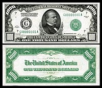 Series 1928 $1,000
Grover Cleveland


-
 Series 1928 $5,000
James Madison -
 Series 1928 $10,000
Salmon Chase


- ^ Large size notes represent the earlier types or series of U.S. banknotes. Their "average" dimension is 7.375 x 3.125 inches (187 x 79 mm). Small size notes (described as such due to their size relative to the earlier large size notes) are an "average" 6.125 x 2.625 inches (156 x 67 mm), the size of modern U.S. currency. "Each measurement is +/- 0.08 inches (2mm) to account for margins and cutting".
- Support as nominator – Godot13 (talk) 08:01, 7 September 2014 (UTC)
- Support - Even more... a 10k bill.... and in 1928 dollars too! — Crisco 1492 (talk) 08:55, 7 September 2014 (UTC)
- Support Those are good pictures - I mean the ones displayed on the bills. And technically good. Hafspajen (talk) 10:19, 7 September 2014 (UTC)

- Comment — Interesting for their high-denominational value, but it seems to me we've had quite a few U.S. currency FPs of late. How about some banknotes from less well known countries / governments — perhaps from some that no longer exist, such as the Free City of Danzig? (Right) Historical EV. Sca (talk) 14:21, 9 September 2014 (UTC)
- Sca-Actually, in terms of the EV, the high denomination value may be secondary to their serial number indicating they were the first of their kind printed. The next nomination will be with your comment in mind...--Godot13 (talk) 18:35, 9 September 2014 (UTC)
- Support. Nice work. Rreagan007 (talk) 18:36, 9 September 2014 (UTC)
- I don't understand how is legal to have these and the image doesn't explain it. Nergaal (talk) 16:07, 13 September 2014 (UTC)
- Quoted from above:"From the U.S. Treasury Department collection transferred to the National Numismatic Collection in 1978...National Museum of American History, Smithsonian Institution." There is also a tag on each of the images indicating it is at the Smithsonian.--Godot13 (talk) 19:53, 13 September 2014 (UTC)
- From a pure copyright perspective, it's fine, as all works by the US government (such as these notes) are PD. In regards to having high quality scans of banknotes, Commons:Currency has some discussion. — Crisco 1492 (talk) 04:24, 14 September 2014 (UTC)
- It is not quite clear that the image is PD. I understand the work of US government to be PD, but in case of money I would prefer to have an explicit link in the template stating that that note is indeed PD. And besides the copyright, is it legal to own prints of this at any size? I would prefer to have the answer to this question clearly covered for banknotes that are still technically in circulation. Some info at here could be more explicitly be included in one of the templates. Nergaal (talk) 07:10, 14 September 2014 (UTC)
- Again, check out the link; the sentence you're looking for is "... Title 18, Section 474, ... restricts transmitting electronic images "with intent to defraud" but says that 'The Secretary shall establish a system [...] to ensure that the legitimate use of such electronic methods and retention of such reproductions by businesses, hobbyists, press and others shall not be unduly restricted.'" . If you want Godot to use the {{PD-USGov-money}} template, I'm sure he can do it. I doubt the Smithsonian (a government agency, I believe) would be letting him put these scans on Wikipedia if it was illegal. — Crisco 1492 (talk) 08:16, 14 September 2014 (UTC)
- There is also an OTRS tag attached to each image as I needed to document Smithsonian approval. Any none of these note are in active circulation anymore.--Godot13 (talk) 08:58, 14 September 2014 (UTC)
- I am not saying that this image is illegal. I was trying to point out that the description below the image does not clearly explain how the image is legal to have - being that in at least several parts of the world high res images of banknotes are technically illegal to own (or so I thought). Nergaal (talk) 00:58, 15 September 2014 (UTC)
- I guess the "Godot13 / Smithsonian Institution" template is fine, but personally I would prefer to add to "permits color illustrations of U.S. currency" something along the lines "including currency in circulation". Nergaal (talk) 01:13, 15 September 2014 (UTC)
- I am not saying that this image is illegal. I was trying to point out that the description below the image does not clearly explain how the image is legal to have - being that in at least several parts of the world high res images of banknotes are technically illegal to own (or so I thought). Nergaal (talk) 00:58, 15 September 2014 (UTC)
- There is also an OTRS tag attached to each image as I needed to document Smithsonian approval. Any none of these note are in active circulation anymore.--Godot13 (talk) 08:58, 14 September 2014 (UTC)
- Again, check out the link; the sentence you're looking for is "... Title 18, Section 474, ... restricts transmitting electronic images "with intent to defraud" but says that 'The Secretary shall establish a system [...] to ensure that the legitimate use of such electronic methods and retention of such reproductions by businesses, hobbyists, press and others shall not be unduly restricted.'" . If you want Godot to use the {{PD-USGov-money}} template, I'm sure he can do it. I doubt the Smithsonian (a government agency, I believe) would be letting him put these scans on Wikipedia if it was illegal. — Crisco 1492 (talk) 08:16, 14 September 2014 (UTC)
- It is not quite clear that the image is PD. I understand the work of US government to be PD, but in case of money I would prefer to have an explicit link in the template stating that that note is indeed PD. And besides the copyright, is it legal to own prints of this at any size? I would prefer to have the answer to this question clearly covered for banknotes that are still technically in circulation. Some info at here could be more explicitly be included in one of the templates. Nergaal (talk) 07:10, 14 September 2014 (UTC)
- From a pure copyright perspective, it's fine, as all works by the US government (such as these notes) are PD. In regards to having high quality scans of banknotes, Commons:Currency has some discussion. — Crisco 1492 (talk) 04:24, 14 September 2014 (UTC)
- Quoted from above:"From the U.S. Treasury Department collection transferred to the National Numismatic Collection in 1978...National Museum of American History, Smithsonian Institution." There is also a tag on each of the images indicating it is at the Smithsonian.--Godot13 (talk) 19:53, 13 September 2014 (UTC)
- Btw, speaking of the actual images, are the actual banknotes blackish on one side and green on the other? It is not clear to me if the stark difference in color is intentional but the designers or by the editor. Also, there is a pink mark on the reverse of the newer 10k note (above "of") which I believe should be erased? Similarly for the front of the older 5k and 10k, there are pencil marks in blue and pink. And there is some yellow staining on the back of the newer 1k which could be removed? Nergaal (talk) 01:16, 15 September 2014 (UTC)
- There are several pages on Commons already which make this point clear. Policy does not require that individual pages have text where templates are enough.
- If you'd actually try Googling you'd find out very quickly that yes, the two colours are in the original notes. This is underexposed, but one can clearly see the difference between the two. Asking that here, without taking the time to search for the answer on your own, is akin to accusing the uploader of misrepresenting the object.
- When one is documenting an actual artefact (in this case, a particular bill), one does not "remove" imperfections on the artefact itself. Scanner gunk, yes. Actual imperfections in the note/painting/sculpture? No. One documents it, flaws, marks, and all. — Crisco 1492 (talk) 02:15, 15 September 2014 (UTC)
- Not sure why u annoyed. But it is strange to me why creases should be fixed while obvlius imperfections that have nothing to do with the artifact. A pencil mark that was not supposed to be there but which can be easily removed without altering the actual value and accuracy of the pic is not that different from a note having been folded. Nergaal (talk) 11:56, 18 September 2014 (UTC)
- Trivialities above aside, great work. Support. Ed [talk] [majestic titan] 01:58, 15 September 2014 (UTC)
Promoted File:US-$500-FRN-1918-Fr-1132d.jpg --Armbrust The Homunculus 12:44, 17 September 2014 (UTC)
Promoted File:US-$1000-FRN-1918-Fr-1133d.jpg --Armbrust The Homunculus 12:44, 17 September 2014 (UTC)
Promoted File:US-$5000-FRN-1918-Fr-1134d.jpg --Armbrust The Homunculus 12:44, 17 September 2014 (UTC)
Promoted File:US-$10000-FRN-1918-Fr-1135d.jpg --Armbrust The Homunculus 12:44, 17 September 2014 (UTC)
Promoted File:US-$500-FRN-1928-Fr-2200g.jpg --Armbrust The Homunculus 12:44, 17 September 2014 (UTC)
Promoted File:US-$1000-FRN-1928-Fr-2210g.jpg --Armbrust The Homunculus 12:44, 17 September 2014 (UTC)
Promoted File:US-$5000-FRN-1928-Fr-2220g.jpg --Armbrust The Homunculus 12:44, 17 September 2014 (UTC)
Promoted File:US-$10000-FRN-1928-Fr-2230b.jpg --Armbrust The Homunculus 12:44, 17 September 2014 (UTC)
Voting period is over. Please don't add any new votes. Voting period ends on 17 Sep 2014 at 19:45:13 (UTC)


- Reason
- Great EV. Exceptional quality.
- Articles in which this image appears
- Etchmiadzin Cathedral, Vagharshapat
- FP category for this image
- Wikipedia:Featured pictures/Diagrams, drawings, and maps/Drawings
- Creator
- Jean Chardin
- Support as nominator – Étienne Dolet (talk) 19:45, 7 September 2014 (UTC)
- Comment - The crop is not straight, even though the original engraving is. — Crisco 1492 (talk) 01:40, 8 September 2014 (UTC)
- The original is the crop and the crop is the uncropped version? Nothing confusing there [head spins round, flies off]. Belle (talk) 15:18, 8 September 2014 (UTC)
- Comment They are both crops. The original, as Crisco purports, is not aligned. I just provided a new one. Étienne Dolet (talk) 17:58, 8 September 2014 (UTC)
- The original is the crop and the crop is the uncropped version? Nothing confusing there [head spins round, flies off]. Belle (talk) 15:18, 8 September 2014 (UTC)
- Support ALT 1 with caption - or ANY Hafspajen (talk) 08:25, 10 September 2014 (UTC)
OpposeI'm not keen on prints being cropped to remove their titles. (Which of the criteria is that you say? 8 maybe? Feels wrong to me anyway.) Belle (talk) 16:55, 10 September 2014 (UTC)

- Comment - the fram has spots and marks .. probably this is why it is cropped. Strictly the frame is not part of the engraving, it is just the paper it is printed on. I recognize this building, even if the presentation doesn't saying it, is considered the oldest cathedral in the world. Hafspajen (talk) 18:05, 10 September 2014 (UTC)
- I'm not talking about the paper, I'm talking about the title which is part of the original engraving. Belle (talk) 21:18, 10 September 2014 (UTC)
- I'm quite confused over your reasoning behind the oppose vote Belle. For one, the "title" is in a foreign language. Why have it when it can be easily conveyed to the reader in a form of a caption that can be easily translated into English? In fact, I don't see this as a title at any rate. It's more of a caption than anything else. Étienne Dolet (talk) 04:37, 11 September 2014 (UTC)
- Call it an aesthetic choice if you wish. Caption, title, it doesn't make much difference; it is part of the engraver's work. Perhaps I'm looking at it from the point of view of featuring the the engraver's work rather than featuring a representation of the cathedral, so that it is not in English doesn't alter my feelings at all; the caption gives it some context. I don't like the tight cropping of plates either, the size of the image in relation to the paper is often an artistic choice too. I'll strike my oppose as I'm on shaky ground with the criteria (woooo, I felt it give a bit then), but I won't support either (so, a wall of text for no discernible change in the nomination's status; good one, Belle). Belle (talk) 08:06, 11 September 2014 (UTC)
- Personally, I rather keep the captions for images like this, as they are part of the artist's creative endeavour, presentations to viewers and readers. Hence why I haven't !voted here. — Crisco 1492 (talk) 09:47, 11 September 2014 (UTC)
- Probably Étienne can provide us with a third alt ALT 3 with caption? Hafspajen (talk) 11:53, 11 September 2014 (UTC)
- I've added ALT1 with caption. Let me know what you think: Hafspajen, Belle, Crisco 1492 Étienne Dolet (talk) 18:34, 11 September 2014 (UTC)
- Well, I still support it, and the reason is that the Armenian Church has a very special position in the history of the early christianity. They were actually the first Christian church outside the original Jewish Christian Church of Jerusalem, earlier then both the early Coptic church and the Roman Early Christian church too, now that is something, you know. And this building as I pointed out is considered as the first or one of the first cathedral. So, Belle, Crisco 1492 - now that Etienne gave you the third picture? Hafspajen (talk) 09:16, 12 September 2014 (UTC)
- Getting there. Could still use a bit of restoration though. — Crisco 1492 (talk) 09:23, 12 September 2014 (UTC)
- Restauration such as ... Crisco 1492 ? Hafspajen (talk) 10:49, 12 September 2014 (UTC)
- Hairs, pencil marks, dirt... — Crisco 1492 (talk) 15:04, 13 September 2014 (UTC)
- Also, without the caption, you're also removing the edges of the image, which means it could never be printed in such a manner that it was at all similar to how engravings are printed - razor-sharp borders are not something seen in engravings. Adam Cuerden (talk) 04:59, 13 September 2014 (UTC)
Not Promoted --Armbrust The Homunculus 19:46, 17 September 2014 (UTC)
Voting period is over. Please don't add any new votes. Voting period ends on 17 Sep 2014 at 20:41:28 (UTC)

- Reason
- Though the picture is not that sharp, good composition, lighting and pose. None of the Indian Classical performances in FP I have noticed and very high EV
- Articles in which this image appears
- Bharata Natyam
- FP category for this image
- Wikipedia:Featured pictures/Culture, entertainment, and lifestyle/Entertainment
- Creator
- Augustus Binu
- Support as nominator – Bellus Delphina talk 20:41, 7 September 2014 (UTC)
- Support with some technical comments: if I had a chance to shoot something like this, I'd probably adjust the exposure bias by dropping it by 1/3 or 2/3 (maybe with a slightly increased ISO, like 800) and then brightening in post. That'd get a faster shutter speed, meaning (hopefully) that we don't have to downsize as much to get a sharp image. I shot these images like that (in what appears to have been slightly worse light, although my lens wasn't exactly a fast one either... shame I misplaced the RAWs) and the results were okay. — Crisco 1492 (talk) 01:35, 8 September 2014 (UTC)
- Comment. Very nice. I won't be trying this pose at home. I was just slightly disappointed in the sharpness of the face at full size. Perhaps I am being too demanding. 109.147.185.178 (talk) 02:01, 8 September 2014 (UTC)
- Support While the quality could be better, the EV wins it for me. Could be replaced if a better image is obtained--Muhammad(talk) 08:45, 9 September 2014 (UTC)
- Support Nikhil (talk) 14:10, 12 September 2014 (UTC)
- Support per Muhammad. Adam Cuerden (talk) 05:10, 13 September 2014 (UTC)
Promoted File:Bharata Natyam Performance DS.jpg --Armbrust The Homunculus 20:42, 17 September 2014 (UTC)
Voting period is over. Please don't add any new votes. Voting period ends on 18 Sep 2014 at 10:10:56 (UTC)

- Reason
- Henry Ossawa Tanner (1859 – 1937) was an African-American artist. He was the first African-American painter to gain international acclaim, and he has been called "the greatest African American painter to date." But he was also a very interesting and original artist and a very good painter. His painting, Sand Dunes at Sunset, Atlantic City - is hanging in the White House, in the Green Room. It was the first painting by an African-American artist to be purchased for the permanent collection of the White House. (If anyone feels like writing an article on it and nominating it, here's the file File:Henry Ossawa Tanner - Sand Dunes at Sunset, Atlantic City - Google Art Project.jpg).
- His painting, The Good Shepherd is part of a series of paintings he painted inspired by his wisit in Jerusalem. He was one of the painers that tried to paint biblical themes in an original enviroment - and in a very imaginative, ingenious, and innovational fashion. These pictures beside they have a dreamy quality, also evoke some of the athosphere of the ancient Jerusalem, and depict the biblical characters in a non-dramatical way, showing them in their every day lifes, talking or walking around - but not in a sensational, spectacular or overdramatic manner.
- Articles in which this image appears
- Henry Ossawa Tanner, Traum durch die Dämmerung
- FP category for this image
- :Wikipedia:Featured pictures#Artwork#Paintings
- Creator
- Henry Ossawa Tanner
- Support as nominator – Hafspajen (talk) 10:10, 8 September 2014 (UTC)
- Is it cropped? The signature seems to be cut off. Belle (talk) 14:44, 8 September 2014 (UTC)
- I agree. Very nice painting, but it seems cropped. — Crisco 1492 (talk) 16:15, 8 September 2014 (UTC)
Hm, too bad. Isn't possible to find an ALT? Crisco? Adam? It would be nice to have something on him. I feel that he as one of the "the greatest African American painter"s should have someting on FP.Hafspajen (talk) 08:20, 10 September 2014 (UTC)- There is no ALT - it looks like this. It is the frame, it is framed like this, it is covering the signature. Hafspajen (talk) 17:31, 10 September 2014 (UTC)
- I'd love to feature one of Tanner's works, but I'm worried we're not doing the painting justice if we're cutting off the sig (and parts of the painting). — Crisco 1492 (talk) 06:36, 11 September 2014 (UTC)
- Well, I'd love that too. But with this particular painting there is nothing we can go about the cut off signature. It is framed and exposed like this att the museum, it looks exactly like this - AT THE MUSEUM. We can try to ask the museum to take the work out of the frame and make a better scan maybe (?). The question is IF it is doable, I have seen many paintings taken out off the frame at a restaurator I was working for a coulpe of month - but they usually have a different color - then the rest of the picture. Probably because of the light from the sun - that causes oxidation. Hafspajen (talk) 09:13, 11 September 2014 (UTC)
- The reason ... could have been that he put that signature so low that it was not possible to frame it in a different way ...Hafspajen (talk) 09:16, 11 September 2014 (UTC)
Not Promoted --Armbrust The Homunculus 12:34, 18 September 2014 (UTC)
Voting period is over. Please don't add any new votes. Voting period ends on 18 Sep 2014 at 12:38:14 (UTC)

- Reason
- It's another beautiful painting of Marie by Krøyer, technically woooooooo, very kindly uploaded by Crisco 1492 after I did my damsel in distress act (not an act really), important in Krøyer's oeuvre as one of his "Blue Hour" paintings (that's the light not porno time). Big enough. Come on, it meets the criteria, just get voting (support).
- Articles in which this image appears
- Summer Evening at Skagen. The Artist's Wife and Dog by the Shore, Peder Severin Krøyer, List of paintings by Peder Severin Krøyer
- FP category for this image
- Artwork/Paintings
- Creator
- Peder Severin Krøyer (him of the impressive facial hair)
- Support as nominator – Belle (talk) 12:38, 8 September 2014 (UTC)
- Support - Lovely painting. — Crisco 1492 (talk) 13:06, 8 September 2014 (UTC)
- Support - An excellent digital copy of one of Denmark's most popular works of art. Also clearly documented in the title article.--Ipigott (talk) 16:06, 8 September 2014 (UTC)
- Support. Great painting; reproduction seems appropriate (good size, appropriate dimensions, Google normally gets the colours right). Solid enough little article, which makes the EV clear. We don't see Denmark-related content everyday, either. Fantastic candidate. J Milburn (talk) 16:49, 8 September 2014 (UTC)
- Support. Much iconic. Only one question - the paintings are supposed to be a week at least in the articles, before they can be nominated. This one was added today everywhere. I am suporting it, and I don't think that this is a case of delisting it, but see Wikipedia:Featured picture criteria point nr 5. (Considering that Belle is new to the project, so we maybe just need to point out that most nominators do wait the week before nominate.) Hafspajen (talk) 19:28, 8 September 2014 (UTC)
- I did know about this, but I considered this one of the "obvious cases" as I couldn't see the painting being removed from the article on the painting. Belle (talk) 22:41, 8 September 2014 (UTC)
- Since the painting has been in the article since it was written, I doubt anyone would insist on it waiting a week. — Crisco 1492 (talk) 05:38, 9 September 2014 (UTC)
- I did know about this, but I considered this one of the "obvious cases" as I couldn't see the painting being removed from the article on the painting. Belle (talk) 22:41, 8 September 2014 (UTC)
- Support Yup, looks of great quality.♦ Dr. Blofeld 19:49, 8 September 2014 (UTC)
- Support High quality and beautiful image.-Godot13 (talk) 22:10, 8 September 2014 (UTC)
- Support — Another lovely Skagen work — the moon reflection on the water is sublime. Sca (talk) 23:13, 8 September 2014 (UTC)
Promoted File:Summer evening at Skagen - P.S. Krøyer - Google Cultural Institute.jpg --Armbrust The Homunculus 12:39, 18 September 2014 (UTC)
Voting period is over. Please don't add any new votes. Voting period ends on 18 Sep 2014 at 16:04:33 (UTC)

- Reason
- Well, y'all wanted more pixels, y'all got more pixels. I blame Belle for teaching me the black magic needed to summon this Rembrandt. Yeah, Belle. All Belle. (Seriously though, high quality scan of a notable engraving, by a very notable artist... made all the more interesting that it's one of only a few of his works that can be classified as "erotica")
- Articles in which this image appears
- Joseph and Potiphar's Wife (etching), List of etchings by Rembrandt
- FP category for this image
- Wikipedia:Featured pictures/Artwork/Others, maybe?
- Creator
- Rembrandt
- Support as nominator – — Crisco 1492 (talk) 16:04, 8 September 2014 (UTC)
- Comment, I would like to support this but I can't... Crisco, I love you, don't take this personally - but that woman ... is just terrible. Hafspajen (talk) 19:33, 8 September 2014 (UTC)
- She does seem anatomically... awkward. ;-) Ðiliff «» (Talk) 21:08, 8 September 2014 (UTC)
- I agree. There's something off-putting about her, but we'll have to wait to tell Rembrandt about it.
 Or perhaps it was deliberate... a woman comfortable in her sexuality would have probably been considered deviant in the 17th century, and he may have tried to represent this physically, with a tension which disturbs the viewer. — Crisco 1492 (talk) 23:37, 8 September 2014 (UTC)
- I agree. There's something off-putting about her, but we'll have to wait to tell Rembrandt about it.
- She does seem anatomically... awkward. ;-) Ðiliff «» (Talk) 21:08, 8 September 2014 (UTC)
WeakSupport - While I agree with both Hafs and Diliff regarding the anatomical awkwardness of the female figure (and am not excited by this particular etching), it is the sole illustration in its own article and appears to be of fairly high quality and resolution.If this grows on me I may go full support later--Godot13 (talk) 21:57, 8 September 2014 (UTC)- Okay, it's not that it grew on me as much as I don't buy my own reasoning- whether I like the image or not it's well made, has EV, and perfectly illustrates the article written about it.--Godot13 (talk) 00:06, 9 September 2014 (UTC)
- Support as I'm getting the blame for it. I don't see anything particularly wrong with the woman, Joseph seems more contorted, but it is more about the quality of the image and its value to the encyclopedia which are both fine (that's a bit weak; both good; both excellent). Belle (talk) 22:56, 8 September 2014 (UTC)
- Oppose. Sorry - but this is not one of Rembrandt's best works. He was a great master, but he had sometimes the unhappy tendency to draw in an uncertain way. We do all excuse this, because he was a superb colorist, but the truth is that he was an artist who couldn't draw with the same accuracy as the other great artists- Rubens, Michelangelo, Durer, and so on - this is one of his works demonstrating it - not the best of his production. Hafspajen (talk) 09:43, 9 September 2014 (UTC)
- Rembrandt's less impressive work could still have EV I suppose, because it shows his weaknesses rather than the usual strengths that are showcased with artists. Featured Pictures aren't always about the most beautiful subjects. Ðiliff «» (Talk) 09:52, 9 September 2014 (UTC)
- I am not against Crisco at all. And it is not because it is uggly. This is in my oppinion a low quality work of Rembrand. There are so many other great etching we can chose from... File:Rembrandt - The windmill - Google Art Project.jpg, - File:Rembrandt van Rijn - An Old Man with a Beard, Fur Cap, and Velvet Cloak - Google Art Project.jpg File:B205 Rembrandt.jpg File:B202 Rembrandt.jpg (therese are not big enough, but just to show) File:Rembrandt van Rijn - Jupiter and Antiope - Google Art Project.jpg File:Rembrandt Harmensz. van Rijn - Christ with the Sick around Him, Receiving Little Children (The 'Hundred Guilder Print') - Google Art Project.jpg Hafspajen (talk) 10:18, 9 September 2014 (UTC)
- Maybe terrible was not an explanation. The womans leggs are distorted, twist out of a natural, normal, original shape. Hafspajen (talk) 10:27, 9 September 2014 (UTC)
- I don't think anyone's saying you're against me. Although the quality of the work is low (by Rembrandt's standards... I'll be damned if I can draw like this), the fact that the work has its own article means the encyclopedic value is there. I rather like the one of the old man, but without an article on the etching, it doesn't have that much EV. — Crisco 1492 (talk) 10:33, 9 September 2014 (UTC)
- Well, I can draw like this. (Not Rembrand's style, but my style. different, but basics are always same - and the anatomical correctness is one criteria.) And I am still saying that it is not anatomically correct. Hafspajen (talk) 10:48, 9 September 2014 (UTC)
- Nobody's saying that it is... — Crisco 1492 (talk) 10:52, 9 September 2014 (UTC)
- It is not among the best examples of a given subject that the encyclopedia has to offer. Not among Rembrand's etchings and not among the subjects representations. Again, please don't take it personal. I do like you a lot. Hafspajen (talk) 10:54, 9 September 2014 (UTC)
- I'm not taking it personal. I'm trying to understand how you're approaching this. I'm not seeing how it is not the best example of "Joseph and Potiphar's Wife (etching)" that Wikipedia has to offer. When the original work is already "not anatomically correct", any reproduction will have the same fault. — Crisco 1492 (talk) 10:59, 9 September 2014 (UTC)
- What if we define the subject not as merely 'Rembrandts' (of which this is certainly not one of the best) but 'Rembrandts that are not well drawn, well known or appreciated'. Then surely it's one of the best examples. ;-) It's all about what you want to illustrate. Anyway, I'm not intending to harrass you, just engaging in friendly debate to stimulate the discussion! I'll bow out now. Ðiliff «» (Talk) 10:59, 9 September 2014 (UTC)
- No, no, this is not harrasment, I can tell the difference... . We discuss. Is not the best example of "Joseph and Potiphar's Wife see Potiphar... And not Rembrands best etching, (article or not). That's all. Hafspajen (talk) 11:02, 9 September 2014 (UTC)
- Except the subject is not "Joseph and Potiphar's Wife" (the Bible story). It is "Joseph and Potiphar's Wife (etching)", the etching by Rembrandt. — Crisco 1492 (talk) 11:05, 9 September 2014 (UTC)
- No, no, this is not harrasment, I can tell the difference...
- Support Like it or not, this is undeniably a fine illustration for its article. Samsara (FA • FP) 03:23, 14 September 2014 (UTC)
- Support - the article on the subject means that the artistic merit doesn't matter so much. Adam Cuerden (talk) 07:02, 16 September 2014 (UTC)
Promoted File:Rembrandt - Joseph and Potiphar's wife.jpg --Armbrust The Homunculus 16:16, 18 September 2014 (UTC)
Voting period is over. Please don't add any new votes. Voting period ends on 18 Sep 2014 at 20:19:25 (UTC)
-
 Original – Man Writing a Letter has its pair, the woman who is reading the letter posted by him. Exposed at the National Gallery of Ireland.
 -
 Original – Woman Reading a Letter


- Reason
- Gabriël Metsu (1629 – 1667) was a Dutch Golden Age painter, who's best pictures were genre works and portraits. While not that iconic as Vermeer, these pictures are of high artistic merit. These are works that are none the less wonderful examples of their particular type or school of art. They were nevertheless desirable and they were stolen a couple of times, in 1974 and again in 1986 from the Russborough House, from the Beit collection. Both times the Woman Reading a Letter and Man Writing a Letter was stolen and recovered. Painted as a a pair and also owned and stolen as a pair, they are currently exposed at the museum as a pair, at the National Gallery of Ireland.
- Articles in which this image appears
- Woman Reading a Letter and Man Writing a Letter and Gabriël Metsu
- FP category for this image
- Artwork/Paintings
- Creator
- Gabriël Metsu
- Support as nominator – Hafspajen (talk) 20:19, 8 September 2014 (UTC)
- Question - How do we know that this is supposed to be a pair? — Crisco 1492 (talk) 04:35, 9 September 2014 (UTC)
- Comment They are exposed at the museum as a pair, "probably the artist’s most famous works". Also here Hafspajen (talk) 11:20, 9 September 2014 (UTC)
- Hung as a pair... not proof of the artist's intentions, but good enough for me. Support set. — Crisco 1492 (talk) 03:18, 10 September 2014 (UTC)
- Comment - You have proof now, it was also the artist's intention. We have 2 two new articles on them - and yes, it was painted as couple from the begining. Hafspajen (talk) 17:03, 10 September 2014 (UTC)
- Support: as paired. Interesting history... Fylbecatulous talk 15:00, 10 September 2014 (UTC)
- Support - a pair of interesting images. SagaciousPhil - Chat 13:55, 11 September 2014 (UTC)
- Support pair/set --Godot13 (talk) 03:34, 12 September 2014 (UTC)
Promoted File:Man Writing a Letter by Gabriël Metsu.jpg --Armbrust The Homunculus 20:21, 18 September 2014 (UTC)
Promoted File:Woman Reading a Letter by Gabriël Metsu.jpg --Armbrust The Homunculus 20:21, 18 September 2014 (UTC)
Voting period is over. Please don't add any new votes. Voting period ends on 18 Sep 2014 at 20:41:06 (UTC)

- Reason
- The great Golden Age painter, Johannes Vermeer 's masterwork. The woman in the picture is measuring - something. Some critics perceive her as measuring her valuables, others that she is measuring what is important in life (the woman is pregnant). She is weighing her valuables too see what they are worth. But behind the woman hangs a painting representing The last judgment. Some say the juxtaposition with the final judgment is suggesting that she is focusing on the treasures of Heaven rather than those of Earth. Other art critics compared the use of ligh with the traditional paintings of the Annunciation theme.
- Articles in which this image appears
- Woman Holding a Balance
- FP category for this image
- Artwork/Paintings
- Creator
- Johannes Vermeer
- Support as nominator – Hafspajen (talk) 20:41, 8 September 2014 (UTC)
- Support - very good use of light. — Crisco 1492 (talk) 04:33, 9 September 2014 (UTC)
- Support - With only 34 works, many set up in the same manner, they never (IMO) feel redundant.--Godot13 (talk) 00:35, 11 September 2014 (UTC)
- Support: I am really becoming fond of this one. Perhaps it does remind me of the Annunciation icons and paintings. It is not only the light, but her draped head covering and she has a serene gaze. Fylbecatulous talk 03:23, 12 September 2014 (UTC)
- Comment Congratulation for a sharp comment, Fylbecatulous. This is exactly what the art critics say - the more one is looking at a Vermeer, the more one dicovers new things, it has an abundant richness of meanings and details - even though they look - simple enough in the beginning. As Godot said, they - never feel redundant... Hafspajen (talk) 09:39, 12 September 2014 (UTC)
- Support I think this is an obvious case. Samsara (FA • FP) 03:29, 14 September 2014 (UTC)
Promoted File:Johannes Vermeer - Woman Holding a Balance - Google Art Project.jpg --Armbrust The Homunculus 20:53, 18 September 2014 (UTC)
Voting period is over. Please don't add any new votes. Voting period ends on 19 Sep 2014 at 04:23:29 (UTC)

- Reason
- Very good EV and gives and indication of how much coverage this disaster received and also how an official may typically be swarmed reporters and cameramen
- Articles in which this image appears
- 2013 Dar es Salaam building collapse, Broadcast journalism, Journalism, Journalism genres
- FP category for this image
- Wikipedia:Featured pictures/People/Others
- Creator
- Muhammad Mahdi Karim
- Support as nominator – Muhammad(talk) 04:23, 9 September 2014 (UTC)
- Support It is an interesting picture. Different, but interesting. Hafspajen (talk) 16:33, 9 September 2014 (UTC)
- Comment - Needs categories. — Crisco 1492 (talk) 03:16, 10 September 2014 (UTC)
- Done --Muhammad(talk) 03:51, 10 September 2014 (UTC)
- I meant on Commons... — Crisco 1492 (talk) 07:30, 10 September 2014 (UTC)
- And on commons --Muhammad(talk) 10:13, 10 September 2014 (UTC)
- I meant on Commons... — Crisco 1492 (talk) 07:30, 10 September 2014 (UTC)
- Done --Muhammad(talk) 03:51, 10 September 2014 (UTC)
- Support - Gosh that's cramped... good shot. — Crisco 1492 (talk) 10:38, 10 September 2014 (UTC)
- Support Nikhil (talk) 14:10, 12 September 2014 (UTC)
- Support Bellus Delphina talk 18:57, 14 September 2014 (UTC)
Promoted File:Suleiman Kova and media, 2013 DSM Building Collapse.jpg --Armbrust The Homunculus 12:31, 19 September 2014 (UTC)
Voting period is over. Please don't add any new votes. Voting period ends on 19 Sep 2014 at 14:34:26 (UTC)

- Reason
- High quality scan of an attractive portrait long used in the article (though in lower resolution than what I just uploaded). Nice to have another king in the ranks.
- Articles in which this image appears
- William I of the Netherlands, List of monarchs of the Netherlands
- FP category for this image
- Wikipedia:Featured pictures/People/Royalty and nobility
- Creator
- Joseph Paelinck
- Support as nominator – — Crisco 1492 (talk) 14:34, 9 September 2014 (UTC)
- Support! Great picture. Excellent composition, one of the very best royal depictions, it has both an air of royalty and also human traits. Good balance, good details, highly skilled painter - indeed. Hafspajen (talk) 15:51, 9 September 2014 (UTC)
- Support SagaciousPhil - Chat 13:52, 11 September 2014 (UTC)
- Support: on the basis of Crisco 1492's and Hafspajen's descriptions and for the historical value of a Coronation portrait. Fylbecatulous talk 21:49, 14 September 2014 (UTC)
- Support per above Adam Cuerden (talk) 00:46, 16 September 2014 (UTC)
Promoted File:William I of the Netherlands.jpg --Armbrust The Homunculus 14:38, 19 September 2014 (UTC)
Voting period is over. Please don't add any new votes. Voting period ends on 19 Sep 2014 at 15:56:36 (UTC)

- Reason
- Most striking image from the romantic painter John Martin. The Romantic movement validated intense emotions. The movementwas placing new emphasis on emotions as authentic apprehension, horror and terror, and awe— especially that which is experienced in confronting the sublimity of untamed nature and its picturesque qualities: new aesthetic categories, and very different from Realism and Classicism as a source of aesthetic experience. Very EV-ish, has actually two own articles.
- Articles in which this image appears
- The Great Day of His Wrath; The Last Judgment (Martin painting), John Martin (painter)
- FP category for this image
- Artwork/Paintings
- Creator
- John Martin
- Support as nominator – Hafspajen (talk) 15:56, 9 September 2014 (UTC)
- Support ///EuroCarGT 03:06, 10 September 2014 (UTC)
- Support: Nice teaching moment and good description, Hafs. This vivid image brings to life your description of intense emotions very well. Fylbecatulous talk 14:47, 10 September 2014 (UTC)
- Support – I'd initially been unsure of this artwork but the more I've looked at it, the more I've been attracted to it. SagaciousPhil - Chat 07:51, 13 September 2014 (UTC)
- Support Bellus Delphina talk 18:57, 14 September 2014 (UTC)
Promoted File:John Martin - The Great Day of His Wrath - Google Art Project.jpg --Armbrust The Homunculus 15:57, 19 September 2014 (UTC)
Voting period is over. Please don't add any new votes. Voting period ends on 19 Sep 2014 at 16:38:18 (UTC)

- Reason
- A high-res, professional photograph freely released by the record label. What more could you want?
- Articles in which this image appears
- Chevelle (band)
- FP category for this image
- Wikipedia:Featured pictures/People/Entertainment
- Creator
- Epic Records
- Support as nominator – J Milburn (talk) 16:38, 9 September 2014 (UTC)
- Neutral - Technically, it's fine (Loeffler is a little OOF, but that's not too fatal a flaw). However, I'm not too sure I like the rays, which I feel were added in post-processing (perhaps because they are so straight and do not seem to diffract). The result is... well, the "wow" is there, but I feel that it's at the expense of EV. — Crisco 1492 (talk) 00:57, 10 September 2014 (UTC)
- Weak oppose Nice composition, but per Crisco 1492, I don't like the rays which are dominating the subject. Nikhil (talk) 09:16, 17 September 2014 (UTC)
Not Promoted --Armbrust The Homunculus 16:43, 19 September 2014 (UTC)
Voting period is over. Please don't add any new votes. Voting period ends on 21 Sep 2014 at 04:42:27 (UTC)
_card_money.jpg)
- Reason
- High quality, high EV. Very early example (1801) of playing card money (see Card Money in New France for general description) from Dutch Guiana (now Surinam). Rare, not illustrated in most references.
- Articles in which this image appears
- Card money, Dutch guilder
- FP category for this image
- Currency
- Creator
- Netherlands
From the National Numismatic Collection, National Museum of American History, Smithsonian Institution.
Image by Godot13.
- Support as nominator – Godot13 (talk) 04:42, 11 September 2014 (UTC)
- Beautiful... and strange... but not sure we've got the EV in "Dutch guilder". A general article on playing card money, sure. — Crisco 1492 (talk) 05:11, 11 September 2014 (UTC)
- I'm not sure there is enough information (reliable sources). I could hardly find anything on the internet and even the general world numismatic references don't have more than a sentence or two for card money in Dutch Guiana...-Godot13 (talk) 05:22, 11 September 2014 (UTC)
- Not even just the Dutch Guiana; playing card money (i.e. on the actual practice, which there should be plenty of sources on) is still a redlink. The image would have much higher EV in an article like that. — Crisco 1492 (talk) 06:33, 11 September 2014 (UTC)
Well, until I have time to write that article, I'll withdraw this...-Godot13 (talk) 06:51, 11 September 2014 (UTC)
- I can help, if need be. This is a very interesting image and I want to see it featured... just don't think it reaches the EV threshold yet. — Crisco 1492 (talk) 06:53, 11 September 2014 (UTC)
- I'm not sure there is enough information (reliable sources). I could hardly find anything on the internet and even the general world numismatic references don't have more than a sentence or two for card money in Dutch Guiana...-Godot13 (talk) 05:22, 11 September 2014 (UTC)
- Support
on the condition that the new article (card money) is expanded. I'll be doing some of that, so don't think there's much to worry about. — Crisco 1492 (talk) 07:05, 11 September 2014 (UTC) - Support - interesting and informative - the card money article is looking good too. SagaciousPhil - Chat 13:49, 11 September 2014 (UTC)
- Support - We may just go for a complete collection, no? Hafspajen (talk) 20:41, 11 September 2014 (UTC)
- Support By the way, I'd love to get some good samples of historic playing cards as well - there's just something a bit more interesting about the older ones. That or historic Tarot. Adam Cuerden (talk) 11:40, 17 September 2014 (UTC)
Promoted File:Dutch Guiana-Suriname-1 Guilder (1801) card money.jpg --Armbrust The Homunculus 05:52, 21 September 2014 (UTC)
Voting period is over. Please don't add any new votes. Voting period ends on 22 Sep 2014 at 06:06:18 (UTC)
_2.jpg)
- Reason
- An absolutely beautiful 18th century note, and from France too! Very useful in the assignat article.
- Articles in which this image appears
- assignat
- FP category for this image
- Wikipedia:Featured_pictures/Culture,_entertainment,_and_lifestyle/Currency
- Creator
- Design: Government of France; note holder: National Numismatic Collection at the Smithsonian Institution. Scanned by Godot13
- Support as nominator – — Crisco 1492 (talk) 06:06, 12 September 2014 (UTC)
- Support - Image is of very high technical quality, is freely licensed, and appears to meet or exceed all of the requirements of becoming a featured picture. KDS4444Talk 06:18, 12 September 2014 (UTC)
- Support per nom and KDS. Hafspajen (talk) 09:04, 12 September 2014 (UTC)
- Support per above.--Godot13 (talk) 01:23, 13 September 2014 (UTC)
- Support - I never thought I'd become so intrigued by these scans of old notes; super quality and really interesting, so plenty of EV. SagaciousPhil - Chat 07:47, 13 September 2014 (UTC)
Promoted File:FRA-A73-République Française-400 livres (1792) 2.jpg --Armbrust The Homunculus 12:36, 22 September 2014 (UTC)
Voting period is over. Please don't add any new votes. Voting period ends on 22 Sep 2014 at 06:13:08 (UTC)

- Reason
- This is a revision of a previous nomination of this image from May of 2013. Previous nomination failed principally on grounds of its file size and layout-- both problems have been resolved: image is now below 2,700KB (yay, efficiency!) and I have learned how to adjust the text layout (yay, practice and experience!). More than this, the image is now more detailed, accurate, and, I hope, interesting. Am still taking suggestions for further improvements.
Biologists have always depicted this creature in either profile view or overhead, sometimes from underneath– but with no actual animal to work with, they have never tried to go further than this, and many of the 2-D illustrations are dull and sometimes not very informative (the Internet is replete with those: see here, here, and here for a few examples).
I have depicted the gametes leaving the gonad, traveling across the pericardium, and down the metanephridia, but am not certain this "works" in the image. Also, am not sure it is rendering correctly in all platforms, so please let me know if anyone has any difficulties viewing it or if any organs or parts seems missing or fragmented. These should all be fixed, but you never know. - Articles in which this image appears
- Mollusc
- FP category for this image
- wp:Featured pictures/Sciences/Biology
- Creator
- KDS444 Nomination through my Wikipedia account (KDS4444) of an image submitted through my Wikimedia Commons account (KDS444).
- Support as nominator – KDS4444Talk 06:13, 12 September 2014 (UTC)
- Support - Wow. — Crisco 1492 (talk) 08:07, 12 September 2014 (UTC)
- Support - Wooow. Hafspajen (talk) 10:47, 12 September 2014 (UTC)
- Support - a great improvement from last time. It is, from a graphics standpoint, very impressive. However, since I am not an expert on molluscs, I cannot comment on the scientific accuracy. dllu (t,c) 19:17, 12 September 2014 (UTC)
- Support. As per above, I'm not qualified to judge the scientific accuracy but it's an extremely well drawn diagram. Ðiliff «» (Talk) 21:00, 12 September 2014 (UTC)
- Comments. For me, the smaller text labels are uncomfortable or impossible to read at normal viewing size, say in the media viewer. When I go to the raw SVG at http://upload.wikimedia.org/wikipedia/commons/3/32/Archimollusc-en.svg, the text reverts to a size far too small for the proportions of the picture, with huge line spacing, such that none of the labels line up intelligibly with the lines. 86.160.86.83 (talk) 23:49, 12 September 2014 (UTC)
- It wouldn't have been my first choice, but I have now converted the text to paths: all of the words should be appearing in their correct size & proportions in all browsers and in all formats (PNG as well as SVG). Yes? KDS4444Talk 14:56, 13 September 2014 (UTC)
- Now the text in the SVG view seems to show correctly. However, in the view in Media Viewer, some of the text is still too small. The words "Cerebral", "Pedal" and "Pleural" can just be read (possibly very slightly better than before), but they look uncomfortably and disproportionately small. The word "Gametes" cannot be read. "Incurrent/Excurrent water" could also very usefully be slightly bigger. 86.160.86.83 (talk) 19:32, 13 September 2014 (UTC)
- Ok, got it, how 'bout now? Better? KDS4444Talk 00:25, 14 September 2014 (UTC)
- The text "Gametes" is still uncomfortably small for me at Media Viewer size. Also, I am unclear why it is, uniquely, in italics. Also, the positioning generally of the text in relation to the connecting lines is messy and inconsistent. This is a fussy comment that I would not mention if this had not been nominated as a featured picture. 217.44.215.14 (talk) 01:30, 15 September 2014 (UTC)
- I had made "gametes" italic and slightly smaller because these were only cells, not organs or body parts, but in the interests of legibility, I have removed those characteristics and it is now the same size as all other text. I need more direction on what you mean by "messy and inconsistent" with regard to the placement of text and lines generally: I made the text either align-right, -center, or -left depending on its position on the page, and placed lines from each organ/ part to its corresponding label— something about how I have done that isn't working for you, and I want to know what it is so I can take a look. Please explain if you can. Thanks! (and don't worry about nit-picking: honestly, I wish I got more of these kinds of small requests because they represent things that I do not notice but which should be changed and are often easy to do so). KDS4444Talk 08:04, 15 September 2014 (UTC)
- Please see this (or this if the first link ceases to work). This is how it looks for me in Media Viewer. I highlighted two of the callouts that show large spacing discrepancy. I disagree that Media Viewer should show the checkerboard background. I raised this before at the MV page, but no one seemed very interested, as I recall. Potentially there is a problem of knowing which colour to make the background if it is not specified in the file. 217.44.215.14 (talk) 12:01, 15 September 2014 (UTC)
- I raised the MV issue again here, in case anyone here is interested in comtributing. 217.44.215.14 (talk) 13:20, 15 September 2014 (UTC)
- NOW I understand. I have now snugged up the lines and text that you highlighted, and went around the entire image doing the same thing to any I felt weren't well placed. Thank you for pointing this out— this is the kind of thing I would not have noticed but which needed addressing. Please let me know if there are any others you feel I should adjust, or any other aspects that you would like to see changed. Also note that I have now placed a white background behind the image so that there will be no more checkerboards visible through it (I hate them, too). KDS4444Talk 19:02, 15 September 2014 (UTC)
Comment Source parameter in the file description needs some refs (something like "own work based on...", not just "own work"). Brandmeistertalk 12:34, 13 September 2014 (UTC)
- Done. Let me know if you would like to see additional specific citations/ sources, though a complete list of images I at some point consulted would require 15 or 20 more. KDS4444Talk 14:56, 13 September 2014 (UTC)
- Support Ok. Brandmeistertalk 15:12, 13 September 2014 (UTC)
- Great diagram! I just have a few comments. I think it would be a little more professional to change "Paired Ganglia: Cerebral, Pedal, and Pleural" into "Cerebral ganglia, Pedal ganglia, and Pleural ganglia". Also I think you point to the same anterior tentacle twice, but that's a minor quibble. Quite a nice one here! Mattximus (talk) 00:39, 14 September 2014 (UTC)
- Thank you! And your wish is my command: see how you like it now and feel free to throw in your "Support" vote if you get an inkling! KDS4444Talk 05:22, 14 September 2014 (UTC)
- Support Thanks for the changes, better now. Mattximus (talk) 21:32, 21 September 2014 (UTC)
- Support That is a gorgeous diagram, and serves a very useful purpose in pointing out the key features. It might be good to emphasize the 3D-ness by having the line for for the rearmost of the two pedal ganglia be obscured by the front of the nerve ring, but that might be confusuing, so use your judgement. Adam Cuerden (talk) 11:42, 21 September 2014 (UTC)
- You know, I was looking at it just now, and I was thinking the exact same thing. Gimme a minute here and let me see what I can do about this! KDS4444Talk 12:18, 21 September 2014 (UTC)
- Okay, so here is what I have done: I have placed the annotation lines for the pleural and pedal ganglia in correct position for a 3-D image, which has meant putting them behind the shell layer. I think this actually looks pretty good this way. I also went ahead and did the same thing for the lines for the metanephridia so that they, too, are in correct position for a 3-D image. While I was at it, I went ahead and added some "body bumps" to the animal's far side, and changed some of the annotation lines so that they appear as Ys rather than Vs (which I think is useful in a few places). Let me know if you think otherwise, or if there are any other points of the diagram that could use improvement (and thank you for the suggestion regarding the placement of the lines, Adam). KDS4444Talk 12:27, 21 September 2014 (UTC)+
- Looks very good, but it does mean a couple more tweaks are in order: I'd do the same thing with Cerebal ganglia, for consistency, possibly Statocysts, and maybe Osphradia, though that one passes through so little of the layer that it's barely necessary.. "Two pair of untorted..." points to the near side of the lower nerve cord pair, but the far side of the upper; better to consistently point to the near one. Or point to all four as two "Y"s? A couple of the body bumps are over the top of the pedal retractor muscles (the ones on the left), which seems wrong. Adam Cuerden (talk) 13:44, 21 September 2014 (UTC)
- Ok, how about now? KDS4444Talk 17:54, 21 September 2014 (UTC)
- That looks very, very good. Adam Cuerden (talk) 18:30, 21 September 2014 (UTC)
Promoted File:Archimollusc-en.svg --Armbrust The Homunculus 12:38, 22 September 2014 (UTC)
Voting period is over. Please don't add any new votes. Voting period ends on 22 Sep 2014 at 21:33:53 (UTC)
- Ripon Cathedral, North Yorkshire, England
-
 The nave looking east
 -
 The nave looking west
 -
 The rood screen
 -
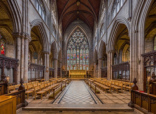 The choir
 -
 The organ


- Reason
- The five images in the set all show interesting and highly detailed views of the stonework, woodwork and architectural style of the cathedral. Of note is the asymmetrical arches and incomplete pillars of the nave which is the result of disruptions of the Reformation in the 1530s when work was stopped on the cathedral. Hopefully people are sick of artwork instead of cathedrals at the moment. ;-)
- Articles in which this image appears
- Ripon Cathedral
- FP category for this image
- Wikipedia:Featured pictures/Places/Interiors
- Creator
- User:Diliff
- Support as nominator – Ðiliff «» (Talk) 21:33, 12 September 2014 (UTC)
- Comment - Rather serious ghosting on the view of the gift shop (!). Person moving, across different exposures I believe. Any chance to reduce that, even a little? The two people drawing in Nave 1 also. — Crisco 1492 (talk) 05:22, 13 September 2014 (UTC)
- Yeah, not possible to reduce that. It's not movement between exposures, it's movement within exposures and I've done all I can to minimise it. The problem is that to get a wide depth of field, I have to use f/13, and inside dark cathedrals, that means exposures up to around 10-15 seconds for the longest exposure in the bracket so if there are people in the shot, they will most likely ghost. I guess we've been lucky enough that most of my images have no people in them, but here, it was impossible to avoid. A few from the front of the nave looking back to the entrance is never going to be devoid of people because that's where the volunteer guides tend to stand and it's where all the visitors stand and gawk (or in this case, look through the gift shop items! Yes, most English Anglican cathedrals have gift shops. ;-) ). In the case of the nave 1 image, those people were sitting there pretty much permanently (they were there to demonstrate some kind of art) and couldn't be avoided in that view of the nave. Ðiliff «» (Talk) 06:08, 13 September 2014 (UTC)
- Fair enough. They are pretty much invisible at thumbnail size anyways, and I understand your pain (oh so much... but still, gift shops? Don't think I've seen that in Canada or in Indonesia) so support. — Crisco 1492 (talk) 07:57, 13 September 2014 (UTC)
- I'm actually in Lithuania at the moment (a kind of Wiki sponsored thing), and trust me, Eastern European Catholic/Orthodox cathedrals are infinitely worse as far as gift shops go. They sell all kinds of kitschy bling relating to this saint or that, and of course lots and lots of candles. Although English cathedrals are definitely tourist attractions too, I wouldn't say most people are visiting because they're strongly religious, most are just interested in the history or architecture. Definitely not like that in Lithuania, where most of the visitors seem very religious. Still, for the most part I haven't felt unwelcome or intimidated taking photos in there. Stay tuned for some Lithuania-themed nominations... Ðiliff «» (Talk) 14:07, 13 September 2014 (UTC)

- Ðiliff, if you're in Vilnius (with its countless churches), be sure to visit the unique St. Anne's, will you? Sca (talk) 14:34, 13 September 2014 (UTC)
- Support Oh, well, File:Ripon Cathedral Nave 1, Nth Yorkshire, UK - Diliff.jpg|The nave looking east, File:Ripon Cathedral Rood Screen, Nth Yorkshire, UK - Diliff.jpg|The rood screen Fille:Ripon Cathedral Choir 2, Nth Yorkshire, UK - Diliff.jpg|The choir; - 'File:Ripon Cathedral Organ, Nth Yorkshire, UK - Diliff.jpg|The organ. No gosts for me, hate them, but rest is good. OR SUPPORT ALL, just because a set, (but still hate gost) Hafspajen (talk) 17:06, 14 September 2014 (UTC)
- Sorry Hafspajen, could you clarify what you were trying to say with the above? ;-) Ðiliff «» (Talk) 19:58, 14 September 2014 (UTC)
- I meant that support, (or support only the ones without gosts - if others think they should be left out, then I support that too..) Hafspajen (talk) 14:44, 15 September 2014 (UTC)
- Support Nikhil (talk) 09:12, 17 September 2014 (UTC)
- Procedural note This nomination has a double !vote by Hafspajen. Armbrust The Homunculus 10:34, 20 September 2014 (UTC)
Not Promoted --Armbrust The Homunculus 12:35, 23 September 2014 (UTC)
- Not enough support for promotion. Armbrust The Homunculus 12:35, 23 September 2014 (UTC)
Voting period is over. Please don't add any new votes. Voting period ends on 23 Sep 2014 at 12:40:45 (UTC)

- Reason
- Beautifully crisp scan of an example of one of the best-know early American comic strips
- Articles in which this image appears
- Little Nemo, Winsor McCay, Comic strip, Sunday comics
- FP category for this image
- Wikipedia:Featured pictures/Artwork/Others
- Creator
- Winsor McCay
- Support as nominator – Curly Turkey ⚞¡gobble!⚟ 12:40, 13 September 2014 (UTC)
- Support - Great scan. — Crisco 1492 (talk) 13:28, 13 September 2014 (UTC)
- Of course ;-) Iconic. --Janke | Talk 15:36, 13 September 2014 (UTC)
- Support - Looks pretty good. I like it. GamerPro64 15:52, 14 September 2014 (UTC)
- Comment I think it could use just a little bit of restoration... Adam Cuerden (talk) 06:25, 16 September 2014 (UTC)
- You're volunteering, right? Curly Turkey ⚞¡gobble!⚟ 07:01, 16 September 2014 (UTC)
- Naturally. But, as I've done about 10 hours of restoration today... tomorrow, methinks. It shouldn't take too long... Adam Cuerden (talk) 07:05, 16 September 2014 (UTC)
- Merci bien! Curly Turkey ⚞¡gobble!⚟ 07:09, 16 September 2014 (UTC)
- Sorry it's taking so long. Trying to get all the dots to align properly slows down restoration a lot. Count this as a support if it closes before then - we can always do a quick delist and replace.Adam Cuerden (talk) 03:35, 20 September 2014 (UTC)
- Merci bien! Curly Turkey ⚞¡gobble!⚟ 07:09, 16 September 2014 (UTC)
- Naturally. But, as I've done about 10 hours of restoration today... tomorrow, methinks. It shouldn't take too long... Adam Cuerden (talk) 07:05, 16 September 2014 (UTC)
- You're volunteering, right? Curly Turkey ⚞¡gobble!⚟ 07:01, 16 September 2014 (UTC)
- Support I'm not sure how to interpret Adam's comment, but I'm happy with the slightly gritty quality of the reproduction. I don't think we need to compensate for inherent flaws of the print. Thumbmarks etc. are a different story, of course, but at a quick glance, I only saw one obvious smudge that looked non-original. Samsara (FA • FP) 15:28, 22 September 2014 (UTC)
- There's a small amount of dirt. Not much. It's just a nightmare to clean. =) Adam Cuerden (talk) 07:22, 23 September 2014 (UTC)
Promoted File:Little Nemo 1907-09-29.jpg --Armbrust The Homunculus 12:44, 23 September 2014 (UTC)
Voting period is over. Please don't add any new votes. Voting period ends on 23 Sep 2014 at 13:20:29 (UTC)

- Reason
- High resolution, good framing. Good to see underwater photography being taken.
- Articles in which this image appears
- Underwater photography
- FP category for this image
- Wikipedia:Featured pictures/Photographic techniques, terms, and equipment
- Creator
- U.S. Navy photo by Mass Communication Specialist 1st Class Jayme Pastoric
- Support as nominator – — Crisco 1492 (talk) 13:20, 13 September 2014 (UTC)
- Support Was waiting for this one. Hafspajen (talk) 16:17, 13 September 2014 (UTC)
- Oppose Good as a generic photo, but EV is limited as we can't see much detail of the equipment. The composition is even more problematic as it is centred not on the act of photographing (don't see what is being photographed) but the abdomen of the photographer. --ELEKHHT 01:58, 14 September 2014 (UTC)
- Comment Hard to understand why this shouldn't have EV? It both has EV and also a good compositon, good light and it is a really useful picture released by the by the United States Navy - about the Expeditionary Combat Camera Underwater Photo Team. Quite a rare and good image. Hafspajen (talk) 16:43, 14 September 2014 (UTC)
- I'd say that this is centered on the photographer. Which is pretty encyclopedic. The image basically shows what it looks like when someone uses a camera underwater - for an article on just that it seems fairly important. It's not meant to show the individual parts of the gear, and it's not really relevant what he's taking a picture of. The lighting and composition are also fairly pleasing. 24.222.214.125 (talk) 21:49, 14 September 2014 (UTC)
- Comment This is an example of what I would consider a good composition. --ELEKHHT 03:04, 16 September 2014 (UTC)
- Support Agree with the IP --Muhammad(talk) 04:30, 15 September 2014 (UTC)
- Support per the IP --Godot13 (talk) 02:13, 16 September 2014 (UTC)
- Support per IP. Adam Cuerden (talk) 23:09, 18 September 2014 (UTC)
- Support --Alchemist-hp (talk) 20:54, 19 September 2014 (UTC)
- Support yes, it provides an excellent illustration of an underwater photographer. SagaciousPhil - Chat 09:05, 23 September 2014 (UTC)
Promoted File:US Navy 120209-N-XD935-302 Mass Communication Specialist 1st Class Shane Tuck, assigned to the Expeditionary Combat Camera Underwater Photo Team, c.jpg --Armbrust The Homunculus 13:22, 23 September 2014 (UTC)
Voting period is over. Please don't add any new votes. Voting period ends on 23 Sep 2014 at 13:31:45 (UTC)


- Reason
- High quality and EV.
- Articles in which this image appears
- Morpho didius
- FP category for this image
- Wikipedia:Featured pictures/Animals/Insects
- Creator
- Archaeodontosaurus
- Support as nominator – Armbrust The Homunculus 13:31, 13 September 2014 (UTC)
- Comment - Cut-out issues around the eyes and antennae of the
ventreboth images, as well as the rear of that one. Some missed spots near the wings...weak opposefor now until clean-up is complete. — Crisco 1492 (talk) 14:58, 13 September 2014 (UTC)
 Done Both images are cleaned. --Archaeodontosaurus (talk) 16:41, 13 September 2014 (UTC)
- Thanks Didier. Support now. — Crisco 1492 (talk) 00:54, 14 September 2014 (UTC)
- Support--Godot13 (talk) 16:26, 15 September 2014 (UTC)
- Support Nice, especially when both sides and a scale bar are there. Brandmeistertalk 09:49, 16 September 2014 (UTC)
- Support Jee 16:47, 16 September 2014 (UTC)
- Support --Alchemist-hp (talk) 20:54, 19 September 2014 (UTC)
- Support -- Slaunger (talk) 21:24, 22 September 2014 (UTC)
Promoted File:Morpho didius Male Dos MHNT.jpg
Promoted File:Morpho didius Male Ventre MHNT.jpg --Adam Cuerden (talk) 16:26, 23 September 2014 (UTC)
Voting period is over. Please don't add any new votes. Voting period ends on 24 Sep 2014 at 08:32:30 (UTC)

- Reason
- Lovely little view of the port in Toulouse
- Articles in which this image appears
- Port de l'Embouchure
- FP category for this image
- Wikipedia:Featured pictures/Places/Urban
- Creator
- Didier Descouens
- Support as nominator – — Crisco 1492 (talk) 08:32, 14 September 2014 (UTC)
- Could this be retaken under better lighting? Looks a bit bland to me --Muhammad(talk) 04:29, 15 September 2014 (UTC)
- One could ask the photographer (are these pings working?) — Crisco 1492 (talk) 12:30, 15 September 2014 (UTC)
- Hi, It was a stormy day, the light was interesting. There were beautiful clouds. I understand the views of Muhammad. --Archaeodontosaurus (talk) 13:33, 15 September 2014 (UTC)
- Oppose the composition doesn't works for me: too much uninteresting water in the foreground (a hole for my eyes, my view drowns ...). I'm missing a foreground unit, a boot, a path ... --Alchemist-hp (talk) 06:22, 17 September 2014 (UTC)
- Oppose I agree with Alchemist-hp. While the lighting and clouds are interesting I don't think this illustrates the port very well as looks more like a deserted section of the river. The image in Port Saint-Sauveur is better in the regard as at least we can see some boats and evidence of commerce. The planking just under the surface in the bottom left corner is a bit distracting too (what is that? a sinking raft? do you have an uncropped version showing a ragged shipwrecked sailor with a long beard waving feebly? Because I'd definitely support that). Belle (talk) 10:24, 17 September 2014 (UTC)
- Oppose per Alchemist-hp. -- Slaunger (talk) 21:22, 22 September 2014 (UTC)
Not Promoted --Armbrust The Homunculus 12:31, 24 September 2014 (UTC)
Voting period is over. Please don't add any new votes. Voting period ends on 24 Sep 2014 at 13:16:03 (UTC)

- Reason
- The three main towers are shown in good quality and light, the image is widely used in articles concerning the topic.
- Articles in which this image appears
- Rouen Cathedral, Seine-Maritime
- FP category for this image
- Wikipedia:Featured pictures/Places/Architecture
- Creator
- DXR
- Support as nominator – DXR (talk) 13:16, 14 September 2014 (UTC)
- Oppose The scaffolding in front of the entrance does for it for me (I suppose ongoing restoration and conservation mean there is almost constantly scaffolding somewhere, but just here it is too distracting; though I'm easily distra...). Belle (talk) 10:08, 17 September 2014 (UTC)
- Weak Oppose I agree with Belle regarding the unfortunate presence of the scaffolding. It kills an otherwise very nice and well-executed photographs - unless, of course, the EV is in showing the ongoing restauration? -- Slaunger (talk) 21:19, 22 September 2014 (UTC)
- Fair enough, Slaunger and Belle, yet restaurations of cathedrals take years and imo they are simply a part of reality, especially if we look at cathedrals that suffered in WWII. Imo, the scaffolding didn't obscure the towers too much, but I get the point that they still distract. Thanks for your vote anyway! --DXR (talk) 22:31, 22 September 2014 (UTC)
- Comment Just thought I'd mention, I know how restorations take long times and scaffolding becomes part of the building for months or even years so that should make it acceptable IMO. However, for this particular scene, I'm not a big fan of the light --Muhammad(talk) 14:35, 23 September 2014 (UTC)
Not Promoted --Armbrust The Homunculus 13:33, 24 September 2014 (UTC)
Voting period is over. Please don't add any new votes. Voting period ends on 24 Sep 2014 at 19:13:15 (UTC)

- Reason
- Well composed photograph with yummy EV. The crop is a bit tight but I still feel its not effecting the beauty and the EV of the image (Size is also a bit small).
- Articles in which this image appears
- Sadya, Onam, Cuisine of Kerala
- FP category for this image
- Wikipedia:Featured pictures/Food and drink
- Creator
- Augustus Binu
- Support as nominator – Bellus Delphina talk 19:13, 14 September 2014 (UTC)
- Oppose - Under the minimum resolution. Should be fairly easy to retake. Also, cut-out is obvious even at thumbnail size. — Crisco 1492 (talk) 12:55, 15 September 2014 (UTC)
- Comment (But it looks good, made me hungry... Hafspajen (talk) 14:41, 15 September 2014 (UTC))
- Oh yeah, the shot and whatnot are nice. It's just those two things I pointed out. — Crisco 1492 (talk) 15:00, 15 September 2014 (UTC)
- *Oh, I know... , (I still need a restaurant, now) ... Hafspajen (talk) 15:11, 15 September 2014 (UTC)
- * Come to Kerala, next year. This year's Onam is already over on September 7! Jee 16:02, 15 September 2014 (UTC)
- Comment (But it looks good, made me hungry...
- Suggest retake Don't cut out the background, use something diffuse like sand. The colors focus and textures are wonderful as is the composition but if you have the means more resolution would help the image a lot. Chillum Need help? Type {{ping|Chillum}} 18:47, 16 September 2014 (UTC)
- Oppose till you increase the resolution. Plus the pappadam is crushed...:-) The herald 06:27, 24 September 2014 (UTC)
Not Promoted --Armbrust The Homunculus 19:17, 24 September 2014 (UTC)
Voting period is over. Please don't add any new votes. Voting period ends on 25 Sep 2014 at 23:20:20 (UTC)

- Reason
- A wonderfully encyclopedic view of an interesting example of trickery from the American Civil War. One quick note: The blurry figure at the back is someone who moved; it would be inappropriate to "fix" this issue.
- This restoration forms part of Operation Brothers at War, a collaboration in rememberance of the American Civil War on its ongoing 150th year anniversary
- Articles in which this image appears
- Quaker Gun, George B. McClellan
- FP category for this image
- Wikipedia:Featured pictures/History/American Civil War
- Creator
- George N. Barnard and James F. Gibson; restoration by Adam Cuerden
- Support as nominator – Adam Cuerden (talk) 23:20, 15 September 2014 (UTC)
- Support - Very nice. — Crisco 1492 (talk) 00:01, 16 September 2014 (UTC)
- Support Good quality picture with very high EV (note that this photo shows the fake guns emplaced as if they were an actual front-line battery, and shows how convincing they would have been to enemy scouts) Nick-D (talk) 11:41, 17 September 2014 (UTC)
- Another one that I'm going to do as a second project is File:Quaker Gun2.jpg, which shows the extra detail on the bits that stuck out of the fort. But first, I have a few things I put off. This was my choice for what I wanted to do as my return to restoring images after a long month, but I'd best get some of the delayed images done before continuing. =) Adam Cuerden (talk) 11:47, 17 September 2014 (UTC)
- I was hoping to hear that one was going to be done, too. (I think it's a fairly humorous image). 24.222.214.125 (talk) 20:28, 17 September 2014 (UTC)
- Another one that I'm going to do as a second project is File:Quaker Gun2.jpg, which shows the extra detail on the bits that stuck out of the fort. But first, I have a few things I put off. This was my choice for what I wanted to do as my return to restoring images after a long month, but I'd best get some of the delayed images done before continuing. =) Adam Cuerden (talk) 11:47, 17 September 2014 (UTC)
- Support Jee 15:59, 23 September 2014 (UTC)
- Support. Very crisp restoration with excellent historical value. Fylbecatulous talk 16:43, 25 September 2014 (UTC)
Promoted File:Centreville, VA, Quaker Guns in the fort on the heights.jpg --Armbrust The Homunculus 02:39, 26 September 2014 (UTC)
Voting period is over. Please don't add any new votes. Voting period ends on 26 Sep 2014 at 05:23:22 (UTC)

- Reason
- A fine image; a version of this has long led the page, carefully restored to as near to its original state as one can get. Another image on behalf of Operation Brothers at War.
- Articles in which this image appears
- Battle of Franklin +1
- FP category for this image
- Wikipedia:Featured pictures/History/American Civil War
- Creator
- Kurz and Allison, restored by Adam Cuerden
- Support as nominator – Adam Cuerden (talk) 05:23, 16 September 2014 (UTC)
- Support per nom. — Crisco 1492 (talk) 06:02, 16 September 2014 (UTC)
- Support – that is an incredible scan! SagaciousPhil - Chat 08:47, 17 September 2014 (UTC)
- Support, excellent work. Kaldari (talk) 22:41, 17 September 2014 (UTC)
- Support — nicely restored. ///EuroCarGT 04:24, 18 September 2014 (UTC)
Promoted File:Kurz and Allison - Battle of Franklin, November 30, 1864.jpg --Armbrust The Homunculus 12:30, 26 September 2014 (UTC)
Voting period is over. Please don't add any new votes. Voting period ends on 26 Sep 2014 at 06:00:42 (UTC)

- Reason
- High resolution of a notable painting, perhaps the artist's best known. A scandal, 'twas.
- Articles in which this image appears
- September Morn, Paul Émile Chabas, Harry Reichenbach, Succès de scandale
- FP category for this image
- Wikipedia:Featured pictures/Artwork/Paintings
- Creator
- Paul Émile Chabas
- Support as nominator – — Crisco 1492 (talk) 06:00, 16 September 2014 (UTC)
- Support, though, honestly? It's actually pretty tasteful. Adam Cuerden (talk) 06:06, 16 September 2014 (UTC)
- Oppose, the subject is too young for the image to be decent by modern standards. Some common-sense discretion surely advisable here. Are we also to feature the more provocative of Balthus' paintings for example? In making this oppose I exercise my right to make an oppose clearly stating a reason. I'm not prepared to debate it. Coat of Many Colours (talk) 07:36, 16 September 2014 (UTC)
- "the subject is too young for the image to be decent by modern standards" - You better not watch any diaper commercials, then. About the same degree of nudity. — Crisco 1492 (talk) 09:00, 16 September 2014 (UTC)
- When I said I wouldn't debate the issue, I didn't mean I wouldn't respond to pointed criticism. The issue here is that this is nominated as a "featured" image. I'm not familiar with nappy advertisements, but if an image of such an advertisement was nominated here which inappropriately eroticized its subject (which I do think is unlikely, but I defer to your expertise), then I would oppose it too while at the same time supporting its appearance in, say, an encyclopaedic article about nappy advertisements. You know very well I'm not a prude, as I took time to annotate a series of Japanese erotic prints you uploaded to Commons at my suggestion. I resent that you don't respect my right to take a discreet position on a matter of principle as I seek to without mocking me. It's doubly surprising because as you know I vehemently objected to your digital restoration of an image of Manet's Olympia, where you warmed the flesh tone in a way that Manet absolutely did not intend or would have countenanced and whose only aesthetic purpose can have been to eroticize the image. Unspoken there regarding my distaste, was the age of the subject. It's well known that Manet's subject was deliberately more girl like than adult. That was a significant element in the uproar his painting caused. In those days the age of menarche of working class girls was about fifteen and a half. Street girls starting a life of prostitution typically around the age of fourteen had barely, if at all, entered puberty, and that is deliberately reflected in Manet's painting. Your clearly inappropriate image found its way to Wikipedia's front page. I would prefer not see this one too. Not on my account. Standards do change you know. You're an ex-pat Brit I take it, who no doubt has heard of Samantha Fox. Directly she had turned sixteen years old, she appeared topless as a page 3 model for the Sun newspaper in 1983 (the by-line was "Sam gives up 'A' levels for 'Ooh' levels", which was certainly amusing to say nothing of her enormous tits of course). The point is that following later amendments to the 1976 Protection of Children Act, that publication would now be illegal, indeed merely to purchase a copy of it also illegal, as the bright line for nudity was set at eighteen years of age.
- I don't believe I can have anything more to contribute here. I trust I have satisfied your circle here that my opposition is neither frivolous nor a troll. Mock on. Coat of Many Colours (talk) 13:34, 16 September 2014 (UTC)
- You're not thinking. The article is about the painting so there's no alternative image we can use. We're here to evaluate the EV and quality of an image in relation to FP standards - not those of your decency and morals. We're not in the business of painting fig leaves. As it stands, I hope you reconsider your vote in light of the purpose of the project (whether or not it has to appear on the main page is an issue for POTD not one to be settled in the FPC queue. To be sure there are some featured images which are considered distasteful and won't end up on the main page). I think it would be reasonable for the closer to ignore this vote as it has nothing to do with the criteria or standards used here. 24.222.214.125 (talk) 15:56, 16 September 2014 (UTC)
- Support Good resolution and directly sourced to Metmuseum. The oppose vote above is amusing: how do you know she's "too young"? That's OR, unless a reliable source would say she's under 18 or something like that, but even then such an argument hardly substantiates an oppose in my view. Brandmeistertalk 08:52, 16 September 2014 (UTC)
- Support, I also think it is a tasteful depiction and was interested to read about the controversy it caused; it's an attractive piece of artwork and I have no problem supporting the nomination. SagaciousPhil - Chat 09:07, 16 September 2014 (UTC)
- Support — Iconic, and certainly not prurient. Sca (talk) 15:05, 16 September 2014 (UTC)
- Support. I don't think it's overtly sexual, personally. Like a lot of good art, it leaves the artist's intention and message to the imagination of the viewer. And I also don't think it's obvious that the girl is 'too young'. It's of course hard to judge the age of a fictitious girl though. I mean, there are strong arguments that the Statue of David depicts an underage boy too. Let's not be puritanical about art - it's very different to the abuse of a real child. Unless it could be demonstrated that viewing the image could be illegal, I don't think we really have any moral arguments for prohibiting the featuring of it. Ðiliff «» (Talk) 15:08, 16 September 2014 (UTC)
- Question Going by the article, does that mean this was painted when the girl was 15 and thus underage? --Muhammad(talk) 16:01, 16 September 2014 (UTC)
- One of the sources I'm compiling on the talk page (forget which) says sixteen. However, as already mentioned above, this is a far cry from pornography (for some reason I can't find the criteria the US uses to define "underage" or "child pornography", though I remember one of them is sexual suggestiveness). Although some might consider the image questionable owing to the model's age, others (such as The New York Times, quoted here) called it "as delicate and innocent as it is beautiful", looking at the nudity as more artistic than pornographic. — Crisco 1492 (talk) 16:08, 16 September 2014 (UTC)
- Here it is: Layperson's guide, The actual legal definitions) — Crisco 1492 (talk) 16:19, 16 September 2014 (UTC)
- Comment — The model Chabas used more than a century ago may have been 16, but this is not a photograph. The subject in the painting is of indeterminate age and looks to me like she might pass for a female in her early 20s. Further, no genitalia are pictured, and the breasts are depicted rather indistinctly, i.e. with discretion. Again, not prurient by current Western standards. Sca (talk) 16:27, 16 September 2014 (UTC)
- Support High encyclopedic value and high image quality. Chillum Need help? Type {{ping|Chillum}} 18:41, 16 September 2014 (UTC)
- Comment I think a number of you are being rather precious in discussing whether this image satisfies or not this or that other criteria for indecency. It's a question that after all has been debated with respect to nude images of young people on Wikipedia rather a lot in the past. In the end Mr. Wales himself had to step in and make a common sense ruling about the matter and delete the images. The common sense question about this image you should ask yourself is whether the image would gratify a paedophile and the answer is of of course yes it would. We do all know that now. Go on to any beach in the UK and start taking pictures of children and you run the risk of being arrested. Take an unsolicited picture of a nude young girl skinny dipping as you see depicted here and you certainly will be, if not lynched first. Now that of course doesn't mean images of this painting should be deleted from their articles. But it does mean that we should be sensitive in the matter of featuring it. It's not for nothing that this painting is not available for viewing at the Met. Similarly the Tate has removed its Ovendens from public display. I should think there are similar examples in many other museums. This one likewise needs to stay in the reserve collection. Coat of Many Colours (talk) 20:22, 16 September 2014 (UTC)
- Oh come now. Its not like this is Child Bride. Hell, this doesn't even have to be on the main page. I personally do not know what the issue is you're raising. GamerPro64 20:39, 16 September 2014 (UTC)
- Plenty of normal clothed images of children would potentially gratify a paedophile too, just as clothed images of adult women may gratify straight men. That's not the point at all. It's rather irrelevant who might get turned on by what. And why even bring up taking a photo of a young girl skinny dipping when it's pretty obvious that this is a painting and not a photo of a real girl and therefore not a fair comparison. Nobody is being taken advantage of here - there is no abuse victim. Finally, I think you're wrong that you'd get arrested for taking photos of children at a beach. You'd probably attract unwanted attention but under what law could you be arrested? There is no such law, and any attempt by the police to stop you would be probably limited to questioning you and making you feel uncomfortable about what is fundamentally legal. This and this makes for enlightening reading. It sounds like a law that you'd welcome, but the same common sense you refer to suggests it's a ridiculous and dangerous idea to suggest that anyone taking photos of children must be a paedophile and therefore committing a crime. Ðiliff «» (Talk) 21:17, 16 September 2014 (UTC)
- I said "run the risk of" and that's absolutely correct in the sense that police have indeed been called out for that sort of thing. I really don't know whether arrests have been made or not. I should think Public Order 1986 would suffice. As a photographer, whose efforts here incidentally I have often lauded, you must surely know that any image of a child nominated FP on Commons will quite likely be rejected if there's no evidence of parental permission.Coat of Many Colours (talk) 23:53, 16 September 2014 (UTC)
- Point of order here: Wales was deleting any art that contained nudity, mainly paintings of adults. And had to give up his powers on Commons because of this. Let's not act like Wales' actions were at all noble. Adam Cuerden (talk) 22:42, 16 September 2014 (UTC)
- Pedophile — Let's see now, is that a lover of feet? Sca (talk) 21:29, 16 September 2014 (UTC)

- American spelling. 'Paedophilia' a neologism by Kraft- Ebbing who saw just half a dozen or so cases in his practice but nevertheless was able to differentiate between benign and pathological presentations. 'Paedophile' itself not a construct that appears before 1951. HTH. Coat of Many Colours (talk) 10:21, 17 September 2014 (UTC)
- I see nudity, I don't see sexuality. There is a difference. Chillum Need help? Type {{ping|Chillum}} 22:33, 16 September 2014 (UTC)
- Yes. This is the famous US Supreme Court ruling "evil lies in the eyes of the beholder". It sucks. 2% of us *are* evil. One in every street. End of. This is an image that needs to stay under the bed. Get real. Ask any mum. Last from me.Coat of Many Colours (talk) 23:53, 16 September 2014 (UTC)
- (ec) Under US law this painting is also completely legal. The model's parents gave their consent, and were present when Chabas painted her (not in the article yet, but the... "Cold Shoulder", I believe... newspaper article on the talk page has this information). She is nude, but there is no "sexually explicit conduct" as defined by the US criminal code (linked above). For a more modern case, think Brooke Shields in Blue Lagoon. — Crisco 1492 (talk) 23:57, 16 September 2014 (UTC)
- Yes, but legality is not really the issue here as I stress. I'm not going to delve into the Graham Ovenden saga I quoted, his paintings are drop dead gorgeous but the fact is he's doing time for them, and he surely had parental permission. Egon Schiele, whose work I adore and upload to Commons (presently too drunk to locate mine amongst the hundreds uploaded, sorry) is another example. It's a question of taste. It's at the Met as you say, but it's not on view. Ask yourself why. Coat of Many Colours (talk) 00:26, 17 September 2014 (UTC)
- "presently too drunk". Can we end this discussion right here for the time being? Because that is quite possibly one of the worst things one wants to hear about an editor on this site. GamerPro64 00:30, 17 September 2014 (UTC)
- It's the terrible pain of living G. Honestly I can handle it. I also used to do a shit load of dope until the bastards closed down Silk Road (email me anyone if you know an alternative site). Meanwhile I took a deep breath, counted to 10 without inhaling, and found this one I uploaded. I will defend the right of this image not to be featured on Wikipedia to my dying breath. Coat of Many Colours (talk) 01:05, 17 September 2014 (UTC)
- What right is that? Chillum Need help? Type {{ping|Chillum}} 01:34, 17 September 2014 (UTC)
- No idea. Pissed, sorry. If it comes back to me, I'll let you know.Coat of Many Colours (talk) 09:40, 17 September 2014 (UTC)
- Although I agree with Gamer's comment, I just want to note that the reason it's not on view is not necessarily owing to the model's age. Indeed, when it was first put into storage in 1971, the Milwaukee Journal gave "banality" as the reason. — Crisco 1492 (talk) 00:56, 17 September 2014 (UTC)
- That too. Coat of Many Colours (talk) 01:05, 17 September 2014 (UTC)
- Eleven years old in this discourse: "Current child-abuse studies reveal that in the lack of an object, paedophiles may gratify themselves with fantasies triggered by an illustration, and then may be spurred on to seek real equivalents to the image. This connection drawn between child imagery and paedophilia is not new. French physicians were documenting it as early as 1860. Amid comparable moral panic ignited by French natalists over the 'white slave trade' and girl-child pornography before the First World War, picturing the body before the age of sexual consent became the subject of vehement protest, extensive legislation, and vigorous prosecution. Yet, unlike the fate of Henson and Mapplethorpe's photography, art by 'official artists' that fetishised the child's body, as epitomised by Chabas, was, and arguably remains, untouchable. Why this happened and continues to happen is the subject of this paper ...".
I have to attend to some other matters now. Probably I shan't be back, even if sober (well frankly, especially if sober). Coat of Many Colours (talk) 01:31, 17 September 2014 (UTC) - Oh well, sober again. I'm glad to see I wasn't offensive. The Brauer article (peer reviewed) looks well researched to me. I'll try and look it up in JStor and write it up for the painting's article. Presumably you didn't notice it? Brauer's estimation of thirteen years old (apparently painted over 3 years - goodness, that's a long time ... ) looks about right to me. I'll look for his sources. Coat of Many Colours (talk) 09:40, 17 September 2014 (UTC)
- I've added a description of Brauer's paper to the article. I do think this nomination should now be withdrawn. Coat of Many Colours (talk) 10:18, 17 September 2014 (UTC)
- Eleven years old in this discourse: "Current child-abuse studies reveal that in the lack of an object, paedophiles may gratify themselves with fantasies triggered by an illustration, and then may be spurred on to seek real equivalents to the image. This connection drawn between child imagery and paedophilia is not new. French physicians were documenting it as early as 1860. Amid comparable moral panic ignited by French natalists over the 'white slave trade' and girl-child pornography before the First World War, picturing the body before the age of sexual consent became the subject of vehement protest, extensive legislation, and vigorous prosecution. Yet, unlike the fate of Henson and Mapplethorpe's photography, art by 'official artists' that fetishised the child's body, as epitomised by Chabas, was, and arguably remains, untouchable. Why this happened and continues to happen is the subject of this paper ...".
- Pedophile — Let's see now, is that a lover of feet? Sca (talk) 21:29, 16 September 2014 (UTC)
- I don't think it will be withdrawn. It is likely to pass. Chillum Need help? Type {{ping|Chillum}} 14:42, 17 September 2014 (UTC)
- I'll have to see Bauer's article when I've got the time. Most sources, however, give 16. Perhaps a young-looking 16 (one of the newspapers I'm looking over quotes a New York Times article as saying she looks 14), but when even her identity is not known, there's not much that can be done to confirm. Either way, 13 or 16, the legality of this image does not change, and it's not being withdrawn. — Crisco 1492 (talk) 15:37, 17 September 2014 (UTC)
- It's very good of you to try to find the time to review the Fae Brauer article. It's not available on JStor and I'm not prepared to order a photocopy from the British Library through my little local village library (stuff travels these parts ...) I have emailed Fae Brauer herself to ask what her sources are for the age, but as I expect you know academia in general doesn't pay much attention to requests from Wikipedia editors. I see you've been editing at September Morn extensively since, inter alia noting the subject's age as sixteen. I made a small copy edit to indicate that was on Chabas' account (by implication). I can add here it's not clear whether that was her age when she began to pose or at the end of the rather long three year period the painting was executed. I notice that you uncritically repeat the story (ultimately sourced to Chabas I suppose) about the recoiling pose in the freezing waters of Lake Annecy. A more plausible version I should think is that of Suzanne Delve, who claimed to be Chabas' subject at the age of fifteen http://hoaxes.org/archive/permalink/the_september_morn_hoax and said she posed in his studio and that the pose arose from her instinctive attempt to protect her modesty. I'm surprised you don't mention this in your considerable expansion (no doubt we can expect a "Did you know" in the fullness of time). I don't doubt that this is the real appeal of the painting to many, the suggestion of voyeurism. I do find this account more plausible because it's absolutely unnecessary to have your model pose in plein air with all its attendant difficulties, of which not least one would be spectators and possible interest from the local gendarmerie . I shall be away again soon, but I shall follow the developments here with interest. My view is that legality in not an issue here. Rather common-sense and good taste. Coat of Many Colours (talk) 17:35, 17 September 2014 (UTC)
- The article is a work in progress (which should be obvious; if it was anywhere near finalized, that uncited sentence in "reception" would have been nixed already). I refuse to cite Museum of Hoaxes, for what I would hope are obvious reasons (lack of editorial control, little evidence its an RS); the only reason its still there is because I haven't edited it out. Anyways, the content of the article is not germane to this FPC discussion. — Crisco 1492 (talk) 00:22, 18 September 2014 (UTC)
- So what's the problem with this http://www.newspapers.com/newspage/26000710/ which is the source for the Suzanne Delve story? It would seem you are applying a degree of editorial discretion as to the quality of the sources cited. A peer-reviewed (whether axe-grinding or not on the question of indecent images of children - erm ... thank god for the axe grinders I and pretty well everyone else, so I would suggest, in the UK trying to protect their children from internet porn and kiddie fiddlers say) paper appearing in a well-known and respected art journal would seem to me to come pretty well high up on the list. This paper cites 11-13 as to the age of the subject. On our community's WP:VERIFY policy that's acceptable to cite. Yet you don't. You say it's something you will look into when you have time. Why is that? I mean, I don't know; I think it's not unlikely that Fay Brauer has gilded the lily somewhat to suit the cut of her axe concerning the subject's age, yes that goes on in axe-grinding academia, but her paper is nevertheless by far the best quality source we have here. Above all, why are you investing so much in this piss poor (yet again the colour of piss as it happens) painting? And why aren't you addressing any of the issues I raise. Balthus? Ovenden? Coat of Many Colours (talk) 01:46, 18 September 2014 (UTC)
- I see you've added Delve now. Thank you for that. I made a small expansion to say she would have been 13 years old when she first posed for Chabas and to add the significant detail that she struck her pose "instinctively". I
noticed that you appear to identify her aswonder if in fact she is the Parisian actress Suzanne Delvé. However there's nothing in the newspaper piece supporting that, which describes her a "hostess". If she really was the actress then she would have been four years older than the 37 given by the piece, making her 17 when she first posed for Chabas. If you would like to OR it, that would be fine by me so long as there's RS at the end of it. Coat of Many Colours (talk) 10:59, 18 September 2014 (UTC)
- Two things: First, and again, the article's content is not germane to the FPC nomination and only serves to take up space. Second, I did not say she was that Suzanne Delvé. I simply went with the source, in which she describes herself as a former stage and film actress. I recommend that you redact your ABF accusation immediately. — Crisco 1492 (talk) 11:20, 18 September 2014 (UTC)
- Missed on the fine print, sorry. The article said "hostess" and didn't accent her name. It's you who is gripped by the issue of her age and legality (not me, I know chicken when I see it), so I would say it is germane. But we can continue on that article's Talk page if embarrasses you to discuss it here. I think it's very likely this is the actress Suzanne Delvé. I can't be arsed myself, but presumably there are images of her out there that can be compared with the one in the newspaper article. That would make the subject 17 - 20 and you could then tell Fay to take a hike on her axe-grinding 11 - 13 pedo band wagon jumping on of and feel vindicated. You could even say something nice about me by way of thanks for helping clear up this very pressing issue in art history (oh, all right, I'll let you off that and your sentiments returned). ABF? Can only find Associated British Foods, but I have made an edit above which I trust soothes you. Coat of Many Colours (talk) 12:46, 18 September 2014 (UTC)
- I see you've added Delve now. Thank you for that. I made a small expansion to say she would have been 13 years old when she first posed for Chabas and to add the significant detail that she struck her pose "instinctively". I
- If we are to go by common sense I will point out that you are the only one who sees this as inappropriate and that the common sense is that there is nothing sexual about the image. It is you who have the uncommon opinion. Chillum Need help? Type {{ping|Chillum}} 18:35, 17 September 2014 (UTC)
- You misunderstand me. I also think you misunderstand the general public. I am speaking for the general public who don't interest themselves in the deliberations of a small group of art critics and aesthetes here, but who I believe would nevertheless rather not see this image valorised by Wikipedia, possibly appearing on its front page as "featured image of the day" and directing their adolescent children to the Commons collection of images by Chabas for more of the same. As for Chabas he is a very minor artist, picking up a few low thousands at Christie's from time to time. Xanthomelanoussprog may well be right below in his appraisal of the EV of this artist, but whatever it is it certainly isn't in Artwork/Paintings as the nomination claims. Coat of Many Colours (talk) 21:04, 17 September 2014 (UTC)
- I must say, the one thing I agree with you about is that he wasn't a particularly talented artist, based on the rest of the images in the gallery of the article. I quite like September Morn though, it's significantly better than the others. Ðiliff «» (Talk) 21:37, 17 September 2014 (UTC)
- I like it too. Call it kitsch or banal if you will, but the subject looking off camera, so to speak, evokes a questioning ambiance. Sca (talk) 00:14, 18 September 2014 (UTC)
- Wordage Log: Preceding discussion comprises 4,000+ words. Sca (talk) 16:25, 18 September 2014 (UTC)
- Wordage Log: In other words, almost twice as long as the article as it currently stands, and twenty times the length of the article as it was when this image was nominated. — Crisco 1492 (talk) 01:38, 19 September 2014 (UTC)
- I did say that I didn't want to debate it, but Crisco made a puerile and infantile intervention. Of course I responded and as the conversation degenerated further I contributed more. The sum of my contributions in the end was to provide the only peer-reviewed source for this painting as well as come up with a fairly plausible hypothesis as to the real identity of the subject. This is a painting that no gallery in the EU or the US would be prepared to exhibit today. What this nomination effectively does is allow Wikipedia its equivalent of exhibiting that painting. That there is just one of me against many here signifies nothing as relatively few people interest themselves in the deliberations at WP Featured Pictures. There are no space constraints in Wikipedia and I am entitled to argue my opposition. Coat of Many Colours (talk) 02:09, 19 September 2014 (UTC) >
- You overlook some important issues. Namely, this is a forum for debate. You can't participate without potentially engaging in discussion. Secondly, that no museum would exhibit this is purely conjecture. Thirdly, that you're the only one taking your position is significant in light of the fact that there's a very clear consensus. Anyone is welcome to voice themselves, but being righteous is far from productive. 24.222.214.125 (talk) 05:21, 19 September 2014 (UTC)
- And, a third point. Your blanket statement "the subject is too young for the image to be decent by modern standards" is both pure conjecture and, as the consensus here and in contemporary reviews indicate, rather prudish. You may consider my response "puerile and infantile", but when you make a blanket statement such as that, implying that anything against your view is not common sense (when your position is clearly against both consensus here, in the press, and the legal US definition of child pornography), then follow this by preemptively stating that you won't debate your position, you aren't exactly opening yourself up to rational discourse; you're poisoning the well before any positive discussion can begin. — Crisco 1492 (talk) 05:44, 19 September 2014 (UTC)
- The only comment I wish to make here is that I share the view of many that the term "child pornography" is an oxymoron, one that in fact serves to justify its existence, and always use a form of words such as "indecent images of children". For the same reasons I avoid the use of the word "model" in this context and use "subject". I can add that I have scrupulously avoided seeking the input of others here. If I had, I'm pretty sure you it would be you in a minority by now. Coat of Many Colours (talk) 16:23, 19 September 2014 (UTC)
- Wordage Log: In other words, almost twice as long as the article as it currently stands, and twenty times the length of the article as it was when this image was nominated. — Crisco 1492 (talk) 01:38, 19 September 2014 (UTC)
- Wordage Log: Preceding discussion comprises 4,000+ words. Sca (talk) 16:25, 18 September 2014 (UTC)
- I like it too. Call it kitsch or banal if you will, but the subject looking off camera, so to speak, evokes a questioning ambiance. Sca (talk) 00:14, 18 September 2014 (UTC)
*Stop whispering! This is a painting that no gallery in the EU or the US would be prepared to exhibit today.? "Other stuff exists"- Sally Mann at the Gagosian etc., and the Chapman brothers' manikins of children. I've had a look at small images of about 80 of his paintings- he must have been churning them out- and his technique seems to be to use thinned "washes" of oils, maybe without any underpainting. To me (and I've not had the opportunity to look at any of his paintings in the (cough, splutter) "flesh") it suggests that his technique may have been more spontaneous and rapid than the three year production claimed for September Morn. Mentioning this in the context of whether the painting has artistic value- it's possible that his technical ability as an artist is being under-rated. Xanthomelanoussprog (talk) 06:30, 19 September 2014 (UTC)
- Sally Mann's work is generally acknowledged as touching on childhood sexuality (though I deny there is such a thing in any significant sense, believing that to be a paedophile construct, and incidentally Sigmund Freud himself in later life regretted he concentrated on a discourse of infant sexuality when he should have better accepted he was listening to accounts of infant seduction). However I find her images as unsentimental images of innocence (in the tradition of Mary Cassatt) and certainly not eroticized. The point about your axe-grinding academic Professor Brauer's paper is that she seeks to understand how painters like Chabas escaped censure, while such as Robert Mapplethorpe and Bill Henson did not. I'm away for a while. I don't wish this nomination well. I hope a thousand and one axe-grinding academics descend on it and chop it to death with a million and one indiscriminate cuts (i.e. discriminating between post and poster, myself naturally excluded of course). Coat of Many Colours (talk) 20:44, 19 September 2014 (UTC)
- I have a feeling if we were to expand Chabas' article, we'd find the French certainly considered him fairly talented. Grand Prix at the 1899 Paris Salon for Joyeux Ébats, after all. I think, personally, that the massive controversy over September Morn and its widespread reproduction ultimately limited any subsequent opportunity he had to be viewed as a serious artist, but that's getting into OR territory there. — Crisco 1492 (talk) 08:03, 19 September 2014 (UTC)
- This fetched £2,120 at Christie's recently. If you're willing to back your hunch with hard cash you can open always an account with them expressing an interest. Pretty sure you will find no shortage of estates willing to offload their collections. I can't find any recent lots for Paul Chabas which still include their Lot notes, which are often very detailed and informative. I'll add him to my own account and when a lot does come up consider editing at his article on the basis of the notes. Coat of Many Colours (talk) 16:23, 19 September 2014 (UTC)
- Sorry to add yet again to the verbiage here. Just trying to be helpful. Coat of Many Colours (talk) 16:23, 19 September 2014 (UTC)
- Chabas certainly churned out a lot of water nymph fantasies, but that in itself doesn't make him a poor artist. Further, September should be promoted if for no other reason than its enduring power to spur controversy. Sca (talk) 13:40, 20 September 2014 (UTC)
- Sorry to add yet again to the verbiage here. Just trying to be helpful. Coat of Many Colours (talk) 16:23, 19 September 2014 (UTC)
- Support Painting appears to have supported and continues to support a whole industry of impostors, yellow journalism, concerned citizens and axe-grinding academics, and therefore has EV. Xanthomelanoussprog (talk) 18:46, 17 September 2014 (UTC)
- Support Let me be clear: as a gay man, perhaps I am uniquely unqualified to assess the image's sexually erotic or pornographic content. As an aesthete, however, I look at this painting and I say, "Why, it looks lovely." I can see that the young girl has the earliest suggestions of breasts, but their presentation here speaks only of that, and while I do consider breasts generally to be something which is often construed sexually, I don't feel like I would accuse anyone in whose collection I found such a painting of likely having acquired it for sexual purposes or interests— it's, well, it's just not "dirty enough" (by which I mean to say, "not dirty"). It strikes me as nothing more than a beautiful presentation of feminine youth. I see nothing vulgar here. Now, of course, that does not mean that another equally reasonable person cannot see something vulgar or cannot construe this as an inappropriate representation of naked youth, and does not mean that a genuine paedophile might not decide that the image is arousing somehow and go on to do bad things as a result. But I find the proposition of that to be far more of a stretch. Maybe I should also mention that again, as a gay man who is honestly very tired of seeing Jennifer Lopez' "booty" and was blessed never to have witnessed Miley Cyrus "twerking," nothing in this painting tires me, which perhaps suggests its value as art is greater than its value as porn of any kind, whether or not the subject is age-appropriate ("age-appropriate," a factor which becomes irrelevant if the picture is, in fact, evocative of art and not of more base emotions, and I am comfortable saying it is the former and simultaneously is not the latter). I feel I know this because of the queasy feeling I do NOT get when I study it. My barometer doesn't shift. It just seems nice, pretty. I like the color tones. I like the splashes of light. To the extent that the image is of high quality and is of great accuracy (both of which seem to be true, yes?), then it meets the criteria of our other featured pictures. How old the model is has no bearing in a non-sexual image. And lastly, as the brother of a woman who spent a year as a federal prosecutor of child pornographers in the Central District of Southern California and who agonized over the hours of pornographic videotape she was required as part of her job to watch in order to be able to effectively prosecute the offenders (an area of assignment that she requested out of because it made her so ill), sometimes, I think, a cigar is maybe just a cigar. This time, anyway. (Sorry, that all took much too long to say.) KDS4444Talk 15:53, 20 September 2014 (UTC)
- Support, so many people can't be wrong. Subject is decent by modern standards. So many people can ertainly not wrong be wrong about that issue. Age - what? I have a friend that looks almost like this - and she is 30 years. And yes, we sick Scandinavian people do go swiming together all naked everywhere - and nobody turns a hair. We go to sauna too, same thing - all naked together, no problem. If God created man in his own image, so what's the problem? The human body is a natural thing - though some might find it repulsive - well, that's their problem, and it is in their mind, not in the real world. It can be easy to find faults everywhere - if one is loking hard enough... It looks like we are still back in the same old puritan times when this picture was scandalous - what does it say on progress? Let's not all behave like old world Victorians who put covers on the legs of the chairs and the tables because it made them excited. (Cast - no idea - you people will surelly find a decent reproduction of the picture to feature.) Hafspajen (talk) 16:19, 20 September 2014 (UTC)
- Oppose I got here totally by accident through happening to still have Crisco's talk page on my watchlist from previous (cordial) conversations. I am a broad-minded, tolerant older woman who has serious reservations about censorship. However, to the extent that I have scanned the discussion here and at the article's talk page, I am very largely in agreement with Coat of Many Colours. The image struck me as repugnant the moment I saw it, since it seems obvious to me that the artist's sole intent was to appeal to those who find such intrusive depiction of underage girls titillating. I urge you not to give it the prominence of featuring it on the Main Page. Awien (talk) 16:40, 20 September 2014 (UTC)
- Just a minor note, Awien: the FPC process does not guarantee that an image will run as POTD (although it is a prerequisite to it). The FP of Michelle Merkin, for instance, was decided by consensus to not be appropriate for running on the main page, and WP:POTD/Unused has several other examples. — Crisco 1492 (talk) 16:54, 20 September 2014 (UTC)
- Support - Sometimes a cigar is just a cigar...--Godot13 (talk) 01:46, 21 September 2014 (UTC)
- Comment Hafspajen, sorry, but you're missing the point. Neither I nor, I assume, Coat of Many Colours is objecting to nudity as such. I myself had a clothing-optional early childhood, as an older woman I continue to be shockingly immodest by North American standards (shocked a doctor - again - just days ago), I can't think of much that's more ridiculous than having to be clothed to swim or not being able to go naked when it's too hot for clothes, and I have been frequenting the great galleries of Europe for fifty years totally unfazed by 99.9% of the nudes. The problem is not the FACT of nudity, but in this instance the exploitative NATURE of the depiction of the nakedness of an underage girl. Awien (talk) 13:53, 21 September 2014 (UTC)
- (edit conflict)Yes, but this is not an exploitative depiction of the nakedness of an underage girl. This is-> File:Hatch, Evelyn (Lewis Carroll, 29.07.1879).jpg. Hafspajen (talk) 14:10, 21 September 2014 (UTC)
- Agreed. It's chalk and cheese, but how one defines 'exploitative' is so subjective that I don't think we can throw the word around without defining it more precisely. I agree that (by my own definition), it's not exploitative nudity. Ðiliff «» (Talk) 14:24, 21 September 2014 (UTC)
- As different as chalk and cheese. Hafspajen (talk) 15:57, 21 September 2014 (UTC)
- No. Awien is quiite right. Hafspajen misunderstands, or simply does not know, the ideal of the so-called erotic innocent girl in late Victorian sexuality. Anne Witchard at page 186 of Dark Chinoiserie directly cites Chabas' paintings and Carroll's Hatch odalisque together via Dijkstra et al. Coat of Many Colours (talk) 00:27, 24 September 2014 (UTC)
- Comment Having now helped Crisco out by translating a French critic for him, and as a result looking at other reproductions, it now seems to me that the colour of this reproduction is heavily skewed towards gold. The palette was described as a symphony in grey (blue-grey, green-grey, violet-grey), whereas there's no grey at all in this reproduction. It probably doesn't adequately represent the painting. Awien (talk) 14:02, 21 September 2014 (UTC)
- The yellow cast of the painting depicted in Alexander Brownlie Docharty is the result of my sloppy photography- I think the same is true of the cast here (I thought it might have been discoloured varnish, but I've just checked a "rebalanced" copy and it brings out greys and greens) Xanthomelanoussprog (talk) 14:36, 21 September 2014 (UTC)
- I've noticed that the "rebalanced" copy still has considerable brown stains, when I do it in Photoshop. Xanthomelanoussprog, did you figure out which email address to contact for inquiry? — Crisco 1492 (talk) 15:34, 21 September 2014 (UTC)
- No, sorry, I'll get on to it now.Xanthomelanoussprog (talk) 15:42, 21 September 2014 (UTC)
- Sent one to the Education Department (for the life of me, couldn't work out who else to send it to- definitely not "Teen Programs" though). Xanthomelanoussprog (talk) 15:56, 21 September 2014 (UTC)
- Wordage Log: 6,400. Sca (talk) 15:05, 21 September 2014 (UTC)
- @Sca: Are you trying to suppress debate here? Why would you want to do that? Awien and Hafspajen, our new contributors, have posted just twice and both their posts have been on topic (whereas yours, on feet fetishism, for example are not always). I've told you before there are no space restrictions on Wikipedia. 103.27.231.148 (talk) 16:03, 21 September 2014 (UTC)
- As a matter of policy, Sca does not respond to unsigned comments. (Nor does he ping.) Sca (talk) 21:40, 21 September 2014 (UTC)
- @Awien: I'm the user Coat on Many Colours (on the run :)). Thanks for your input. I shan't contribute more here, but I did appreciate it. 103.27.231.148 (talk) 16:03, 21 September 2014 (UTC)
- @Crisco 1492: Am I to understand this is a crap (colour of) image anyway? So why was it nominated as the finest Wikipedia has to offer?. And is the proposal now to photoshop it? 103.27.231.148 (talk) 16:03, 21 September 2014 (UTC)
- Don't talk to me. Said nothing on feet fetishism and I don't like the tone of this discussion. Hafspajen (talk) 18:05, 21 September 2014 (UTC)
- Warrn't talking to you. Talking to user Sca. {{ping|Sca}} it began. He made an arch post on "pedophilia" (foot fetishism if you're not American) . Hope that clears that up. What I undertook of your mentor was that I would ignore your posts, but I take it you are not so god almightily precious that I cannot even allude to them. Goodness. I was defending your right to post here, for example to register your distaste for the tone of the discussion. 103.27.231.148 (talk) 19:06, 21 September 2014 (UTC)
- Don't mention my name then', as you did, not mentioning it, for example is a good start. Keep NOT talking to me, and not saying things like:you are not so god almightily precious, (bad style) and I still don't like the tone of this discussion, "puerile" and "infantile" and stuff. Think that nobody called YOU one or two well deserved things. Hafspajen (talk) 21:00, 21 September 2014 (UTC)
- Comment - If I can see some evidence that the colors are off them I would certainly reconsider based on quality of image issues. I would need to know if the discoloration was due to aging/poor storage of the original(which should not work against the image) or if there were white balance issues or bad lighting. Chillum Need help? Type {{ping|Chillum}} 18:27, 21 September 2014 (UTC)
- I agree, based on a Google image search, it's clear that there are a lot of different versions of this painting online. But given that the version we're using comes directly from the MET's website, we should be careful before we assume it's wrong. Ðiliff «» (Talk) 18:34, 21 September 2014 (UTC)
- Debated in the other place here commencing "Quote from article The painting is dominated by grays: the gray of the woman's shaded body, the blue-grays of the September water, the green-grays of the sky, and the pink-grays of the hills".. 103.27.231.148 (talk) 19:12, 21 September 2014 (UTC)
- And that quote is from 1912. A painting can be pretty heavily damaged in that time, especially if its been in storage for most (if not all) of the past 40 years. For someone who claims a knowledge of art history and the fine arts, claiming otherwise is a rookie mistake. As far as I can tell, the less-brown reproductions on the web are probably based on Carson, Gerald. (1961). "They knew what they liked." American Heritage. 12(5); advertisements for this book in Life had a colour print, so I'd think that the book does too. This Life version indicates a bit of yellowing already, though that may be the aging of the magazine. — Crisco 1492 (talk) 00:24, 22 September 2014 (UTC)
- I hadn't looked out for other versions of this image but if this one bears any resemblance to the original, then it's quite clear that your nominated version really can't be considered the finest available. I (CoMC) have never claimed a particular knowledge of art history and the fine arts, a personal attack by a user whose username I dare not name in a protected place elsewhere well short of the mark. You can safely hypothesise I think that I am collector of knick-knacks and that my hobby takes me all over the word. I don't in fact collect works of art very much, the occasional little thing by van Gogh and so on that meets the eye, but not in any systematic way. 103.27.231.221 (talk) 11:00, 22 September 2014 (UTC)
- There's an artifact in the nominated file, which is accentuated by image processing. The same artifact is present in the linked image, suggesting that it is derived from the nominated file. I think the linked file is the commercially-available version. Xanthomelanoussprog (talk) 11:20, 22 September 2014 (UTC)
- So you argue for pages and pages that certain scans colours are off, and that any attempts to fix them make them look even worse, driving one editor to almost retire in doing so, but once you make a mistake you say that you "have never claimed a particular knowledge of art history and the fine arts". I will refrain from saying what this makes you, but the implication is here, just as you implied I was something much worse at the article's talk page. — Crisco 1492 (talk) 12:28, 22 September 2014 (UTC)
- What mistake? And it is a matter of fact that I have never once made any claim to expertise in the fine arts. I would not be very successful in what I do if I had not picked up some expertise, but the fact is I've never once claimed it. That is your certain editor's projection (under diplomatic protection as it were). I'm not sure what Xanthomelanoussprog means by artefact (the coat hidden in the bushes he mentioned in another post? - that would certainly add to the questioning ambiance noted by another editor here), but I don't see how that determines which is the better of the two images. Like user:Johnbod I had never heard of this painting before, though I grant you it appears to have once been enormously popular in the US. But it's quite plain I think that this is a very poor image of a very suspect painting. Here's another example of this artist's ouevre (apparently at the Petit Palais - I doubt it's on display today) I found just now. Not on my account, thank you. 103.27.229.55 (talk) 15:01, 22 September 2014 (UTC)
- Just to add here - the French national collection databse Joconde lists only 19 works by Paul Chabas, mostly self-portraits and none in the oeuvre he is noted for linked above. I suspect that does indicate those works have been removed from public display. I'll email the Petit Palais to enquire and report back if I get a response. 103.27.229.55 (talk) 15:56, 22 September 2014 (UTC)
- And what, exactly, does his works being displayed / not being displayed have to do with this scan of this painting as representational of this painting? You're veering increasingly off tangent. If you really are on a holiday, why not continue said holiday without dealing with all of this? I'd hate to think you're missing out on satay or whatever while arguing about kitsch. — Crisco 1492 (talk) 16:13, 22 September 2014 (UTC)
- I don't think this is meant to be erotic by any means. I think 1 in every 5 French movies show more underage or borderline-underage nakedness. And since this is featured at the Met, I don't see how could this possibly be considered to be breaking any actual laws. Quality-wise it should be featured. Nergaal (talk) 10:27, 22 September 2014 (UTC)
- Prof. Brauer kindly replied to my emailed request for the article Coat originally cited for the 11–13 y.o. estimate (which I will read and parse either tomorrow or the day after). This is pertinent to the current discussion because her article includes a detail and reproduction of the painting, with a significant yellow tinge. The only difference is that it is brighter and that what appears to be damage to the canvas is rather prominent. She does not explicitly state where the image came from, though, whether it is a photograph she took or an adjustment of the MET's scan. — Crisco 1492 (talk) 16:46, 22 September 2014 (UTC)
- Another note: the sentence "... Chabas' September Morn continues to hang in the Metropolitan Museum..." (p. 139) indicates that, as recently as 2011, it was still hanging. — Crisco 1492 (talk) 16:55, 22 September 2014 (UTC)
- It's the orange tinged area on the right arm, extending upwards to the lower right breast and also on the right thumb- I've had a look at the Met site zoomed up to the maximum and it still looks too bright to be paint. Xanthomelanoussprog (talk) 18:16, 22 September 2014 (UTC)
- This image perhaps?. I'll check with the Met. Perhaps it got slashed by an axe-grinding maniac. Can I suggest this nomination is extended so that the group can at least get a reasonable image of the painting to Feature. Please keep your remarks to me on topic, dealing with the issues and not personalities. Whether Chabas' genre paintings of naked young girls are still on display in European galleries is on topic in terms of the oppose that I raised. Satay off the diet-sheet for me I'm afraid, as is (say) kufteh 103.27.229.55 (talk) 18:26, 22 September 2014 (UTC)
- Oh, and can you email me a copy of Fay Brauer's paper at my CoMC account please. Email is enabled. Thank you. 103.27.229.55 (talk) 18:30, 22 September 2014 (UTC)
- Oh also, can you be sure to ask Fay if we can quote her 2001 abstract in full I uploaded that you reverted as you said you would? I expect we can. Her 2011 abstract is marked "© Citation only" meaning we can. Personally I would be satisfied with the abstract quoted in the citation's quote field, but if you feel you would enjoy paraphrasing the paper as an exercise demonstrating how a skilled and respected administrator approaches such a task, that would be great learning experience as well. I've already archived it at http://www.webcitation.org/6SmmP79s0 for you. 103.27.231.183 (talk) 20:36, 22 September 2014 (UTC)
- I will not do so by email, but I would probably be willing to do so via Dropbox (you'd just download). This would be intended for discussion re: the article and not further dissemination, however. Regarding the painting: it looks more like dirt and grime have latched onto the painting, possibly damaging the paint, than an attack. You can check. — Crisco 1492 (talk) 00:02, 23 September 2014 (UTC)
- Dropbox would be fine, though I don't actually know how it works. I would like to read Prof Brauer's paper. I'm tolerably curious to know how she arrived at 11-13 (pleeease don't come back at me claiming I'm obsessing about age). I'm afraid do I think that's a subjective assessment and if it proves so I would support dropping the age estimate from the article. Needles to say I support her in her general drift as I understand her from the abstract and I am genuinely curious to know how Chabas escaped censure. I see what you mean from the jpg. I frankly rather doubt the Met let it slide into such a condition. I'll email them tomorrow. Regarding this painting, if it really does, or at any rate did originally, look like the version I linked, then I would say it is indeed a very fine painting, and a very different proposition to the image nominated. That doesn't mean I would withdraw my opposition, absolutely not, but at least the enterprise doesn't become quite so ridiculous. I did put the image through my processor and pressed the remove color cast button and what came up was close to the version I link, though it couldn't be used. I wouldn't necessarily call the painting a masterpiece, overused term, but I can well see as Ðiliff remarks, that it's a whole level above other of his work I've seen. If the group must Feature his work, and plainly you are all committed to that, then let's at least Feature a (avoiding 'decent') worthy image of it. After checking at the Met if someone in the group can make a a worthy effort at restoring it per the description and advice from the Met, I would have no objection. 103.27.231.186 (talk) 01:10, 23 September 2014 (UTC)
- We should be featuring the painting as it is now, not as it was at a certain point in the past (think Mona Lisa). It would be agreeable to have the Carson reproduction in the article as an example of what it would have looked like in the late 1950s, in the section describing the painting, if we can cite that it has been severely tarnished over the years (an email from the MET would help there). However, the current look of the painting has more EV than how it looked in the 1950s, as it better depicts the work (as an object, not the image depicted) as it currently is. — Crisco 1492 (talk) 01:18, 23 September 2014 (UTC)
- The point is I don't know what the painting looks like or what to expect. But I would say that if the painting ever looked like this commercial poster, then I can't imagine it getting into the condition suggested by the nominated image, not in a mere 100 years. I think it's much more likely that the image itself is crap. I mean this group is no stranger to crap Google images, for example. But I'm afraid I shall probably have to retire from this discussion now (lor what a shame). I will email the Met, but I don't frankly expect an answer and indeed if do receive one, I'm not sure I'll be able to share it. I suggest you email yourself. Good luck with your nomination. I mean I think it's totally misconceived and inappropriate, but I do grant at least that the painting itself might have more merit than the nominated image originally suggested. 103.27.229.112 (talk) 04:57, 23 September 2014 (UTC)
- Wordage log: Congrats to all of us nascent art historians and art critics — we have now reached and indeed exceeded the volume of the Miley Cyrus article, which comprises a mere 8,000 words. Our September Morn discussion now tops 8,200 words. Wow.
 Sca (talk) 23:53, 22 September 2014 (UTC)
- Let me know if it ever gets past RSA (cryptosystem). That might impress. 103.27.231.186 (talk) 01:10, 23 September 2014 (UTC)
- (Me, deliberately missing the point): But that article's so much shorter! — Crisco 1492 (talk) 01:18, 23 September 2014 (UTC)
- Woops! So totally me. Can't even count ... :) 103.27.229.112 (talk) 04:57, 23 September 2014 (UTC)
- I've already forgotten the point of this nomination now. GamerPro64 01:20, 23 September 2014 (UTC)
- May I point you to the beginning? — Crisco 1492 (talk) 01:25, 23 September 2014 (UTC)
- Can it even be pointed out? GamerPro64 02:08, 23 September 2014 (UTC)
- Is this an instance of rhetorical pointillism? Sca (talk) 13:48, 23 September 2014 (UTC)
- I dislike the implication that all this debate is trivial. I think the issues are really important and I shall carry on championing them. 103.27.229.112 (talk) 04:57, 23 September 2014 (UTC)
- Wordage log: Congrats to all of us nascent art historians and art critics — we have now reached and indeed exceeded the volume of the Miley Cyrus article, which comprises a mere 8,000 words. Our September Morn discussion now tops 8,200 words. Wow.
- The image used by Fae Brauer shows damage typical of a dirty and scratched colour slide. Note the rectangular black object lower middle and the two fine lines at an angle to each other. Severe colour fringing at the top may be caused by the slide surface losing contact with a glass surface (mounting or scanner plate). The general dirt actually looks more like what would occur on a paper-based reproduction- could also be dirt on the original canvas- however the reduction in tonal separation in the painting's background suggests that there's some kind of generational gap between Brauer's image and the painting- as if someone had photographed an old and worn postcard on slide film and then left the slide unprotected in an office drawer. Xanthomelanoussprog (talk) 08:13, 23 September 2014 (UTC)
- You know, I think you may be right about that. Explains a couple of the scratches. — Crisco 1492 (talk) 08:20, 23 September 2014 (UTC)

- I've uploaded this to aid discussion. The resolution of the MET's scan suggests, to me, that it can't possibly be a postcard reproduction that they scanned, and there is no semblance of paper texture in their version. — Crisco 1492 (talk) 10:30, 24 September 2014 (UTC)
- Yes. Brauer's version is the one that looks like a print, not the MET's. If yellow stains are left, and they are present on the original painting, it may be the result of a botched clean- I've seen similar stains on a John Lavery portrait from being wiped down with a damp rag or something. As to Brauer's, I know (secondhand) what the relationship between lecturers and the reprographic department is like :) Xanthomelanoussprog (talk) 11:06, 24 September 2014 (UTC)
- Indeed. ;) Glad I just have to worry about text criticism. — Crisco 1492 (talk) 13:40, 24 September 2014 (UTC)
- This is the version originally uploaded by a German wikipedia user (since overwritten at File:September-Morning.jpg). Don't you think the question of whether the painting today actually looks like the nominated image oughtn't to be addressed fairly quickly? The assumption seems to be that the painting's condition has deteriorated, but I don't see why you are making that assumption. Just as likely seems to me that it is yet another color-cast image. Coat of Many Colours (talk) 12:02, 24 September 2014 (UTC)
- I see Anne Veronica Witchard's book cites the titles of three paintings by Chabas. Xanthomelanoussprog (talk) 15:31, 24 September 2014 (UTC)
- That's right. Not sure what your point is. She meant all his paintings, or at least in his nudie girlie genre which was by far the greater part of his output. It's how he made his living. The fact is that Ruskin, Caroll and Chabas are mentioned all of a piece in this area. Witchard isn't the only source. So what's being done about this particular nomination now that it's conceded its another color-cast image on the Talk page at its article? Coat of Many Colours (talk) 19:41, 24 September 2014 (UTC)
- Yes, Witchard's index has the names of three of his paintings. Xanthomelanoussprog (talk) 07:18, 25 September 2014 (UTC)
- The passage I wished to draw attention to reads "Pictures like those of Chabas that 'emphasized analogies between the actions of nude little girls and the familiar poses of vanity or physical arousal given to adult woman' had a general market." The in-quote is from Bram Dijkstra's Idols of Perversity: Fantasies of Feminine Evil in Fin-de-siècle Culture quoted in the previous paragraph and a footnote is provided which reads "Ibid. See for example Lewis Carroll's Portrait of Evelyn Hatch (c.1879-79), a naked child in the erotic pose of an odalisque". An ensuing paragraph references James R. Kincaid. None of the three paintings indexed refer to the passage.
Have you heard back from the Met yet? Coat of Many Colours (talk) 15:35, 25 September 2014 (UTC)
- No, haven't heard anything from the Met. As regards Witchard, at least one of the titles given is wrong- however a Google image search for it will produce a link to this. As well as an image of a banknote… Xanthomelanoussprog (talk) 16:17, 25 September 2014 (UTC)
- :) yes, the allusion not lost on me. I think Puberty is the one called The Shepherdess elsewhere, and that's right about the other two titles which seem to refer to the same painting. Edvard Munch actually has a painting called Puberty. There was an image of it on Commons which I had taken down on copyright grounds (he goes PD beginning next year). In the interest of free speech I shall upload a high resolution version to the article and nominate it for Featuring here.
It would seem this nomination is to go forward tomorrow, even though it's not all clear that the image is a good one. I shall roll my eyes and look away. Coat of Many Colours (talk) 18:23, 25 September 2014 (UTC)
- :) yes, the allusion not lost on me. I think Puberty is the one called The Shepherdess elsewhere, and that's right about the other two titles which seem to refer to the same painting. Edvard Munch actually has a painting called Puberty. There was an image of it on Commons which I had taken down on copyright grounds (he goes PD beginning next year). In the interest of free speech I shall upload a high resolution version to the article and nominate it for Featuring here.
- The passage I wished to draw attention to reads "Pictures like those of Chabas that 'emphasized analogies between the actions of nude little girls and the familiar poses of vanity or physical arousal given to adult woman' had a general market." The in-quote is from Bram Dijkstra's Idols of Perversity: Fantasies of Feminine Evil in Fin-de-siècle Culture quoted in the previous paragraph and a footnote is provided which reads "Ibid. See for example Lewis Carroll's Portrait of Evelyn Hatch (c.1879-79), a naked child in the erotic pose of an odalisque". An ensuing paragraph references James R. Kincaid. None of the three paintings indexed refer to the passage.
Promoted File:Paul Chabas September Morn The Metropolitan Museum of Art.jpg --Armbrust The Homunculus 12:30, 26 September 2014 (UTC)
Voting period is over. Please don't add any new votes. Voting period ends on 26 Sep 2014 at 08:53:35 (UTC)

- Reason
- A fine portrait by Mathew Brady. I should note this is a daguerreotype (or, more specifically, a relatively-contemporaneous albumen photo of a daguerreotype, which is good, because daguerreotypes degrade rather badly over time). Pierce died in 1869, before more modern photography became common, of course, but daguerreotypes are a somewhat strange-looking medium to anyone used to more modern images. Still, it's a photograph of a very notable person who lived in a period where we couldn't expect more modern photography.
- Articles in which this image appears
- Franklin Pierce et al.
- FP category for this image
- Wikipedia:Featured_pictures/People/Political
- Creator
- Mathew Brady, restoration by Adam Cuerden
- Support as nominator – Adam Cuerden (talk) 08:53, 16 September 2014 (UTC)
- Hmmm.... I think this is one of the situations where I'd think an engraving would work a bit better. I support this nomination, but still question the assumption that photographs are necessarily better than other media. — Crisco 1492 (talk) 10:49, 16 September 2014 (UTC)
- Depended on the engraving. I didn't see any good ones. Adam Cuerden (talk) 19:02, 16 September 2014 (UTC)
Not Promoted --Armbrust The Homunculus 12:31, 26 September 2014 (UTC)
Voting period is over. Please don't add any new votes. Voting period ends on 26 Sep 2014 at 09:41:36 (UTC)

- Reason
- Finally found this while searching for a good reproduction of the Alexander Mosaic. The image's sharpness allows to see individual tiles of the mosaic, showing this well-known area.
- Articles in which this image appears
- Alexander Mosaic, Alexander the Great
- FP category for this image
- Artwork/Others
- Creator
- unknown
- Support as nominator – Brandmeistertalk 09:41, 16 September 2014 (UTC)
- I really, really want to support this... but do we have precedent for PD-Art applying to tile mosaics? — Crisco 1492 (talk) 09:50, 16 September 2014 (UTC)
- Yes, several, also from DcoetzeeBot. Tile mosaics like these is reasonably an art. Brandmeistertalk 10:11, 16 September 2014 (UTC)
- It's not the art that worried me. It's the 2D-ness of the work. But I guess that's reasonable enough precedent. Support — Crisco 1492 (talk) 10:15, 16 September 2014 (UTC)
- Support I thought maybe the camera was positioned a bit to the right of the subject, but it looks like that's just the perspective of the mosaic (we should also get a picture when they finish it; these Romans are sooo slow). Belle (talk) 09:47, 17 September 2014 (UTC)
- Support - an encyclopedia should have good, accurate, thorough versions of art like this, and the Alexander the Great mosaic, well, it is a classic in both the historical and artistic senses. This image looks like it captures everything important about the original piece of art, including the placement of each of the tiles. Gotta love that! KDS4444Talk 16:08, 18 September 2014 (UTC)
- Support Per KDS4444. While I'd like to see us feature the full mosaic at some point, I think this is a reasonably self-selecting detail from it, given the damaged areas cut it off, and it shows the most important figure. Adam Cuerden (talk) 23:21, 19 September 2014 (UTC)
Promoted File:Alexander the Great mosaic.jpg --Armbrust The Homunculus 12:32, 26 September 2014 (UTC)
Voting period is over. Please don't add any new votes. Voting period ends on 27 Sep 2014 at 05:23:40 (UTC)
- Reason
- First feature film with Native North Americans, 8 years before Nanook of the North. Considered "culturally, historically, and aesthetically significant" by the Library of Congress. Sole film by Edward Curtis. High EV to the article on the film.
- Articles in which this image appears
- In the Land of the Head Hunters
- Format
- 40 min 10 s, 624 × 480, no audio.
- FP category for this image
- Culture, entertainment, and lifestyle/Entertainment
- Creator
- Edward Curtis
- Support as nominator – — Racconish ✉ 05:23, 17 September 2014 (UTC)
- Support - On my user page I feature an image by Edward Curtis of a Kwagu'ł woman wearing a fringed Chilkat blanket. The same Chilkat blanket recently went up for sale at Christie's, Paris, though it didn't reach its reserve. Coat of Many Colours (talk) 09:24, 17 September 2014 (UTC)
Not Promoted -- — Crisco 1492 (talk) 07:41, 27 September 2014 (UTC)
Voting period is over. Please don't add any new votes. Voting period ends on 27 Sep 2014 at 10:49:48 (UTC)

- Reason
- Part of my work for Operation Great War Centennial (and the Signpost for that matter: Some weeks, the best way to get pictures to illustrate major featured articles - or, in this case, lists - is to prepare them yourself). A fine photograph of an important Russian personage. Eastern Europeans are underrepresented, and I was surprised to find such a good quality photograph. Minor issues - this was pretty clearly originally intended to be oval framed, as the glow in the lower corners demonstrates, but that's a fairly minor issue given the difficulty of finding a better image. There were also a lot of fingerprints on this, by the way. Someone with greasy fingers got them all over the centre of the image. Don't do that, kids.
- Articles in which this image appears
- Ivan Goremykin, Russian legislative election, 1906 and List of heads of government of Russia
- FP category for this image
- Wikipedia:Featured_pictures/People/Political
- Creator
- Uncredited; restoration by Adam Cuerden
- Support as nominator – Adam Cuerden (talk) 10:49, 17 September 2014 (UTC)
- Moustache ---- Support, I mean. Wonderful photograph, very useful. — Crisco 1492 (talk) 11:01, 17 September 2014 (UTC)
- Support for the 'stache & chops alone. I wonder if this fellow ever met Admiral Tirpitz? Sca (talk) 16:21, 17 September 2014 (UTC)
- PS: Chops seem to have been the done thing in late Imperial Russia. Sca (talk) 13:35, 25 September 2014 (UTC)
- Support the image should really also be in article on some aspect of facial hair... --Godot13 (talk) 22:39, 18 September 2014 (UTC)
- Support Jee 16:06, 23 September 2014 (UTC)
Promoted File:Ivan Logginovitch Goremykin, c. 1906.jpg --Armbrust The Homunculus 11:17, 27 September 2014 (UTC)
Voting period is over. Please don't add any new votes. Voting period ends on 7 Oct 2014 at 13:18:44 (UTC)
- India Pride
-
 The Shola Grasslands and forests in the Kudremukh National Park, Western Ghats, India by Karunakar Rayker
 -
-

-
 The Kedarnath range
 -


_in_Amritsar,_India.jpg)


- Reason
- One perfect blend of high quality pictures showing the Great Indian theme of unity within diversity
- Articles in which this image appears
- India mainly
- FP category for this image
- Wikipedia:Featured pictures/Places/Others
- Creator
- Specified above
- Support as nominator – The herald 13:18, 27 September 2014 (UTC)
- Oppose, recommend withdrawing. Not united by a single subject, not all in the same article, one is already featured, File:KedarRange.jpg has distracting shadows, etc. Excellent if you were building a portal on India, but that's a different project. — Crisco 1492 (talk) 14:22, 27 September 2014 (UTC)
Not Promoted --The herald 14:52, 27 September 2014 (UTC)
- Nomination withdrawn by nominator The herald 14:52, 27 September 2014 (UTC)
Voting period is over. Please don't add any new votes. Voting period ends on 27 Sep 2014 at 21:52:20 (UTC)

- Reason
- Perhaps one of the most dramatic eye-witness photographs of the Armenian Genocide. An Armenian woman is trying to help her child who's laying dead in the middle of the Syrian desert. Great EV and good quality for such an old photograph.
- Articles in which this image appears
- Armenian Genocide
- FP category for this image
- Wikipedia:Featured_pictures/History/Others
- Creator
- EtienneDolet
- Support as nominator – Étienne Dolet (talk) 21:52, 17 September 2014 (UTC)
Weak oppose The attempt to remove film grain has killed some details. Compare the child on the left's trousers to an earlier version in the file history. Adam Cuerden (talk) 23:13, 17 September 2014 (UTC)Support. Looks a lot better. Adam Cuerden (talk) 04:23, 20 September 2014 (UTC)
- I made the current version, and I see what you are referring to. I had taken steps to bring back in the details lost, but I may have rendered too soon. When I get back to my other computer I will see if I can re-render and re-upload. MjolnirPants Tell me all about it. 04:00, 18 September 2014 (UTC)
- That's what I was hoping would happen. Honestly, you don't really need to worry about grain so much [some grain is usually perfectly acceptable], though I think there is a little more damage to fix: That lighter patch on the child, below the woman's elbow looks like dirt on the image to me. A bit of burn should fix that. Adam Cuerden (talk) 04:18, 18 September 2014 (UTC)
- Okay, so I was right about the detail corrections, I'd forgotten to include them in the final render. So I made a new one with those in, and now I'm looking at the whole thing more critically. I think you're right about the grain in that I did too much to remove it. So I'm going to upload a new version of it in a few minutes that corrects the fading around the edges, the dust & scratches, the levels and which picks out the faces just a bit, and stops there. I think everyone will like this version best, but let me know. I can always add more touchups or scale back some. MjolnirPants Tell me all about it. 13:48, 18 September 2014 (UTC)
- Addendum: @Adam Cuerden: I see what you're referring to on the girl's dress, however when I look closer up, the light area follows the surface of that particular piece of cloth perfectly. I think it's actually discoloration of the material. I could still fix it, but I'm at a point where I'm reluctant to do too much. MjolnirPants Tell me all about it. 14:46, 18 September 2014 (UTC)
- Let's leave it, then. Adam Cuerden (talk) 21:12, 18 September 2014 (UTC)
- That's what I was hoping would happen. Honestly, you don't really need to worry about grain so much [some grain is usually perfectly acceptable], though I think there is a little more damage to fix: That lighter patch on the child, below the woman's elbow looks like dirt on the image to me. A bit of burn should fix that. Adam Cuerden (talk) 04:18, 18 September 2014 (UTC)
- I made the current version, and I see what you are referring to. I had taken steps to bring back in the details lost, but I may have rendered too soon. When I get back to my other computer I will see if I can re-render and re-upload. MjolnirPants Tell me all about it. 04:00, 18 September 2014 (UTC)
- Strong support on EV, but I do prefer the original as uploaded. Perhaps Adam could work on an Alt? Coat of Many Colours (talk) 00:18, 18 September 2014 (UTC)
- Comment: Note previous FPC nom. --101.108.105.159 (talk) 06:50, 18 September 2014 (UTC)
- Support This picture is quite moving and powerful, which is what led me to take an interest in it beyond the photography workshop. MjolnirPants Tell me all about it. 12:41, 23 September 2014 (UTC)
- Support Wish the quality was a bit better, but it's pretty good considering the age of the photo. --Երևանցի talk 22:36, 26 September 2014 (UTC)
- Support -- No doubt at all..The herald 14:00, 27 September 2014 (UTC)
Promoted File:Armenian woman kneeling beside dead child in field.png --Armbrust The Homunculus 22:03, 27 September 2014 (UTC)
Voting period is over. Please don't add any new votes. Voting period ends on 28 Sep 2014 at 03:00:27 (UTC)
- Reason
- High quality, high EV (presented as a complete set). State Arms of the Union illustrated by Henry Mitchell[n 1] and published by Louis Prang in 1876. There are 45 Chromolithographed state and territorial coats of arms plus the title page. These images have been used to illustrate Historical coats of arms of the U.S. states from 1876 (
currentlya Featured ListCandidate) and also appear individually in 44 articles. - Original
- U.S. State coats of arms illustrated in State Arms of the Union by Henry Mitchell and published by Louis Prang in 1876. There are 45 state and territorial arms plus the title page.
- Articles in which these images appear
- Historical coats of arms of the U.S. states from 1876 (all), and one in each of the following: Seal of Alabama, Seal of Arkansas, Seal of California, Seal of Colorado, Seal of Connecticut, Dakota Territory, Seal of Delaware, Seal of the District of Columbia , Seal of Florida, Seal of Georgia, Idaho Territory, Seal of Illinois, Seal of Indiana, Seal of Iowa, Seal of Kansas, Seal of Kentucky, Seal of Louisiana, Seal of Maine, Seal of Maryland, Seal of Massachusetts, Seal of Michigan, Seal of Minnesota, Seal of Mississippi, Seal of Missouri, Montana Territory, Seal of Montana, Seal of Nebraska, Seal of Nevada, Seal of New Hampshire, Coat of arms of New Jersey, New Mexico Territory, Seal of New York, Seal of North Carolina, Seal of Oregon, Flag and coat of arms of Pennsylvania, Coat of arms of Rhode Island, Seal of South Carolina, Seal of Tennessee, Seal of Texas, Utah Territory, Coat of arms of Vermont, Flag and seal of Virginia, Seal of West Virginia, Seal of Wisconsin, and Wyoming Territory. Spanish Wikipedia (40), Hebrew Wikipedia (1)
- FP category for this image
- Wikipedia:Featured pictures/Artwork/Others
- Creator
- Mitchell, Henry (1876). The State Arms of the Union. Boston: L. Prang & Co.
Restoration by Godot13.
-
 U.S. Great Seal
 -
 Alabama
 -
 Arkansas
 -
 California
.jpg)
.jpg)
.jpg)
.jpg)
-
 Colorado
 -
 Connecticut
 -
 Dakota Territory
 -
 Delaware
.jpg)
.jpg)
.jpg)
.jpg)
-
 District of Columbia
 -
 Florida
 -
 Georgia
 -
 Idaho Territory
.jpg)
.jpg)
.jpg)
.jpg)
-
 Illinois
 -
 Indiana
 -
 Iowa
Iowa -
 Kansas
.jpg)
.jpg)
.jpg)
.jpg)
-
 Kentucky
 -
 Louisiana
 -
 Maine
Maine -
 Maryland
.jpg)
.jpg)
.jpg)
.jpg)
-
 Massachusetts
 -
 Michigan
 -
 Minnesota
 -
 Mississippi
.jpg)
.jpg)
.jpg)
.jpg)
-
 Missouri
 -
 Montana Territory
 -
 Nebraska
 -
 Nevada
.jpg)
.jpg)
.jpg)
.jpg)
-
 New Hampshire
 -
 New Jersey
 -
 New Mexico Territory
 -
 New York
.jpg)
.jpg)
.jpg)
.jpg)
-
 North Carolina
 -
 Ohio
Ohio -
 Oregon
 -
 Pennsylvania
.jpg)
.jpg)
.jpg)
.jpg)
-
 Rhode Island
 -
 South Carolina
 -
 Tennessee
 -
 Texas
Texas
.jpg)
.jpg)
.jpg)
.jpg)
-
 Utah Territory
 -
 Vermont
 -
 Virginia
 -
 West Virginia
.jpg)
.jpg)
.jpg)
.jpg)
-
 Wisconsin
 -
 Wyoming Territory
.jpg)
.jpg)
- Support as nominator – Godot13 (talk) 03:00, 18 September 2014 (UTC)
- Support set - Although I wish we could have saved the texture of the paper outside of the coats of arms, I understand that the situation has not permitted it. — Crisco 1492 (talk) 04:45, 18 September 2014 (UTC)
- AGF support as I can't review all of these individually. Samsara (FA • FP) 15:24, 22 September 2014 (UTC)
- Support - SagaciousPhil - Chat 08:24, 23 September 2014 (UTC)
- Needs slightly more work. Look at File:New Mexico territory coat of arms (illustrated, 1876).jpg, for example - there's a lot of white threads that appear to be paper fibres that got stuck to the ink. I think we could get these slightly better. Adam Cuerden (talk) 13:23, 23 September 2014 (UTC)
- Adam- I see what you're referring to. Just to clarify, does "we" mean me, or you? Because we discussed the prospect of you helping on some of the images, but when all the TIF files were loaded and I left a note on your talk page I never heard back. Your restoration skill for the issue you describe with the New Mexico file is stronger than mine, so your help would be appreciated.--Godot13 (talk) 13:41, 23 September 2014 (UTC)
- I'll do my best. Adam Cuerden (talk) 16:24, 23 September 2014 (UTC)
- Thanks, if you have any reservation about completing in time, please let me know and I will put the nomination on hold for a day or two.--Godot13 (talk) 05:08, 24 September 2014 (UTC)
- In all honesty, it probably wouldn't hurt, at least until I can get a few [?] done, and know the exact scope and time sink. Adam Cuerden (talk) 13:51, 24 September 2014 (UTC)
- Please let me know which ones you've identified and which you want to work on, and I will do the rest. I understand the desire to have everything in the best shape it can be, but I really would like to wrap this nomination up as you know there is limited time before the cup is over and your comment (without a 5th support) effectively puts the nomination in limbo.--Godot13 (talk) 18:50, 24 September 2014 (UTC)
- Not having heard back, and in a desire to both let this nomination run its course and not unduly burden you, I've started some of the fiber cleaning on several files. I uploaded a new version of New Mexico and will upload more later.--Godot13 (talk) 07:35, 25 September 2014 (UTC)
- Please let me know which ones you've identified and which you want to work on, and I will do the rest. I understand the desire to have everything in the best shape it can be, but I really would like to wrap this nomination up as you know there is limited time before the cup is over and your comment (without a 5th support) effectively puts the nomination in limbo.--Godot13 (talk) 18:50, 24 September 2014 (UTC)
- In all honesty, it probably wouldn't hurt, at least until I can get a few [?] done, and know the exact scope and time sink. Adam Cuerden (talk) 13:51, 24 September 2014 (UTC)
- Thanks, if you have any reservation about completing in time, please let me know and I will put the nomination on hold for a day or two.--Godot13 (talk) 05:08, 24 September 2014 (UTC)
- I'll do my best. Adam Cuerden (talk) 16:24, 23 September 2014 (UTC)
- Comment - The following files have been tweaked per above: Title page, Alabama, Arkansas, California, Colorado, Connecticut, Delaware, District of Columbia, Florida, Georgia, Idaho, Illinois, Indiana, Iowa, Kansas, Kentucky, Louisiana, Maine, Maryland, Massachusetts, Michigan, Minnesota, Mississippi, Missouri, Montana, Nebraska, Nevada, New Hampshire, New Jersey, New Mexico, New York, North Carolina, Ohio, Oregon, Pennsylvania, Rhode Island, South Carolina, Tennessee, Texas, Utah, Vermont, Virginia, West Virginia, Wisconsin, and Wyoming (45). Changes are very slight. More to follow.--Godot13 (talk) 18:33, 25 September 2014 (UTC) --Godot13 (talk) 15:57, 27 September 2014 (UTC)
- Please suspend this. This could take a bit. Have you updated the TIFFs as well, because I'm half-way through Arkansas, and there's a TON of stuff on the right wing (as seen looking at it). Adam Cuerden (talk) 14:19, 26 September 2014 (UTC)
- Adam Cuerden-You do not read/respond to the messages left here. I have already done about 60% of them. I will finish them. No, I have not yet updated the TIFs, only the JPEGs.--Godot13 (talk) 16:46, 26 September 2014 (UTC)
- It would be nice if you had said the TIFFs weren't updated before I downloaded them to check whether anything needed done and put a few hours in, presuming you had missed things. Adam Cuerden (talk) 19:15, 26 September 2014 (UTC)
- Sorry for the miscommunication. I thought I was being clear here. I will make it up to you... You said something about playing cards a few days back, I may be able to help with that in a few weeks.--Godot13 (talk) 20:01, 26 September 2014 (UTC)
- It happens. Just had put today aside for this, then half-way through, saw you said you had done the one I was in the middle of, and finding a fair bit to fix on. Adam Cuerden (talk) 20:25, 26 September 2014 (UTC)
- Adam TIFs are updated to most current version (list of completed files above). We will have better coordination in the future. If not for Cup, I would have no issue slowing it all down. Win or loose, I won't be competing again. But I do want to make every effort possible. When the rest of the files are completed (8-10 hours, perhaps optimistically) will I need to work on getting additional reviewers to view the images and/or leave comments?--Godot13 (talk) 21:02, 26 September 2014 (UTC)
- If I haven't updated before this closes, you may assume my Support. As for the other reviews, what generally is done is to leave a message on all current reviewers' talk pages, telling them the nomination is updated. Adam Cuerden (talk) 21:23, 26 September 2014 (UTC)
- Thanks! I had planned to send a note to each reviewer as soon as the revisions were complete.--Godot13 (talk) 00:38, 27 September 2014 (UTC)
- If I haven't updated before this closes, you may assume my Support. As for the other reviews, what generally is done is to leave a message on all current reviewers' talk pages, telling them the nomination is updated. Adam Cuerden (talk) 21:23, 26 September 2014 (UTC)
- Adam TIFs are updated to most current version (list of completed files above). We will have better coordination in the future. If not for Cup, I would have no issue slowing it all down. Win or loose, I won't be competing again. But I do want to make every effort possible. When the rest of the files are completed (8-10 hours, perhaps optimistically) will I need to work on getting additional reviewers to view the images and/or leave comments?--Godot13 (talk) 21:02, 26 September 2014 (UTC)
- It happens. Just had put today aside for this, then half-way through, saw you said you had done the one I was in the middle of, and finding a fair bit to fix on. Adam Cuerden (talk) 20:25, 26 September 2014 (UTC)
- Sorry for the miscommunication. I thought I was being clear here. I will make it up to you... You said something about playing cards a few days back, I may be able to help with that in a few weeks.--Godot13 (talk) 20:01, 26 September 2014 (UTC)
- It would be nice if you had said the TIFFs weren't updated before I downloaded them to check whether anything needed done and put a few hours in, presuming you had missed things. Adam Cuerden (talk) 19:15, 26 September 2014 (UTC)
- Adam Cuerden-You do not read/respond to the messages left here. I have already done about 60% of them. I will finish them. No, I have not yet updated the TIFs, only the JPEGs.--Godot13 (talk) 16:46, 26 September 2014 (UTC)
- Please suspend this. This could take a bit. Have you updated the TIFFs as well, because I'm half-way through Arkansas, and there's a TON of stuff on the right wing (as seen looking at it). Adam Cuerden (talk) 14:19, 26 September 2014 (UTC)
- Just noting that I still support this nomination; unfortunately we have a very slow, restricted (and meagre!) data allowance so I can't download all of them but the further work done that I've checked has enhanced these even more. With my sincere apologies to Armburst who will no doubt have to sort my indenting/formatting yet again ;-) SagaciousPhil - Chat 07:43, 27 September 2014 (UTC)
- Support. Godot is working on it, and will finish it soon, AGF. And I always liked Louis Prang. Hafspajen (talk) 09:22, 27 September 2014 (UTC)
- Thank you Hafs... and it is finished...--Godot13 (talk) 15:57, 27 September 2014 (UTC)
- One rogue file tried to hide on my other computer... All 46 files updated.--Godot13 (talk) 22:54, 27 September 2014 (UTC)
- Thank you Hafs... and it is finished...--Godot13 (talk) 15:57, 27 September 2014 (UTC)
Promoted File:State Arms of the Union (title page, illustrated, 1876).jpg Armbrust The Homunculus 05:10, 28 September 2014 (UTC)
Promoted File:Alabama state coat of arms (illustrated, 1876).jpg Armbrust The Homunculus 05:10, 28 September 2014 (UTC)
Promoted File:Arkansas state coat of arms (illustrated, 1876).jpg Armbrust The Homunculus 05:10, 28 September 2014 (UTC)
Promoted File:California state coat of arms (illustrated, 1876).jpg Armbrust The Homunculus 05:10, 28 September 2014 (UTC)
Promoted File:Colorado state coat of arms (illustrated, 1876).jpg Armbrust The Homunculus 05:10, 28 September 2014 (UTC)
Promoted File:Connecticut state coat of arms (illustrated, 1876).jpg Armbrust The Homunculus 05:10, 28 September 2014 (UTC)
Promoted File:Dakota territory coat of arms (illustrated, 1876).jpg Armbrust The Homunculus 05:10, 28 September 2014 (UTC)
Promoted File:Delaware state coat of arms (illustrated, 1876).jpg Armbrust The Homunculus 05:10, 28 September 2014 (UTC)
Promoted File:District of Columbia coat of arms (illustrated, 1876).jpg Armbrust The Homunculus 05:10, 28 September 2014 (UTC)
Promoted File:Florida state coat of arms (illustrated, 1876).jpg Armbrust The Homunculus 05:10, 28 September 2014 (UTC)
Promoted File:Georgia state coat of arms (illustrated, 1876).jpg Armbrust The Homunculus 05:10, 28 September 2014 (UTC)
Promoted File:Idaho territory coat of arms (illustrated, 1876).jpg Armbrust The Homunculus 05:10, 28 September 2014 (UTC)
Promoted File:Illinois state coat of arms (illustrated, 1876).jpg Armbrust The Homunculus 05:10, 28 September 2014 (UTC)
Promoted File:Indiana state coat of arms (illustrated, 1876).jpg Armbrust The Homunculus 05:10, 28 September 2014 (UTC)
Promoted File:Iowa state coat of arms (illustrated, 1876).jpg Armbrust The Homunculus 05:10, 28 September 2014 (UTC)
Promoted File:Kansas state coat of arms (illustrated, 1876).jpg Armbrust The Homunculus 05:10, 28 September 2014 (UTC)
Promoted File:Kentucky state coat of arms (illustrated, 1876).jpg Armbrust The Homunculus 05:10, 28 September 2014 (UTC)
Promoted File:Louisiana state coat of arms (illustrated, 1876).jpg Armbrust The Homunculus 05:10, 28 September 2014 (UTC)
Promoted File:Maine state coat of arms (illustrated, 1876).jpg Armbrust The Homunculus 05:10, 28 September 2014 (UTC)
Promoted File:Maryland state coat of arms (illustrated, 1876).jpg Armbrust The Homunculus 05:10, 28 September 2014 (UTC)
Promoted File:Massachusetts state coat of arms (illustrated, 1876).jpg Armbrust The Homunculus 05:10, 28 September 2014 (UTC)
Promoted File:Michigan state coat of arms (illustrated, 1876).jpg Armbrust The Homunculus 05:10, 28 September 2014 (UTC)
Promoted File:Minnesota state coat of arms (illustrated, 1876).jpg Armbrust The Homunculus 05:10, 28 September 2014 (UTC)
Promoted File:Mississippi state coat of arms (illustrated, 1876).jpg Armbrust The Homunculus 05:10, 28 September 2014 (UTC)
Promoted File:Missouri state coat of arms (illustrated, 1876).jpg Armbrust The Homunculus 05:10, 28 September 2014 (UTC)
Promoted File:Montana territory coat of arms (illustrated, 1876).jpg Armbrust The Homunculus 05:10, 28 September 2014 (UTC)
Promoted File:Nebraska state coat of arms (illustrated, 1876).jpg Armbrust The Homunculus 05:10, 28 September 2014 (UTC)
Promoted File:Nevada state coat of arms (illustrated, 1876).jpg Armbrust The Homunculus 05:10, 28 September 2014 (UTC)
Promoted File:New Hampshire state coat of arms (illustrated, 1876).jpg Armbrust The Homunculus 05:10, 28 September 2014 (UTC)
Promoted File:New Jersey state coat of arms (illustrated, 1876).jpg Armbrust The Homunculus 05:10, 28 September 2014 (UTC)
Promoted File:New Mexico territory coat of arms (illustrated, 1876).jpg Armbrust The Homunculus 05:10, 28 September 2014 (UTC)
Promoted File:New York state coat of arms (illustrated, 1876).jpg Armbrust The Homunculus 05:10, 28 September 2014 (UTC)
Promoted File:North Carolina state coat of arms (illustrated, 1876).jpg Armbrust The Homunculus 05:10, 28 September 2014 (UTC)
Promoted File:Ohio state coat of arms (illustrated, 1876).jpg Armbrust The Homunculus 05:10, 28 September 2014 (UTC)
Promoted File:Oregon state coat of arms (illustrated, 1876).jpg Armbrust The Homunculus 05:10, 28 September 2014 (UTC)
Promoted File:Pennsylvania state coat of arms (illustrated, 1876).jpg Armbrust The Homunculus 05:10, 28 September 2014 (UTC)
Promoted File:Rhode Island state coat of arms (illustrated, 1876).jpg Armbrust The Homunculus 05:10, 28 September 2014 (UTC)
Promoted File:South Carolina state coat of arms (illustrated, 1876).jpg Armbrust The Homunculus 05:10, 28 September 2014 (UTC)
Promoted File:Tennessee state coat of arms (illustrated, 1876).jpg Armbrust The Homunculus 05:10, 28 September 2014 (UTC)
Promoted File:Texas state coat of arms (illustrated, 1876).jpg Armbrust The Homunculus 05:10, 28 September 2014 (UTC)
Promoted File:Utah territory coat of arms (illustrated, 1876).jpg Armbrust The Homunculus 05:10, 28 September 2014 (UTC)
Promoted File:Vermont state coat of arms (illustrated, 1876).jpg Armbrust The Homunculus 05:10, 28 September 2014 (UTC)
Promoted File:Virginia state coat of arms (illustrated, 1876).jpg Armbrust The Homunculus 05:10, 28 September 2014 (UTC)
Promoted File:West Virginia state coat of arms (illustrated, 1876).jpg Armbrust The Homunculus 05:10, 28 September 2014 (UTC)
Promoted File:Wisconsin state coat of arms (illustrated, 1876).jpg Armbrust The Homunculus 05:10, 28 September 2014 (UTC)
Promoted File:Wyoming territory coat of arms (illustrated, 1876).jpg Armbrust The Homunculus 05:10, 28 September 2014 (UTC)
- Added images to Wikipedia:Featured pictures/Diagrams, drawings, and maps/Drawings. Armbrust The Homunculus 05:20, 28 September 2014 (UTC)
Voting period is over. Please don't add any new votes. Voting period ends on 28 Sep 2014 at 09:35:42 (UTC)
-

Rp 1,000
(Pattimura) -

Rp 2,000
(Prince Antasari) -

Rp 5,000
(Tuanku Imam Bonjol)
,_processed,_obverse%2Breverse.jpg)
,_processed,_obverse%2Breverse.jpg)
,_processed,_obverse_and_reverse.jpg)
-

Rp 10,000
(Mahmud Badaruddin II) -

Rp 20,000
(Oto Iskandar di Nata)
,_processed,_obverse%2Breverse.jpg)
,_processed,_obverse%2Breverse.jpg)
-

Rp 50,000
(I Gusti Ngurah Rai) -

Rp 100,000
(Sukarno and Mohammad Hatta)
,_processed,_obverse%2Breverse.jpg)
,_processed,_obverse%2Breverse.jpg)
- Reason
- High quality scans of all the current banknotes of the Rupiah (including the 1k, which doesn't seem to be in production anymore). Can't let Godot have a category all to himself now, can we?
- Articles in which this image appears
- Indonesian rupiah, Banknotes of the Rupiah
- FP category for this image
- Wikipedia:Featured pictures/Culture, entertainment, and lifestyle/Currency
- Creator
- Bank Indonesia, scanned by User:Crisco 1492
- Support as nominator – — Crisco 1492 (talk) 09:35, 18 September 2014 (UTC)
- Support --vibrant and very high quality images.--Godot13 (talk) 17:33, 18 September 2014 (UTC)
- Support Wow, nice scan. Now with a high quality printer... Mattximus (talk) 22:22, 18 September 2014 (UTC)
- At this exchange rate? Not worth it. — Crisco 1492 (talk) 23:49, 18 September 2014 (UTC)
- Comment: I'm a bit troubled by the licensing. These images cannot be both CC and PD (which is what, for instance, the categories currently suggest), as there are elements of CC which are not compatible with the PD. If, in scanning the notes, you have done enough to be able to claim copyright (which I don't think you have under US law), then the image is CC; if you haven't, and your claim about the licensing of banknote designs is correct (I'm happy to defer to you) then it's PD. Perhaps you could explain the PD status of the design in the information template, before reserving the copyright tag for the "final" copyright status of the files. J Milburn (talk) 09:08, 19 September 2014 (UTC)
- Under US law, you are correct, as sweat of the brow is not recognized for claims of copyright. Under UK law, however, I am allowed to assert a CC license over the scans (similar to how Adam has asserted a CC license on his more involved restorations). Owing to the effort it took to prepare these scans (tracking down the notes [the 1k in particular was hard to get in decent shape, as those are getting sparse], cleaning off the dust and gunk, avoiding Photoshop issues), I've decided that I want to ask that reusers credit me for the scans. A bit further detail can be found at Commons:Reuse of PD-Art photographs. This dual licensing has passed VIC on Commons on several occasions so far, and we've never had issues with Adam's dual licensed scans. (For the PD-ness of the banknotes, the template includes links to the pertinent law)
I have already separated the copyright templates for the banknote and on the scan with headers ("Scan" and "Banknote", respectively). I could add "Owing to the effort involved in scanning, in countries recognizing sweat of the brow the author releases this image under a (license tag). Otherwise, the author requests attribution if these images are reused". if you prefer. — Crisco 1492 (talk) 09:35, 19 September 2014 (UTC)
- Under US law, you are correct, as sweat of the brow is not recognized for claims of copyright. Under UK law, however, I am allowed to assert a CC license over the scans (similar to how Adam has asserted a CC license on his more involved restorations). Owing to the effort it took to prepare these scans (tracking down the notes [the 1k in particular was hard to get in decent shape, as those are getting sparse], cleaning off the dust and gunk, avoiding Photoshop issues), I've decided that I want to ask that reusers credit me for the scans. A bit further detail can be found at Commons:Reuse of PD-Art photographs. This dual licensing has passed VIC on Commons on several occasions so far, and we've never had issues with Adam's dual licensed scans. (For the PD-ness of the banknotes, the template includes links to the pertinent law)
- Support. I think CC BY-SA as Godot13 doing is OK; but source and author should be well described. Jee 16:30, 20 September 2014 (UTC)
- Support Adam Cuerden (talk) 06:14, 23 September 2014 (UTC)
Promoted File:1000 rupiah bill, 2000 series (2013 date), processed, obverse+reverse.jpg --Armbrust The Homunculus 09:38, 28 September 2014 (UTC)
Promoted File:2000 rupiah bill, 2009 series (2014 date), processed, obverse+reverse.jpg --Armbrust The Homunculus 09:38, 28 September 2014 (UTC)
Promoted File:5000 rupiah bill, 2001 series (2009 date), processed, obverse and reverse.jpg --Armbrust The Homunculus 09:38, 28 September 2014 (UTC)
Promoted File:10000 rupiah bill, 2010 revision (2014 date), processed, obverse+reverse.jpg --Armbrust The Homunculus 09:38, 28 September 2014 (UTC)
Promoted File:20000 rupiah bill, 2011 revision (2013 date), processed, obverse+reverse.jpg --Armbrust The Homunculus 09:38, 28 September 2014 (UTC)
Promoted File:50000 rupiah bill, 2011 revision (2013 date), processed, obverse+reverse.jpg --Armbrust The Homunculus 09:38, 28 September 2014 (UTC)
Promoted File:100000 rupiah bill, 2011 revision (2013 date), processed, obverse+reverse.jpg --Armbrust The Homunculus 09:38, 28 September 2014 (UTC)
Voting period is over. Please don't add any new votes. Voting period ends on 8 Oct 2014 at 07:42:34 (UTC)
-
 Morning Freezing Fog in Elko, Nevada, by Jrmichae
 -
 Frozen fog during extreme cold with tree in farmers field at daybreak, by Ian Furst
 -
 The formation of fog near a German house, by Dietmar Rabich


- The FPs of fog, which could be incorporated into the set
-
 San francisco in fog with rays
 -
 Dense fog over Indian Subcontinent


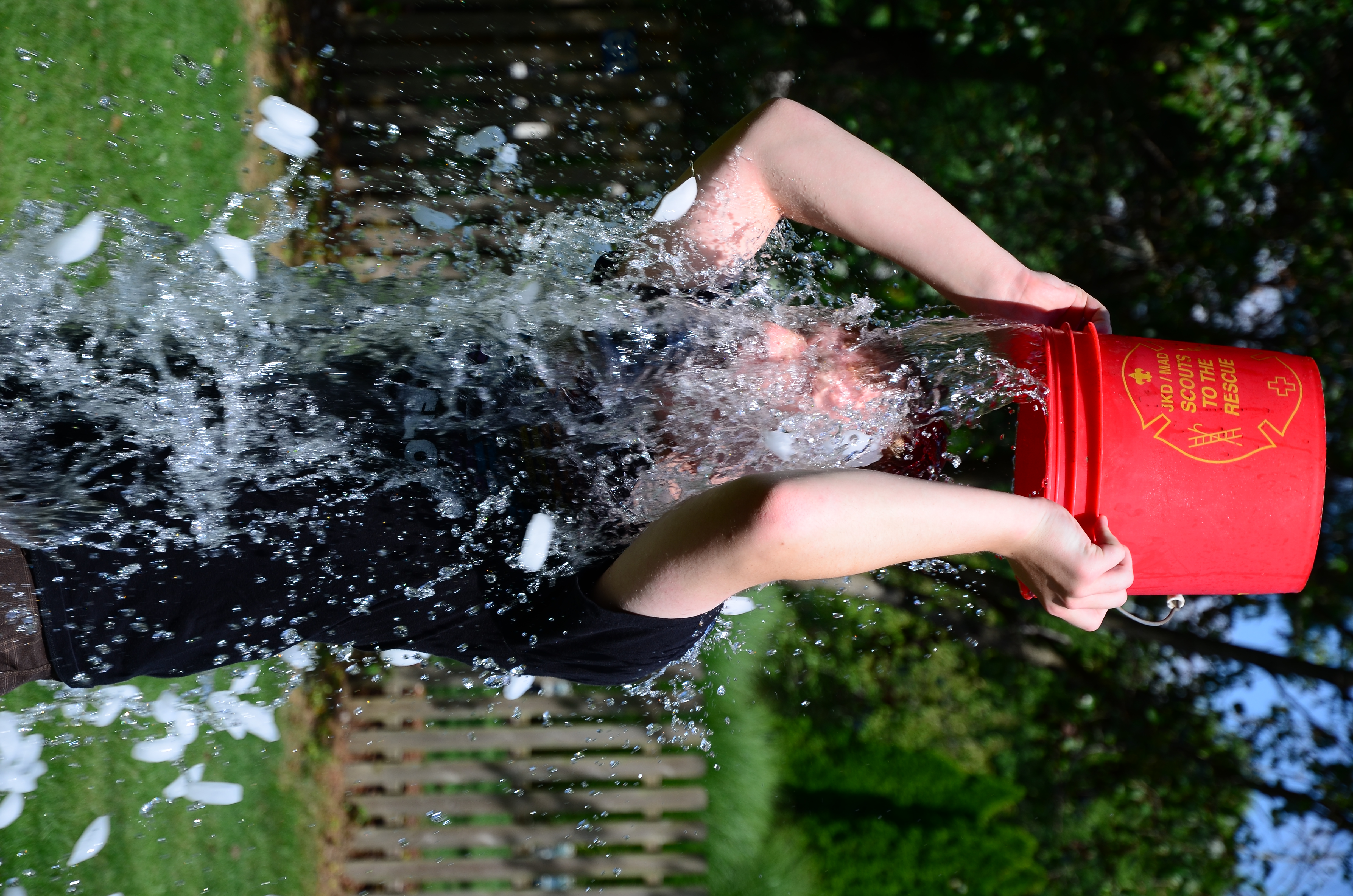
_-_Google_Art_Project.jpg)
.jpg)
.jpg)
_Mosaic.jpg)
- Reason
- A perfect set of images taken from foggy surroundings
- Articles in which this image appears
- Fog
- FP category for this image
- Wikipedia:Featured pictures/Natural phenomena/Weather and/or Wikipedia:Featured pictures/Places/Landscapes
- Support as nominator – The herald 07:42, 28 September 2014 (UTC)
- Oppose. These are not a set in any coherent way. Not a useful nomination. If you want to nominate some of these individually, fine, but "here are some nice pictures of fog" is not helpful. J Milburn (talk) 09:21, 28 September 2014 (UTC)
- Oppose per J. If you're interested in nominating sets, that's good. But please look at previous sets to see what is expected of them. — Crisco 1492 (talk) 11:01, 28 September 2014 (UTC)
- Alright, gonna try J..The herald 13:41, 28 September 2014 (UTC)
Not Promoted --The herald 13:42, 28 September 2014 (UTC)
- Withdrawn as nominator The herald 13:42, 28 September 2014 (UTC)
Voting period is over. Please don't add any new votes. Voting period ends on 10 Sep 2014 at 18:45:18 (UTC)


- Reason
- High quality image about a notable hamburger = high EV.
- Articles in which this image appears
- Big Mac (most EV), Hamburger, +3 other
- FP category for this image
- Wikipedia:Featured pictures/Food and drink
- Creator
- Evan-Amos
- Support alt as nominator – Armbrust The Homunculus 18:45, 31 August 2014 (UTC)
- Comment I'm slightly worried this might look better than the hamburger really is. Any information about how much manipulation of the burger happened? Adam Cuerden (talk) 18:58, 31 August 2014 (UTC)
- It looks pretty realistic to me. It looks fairly 'pristine' and probably re-arranged slightly for better presentation (but only in the same way we generally try to present a landscape accurately but in favourable lighting conditions when possible). In terms of the ingredients and their texture, it looks authentic to me. I'm wondering though how he managed to get the burger from the restaurant to a studio set up before the cheese congealed! It looks reasonably fresh. Anyway, this is all just educated guesswork. I'd also be interested to know what manipulation (both digital and physical) took place to present the burger like this. Ðiliff «» (Talk) 21:38, 31 August 2014 (UTC)
- Comment - First off, I can't be the only one who feels uncomfortable looking this sandwich. Maybe its from watching Supersize Me one too many times. Also, I notice brown specks around the sandwich on the bottom left corner of it. Are they crumb bits or the sort? GamerPro64 22:03, 31 August 2014 (UTC)
- Comment - I agree that there is something (or things) off-putting about the photo, but it's hard to diagnose. I think part of it is the way the middle bun hangs downward and confuses the viewer's perspective, suggesting that the burger is much closer the camera/viewer than it actually was. Another factor that might contribute to the in-your-face quality of the picture is the very tight, front-and-center cropping. Just as an experiment, I uploaded an edit that expands the space around the burger by increasing canvas size 125%. I also moved the burger slightly downward in the hopes that this composition might feel more natural (see the many featured pictures of foodstuffs by User:Fir0002) Tokugawapants (talk) 06:25, 1 September 2014 (UTC)
- Weak support alt - I've considered this several times, but ultimately I keep falling back to the idea that a good picture of food has some context (i.e. is not a cutout). Of our woefully underpopulated category, my favourite is easily File:Various grains.jpg. It is clear, well defined, yet also provides a little context. That being said, this is a very good shot of a Big Mac, and he must have had a friendly server to not get the mishmash I always end up with. — Crisco 1492 (talk) 01:44, 1 September 2014 (UTC)
- Comment - I went back and made some minor edits to the picture. My editing has changed a lot since then, but I just did some minor cleanup. For those wondering about this picture, it's just a plain Big Mac that I picked up explicitly to photograph. I asked for the cheese to be separate, so I would be able to move stuff around on the burger. The cheese normally acts as glue that really prevents you from making it look good after you get it. To prep the Big Mac for photos, I just rearranged the contents so it was pulled toward the front edge. You do this so you can actually see the contents clearly, otherwise it gets buried by the bun. When it's set, I just add the cheese to it and shoot. Evan-Amos (talk) 05:38, 1 September 2014 (UTC)
- Very interesting, thanks for sharing. :) — Crisco 1492 (talk) 06:34, 1 September 2014 (UTC)
- Indeed. Thank you! Adam Cuerden (talk) 09:58, 1 September 2014 (UTC)
- Isn't moving the ingredients towards the front artificially inflating the perceived size? ("The cheese normally acts as glue" [dreamy look] Mmmmmm, glue.) Belle (talk) 12:45, 1 September 2014 (UTC)
- Probably one of the reasons the image ended up here. — Crisco 1492 (talk) 16:00, 1 September 2014 (UTC)
- Support either. I'm not sure how you could put a Big Mac in its proper context. In it's cardboard box? Sitting on a McDonalds tray in a restaurant? Either way, you might have better context but you'd have a much poorer view of the Big Mac itself... Ðiliff «» (Talk) 09:52, 1 September 2014 (UTC)
- Half-eaten next to an overflowing bin in the street with a single sliced pickle next it being sniffed disdainfully by a stray dog. That's how I normally see them. Belle (talk) 12:45, 1 September 2014 (UTC)
- In the interests of encyclopaedic accuracy, do you suggest we investigate high street bins searching for the most authoritatively presented Big Mac we can find? ;-) Ðiliff «» (Talk) 14:09, 1 September 2014 (UTC)
- When I tried reproducing this (the results were nowhere near satisfactory, and I didn't go to the extent Evan did) I tried positioning the BM on top its box, with a white wall behind it. Perhaps not as colorfully contextual as a dumpster (*wink*), but it goes well with the impersonal McD persona. — Crisco 1492 (talk) 15:58, 1 September 2014 (UTC)
- In the interests of encyclopaedic accuracy, do you suggest we investigate high street bins searching for the most authoritatively presented Big Mac we can find? ;-) Ðiliff «» (Talk) 14:09, 1 September 2014 (UTC)
- Support either, prefer alt. I think I'd have preferred a shadow, instead of a full cutout, but I reckon this'll do nicely. Adam Cuerden (talk) 09:58, 1 September 2014 (UTC)
- Support either Nice, especially since food is quite rarely nominated here. Brandmeistertalk 11:48, 1 September 2014 (UTC)
- Support alt - While both images are pretty good in their own right, the alt comes off as less off putting to me. GamerPro64 15:03, 1 September 2014 (UTC)
- Oppose until clarified Is this a real Big Mac, or is it some form of "substitute" made to be photographed? I've never seen one looking like that (i.e. cleanly and well arranged) in any MacD place I've ordered one, anywhere in the world... ;-) --Janke | Talk 08:27, 2 September 2014 (UTC)
- See the photographer's comments above. Belle (talk) 08:43, 2 September 2014 (UTC)
- Indeed. I think myself and the nominator were the only ones who !voted before the clarification was made. — Crisco 1492 (talk) 09:36, 2 September 2014 (UTC)
- As I understand it, the photographer used only the real ingredients but strived to photograph it in an ideal state, rather than as typically prepared and served by a pimply-faced teenager who wishes he was somewhere else. I don't think that's necessarily any different to (to use another photographic example) going out and taking a photo of the most pristine flower or the butterfly with the least tattered wings, taking a photo of a landscape on a sunny day with blue sky as opposed to overcast and flat, or something like that. It's not misrepresenting reality necessarily, it's just trying to get the most aesthetic view of the subject. But whether that makes it representative, well that's a matter of debate. As photographers, I think we naturally lean towards aesthetics, but I can see both sides of this. Ðiliff «» (Talk) 12:16, 2 September 2014 (UTC)
- Indeed. I think myself and the nominator were the only ones who !voted before the clarification was made. — Crisco 1492 (talk) 09:36, 2 September 2014 (UTC)
- See the photographer's comments above. Belle (talk) 08:43, 2 September 2014 (UTC)
- Oppose. I share Diliff's worries, here. I'm not particularly keen on striving to display this in a positive way. J Milburn (talk) 20:02, 2 September 2014 (UTC)
- As opposed to...? Landscapes? Other products? A whopper (which, BTW, we really need a better picture of)? — Crisco 1492 (talk) 23:46, 2 September 2014 (UTC)
- There seems to be a kind of bias among a lot of commenters against attempting to display something which is 1) a commercial product and 2) generally regarded as distasteful in a professional light (which reflects positively on an object with a negative connotation). FP regularly prefers sites popular with tourists devoid of people, plants which in peak bloom and virgin condition, household products which look fresh out of the catalog, and many others. While I think this could be taken too far (look at how McDonalds photographs the Big Mac) this particular image strikes me as being along the same lines as many others which we have passed before - balancing between honesty and professional. As a follow-up, here's some featured salad. That's a lot nicer than I generally plate one, and probably a lot more aesthetic than when you do it, too (if it's not, by all means please have me over for dinner). But no one was terribly upset about that. 24.222.214.125 (talk) 01:50, 3 September 2014 (UTC)
- I agree, but I think I see where the problem is: the Big Mac is instantly recognizable as belonging to a particular entity, is still available for sale (and heavily promoted), and is synonymous with junk food. The first two make the commercial value of featuring such an image on par with a current video game, film, or TV series (i.e. conceivably affecting the company's bottom line), while the third is a matter of prejudice. That being said, I firmly believe that we should judge the image itself, in all cases, rather than any possible commercial/promotional effect. I mean, File:ULPower UL260i.jpg is straight from the company's advertising material, but there were no complaints when it was nominated. Reviewers let the image speak for itself. — Crisco 1492 (talk) 02:30, 3 September 2014 (UTC)
- Agreed also. I think it's necessary to leave ideology at the door when participating in FPC. Obviously we don't want to overtly support a company's product, but the image is a long way from anything that we would normally considered promotional. We've established that it's presented better than is normally the case by a worker at a McDonalds restaurant, but it's clearly not the kind of photo normally seen in advertising either and I cannot really conceive that McDonalds would benefit from, or indeed desire for us to feature an image of its signature burger in this manner. Ðiliff «» (Talk) 02:42, 3 September 2014 (UTC)
- I agree, but I think I see where the problem is: the Big Mac is instantly recognizable as belonging to a particular entity, is still available for sale (and heavily promoted), and is synonymous with junk food. The first two make the commercial value of featuring such an image on par with a current video game, film, or TV series (i.e. conceivably affecting the company's bottom line), while the third is a matter of prejudice. That being said, I firmly believe that we should judge the image itself, in all cases, rather than any possible commercial/promotional effect. I mean, File:ULPower UL260i.jpg is straight from the company's advertising material, but there were no complaints when it was nominated. Reviewers let the image speak for itself. — Crisco 1492 (talk) 02:30, 3 September 2014 (UTC)
- There seems to be a kind of bias among a lot of commenters against attempting to display something which is 1) a commercial product and 2) generally regarded as distasteful in a professional light (which reflects positively on an object with a negative connotation). FP regularly prefers sites popular with tourists devoid of people, plants which in peak bloom and virgin condition, household products which look fresh out of the catalog, and many others. While I think this could be taken too far (look at how McDonalds photographs the Big Mac) this particular image strikes me as being along the same lines as many others which we have passed before - balancing between honesty and professional. As a follow-up, here's some featured salad. That's a lot nicer than I generally plate one, and probably a lot more aesthetic than when you do it, too (if it's not, by all means please have me over for dinner). But no one was terribly upset about that. 24.222.214.125 (talk) 01:50, 3 September 2014 (UTC)
- As opposed to...? Landscapes? Other products? A whopper (which, BTW, we really need a better picture of)? — Crisco 1492 (talk) 23:46, 2 September 2014 (UTC)
- Support either, prefer alt. It's nicely done. Rreagan007 (talk) 19:48, 3 September 2014 (UTC)
- I'm getting sick just looking at it. Sca (talk) 13:39, 4 September 2014 (UTC)
- Oppose I think the fact that it has been arranged in such a way as to make it appear more substantial makes it a poor representation of the subject (It's like a push-up bra for burgers) Belle (talk) 01:46, 6 September 2014 (UTC)
- Ma'am, I believe this is the storage container you are looking for. — Crisco 1492 (talk) 11:44, 6 September 2014 (UTC)
- I want one; the only drawbacks for me are that I don't eat meat and already have the bra filled Belle (talk) 23:15, 6 September 2014 (UTC)
- Ma'am, I believe this is the storage container you are looking for. — Crisco 1492 (talk) 11:44, 6 September 2014 (UTC)
- Comment. I think it is a fair and reasonable depiction of a Big Mac. OK, so often they come out a bit more squashed than this, but you could say the same about a picture of a piece of fruit, or a flower, or whatever. Often the ones you buy or see are not as perfect as the pretty picture. The best ones are obviously going to be chosen to be photographed (normally). 109.147.185.178 (talk) 22:56, 7 September 2014 (UTC)
- Oppose I don't like that things were pulled to the edge. To me an ideal pic would have a cross section view alongside the original unmodified one --Muhammad(talk) 08:54, 9 September 2014 (UTC)
- Comment: I agree with Muhammad above that a cross-sectional approach, as is regularly employed with fruit FPs, would probably be better at faithfully representing the subject. --Paul_012 (talk) 16:01, 16 September 2014 (UTC)
- Closing note -- Well, I am not sure why the nomination is still not closed. I can see 6 support alt. and hence, just make it go. Armbrust, Adam Cuerden,Brandmeister, GamerPro64, Rreagan007 and Diliff crosses the threshold. But 4 opposes(when they say it, they say it to both) and Crisco have weak support of alt. That's 59% support (6.5/11), below par of 80% consensus. The herald 02:29, 29 September 2014 (UTC)
Not Promoted --The herald 02:30, 29 September 2014 (UTC)
- Not enough consensus The herald 02:30, 29 September 2014 (UTC)
- If you're going to close, especially a contested nomination like this one, you should probably be aware the consensus is in fact usually regarded as 2/3rds. In this case, the percentage is below in either case so to some extent it's a non-issue. But be cognizant of how the project is run. It was likely not closed promptly because it is rather close. 24.222.214.125 (talk) 04:30, 29 September 2014 (UTC)
- I am not sure with what you say. Are you saying that it must be considered as a close much before officially closing it? Then in that case, I don't think I am wrong. Neither consensus nor votes can pass this nomination and hence its better to be closed officially.. The herald 12:26, 30 September 2014 (UTC)
- What I'm saying is that you should take time to review the closing rules before actually closing nominations. While the closure here is, in my opinion, correct not knowing what consensus for passing is (80% vs 66%) is a pretty major oversight. 24.222.214.125 (talk) 15:35, 30 September 2014 (UTC)
- I am not sure with what you say. Are you saying that it must be considered as a close much before officially closing it? Then in that case, I don't think I am wrong. Neither consensus nor votes can pass this nomination and hence its better to be closed officially.. The herald 12:26, 30 September 2014 (UTC)
Voting period is over. Please don't add any new votes. Voting period ends on 29 Sep 2014 at 02:48:36 (UTC)

- Reason
- A rather striking, albeit simple, recruitment poster from WWI. Such posters tended to be a little over the top. There are prettier ones, but this one is widely in use. Part of my work on Operation Great War Centennial.
- Articles in which this image appears
- In no particular order: Bombardment of Yarmouth and Lowestoft, Civil defense, German strategic bombing during World War I, God Save the Queen, History of the United Kingdom during World War I, Recruitment to the British Army during the First World War, Zeppelin
- FP category for this image
- Wikipedia:Featured pictures/History/World War I
- Creator
- Publicity Department, Central Recruiting Depot. Restoration by Adam Cuerden.
- Support as nominator – Adam Cuerden (talk) 02:48, 19 September 2014 (UTC)
- Support - Nice clear-cut scan. Great restoration as well. Étienne Dolet (talk) 04:48, 19 September 2014 (UTC)
- Support - Solid restoration.--Godot13 (talk) 05:08, 19 September 2014 (UTC)
- Support - Fantastic. Though I think the Blitzed Brits would have been happier with blimps than bombers. — Crisco 1492 (talk) 10:06, 19 September 2014 (UTC)
- Support — Interesting bit of (attempted) wartime psychology. High historical EV. Sca (talk) 14:15, 19 September 2014 (UTC)
- Question There is a yellow taint in the upper part of the white frame. Is that intentional? -- Slaunger (talk) 22:26, 20 September 2014 (UTC)
- If it's what I think you're looking at, it appeared to be ink, so I left it. I think they were using yellow ink to modify the blues/greens. Adam Cuerden (talk) 23:39, 20 September 2014 (UTC)
- Well, some of it is ink, yes, but there is also a tendency of a more yellow gradient cast in the upper parts of the image as if it was a bit bleached by light over the years or so. Nothing serious though, just an observation. -- Slaunger (talk) 09:17, 21 September 2014 (UTC)
- I'm having trouble seeing it, to be honest. Any comparison that'd make it easy to notice? Adam Cuerden (talk) 09:21, 21 September 2014 (UTC)
- For me it is quite evident by just looking at the preview in the nom page. But nevermind, it is not a serious issue at all. -- Slaunger (talk) 09:34, 21 September 2014 (UTC)
- Oh, right. I think that's somewhat more of a lightness/darkness issue than a saturation issue. The LoC scans are done with a book scanner, I believe, which don't help matters. If it's not that visible, I think I might leave it, particularly given how much of the green border on the left and top had to be reconstructed (see TIFF/LoC link), which could throw attempts to do subtle tweaks off. Thoough there is one thing I could try... let me load this up. Adam Cuerden (talk) 10:28, 21 September 2014 (UTC)
- @Slaunger: Think that worked. Used the hue-saturation tool with the select tools to get a bit of selectivity. How's it look now? Adam Cuerden (talk) 11:00, 21 September 2014 (UTC)
- It is a subtle edit, but I do notice the improvement. Thanks for investing your time in it. -- Slaunger (talk) 11:52, 21 September 2014 (UTC)
- No worries! I just had to figure out a good way to do it, given I didn't want the reconstructed green outer borders to change. (They're partially made by flipping borders from other sides, so are about the right colour already. Adam Cuerden (talk) 12:04, 21 September 2014 (UTC)
- It is a subtle edit, but I do notice the improvement. Thanks for investing your time in it. -- Slaunger (talk) 11:52, 21 September 2014 (UTC)
- @Slaunger: Think that worked. Used the hue-saturation tool with the select tools to get a bit of selectivity. How's it look now? Adam Cuerden (talk) 11:00, 21 September 2014 (UTC)
- Oh, right. I think that's somewhat more of a lightness/darkness issue than a saturation issue. The LoC scans are done with a book scanner, I believe, which don't help matters. If it's not that visible, I think I might leave it, particularly given how much of the green border on the left and top had to be reconstructed (see TIFF/LoC link), which could throw attempts to do subtle tweaks off. Thoough there is one thing I could try... let me load this up. Adam Cuerden (talk) 10:28, 21 September 2014 (UTC)
- For me it is quite evident by just looking at the preview in the nom page. But nevermind, it is not a serious issue at all. -- Slaunger (talk) 09:34, 21 September 2014 (UTC)
- I'm having trouble seeing it, to be honest. Any comparison that'd make it easy to notice? Adam Cuerden (talk) 09:21, 21 September 2014 (UTC)
- Well, some of it is ink, yes, but there is also a tendency of a more yellow gradient cast in the upper parts of the image as if it was a bit bleached by light over the years or so. Nothing serious though, just an observation. -- Slaunger (talk) 09:17, 21 September 2014 (UTC)
- If it's what I think you're looking at, it appeared to be ink, so I left it. I think they were using yellow ink to modify the blues/greens. Adam Cuerden (talk) 23:39, 20 September 2014 (UTC)
- Support Good restoration and high EV. -- Slaunger (talk) 09:17, 21 September 2014 (UTC)
- Support per nom. -- Alexf(talk) 14:19, 22 September 2014 (UTC)
- Support : per Slaunger. --JLPC (talk) 08:28, 27 September 2014 (UTC)
Promoted File:It is far better to face the bullets.jpg --Armbrust The Homunculus 02:49, 29 September 2014 (UTC)