Wikipedia:Featured picture candidates/September-2009
| Featured picture tools |
|---|
Please cut and paste new entries to the bottom of this page, creating a new monthly archive (by closing date) when necessary.

- Reason
- Another Denslow illustration of a famous nursery rhyme. It turns out this rhyme has added encyclopedic value as an example of 1980s revisionism. Restored version of File:Black sheep Denslow.jpg.
- Articles this image appears in
- Baa, Baa, Black Sheep, William Wallace Denslow, Nursery_rhyme#Nursery_rhyme_revisionism, List of fictional sheep, Black sheep
- Creator
- William Wallace Denslow
- Support as nominator --Durova306 21:53, 24 August 2009 (UTC)
- Support Has tons of EV and no issues with the image. «l| Promethean ™|l» (talk) 22:27, 24 August 2009 (UTC)
- Support Great free use image for a highly known nursery rhyme. Staxringold talkcontribs 23:39, 24 August 2009 (UTC)
- Support Noodle snacks (talk) 07:47, 25 August 2009 (UTC)
- Support per nom. My god, Wikipedia has a list of fictional sheep. Spikebrennan (talk) 16:40, 25 August 2009 (UTC)
- Support. Great EV (5 articles!), beautiful restoration. Kaldari (talk) 22:21, 27 August 2009 (UTC)
- Support - Good encyclopedic value, interesting and visually appealing. –Juliancolton | Talk 18:48, 26 August 2009 (UTC)
Promoted File:The Black sheep illustrated by William Wallace Denslow.jpg --Makeemlighter (talk) 02:53, 1 September 2009 (UTC)


- Reason
- I have dozens of jumping spider photos that are technically far better than this one, but none of them come close to being as valuable. This photo is not for illustrating a particular jumping spider, but to illustrate the section on jumping spider courtship dances in the article jumping spider. Obviously the sharpness is not comparable to most other featured macro shots. For shooting jumping spiders (which are quite tiny) I usually have to open up to f/8 or so to avoid diffraction softening. In this case, however, it was important to get the legs in the focus plane (as they are an important part of the display) so I stopped down to f/13. At full res the diffraction softening is obvious, but IMO the trade-off was worth it and I would shoot it at the same aperture if I did it again. The other flaw is that there are 21 blown pixels on the leg and 5 in the eyes where the specular highlights are. There are no totally blown areas, however, just pixels, and otherwise the levels and curves are pretty nice. Since this was shot hand-held on an overcast day, obviously a strong flash was required (not to mention the fact that it's dancing). The primary selling point for this images is obviously it's encyclopedic value. The description of jumping spider courtship behavior needed a good photo and this one fits the bill nicely. There are only a handful of similar photographs on the internet and none that are free license.
- Articles this image appears in
- Jumping spider#Reproduction
- Creator
- Kaldari
- Support as nominator. You can also see the action from another angle. --Kaldari (talk) 20:32, 20 August 2009 (UTC)
- Regretful oppose While I appreciate the exceptions you brought up, IMO this is better suited at VPC. Actually, with a little of effort in image editing, the image could have been improved with software if you would've used less aperture and more flash. ZooFari 04:10, 21 August 2009 (UTC)
- Ah, I forgot about VPC (as most people do). Perhaps you're right that it would be better suited there. Can you explain a bit more about the "less aperture more flash". I'm always interested in learning more about photography. Kaldari (talk) 04:39, 21 August 2009 (UTC)
- Oops, I meant "More aperture more flash", I think. What lighting conditions did you take the pic in? ZooFari 04:43, 21 August 2009 (UTC)
- It was quite overcast. I was under the impression that opening the aperture always reduces depth of field. Is there a way around that? Kaldari (talk) 15:26, 21 August 2009 (UTC)
- New ring flash? Noodle snacks (talk) 07:03, 21 August 2009 (UTC)
- Ha, sharp eyes! Yep, finally upgraded to the Canon MT-24EX Macro Twin Lite Flash. It's a big improvement on the ring flash, IMO. Kaldari (talk) 15:26, 21 August 2009 (UTC)
- Oops, I meant "More aperture more flash", I think. What lighting conditions did you take the pic in? ZooFari 04:43, 21 August 2009 (UTC)
- Ah, I forgot about VPC (as most people do). Perhaps you're right that it would be better suited there. Can you explain a bit more about the "less aperture more flash". I'm always interested in learning more about photography. Kaldari (talk) 04:39, 21 August 2009 (UTC)
- Support Appreciate the difficulty, DOF is ok and so is sharpness. --Muhammad(talk) 11:00, 21 August 2009 (UTC)
- Oppose - great shot, but the front leg is either out of focus or in a motion blur. Jauerbackdude?/dude. 15:40, 21 August 2009 (UTC)
- The spider is only 1 cm long. To get the entire spider in focus, I would have had to have stopped the aperture down to f/16 or so which would have ruined the sharpness due to diffraction. I tried to choose the best trade-off between loosing sharpness and getting the spider in the focus plane. That said, if the front leg being out of focus is distracting to you, I suppose that is a valid objection. Kaldari (talk) 16:05, 21 August 2009 (UTC)
- Weak support You'd never have got that leg sharp with just another stop down. Clearly a good decision to go as far as f13 as any loss of minute detail is wholly mitigated by gains in overall pictorial value. It's a good angle and a fine illustration, only weak supporting in recognition of the high bug bar. --mikaultalk 22:41, 22 August 2009 (UTC) -edit- and I'm not a fan of those twin flash units... too many specular highs, very distracting...
- Weak Support per above. Noodle snacks (talk) 07:48, 25 August 2009 (UTC)
Oppose flipped image, inappropriately manipulated. In my opinion definately relevent in this case as someone examining - and say using it in a school paper - would be likely to refer to the "left" or "right" legs. Guest9999 (talk) 17:32, 26 August 2009 (UTC)Striking oppose (image unflipped). Guest9999 (talk) 00:25, 27 August 2009 (UTC)- Hmm, that's an interesting oppose. Since jumping spiders are bilaterally symmetrical, I wouldn't think it would be an issue. Kaldari (talk) 22:27, 26 August 2009 (UTC)
- I didn't notice that. You could always just flip it back and place a left in the image syntax. Noodle snacks (talk) 23:23, 26 August 2009 (UTC)
- Unflipped. Kaldari (talk) 23:37, 26 August 2009 (UTC)
- I didn't notice that. You could always just flip it back and place a left in the image syntax. Noodle snacks (talk) 23:23, 26 August 2009 (UTC)
- Hmm, that's an interesting oppose. Since jumping spiders are bilaterally symmetrical, I wouldn't think it would be an issue. Kaldari (talk) 22:27, 26 August 2009 (UTC)
- Question Kaldari, do you have the exact original (no RAW though)? Or is it the first version you uploaded? ZooFari 23:44, 26 August 2009 (UTC)
- I have the RAW and an original higher-res JPEG. The version that was uploaded was downsampled, noise-reduced, and sharpened. Kaldari (talk) 23:47, 26 August 2009 (UTC)
- Would you by any chance be willing to upload it or email it to me? Just to take a look. I might be able to do some tweaks to the version open for voting, but I would like to see the work you've done so far first. ZooFari 00:09, 27 August 2009 (UTC)
- Sure, just send me your email address. Kaldari (talk) 21:36, 27 August 2009 (UTC)
- Would you by any chance be willing to upload it or email it to me? Just to take a look. I might be able to do some tweaks to the version open for voting, but I would like to see the work you've done so far first. ZooFari 00:09, 27 August 2009 (UTC)
- I have the RAW and an original higher-res JPEG. The version that was uploaded was downsampled, noise-reduced, and sharpened. Kaldari (talk) 23:47, 26 August 2009 (UTC)
Suspended for editing. Could also close if preferred, and you can nominate the new version later, but I don't want to discourage work being done on an image by a hasty "no quorum" close. Shoemaker's Holiday Over 201 FCs served 00:36, 29 August 2009 (UTC)
- Edit now done so I'm Unsuspending. Zoofari could you strike your previous vote please since you've now voted twice? Also renamed edit from Alt to Edit per conventions (an alt is a completely different image). Note: I'm just putting this back to the 'decision time' section - if you want to run it right from the top again, go ahead but I don't think it needs it. --jjron (talk) 07:21, 29 August 2009 (UTC)
- Support alt see the thumb for changes. I'm not a wizard so I couldn't bring the leg into focus :-( ZooFari 05:05, 29 August 2009 (UTC)
- I appreciate the effort, but I have to say I prefer the original. The alt is over-sharpened - the areas where the hairs overlap the background are quite noisey for example. Also, all of the white areas are blown in the alt, so there is actually less detail rather than more. As you said, it would take a wizard to fix it (without being able to focus-stack), so maybe it's just not good enough to feature. Kaldari (talk) 16:38, 29 August 2009 (UTC)
Promoted File:Phidippus clarus courtship edit.jpg --Pmlineditor Talk 14:55, 31 August 2009 (UTC)
- Why was the edit promoted? Have you read the discussion? Kaldari (talk) 15:18, 31 August 2009 (UTC)
- Yes, I have read it. I believe there is sufficient consensus to promote this one. The majority of the votes are support and I see no reason not to promote. If you oppose this, please nominate for delisting. Pmlineditor Talk 15:22, 31 August 2009 (UTC)
- There is only one editor in favor of the edit (Zoofari) and two against it (myself and Jauerback), whereas the original version has four editors in favor (Muhammad, mikaul, Noodle snacks, and myself) and two opposed (Jauerback and Zoofari). Additionally, the problems with the edit were detailed in the discussion - over-sharpening and blown highlights - without response. How can that be viewed as consensus? Kaldari (talk) 15:38, 31 August 2009 (UTC)
- I see. Can you please go for a delisting (or something else)? Pmlineditor Talk 15:57, 31 August 2009 (UTC)
- Why jump through extra hoops here? You made a clear mistake, just rectify it. No need to go through a delisting process here. --Dschwen 16:33, 31 August 2009 (UTC)
- Ok. :( Pmlineditor Talk 16:46, 31 August 2009 (UTC)
- Turn that frown upside down! There is no shame here. Mistakes happen, fortunately most of them are easy to fix. --Dschwen 18:33, 31 August 2009 (UTC)
- Ok. :( Pmlineditor Talk 16:46, 31 August 2009 (UTC)
- Why jump through extra hoops here? You made a clear mistake, just rectify it. No need to go through a delisting process here. --Dschwen 16:33, 31 August 2009 (UTC)
- I see. Can you please go for a delisting (or something else)? Pmlineditor Talk 15:57, 31 August 2009 (UTC)
- There is only one editor in favor of the edit (Zoofari) and two against it (myself and Jauerback), whereas the original version has four editors in favor (Muhammad, mikaul, Noodle snacks, and myself) and two opposed (Jauerback and Zoofari). Additionally, the problems with the edit were detailed in the discussion - over-sharpening and blown highlights - without response. How can that be viewed as consensus? Kaldari (talk) 15:38, 31 August 2009 (UTC)
- Yes, I have read it. I believe there is sufficient consensus to promote this one. The majority of the votes are support and I see no reason not to promote. If you oppose this, please nominate for delisting. Pmlineditor Talk 15:22, 31 August 2009 (UTC)
Not promoted - no consensus. My apologies for this but this is the best I can make of this now. We were leaving it open to give the edit some time, but we have been pre-empted and I suppose must now make a decision. I would tend to encourage a renomination (or alternative decision here). --jjron (talk) 08:24, 1 September 2009 (UTC)
- I think that decision is correct. There really wasn't any kind of consensus. Kaldari (talk) 14:47, 1 September 2009 (UTC)
- Thank you. That's a generous attitude and quite a vote of confidence given that it meant your image went from being promoted in some form to not being promoted. That type of 'good sportsmanship' can be lacking here at times. --jjron (talk) 04:30, 2 September 2009 (UTC)

- Reason
- High quality and good EV
- Articles this image appears in
- Magpie-lark
- Creator
- Fir0002
- Support as nominator --Fir0002 10:38, 26 August 2009 (UTC)
- Support probably should have been more hasty uploading a similar picture I had from Canberra. Well done. Noodle snacks (talk) 12:34, 26 August 2009 (UTC)
- That one wasn't of a female was it? The one we have in the taxobox at the moment is awful. Sabine's Sunbird talk 19:21, 27 August 2009 (UTC)
- Good question, I'll have a look later. Noodle snacks (talk) 02:52, 28 August 2009 (UTC)
- Support Australia has wonderful birds. Durova306 18:42, 26 August 2009 (UTC)
- Support, looks great. –Juliancolton | Talk 18:44, 26 August 2009 (UTC)
- Support Staxringold talkcontribs 22:53, 26 August 2009 (UTC)
- Oh, yeah, Support also. Sabine's Sunbird talk 22:33, 27 August 2009 (UTC)
- Oppose The prominent railing the bird is sitting on is distracting. Given that these birds are very common, the composition counts against this photo. Nick-D (talk) 10:32, 28 August 2009 (UTC)
- I disagree that it's distracting. In fact, I think it's an interesting aspect to the shot. –Juliancolton | Talk 23:27, 30 August 2009 (UTC)
- Support. Given these birds are "...common and very widespread bird both in urban and rural areas", I don't think it's inappropriate for it to be sitting on a rail in a suburban garden, as it is part of the representative environment and possibly even adds to EV. Diliff | (Talk) (Contribs) 08:15, 29 August 2009 (UTC)
Promoted File:Male magpie lark in suburban garden.jpg --jjron (talk) 08:35, 1 September 2009 (UTC)

- Support as nominator --Fir0002 10:38, 26 August 2009 (UTC)
- Question Wasn't there a FP as the taxobox image before this one? --Muhammad(talk) 10:51, 26 August 2009 (UTC)
- I think it was this one some time ago.
- Support Good quality and isolation. The ones I saw grew so closely together I couldn't get just a single one --Muhammad(talk) 10:56, 26 August 2009 (UTC)
- You gotta break some
eggssunflowers to make anomletteFP ;-). --Dschwen 14:45, 26 August 2009 (UTC)- Hehe, I was in someone's farm though. Didn't want to get the villagers angry :) --Muhammad(talk) 15:59, 26 August 2009 (UTC)
- Would they have chased you with pitchforks? --Dschwen 21:44, 26 August 2009 (UTC)
- Didn't see any pitchforks but jembes were accessible. --Muhammad(talk) 08:34, 27 August 2009 (UTC)
- Would they have chased you with pitchforks? --Dschwen 21:44, 26 August 2009 (UTC)
- Hehe, I was in someone's farm though. Didn't want to get the villagers angry :) --Muhammad(talk) 15:59, 26 August 2009 (UTC)
- You gotta break some
- Comment Size ref? Spikebrennan (talk) 17:33, 26 August 2009 (UTC)
- Inner diameter (excluding petals) is approx 15cm --Fir0002 13:45, 27 August 2009 (UTC)
- While a scale in the image would be ideal, I'd be happy with a mention of this in the image page or the image caption. Spikebrennan (talk) 15:17, 27 August 2009 (UTC)
- Entirely disagree. Unless the scale of the object is unusual or exceptional to the extent that it is necessary for the illustration (for example if this was an image of the a world record sunflower) then it is inappropriate to include a scale bar. It's all the more inappropriate where the scale is not precise but a mere approximation. At any rate, I've updated the caption --Fir0002 06:45, 28 August 2009 (UTC)
- While a scale in the image would be ideal, I'd be happy with a mention of this in the image page or the image caption. Spikebrennan (talk) 15:17, 27 August 2009 (UTC)
- Inner diameter (excluding petals) is approx 15cm --Fir0002 13:45, 27 August 2009 (UTC)
- Support Very nice quality and excellent EV. Makeemlighter (talk) 07:38, 30 August 2009 (UTC)
- Support per the above. Ks0stm (T•C) 20:51, 30 August 2009 (UTC)
Promoted File:Sunflower sky backdrop.jpg --jjron (talk) 08:34, 1 September 2009 (UTC)

- Support as nominator --Fir0002 10:38, 26 August 2009 (UTC)
- Comment Lighting seems very harsh --Muhammad(talk) 10:50, 26 August 2009 (UTC)
- Lighting is fine for me, and you must of been way across the room with a 150mm lens for this. You have swiped the top of the right cabbage with a white paint brush though, and the white balance varies between the two images. The shadow on the RHS image is very blue. Noodle snacks (talk) 11:54, 26 August 2009 (UTC)
- No paint brush swipe - I did some selective levels to that section to brighten some grey shadows which must have caused it (feather effects). And yeah you're right there does look like a minor variation in WB. I'll do a reprocess probably tmrw. --Fir0002 14:01, 27 August 2009 (UTC)
- Fixed --Fir0002 06:45, 28 August 2009 (UTC)
- No paint brush swipe - I did some selective levels to that section to brighten some grey shadows which must have caused it (feather effects). And yeah you're right there does look like a minor variation in WB. I'll do a reprocess probably tmrw. --Fir0002 14:01, 27 August 2009 (UTC)
- Lighting is fine for me, and you must of been way across the room with a 150mm lens for this. You have swiped the top of the right cabbage with a white paint brush though, and the white balance varies between the two images. The shadow on the RHS image is very blue. Noodle snacks (talk) 11:54, 26 August 2009 (UTC)
- Comment Size ref or scale? Spikebrennan (talk) 17:33, 26 August 2009 (UTC)
- I think most people know how big cabbage is. Kaldari (talk) 21:21, 26 August 2009 (UTC)
- Why would they be looking in an encyclopedia for information about them if they knew things like that? I tend to look for things I don't know rather than read things I already know myself... Thus the viewers of this article may NOT know the size of a cabbage... Gazhiley (talk) 08:33, 27 August 2009 (UTC)
- Thirded. Papa Lima Whiskey (talk) 09:21, 27 August 2009 (UTC)
- Lol with all that discussion no one took the initiative to add the scale! Scale is approx 25cm in diameter (inner sphere) --Fir0002 14:01, 27 August 2009 (UTC)
- And who's going to do that, with the flood of self-nominations that you're subjecting us to? Papa Lima Whiskey (talk) 11:17, 31 August 2009 (UTC)
- Lol with all that discussion no one took the initiative to add the scale! Scale is approx 25cm in diameter (inner sphere) --Fir0002 14:01, 27 August 2009 (UTC)
- Thirded. Papa Lima Whiskey (talk) 09:21, 27 August 2009 (UTC)
- Why would they be looking in an encyclopedia for information about them if they knew things like that? I tend to look for things I don't know rather than read things I already know myself... Thus the viewers of this article may NOT know the size of a cabbage... Gazhiley (talk) 08:33, 27 August 2009 (UTC)
- There are many things that could be added to a picture that are not necessarily clear... Not all pictures require size ref. If we ask for every picture to have size ref then why not ask for colour reference, speed of the subject with respect to the viewer reference. We could add many others magnitudes that people could ask and not know from the picture but I'll refrain from that since many might be computed from the metadata of the picture. But even this is not at all obvious how to do. Franklin.vp 21:42, 27 August 2009 (UTC)
- Agreed. We don't need to clutter up the image with information that should be provided in the article text. Unless the subject is of a surprising scale, there is no reason to plaster a scale graphic onto the image. Kaldari (talk) 21:58, 27 August 2009 (UTC)
- I think most people know how big cabbage is. Kaldari (talk) 21:21, 26 August 2009 (UTC)
- Support btw. cannot see the blue that noodle refers to, and looks very good to me... Gazhiley (talk) 12:28, 27 August 2009 (UTC)
- Comment Is cabbage really that white? Makeemlighter (talk) 07:35, 30 August 2009 (UTC)
- Indeed they are - have you never had one? --Fir0002 13:08, 30 August 2009 (UTC)
- Only chopped up, and I usually don't pay much attention to the colors of the food I eat! Makeemlighter (talk) 16:00, 30 August 2009 (UTC)
- Indeed they are - have you never had one? --Fir0002 13:08, 30 August 2009 (UTC)
Not promoted --jjron (talk) 08:15, 1 September 2009 (UTC)

- Reason
- Renom of a previous attempt - comments there indicated a single image would be better
- Articles this image appears in
- Fleet Air Arm (RAN)
- Creator
- Fir0002
- Support as nominator --Fir0002 10:38, 26 August 2009 (UTC)
- Comment The angle is slightly unhappy because it leads to one of the rotors overlapping the tail as well as
overunderexposure of large parts of the underside and sides - the farther landing skid has been reduced to a mere silhouette. This all leads to a snapshotty feel overall imo. Approaching the aerospace industry and military with requests for pictures may yield much better material than this. Papa Lima Whiskey (talk) 09:34, 27 August 2009 (UTC)- On the other hand the angle is slightly happy because it makes the object 3D rather than 2D-side-on-portrait. It's also from a top down rather than a overhead angle which elevates it from snapshot level IMO. I'm assuming you mean under exposure right? Still plenty of detail there - I'll run the standard suggestion of getting your monitor calibrated. If you don't believe me bump up the gamma or something in your image editor of choice. --Fir0002 13:52, 27 August 2009 (UTC)
- Support Great angle. The farther landing skid is not a problem even if underexposed since you can see perfectly the other one. Franklin.vp 15:28, 27 August 2009 (UTC)
- Support well done. Cacophony (talk) 04:09, 28 August 2009 (UTC)
- Support upstateNYerformerly wadester16 21:23, 30 August 2009 (UTC)
Promoted File:RAN squirrel helicopter at melb GP 08.jpg --jjron (talk) 08:34, 1 September 2009 (UTC)


- Reason
- Another renom - now sitting in an expanded article
- Articles this image appears in
- Chondropyga dorsalis
- Creator
- Fir0002
- Support as nominator --Fir0002 10:38, 26 August 2009 (UTC)
- Comment Size ref or scale? Spikebrennan (talk) 17:34, 26 August 2009 (UTC)
- Size is approx 25mm in length --Fir0002 13:46, 27 August 2009 (UTC)
- Not too fond of the blunt flash lighting. --Dschwen 02:32, 27 August 2009 (UTC)
- Blunt? I'm assuming you're not referring to the original? --Fir0002 13:46, 27 August 2009 (UTC)
- Oppose Atypical pose - it looks dead. Noodle snacks (talk) 12:04, 28 August 2009 (UTC)
- Not really - compare the Alt which was taken after the studio shot when it was already active (it flew off a few moments after this shot). --Fir0002 13:09, 30 August 2009 (UTC)
- Support Illustrates the subject well. Mostlyharmless (talk) 09:38, 31 August 2009 (UTC)
Not promoted --jjron (talk) 08:18, 1 September 2009 (UTC)


- Reason
- High quality and resolution image of significant EV and historical value, a US president and one of the greatest pitchers of all time shaking hands. Crop style was Durova's idea, I like it as it catches the full image and the feeling of the crowd whilst losing the intrusive barrier of the original.
- Articles this image appears in
- Calvin Coolidge, Walter Johnson, 1924 in baseball, Minnesota Twins, Sports diplomacy#Sports and politics in the United States
- Creator
- National Photo Company Collection, edited by Staxringold, Durova, and Shoemaker's Holiday.
- Support as nominator --Staxringold talkcontribs 00:40, 26 August 2009 (UTC)
- Comment I'm unsure about the crop... I see its purpose although I am slightly uneasy about losing some of the the bottom right. But, if we agree cropping is a good idea why did you choose to keep so much on the right and left? I don't have an answer to this, of course, but it's what came to mind when comparing to the original. I'm not sure it's the best crop for all of the articles, especially the two biographies. gren グレン 06:33, 26 August 2009 (UTC)
- The idea is to keep the feeling of a crowd, since that's where they are, while removing the obstructions. Staxringold talkcontribs 14:01, 26 August 2009 (UTC)
- What about something like Alt1? It still has a good amount of crowd but the aspect ratio isn't as severe. Kaldari (talk) 22:11, 27 August 2009 (UTC)
- Support Great EV. — Jake Wartenberg 01:47, 27 August 2009 (UTC)
- Support revised version. Staxringold and I discussed several possible crops and agreed this was the best solution. Minimizes the intrusive barrier on the original while retaining the handshake and crowd presence. Durova306 02:03, 27 August 2009 (UTC)
- Oppose alt one. Cuts off figures at both left and right. Loses sense of crowd, including appauding figure at far right and the dynamic diagonal slope from the upper background. A more typical crop isn't necessarily a better one. Durova306 00:45, 28 August 2009 (UTC)
- Support original, Oppose Alt as auxilliary dirtzapper. The crop is more typical, but seems to lose a lot of the dynamism of the original.
Plus the 1920s fashions visible in the crowd are an additional source of appeal. Shoemaker's Holiday Over 201 FCs served 03:34, 27 August 2009 (UTC)
- Comment This is one of those super cool pictures that I love seeing but hate voting
foron. I just don't see the EV for it. Maybe someone can explain it to me before I vote. Makeemlighter (talk) 07:30, 28 August 2009 (UTC)
- There's the biographical value showing what they look like, it shows the interrelationship of politics and sports in the US, it came after one of the lone bright spots in the history of the Washington Senators, and perhaps most important directly displays the friendship briefly mentioned in the Walter Johnson article ("A life-long Republican and friend of President Calvin Coolidge...") which will need to be far expanded for the article to properly reach FA status (but this image goes to that friendship). Staxringold talkcontribs 07:53, 28 August 2009 (UTC)
- Oh, I didn't see that about them being friends. That's interesting. Anyway, I think this picture would be best used for an article discussing the "American League diploma" mentioned in the image description. Unfortunately, I can't find any more information about that. Was it common for a president to present that to the team? Do we have any more info on this specific meeting between Johnson and Coolidge? Makeemlighter (talk) 11:11, 28 August 2009 (UTC)
- I have no information on that thing, though given that this photo is from 1925 and the Senators won the World Series (and thus the AL pennant) in 1924 and WJ won the League Award, it's probably something to do with one of those things. Staxringold talkcontribs 15:35, 28 August 2009 (UTC)
- Support Noodle snacks (talk) 12:05, 28 August 2009 (UTC)
Promoted File:Walter Johnson and Calvin Coolidge shake hands FINAL.jpg --jjron (talk) 08:34, 1 September 2009 (UTC)
Wikipedia:Featured picture candidates/File:Sarcophagid fly Portrait.jpg

- Reason
- This image is a high quality and unique painting of General of the Army Dwight D. Eisenhower by Nicodemus David Hufford III, which I believe meets the Featured Picture criteria. The image well illustrates Eisenhower as a General of the Army and Chief of Staff of the United States Army prior to his election to President.
- Articles this image appears in
- Supreme Headquarters Allied Powers Europe, Chief of Staff of the United States Army, 1952 Republican National Convention, Military career of Dwight D. Eisenhower, Commanders of World War II, Portal:United States Army/Selected biography, Portal:United States Army/Selected biography/3, Republican Party (United States) presidential primaries, 1952
- Creator
- Nicodemus David Hufford III

- Support as nominator --Abraham, B.S. (talk) 07:11, 25 August 2009 (UTC)
- Comment Is it just me or is this really yellow? Noodle snacks (talk) 07:57, 25 August 2009 (UTC)
- It doesn't really look yellow to me; just karki/brown uniform and skin coloured, well skin. ;-) Perhaps it is your monitor? Cheers, Abraham, B.S. (talk) 08:01, 25 August 2009 (UTC)
- Those colours arent right, unless we both have monitor problems--Childzy ¤ Talk 10:34, 25 August 2009 (UTC)
- I have lightened the image up as shown in Edit 1. How does it look now? Cheers, Abraham, B.S. (talk) 11:41, 25 August 2009 (UTC)
- Those colours arent right, unless we both have monitor problems--Childzy ¤ Talk 10:34, 25 August 2009 (UTC)
- It doesn't really look yellow to me; just karki/brown uniform and skin coloured, well skin. ;-) Perhaps it is your monitor? Cheers, Abraham, B.S. (talk) 08:01, 25 August 2009 (UTC)
- Comment. There are either a lot of JPEG artifacts, or strongly noticeable halftone pattering from a scan from a book, or perhaps both. Is there a better reproduction of this painting available? Spikebrennan (talk) 16:39, 25 August 2009 (UTC)
- Sadly, no. The others I have viewed are either limited in resolution, or are of poor quality. Cheers, Abraham, B.S. (talk) 08:38, 26 August 2009 (UTC)
- Oppose The halftone is enough to weaken support but it's hardly surprising that the colour is off given that this is a version of a scan of a book halftone of a photo of the original: a fourth generation copy. As with Chinese whispers, I'd be very surprised if this is how the original looks.--mikaultalk 21:19, 25 August 2009 (UTC)
- I think this one is probably closer, albeit cropped, to the original, in which case I still think this is a better copy. Will see if I can do anything with the image, though. Cheers, Abraham, B.S. (talk) 08:38, 26 August 2009 (UTC)
- Right, thanks for posting the link. The version we have here is clearly miles out (the blue of the badge on his shoulder is rendered almost mid-grey here) and I'm afraid attempting to correct it with this file is not going to be possible without introducing a load of noise and posterisation. It's a decent painting; deserves decent repro. --mikaultalk 10:51, 26 August 2009 (UTC)
- I think this one is probably closer, albeit cropped, to the original, in which case I still think this is a better copy. Will see if I can do anything with the image, though. Cheers, Abraham, B.S. (talk) 08:38, 26 August 2009 (UTC)
- Oppose per above. MER-C 08:10, 26 August 2009 (UTC)
- Oppose per above/myself. Noodle snacks (talk) 23:43, 26 August 2009 (UTC)
Not promoted --jjron (talk) 08:15, 1 September 2009 (UTC)

- Reason
- Quality+EV
- Articles this image appears in
- Castle of São Jorge and Lisbon
- Creator
- Massimo Catarinella
- Support as nominator --Massimo Catarinella (talk) 20:39, 27 August 2009 (UTC)
- Comment: I should say that this is not a picture of the castle, it is a picture of the houses next to it that manages to capture the whole castle. Sadly enough, cropping it, I think, either will eliminate some portion of the castle or make the picture ugly. I see that the castle has this sort of stairway that would be difficult to isolate from the houses if we want to include it in the picture. Except for this mistake of the composition, I think, for the Wikipedia purposes it is a good picture. Now it comes to my mind that maybe the houses are part of the castle. Maybe someone knowing about the Castle of São Jorge can explain this. If this is the case I have no objection about the picture. Franklin.vp 21:12, 27 August 2009 (UTC)
- The castle is located in a citadel, which is quite big as you can see in the picture (look for the wall above the houses). You can only access the castle by first entering the citadel. The entrance to the citadel is on the other side of the one shown in this picture. Before you arrive at the gate, you have to make your way through a residential neighborhood, which is built around the citadel as shown in the panorama. Since the castle, citadel and surroundings are so much woven into one another, I think it is best to show them all in one panorama. Also, the composition would be damaged if I would crop the picture otherwise. Some of you have expressed to see more of the surroundings as stated below at the nomination for the Jeronimos Monastery. I only found two good vantage points to take this picture from. One was where this one was taken from and the other one the top of the Santa Justa Elevator (use Google Maps and Street View).--Massimo Catarinella (talk) 21:44, 27 August 2009 (UTC)
- Support, however shouldn't this get added to Lisbon to completely use it's EV? As it stands the castle is but a small part of this image. Staxringold talkcontribs 21:01, 27 August 2009 (UTC)
- I couldn't find a good spot to insert it in the article of Lisbon, but if you know of one then please do so. --Massimo Catarinella (talk) 21:44, 27 August 2009 (UTC)
- Comment Is there nobody willing to cast their vote? --Massimo Catarinella (talk) 14:24, 30 August 2009 (UTC)
WeakSupport I agree that this should be added to Lisbon. It would have better EV there. Otherwise, great shot. Makeemlighter (talk) 16:10, 30 August 2009 (UTC)
- Full support due to placement in Lisbon article. Makeemlighter (talk) 16:01, 1 September 2009 (UTC)
- Comment I have also inserted the image in the Lisbon article as requested, after rearranging the history section. --17:42, 30 August 2009 (UTC)
Not promoted - no quorum. --jjron (talk) 07:36, 3 September 2009 (UTC)

- Reason
- Quite a striking illustration of the length of this animal. Yes part of the tail is partially obscured by some leaves which were in the way, but there wasn' much I could do about it and it doesn't detract much IMO. Good quality + good EV
- Articles this image appears in
- Lace Monitor
- Creator
- Fir0002
- Support as nominator --Fir0002 13:40, 27 August 2009 (UTC)
- Oppose Most of it is obscured and the angle isn't very illustrative. Compare to [1] or [2]. Noodle snacks (talk) 12:22, 28 August 2009 (UTC)
- Oppose. I think the fact that's significantly obscured behind the tree is enough. Many of the other images in the gallery of the article show that a better view of a Lace Monitor up a tree is quite possible. They're not as good technically, but they're better compositionally IMO. We should expect both good technicals and a good illustrative view of the animal. Diliff | (Talk) (Contribs) 20:58, 28 August 2009 (UTC)
- Oppose per Noodle snacks and Diliff. Papa Lima Whiskey (talk) 13:10, 29 August 2009 (UTC)
- Oppose - The bottom 1/3 or so is obscured by green bluriness. –Juliancolton | Talk 23:35, 30 August 2009 (UTC)
- Oppose. It's not hard to get a better illustration than this cut off image. Mostlyharmless (talk) 09:41, 31 August 2009 (UTC)
Not promoted --jjron (talk) 07:37, 3 September 2009 (UTC)

- Reason
- Good shot of an attractive small bird
- Articles this image appears in
- Rufous Whistler
- Creator
- Fir0002
- Support as nominator --Fir0002 13:38, 27 August 2009 (UTC)
- Support Haha, what a cute little guy. Assuming his feet aren't wildly unique (since they are hiding in this shot), great photo. Staxringold talkcontribs 15:16, 27 August 2009 (UTC)
- One foot is visible, it is just very similar in colour to the branch. Sabine's Sunbird talk 21:07, 27 August 2009 (UTC)
- Support - Sabine's Sunbird talk 21:07, 27 August 2009 (UTC)
- Support Excellent shot Gazhiley (talk) 12:53, 28 August 2009 (UTC)
- Oppose Buckets of direct flash is misrepresenting the plumage (compare to: [3]) and giving the bird steeleye. It is over-sharpened, probably in an attempt to mask the slightly out of focus head. Noodle snacks (talk) 05:50, 29 August 2009 (UTC)
Promoted File:Rufous whistler.jpg --jjron (talk) 07:48, 3 September 2009 (UTC)

- Reason
- Aesthetic composition of this bird on the beach with the ocean behind it
- Articles this image appears in
- Silver Gull
- Creator
- Fir0002
- Support as nominator --Fir0002 13:37, 27 August 2009 (UTC)
- Support Clean and simple. Staxringold talkcontribs 15:14, 27 August 2009 (UTC)
- Support Very nice composition --Massimo Catarinella (talk) 17:04, 27 August 2009 (UTC)
- Support Good composition, nice work! --Cj.samson (talk) 07:52, 28 August 2009 (UTC)
- Support Doing his little turn on the birdwalk, on the birdwalk, on the birdwalk yeah, he's doing his little turn on the birdwalk... yeah its friday afternoon and I'm looking at pictures of birds... excellent picture... Gazhiley (talk) 13:04, 28 August 2009 (UTC)
- Support Noodle snacks (talk) 08:48, 29 August 2009 (UTC)
- Support It looks like he was posing for you. Great shot! --Arustleund (talk) 19:18, 29 August 2009 (UTC)
- Support –Juliancolton | Talk 23:33, 30 August 2009 (UTC)
- Support As if my vote is really needed in this highly liked nomination, still though, great shot. Nezzadar (talk) 03:11, 2 September 2009 (UTC)
- Support --Avala (talk) 18:35, 2 September 2009 (UTC)
Promoted File:Silver gull jan 09.jpg --jjron (talk) 07:46, 3 September 2009 (UTC)

- Reason
- Good quality shot with good EV
- Articles this image appears in
- Brown Treecreeper
- Creator
- Fir0002
- Support as nominator --Fir0002 13:36, 27 August 2009 (UTC)
- Support As per nom. Gazhiley (talk) 13:04, 28 August 2009 (UTC)
- Support. Good action shot. Diliff | (Talk) (Contribs) 16:05, 29 August 2009 (UTC)
- Support –Juliancolton | Talk 23:28, 30 August 2009 (UTC)
Promoted File:Brown treecreeper jan09.jpg --jjron (talk) 07:46, 3 September 2009 (UTC)

- Reason
- High quality shot of an interesting insect showing its highly iridescent shell
- Articles this image appears in
- Beetle, Iridescence
- Creator
- Fir0002
- Support as nominator --Fir0002 13:34, 27 August 2009 (UTC)
- Comment The beetle looks funny on the white background, similar to the one below. During my few attempts to refrigerate arthropods for "studio shots" I noticed that before they got warmed up, they were in an unnatural position similar to this one, and only afterwards did they look natural, but it was usually too late to properly photograph it then. --Muhammad(talk) 14:53, 27 August 2009 (UTC)
- Comment Once more, with feeling... size ref or scale? Spikebrennan (talk) 15:11, 27 August 2009 (UTC)
- Approx 25mm --Fir0002 06:43, 28 August 2009 (UTC)
- Oppose Same as below - looks dead. Noodle snacks (talk) 12:07, 28 August 2009 (UTC)
- Support for EV in Iridescence. Makeemlighter (talk) 16:07, 1 September 2009 (UTC)
- Support: Good detail and I don't mind the white background. The pose doesn't look particularly "dead", but even if it did I'm not sure I would care about that, either. I'd like to see this in articles for the family, genus, and the species, so I just might work on those. Maedin\talk 07:06, 2 September 2009 (UTC)
- Support Who cares if it looks dead, it's illustrating iridescence. It meets the technical requirements, looks nice. I'll vote, why not? Nezzadar (talk) 19:48, 2 September 2009 (UTC)
- Oppose per my earlier comments and noodle. Ev for iriscidence is also limited as that article is filled with images. --Muhammad(talk) 22:55, 2 September 2009 (UTC)
- True, but I think it's valuable as an example of biological iridescence. The other images don't show that quite as well. The one that's an FP is certainly excellent, but I'm not sure it has as much EV for this topic as the current nom. Makeemlighter (talk) 02:25, 3 September 2009 (UTC)
Not promoted - no consensus. --jjron (talk) 07:37, 3 September 2009 (UTC)

- Reason
- Really detailed, adds enc to a number of articles. 3.5:1 magnification. Handheld, all natural light ;). Compliments the other Calliphora vomitoria FP with the nasty crop.
- Articles this image appears in
- Blow-fly, Calliphora, Blue bottle fly, Calliphorinae
- Creator
- Noodle snacks
- Support as nominator --Noodle snacks (talk) 09:41, 27 August 2009 (UTC)
- Support How did you manage it handheld? How many images stacked? I am turning green ;-) --Muhammad(talk) 10:48, 27 August 2009 (UTC)
- Handheld is a joke. I'd say that 3:1 or less is generally OK hand-held with some support (arms against something, monopod, pole) and flash. Tripod is basically mandatory for anything higher though. It is very difficult to focus at high magnifications and the viewfinder is very dim. This is also a 30 image stack (seems to be the magic number). Noodle snacks (talk) 10:53, 27 August 2009 (UTC)
- Support Nice work. Still a few stacking flaws but better than the other shot --Fir0002 13:43, 27 August 2009 (UTC)
- Support wow. Jauerbackdude?/dude. 15:33, 27 August 2009 (UTC)
- Support. Lovely...erm, I mean disgusting. Durova306 16:22, 27 August 2009 (UTC)
- Conditional support. The right antenna is abruptly cut off at the eye due to the focus stacking. This is also true of most of the hairs, but not as noticeable. The antenna should be easy to fix by manually masking it. If you can take care of that, I can overlook the other minor focus-stacking problems and support it. Kaldari (talk) 21:50, 27 August 2009 (UTC)
- More difficult than it sounds unfortunately. It'd be a manual mask over about 8 frames... Noodle snacks (talk) 05:29, 29 August 2009 (UTC)
- 8 frames just for the antenna? Wow. It's hard to support otherwise, as the antenna is an important part of the anatomy of the head, and since this is a portrait shot, the parts of the head should be clear at least. Considering the difficulty of fixing it, however, and the excellence of the picture otherwise, I'll give a weak support. Kaldari (talk) 16:50, 29 August 2009 (UTC)
- More difficult than it sounds unfortunately. It'd be a manual mask over about 8 frames... Noodle snacks (talk) 05:29, 29 August 2009 (UTC)
Promoted File:Calliphora vomitoria Portrait.jpg --jjron (talk) 07:45, 3 September 2009 (UTC)
.jpg)
- Reason
- First published image of her, and the one which almost all subsequent depictions are based off of. The revisionism of this image compared to Cassandra Austen's original sketch is a major subject of academic discussion, and, indeed, is discussed in both articles this engraving is used in (it replaces a low-resolution image). Could reasonably be used in the main Jane Austen article, but I'd rather let the editors there decide where to put it in.
- Articles this image appears in
- Reception history of Jane Austen, A Memoir of Jane Austen
- Creator
- From a watercolour by James Andrews of Maidenhead based on an unfinished work by Cassandra Austen. Engraving by Lizars.
- Restoration by Adam Cuerden and Staxringold
- Support as nominator --Shoemaker's Holiday Over 201 FCs served 23:32, 26 August 2009 (UTC)
- Support as a minor co-worker on this key image. Staxringold talkcontribs 00:13, 27 August 2009 (UTC)
- Support High quality; top enc. Durova306 02:00, 27 August 2009 (UTC)
- Support + Suggestion. I really don't think it would detract from the value of the image to crop off the text, and I think a cropped version would be more appropriate for the article (you can't read it at thumbnail size anyway). Kaldari (talk) 22:19, 27 August 2009 (UTC)
- And there I had some major debates. In the end, I thought it was probably important to leave in the context, as the provenance of this is rather important to its value. I actually wondered about crossing less tightly, in order to balance the text at the bottom, as the image is a bit more centred in the book itself. Perhaps the best option is to make both versions available, and use one in the Memoir article, the other in the reception history? Shoemaker's Holiday Over 201 FCs served 01:51, 28 August 2009 (UTC)
- That sounds like a good idea to me. Kaldari (talk) 15:15, 28 August 2009 (UTC)
- I'll get it sorted tonight. Any opposition to labelling both as FP, but only adding the uncropped to galleries and such? Shoemaker's Holiday Over 201 FCs served 16:19, 28 August 2009 (UTC)
- Sounds fine to me. Kaldari (talk) 18:34, 28 August 2009 (UTC)
- I think that would set a very dangerous precedent. Need to chose cropped or uncropped, as we do for every other image that has edited versions. --jjron (talk) 15:12, 29 August 2009 (UTC)
- Sounds fine to me. Kaldari (talk) 18:34, 28 August 2009 (UTC)
- I'll get it sorted tonight. Any opposition to labelling both as FP, but only adding the uncropped to galleries and such? Shoemaker's Holiday Over 201 FCs served 16:19, 28 August 2009 (UTC)
- That sounds like a good idea to me. Kaldari (talk) 15:15, 28 August 2009 (UTC)
- And there I had some major debates. In the end, I thought it was probably important to leave in the context, as the provenance of this is rather important to its value. I actually wondered about crossing less tightly, in order to balance the text at the bottom, as the image is a bit more centred in the book itself. Perhaps the best option is to make both versions available, and use one in the Memoir article, the other in the reception history? Shoemaker's Holiday Over 201 FCs served 01:51, 28 August 2009 (UTC)
Promoted File:Jane Austen, from A Memoir of Jane Austen (1870).jpg --jjron (talk) 07:43, 3 September 2009 (UTC)

- Reason
- A good period example of heraldry: this comes from a sixteenth century manuscript grant of arms signed by the king of Spain. Restored version of File:Grant of arms.jpg.
- Articles this image appears in
- Grant of Arms, Law_of_Arms#The_right_to_bear_arms, Spanish_heraldry#Origins_and_history
- Creator
- Anonymous illustrator employed by King Philip II of Spain
- Support as nominator --Durova306 18:41, 26 August 2009 (UTC)
- Comment Is this the entire document, or is this just an illustration included on the document? I would think that a grant of arms would be a document that includes legal text and includes an illustration of the arms, something like: "I, the king, hereby grant to Senor Mesa and his descendants the right to bear arms described as follows (HERALDIC DESCRIPTION), which look like this (ILLUSTRATION)." The document itself would have EV; I am unsure what EV the nominiated picture has apart from depicting this particular coat of arms. Spikebrennan (talk) 18:52, 26 August 2009 (UTC)
- The caption "Illustration from a manuscript grant of arms..." isn't clear enough? Of the nineteen page manuscript only two pages contain illustration: the initial page and this portion illustrating the coat of arms itself. Durova306 19:19, 26 August 2009 (UTC)
- Support It would be impractical to include all 19 pages, but this provides an attractive and encyclopedic sample, from which further discussion can spring. If more details are desirable, the original text is linked (and, being LoC, should be stable into the far future), so they are easily acquirable, and could be added to the caption on the appropriate pages. Shoemaker's Holiday Over 200 FCs served 21:55, 26 August 2009 (UTC)
- Support. It is pretty soft at full size though. Noodle snacks (talk) 12:22, 28 August 2009 (UTC)
- Support Good enough EV and quality. Makeemlighter (talk) 16:04, 1 September 2009 (UTC)
- Support, GerardM (talk) 16:12, 1 September 2009 (UTC)
Promoted File:Grant of arms2.jpg --jjron (talk) 07:39, 3 September 2009 (UTC)


- Reason
- High resolution and quality image that clearly displays the triple, featuring one of the all time greats at achieving the triple. This is like a photo of Ruth, Aaron, or Bonds hitting a home run, a great doing what he's great at. The previous nomination fell flat due to EV issues, but in discussing this with Durova I pointed out that this isn't a great pure-EV image for just Cobb (although it is valuable in displaying his massive baserunning prowess and speed, it is not a portait) it also displays the triple itself.
- Articles this image appears in
- Ty Cobb, Triple (baseball), Slide (baseball)
- Creator
- National Photo Company, edited by Durova
- Support as nominator --Staxringold talkcontribs 20:22, 27 August 2009 (UTC)
- Note, previous nomination is here.
- Support per nom. Staxringold found additional encyclopedic use for the image. Durova306 20:29, 27 August 2009 (UTC)
- Comment. Not particularly convinced EV has been improved. As the previous nom noted this looks like it's taken at practice. If so then any claim that he's making a triple is surely rather hollow? And regardless this is one of those things that's going to be really hard to capture. What we actually see is him making third base, anything beyond that has to just come down to the photographer's word or speculation, and the LOC image page says "Title from unverified data...", so that's not all that convincing. --jjron (talk) 03:00, 28 August 2009 (UTC)
- This was discussed extensively at the talk page. Given that on the day and in the city for this photo Cobb had a triple, it seems quite real. Plus it displays the full EV either way. Staxringold talkcontribs 03:19, 28 August 2009 (UTC)
- Interesting discussion but inconclusive - one knowledgeable editor suggested it was the triple, another that "So as far as we know, it's Cobb stealing third...", and the weight of discussion seemed to feel it was a practice or staged shot (not just due to the empty stands, but due to the stance of the left fielder), though no one was really committed. --jjron (talk) 06:55, 28 August 2009 (UTC)
- Even if that was true, what exactly would it detract from the EV? Staxringold talkcontribs 07:26, 28 August 2009 (UTC)
- The main reason given for the renom was that EV was now better because it's illustrating a triple. Well surely if it's not doing this (and at best it seems we're unsure) the reasoning given and the EV isn't that strong? Only after voters are sure about that should they then be evaluating whether it's an FP quality illustration of a triple. --jjron (talk) 08:01, 28 August 2009 (UTC)
- Maybe a happier and higher EV home for this could be Slide (baseball)? Ty Cobb actually already gets a mention in that article. --jjron (talk) 08:04, 28 August 2009 (UTC)
- Actually looked at that article pre-nom, but it's already image-laden. Staxringold talkcontribs 08:08, 28 August 2009 (UTC)
- Is this not superior to some of the current images? I wonder also if this wouldn't benefit from a bit of a crop to focus more on the play - frankly that sky's not doing much for it. --jjron (talk) 08:13, 28 August 2009 (UTC)
- Added. And give a crop a try if you want. Staxringold talkcontribs 08:29, 28 August 2009 (UTC)
- I was also very suspicious about it being a genuine triple. It just doesn't look like a legitimate game situation, and as mentioned, it doesn't really illustrate a triple at all. It may have been a triple, but it just doesn't illustrate it. The only thing that properly does illustrate it is a video of the entire event from the moment of the pitch onwards, or a diagram. But as far as EV on slide goes, I think it's a pretty good historical example, and IMO the only article that it illustrates significantly enough. Diliff | (Talk) (Contribs) 17:06, 28 August 2009 (UTC)
- Edit1 added. --jjron (talk) 14:18, 28 August 2009 (UTC)
- Support Edit1 or consensus version now it's in slide per above discussion. Incidentally I touched up the article a bit as well. --jjron (talk) 14:25, 28 August 2009 (UTC)
- I kinda like that crop... I guess I support either one really. Nice clean-up on the article, too. Staxringold talkcontribs 14:31, 28 August 2009 (UTC)
- Support crop. Great photo. Nice restoration. Good EV. Meets all the criteria. Kaldari (talk) 15:08, 28 August 2009 (UTC)
- Support crop based on the EV in the Slide (baseball) article only. Would probably withdraw support if it were not kept in the article but will support for now. Diliff | (Talk) (Contribs) 17:06, 28 August 2009 (UTC)
Conditionalsupport crop if the caption is altered to make it clear this is baseball-related to someone who isn't familiar with the terminology. Perhaps something like "Ty Cobb, the baseballer second all time in career triples, ...". Time3000 (talk) 14:58, 30 August 2009 (UTC)
- It's only included at baseball articles, which caption would you like changed? Staxringold talkcontribs 15:06, 30 August 2009 (UTC)
- I was thinking of the caption on this page, since it's used (I think?) in the POTD text. Time3000 (talk) 17:33, 30 August 2009 (UTC)
- Ah, ok, all done. Staxringold talkcontribs 18:23, 30 August 2009 (UTC)
- Shouldn't matter really - Howcheng does a sterling job rewriting the captions for POTD anyway, he doesn't just use what's here, he ensures it makes sense to a general reader. --jjron (talk) 08:35, 31 August 2009 (UTC)
- Either way it's there now, so mine's definitely a support. Time3000 (talk) 14:33, 31 August 2009 (UTC)
- Support crop per above. Ks0stm (T•C) 20:47, 30 August 2009 (UTC)
- Strongly Oppose Both Really? Okay, first off, it dosen't show a triple, second, it dosen't identify the players, third off, the picture is blurry. If you want to highlight Ty Cobb, get a shot that clearly is of Cobb. As for the triple and the slide, there are a multitude of better pictures. Nezzadar (talk) 20:01, 1 September 2009 (UTC)
- Whether it's an in-game or practice triple it's a triple, and it's a perfect shot of a slide. How exactly else do you propose displaying a triple? As for Cobb, the EV is not as a portrait (for which this image would be less useful, as you say), but for displaying his baserunning ability. That's a minor part of the EV in this new FPC anyways, that's the whole difference from the original. Staxringold talkcontribs 21:06, 1 September 2009 (UTC)
Promoted File:Ty Cobb sliding2-edit1.jpg --Makeemlighter (talk) 14:03, 3 September 2009 (UTC)

- Reason
- High quality, dynamic image, represents the subject well
- Articles this image appears in
- Tubing (recreation)
- Creator
- Peter Opatrny
- Support as nominator --Arustleund (talk) 20:32, 28 August 2009 (UTC)
- Support. Good shot, clearly illustrative of riding a tube. :-) Diliff | (Talk) (Contribs) 20:59, 28 August 2009 (UTC)
- Support A bit underexposed maybe, but the expression is classic. Noodle snacks (talk) 23:53, 28 August 2009 (UTC)
- Support Though slightly tilted, it really doesn't matter in this action shot. Good quality. SpencerT♦Nominate! 02:16, 29 August 2009 (UTC)
- Support per Noodle snacks. upstateNYerformerly wadester16 17:37, 29 August 2009 (UTC)
- Support Illustrates the subject in a compelling manner. Mostlyharmless (talk) 09:36, 31 August 2009 (UTC)
- Support - it's all been said already. Jauerbackdude?/dude. 15:51, 31 August 2009 (UTC)
- Support - well done. - 154.20.253.177 (talk) 18:27, 3 September 2009 (UTC)
Promoted File:Tubing_on_Pleasant_Lake_MN.jpg --jjron (talk) 07:39, 4 September 2009 (UTC)


- Reason
- The version in the last nomination (Wikipedia:Featured picture candidates/Mona Lisa) was too small (Version 10:40, 16 November 2006). Now it has much higher resolution.
- Articles this image appears in
- See Pages that link to "File:Mona Lisa.jpg"
- Creator
- Leonardo da Vinci
- Support as nominator --Mikael Häggström (talk) 16:41, 28 August 2009 (UTC)
- Comment. The source is obviously not accurate. Seems to be a scan of a poster. Half-toning and striping artifacts are evident if you look at it full-res (see the sleeve of the left arm). The level of detail is excellent, however, especially compared to our other versions of the painting. Inclined to support if we can fix the source. Kaldari (talk) 17:08, 28 August 2009 (UTC)
- Oppose Even beyond the source there are basic and clear dust spots, and is a bit blurry at points. Really needs a lossless format to fix up. Staxringold talkcontribs 18:43, 28 August 2009 (UTC)
- How about the alternative one? Mikael Häggström (talk) 06:47, 29 August 2009 (UTC)
- Oppose -There is no place for pics of Sonia Jackson on wikipedia. Joking aside it is not good quality. Himalayan 20:45, 31 August 2009 (UTC)
- Oppose. Iconic painting, but the reproduction isn't there yet. Durova308 22:37, 2 September 2009 (UTC)
Not promoted --jjron (talk) 07:37, 4 September 2009 (UTC)
- Note: There is a higher-quality reproduction of the Mona Lisa now available at File:Mona Lisa, by Leonardo da Vinci, from C2RMF retouched.jpg if anyone would like to nominate it. Dcoetzee 21:16, 17 July 2011 (UTC)

- Reason
- High quality shot of an interesting scene
- Articles this image appears in
- Jacky Winter
- Creator
- Fir0002
- Support as nominator --Fir0002 06:50, 28 August 2009 (UTC)
- Support HE'S LOOKING RIGHT AT US!!! RUN! Staxringold talkcontribs 08:00, 28 August 2009 (UTC)
- Support Lovely clear picture, excellent quality. I get the feeling from the current crop of FP noms that fir loves the birds... not alone there... hehe Gazhiley (talk) 12:41, 28 August 2009 (UTC)
- Support Noodle snacks (talk) 23:53, 28 August 2009 (UTC)
- Oppose I'm a bit concerned about the ethics of featuring nesting birds. Lycaon (talk) 11:42, 29 August 2009 (UTC)
- Could you clarify this? I guess I'm just not seeing the ethical dilemma. As far as I can understand, I don't think Fir touched/moved the eggs or nest. SpencerT♦Nominate! 15:24, 29 August 2009 (UTC)
- The foxes who read wikipedia might find out where the birds nest :-) --Muhammad(talk) 16:16, 29 August 2009 (UTC)
- Unfortunately they will miss that meal, as the image is not geocoded. --Dschwen 18:22, 29 August 2009 (UTC)
- I wonder if lycaon also would mind featuring images of mating birds. I was about to upload and nominate one, but now I am not sure what to do %-( --Two+two=4 (talk) 19:46, 29 August 2009 (UTC)
- Some species will abandon a nest if disturbed. Noodle snacks (talk) 01:57, 30 August 2009 (UTC)
- Is that pertinent to a FPC though? If this image was ever released on a suitable license would we be arguing about the ethics of what Kevin Carter did or should have done? Sabine's Sunbird talk 03:40, 30 August 2009 (UTC)
- Not really, no. I did support the image. Noodle snacks (talk) 06:53, 30 August 2009 (UTC)
- I know, it was more directed at Lycaon. Sabine's Sunbird talk 07:02, 30 August 2009 (UTC)
- Not really, no. I did support the image. Noodle snacks (talk) 06:53, 30 August 2009 (UTC)
- It is a myth that birds will abandon nests due to any minor disturbance of humans, though they may briefly fly away or even attempt to lead the person/fox away. This is especially true if this only involves a picture and the taker didn't even really come close to the nest. What a silly thing to get in an ethical dilemma about, nesting birds are the bread and butter of a lot of wildlife photogs.D-rew (talk) 05:07, 30 August 2009 (UTC)
- It varies I think from species t species. Some species can be picked off the nest, then placed back down without the bird being remotely concerned (albatrosses) some may indeed decide to abandon. Abandonment is more usual if the disturbance is repeated, which happens to rare species beset by twitchers. Sabine's Sunbird talk 05:30, 30 August 2009 (UTC)
- As Sabine says it is indeed a falsehood that it's a myth, it varies depending on species; see this for example. While it appears Fir has tried to minimise disturbance, including shooting with a 400mm lens, perhaps Lycaon's main concern is that it may encourage less ethical behaviour in others by featuring them. @ User:Two+two=4, mating is a different matter which I doubt would raise these concerns unless you were obviously disturbing the mating, but we certainly have several mating bug images. --jjron (talk) 13:31, 30 August 2009 (UTC)
- I don't oppose taking images of nesting birds if done ethically and responsibly (e.g. here with a 400 mm), and I trust Fir to know what he is doing. I oppose to featuring this kind of images (unless you can assure me they'll never reach the front page as POTD) as to avoid copycats by less scrupulous photographers. Nesting birds are 'easy prey' for spectacular shots but disturbance of nesting birds is an all too sad reality. Lycaon (talk) 14:37, 1 September 2009 (UTC)
- As Sabine says it is indeed a falsehood that it's a myth, it varies depending on species; see this for example. While it appears Fir has tried to minimise disturbance, including shooting with a 400mm lens, perhaps Lycaon's main concern is that it may encourage less ethical behaviour in others by featuring them. @ User:Two+two=4, mating is a different matter which I doubt would raise these concerns unless you were obviously disturbing the mating, but we certainly have several mating bug images. --jjron (talk) 13:31, 30 August 2009 (UTC)
- It varies I think from species t species. Some species can be picked off the nest, then placed back down without the bird being remotely concerned (albatrosses) some may indeed decide to abandon. Abandonment is more usual if the disturbance is repeated, which happens to rare species beset by twitchers. Sabine's Sunbird talk 05:30, 30 August 2009 (UTC)
- Is that pertinent to a FPC though? If this image was ever released on a suitable license would we be arguing about the ethics of what Kevin Carter did or should have done? Sabine's Sunbird talk 03:40, 30 August 2009 (UTC)
- Some species will abandon a nest if disturbed. Noodle snacks (talk) 01:57, 30 August 2009 (UTC)
- I wonder if lycaon also would mind featuring images of mating birds. I was about to upload and nominate one, but now I am not sure what to do %-( --Two+two=4 (talk) 19:46, 29 August 2009 (UTC)
- Unfortunately they will miss that meal, as the image is not geocoded. --Dschwen 18:22, 29 August 2009 (UTC)
- The foxes who read wikipedia might find out where the birds nest :-) --Muhammad(talk) 16:16, 29 August 2009 (UTC)
- Could you clarify this? I guess I'm just not seeing the ethical dilemma. As far as I can understand, I don't think Fir touched/moved the eggs or nest. SpencerT♦Nominate! 15:24, 29 August 2009 (UTC)
- Support per nom. throws a rotten egg at the threaded discussion Durova306 21:20, 30 August 2009 (UTC)
- Support I'm sure Fir did his best not to disturb the bird, I would have been more concerned if it was remotely endangered, but the loss of one nest is minimal. Also I would have thought including the picture was more important than whether it's featured or not.Terri G (talk) 12:16, 2 September 2009 (UTC)
- Support, great picture. I've watched birds nesting in my garden since I was a little kid, and never has a nest been abandoned apart from once when the chicks were killed by magpies. There is no ethical issue to photographing bird's nests, and even if there was, it would not be our place to judge. The photograph is highly valuable/informative, freely licensed and technically excellent. J Milburn (talk) 22:57, 2 September 2009 (UTC)
Promoted File:Jacky winter nesting.jpg --jjron (talk) 07:39, 4 September 2009 (UTC)

- Reason
- High quality image of a hard to get scene with good EV
- Articles this image appears in
- Dusky Woodswallow
- Creator
- Fir0002
- Support as nominator --Fir0002 06:53, 28 August 2009 (UTC)
- Oppose The branch is just too intrusive, IMO. Staxringold talkcontribs 07:59, 28 August 2009 (UTC)
- Oppose Distracting branch -- Cj.samson (talk) 11:33, 28 August 2009 (UTC)
- Oppose as above sorry... I can't help but think that if fir stepped just one or two steps to the right that branch wouldn't be in the picture... Sorry... Gazhiley (talk) 12:43, 28 August 2009 (UTC)
- FWIW this composition had the largest "window" into the nest - a step to the right and the image would be of leaves. They obviously value their privacy :) --Fir0002 14:29, 29 August 2009 (UTC)
- Yeah, I have no doubt you did your best to get the right angle. It's that sort of problem that is the bane of my architectural/cityscape photography, there's always something that gets in your way in crowded cities. Diliff | (Talk) (Contribs) 15:42, 29 August 2009 (UTC)
- FWIW this composition had the largest "window" into the nest - a step to the right and the image would be of leaves. They obviously value their privacy :) --Fir0002 14:29, 29 August 2009 (UTC)
- Oppose. Not FP quality composition. Hard to get, I agree, but it can be done. Diliff | (Talk) (Contribs) 16:59, 28 August 2009 (UTC)
- Comment Not ideal composition, but if this were used in an article dealing with feeding, the EV would probably be enough to overcome the composition. This really is an excellent look at how the parent bird feeds the young birds. Makeemlighter (talk) 19:51, 28 August 2009 (UTC)
- Oppose As above nom. Lycaon (talk) 11:47, 29 August 2009 (UTC)
- Oppose Yeah, the branch is one thing, but the birds are not that clear either. Nezzadar (talk) 19:59, 1 September 2009 (UTC)
Not promoted --jjron (talk) 07:38, 4 September 2009 (UTC)

- Reason
- High quality image with good EV
- Articles this image appears in
- Willie Wagtail
- Creator
- Fir0002
- Support as nominator --Fir0002 06:53, 28 August 2009 (UTC)
- Support What a funky looking little guy. Staxringold talkcontribs 07:59, 28 August 2009 (UTC)
- Support Very clear and high-quality photo with good EV. Nick-D (talk) 11:39, 28 August 2009 (UTC)
- Support agree with above Gazhiley (talk) 12:44, 28 August 2009 (UTC)
- Oppose As above nom. Lycaon (talk) 11:48, 29 August 2009 (UTC)
- Support –Juliancolton | Talk 23:37, 30 August 2009 (UTC)
- Comment Who names these critters-the 3rd grade? :) Lemon martini (talk) 13:45, 31 August 2009 (UTC)
- Support Good quality picture, although the other nest picture in the article is quite good too, might be good in Bird nest too as it's held together with spider web.Terri G (talk) 12:20, 2 September 2009 (UTC)
- Support per nom. Durova308 22:38, 2 September 2009 (UTC)
- Support very nice. - 154.20.253.177 (talk) 18:27, 3 September 2009 (UTC)
Promoted File:Willie wagtail in nest.jpg --jjron (talk) 07:39, 4 September 2009 (UTC)


- Reason
- High quality shot of a small bird
- Articles this image appears in
- White-browed Scrubwren
- Creator
- Fir0002
- Support as nominator --Fir0002 06:54, 28 August 2009 (UTC)
- Support Staxringold talkcontribs 07:58, 28 August 2009 (UTC)
- This and many other recent bird shots are heavily over-sharpened. Any chance of toning it down a bit? Noodle snacks (talk) 12:13, 28 August 2009 (UTC)
- Disagree - I'd just call this image sharp, and "heavily over-sharpened" is a bit of an exaggeration don't you think? I guess there's an element of subjectivity in "oversharpening" - for example I personally find this shot of yours oversharpened. Incidentally, that shot has had the background blurred hasn't it? Might be worth mentioning that somewhere if so... --Fir0002 14:19, 29 August 2009 (UTC)
- Support despite noodle's request, I still think this is an excellent picture... Gazhiley (talk) 12:50, 28 August 2009 (UTC)
- Oppose - Oversharpened. Noodle snacks (talk) 02:12, 30 August 2009 (UTC)
- Sigh - well if you feel that strongly about it I've uploaded an edit converted from RAW with a low sharpness setting which is hopefully more to your liking --Fir0002 13:13, 30 August 2009 (UTC)
- Comment the angle of the head bothers me a little. It is hard to make out the characteristic facial markings. Sabine's Sunbird talk 07:05, 30 August 2009 (UTC)
Not promoted --jjron (talk) 07:37, 4 September 2009 (UTC)

- Reason
- Good shot with high EV - juveniles look quite different to adults
- Articles this image appears in
- Pacific Gull
- Creator
- Fir0002
- Support as nominator --Fir0002 06:53, 28 August 2009 (UTC)
- Support Awesome image. You just come back from a big birding trip? Staxringold talkcontribs 07:58, 28 August 2009 (UTC)
- Support You should start your own social networking site devoted to pictures of birds and call it Tweeter... Gazhiley (talk) 12:52, 28 August 2009 (UTC)
- If updates on Twitter are called tweets would updates on Tweeter be called twits? Staxringold talkcontribs 18:41, 28 August 2009 (UTC)
- Oppose Not an easy decision, but its sister image, File:Larus pacificus Bruny Island.jpg, has set the bar for sharpness and detail so much higher. Rationale for inclusion is good, but the image doesn't fulfil its potential. Papa Lima Whiskey (talk) 13:56, 29 August 2009 (UTC)
- Oppose: Seems unsharp in areas, particularly at the beak. Agree with PLW. Maedin\talk 11:44, 3 September 2009 (UTC)
Not promoted --jjron (talk) 07:37, 4 September 2009 (UTC)


- Reason
- Interesting shot with good EV
- Articles this image appears in
- Whistling Kite
- Creator
- Fir0002
- Support as nominator --Fir0002 14:06, 29 August 2009 (UTC)
- Comment. Very good capture, but also very indistinct from the background and it is slightly underexposed IMO. Could definitely do with some dodging of the bird's wings to bring it out from the background. I had very rough attempt at it and it brought out the detail very well. Putting a bit of effort into it from the original (RAW, hopefully) would yield much better results than mine. Diliff | (Talk) (Contribs) 16:02, 29 August 2009 (UTC)
- I did a slight overall brightening on the bird and boosted the saturation slightly to bring it out a bit more; but I'd already done a fair bit of dodging/brightening from the original and personally don't feel it should have any more as it starts looking a bit unnatural. --Fir0002 13:19, 30 August 2009 (UTC)
- Fair enough. Well I put this edit out there anyway, as I don't personally think the bird looks significantly more unrealistic as a result of the edit, but it does stand out a bit more now. Diliff | (Talk) (Contribs) 14:20, 30 August 2009 (UTC)
- I did a slight overall brightening on the bird and boosted the saturation slightly to bring it out a bit more; but I'd already done a fair bit of dodging/brightening from the original and personally don't feel it should have any more as it starts looking a bit unnatural. --Fir0002 13:19, 30 August 2009 (UTC)
- Weak Support Edit 1, Neutral Original, as per above discussion. Diliff | (Talk) (Contribs) 14:20, 30 August 2009 (UTC)
- Support either, good shot --Muhammad(talk) 00:41, 2 September 2009 (UTC)
- Support either. Highly illustrative, sufficient quality. Mostlyharmless (talk) 03:04, 2 September 2009 (UTC)
- Support edit 1 I was torn between the better detail in the edit and the closer to real-lifeness of the original, but showing more detail is probably more important.Terri G (talk) 12:09, 2 September 2009 (UTC)
- Support edit 1. The lower wing edges are more distinct. Brand[t] 09:19, 3 September 2009 (UTC)
- Oppose both: Much too dark. I don't like the haloing of the edit and don't think it's much of an improvement, sorry, :( If the image were provided higher resolution, this may offset the flaws, but at only 1067x1600, no way. Maedin\talk 12:19, 3 September 2009 (UTC)
Promoted File:Whistling_kite_in_flight_edit_1.jpg --Staxringold talkcontribs 04:09, 5 September 2009 (UTC)

- Support as nominator --Fir0002 14:05, 29 August 2009 (UTC)
- Support I think the quality is excellent. Dogposter 23:46, 29 August 2009 (UTC)
- Support -Stunning and beautifully crisp. Himalayan 20:43, 31 August 2009 (UTC)
- Pretty much anything you downsample to 1.6 MP should be crisp! --Dschwen 01:36, 2 September 2009 (UTC)
- Support. Does what it says it does. It could also go into the gallery in Australian Pelican, although I understand why you might not have. Putting something into a gallery in a second article weakens its chances here, even when it has high EV in the first. Mostlyharmless (talk) 03:03, 2 September 2009 (UTC)
- Support Good image with good EV, much better than the only other flying pic in the article.Terri G (talk) 12:05, 2 September 2009 (UTC)
- Support --Avala (talk) 18:34, 2 September 2009 (UTC)
Promoted File:Australian pelican in flight.jpg --Staxringold talkcontribs 04:29, 5 September 2009 (UTC)

- Reason
- Interesting shot of this species
- Articles this image appears in
- Great Cormorant
- Creator
- Fir0002
- Support as nominator --Fir0002 14:05, 29 August 2009 (UTC)
- Support great capture. Durova306 21:22, 30 August 2009 (UTC)
- Support, per Durova. Mostlyharmless (talk) 03:07, 1 September 2009 (UTC)
- Support It's good, but I am supporting it because it needs a third vote to reach quorum, not because of anything special. Nezzadar (talk) 03:25, 2 September 2009 (UTC)
- Oppose well timed, but almost nothing is in sharp focus. Noodle snacks (talk) 05:10, 2 September 2009 (UTC)
- Weak support Not sure it has it's best EV at great cormorant, I would have thougth Bird flight would be more appropriate and it is certainly of a comparable quality to the other FP's on that page, for which it might be nice to have an idea of what phase of flight it was in (although with Fir leaving we might never know).Terri G (talk) 12:03, 2 September 2009 (UTC)
- Oppose I don't mind so much about the wing tips, but the base of the wing is really messed up as well. Probably just unlucky, but since FP is a binary operation, I come out opposing. Papa Lima Whiskey (talk) 15:28, 2 September 2009 (UTC)
Not promoted --Staxringold talkcontribs 04:43, 5 September 2009 (UTC)

- Reason
- Kangaroo licking its forepaws to assist in cooling during a very hot summer day. High quality image of an interesting animal behaviour.
- Articles this image appears in
- Thermoregulation
- Creator
- Fir0002
- Support as nominator --Fir0002 12:49, 30 August 2009 (UTC)
- Oppose. A high quality example, but that fence really clutters and distracts from the the image, unfortunately. Mostlyharmless (talk) 09:33, 31 August 2009 (UTC)
- Oppose per Mostlyharmless. The mixed lighting doesn't look great either. Noodle snacks (talk) 08:54, 2 September 2009 (UTC)
- Weak support EV looks good, but the lighting is a bit distracting, even if it was unavoidable.Terri G (talk) 11:54, 2 September 2009 (UTC)
- Oppose per Mostlyharmless, Noodle snacks. Papa Lima Whiskey (talk) 15:23, 2 September 2009 (UTC)
Not promoted --Staxringold talkcontribs 04:47, 5 September 2009 (UTC)
.jpg)
- Reason
- High quality with good EV
- Articles this image appears in
- Eastern Yellow Robin
- Creator
- Fir0002
- Support as nominator --Fir0002 12:48, 30 August 2009 (UTC)
- Support The tag is the only noticeable imperfection, and it doesn't detract from EV. Staxringold talkcontribs 23:40, 30 August 2009 (UTC)
- Support. Illustrates the subject well. Mostlyharmless (talk) 09:34, 31 August 2009 (UTC)
- Support –Juliancolton | Talk 14:21, 31 August 2009 (UTC)
- Support Usual high quality bird pic from Fir. Terri G (talk) 11:47, 2 September 2009 (UTC)
Promoted File:Eastern yellow robin (Victoria, Australia 2008).jpg --Staxringold talkcontribs 04:50, 5 September 2009 (UTC)

_-_Nymphs_and_Satyr_(1873).jpg)

- Reason
- A merge of two notable subjects that illustrates humor that is often associated with digitally composed montages in popular culture. Originals are here and here.
- Articles this image appears in
- Image editing, Photo manipulation
- Creator
- Originals by User:Kalyanvarma and William-Adolphe Bouguereau, edited User:Durova
- Support as nominator — Jake Wartenberg 04:07, 31 August 2009 (UTC)
- Oppose, I tend to think that pages such as this should be represented by more famous images (Stalin photo manipulations) and not Wikipedia self references. Had this been a specific skill with no famous public domain examples (Photoshop-swap-heads). But, I don't think this is the proper image to put as an FP for something as basic as image manipulation which I feel could be better represented. gren グレン 07:37, 31 August 2009 (UTC)
- Oppose. Too trivial for a FP, per Gren. MER-C 12:41, 31 August 2009 (UTC)
- Oppose. Images are not appropriate for Wikipedia articles, per Wikipedia:Self-references to avoid. Kaldari (talk) 16:32, 31 August 2009 (UTC)
- Oppose. For one thing, the hand on Jimmy Wales's head (belonging to the nymph on the left) looks unrealistic. NotFromUtrecht (talk) 06:53, 1 September 2009 (UTC)
- Oppose. Nice work, but zero EV, the original version fits best. Brand[t] 10:10, 1 September 2009 (UTC)
- Oppose Per above. I don't believe that such images can be featured. Pmlineditor Talk
- Oppose. I'm really not big on these self references, and, if push came to shove, I think I'd support removing the image from the article. It reminds me of a Wikipedia-themed lolcat I removed from our article. This image is actually very Uncyclopedia, and more than a little silly. J Milburn (talk) 23:15, 2 September 2009 (UTC)
Not promoted --jjron (talk) 12:10, 6 September 2009 (UTC)

- Reason
- Great quality and good EV
- Articles this image appears in
- Sacred Kingfisher
- Creator
- Fir0002
- Support as nominator --Fir0002 12:50, 30 August 2009 (UTC)
- Support per nom. Durova306 04:01, 1 September 2009 (UTC)
- Support Noodle snacks (talk) 06:35, 1 September 2009 (UTC)
- Support. High quality and EV. Mostlyharmless (talk) 02:54, 2 September 2009 (UTC)
- Support. Nice shot, fine colors. Brand[t] 10:30, 2 September 2009 (UTC)
- Support I'm assuming the technicals are fine, which makes it a great picture. How did you get it to pose so perfectly though? Terri G (talk) 11:44, 2 September 2009 (UTC)
- Support --Avala (talk) 18:34, 2 September 2009 (UTC)
Promoted File:Sacred kingfisher nov08.jpg --jjron (talk) 12:13, 6 September 2009 (UTC)

- Reason
- High quality + good EV
- Articles this image appears in
- Black Swan
- Creator
- Fir0002
- Support as nominator --Fir0002 12:48, 30 August 2009 (UTC)
- Support. A great illustration Note: This comment was by User:Mostlyharmless
- Support Great picture in a nice and natural environment for a swan, water. Staxringold talkcontribs 14:02, 31 August 2009 (UTC)
- Support Per above. --Massimo Catarinella (talk) 21:32, 31 August 2009 (UTC)
- Oppose Fair-well happies aside I don't think the quality is there, and the lighting is pretty bad on the head. Noodle snacks (talk) 06:34, 1 September 2009 (UTC)
- Support Don't agree with noodle snacks on the lighting, don't know enough about the technical side to decide if there's an issue with quality.Terri G (talk) 11:52, 2 September 2009 (UTC)
- Oppose per Noodlesnacks. Mfield (Oi!) 23:25, 3 September 2009 (UTC)
- Support. The lighting looks fine to me, and the image looks nice, has good EV, and does not have any major technical flaws that I can see. NW (Talk) 04:52, 5 September 2009 (UTC)
Promoted File:Black swan jan09.jpg --jjron (talk) 12:13, 6 September 2009 (UTC)

- Reason
- High quality with good EV.
- Articles this image appears in
- Goose. Could probably replace the existing image in the Cape Barren Goose article as it has better lighting and shows the bird from a slightly more representative angle (side on). Thought I'd raise this issue here to generate some greater consensus
- Creator
- Fir0002
- Support as nominator --Fir0002 12:49, 30 August 2009 (UTC)
- Doesn't bother me if it goes in cape barren goose. Noodle snacks (talk) 05:11, 2 September 2009 (UTC)
- Weak support Not as compelling as some of Fir's other pics, but I think it could easily replace the image top left in the cape barren goose article, if not the one in the infobox.Terri G (talk) 11:57, 2 September 2009 (UTC)
Not promoted --jjron (talk) 12:11, 6 September 2009 (UTC)

- Reason
- Good quality + good EV
- Articles this image appears in
- Australian Darter
- Creator
- Fir0002
- Support as nominator --Fir0002 14:05, 29 August 2009 (UTC)
- Support. Would prefer a slightly tighter crop, but good composition. Diliff | (Talk) (Contribs) 16:03, 29 August 2009 (UTC)
- Support, per Diliff. Mostlyharmless (talk) 03:10, 1 September 2009 (UTC)
- Support Noodle snacks (talk) 06:35, 1 September 2009 (UTC)
- Weak support Only because I found I was focusing more on the branch than the bird.Terri G (talk) 12:10, 2 September 2009 (UTC)
Promoted File:Darter - anhinga melanogaster.jpg --jjron (talk) 12:13, 6 September 2009 (UTC)


- Reason
- EV+Quality
- Articles this image appears in
- Domtoren, Utrecht and the Netherlands
- Creator
- Massimo Catarinella
- Support as nominator --Massimo Catarinella (talk) 21:20, 31 August 2009 (UTC)
- Nice image, however Oppose due to distracting deep shadow on the roof. SilkTork *YES! 22:05, 31 August 2009 (UTC)
- Uploaded an alternative --Massimo Catarinella (talk) 22:46, 31 August 2009 (UTC)
- I appreciate that; however, what you gain in one area you lose in another - the tower is now slightly bleached in the Sun, and there are some distracting shadows in the lantern. Also, looking at both, it appears that the tower is leaning to the left. SilkTork *YES! 07:31, 1 September 2009 (UTC)
- I can't help the fact. that a 700-year-old structure is tilted somewhat. As for the image itself, there is no overexposure. Shadows will always be there. This building is very large and has a lot of nooks and crannies, which can't be evenly lit at the same time. It's either this or that. I've now offered you an image in the early and late afternoon. If I would have taken this in the morning, the sun would be in my face. --Massimo Catarinella (talk) 10:47, 1 September 2009 (UTC)
- As the tower leans slightly more in the first image, I think it's the camera angle rather than the age of the tower that is at fault. This is bourne out by looking at the modern white building in background (the one in front of the ASR building) as that also leans in both, and leans more in the first than the second. As for solving the shadow/bleaching problem, try shooting it on a day with good light, but no direct sunshine. SilkTork *YES! 17:33, 5 September 2009 (UTC)
- This one File:Domtoren vanaf de Stadhuisbrug.JPG has a more interesting angle that gives more detail and overcomes some of the shadow problems. Also it doesn't lean! I'm not offering it as a substitute, but a suggestion of a better angle to take the tower. SilkTork *YES! 17:42, 5 September 2009 (UTC)
- Apparently I haven't convinced you, but you have to believe me when I say this tower is tilted. First of all, I've seen the tilt with my own eyes. I also took different pictures that day from different viewing points, which also show the same tilt. I use a Manfrotto tripod with a built in measuring system, which uses a water bubble (don't know the English noun for it). Since this panorama was taken from a modern building, this simply eliminates every major tilt. Afterwards, I've corrected a small tilt of 0,2 degrees in Photoshop by drawing vertical lines using the modern office building in the background, which you mention, as a reference point (draw a vertical line over it and you will see there is no tilt). Another way to notice there is no tilt, is by looking at the chimneys and the small tower in the foreground. The alternative could contain a minor tilt, since I've that one quickly by hand. If it were to become a FP, I could always correct this afterwards. Oh, one more thing about the tilt-issue... every part of the tower is tilted in a different direction (the lantern for instance is less tilted than the part directly below it). As for the other image you showed, yes, that one was taken from the square in front of the city hall. That square is a very crowded place, so a panorama shot there wouldn't become a very nice one imo. I've uploaded the current panorama to Wikipedia, because it also includes the cathedral and not simply the tower. Therefore it can also be used in different articles. --Massimo Catarinella (talk) 03:13, 6 September 2009 (UTC)
- This one File:Domtoren vanaf de Stadhuisbrug.JPG has a more interesting angle that gives more detail and overcomes some of the shadow problems. Also it doesn't lean! I'm not offering it as a substitute, but a suggestion of a better angle to take the tower. SilkTork *YES! 17:42, 5 September 2009 (UTC)
- As the tower leans slightly more in the first image, I think it's the camera angle rather than the age of the tower that is at fault. This is bourne out by looking at the modern white building in background (the one in front of the ASR building) as that also leans in both, and leans more in the first than the second. As for solving the shadow/bleaching problem, try shooting it on a day with good light, but no direct sunshine. SilkTork *YES! 17:33, 5 September 2009 (UTC)
- I can't help the fact. that a 700-year-old structure is tilted somewhat. As for the image itself, there is no overexposure. Shadows will always be there. This building is very large and has a lot of nooks and crannies, which can't be evenly lit at the same time. It's either this or that. I've now offered you an image in the early and late afternoon. If I would have taken this in the morning, the sun would be in my face. --Massimo Catarinella (talk) 10:47, 1 September 2009 (UTC)
- I appreciate that; however, what you gain in one area you lose in another - the tower is now slightly bleached in the Sun, and there are some distracting shadows in the lantern. Also, looking at both, it appears that the tower is leaning to the left. SilkTork *YES! 07:31, 1 September 2009 (UTC)
- Support with slight preference to the alternative. EV is high enough to offset minor lighting problems. Makeemlighter (talk) 16:14, 1 September 2009 (UTC)
- Neutral. I don't consider the lighting an issue (and laughed out loud at the fact that "I can't help the fact that a 700-year-old structure is tilted somewhat") but I don't like the distracting building at the bottom, cutting off the bottom of the subject. Compare with our other architectural FPs- a full shot of the whole building would be best. I appreciate how difficult that is, but right now this is slightly lacking. J Milburn (talk) 18:26, 1 September 2009 (UTC)
- I understand your argument, but would like to point out that the FP's of the Big Ben and Torre Agbar are also cut of at the bottom. I noticed that Wikipedia didn't had a decent picture of this structure, so decided to take on while being in Utrecht yesterday. At least now Wikipedia has one. Whether it becomes a FP is up to you guys (obviously). --Massimo Catarinella (talk) 18:36, 1 September 2009 (UTC)
- I thought of the Big Ben image when I made the comment- that is of the tower, rather than the building as a whole, and so serves its purpose well. The other one is a little cut off, but not nearly as much as this one. Please don't take this negatively; it's a great picture and a great addition to the encyclopedia, I just don't think it's FP material. J Milburn (talk) 23:10, 2 September 2009 (UTC)
- Don't worry, I don't take things said here (well, most of them ;) ) negatively including your comment. --Massimo Catarinella (talk) 15:02, 3 September 2009 (UTC)
- I thought of the Big Ben image when I made the comment- that is of the tower, rather than the building as a whole, and so serves its purpose well. The other one is a little cut off, but not nearly as much as this one. Please don't take this negatively; it's a great picture and a great addition to the encyclopedia, I just don't think it's FP material. J Milburn (talk) 23:10, 2 September 2009 (UTC)
- Oppose Alternate; Neutral on Original What was done to the shadows on the alt is clearly unnatural, especially the small roof in the bottom right corner. As for the other, I have yet to decide if it is worthy. Nezzadar (talk) 19:44, 2 September 2009 (UTC)
- Excuse me? I've done nothing to the shadows. The picture was just taken earlier on in the day (see the clock on the tower). --Massimo Catarinella (talk) 20:04, 2 September 2009 (UTC)
Not promoted - no quorum. --jjron (talk) 07:44, 7 September 2009 (UTC)

- Reason
- Fits the criteria and looks good to me. Better than the last nom. I made.
- Articles this image appears in
- West Bengal, Kolkata, Eden Gardens, Feroz Shah Kotla and many more, too large to mention
- Creator
- Peter Andersen (uploader) and Chippu Abraham (creator)
- Support as nominator --Pmlineditor Talk 14:27, 31 August 2009 (UTC)
- Oppose mainly due to poor composition --Childzy ¤ Talk 15:07, 31 August 2009 (UTC)
- Oppose per Childzy. See this image as an example of a fully inclusive stadium shot. Staxringold talkcontribs 16:05, 31 August 2009 (UTC)
- Oppose due to lack of drama and interest, possibly due to awkward angle, and part of the field being cut off. SilkTork *YES! 22:08, 31 August 2009 (UTC)
- Oppose per above. MER-C 07:26, 1 September 2009 (UTC)
Not promoted --jjron (talk) 07:44, 7 September 2009 (UTC)

- Reason
- Seems to meet the criteria. Above 1000px :) The picture is that of the second largest stadium in the world during a match which was the last of Oliver Kahn. Seems to be okay to me.
- Articles this image appears in
- Kolkata, Baichung Bhutia and Yuva Bharati Krirangan
- Creator
- Lovedimpy
- Support as nominator --Pmlineditor Talk 14:14, 31 August 2009 (UTC)
- Oppose. Very poor resolution at 100%, uninteresting angle with low encyclopedic value. NotFromUtrecht (talk) 14:41, 31 August 2009 (UTC)
- Oppose, poor resolution, grain, color noise, and the lights are too prominent in the background. –blurpeace (talk) 14:50, 31 August 2009 (UTC)
- Oppose - per above. Jauerbackdude?/dude. 14:57, 31 August 2009 (UTC)
- Oppose per everybody. Staxringold talkcontribs 16:06, 31 August 2009 (UTC)
- Oppose Fuzzy and poor quality - it doesn't get better at full resolution, that reveals the poor quality. SilkTork *YES! 22:12, 31 August 2009 (UTC)
- Oppose per above. MER-C 07:26, 1 September 2009 (UTC)
- Oppose. Interesting thumbnail, but I don't think this is featured picture material. J Milburn (talk) 18:27, 1 September 2009 (UTC)
Not promoted --jjron (talk) 07:44, 7 September 2009 (UTC)

- Reason
- The image shows an extremely powerful tropical cyclone with classic features. It shows a textbook example of a rapidly intensifying system with a pinhole eye (a pinhole eye being an eye less than 10 nautical miles in diameter).
- Articles this image appears in
- 2009 Pacific hurricane season and Hurricane Jimena (2009)
- Creator
- HurricaneSpin (uploaded by) Image produced by NASA
- Support as nominator --Cyclonebiskit (talk) 12:49, 31 August 2009 (UTC)
- Oppose. Nah, seen that before. We already have features cyclones. What makes this one so special? --Dschwen 14:35, 31 August 2009 (UTC)
- WP:WIAFP does not prohibit multiple featured pictures on marginally similar topics. –Juliancolton | Talk 14:54, 31 August 2009 (UTC)
- This is not really just marginally similar, it's basically the same as File:Cyclone_Gafilo.jpeg or File:Hurricane_Isabel_18_sept_2003_1555Z.jpg. Call me ignorant, but if you've seen one storm shot from space, you've seen them all. Also, big f'ing deal. NASA produces one of these for pretty much every storm. Should we batch nominate them all? --Dschwen 22:02, 31 August 2009 (UTC)
- All birds look similar to me. Should we demote all but one or two featured pictures on birds? –Juliancolton | Talk 22:26, 31 August 2009 (UTC)
- Keep in mind this picture is for the 2009 hurricane season, so the pictures you suggested couldn't be put into the 2009 season page. Also, per Juliancolton Nezzadar (talk) 20:10, 1 September 2009 (UTC)
- All birds look similar to me. Should we demote all but one or two featured pictures on birds? –Juliancolton | Talk 22:26, 31 August 2009 (UTC)
- This is not really just marginally similar, it's basically the same as File:Cyclone_Gafilo.jpeg or File:Hurricane_Isabel_18_sept_2003_1555Z.jpg. Call me ignorant, but if you've seen one storm shot from space, you've seen them all. Also, big f'ing deal. NASA produces one of these for pretty much every storm. Should we batch nominate them all? --Dschwen 22:02, 31 August 2009 (UTC)
- WP:WIAFP does not prohibit multiple featured pictures on marginally similar topics. –Juliancolton | Talk 14:54, 31 August 2009 (UTC)
- Support - It meets all the critera for an FP and remember no two cyclones are the same.Jason Rees (talk) 23:51, 31 August 2009 (UTC)
- Oppose Seen far better TC FP's. This isnt a great example. Please do ask if you want a slightly more technical reason, but most people tend not to like the cloud babble. Seddσn talk|WikimediaUK 02:28, 1 September 2009 (UTC)
- I would actually like a more technical reason :) I don't mind the babble Cyclonebiskit (talk) 02:33, 1 September 2009 (UTC)
- WIAFP #3. MER-C 07:42, 1 September 2009 (UTC)
- Detailed Oppose The storm is cropped, particularly the southern/western outflow. The storm itself is also rather ragged, with very broken banding. This is not a prime example of a tropical cyclone, also a further pulled back image would give more of a sense of scale, particularly it should have more of the Baja peninsular, preferably with the connection with mainland mexico further north. It is clear that the argument it not that there are similar images of tropical cyclones, but that there are better images of tropical cyclones. Seddσn talk|WikimediaUK 00:45, 2 September 2009 (UTC)
- And.. the image is no longer in use in the article. Seddσn talk|WikimediaUK 01:28, 4 September 2009 (UTC)
- Detailed Oppose The storm is cropped, particularly the southern/western outflow. The storm itself is also rather ragged, with very broken banding. This is not a prime example of a tropical cyclone, also a further pulled back image would give more of a sense of scale, particularly it should have more of the Baja peninsular, preferably with the connection with mainland mexico further north. It is clear that the argument it not that there are similar images of tropical cyclones, but that there are better images of tropical cyclones. Seddσn talk|WikimediaUK 00:45, 2 September 2009 (UTC)
- Support - Great image of a great Tropical cyclone, and a good addition to all the wonderful FP's based on crteria. Darren23 My Contributions 02:31, 1 September 2009 (UTC)
- Support. A high quality illustration of Hurricane Jimena. Mostlyharmless (talk) 02:44, 1 September 2009 (UTC)
- Support. And no, it ain't gonna hit me. Durova306 03:50, 1 September 2009 (UTC)
- Oppose due to banding. Also per Dschwen, fails WIAFP #3. MER-C 07:42, 1 September 2009 (UTC)
- Support-While this is another tropical cyclone, it is one of the best examples of a pinhole eye. --Anhamirak 12:46, 1 September 2009 (UTC)
- Weak Support It's a nice picture, but as someone who has lived through hurricanes, I can never be enthusiastic about them, hence the weak support. He eh. Nezzadar (talk) 20:10, 1 September 2009 (UTC)
- P.S. YOU try taking a photo from space, then you can comment on it being framed poorly. There just aren't that many alternitives. Nezzadar (talk) 19:50, 2 September 2009 (UTC)
- If we were talking about Mars or another planet, then your argument would stand and if fact I would totally agree with you, as I have before. But it falls apart when we have all of these, and these are just the ones that have been categorised properly. It has a viewing width of 2,330 km and views the entire surface of the Earth every one to two days. It is an almost statistical certainty for a storm to be captured. I think we can be picky with what we can promote or not. There are a swathe of these images so please people, lets start applying better standards than Ooooo they're pretty clouds from space, that'll do. Seddσn talk|WikimediaUK 03:42, 3 September 2009 (UTC)
- Oppose per Seddon. Unless we decide that each storm is sufficiently different than the other tropical storms that each one can have its own FP, so to say, we should really only choose the best of them (of which this is not one, per Seddon). NW (Talk) 03:40, 3 September 2009 (UTC)


- Neutral A very nice photo (after all, GOES is a professional photographer :-D), but for FP I prefer that there be no ambiguity about what the cyclone is (to a non-expert). Here there is a lot of convection and convective debris all around the storm, especially over land, which takes the focus away from the cyclone itself. I like tropical cyclones with a nice moat around them, so it is clear what is the storm and what is not; we can't all be experts in hurricane structure, after all.
- As for whether a separate storm is a separate subject as far as FP is concerned, I like the example used above. Two birds look similar: what is preventing them from having their own separate FPs though? We can't use a picture of a raven on the crow page (even if they look the same to the untrained eye) any more than we can use an image of Hurricane Katrina on the article for Hurricane Ike.-RunningOnBrains(talk) 03:12, 5 September 2009 (UTC)
Not promoted - no consensus. --jjron (talk) 07:44, 7 September 2009 (UTC)
- Reason
- Not entirely sure, but I think FPC is still the venue for movies. At any rate here's a sample of the Mk II video. Unfortunately I've got very slow uploads (~10kb/s) and wasn't sure whether the media wiki software could handle 1080p, so I've downsampled to 720p and reduced quality from 44,000kbps to 9600kbps. So not quite as amazing as the original footage, but still pretty good. Shows interesting feeding behaviour which IMO couldn't be shown in an image half as well.
- Articles this image appears in
- Emu, High-definition television
- Creator
- Fir0002
- Support as nominator --Fir0002 12:32, 31 August 2009 (UTC)
- Support Took a long time to download but was worth the wait. EV for feeding is good as it shows how the bird lifts its head and all. Ideally, the leaves at the front should not have been there but well you can't have everything. Good EV in the HD article as well as it shows how good the quality is. Would have enjoyed to see some macro videos but alas... --Muhammad(talk) 17:09, 31 August 2009 (UTC)
- Weak support Not convinced on the EV for emu (can't see the head when actually feeding), but looks fine for HD TV. Terri G (talk) 11:42, 2 September 2009 (UTC)
Not promoted --jjron (talk) 07:43, 7 September 2009 (UTC)

- Reason
- High quality with good EV
- Articles this image appears in
- Australian White Ibis
- Creator
- Fir0002
- Support as nominator --Fir0002 14:05, 29 August 2009 (UTC)
- Support. A good illustration of an Ibis in a natural habitat. The shadows don't put me off at all. Mostlyharmless (talk) 02:56, 2 September 2009 (UTC)
- Weak support The bird is good, although I find the background a little distracting.Terri G (talk) 12:12, 2 September 2009 (UTC)
- Support - It's a featured picture...--Sabri76'message 17:21, 3 September 2009 (UTC)
Not promoted --jjron (talk) 07:43, 7 September 2009 (UTC)

- Reason
- Well this is it boys - the last one! One full res 5D shot to bid WP and FPC farewell as I retire. High quality and good EV showing the entire tail
- Articles this image appears in
- Meerkat
- Creator
- Fir0002
- Support as nominator --Fir0002 12:32, 31 August 2009 (UTC)
- Why retiring? --Muhammad(talk) 13:03, 31 August 2009 (UTC)
- We need a slightly different picture underneath this one so that we can...compare the meerkat :) Lemon martini (talk) 13:21, 31 August 2009 (UTC)
- Support but mirror the above, why are you retiring?! Staxringold talkcontribs 13:58, 31 August 2009 (UTC)
- Yeah, found that soon after my post. It's always sad to see drama drive someone away. Staxringold talkcontribs 14:42, 31 August 2009 (UTC)
- Support - Jauerbackdude?/dude. 14:33, 31 August 2009 (UTC)
- Support: Really good, and big! Farewell to Fir, and a very good choice to go out on. Maedin\talk 15:33, 31 August 2009 (UTC)
- Support: As always a great image. I understand your reasons to retire. Wikipedia should also offer its contributors the option of uploading their pictures under a non-commercial license. If they would offer people this choice, Wikipedia would greatly benefit from it and attract more semi- and professional photographers. With that being said, I wish you all the best. I normally don't give comments regarding your pictures (don't know why actually), but you have given Wikipedia a lot of yourself. Therefore you deserve our gratitude and respect. --Massimo Catarinella (talk) 21:28, 31 August 2009 (UTC)
- Support All the best to you, Fir. upstateNYerformerly wadester16 21:40, 31 August 2009 (UTC)
- Wow, I didn't think I'd see this day. A full resolution shot from Fir! I'm going to hold off on my lengthy thank-you speech, as in my opinion uploading full resolution should be the norm, not the mini-cherry on the whipcream on the sundae. So to make it short: thanks for your contributions, but Wikipedia should stay true to its ideals of being free as in speech, not just as in beer. Oh, and support of course. --Dschwen 22:09, 31 August 2009 (UTC)
- Support and so long and thanks for all the birds. Sorry to see you go. Sabine's Sunbird talk 01:22, 1 September 2009 (UTC)
- What the said; support. –Juliancolton | Talk 02:05, 1 September 2009 (UTC)
- Support. A great image. Thanks Fir. Mostlyharmless (talk) 02:49, 1 September 2009 (UTC)
- Support per nom. Durova306 03:39, 1 September 2009 (UTC)
- Meets criteria, and so Support. Pmlineditor Talk 08:13, 1 September 2009 (UTC)
- Support Noodle snacks (talk) 05:12, 2 September 2009 (UTC)
- Support Sorry to see you go, but thanks for the latest rash of great pictures, of which I think this might be your best. Terri G (talk) 11:39, 2 September 2009 (UTC)
- Support - per all above 154.20.253.177 (talk) 18:29, 3 September 2009 (UTC)
Promoted File:Meerkat feb 09.jpg --jjron (talk) 07:46, 7 September 2009 (UTC)

- Reason
- High quality, emotive portrait. An excellent example of how our submissions system should work- though an image was not even actively requested, Wynter was happy to contact us with this photograph to be released under a free license.
- Articles this image appears in
- Danny Lee Wynter
- Creator
Publicity photo supplied by Wynter himself.Johan Persson
- Support as nominator --J Milburn (talk) 18:14, 1 September 2009 (UTC)
- Support Awesome. Glad to see some other celebrity realize the intelligence of what I believe Plácido Domingo was the first to do. Staxringold talkcontribs 19:04, 1 September 2009 (UTC)
- We do get a good few, but there's also a lot of junk at the OTRS address, plus people not jumping through the necessary hoops (clarifying license and their claim on the image; that sort of thing). It's pretty tedious working through it all, but it's good when you get an image like this! J Milburn (talk) 19:20, 1 September 2009 (UTC)
- Support Kudos to smart celebrities who understand free licensing. Durova308 21:00, 1 September 2009 (UTC)
- Support. A high quality portrait. Mostlyharmless (talk) 02:55, 2 September 2009 (UTC)
- Weak Support f2.8 on a full frame camera is leaving one eye out of focus. Noodle snacks (talk) 05:06, 2 September 2009 (UTC)
- Neutral - insufficient DOF and JPEG artifacts with the eye a little blocky. Not an oppose, but can't bring myself to support. MER-C 08:08, 2 September 2009 (UTC)
- Weak oppose Essentially for the DOF issues, although I think it's aesthetically very good, so I'm glad an oppose won't mean it won't be used on wikipedia. Terri G (talk) 11:27, 2 September 2009 (UTC)
- Support. I don't think the DOF issue is significant in this case. The level of detail is excellent and the aesthetics are obviously quite good. Kaldari (talk) 21:32, 2 September 2009 (UTC)
- Questions Do we know that Wynter owns the copyright of this image, and if not whether the photographer released this under a free license? I'm not sure Winter should be credited in the "Author" field on the image page, in any case. --mikaultalk 22:02, 3 September 2009 (UTC)
- Wynter did not say who the photographer was. However, he is the copyright holder- this is a work for hire. J Milburn (talk) 22:08, 3 September 2009 (UTC)
- Hm, you don't normally see WFH agreements in the UK. I've heard of similar arrangements but they're quite the exception and copyright usually resides with a company, not an individual. Even then I'd expect the moral right of attribution to be retained by the photographer, not the copyright holder. --mikaultalk 22:51, 3 September 2009 (UTC)
- At this point, I step down- I'm certainly not a lawyer! This is a publicity photo that Wynter uses as he wishes, and he contacted us and said he was releasing it- am I wrong to assume good faith? J Milburn (talk) 22:52, 3 September 2009 (UTC)
- Me neither! I don't wish to cast aspersions on the actions of the contributor but it is quite possible that he doesn't understand the nature of his license to use the image. I may well be completely wrong but we do need to be careful with this sort of thing, especially with FPs. FWIW the EXIF data reveals the author to be Johan Persson, a stage & screen specialist. I've dropped him an email. I still think, whatever the fact of the matter, he should be credited as author. --mikaultalk 00:39, 4 September 2009 (UTC)
- I have no objection to that, obviously. J Milburn (talk) 08:14, 4 September 2009 (UTC)
- Reply received from the photographer; he has no objection (as I suspceted) but very much appreciated being informed of the upload here. Assuming we want to encourage more of this kind of work, it's essential we properly credit the photographer (and not the license holder) as author. I've amended the image description page accordingly; further comments at talk page. --mikaultalk 21:55, 7 September 2009 (UTC)
- If you could forward your email to [email protected], along with a link to the image, that would be great- that way, we have evidence of release from the copyright holder and the photographer, meaning there are no potential copyright issues in the future. J Milburn (talk) 22:01, 7 September 2009 (UTC)
- Reply received from the photographer; he has no objection (as I suspceted) but very much appreciated being informed of the upload here. Assuming we want to encourage more of this kind of work, it's essential we properly credit the photographer (and not the license holder) as author. I've amended the image description page accordingly; further comments at talk page. --mikaultalk 21:55, 7 September 2009 (UTC)
- I have no objection to that, obviously. J Milburn (talk) 08:14, 4 September 2009 (UTC)
- Me neither! I don't wish to cast aspersions on the actions of the contributor but it is quite possible that he doesn't understand the nature of his license to use the image. I may well be completely wrong but we do need to be careful with this sort of thing, especially with FPs. FWIW the EXIF data reveals the author to be Johan Persson, a stage & screen specialist. I've dropped him an email. I still think, whatever the fact of the matter, he should be credited as author. --mikaultalk 00:39, 4 September 2009 (UTC)
- At this point, I step down- I'm certainly not a lawyer! This is a publicity photo that Wynter uses as he wishes, and he contacted us and said he was releasing it- am I wrong to assume good faith? J Milburn (talk) 22:52, 3 September 2009 (UTC)
- Hm, you don't normally see WFH agreements in the UK. I've heard of similar arrangements but they're quite the exception and copyright usually resides with a company, not an individual. Even then I'd expect the moral right of attribution to be retained by the photographer, not the copyright holder. --mikaultalk 22:51, 3 September 2009 (UTC)
- Wynter did not say who the photographer was. However, he is the copyright holder- this is a work for hire. J Milburn (talk) 22:08, 3 September 2009 (UTC)
- Weak support The framing's a little weird, cropped quite long and tall for some reason, but still a very nice capture. --mikaultalk 21:59, 7 September 2009 (UTC)
- Support This sort of model shot has an aesthetic maybe a little different to what we're used to, but it's still quite usable in an encyclopedia. Shoemaker's Holiday Over 204 FCs served 22:49, 7 September 2009 (UTC)
Promoted File:Danny Lee Wynter.jpg --jjron (talk) 07:33, 8 September 2009 (UTC)

- Reason
- Clear and good shot, seems to meet the criteria. We have many pics of Lions featured, but this looks ok to me.
- Articles this image appears in
- Lion
- Creator
- Tekken50
- Support as nominator --Pmlineditor Talk 12:47, 1 September 2009 (UTC)
- Oppose - Great composition but its not got the same sort of quality FP's have, possible Quality Picture --Childzy ¤ Talk 15:37, 1 September 2009 (UTC)
- Oppose- it's great, but can't really compare with the likes of File:Lion waiting in Nambia.jpg in terms of encyclopedic value. J Milburn (talk) 18:18, 1 September 2009 (UTC)
- Oppose - For it to meet the requirements' it has to make a significant contribution to the article(s) it is attached to. This picture is one of over a dozen and offers little to the article. I also find it too bright, but that has less bearing on my decision. Nezzadar (talk) 03:04, 2 September 2009 (UTC)
- Oppose Sorry, got to agree with the others, EV is too low. Terri G (talk) 11:30, 2 September 2009 (UTC)
Not promoted --jjron (talk) 07:33, 8 September 2009 (UTC)
- Reason
- Looks like a good picture to me. Not at all grainy and meets the size requirement. Hopefully, this one is ok.
- Articles this image appears in
- Arabian Sea, Kannur District, St. Angelo Fort
- Creator
- kjrajesh
- Support as nominator --Pmlineditor Talk 10:01, 1 September 2009 (UTC)
- Support иιƒкч? 10:06, 1 September 2009 (UTC)
- oppose tonal value has to be corrected – Wladyslaw (talk) 14:01, 1 September 2009 (UTC)
- Oppose - Lots of technical problems --Childzy ¤ Talk 15:36, 1 September 2009 (UTC)
- Oppose - The bigger it gets, the worse it looks. A good picture taken by a modern camera will look better when enlarged, as the details will "pop." This blurs as it gets bigger. Sorry. Nezzadar (talk) 03:14, 2 September 2009 (UTC)
- Oppose - blown highlights, washed out and blurry. MER-C 07:58, 2 September 2009 (UTC)
Not promoted --jjron (talk) 07:33, 8 September 2009 (UTC)

- Reason
- Very high quality and resolution portrait of a very intense looking Ed Walsh. Restoration of this image. The career record holder in ERA the subject is a hugely notable, Hall of Fame pitcher who holds the all-time record in one of the game's most fundamental statistics. This careful restoration very clearly displays Walsh in traditional portrait-EV style, but the intensity of his gaze also creates a very engaging image.
- Articles this image appears in
- Ed Walsh, Chicago White Sox, Earned run average
- Creator
- Paul Thompson
- Support as co-nominator --Staxringold talkcontribs 02:56, 1 September 2009 (UTC)
- Support as conominator. Durova306 02:58, 1 September 2009 (UTC)
- Support, per noms. Mostlyharmless (talk) 03:06, 1 September 2009 (UTC)
- Support, Looks fine IMO. Pmlineditor Talk 09:55, 1 September 2009 (UTC)
- Support, GerardM (talk) 16:03, 1 September 2009 (UTC)
- Support, the epitome of awesome old photo. -Ben pcc (talk) 17:50, 1 September 2009 (UTC)
- Comment: Is he sucking on something? It's technically excellent, but it seems a little candid? J Milburn (talk) 18:20, 1 September 2009 (UTC)
- I would not be surprised if he's chewing tobacco, but given his expression he's also probably a bit of a tough old arse and is pissed at being photographed. Staxringold talkcontribs 19:02, 1 September 2009 (UTC)
- Seconding the guess about tobacco. Very candid shot: note the sweater slipping from his shoulder and the dark circles under the eyes. Also the knitted brow. Durova308 21:05, 1 September 2009 (UTC)
- Support Noodle snacks (talk) 05:07, 2 September 2009 (UTC)
- Support --Muhammad(talk) 16:50, 3 September 2009 (UTC)
- Weak support awesome photo with good EV but I prefer the original, wider crop, tone, scribblings and all. --mikaultalk 22:07, 3 September 2009 (UTC)
Promoted File:Ed Walsh portrait 1911.jpg --jjron (talk) 07:34, 8 September 2009 (UTC)

- Reason
- Stumbled upon this when wikilinking an article to arcade. Found the composition to offer stunning beauty and the steel work just amazed me (as a structural engineer by education). Wasn't originally in Cleveland Arcade, but that has now changed and it is now the lead image, for which I believe it is warranted. This is the kind of photograph that just shouts "MAIN PAGE!" to me.
- Articles this image appears in
- Arcade, Cleveland
- Creator
- Martin Linsey (HABS photographer)
- Support as nominator --upstateNYerformerly wadester16 01:58, 1 September 2009 (UTC)
- Support Per above. I think I see a tilt in the image though. --Massimo Catarinella (talk) 11:17, 1 September 2009 (UTC)
- Support Looks great to me. ;) Pmlineditor Talk 11:51, 1 September 2009 (UTC)
- Support Definitely some slight tilt and slightly off center, but without a time machine you can't really fix this one. Staxringold talkcontribs 13:45, 1 September 2009 (UTC)
- Support - as others --Childzy ¤ Talk 15:38, 1 September 2009 (UTC)
- Support, GerardM (talk) 16:06, 1 September 2009 (UTC)
- Support Noodle snacks (talk) 05:23, 2 September 2009 (UTC)
- Support. Strongly reminds me of what the interior of the Philadelphia Bourse used to look like (http://chowtimes.com/wp-content/uploads/2008/09/phillysgourmetcafe-14.jpg for a post-renovation photo). Spikebrennan (talk) 13:38, 2 September 2009 (UTC)
Promoted File:Cleveland Arcade, 1966.jpg --jjron (talk) 07:34, 8 September 2009 (UTC)


- Reason
- Buy one stunning shot of an unusual and interesting weather phenomenon, get an incredible landscape of a national park for free!
- Articles this image appears in
- Pyrocumulus cloud
- Creator
- Mbz1
- Support as nominator --SnurksT 06:54, 21 August 2009 (UTC)
- Weak Support Stunning, if surreal image, however I am sure the colouring of the sky above the cloud formation is not accurate - above looks very very dark, almost too dark as if the colour settings of this picture have been adjusted... Plus coulds look orange? Will change to full support if anyone can explain and verify that this is the true colours... Thanks... Gazhiley (talk) 10:44, 21 August 2009 (UTC)
- If you read the article: These clouds are clouds created by a major forest fire: They gain that colour because of the ash and smoke in them. Shoemaker's Holiday Over 200 FCs served 19:40, 22 August 2009 (UTC)
- The sky is definitely very dark though. It looks like a polariser was used but even then, it seems too dark to be just that. The author of this image has a habit of overprocessing her photos, rendering them interesting and punchy but unrealistically presented. Diliff | (Talk) (Contribs) 21:07, 22 August 2009 (UTC)
- If you read the article: These clouds are clouds created by a major forest fire: They gain that colour because of the ash and smoke in them. Shoemaker's Holiday Over 200 FCs served 19:40, 22 August 2009 (UTC)
- Comment - Was this reproduced or downsized at all, it's way too dark for my taste, and this leaves me to wonder why? ceranthor 11:16, 21 August 2009 (UTC)
- Support Beautiful and high EV. To me it looked like the darkness was because of the smoke from the fire. — Jake Wartenberg 21:13, 22 August 2009 (UTC)
- Weak support Difficult to oppose such a dramatic image with such high EV. Slightly heavy-handed filtering (but it has brought out the subject very well) slightly pointless foreground (but the width is necessary & good) not tremendously sharp (but not poorly-defined either) I think it's a worthy FP, on balance. --mikaultalk 22:34, 22 August 2009 (UTC)
- Comment This picture has been filtered, I should say too much. On the other hand changing that I-totally-faked-my-sky effect will reduce a lot the attention over the clouds and sky. I suggest cropping a good deal from below (almost before the woods) while leaving the sky that way. The reason is that in this picture the viewer is attracted both to the first plane and the clouds. This dichotomy is subconsciously uncomfortable for the viewer. You can see that there are two hard lines in the picture (the horizon and the one right after the foreground and before the woods) that divide the picture in three bands. The first and the third are highlighted in the picture while the middle (the woods) is not. The viewer's attention is split in two. Try now covering with your hand the foreground. All the attention is gathered by the clouds. At this point (after the cropping) I would try the filter of the sky in a more subtle way. The better composition now brings the sky as the point of attention without the need of 'touching' so much the colors. Maybe a little 'touching' is good but if people are noticing it is because it was too much. This is an example that tells us once again that cropping and good composition are far better strategies to get a good picture through edition than filters. Blurring is also quite useful but this picture (I think) doesn't require it. I hope this is useful Frank cheValier on a Pc (talk) 17:17, 23 August 2009 (UTC)
- Oppose per Frankche. Very odd filter. Staxringold talkcontribs 23:43, 24 August 2009 (UTC)
- Weak Support High EV makes up for technical deficiencies. Makeemlighter (talk) 07:13, 28 August 2009 (UTC)
- Edit1 added. --jjron (talk) 15:22, 28 August 2009 (UTC)
- Jjron, do you have access to the original? Could you please also upload an edit cropping from below between the first line of trees and the second? If you have the original more can be done for the colors. It is good to to the filtering after the cropping. Thanks Franklin.vp 16:25, 28 August 2009 (UTC)
- No I don't sorry. I was just editing off the 'original' version here. If I had the original original (as it were) I would do a less cooked version, as is I was basically just trying to undo some of the possibly excessive work done (as per Diliff's and others comments) - as a side effect, and not necessarily a bad one IMO, I think it brought out a bit more yellow in the clouds. BTW, while I was editing I tried cropping as you suggested but just couldn't make it look good - I see what you're suggesting, but it just made it too long and thin for mine, I ended up basically agreeing with the sentiments Mikaul expressed about the pointless foreground but it being necessary for the width. BTW also tried a minor sharpening, but for mine it brought out excessive noise in the sky. --jjron (talk) 07:01, 29 August 2009 (UTC)
- Jjron, do you have access to the original? Could you please also upload an edit cropping from below between the first line of trees and the second? If you have the original more can be done for the colors. It is good to to the filtering after the cropping. Thanks Franklin.vp 16:25, 28 August 2009 (UTC)
Giving a little time for the edit to be considered. --Shoemaker's Holiday Over 201 FCs served 00:43, 29 August 2009 (UTC)
- Weak support per Makeem & Mick. Preference to Edit1. --jjron (talk) 08:06, 29 August 2009 (UTC)
- Edit2 added.--jjron (talk) 08:16, 29 August 2009 (UTC)
- Oppose all Unrealistically overprocessed. Lycaon (talk) 11:50, 29 August 2009 (UTC)
- Comment The edits look better to me. I don't really have a preference between them. Makeemlighter (talk) 07:31, 30 August 2009 (UTC)
- Oppose Origional, Oppose Edit One, Neutral on Edit Two I just don't like the massive chunk of land at the bottom of the first two versions, concidering the focus is on clouds. As for the third, I Support it if the clouds naturally look that yellow, but Stongly Oppose if they were yellowed by the photographer, as has been stipulated. Nezzadar (talk) 20:20, 1 September 2009 (UTC)
- Comment What is always surpising to me is how reviewers, who have never seen a phenomenon are talking about it as if they have seen it many times and know what they are talking about. It reminded me how one of my first nomination was opposed and I was advised to use not a fisheye lens that I did, but 17 mm lens here. That image was of fogbow. Fogbows are rare, but few days ago I was lucky to see one and I used my 17 mm to capture it. Of course it did not fit File:Fogbow with 17 mm lens.jpg. The same with pyrocumulus clouds. How do you know what colors they should have been? They could be of a different colors [4] deppending of many things. I have crashed my hard drive, so I have no original image to upload. John, thanks for working on the image! mbz1
NeutralI tend to disbelieve unsubstantiated claims on this page that an image has been "over-processed", as personal experience has taught me that these are often untrue.Unfortunately the original photographer can not be contacted, butI am loathe to believe that the colors have been substantially altered in post-processing. I get a "dark sky" result like this all the time when using very fast shutter speeds, as would be required to resolve the details on the very reflective cloud tops in the direct sun.But again, it would be nice to get testimony from the original photographer.-RunningOnBrains(talk) 02:12, 5 September 2009 (UTC)
- Change to Support. I guess I should have read the previous comment :-D. A minor scolding to those who dismiss wonderful pictures as the result of "processing". Some people just take damn good pictures. -RunningOnBrains(talk) 02:19, 5 September 2009 (UTC)
- Well, probably the original picture was a "damn good picture" but these clouds are a classical output of enhancing the colours in the picture:the sky with that dark blue, the clouds with the redish-yellow colour the whitening underneath and grainy looking water in the air. The composition of the original is not that great either. In a picture where the subject is the clouds you have a highly attractive foreground. I don't like the cropped version either because the filter applied didn't managed to recover the original. It looks like my shirts when I do the laundry myself, bleached. Franklin.vp 17:46, 5 September 2009 (UTC)
- Support Edit1, Weak Support Original and Strong oppose Edit 2 - I guess I'll vote. I just feel that Edit 2 absolutely ruins all artistry in the image, and makes it much less eye-catching. The reprocessing of Edit 1 is reasonable to make the camera's eye better reflect the human. Shoemaker's Holiday Over 204 FCs served 14:52, 6 September 2009 (UTC)
- Oppose all Well, I have to oppose because I don't think the image has enough quality yet or could have, since the original is missing. The first posted image has a very distracting foreground. Distracting doesn't mean bad in fact it means that is too good for being there. It is only a mistake of the composition. You know what is the prettiest part of the picture? In the center-right and lower part, the contrast of the green, then yellow and then very green again of the grass; close to that light or pole over there. You have to fight not looking at that place. You can notice the presence of a color filter not just from the unusual colors but also from the look of the clouds when magnified a little. Enhancing the sky makes some very thin parts of the clouds to become more blue and then those that don't look like (visible) drops. (look at the left part of the clouds). Also the white halo under the clouds is very suspicious. For some reason all of my fake skies have this color features. The dark blue of the sky the yellow in the middle-lower part of the clouds and the white halo together with the visible "drops of water". I just noticed in the center it is even more noticeable this phenomenon. Franklin.vp 16:45, 7 September 2009 (UTC)
- Oppose per above. Appears to have had a great deal of highlight reduction, leaving halos. Noodle snacks (talk) 07:58, 8 September 2009 (UTC)
Not promoted Consensus is definitely not clear to promote this. --upstateNYer 13:37, 8 September 2009 (UTC)

- Reason
- Period photograph of the main library of Bronx Community College before landscaping obscured the flanking Hall of Fame for Great Americans, which was the first hall of fame in the United States. Restored version of File:NYU library.jpg.
- Articles this image appears in
- Hall of Fame for Great Americans, Bronx Community College
- Creator
- Detroit Publishing Company

- Support as nominator --Durova308 22:32, 2 September 2009 (UTC)
- Support Old building images are always so pretty. Staxringold talkcontribs 23:46, 2 September 2009 (UTC)
- Support. Very good photograph. No objections. - Darwinek (talk) 19:42, 3 September 2009 (UTC)
- Comment It is very nice but I'd like to suggest a heresy: a tighter crop. As the subject is the point of the shot and the EV of detail at the extremities of the frame negligible, I don't think we'd be losing much and the image would be loads more dynamic. --mikaultalk 21:01, 3 September 2009 (UTC)
- Cropped top and bottom a bit. Kept the sides due to the EV of the arcade. Better? Durova310 23:05, 3 September 2009 (UTC)
- Support alt 1 per my comment above. --mikaultalk 00:05, 4 September 2009 (UTC)
Promoted File:NYU library2 crop.jpg --jjron (talk) 06:49, 9 September 2009 (UTC)

- Reason
- High quality, nicely framed shot perfectly depicting Greinke in the act of pitching. Slight motion blur which is always going to be unavoidable as pitching is by necessity a very quick set of motions, certainly doesn't detract from EV. This is a test case to go along with this peer review on Allison's uploads to see what you all think.
- Articles this image appears in
- Zack Greinke, 2009 Kansas City Royals season
- Creator
- Keith Allison
- Support as nominator --Staxringold talkcontribs 01:11, 2 September 2009 (UTC)
- Support. Certain varieties of motion blur are desirable in sports photography. Durova308 01:17, 2 September 2009 (UTC)
- Support, high quality, illustrative. Mostlyharmless (talk) 02:51, 2 September 2009 (UTC)
- Weak support. A little concerned about the noise but still awesome. MER-C 08:15, 2 September 2009 (UTC)
- Support I'm not a fan of baseball, but this almost enticed me to find out what was going on when it was taken. Terri G (talk) 11:24, 2 September 2009 (UTC)
- Support - it's hard to get that DOF w/o any motion blur in a sports shot. I still haven't managed to do it... Jauerbackdude?/dude. 13:59, 2 September 2009 (UTC)
- Support great angle and execution. Cacophony (talk) 02:07, 6 September 2009 (UTC)
Promoted File:Zack Greinke on July 29, 2009.jpg --jjron (talk) 06:49, 9 September 2009 (UTC)

- Reason
- Good quality, EV. Very few ant FPs. Stable in article for more than 6 months now
- Articles this image appears in
- Camponotus flavomarginatus, Camponotus
- Creator
- Muhammad Mahdi Karim
- Support as nominator --Muhammad(talk) 00:46, 3 September 2009 (UTC)
- Question Is it drunk? ZooFari 04:33, 5 September 2009 (UTC)
- Hehe, no I think it is cleaning its antennae --Muhammad(talk) 09:27, 5 September 2009 (UTC)
- Oppose So-so depth of field just on the subject itself. The feelers and legs blur almost immediately. Staxringold talkcontribs 16:39, 8 September 2009 (UTC)
- Oppose per Stax; the blurry antenna takes away from the image. Wizardman 20:08, 8 September 2009 (UTC)
Not promoted --Makeemlighter (talk) 03:00, 10 September 2009 (UTC)

- Reason
- Good quality and EV.
- Articles this image appears in
- Madagascar Green-pigeon
- Creator
- Muhammad Mahdi Karim
- Support as nominator --Muhammad(talk) 00:47, 3 September 2009 (UTC)
- Opppose Almost none of the shot is in focus, the background looks fake, and the background is too close in color to the subject (they run together). Staxringold talkcontribs 01:17, 3 September 2009 (UTC)
- Oppose not enough of the subject in the image or in focus for identification purposes, and thus EV as a bird image. Mfield (Oi!) 04:31, 3 September 2009 (UTC)
- Oppose per above. Noodle snacks (talk) 23:41, 5 September 2009 (UTC)
Not promoted --Makeemlighter (talk) 03:10, 10 September 2009 (UTC)
- UPDATE Nov 2010: identified as an African Green Pigeon. Snowman (talk) 21:32, 20 November 2010 (UTC)

- Reason
- Good quality and EV
- Articles this image appears in
- Muscini, Musca (genus)
- Creator
- Muhammad Mahdi Karim
- Support as nominator --Muhammad(talk) 00:47, 3 September 2009 (UTC)
- Oppose Lighting is nice, but its fairly small and quite soft. Noodle snacks (talk) 13:37, 4 September 2009 (UTC)
Not promoted --Makeemlighter (talk) 03:10, 10 September 2009 (UTC)

- Reason
- Good quality and EV, showing an interesting behaviour. Could be added to other articles as well. Countering bias against ant images.
- Articles this image appears in
- Carpenter ant
- Creator
- Muhammad Mahdi Karim
- Support as nominator --Muhammad(talk) 00:47, 3 September 2009 (UTC)
Not promoted No quorum --Makeemlighter (talk) 03:10, 10 September 2009 (UTC)

- Reason
- I have been practicing on houseflies since I first got my 150mm. Different lighting techniques and all, and this IMO is the best of them all. Good quality and EV. Subject deserves a FP.
- Articles this image appears in
- Housefly
- Creator
- Muhammad Mahdi Karim
- Support as nominator --Muhammad(talk) 00:47, 3 September 2009 (UTC)
- Weak oppose for the distracting object lower left that is clipping the subject. You have a lot of much better macros of much rarer flies on this very page so the most common one of all should really be up to the same standard. Mfield (Oi!) 04:36, 3 September 2009 (UTC)
- Reason says "Subject deserves a FP". Not to prejudice this nom, but for the record the subject has several FPs (check images in article). --jjron (talk) 14:33, 3 September 2009 (UTC)
- I meant FP for the one complete housefly. We have a portrait and a mating pic, but no complete body shot. --Muhammad(talk) 15:01, 3 September 2009 (UTC)
- Fair enough - couldn't remember that specifically with all the other flies... :-) --jjron (talk) 07:57, 4 September 2009 (UTC)
- I meant FP for the one complete housefly. We have a portrait and a mating pic, but no complete body shot. --Muhammad(talk) 15:01, 3 September 2009 (UTC)
- Oppose per Mfield. Shouldn't be too hard to do better. Noodle snacks (talk) 05:12, 9 September 2009 (UTC)
Not promoted --Makeemlighter (talk) 03:09, 10 September 2009 (UTC)

- Reason
- Good quality and EV. Interesting view and good DOF on subject.
- Articles this image appears in
- Noctuidae, Catocalinae, Egybolis, Egybolis vaillantina
- Creator
- Muhammad Mahdi Karim
- Support as nominator --Muhammad(talk) 00:47, 3 September 2009 (UTC)
Not promoted No quorum --Makeemlighter (talk) 03:08, 10 September 2009 (UTC)

- Reason
- Good quality, EV, lighting. Surprising that we don't have any mosquito FPs.
- Articles this image appears in
- Culex
- Creator
- Muhammad Mahdi Karim
- Support as nominator --Muhammad(talk) 00:46, 3 September 2009 (UTC)
- Weak Oppose for out of focus parts of the subject (and not on the edges or something). Staxringold talkcontribs 22:40, 8 September 2009 (UTC)
Not promoted --Makeemlighter (talk) 03:08, 10 September 2009 (UTC)

- Reason
- Good quality and EV. No other picture shows this.
- Articles this image appears in
- Coconut, Arecaceae
- Creator
- Muhammad Mahdi Karim
- Support as nominator --Muhammad(talk) 02:25, 3 September 2009 (UTC)
- Oppose. It's technically good, but the subject is not immediately obvious, and is blocked off by the dead section two thirds of the way up, as well as the draping leaves from above. The angle leaves a lot to be desired, and composition is a bit weak. I personally think a much better picture could be produced of this subject. Love the little lizard though! J Milburn (talk) 16:58, 3 September 2009 (UTC)
- The dead part is part of the plant where the flowers sprout from. IMO. Its part of the view. --Muhammad(talk) 23:06, 3 September 2009 (UTC)
- Oppose per J Milburn. Other stuff is distracting. Sasata (talk) 19:26, 3 September 2009 (UTC)
- Ok, I have images which just show the flowers but it is impossible to get the whole bunch of them without the surrounding parts of the plant. And let's not forget this is an encyclopedia. For someone who grew up around coconuts, I had not seen any flowers and this picture IMO illustrates the flowers, their positioning and pollinators (the 3 lizards). --Muhammad(talk) 23:06, 3 September 2009 (UTC)
- Support an image without its EV (the leaves, carcass and "distractions") with just the flowers visible would be pretty boring and artificially pruned. I think its good and the composition is ideal. ZooFari 04:31, 5 September 2009 (UTC)
- Oppose Lighting is not the best. Also, I could imagine a composition where the vegetative parts could add to the picture, but this isn't it. Bonus points for the gecko, though - any chance of a close-up? Papa Lima Whiskey (talk) 21:33, 6 September 2009 (UTC)
Not promoted --Makeemlighter (talk) 03:19, 10 September 2009 (UTC)

- Reason
- Good quality and EV. Illustrates the Uluguru Mountains very well.
- Articles this image appears in
- Stream, Uluguru Mountains
- Creator
- Muhammad Mahdi Karim
- Support as nominator --Muhammad(talk) 02:12, 3 September 2009 (UTC)
- Oppose I don't think it readily illustrates stream, the low viewpoint makes it look more like a tiny waterfall than the textbook definition of stream. On a side issue - holy crap the Stream article is ripe for a cleanup of images, it has way too many and a lot of them really cover other water features better than the article title. But getting back to this image, I am also left feeling it is a bit of a stretch to say it illustrates Uluguru mountains well as it doesn't really include enough context to place it there. It really looks like a great many places not even limiting it to one continent let alone a set of mountains, as the rocks and trees are not particularly unusual. Maybe this one is just not a very FP subject. Mfield (Oi!) 02:46, 3 September 2009 (UTC)
- Oppose, nice picture, but doesn't seem particularly encyclopedic. J Milburn (talk) 17:00, 3 September 2009 (UTC)
- Oppose Agree, lacking EV. Sasata (talk) 19:32, 3 September 2009 (UTC)
- Oppose I can agree with the above, and would add that the central problem would be that stream means different things depending where you are in the English-speaking world (and hence, anywhere, since it's not obvious which definition should apply to any given foreign country...). Possible that this can never be resolved based on Reliable Sources. Papa Lima Whiskey (talk) 21:28, 6 September 2009 (UTC)
- Oppose, EV issues. Pretty picture though. And again, both Stream and Uluguru Mountains articles already have plenty of good pictures (the latter one by you). --Dschwen 14:31, 9 September 2009 (UTC)
Not promoted --Makeemlighter (talk) 03:19, 10 September 2009 (UTC)

- Reason
- High quality, detailed focus stacked image.
- Articles this image appears in
- Blow-fly, Calliphora, Calliphorinae
- Creator
- Noodle snacks
- Support as nominator --Noodle snacks (talk) 01:58, 3 September 2009 (UTC)
- Question Is it flying? --Muhammad(talk) 02:16, 3 September 2009 (UTC)
- Nope, see the retouched tag on the image page. Noodle snacks (talk) 10:57, 3 September 2009 (UTC)
- Weak oppose I prefer the living, better focused version. --Muhammad(talk) 15:06, 3 September 2009 (UTC)
- Another question how come it is not focus stacked further in depth? Mfield (Oi!) 02:58, 3 September 2009 (UTC)
- Hairs causing major stacking problems. Noodle snacks (talk) 10:57, 3 September 2009 (UTC)
- Comment. This may seem weird, but I would prefer this picture with the pin still visible, otherwise it looks a bit surreal. Kaldari (talk) 16:12, 3 September 2009 (UTC)
- Oppose, yeah, sorry, gotta say it just looks strange without the pin. Not at all natural looking. J Milburn (talk) 17:03, 3 September 2009 (UTC)
- Oppose. Nah. It seems to me the only point of removing the pin was to make the picture look more spectacular. I feel a little tricked, on first glance I thought holy cow, he got it in mid flight. Yeah, it is disclosed on the image page, but with respect to encyclopedic value the postprocessing is useless, or rather detrimental. Plus the subject is dead, it is not like we have a shortage of living fly shots... --Dschwen 18:48, 4 September 2009 (UTC)
- Blow-fly, an article which already contains three featured pictures and another candidate currently on this page by Muhammad. Calliphora and Calliphorinae, already on FP in each of those and the last few edits just shuffled and replaced equally good images. --Dschwen 14:44, 9 September 2009 (UTC)
- Oppose misrepresents itself at first glance, prefer a living version. Clegs (talk) 02:13, 8 September 2009 (UTC)
Not promoted --Makeemlighter (talk) 03:18, 10 September 2009 (UTC)


- Reason
- Good quality, EV.
- Articles this image appears in
- Udders
- Creator
- Muhammad Mahdi Karim
- Support as nominator --Muhammad(talk) 00:47, 3 September 2009 (UTC)
- Weak oppose I think EV would be better if the shot were taken at ground level, pointing upward, to expose more of the udder; it would then better show the topography of the undersurface, and would also show if the spots are symmetrically distributed. Sasata (talk) 19:45, 3 September 2009 (UTC)
- But then you'would have to get under the cow to do that. Any there is no single way to illustrate anything. With this angle, you can see how they hang which would be otherwise impossible. Also, it meets Wikipedia:Featured picture criteria, since we don't have another image. --Muhammad(talk) 23:01, 3 September 2009 (UTC)
- Not directly under the cow, but on the ground next to it, looking upwards. Dangerous, maybe... exposing yourself to hidden patties, or the wrath of nearby bovines who may take offense at your indiscrete intentions and initiate a trampling rampage. But the payoff would have been great: a more complete picture of the milk-sustaining meat sac that is the udder, and a chance at FPC glory. Sasata (talk) 23:16, 3 September 2009 (UTC)
- But then you'would have to get under the cow to do that. Any there is no single way to illustrate anything. With this angle, you can see how they hang which would be otherwise impossible. Also, it meets Wikipedia:Featured picture criteria, since we don't have another image. --Muhammad(talk) 23:01, 3 September 2009 (UTC)
- Oppose. EV is certainly there, but low aesthetics and distracting colors. Brand[t] 15:03, 4 September 2009 (UTC)
- FWIW, EV takes precedence over aesthetics. Distracting colours? --Muhammad(talk) 15:53, 4 September 2009 (UTC)
- The ivory skin parts and dark nipples look a bit odd, I would prefer a white and pink instead. Brand[t] 16:07, 4 September 2009 (UTC)
- Odd to you, but natural. I didn't paint them, honest :p Anyway, alternative put up for you. --Muhammad(talk) 16:17, 4 September 2009 (UTC)
- Actually such coloration as here or here fits better IMO. Brand[t] 11:33, 5 September 2009 (UTC)
- Odd to you, but natural. I didn't paint them, honest :p Anyway, alternative put up for you. --Muhammad(talk) 16:17, 4 September 2009 (UTC)
- The ivory skin parts and dark nipples look a bit odd, I would prefer a white and pink instead. Brand[t] 16:07, 4 September 2009 (UTC)
- FWIW, EV takes precedence over aesthetics. Distracting colours? --Muhammad(talk) 15:53, 4 September 2009 (UTC)
- Oppose There are a number of possible criticisms here. The foremost would be that I generally prefer illustrations/drawings for anatomical subjects. Another is that cows can only really illustrate one aspect of this subject, namely udders under artificial selection for milk yield. The horse image File:Pferdeeuter.JPG that was in the article previously, illustrates udders under predominantly natural selection, although a truly wild animal would be the best contrast. For EV, a zoomed-out inset would also be quite nice - consider that the images currently placed in cattle don't fully illustrate where the udder is on a cow (unbelievable really, but this: File:DSCN2923-milking 900x1200.jpg is as close as it gets). Finally though, thanks for helping with improving these smaller articles! Papa Lima Whiskey (talk) 19:54, 6 September 2009 (UTC)
Not promoted --Makeemlighter (talk) 03:18, 10 September 2009 (UTC)


- Reason
- Good quality and EV. Well focus flower and non distracting leaves add EV. Good lighting as well.
- Articles this image appears in
- Zinnia
- Creator
- Muhammad Mahdi Karim
- Support as nominator --Muhammad(talk) 00:47, 3 September 2009 (UTC)
- Weak Oppose Not a fan of the lighting. upstateNYerformerly wadester16 01:14, 3 September 2009 (UTC)
- Alt 1Uploaded --Muhammad(talk) 16:38, 4 September 2009 (UTC)
- Oppose. Snapshotty lighting, and for a flower shot (static subject, intrinsically pretty) the picture should have more artistic merit than this (goes for the alt too). --Dschwen 19:18, 4 September 2009 (UTC)
- Oppose both Lack of a cultivar name or location information reduces EV. --Melburnian (talk) 08:24, 6 September 2009 (UTC)
- Question I would welcome an explanation of what are the flaws of the lighting in this picture. What is wrong and in what way it could be better? For me this is one of those moments in which I really don't see what is going on and I feel I would learn a lot new things if someone explains me a little. Thanks. Franklin.vp 15:59, 7 September 2009 (UTC)
Not promoted --Makeemlighter (talk) 03:17, 10 September 2009 (UTC)

- Reason
- Good quality, EV and wow. IMO well captured action shot
- Articles this image appears in
- Irrigation, Irrigation sprinkler
- Creator
- Muhammad Mahdi Karim
- Support as nominator --Muhammad(talk) 00:47, 3 September 2009 (UTC)
- Oppose I don't think it illustrates the subject as well as it could. Greener grass + faster shuter would be ideal. Cacophony (talk) 02:05, 6 September 2009 (UTC)
- This was shot at 1/3,200 sec (0.0003125). --Muhammad(talk) 07:38, 6 September 2009 (UTC)
- Oppose the shot (angle, colours and composition) makes poorly showing the subject. This is mixed with the background which, being most of the picture, makes necessary that the subject were more salient. This impoverish the EV of the picture. Franklin.vp 02:11, 7 September 2009 (UTC)
Not promoted --Makeemlighter (talk) 03:16, 10 September 2009 (UTC)

- Reason
- High resolution historic photograph from the excavation of the fourth largest Roman settlement in Britain. Contains more material in situ than a comparable modern photo. Restored version of File:Excavation at Uriconium by Francis Bedford.jpg.
- Articles this image appears in
- Viroconium Cornoviorum
- Creator
- Francis Bedford
- Support as nominator --Durova308 16:13, 2 September 2009 (UTC)
- Comment The words "digitally restored" piss me off... Do everyone a favor and juxtopose the restored with the origional, if it exists, so we can be sure what we viewing is close to legitimate. I won't support it until then. Nezzadar (talk) 19:41, 2 September 2009 (UTC)
- That's what Durova did for years, then people complained and specifically insisted that she merely link. Shoemaker's Holiday Over 203 FCs served 20:19, 2 September 2009 (UTC)
- Actually have pretty much always provided the link to the unrestored version. People who use vulgar language to demand differently aren't worth pleasing. Suggest lifting one's mind from the gutter, reading, and clicking. Durova308 21:35, 2 September 2009 (UTC)
- That's what Durova did for years, then people complained and specifically insisted that she merely link. Shoemaker's Holiday Over 203 FCs served 20:19, 2 September 2009 (UTC)
- Yes, but you used to include a thumbnail as well, which people got upset about for some reason, and specifically asked you not to, as I recall. Not that it ought to matter, since, you know, if you want to compare a subtle restoration with the original, you shouldn't be using the thumbnails anyway. Shoemaker's Holiday Over 204 FCs served 09:59, 3 September 2009 (UTC)
- Seriously, did you bother to click even once before complaining? Other versions of this file are hidden away in the evil-y named "Other versions" section of the image's template. DAMN YOU DUROVA YOU TRICKSTER, HIDING THE ORIGINAL FILE AWAY LIKE THAT! Staxringold talkcontribs 23:45, 2 September 2009 (UTC)
- Actually you don't even have to go that far. A link to the original is provided in the reason at the top of the nom, which should always be read before going any further. --jjron (talk) 08:49, 3 September 2009 (UTC)

- Fwiw, one of the reasons the nominations receive links rather than thumbnails is to encourage close examination. These restorations are performed to hold up at scrutiny of 200% resolution and upwards (faces often get attention at 500% or more). It isn't possible to gauge very much about a restoration from a thumbnail view: thumbnails conceal poor clone stamping and fail to reveal whether dust and scratch removal was performed adequately. In this instance the most delicate part of the work was gleaning more information about the ruins from a very contrasty original. A bit more of the masonry emerges from the shadows, which is interesting because of subsequent alterations to the site. Durova310 16:07, 3 September 2009 (UTC)
- Support Staxringold talkcontribs 23:45, 2 September 2009 (UTC)
- Support GerardM (talk) 16:34, 3 September 2009 (UTC)
- Comment Not 100% sure about the EV here but one thing is for certiain: this site is well over 500 miles from Caithness! --mikaultalk 21:56, 3 September 2009 (UTC)

- Good catch. The image should be in Wroxeter or Cornovii_(Midlands) but not Cornovii_(Caithness). I removed it from the latter article, but don't have the time to choose a good place in the two former articles. Ksempac (talk) 06:51, 4 September 2009 (UTC)
- Comment Increasing the saturation confirms what I thought I saw: the chroma noise is much worse than in the original. Since this adds nothing to the image, would it be possible to reduce it? —SMALLJIM 11:14, 4 September 2009 (UTC)
- The original suffered from a small amount of chromatic aberration. That's a scanner problem with limited options to fix in editing. I reduced the saturation by more than 30%; the shadow/highlight adjustment may have produced the effect you saw. It would be possible to get rid of it by editing from only one color channel or by grayscaling the image; either option has drawbacks. Durova310 14:14, 4 September 2009 (UTC)
- There's a degree of CA, certainly - around the tops of the pilae for instance, but there's also an overall increase in chroma noise. The accompanying image shows 400% magnifications of part of the image: left - your version, right - original; top - as displayed, bottom - with saturation increased by 100% three times in gimp. While there's some chroma noise in the original it's well controlled and doesn't stray far from the base colour. However, the processed version seems to shimmer with subdued colour and increasing the contrast shows why: the whole image is covered with a matrix of sharply-defined multicoloured patches. I believe that noise reduction of the chrominance channels should get this back under control. Am I being too picky? I know you do lots of excellent restorations! —SMALLJIM 16:28, 4 September 2009 (UTC)
- Update: this process seems to work. —SMALLJIM 16:48, 4 September 2009 (UTC)
- Taking a try at this now. Staxringold talkcontribs 20:08, 4 September 2009 (UTC)
- Comment Alt 1 uploaded with that filter. Staxringold talkcontribs 20:19, 4 September 2009 (UTC)
- Yes there's a huge difference – the sky is now green! Really interesting observation but I'm not sure the problem would be so obvious in real-world viewing that it was worth attempting to correct. --mikaultalk 21:48, 4 September 2009 (UTC)
- I had rather better success doing that process manually and slightly blurring just the A channel. But it got me thinking. Can we trust the short article Photo restoration? It sounds about right to me. This image has clearly acquired tainted colour information during the scanning and subsequent processing. So would it not be preferable to discard the colour channels, which don't appear to hold any spatial information relevant to the original image, and recreate what is thought to have been the original colour by "colorizing"? —SMALLJIM 00:08, 5 September 2009 (UTC)
- Agree, what's the point of preserving bogus color information? It's a black and white photograph, so why not just change it to black and white and colorize it to match the tone of the original image? Kaldari (talk) 15:49, 9 September 2009 (UTC)
Not promoted Seems after all that discussion, there is no quorum. --upstateNYer 05:00, 10 September 2009 (UTC)

- Reason
- Good quality and EV. Renom of this. Been stable in article for over 4 months now
- Articles this image appears in
- Baccha (hoverfly), Syrphinae
- Creator
- Muhammad Mahdi Karim
- Support as nominator --Muhammad(talk) 00:46, 3 September 2009 (UTC)
- Support Nice simple backgrounds like this are key for nature photos. Staxringold talkcontribs 15:34, 8 September 2009 (UTC)
- Support, what needs to be clear and detailed is such. It's simple, as said above. Wizardman 20:05, 8 September 2009 (UTC)
- Oppose Lighting is fairly harsh. More importantly it isn't very sharp. Noodle snacks (talk) 05:10, 9 September 2009 (UTC)
Not promoted --upstateNYer 05:01, 10 September 2009 (UTC)

- Reason
- Very small and nervous squirrel. I had to squat and wait for minutes for it to get used to me, then move in inch by inch. And at the slightest movement (there were many passerby), the squirrel climbed back up the tree and the whole process had to be restarted. Good quality and EV.
- Articles this image appears in
- Indian Palm Squirrel
- Creator
- Muhammad Mahdi Karim
- Support as nominator --Muhammad(talk) 00:46, 3 September 2009 (UTC)
- Support Quality is good and nothing missing from the shot. Could have removed the distracting background with your face in the dirt though. Noodle snacks (talk) 23:43, 5 September 2009 (UTC)
- Support Good EV. Not the greatest light near the head, but it doesn't bother me. I much prefer this picture to all the creepy crawlies you nominate! Makeemlighter (talk) 04:29, 6 September 2009 (UTC)
- Creepy crawlies are much easier to find ans stalk --Muhammad(talk) 07:40, 6 September 2009 (UTC)
- Weak Support Great image, I just really wish the little guy was on a green background or something, the forest floor is SO similar to his coat. Staxringold talkcontribs 16:41, 8 September 2009 (UTC)
Not promoted I know I'll be chewed out for this, but this doesn't have four full supports. Let the games begin... --upstateNYer 05:01, 10 September 2009 (UTC)

- Reason
- Good quality and EV
- Articles this image appears in
- Muscidae, Mydaeinae
- Creator
- Muhammad Mahdi Karim
- Support as nominator --Muhammad(talk) 00:54, 3 September 2009 (UTC)
- Support Pretty good. Noodle snacks (talk) 05:11, 9 September 2009 (UTC)
Not promoted No quorum. --upstateNYer 05:02, 10 September 2009 (UTC)
Wikipedia:Featured picture candidates/File:Pyrrhocoridae cf Scantius forsteri - Tanzania.jpg

- Reason
- The spider hid very well on a wall similarly coloured as itself. It could then easily capture the prey. After its feat, I quietly set up my tripod and took a shot. Since flash would have disturbed the spider and would have reduced the EV for camouflage, this is a natural light shot. Good quality and very good EV.
- Articles this image appears in
- Ant, Camouflage, Jumping spider, Crypsis, Animal colouration
- Creator
- Muhammad Mahdi Karim
- Support as nominator --Muhammad(talk) 00:47, 3 September 2009 (UTC)
- Weak Support. I love this photo. However, I have a few questions and a suggestion. First, where was the photo taken, i.e. what country or region? Secondly, how did you ID it? If it is in fact, Platycryptus undatus, it is a pretty unique looking specimen. My suggestion would be to either rotate and crop or crop to a vertical (or square) orientation. Right now there is too much dead space in the photo. Kaldari (talk) 16:26, 3 September 2009 (UTC)
- Pictured in Dar es Salaam, Tanzania. I uploaded the image to wikimedia and received a msg on my talk page within minutes from someone who id'd it as Platycryptus undatus, his favourite jumping spider species. I feel the wide crop illustrates camouflage better. --Muhammad(talk) 16:43, 3 September 2009 (UTC)
- If it was found in Tanzania, I'm afraid it's not Platycryptus undatus. Kaldari (talk) 19:55, 3 September 2009 (UTC)
- I'm no expert and I didn't id it so can't say anything there. Have removed it from that article as a precautionary measure, but EV is still good for the other articles. --Muhammad(talk) 22:58, 3 September 2009 (UTC)
- If it was found in Tanzania, I'm afraid it's not Platycryptus undatus. Kaldari (talk) 19:55, 3 September 2009 (UTC)
- Pictured in Dar es Salaam, Tanzania. I uploaded the image to wikimedia and received a msg on my talk page within minutes from someone who id'd it as Platycryptus undatus, his favourite jumping spider species. I feel the wide crop illustrates camouflage better. --Muhammad(talk) 16:43, 3 September 2009 (UTC)
- Support An interesting scene. EV is weak in Camouflage and related imo (dozens of images). The method with which jumping spiders capture prey is important however. I hope you can send it to a few people for any further ID info. Noodle snacks (talk) 05:15, 9 September 2009 (UTC)
Not promoted No quroum. --upstateNYer 05:02, 10 September 2009 (UTC)

- Reason
- Good quality, lighting and EV. White balance is ok, the leaves had dried and for some reason, the fly decided to rest on them (camouflage?)
- Articles this image appears in
- Eristalinus, Eristalinus fuscicornis
- Creator
- Muhammad Mahdi Karim
- Support as nominator --Muhammad(talk) 00:47, 3 September 2009 (UTC)
- Support nice and detailed. Mfield (Oi!) 04:29, 3 September 2009 (UTC)
- Support Well done, though the missing foot is annoying. Noodle snacks (talk) 13:34, 4 September 2009 (UTC)
- Support per nom. Durova311 18:02, 4 September 2009 (UTC)
- Support Per all. Staxringold talkcontribs 16:44, 8 September 2009 (UTC)
Promoted File:Eristalinus fuscicornis.jpg --upstateNYer 05:03, 10 September 2009 (UTC)

- Reason
- Good quality and EV. Only image of the species available on wiki
- Articles this image appears in
- Chalcostephia, Chalcostephia flavifrons
- Creator
- Muhammad Mahdi Karim
- Support as nominator --Muhammad(talk) 00:47, 3 September 2009 (UTC)
- Support - top right wing slightly out of focus at the edge but otherwise its very good --Childzy ¤ Talk 14:26, 3 September 2009 (UTC)
- Support Better than expected at thumb. Noodle snacks (talk) 13:35, 4 September 2009 (UTC)
- Support Might be a tad better on a white background to catch the details in the wings, but a great shot nonetheless. Staxringold talkcontribs 22:41, 8 September 2009 (UTC)
Promoted File:Chalcostephia flavifrons.jpg --upstateNYer 05:03, 10 September 2009 (UTC)

- Reason
- Good quality, ev and wow. AN addition to my collection of arthropods mating, shoemaker :-)
- Articles this image appears in
- Millipedes
- Creator
- Muhammad Mahdi Karim
- Support as nominator --Muhammad(talk) 00:47, 3 September 2009 (UTC)
- Support - I've seen illustrations of hot millipede sex, but never a photo before, so the EV is certainly there. In before all the "think about the children" opposes and the "wp is not censored" replies. Sabine's Sunbird talk 02:10, 4 September 2009 (UTC)
- Oppose I think all of the R rated stuff is actually going on at the edge of the frame and out of focus, if I am reading the article correctly. Noodle snacks (talk) 23:51, 5 September 2009 (UTC)
- Oppose – I agree. If the subject is millipedes mating, we need to see some action! But seriously, the subject is out of focus. Apart from that, it's a great picture. I'd support if the subject was "Milipedes hugging". Jerry teps (talk) 09:33, 7 September 2009 (UTC)
- The "subject" is Millipede - that is the article it illustrates. de Bivort 03:38, 8 September 2009 (UTC)
- weak support nice image good technicals and color, pity more of the animals isn't shown. de Bivort 03:38, 8 September 2009 (UTC)
Not promoted --upstateNYer 05:07, 10 September 2009 (UTC)

- Reason
- Good quality and EV.
- Articles this image appears in
- Lal Bagh, Kempe Gowda I
- Creator
- Muhammad Mahdi Karim
- Support as nominator --Muhammad(talk) 00:47, 3 September 2009 (UTC)
- Weak support. Gets suport for being a welcome break from the insect macro monotony. --Dschwen 19:16, 4 September 2009 (UTC)
- Weak oppose There are many other temple FPs of much better quality. I don't think it is FP material. Pmlineditor Talk 09:22, 5 September 2009 (UTC)
- This is not a "temple". It is one of the four tower built by Kempegowda in the 17th Century. Hindu worshippers just go there for some reason. --Muhammad(talk) 09:26, 5 September 2009 (UTC)
- The picture doesn't have a great impact on the articles where it is, or, isn't a significant part of the article. Sorry, I can't support. Pmlineditor Talk 10:49, 5 September 2009 (UTC)
- The towers are very notable and the image's usage in Kempe Gowda I is in my opinion a vvery significant part of the article, being the only image there. Also, the towers is one of the most famous monuments in Lalbagh. No need to apologize however, you have the right to an opinion and I respect that. --Muhammad(talk) 12:26, 5 September 2009 (UTC)
- The picture doesn't have a great impact on the articles where it is, or, isn't a significant part of the article. Sorry, I can't support. Pmlineditor Talk 10:49, 5 September 2009 (UTC)
- This is not a "temple". It is one of the four tower built by Kempegowda in the 17th Century. Hindu worshippers just go there for some reason. --Muhammad(talk) 09:26, 5 September 2009 (UTC)
- Support. Illustrates the subject well. Mostlyharmless (talk) 08:08, 8 September 2009 (UTC)
- Weak oppose. Very nice composition, but the tower seems a bit out of focus towards the top, which is disappointing. I'm not entirely certain about this, because the picture is only 1067 pixels high and the tower occupies a small proportion of the image. Since the tower is the main subject of the picture, I'd like to see a bigger and sharper image so that it can be seen in detail. NotFromUtrecht (talk) 15:41, 8 September 2009 (UTC)
Not promoted --upstateNYer 05:08, 10 September 2009 (UTC)

- Reason
- Good quality, EV and wow. Been stable in articles for over 2 months now
- Articles this image appears in
- Carpenter bee, Eye
- Creator
- Muhammad Mahdi Karim
- Support as nominator --Muhammad(talk) 00:47, 3 September 2009 (UTC)
- This is missing a propper ID, and the caption in carpenter bee is pretty weak Carpenter bees have large compound eyes, yeah, so do lots of insects. --Dschwen 19:03, 4 September 2009 (UTC)
- ID is as good as you can get. And since this is a head shot, I don't see the importance of requiring the species id as well. --Muhammad(talk) 23:22, 4 September 2009 (UTC)
- What do you mean as good as you can get?! I got a better ID on mine. --Dschwen 01:30, 5 September 2009 (UTC)
- Probably because it is not an African species. --Muhammad(talk) 02:42, 5 September 2009 (UTC)
- So? Do you have at least a couple more shots of the whole bee? --Dschwen 09:52, 6 September 2009 (UTC)
- I have but they are not FP quality. --Muhammad(talk) 12:24, 6 September 2009 (UTC)
- Did you upload them? --Dschwen 16:14, 6 September 2009 (UTC)
- Not yet. I have better full body quality images of other carpenter bee species which I am hoping to upload. --Muhammad(talk) 18:06, 6 September 2009 (UTC)
- Did you upload them? --Dschwen 16:14, 6 September 2009 (UTC)
- I have but they are not FP quality. --Muhammad(talk) 12:24, 6 September 2009 (UTC)
- So? Do you have at least a couple more shots of the whole bee? --Dschwen 09:52, 6 September 2009 (UTC)
- Probably because it is not an African species. --Muhammad(talk) 02:42, 5 September 2009 (UTC)
- What do you mean as good as you can get?! I got a better ID on mine. --Dschwen 01:30, 5 September 2009 (UTC)
- ID is as good as you can get. And since this is a head shot, I don't see the importance of requiring the species id as well. --Muhammad(talk) 23:22, 4 September 2009 (UTC)
- Support Crazy high rez and tack sharp. Clegs (talk) 02:02, 8 September 2009 (UTC)
Not promoted --upstateNYer 05:08, 10 September 2009 (UTC)

- Reason
- Good quality, lighting and EV. Complements the female FP in the article
- Articles this image appears in
- Chrysomya megacephala, Blow-fly
- Creator
- Muhammad Mahdi Karim
- Support as nominator --Muhammad(talk) 00:47, 3 September 2009 (UTC)
- Questions
- Cited statement from article: cercus of the male is longer than that of the female - if I can see any difference "female" File:Ch.megacephala wiki.jpg has longer cercus and eyes quite close together (eyes with the males being close together and the females farther apart). Can't tell eye distance in the nominated image, but unless the sexual differences are really clear-cut between the two images, I don't think this subject merits a second FP. Papa Lima Whiskey (talk) 20:06, 6 September 2009 (UTC)
- The differences are many and the two are quite easy to tell apart. FWIW, one of the leading old world dipterologist confirmed that this was a male. --Muhammad(talk) 22:34, 6 September 2009 (UTC)
- Thanks for the reply. I can't resist adding something I was holding back earlier, which is that in these cases, it may be desirable to name the authority who confirmed the ID. I hope the benefits are obvious. Papa Lima Whiskey (talk) 23:41, 6 September 2009 (UTC)
- Well this is not always possible but in this case, it was identified by Theo Zeegers of the Netherlands --Muhammad(talk) 01:28, 7 September 2009 (UTC)
- Thanks for the reply. I can't resist adding something I was holding back earlier, which is that in these cases, it may be desirable to name the authority who confirmed the ID. I hope the benefits are obvious. Papa Lima Whiskey (talk) 23:41, 6 September 2009 (UTC)
- (forgot to add this question earlier) I'm wondering about the strange background color - was this shot indoors? In a studio? Thanks again. Papa Lima Whiskey (talk) 23:41, 6 September 2009 (UTC)
- No this is a natural environment shot. I guess I got lucky with the bokeh --Muhammad(talk) 01:28, 7 September 2009 (UTC)
Not promoted No quorum. --upstateNYer 05:08, 10 September 2009 (UTC)

- Reason
- Good quality, Ev and aesthetics. Bee caught carrying pollen which is what most people associate bees with, after honey. No other pictures of the genus on wiki. Previously nominated, but failed to gain quorum.
- Articles this image appears in
- Halictidae, Sweat bee, Lipotriches, Pollinator
- Creator
- Muhammad
- Support as nominator --Muhammad(talk) 00:47, 3 September 2009 (UTC)
- Support easily meets the FP criteria Nick-D (talk) 01:55, 3 September 2009 (UTC)
- Oppose as fir in the original nomination. I think the OOF head is a detriment. Noodle snacks (talk) 02:28, 3 September 2009 (UTC)
- Previous nom. --jjron (talk) 14:29, 3 September 2009 (UTC)
- Oppose, solid macro, but really nothing special. --Dschwen 18:58, 4 September 2009 (UTC)
Not promoted --upstateNYer 05:10, 10 September 2009 (UTC)

- Reason
- Good quality and EV. The nymph had just shed its exoskeleton and thus has the pink coloured appearance. Renomination as previous attempt did not get enough votes.
- Articles this image appears in
- Pentatomoidea, Pentatomidae, Pseudatelus
- Creator
- Muhammad Mahdi Karim
- Support as nominator --Muhammad(talk) 00:47, 3 September 2009 (UTC)
- Comment: The focus seems to be on the branch, rather than the nymph? J Milburn (talk) 17:04, 3 September 2009 (UTC)
- Support as before. Noodle snacks (talk) 23:47, 5 September 2009 (UTC)
Not promoted No quorum. --upstateNYer 05:10, 10 September 2009 (UTC)

- Reason
- Good quality and EV
- Articles this image appears in
LycheeRambutan, Nephelium- Creator
- Muhammad Mahdi Karim
- Support as nominator --Muhammad(talk) 01:23, 3 September 2009 (UTC)
- Comment you have dust spots top left. Noodle snacks (talk) 02:30, 3 September 2009 (UTC)
- Thanks. Cloned out --Muhammad(talk) 02:38, 3 September 2009 (UTC)
- Question Very vibrant & excellent level of detail; I would support, but wanted to ask: this image has been removed from Lychee by an editor who said it is actually a related species, the Rambutan. I'm not sufficently familiar to identify either, but wondered if it might go in that article instead? --☇Kateshortforbob talk☄ 15:07, 3 September 2009 (UTC)
- Certainly looks like Rambutan. I knew what the fruit was called in Swahili, shoki shoki so searched for its translation and got litchi. See here, here and [5]. --Muhammad(talk) 16:41, 3 September 2009 (UTC)
- Any suggestions anybody? I'm confused now --Muhammad(talk) 16:41, 3 September 2009 (UTC)
- Well, in the States at least, we've heard of Lychee, but not Rambutan. So maybe Rambutan is sometimes called Lychee in English countries. That's my guess :) Kaldari (talk) 23:40, 3 September 2009 (UTC)
- Nope, I've heard of, and eaten both. I don't know which is which very well though. Noodle snacks (talk) 00:12, 4 September 2009 (UTC)
- These are Rambutans. The pictures of its internal structures, the size and description all match Rambutan, so have added it to the article, where it replaced much lower quality images. Will put it up for renaming after this nom is closed.--Muhammad(talk) 05:41, 4 September 2009 (UTC)
- Nope, I've heard of, and eaten both. I don't know which is which very well though. Noodle snacks (talk) 00:12, 4 September 2009 (UTC)
- Well, in the States at least, we've heard of Lychee, but not Rambutan. So maybe Rambutan is sometimes called Lychee in English countries. That's my guess :) Kaldari (talk) 23:40, 3 September 2009 (UTC)
- I don't mean to pry here. But that picture lasted a mere eight minutes in its respective article. Looks like Muhammad already had his eyes on the prize here. I've said it before, and I'm saying it again, rushing nominations like this does not benefit the project. Give your pictures some time after adding them. FP is not the main goal, illustrating an encyclopedia is! --Dschwen 18:54, 4 September 2009 (UTC)
- Nah, this was not put up for the prize. Its not part of the 26 flooded noms. I added the image to the article assuming the the translation was correct. However, now that that has been corrected, I am pretty sure it will remain in the other articles. --Muhammad(talk) 23:18, 4 September 2009 (UTC)
- Comment because of the much higher resolution and differing composition the previous infobox image at Rambutan (File:Rambutan Nephelium lappaceum Whaldener Endo.jpg), showed the individual fruit in much greater detail (I'd say the central fruit might be made up of more pixels than this entire image) even if the focus/sharpness is not as good. Guest9999 (talk) 03:41, 6 September 2009 (UTC)
- Resolution isn't everything and what use is a ridiculously high res image to a reader if it is not focused well? Compositionwise, this is superior because unlike that one, it shows how they are in a group. --Muhammad(talk) 07:36, 6 September 2009 (UTC)
- And compositionwise it is worse, because it does not show a single fruit. Uhm? --Dschwen 09:42, 6 September 2009 (UTC)
- No single image can show everything. A whole body shot of an animal will show some features not seen in a portrait. Similar case here. Nonetheless, I have added a single fruit image to the article. --Muhammad(talk) 12:22, 6 September 2009 (UTC)
- I didn't say the composition was better or worse, I said it was different. Because of the increased resolution it is possible to see greater detail of the <non-technical terms> sticky-outy things and the segmentation of the fruit which they come from </non-technical terms>. My only point was that it is not inconceivable that someone could find that valuable. Both photos were taken with ~10 MP cameras, so it would seem to be a conscious decision that this one is less than a quarter of the size of the one it replaced. However seeing as File:Rambutan white background.jpg has been added to the infobox I see this whole issue as moot. Guest9999 (talk) 13:12, 6 September 2009 (UTC)
- Does that equal a support :p --Muhammad(talk) 14:10, 6 September 2009 (UTC)
- I didn't say the composition was better or worse, I said it was different. Because of the increased resolution it is possible to see greater detail of the <non-technical terms> sticky-outy things and the segmentation of the fruit which they come from </non-technical terms>. My only point was that it is not inconceivable that someone could find that valuable. Both photos were taken with ~10 MP cameras, so it would seem to be a conscious decision that this one is less than a quarter of the size of the one it replaced. However seeing as File:Rambutan white background.jpg has been added to the infobox I see this whole issue as moot. Guest9999 (talk) 13:12, 6 September 2009 (UTC)
- No single image can show everything. A whole body shot of an animal will show some features not seen in a portrait. Similar case here. Nonetheless, I have added a single fruit image to the article. --Muhammad(talk) 12:22, 6 September 2009 (UTC)
- And compositionwise it is worse, because it does not show a single fruit. Uhm? --Dschwen 09:42, 6 September 2009 (UTC)
- Resolution isn't everything and what use is a ridiculously high res image to a reader if it is not focused well? Compositionwise, this is superior because unlike that one, it shows how they are in a group. --Muhammad(talk) 07:36, 6 September 2009 (UTC)
- Rambutan, that should be sufficiently exotic to provide an example of an FP really improving the illustration of an article. Nope, plenty of high quality high resolution and encyclopedic images already in there. --Dschwen 14:48, 9 September 2009 (UTC)
- Such as? --Muhammad(talk) 16:05, 9 September 2009 (UTC)
Not promoted No quorum. --upstateNYer 05:12, 10 September 2009 (UTC)

- Reason
- Another attempt at Eriophora heroine or Eriophora pustuosa (can't tell them apart from the photo)
- Articles this image appears in
- Eriophora
- Creator
- Noodle snacks
- Support as nominator --Noodle snacks (talk) 02:01, 3 September 2009 (UTC)
- Weak oppose The angle and lighting is nice - although maybe the top of the spider's abdomen could use a little curve adjustment/burning to recover a little detail (although my new machine hasn't arrivedca and my wife's iMac hasn't been calibrated recently so it may be this end in which case forget that). The thing the bugs me into the weak oppose is background noise and what I suspect is some graininess from focus stacking? I think some NR work could fix all that easy enough and then I'd move to support. Mfield (Oi!) 02:54, 3 September 2009 (UTC)
- NRed. Noodle snacks (talk)
- Support Nice. (p.s. I italicized the names) Sasata (talk) 19:40, 3 September 2009 (UTC)
- QuestionHow big was it? --Muhammad(talk) 03:00, 6 September 2009 (UTC)
- About the same size as the last one. ~2.5:1 Noodle snacks (talk) 04:59, 6 September 2009 (UTC)
- Support Not perfect but good enough --Muhammad(talk) 07:33, 6 September 2009 (UTC)
- About the same size as the last one. ~2.5:1 Noodle snacks (talk) 04:59, 6 September 2009 (UTC)
- Oppose Indeed, a scale would be good. Papa Lima Whiskey (talk) 00:28, 9 September 2009 (UTC)
- I get opposition when I place scales in images because of the scale. Done nonetheless Noodle snacks (talk)
- Not bad, but only an incremental improvement to illustrating the article (a good picture by Benjamint44 was kicked out of the article). Ironically there already was an FP by Fir0002 in the article, which seems to have been misidentified. So much for the cherished EV... --Dschwen 14:39, 9 September 2009 (UTC)
Not promoted No quorum --upstateNYer 05:13, 10 September 2009 (UTC)


- Reason
- High resolution, decent lighting and perspective; interesting subject.
- Articles this image appears in
- Church porch, Church of St Mary, Yatton
- Creator
- NotFromUtrecht
- Support as nominator --NotFromUtrecht (talk) 19:14, 3 September 2009 (UTC)
- Weak support There's undoubtable EV here and detail etc is really good. I'm a little concerned that the very slight variations from the vertical and horizontal might be down to Hugin and not the vagaries of 15th century architecture, ground settlement, etc. I find the lighting a little too high-key and the crop a little too tight, but they're less major concerns. --mikaultalk 20:25, 3 September 2009 (UTC)
- It's certainly not the case that the proportions of the building itself are perfect: for example, I'm pretty sure that the roof actually does slope downwards from right to left, and that the angel carving is slightly off-centre. Beyond that, I can't see anything here that one might attribute to perspective/stitching distortion. As for the issue of the tight crop, I did the picture like this because there is a lot of clutter surrounding the porch: gravestones, a large churchyard cross, the church tower, and overhanging branches. The current version is cropped as widely as my set of pictures permit, although I might be able to go back and reshoot it. NotFromUtrecht (talk) 08:46, 4 September 2009 (UTC)
- OK, I went back and have done a second version. I tried to do it lower key lighting, as well as sort out the cropping issues. NotFromUtrecht (talk) 17:59, 4 September 2009 (UTC)
- It's certainly not the case that the proportions of the building itself are perfect: for example, I'm pretty sure that the roof actually does slope downwards from right to left, and that the angel carving is slightly off-centre. Beyond that, I can't see anything here that one might attribute to perspective/stitching distortion. As for the issue of the tight crop, I did the picture like this because there is a lot of clutter surrounding the porch: gravestones, a large churchyard cross, the church tower, and overhanging branches. The current version is cropped as widely as my set of pictures permit, although I might be able to go back and reshoot it. NotFromUtrecht (talk) 08:46, 4 September 2009 (UTC)
Weak support I think its a great picture and I echo the comments above, it needs to be a slightly larger crop, is this possible? --Childzy ¤ Talk 00:34, 4 September 2009 (UTC)- Support ALT --Childzy ¤ Talk 23:23, 4 September 2009 (UTC)
- oppose both. Uninspired composition, way too much downsampling (window grating just looks odd). --Dschwen 14:20, 9 September 2009 (UTC)
- Thanks for your comments. I didn't resize this image for any specific artistic reasons, but simply because working with large files makes GIMP very unstable on my computer. In this case I agree with you about the downsampling, so I'll persevere and try to replace Version 2 with a bigger image. I like the composition, but I respect your decision not to! NotFromUtrecht (talk) 15:03, 9 September 2009 (UTC)
- That's great to hear, thank you. But your problems with GIMP surprise me a bit. What kind of computer do you have that GIMP is giving you a hard time with images above 5MP? My machine at home has only 512MB and I'm working on 50MP images there. --Dschwen 15:08, 9 September 2009 (UTC)
- It's a two year old Dell Inspiron laptop, with 2GB memory, fairly decent dual core processor and Windows XP. I've found rotating, cropping and perspective distorting images in GIMP the worst. A big image (say 40MP or so) would have maybe a 40% chance of breaking GIMP if I tried to perform one of those tasks. Saying that, I've updated it to version 2.6.7 now, and have had no problems so far. NotFromUtrecht (talk) 07:07, 10 September 2009 (UTC)
- That's great to hear, thank you. But your problems with GIMP surprise me a bit. What kind of computer do you have that GIMP is giving you a hard time with images above 5MP? My machine at home has only 512MB and I'm working on 50MP images there. --Dschwen 15:08, 9 September 2009 (UTC)
- Thanks for your comments. I didn't resize this image for any specific artistic reasons, but simply because working with large files makes GIMP very unstable on my computer. In this case I agree with you about the downsampling, so I'll persevere and try to replace Version 2 with a bigger image. I like the composition, but I respect your decision not to! NotFromUtrecht (talk) 15:03, 9 September 2009 (UTC)
Not promoted --jjron (talk) 08:15, 10 September 2009 (UTC)

- Reason
- A high resolution image of good quality which quickly and accurately demonstrates formation flight.
- Articles this image appears in
- Formation flying, Gloster Meteor, Hawker Hunter
- Creator
- Arpingstone
- Support as nominator --Trevor MacInnis contribs 18:20, 3 September 2009 (UTC)
- Weak oppose Airplanes! Nice, but oversharpened. There's a white border around each airplane. Not that great up close but ok I guess. -Ben pcc (talk) 20:16, 3 September 2009 (UTC)
- Oppose As above, the white line is not good - almost looks like they have been photoshopped to be that close together, although I'm sure they haven't... Gazhiley (talk) 11:29, 4 September 2009 (UTC)
Not promoted --jjron (talk) 08:15, 10 September 2009 (UTC)


- Reason
- A dynamic, high quality image of a modern and reasonably big name player. The third base coach/baserunning the background adds to the intensity of the moment, also. This is a slightly cropped version of the original image, cutting away a bit of crowd on the right to better center the photo. In addition, Allison uploaded this very different image of Pettitte, just FYI.
- Articles this image appears in
- Andy Pettitte
- Creator
- Keith Allison, this version cropped by Staxringold
- Support as nominator --Staxringold talkcontribs 17:49, 3 September 2009 (UTC)
- Support per nom. — Preceding unsigned comment added by Sasata (talk • contribs)
- Comment Eliminating some of the background, especially on the left and right sides, to focus solely on the pitcher might be a good idea. I'll consider supporting the nomination then. -- mcshadypl TC 20:07, 3 September 2009 (UTC)
- You really end up losing a lot when you do that. If you crop too much crowd (I could see a case for losing a bit of crowd, though I don't think it needs it) you lose the game atmosphere and if you crop the left/right you lose the mound angle that he's pushing off from and the pressure the opposing player/coach creates. Staxringold talkcontribs 21:24, 3 September 2009 (UTC)
- Comment I've scrolled past this twice and can't help thinking it looks underexposed, even though (I guess) its under artificial lighting..? which occasonally has a slightly dulling effect. --mikaultalk 21:30, 3 September 2009 (UTC)
- Where do you take issue with the color/lighting? Pettitte stands out pretty nicely from the crowd, IMO. Staxringold talkcontribs 22:48, 3 September 2009 (UTC)
- Alternaitve uploaded. --mikaultalk 00:20, 4 September 2009 (UTC)
- Support per nom, although I would be a more enthusiastic supporter of the uncropped original. An excellent action capture. The presence of fans and an opposing uniform (probably the third base coach) adds tension to the composition. Note how the diagonals of the pitcher's body seem to point to the third base coach and their feet almost meet, which symbolically connects them. Well worth featuring. Durova310 22:45, 3 September 2009 (UTC)
- Support either --Childzy ¤ Talk 00:35, 4 September 2009 (UTC)
- Support Original I think the jersey color is closer to real-life in the original. Excellent quality and framing. Clegs (talk) 02:09, 8 September 2009 (UTC)
Promoted File:Andy Pettitte by Keith Allison 8 31 09 pic2 CROP.jpg --jjron (talk) 08:19, 10 September 2009 (UTC)

- Reason
- Another example of a professional quality free photograph provided by the subject through our photo submission system. Though I do not consider this as good as my other recent nomination, I still feel it is technically of a high quality, and extremely valuable as it illustrates an article about someone who has made a career out of their looks/being photographed. On such articles, the need for illustration is even higher than in most other biographies.
- Articles this image appears in
- Lauren Anderson
- Creator
- Work for hire owned and released by Lauren Anderson

- Support as nominator --J Milburn (talk) 17:47, 3 September 2009 (UTC)
- Comment Great image, however I would suggest a crop to get rid of the distracting knee (which appears to be giving off some odd light). My only concern other than that are possible slightly blown whites in her hair.— Preceding unsigned comment added by Staxringold (talk • contribs) 18:00, 3 September 2009
- I actually considered cropping out the knee myself just after I'd made the nomination. I'd imagine the blown whites are a deliberate feature- compare to our other featured model pic where there is some crazy lighting in the hair. As this is a modelling shot, I'd imagine the "rules" of what makes a good picture are a little different. J Milburn (talk) 18:05, 3 September 2009 (UTC)
- Seriously though, with the knee, am I crazy or is there something weird in the version that includes it? Staxringold talkcontribs 18:08, 3 September 2009 (UTC)
- The line of her bra is following the line of her knee so it looks like a ghost/reflection? Mfield (Oi!) 18:20, 3 September 2009 (UTC)
- Very weak oppose both Whilst applauding the releasing of such images for free use, and not doubting the image's value for illustrating the subject, I too find the framing on the original to be a little awkward, the brain want's to see more leg or no knee at all and as such it is distracting. Unfortunately the crop does really cure it, whilst it's better with the knee removed, the rest of the image then feels unbalanced to the point that the original remains a better complete image. Mfield (Oi!) 18:20, 3 September 2009 (UTC)
- Weak oppose Sorry, but Mfield sums it up nicely above. That is some weird reflection going on, the curvature matches that of the knee below it and not the outline of the bra on the other side. Sasata (talk) 19:18, 3 September 2009 (UTC)
- Comment per Mfield, the crop still isn't right. An even tighter crop might help but I'm not convinced it wasn't too tight top & right to start with. And I know it sounds daft but that gap in the wood behind her head might be contributing a lot to the lack of balance in the composition. LIghting is good, FWIW, very typical with good EV for glamour photography. --mikaultalk 20:44, 3 September 2009 (UTC)
- I've added it to that article. J Milburn (talk) 20:52, 3 September 2009 (UTC)
- Support Alt 1 - I like it, good Ev for the new article its been added to. Shows a different sort of image to the one already featured. Good portrait, good composition (apart from hair chopped off) and i don't agree with regards to the crop unbalancing the image, its just a head a shoulders portrait shot now --Childzy ¤ Talk 00:43, 4 September 2009 (UTC)
- Support Alt 1. One more nice free shot of a celebrity and EV. Brand[t] 15:00, 4 September 2009 (UTC)
- Oppose per Mfield --Muhammad(talk) 15:55, 4 September 2009 (UTC)
- Oppose regretfully, although I think it is among the best images of a living person on Wikipedia the framing of the image is just not up to featured picture standards. Guest9999 (talk) 03:32, 6 September 2009 (UTC)
Not promoted --jjron (talk) 08:16, 10 September 2009 (UTC)


- Reason
- Thanks to the Swedish WMF chapter, Commons recently obtained selections of high resolution nineteenth century photography by leading photographers. This would be our first Gustave Le Gray FP, probably made circa 1850 and almost certainly before 1864. Restored version of File:Train station with train and coal depot by Gustave Le Gray.jpg.
- Articles this image appears in
- Gustave Le Gray
- Creator
- Gustave Le Gray
- Support as nominator --Durova310 16:38, 3 September 2009 (UTC)
- Support A photograph has pretty high EV for a key figure in photography history. Staxringold talkcontribs 16:56, 3 September 2009 (UTC)
- Comment What are the lines connecting the trees on the left to the station? Sasata (talk) 19:22, 3 September 2009 (UTC)
- Those would most likely be telegraph lines. Train stations often doubled as telegraph offices during this period. Durova310 19:25, 3 September 2009 (UTC)
- Support High EV. I'd suggest a placement in History of photography, but that article's pretty full of images already. Sasata (talk) 19:53, 3 September 2009 (UTC)
- Comment Wow, I bet you had some fun with that watermark... I'd really like to wholeheartedly support this but I have to say I much prefer the colour and tone of the original upload. Le Gray was a great innovator in his field and I'd be very inclined to accept verbatim whatever survives as a photographic record. The density and overall rich hue of the original is likely due to deliberate chemical toning, for example. Do you have a repaired version without the tonal corrections? --mikaultalk 21:52, 3 September 2009 (UTC)
- File:Train station with train and coal depot by Gustave Le Gray1.tif would fit your bill; edits noted on the file hosting page. Could convert to JPEG if you prefer it. Durova310 22:48, 3 September 2009 (UTC)
- Great. A jpeg would be better for the article. --mikaultalk 00:00, 4 September 2009 (UTC)
- File:Train station with train and coal depot by Gustave Le Gray1.tif would fit your bill; edits noted on the file hosting page. Could convert to JPEG if you prefer it. Durova310 22:48, 3 September 2009 (UTC)
- Support alt1 Wonderfully atmospheric, a fitting example and worthy FP. --mikaultalk 08:01, 4 September 2009 (UTC)
Question How is the technical quality evaluated in these cases? Is it the quality of the scanning process or the one of the original Le Gray's? Franklin.vp 01:08, 7 September 2009 (UTC)
- I do not find this picture very instructive. Just because it is old and taken by a certain person does not make it especially valuable per se. You can hardly make out anything in the darkish forground. I have no idea if this is how Le Gray intended the picture to look like, or whether the digital representation is just messed up. --Dschwen 20:02, 7 September 2009 (UTC)
- Re SH & Franklin: as with all scans, we have no evidence that the original image looked exactly like this. However the alt is straight out of the scanner tone-wise, and comes from a good quality source, so I'd be very inclined to accept this as a veracious copy. I'm also fairly sure that the tint here is the result of chemical toning, possibly selenium, based on its distinctive hue and the fact that Le Grey was know to be an early experimenter with image permanence techniques. EV is claimed here solely for Le Grey himself (a highly notable photographer) and is IMO a much better example of his work than the other images in the article. The signature should indicate that Le Grey was sufficiently happy with the image to make it equally notable. As the subject and what you might call literal content of the image isn't at issue here, I'd be looking for image quality, decent reproduction and authenticity, in that order. --mikaultalk 21:30, 7 September 2009 (UTC)
Promoted File:Train station with train and coal depot by Gustave Le Gray1.jpg --jjron (talk) 08:19, 10 September 2009 (UTC)

- Reason
- Highly historically and culturally significant.
- Articles this image appears in
- Mongols Epicanthic fold, Mongol Empire, Borjigin, Paramount chief, Tribal chief, History of the Song Dynasty, Genghis Khan, History of Uzbekistan to 1876, List of national founders
- Creator
- Unknown
- Support as nominator --Jakeb (talk) 16:39, 3 September 2009 (UTC)
- Oppose. Suffers from compression artifacting. Would gladly support a better copy of this image; huge encyclopedic value. Durova310 16:48, 3 September 2009 (UTC)
- Oppose per Durova. Staxringold talkcontribs 18:19, 3 September 2009 (UTC)
- Oppose per above. Sasata (talk) 19:23, 3 September 2009 (UTC)
Not promoted --jjron (talk) 08:16, 10 September 2009 (UTC)

- Reason
- Striking picture taken of the "Carved Bridge" at Cassiobury Park
- Articles this image appears in
- Cassiobury Park
- Creator
- Tyw7 (Talk • Contributions)
- Support as nominator --Tyw7 (Talk • Contributions) 13:15, 9 September 2009 (UTC)
- Nope. Please have a look at WP:FP. No clear subject, date stamp on the picture. --Dschwen 13:59, 9 September 2009 (UTC)
- The subject is the bridge. --Tyw7 (Talk • Contributions) 14:27, 9 September 2009 (UTC)
- But how do we know this is a bridge? It could just be a railing close to the edge of a river... Gazhiley (talk) 08:46, 10 September 2009 (UTC)
- The subject is the bridge. --Tyw7 (Talk • Contributions) 14:27, 9 September 2009 (UTC)
- Oppose. Poor general quality: large areas out of focus, noisy image, unpleasant lighting. The subject has low encyclopedic value to the article that it appears in. The date stamp is unnecessary and distracting, and the image is not geocoded. Apologies for being so strongly critical, but since you have also posted this image to the Peer Review page, I think you might appreciate the feedback. NotFromUtrecht (talk) 14:13, 9 September 2009 (UTC)
- What is geocoded? --Tyw7 (Talk • Contributions) 14:25, 9 September 2009 (UTC)
- Oppose - Tyw7, the point of Peer review is that you take something from the opinions of users who take time to comment. Jjron left you an extensive message on your talk page explaining the issues with the images. --Childzy ¤ Talk 15:03, 9 September 2009 (UTC)
- Oppose It looks like this was taken with a poor-quality camera. -- mcshadypl TC 15:52, 9 September 2009 (UTC)
- Oppose and Speedy Close Clearly does not meet FP criteria. Makeemlighter (talk) 02:53, 10 September 2009 (UTC)
- Oppose and Speedy Close as well... Gazhiley (talk) 08:46, 10 September 2009 (UTC)
Not promoted J Milburn (talk) 09:01, 10 September 2009 (UTC)

- Reason
- Nice shot of Stafford railway station
- Articles this image appears in
- Stafford railway station
- Creator
- Tyw7 (Talk • Contributions)
- Support as nominator --Tyw7 (Talk • Contributions) 13:08, 9 September 2009 (UTC)
- Oppose. Ordinary snapshot, blurry, overexposed sky, date stamp on the picture. WP:SNOW. --Dschwen 14:01, 9 September 2009 (UTC)
- Oppose --Childzy ¤ Talk 15:04, 9 September 2009 (UTC)
- Oppose Poor quality. -- mcshadypl TC 15:54, 9 September 2009 (UTC)
- Oppose and Speedy Close Clearly does not meet FP criteria. Makeemlighter (talk) 02:54, 10 September 2009 (UTC)
Not promoted J Milburn (talk) 09:02, 10 September 2009 (UTC)

- Reason
- An important poet in a good high resolution portrait. Restored version of File:Coleridge.jpg.
- Articles this image appears in
- Samuel Taylor Coleridge, Samuel Cousins
- Creator
- Engraver Samuel Cousins, painter Washington Allston
- Support as nominator --Durova311 00:07, 5 September 2009 (UTC)
- Support per nom. Staxringold talkcontribs 01:58, 5 September 2009 (UTC)
- Support for Samuel Cousins. For Coleridge, I might prefer one of the other eligible portraits if uploaded at sufficient quality - File:SamuelTaylorColeridge.jpg is just one of the possible alternatives. Papa Lima Whiskey (talk) 19:43, 6 September 2009 (UTC)
- Support per others or it wont pass at this rate --Childzy ¤ Talk 23:00, 8 September 2009 (UTC)
- Support - as a former art history major, I support any and all Allston love. :-) --Ser Amantio di NicolaoChe dicono a Signa?Lo dicono a Signa. 13:41, 10 September 2009 (UTC)
Promoted File:Samuel Taylor Coleridge at age 42.jpg --jjron (talk) 08:25, 11 September 2009 (UTC)

- Reason
- The Brooklyn Eagle was was a daily newspaper for over 100 years. To be candid, this restoration has been performed in hopes of promoting relations between the Brooklyn Public Library (which owns the defunct Eagle's archives) and the New York Wikimedia chapter. If a partnership develops between the library and WMF it would be a boon for Wikisource and possibly also for Commons. Restored version of File:Brooklyn Daily Eagle.jpg. Very high resolution; compressed courtesy copy also available for viewers with slow connections at File:Brooklyn Daily Eagle2 courtesy copy.jpg.
- Articles this image appears in
- Brooklyn Eagle
- Creator
- Harris & Ewing
- Support as nominator --Durova311 18:19, 4 September 2009 (UTC)
- Support Good quality and high encyclopedic value. Lazulilasher (talk) 22:30, 4 September 2009 (UTC)
- Support Big, irreplaceable EV. Very high quality. Staxringold talkcontribs 04:03, 5 September 2009 (UTC)
- Oppose Sorry, but I can't see the EV here - wouldn't a front page from the newspaper covering a major event be a better lead image? There's also the awkward crop which cuts off the top of the building and the car obscuring the optician's(?) below - not to mention the cut-off car at the right. Time3000 (talk) 11:07, 5 September 2009 (UTC)
- Support A street view of the offices provides plenty of good EV, though I wouldn't mind having a front page shot for the lead and moving this down to the Brooklyn Eagle#Demise of the original Eagle section. The restoration is of high quality. And a help in building a relationship with the Brooklyn Public Library is simply icing on the cake. NW (Talk) 19:05, 6 September 2009 (UTC)
- Support - great EV and I love the hat cleaning sign, shows how times have changed a bit --Childzy ¤ Talk 23:03, 8 September 2009 (UTC)
- Oppose Firefox 3.0.x says full scale image can't be displayed because it "contains errors". I'm also concerned that the noise here looks digital rather than like photographic grain. (Opera was able to display the image.) I was unable to determine at what stage this noise was introduced, since the image description says "See also File:Brooklyn Daily Eagle1.tif (partial restoration) and File:Brooklyn Daily Eagle2.tif (full restoration, uncompressed)." but these files don't exist on Commons. Papa Lima Whiskey (talk) 00:45, 9 September 2009 (UTC)
- You're the first person to report a problem with opening the file in Firefox (which is my primary browser; been having no problems). LoC scanned the original at 16 bit; had to convert to 8 bit to save as a JPEG. After several tries at uploading the TIFFs, it appears that Brion Vibber didn't permit 16 bit format when he enabled TIFFS a few months ago. Been fighting a bad cold all week, which is setting back a lot of work (such as followup on that). Anyway, this isn't digital noise. When a 5"x7" negative gets scanned at 150MB, that extremely high resolution does reveal photographic grain.Durova312 01:26, 9 September 2009 (UTC)
- Support - GerardM (talk) 19:04, 9 September 2009 (UTC) it works for me using Ubuntu's firefox 3.0 ... Great restoration with fine annotations on the process
Promoted File:Brooklyn Daily Eagle2.jpg --jjron (talk) 08:24, 11 September 2009 (UTC)

- Reason
- Likely first ballot Hall of Famer Mariano Rivera is perfectly captured here. No motion blur, a perfect frozen image of an all time great (probably) about to strike some poor batter out.
- Articles this image appears in
- Mariano Rivera, Closer (baseball)
- Creator
- Keith Allison
- Support as nominator --Staxringold talkcontribs 15:59, 4 September 2009 (UTC)
- Support, per nom. Great shot. –blurpeace (talk) 17:24, 4 September 2009 (UTC)
- Support agreed. Best picture of a baseball player that I have seen in a while. -- mcshadypl TC 04:59, 5 September 2009 (UTC)
- Support. A pretty good action shot. There is some noise on the background, but it doesn't seem to have significantly tainted the main subject, so I'd prefer if this were accepted as is (unless someone wants to mask off the background and NR background only). Papa Lima Whiskey (talk) 16:35, 5 September 2009 (UTC)
- Support good technical standard, among the best images of a living person on Wikipedia. Guest9999 (talk) 03:27, 6 September 2009 (UTC)
- Support per others --Childzy ¤ Talk 10:04, 7 September 2009 (UTC)
- Support. Captures the action wonderfully. Mostlyharmless (talk) 00:30, 8 September 2009 (UTC)
- Support. Great work of photography - it is detailed and sharply captures Rivera, who is in rapid motion in the photo. Y2kcrazyjoker4 (talk) 18:02, 8 September 2009 (UTC)
- Support. High quality, great photo. Ultimate FP stuff. - Darwinek (talk) 11:02, 9 September 2009 (UTC)
Promoted File:Mariano Rivera allison 7 29 07.jpg --jjron (talk) 08:24, 11 September 2009 (UTC)

- Reason
- I think it’s a good photo.
- Articles this image appears in
- Ventura, California and User:D climacus/Photos by D climacus
- Creator
- D climacus / KODAK EASYSHARE C713 ZOOM DIGITAL CAMERA
- Support as nominator --David - (Wikipedia Vandal Fighter). 12:09, 6 September 2009 (UTC)
- Comment. Sorry David, but this isn't FP quality for a number of reasons which others may like to elaborate. And for the record your reason is insufficient, your userpage is not an article, the information on the image page is poor (and images should really be uploaded to Commons), and you don't need to list your camera as a creator. Can I suggest you try Picture peer review instead and spend a bit of time here seeing what is expected before nominating. --jjron (talk) 12:58, 6 September 2009 (UTC)
- Thank you for the friendly advice.--David 13:36, 6 September 2009 (UTC)
- Oppose - the background is hazy, the horizon appears to slope, the bird is indistinct, the scene is not especially attractive or dramatic, and the blue of the sea appears to be darker than normal. SilkTork *YES! 18:34, 6 September 2009 (UTC)
- Oppose Crooked, no detail in anything but waves, unimpressive resolution. —Darxus (talk) 19:35, 8 September 2009 (UTC)
Not promoted --jjron (talk) 08:03, 12 September 2009 (UTC)

- Reason
- Really high-quality image of something not seen every day. Shows perfectly what a bifid uvula looks like.
- Articles this image appears in
- Palatine uvula
- Creator
- David Bernstein
- Support as nominator --Solepole (talk) 15:53, 5 September 2009 (UTC)
- Weak oppose. I don't think the picture is really FP-worthy- I do feel a better picture could be produced. For instance, the shadow on the left detracts from the picture. However, as the subject is so unusual, this would be a fantastic candidate to become a valued picture. J Milburn (talk) 22:45, 5 September 2009 (UTC)
- Oppose – A very amateur picture (no offence if you took it). It's a fair amount of EV, but does not meet the technical standards of a FP, sorry, but FPs must be the best illustration of their subject. Sorry. Jerry teps (talk) 09:11, 7 September 2009 (UTC)
- Oppose - mainly because lighting wise it could be improved --Childzy ¤ Talk 22:59, 8 September 2009 (UTC)
- Weak oppose - I think the lighting is fine, but there is very little image. The bottom half of the image is completely out of focus, and only the uvula itself has any detail. It looks great at thumbnail size, but at full zoom there just isn't enough there. Stevage 07:24, 9 September 2009 (UTC)
Not promoted --jjron (talk) 08:03, 12 September 2009 (UTC)

- Reason
- High quality image that displays a whole host of things. This was previously nominated and fell with limited commenting due to EV. However, expanded now to include representation of athletics in the Ivy League and someone added it to History of graphic design to display it's notable creator. This one image simultaneously displays a specific school's athletics, that school's league athletics, that college sport as a whole historically, AND a notable graphical artist. Massive EV on a very high quality restoration.
- Articles this image appears in
- Cornell Big Red, Ivy League, College baseball, History of graphic design
- Creator
- Edward Penfield, restored by Durova
- Support as nominator --Staxringold talkcontribs 05:16, 5 September 2009 (UTC)
- Support per nom. Glad to see more uses have been found for this one. Durova311 05:17, 5 September 2009 (UTC)
- Oppose as before. Not really any closer to meeting the EV requirement. From the criteria: "An image has more encyclopedic value if it contributes strongly to a single article, rather than contributes weakly to many." This is a textbook case of contributing weakly to a bunch of articles. Makeemlighter (talk) 07:01, 5 September 2009 (UTC)
- It's a picture of a Cornell baseball player. How else do you propose displaying Cornell college baseball? Staxringold talkcontribs 07:04, 5 September 2009 (UTC)
- Despite popular connotations about the phrase "Ivy League", it is actually an athletic conference. Durova311 13:40, 5 September 2009 (UTC)
- I'm having trouble with this, because it's not, as Makeemlighter imo correctly points out, encyclopedically valuable in the baseball articles, and we have no article about Edward Penfield, whose notability the inclusion in History of graphic design seems to depend on. I think if Penfield really is notable, then it's an embarrassment that we have so little evidence of it. Could we possibly get more? Just to be clear, I think the inclusion in History of graphic design is of a gallery nature (indeed, the "gallery" plugin was used!) and is therefore not an eligible component of this nomination. Papa Lima Whiskey (talk) 16:51, 5 September 2009 (UTC)
- Only mentioned the graphic design article because it was there, someone else added that (that article really is a mess). This image, to me, has massive EV as it simultanously displays 3 things (the school, conference athletics for that school, and the sport). Staxringold talkcontribs 17:15, 5 September 2009 (UTC)
- Since others have made it clear and there seems to be no remedy to my objections (whatever the reason may be), I'll also:
- oppose. I don't see what special information this image conveys about any of the things Staxringold refers to (the school, conference athletics for that school, and the sport); also see my comment above and that of Makeemlighter. Papa Lima Whiskey (talk) 19:25, 6 September 2009 (UTC)
- Oppose on encyclopaedic value grounds. I think photographs would better describe the topic of all of the articles it is in except for History of graphic design (to which I think it adds little value and its placement is frankly questionable - although it's hard to tell because of the general state of the article) and I don't see the historic value as enough - at least in its current context - to overcome that. Guest9999 (talk) 03:24, 6 September 2009 (UTC)
- Support for encyclopedic value in Ivy League and Cornell Big Red. Mostlyharmless (talk) 05:40, 6 September 2009 (UTC)
- (Conditionally Weak) Support: I think it's very encyclopedic, but an electronic crop looks much worse on the bottom than the original inclusion of a small white border. Any chance of including a little border? Shoemaker's Holiday Over 204 FCs served 14:46, 6 September 2009 (UTC)
- Staxringold pinged me about something requested here, and it turns out the request is a bit different from anticipated. As Shoemaker is aware, rotation and cropping are normally my first actions in restoration. I crop close when possible because nearly all viewers will see the image in thumbnail; a close crop maximizes the size of the pertinent data. The actual bottom border on this image is heavily damaged; it required patching at the corners to achieve the current crop. The figure's feet will not emerge if the image is recropped; cut off ankles are artistic intention. Basically, Shoemaker's Holiday is asking for the entire image to be downscaled in thumbnail in return for a handful of pixels. If he wants to offer an alternate crop I'll gladly supply TIFF files, but the rationale behind this request entirely escapes me. Durova312 16:26, 6 September 2009 (UTC)
- Weak Oppose per Papa Lima Whiskey's last comment. -- mcshadypl TC 15:59, 9 September 2009 (UTC)
Not promoted --jjron (talk) 07:59, 12 September 2009 (UTC)

- Reason
- a good gold sample, good DOF
- Articles this image appears in
- Gold
- Creator
- Alchemist-hp
- Support as nominator --Alchemist-hp (talk) 01:04, 5 September 2009 (UTC)
- Comment The focus stacking doesn't look perfect to me - as the crystal receds from the camera, it goes in and out of focus. Time3000 (talk) 10:54, 5 September 2009 (UTC)
- Comment all the crystal fragmens behind the foreground crystals are allways not possible to have it sharp enough. They are simply disturbed from the foreground crystals. I wrote it was made from 20 each single photos! --Alchemist-hp (talk) 12:19, 5 September 2009 (UTC)
- Weak support I see your point - my mistake, I'm not very familiar with focus stacking. Time3000 (talk) 12:51, 5 September 2009 (UTC)
- Comment all the crystal fragmens behind the foreground crystals are allways not possible to have it sharp enough. They are simply disturbed from the foreground crystals. I wrote it was made from 20 each single photos! --Alchemist-hp (talk) 12:19, 5 September 2009 (UTC)
- Support Noodle snacks (talk) 03:39, 7 September 2009 (UTC)
- Support Wow! Great picture, big EV, looks fantastic, good quality picture, very interesting! My only problem with it is that it's hard to make out individual branchs right in the middle, but this is only a small gripe and doesn't terribly detract from the picture (the EV and wow factor far outway this if it was a serious problem anyway, at least IMO). Jerry teps (talk) 09:15, 7 September 2009 (UTC)
- Also, can we get a caption that's a little more descriptive? I'd like to see how it was made, without searching through the article. Also, I have another problem. The picture is only featured in the infobox and is very tiny. It's a very small part of the article and if this is to be a FP, needs to be fixed. (I still support it, if it's not changed, a weak support, sorry, but that's a major problem for me. FPs need to be FPs and need a larger focus in the article). Jerry teps (talk) 09:21, 7 September 2009 (UTC)
- Info: please place the image in the gold article to an other place. It is made via a chemical transport reaction: 2 Au + 3 Cl2 at ~300-350°C --> to 2 AuCl3 and decomposition at ~700-800°C return to: 2Au + 3Cl2. I add this fact also to the image description. --Alchemist-hp (talk) 09:58, 7 September 2009 (UTC)
- Support Been a little while for one of these. Staxringold talkcontribs 18:51, 10 September 2009 (UTC)
Promoted File:Gold-crystals.jpg --jjron (talk) 08:08, 12 September 2009 (UTC)

- Reason
- I was annoyed a couple days ago as I saw the lead image for the Derek Jeter article was this image. So sad and unfortunate, so close to a perfect image but he's not quite set yet and that leaves his arms obstructing his face slightly. So, given that my last few Allison nominations have been pitchers and that image was an Allison, I kept that goal in my mind whilst browsing his albums. I came upon this today, and I certainly think it's featured quality. EV as it displays a Hall of Fame quality baseball player in his batting stance, providing dual EV both in displaying how he looks (a traditional portrait) and how he looks performing his profession (you would want an image of a famous welder to be welding, right?).
- Articles this image appears in
- Derek Jeter
- Creator
- Keith Allison
- Support as nominator --Staxringold talkcontribs 05:28, 6 September 2009 (UTC)
- Support. A quality image that shows Derek Jeter doing what he does. Mostlyharmless (talk) 05:53, 6 September 2009 (UTC)
- Comment - the picture quality is poor, as it appears this is at full zoom. SilkTork *YES! 18:40, 6 September 2009 (UTC)
- Support picture quality not that poor compared to most sports pictures --Childzy ¤ Talk 10:03, 7 September 2009 (UTC)
- Support Good quality image, perfect pose. Clegs (talk) 02:04, 8 September 2009 (UTC)
- Support. I was just thinking when viewing this picture that it could be FP-quality. Then I check and it's here, it's definitely a great shot. Wizardman 19:57, 8 September 2009 (UTC)
- Support. Perfect EV, high quality. Comment: The image is rather noisy when viewed at 100%. I think simply downsampling/resizing it to 50% would be the best solution to this problem, since no detail on the main subject is lost by doing so, and the noise isn't so noticeable at this size. NotFromUtrecht (talk) 06:54, 9 September 2009 (UTC)
- What would be the point of downsampling? Just view it at 50% then. You always use quality. A large scale print of the original will always look better than a print of a downsampled version. This obsession with looking at images at 100% is counterproductive. Please upload all reasonalbly good images at full resolution. --Dschwen 14:15, 9 September 2009 (UTC)
Promoted File:Derek Jeter batting stance allison.jpg --Makeemlighter (talk) 00:15, 14 September 2009 (UTC)

- Reason
- Demonstrates features peculiar to trials riding: executing the jump onto a wooden beam, good view of the bicycle - including lack of seat, extreme posture. The official in the background showing a closed fist (no penalty points) just tops it off. A few other niceties: you can see the rider's face, there is mud flying through the air, the event village can be seen in the background. Before I added this and a couple of other images, there were only a couple of fairly low quality images on the article (or indeed, on commons).
- Articles this image appears in
- Bike trials
- Creator
- User:Stevage
- Support as nominator --Stevage 00:06, 7 September 2009 (UTC)
- Support Some fill flash on his face would have been good, but perfect timing otherwise. I'd nominate File:MTB Trials 3 Stevage.jpg at some point. Noodle snacks (talk) 02:22, 7 September 2009 (UTC)
- Neutral/Comment – The tents and people are far too distracting for me to support and the log on the bottom left is distracting too. It's got good EV and a good comp, but I think a better picture can be found for this subject. (it has too many problems to be a featured picture IMHO) Also, is that dirt below his face, in the middle? That should be edited out as the main focus should be on the rider, and it is slightly distracting (barely, just something I thought I should mention though). I'm slightly leaning to oppose, but i'd like to hear others opinions first. Jerry teps (talk) 09:08, 7 September 2009 (UTC)
- Support I wouldnt edit the mud out, its key to the scene. Its not ideal having building in the background but it doesnt ruin the image. Biggest problem is a dark face but the fact is 'Bike trials' is illustrated well with the body shape and action --Childzy ¤ Talk 10:07, 7 September 2009 (UTC)
- Oppose DOF too high, cluttered background. --Dschwen 19:57, 7 September 2009 (UTC)
- Weak oppose per Dschwen -- mcshadypl TC 23:13, 7 September 2009 (UTC)
- Oppose Background is very distracting. Clegs (talk) 01:50, 8 September 2009 (UTC)
- Weak Oppose It's sad, because the image is so nice, but the background really is distracting. Staxringold talkcontribs 02:39, 8 September 2009 (UTC)
- Comment - thanks for the comments all, they're really useful. Strangely, I didn't even notice the distracting background before, but I see what you mean. I definitely wouldn't edit out the flying mud personally - even if I did originally think it was dirt on the sensor and had to check :) Sort of agree about the DOF - I'll have to get a neutral filter, notice that the shutter speed was already maximum (1/4000th), so I actually couldn't get the aperture any wider. Pity, because that lens goes to F1.4. Also, it's doubtful whether fill-in flash would have made sense, as you can see the sun is lighting him well, it's just that in this particular pose his face is shaded by his helmet. (Also, I'd feel weird about firing flashes at a trials rider...) Stevage 13:26, 8 September 2009 (UTC)
- Comment - Nominate the image Noodle snacks suggested, thats very good --Childzy ¤ Talk 22:57, 8 September 2009 (UTC)
- Agree, a little bit less action, but way better composition. --Dschwen 14:11, 9 September 2009 (UTC)
- Heh, I find this one much more interesting, personally. Guess I'll nominate it due to popular demand.Stevage 13:27, 10 September 2009 (UTC)
- Agree, a little bit less action, but way better composition. --Dschwen 14:11, 9 September 2009 (UTC)
- You can always use a longer focal length to get a lower DOF. --Dschwen 14:12, 9 September 2009 (UTC)
- Comment - Nominate the image Noodle snacks suggested, thats very good --Childzy ¤ Talk 22:57, 8 September 2009 (UTC)
- Weak oppose Distracting Bokeh --Muhammad(talk) 14:04, 11 September 2009 (UTC)
Not promoted --Makeemlighter (talk) 03:25, 14 September 2009 (UTC)
.jpg)
- Reason
- Nice and comprehensive shot of the Office's old interior. The right bottom corner was photoshopped a bit.
- Articles this image appears in
- National Building Museum
- Creator
- National Photo Company Collection, uploaded by Brandmeister
- Support as nominator --Brand[t] 11:07, 21 August 2009 (UTC)
- Comment Some interesting damage near the top - could use a little light restoration to fix it. Shoemaker's Holiday Over 198 FCs served 12:58, 21 August 2009 (UTC)
- Looks like a glow, the restoration is welcome. Brand[t] 18:18, 21 August 2009 (UTC)
- Weak Support due to photoshopping of pic mentioned in description and also what i assume is motion blur on people in pic (including ghostly double man at right of pic) this is only weak support. would be oppose but obviously cannot retake pic! Gazhiley (talk) 14:21, 21 August 2009 (UTC)
- Support - Sharp and great EV. ceranthor 16:14, 21 August 2009 (UTC)
- Conditional support Great shot and a wonderful example of late collodion work but I'd want to see the original file linked on the image page before supporting. Retouching the sort of flaws that appear on the top of the frame here isn't a good idea, as it's not damage as such but original detail. The emulsion doesn't always coat or dry on the glass perfectly and a lot of the time the edges show this weird, uneven, botchy finish. It's nearly always going to be a net loss to the image attempting to repair these flaws, IMO. Oh and figures are always going to be blurred in an interior shot with a dark lens and a very slow emulsion. I think they really add to the "story" of the shot, personally. --mikaultalk 21:21, 22 August 2009 (UTC)
- The original file with watermark is here. Actually I don't think there was some motion-blur preventing technology back then. Brand[t] 09:47, 23 August 2009 (UTC)
- Oppose. Lacking documentation. Please upload the unrestored version to Commons, link between versions, and add detailed notes about the edits performed. "Photoshopped a bit" is not sufficient. Durova306 02:24, 26 August 2009 (UTC)
- Fixed. Brand[t] 09:32, 26 August 2009 (UTC)
- Thank you for the upload. Unless I've missed it, the specific edits still aren't listed. And there's extensive uncorrected damage in the upper ten percent of the image. Looks like water or chemical stains. Durova306 18:50, 26 August 2009 (UTC)
- See another version linked in the description, the watermark was removed. Brand[t] 09:26, 27 August 2009 (UTC)
- Thank you for the upload. Unless I've missed it, the specific edits still aren't listed. And there's extensive uncorrected damage in the upper ten percent of the image. Looks like water or chemical stains. Durova306 18:50, 26 August 2009 (UTC)
- Fixed. Brand[t] 09:32, 26 August 2009 (UTC)
- Oppose Damage near the top. If it's fixed, this would probably be a support. Makeemlighter (talk) 07:19, 28 August 2009 (UTC)
Suspended to allow editing and documentation fixes: Can also be closed and renominated later, as nominator desires, but I don't like upsetting ongoing work. Shoemaker's Holiday Over 201 FCs served 00:41, 29 August 2009 (UTC)
- I don't mind. Brand[t] 09:00, 29 August 2009 (UTC)
- Umm, so who's editing and fixing? --jjron (talk) 08:45, 31 August 2009 (UTC)
- Anyone who wants. Brand[t] 13:07, 31 August 2009 (UTC)
- What if no one wants to? Kaldari (talk) 19:11, 31 August 2009 (UTC)
- I think SMH was assuming Brand was working on it - if not, and if no one else puts their hand up to do so, I'll close it. --jjron (talk) 13:32, 2 September 2009 (UTC)
- I already asked SH. If nothing ultimately happens, then yes, could be closed. Brand[t] 19:14, 2 September 2009 (UTC)
- I think SMH was assuming Brand was working on it - if not, and if no one else puts their hand up to do so, I'll close it. --jjron (talk) 13:32, 2 September 2009 (UTC)
- What if no one wants to? Kaldari (talk) 19:11, 31 August 2009 (UTC)
- Anyone who wants. Brand[t] 13:07, 31 August 2009 (UTC)
- Umm, so who's editing and fixing? --jjron (talk) 08:45, 31 August 2009 (UTC)
Not promoted (has been suspended for over two weeks with no updates; would basically require nom to be restarted anyway, so if concerns are addressed it can be renominated). --jjron (talk) 12:44, 14 September 2009 (UTC)

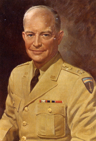
![[1]](http://herpindiego.com/images/Australia2004/LaceMonitor3.jpg)
![[2]](http://www.animalpicturesarchive.com/ArchOLD-6/1162993531.jpg)
![[3]](http://farm2.static.flickr.com/1013/1420932298_e8a32d3524.jpg?v=0)
.jpg)
.jpg&action=edit§ion=T-1)
reversed.jpg)
.jpg&action=edit&redlink=1)
- Reason
- Incredible picture with a really good EV. I know there is some stitching, but I think that is forgivable for a picture more than 140 years old.
- Articles this image appears in
- Edo
- Creator
- Felice Beato
- Support as nominator --→Nehle(talk) 07:42, 8 September 2009 (UTC)
- Oppose Too many stitching errors. – LATICS talk 08:28, 8 September 2009 (UTC)
- Oppose per Latics. Also runs into criteria 2 problems with an only 450 pixel vertical. Staxringold talkcontribs 15:01, 8 September 2009 (UTC)
- Oppose Bad stitching and low resolution, as previously stated. —Darxus (talk) 19:26, 8 September 2009 (UTC)
- Oppose Per others --Childzy ¤ Talk 22:56, 8 September 2009 (UTC)
Not promoted --jjron (talk) 12:52, 14 September 2009 (UTC)


- Reason
- Good compliment to the other saw fly larva shot. Considerably more detailed.
- Articles this image appears in
- Pergidae
- Creator
- Noodle snacks
- Support as nominator --Noodle snacks (talk) 02:06, 3 September 2009 (UTC)
- Weak
opposeBlurred head --Muhammad(talk) 02:17, 3 September 2009 (UTC)- Weak support On second thought, the OOF area is very small -Muhammad(talk) 16:59, 9 September 2009 (UTC)
- Weak Support whilst the dof is a little thin on the head, I don't think it is a deal breaker. The composition and lighting is nice. I would prefer a tighter crop though. Mfield (Oi!) 02:50, 3 September 2009 (UTC)
- Support, love the composition and think the crop is fine. J Milburn (talk) 17:01, 3 September 2009 (UTC)
- Weak Support a tad blurry in parts, but otherwise fine picture; too bad the article is so crappy. Sasata (talk) 19:36, 3 September 2009 (UTC)
Weak supportper previous weak-supporters. Papa Lima Whiskey (talk) 19:35, 6 September 2009 (UTC)- Just thought I'd mention that there are not eyes etc to miss on the head. Noodle snacks (talk) 06:05, 8 September 2009 (UTC)
- Oppose Scale is missing. Papa Lima Whiskey (talk) 00:30, 9 September 2009 (UTC)
- Scaled. Noodle snacks (talk) 04:49, 9 September 2009 (UTC)
- And again, Pergidae already has two very good images, one already being an FP. --Dschwen 14:33, 9 September 2009 (UTC)
- See my rationale. Noodle snacks (talk) 05:36, 10 September 2009 (UTC)
Voting closed; waiting on Papa Lima Whiskey to respond to request for scale, which was fulfilled. upstateNYer 05:29, 10 September 2009 (UTC)
- Still can't support since the scale that was added is very small; it is only readable - and even then with some difficulty - on the full size image. Ideally, as it has been in other promoted images, a scale should be readable at thumbnail size.[6][7][8] Papa Lima Whiskey (talk) 19:05, 11 September 2009 (UTC)
- Please tell me if you have your thumbnail preferences set to 300, 250, 200 or 150px... Noodle snacks (talk) 11:56, 12 September 2009 (UTC)
- Edit Uploaded. I hope you dont mind, NS --Muhammad(talk) 23:55, 12 September 2009 (UTC)
Promoted File:Perga_sp._AF_2_edit1.jpg --Time3000 (talk) 17:04, 14 September 2009 (UTC)

- Reason
- Restitch to fix some problems in the sky that diliff spotted in the original. I've also changed projections to make the actual front door more visible in the frame.
- Articles this image appears in
- Parliament House, Canberra, Australia, Australian Landmarks
- Creator
- Noodle snacks
- Support as nominator --Noodle snacks (talk) 07:43, 9 September 2009 (UTC)
- oppose I like this picture an I like pictures made in the blue hour especially. But sadly there are a few points that disturb the good impression: the picture composition seems to me not harmonically. The EV of this File:Parliament House, Canberra, Pano jjron 25.9.2008-edit1.jpg pic is better because you get a better imagination of the exceptional architecture of this building. And last: the sharpness of this pic is not as good as it good be. Noodle snacks hat shoot much better pics. – Wladyslaw (talk) 08:32, 9 September 2009 (UTC)
- Pretty, but in terms of enc value I do not see this being an improvement over the daytime shot of the same building that was just featured here. (nothing personal, but this is an example for my unfriendly rant on Mainpage talk: an image contribution which adds only to articles that are already relatively well illustrated) --Dschwen 14:03, 9 September 2009 (UTC)
- This image is in a number of articles that the other isn't and it was in parliament house first. Noodle snacks (talk) 05:24, 13 September 2009 (UTC)
Not promoted --jjron (talk) 07:18, 16 September 2009 (UTC)

- Reason
- I shot a panorama but there isn't much more to see from this vantage point but ocean and it wouldn't stitch without significant errors. This was taken at the edge of a 350m high cliff. Cape Raoul is off in the distance, centre frame. Shipstern's bluff is maybe an hour walk from here. Cape Raoul is an important feature of the Tasman National Park.
- Articles this image appears in
- Tasman National Park, Tasman Peninsula
- Creator
- Noodle snacks
- Support as nominator --Noodle snacks (talk) 07:37, 9 September 2009 (UTC)
- Beautiful shot and a genuinely new contribution to an article needing an illustration. Resolution is pretty low though so weak support. --Dschwen 14:08, 9 September 2009 (UTC)
- Support despite oversharpening along horizon; I'd also prefer a higher resolution version per Dschwen. BTW, is the surprisingly well-exposed sky the result of post-processing or just the light? Time3000 (talk) 17:26, 9 September 2009 (UTC)
- Two exposures. One for the sky, one for the foreground. Blended with a gradient mask. Net result is the same as a graduated neutral density filter. Noodle snacks (talk) 06:53, 12 September 2009 (UTC)
- Support, you've chosen a great position from which to take the photograph- I love the way you get a feeling of scale and manage to show so much of the cape. J Milburn (talk) 19:02, 10 September 2009 (UTC)
- Support 194.209.146.84 (talk) 07:26, 11 September 2009 (UTC)
- Note - Two edits on I.P --Childzy ¤ Talk 09:04, 11 September 2009 (UTC)
- Support upstateNYer 00:34, 12 September 2009 (UTC)
- Support as others --Muhammad(talk) 02:52, 14 September 2009 (UTC)
- Weak Support The tripod's pole is visible in the frame and fairly low resolution for the shot as well. — raeky (talk | edits) 04:33, 16 September 2009 (UTC)
Promoted File:Cape Raoul from Lookout.jpg --jjron (talk) 07:22, 16 September 2009 (UTC)

- Reason
- A clear image demonstration an infantryman in action
- Articles this image appears in
- List of common World War II infantry weapons, Hand grenade
- Creator
- US Gov, from Library of Congress files.
- Support as nominator --Trevor MacInnis contribs 04:40, 9 September 2009 (UTC)
Oppose. Well below size requirements. See the criteria, specifically point 2. It looks like there is an original TIFF available for that image and at 180mb, it should be much higher resolution. Also, the image description seems a bit tasteless as is. I can see now that it's the original image's propaganda title, but it probably should be stated a bit more clearly, lest it offend. ;-) Diliff | (Talk) (Contribs) 07:42, 9 September 2009 (UTC)- Went ahead and uploaded a jpeg version of the original unrestored tiff file. It's got plenty of res, but will remain neutral for now. Diliff | (Talk) (Contribs) 08:24, 9 September 2009 (UTC)
- Oppose. Looks almost comically posed. Extremely dark and vignetted. Might have some EV for the WWII list article, but I wouldn't put it in the Hand grenade article since that article already has better images that are similar. Kaldari (talk) 15:35, 9 September 2009 (UTC)
- Oppose Not much EV for hand grenade. Doesnt look real either, like a wax work almost (not opposing for this reason) --Childzy ¤ Talk 15:43, 9 September 2009 (UTC)
- I was going to say the same thing - he looks like he belongs in Madame Tussauds... Diliff | (Talk) (Contribs) 18:28, 9 September 2009 (UTC)
- I've seen more realistic waxworks in Madame Tussauds. Must be the lighting or something --Childzy ¤ Talk 19:59, 9 September 2009 (UTC)
- I was also going to say the same thing. Weird. upstateNYer 05:20, 11 September 2009 (UTC)
- I was going to say the same thing - he looks like he belongs in Madame Tussauds... Diliff | (Talk) (Contribs) 18:28, 9 September 2009 (UTC)
- Oppose Agreed on the subject looking very 'waxy', some of the waxworks I've seen are terrible and this would fit right in with them, and the picture is far too dark.Silvestra (talk) 23:58, 10 September 2009 (UTC)
- Oppose, looks extremely fake. As has been said, very waxy, too dark, he's pulling that expression... Looks very posed, like something out of a videogame cinematic. J Milburn (talk) 11:02, 11 September 2009 (UTC)
- Oppose - poor lighting for an encyclopedic photograph. Cacophony (talk) 05:34, 15 September 2009 (UTC)
Not promoted --jjron (talk) 07:19, 16 September 2009 (UTC)

- Reason
- Good quality and EV
- Articles this image appears in
- Stratiomyidae
- Creator
- Muhammad
- Support as nominator --Muhammad(talk) 02:37, 3 September 2009 (UTC)
- Support Certainly, nice. Mfield (Oi!) 02:47, 3 September 2009 (UTC)
- Support. What's the silky stuff to the right of the image? Is that anything to do with the subject? J Milburn (talk) 16:55, 3 September 2009 (UTC)
- Probably some kind of fungus growing on the leaf --Muhammad(talk) 18:04, 3 September 2009 (UTC)
- Weak support Lacks a bit of sharpness even in the clear parts, but overall pretty good. Sasata (talk) 19:31, 3 September 2009 (UTC)
Support. It might be worth saying whether the eyes are really striped, or if it's some sort of prism effect. Thank you. Papa Lima Whiskey (talk) 19:31, 6 September 2009 (UTC)"- Oppose lighting is really harsh unfortunately. Noodle snacks (talk) 11:11, 7 September 2009 (UTC)
OpposeScale is missing. Papa Lima Whiskey (talk) 00:31, 9 September 2009 (UTC)- Scale added. --Muhammad(talk) 12:12, 9 September 2009 (UTC)
- Where did you get the scale from? The description says app. 20mm long, with your scale it looks more like 10 or 15mm max now. I'm not sure scale is missing is a solid reason for oppose, but sure as hell sticking in a made-up/guessimate scale is not adressing that concern either. --Dschwen 14:27, 9 September 2009 (UTC) P.S.: It is actually making it worse, as the image now claims an acuracy it cannot provide (unless of course you convince me otherwise, that your scale is exact) --Dschwen 14:28, 9 September 2009 (UTC)
- Since I had pictures of the fly at 1:1 and at less, I used the 1:1 and got the scale. The 20mm was an approximate as mentioned as I had not "measured" the fly. Sorry for all the confusion --Muhammad(talk) 16:41, 9 September 2009 (UTC)
- Where did you get the scale from? The description says app. 20mm long, with your scale it looks more like 10 or 15mm max now. I'm not sure scale is missing is a solid reason for oppose, but sure as hell sticking in a made-up/guessimate scale is not adressing that concern either. --Dschwen 14:27, 9 September 2009 (UTC) P.S.: It is actually making it worse, as the image now claims an acuracy it cannot provide (unless of course you convince me otherwise, that your scale is exact) --Dschwen 14:28, 9 September 2009 (UTC)
- Scale added. --Muhammad(talk) 12:12, 9 September 2009 (UTC)
Voting closed; waiting on Papa Lima Whiskey to respond to request for scale, which was fulfilled. upstateNYer 05:30, 10 September 2009 (UTC)
- Supporting again since a genuinely useful scale was added. Papa Lima Whiskey (talk) 17:37, 11 September 2009 (UTC)
Promoted File:Soldierfly.jpg --jjron (talk) 07:21, 16 September 2009 (UTC)
- Reason
- An overall good photo of one of the most prolific singer-songwriters in the music business
- Articles this image appears in
- www.wikipedia.org/wiki/Richard_Marx
- Creator
- loaded by CyndeG, photo by Nels Israelson
- Support as nominator --Jeremy (talk) 11:13, 14 September 2009 (UTC)
- Speedy close Too small; have a peak at the Featured Picture criteria and feel free to bring back another image that meets the expectations. Best, upstateNYer 11:53, 15 September 2009 (UTC)
- The nominator also needs to tell us who the author of the work is, which is another criteria. Mostlyharmless (talk) 22:48, 15 September 2009 (UTC)
- Possible Copyright violation? Mostlyharmless (talk) 22:50, 15 September 2009 (UTC)
- Just found out who took the photo Jeremy (talk) 23:30, 15 September 2009 (UTC)
Not promoted MER-C 08:25, 16 September 2009 (UTC)
.jpg)
- Reason
- Nice and sharp shot in addition to victory garden posters, EV.
- Articles this image appears in
- Victory garden, United States home front during World War I
- Creator
- Harris & Ewing, uploaded by Brandmeister
- Support as nominator --Brand[t] 10:22, 9 September 2009 (UTC)
- Comment The image is sourced to a blog. Is there no better source for it? Durova314 00:51, 10 September 2009 (UTC)
- It appears the restoration was partly done by the bloggers (and partly by the uploader), but the original can be sourced to the LOC. J Milburn (talk) 19:00, 10 September 2009 (UTC)
- The source is fixed now. Brand[t] 20:02, 11 September 2009 (UTC)
- It appears the restoration was partly done by the bloggers (and partly by the uploader), but the original can be sourced to the LOC. J Milburn (talk) 19:00, 10 September 2009 (UTC)
- Support per nom. Durova317 00:15, 12 September 2009 (UTC)
- Support upstateNYer 00:31, 12 September 2009 (UTC)
- Oppose Resolution is not what is expected of historical pictures and I find the EV to be very weak. --Muhammad(talk) 14:03, 13 September 2009 (UTC)
- I downloaded the unrestored 10,309x7,684 version, it's quite ugly and huge to work on. Brand[t] 17:25, 13 September 2009 (UTC)
- Support, illustrates the subject well. Mostlyharmless (talk) 02:39, 15 September 2009 (UTC)
- Oppose. Sorry, but agree with Muhammad. I'm not so worried about size (it is well within guidelines), but not at all sold on EV, and quality is quite poor, especially across the top and upper left. Also overly tight cropping top and bottom. --jjron (talk) 07:34, 15 September 2009 (UTC)
- Oppose, particularly with nominators note that there is a bigger version out there. It's a big job, but somebody's gotta' do it. Staxringold talkcontribs 13:53, 16 September 2009 (UTC)
Not promoted --Shoemaker's Holiday Over 206 FCs served 17:06, 16 September 2009 (UTC)


- Reason
- High quality and resolution portrait of one of the greatest golfers of all time. Note, the EV of this is NOT pertaining to the form for Woods' drive (he's already completed it), so the framing does not detract. This is a portrait, the frame allows for better seeing his face (and, like the Derek Jeter image where it's extra-nice because it's a great hitter hitting, here is a portrait of a great golfer golfing).
- Articles this image appears in
- Tiger Woods
- Creator
- Keith Allison
- Support as nominator --Staxringold talkcontribs 19:21, 10 September 2009 (UTC)
- Comment. Photo is quite noisey at full-res. Someone might want to run it through noise reduction to see if it can be improved. Kaldari (talk) 19:33, 10 September 2009 (UTC)
- Do you know of any good anti-noise GIMP filters? The only one I've got is to kill chroma noise, so lowers the coloration of the overall photo. Staxringold talkcontribs 14:22, 11 September 2009 (UTC)
- I'm afraid I don't. Maybe someone else could help out. I'd do it myself, but I'm on vacation :) Kaldari (talk) 15:43, 11 September 2009 (UTC)
- Oppose I don't think even that would fix it, Kaldari. upstateNYer 05:17, 11 September 2009 (UTC)
- If someone did a Noise Reduction and then a downsample it might be up to par. Ha! Kaldari (talk) 15:42, 11 September 2009 (UTC)
- Edit 1 Uploaded. Not downsampled coz Dschwen will get mad then. --Muhammad(talk) 16:14, 11 September 2009 (UTC)
- Now his skin looks like wax; oppose edit as well. upstateNYer 00:25, 12 September 2009 (UTC)
- Edit 1 Uploaded. Not downsampled coz Dschwen will get mad then. --Muhammad(talk) 16:14, 11 September 2009 (UTC)
- If someone did a Noise Reduction and then a downsample it might be up to par. Ha! Kaldari (talk) 15:42, 11 September 2009 (UTC)
- Support EDIT - Good EV, shows the man doing what he does --Childzy ¤ Talk 18:15, 11 September 2009 (UTC)
- Oppose both Sorry, per issues concerned above. The edit is appreciated but it now looks artificially placed (especially with that type of opaque background). The streaks to the bottom right distract as well. ZooFari 03:42, 12 September 2009 (UTC)
- Support Edit A very good shot that is *substantially* better than any other images available. A bit of sensor dust below is left elbow could easily be fixed though. Cacophony (talk) 05:29, 15 September 2009 (UTC)
- Oppose The noise could POSSIBLY be fixed with proper application of profiles and masks, but the other issues remain. Reproduceable shot, facial expression to me isn't really flattering, the fence bar or whatever it is in the background is distracting to me. The Edit 1 version is HIGHLY over edited and all detail has been lost. — raeky (talk | edits) 07:42, 15 September 2009 (UTC)
Not promoted --jjron (talk) 07:32, 17 September 2009 (UTC)

- Reason
- By popular demand. Surprisingly EV photo: simultaneously shows a trials competitor committing a penalty (foot on ground), and being penalised for it (official's finger signals one penalty point, total). Good clear shot of the bike and obstacles, and depth of field is just about right IMHO - the official is slightly out of focus but not too much. No annoying spectators in the background, and the rider's outfit contrasts well with the background. As an added bonus, I've managed to identify[9] him from the number (4):
Ben SlingerJoe Oakley. The pose isn't quite as interesting as the other one I nominated, but the official adds some interest. - Articles this image appears in
- Mountain bike trials
- Creator
- Stevage
- Support as nominator Uncropped version uploaded here in case anyone wants to experiment with composition. Now I'm thinking it would be better to show more context to the right - helps understand *why* he put a foot down. --Stevage 14:48, 10 September 2009 (UTC)
- Support as below. Great composition, nice catch. And a welcome change of subject on this page. --Dschwen 14:53, 10 September 2009 (UTC)
- Comment: Is the subject notable? It'd be a nice complement to the image if we could have his name a bluelink. J Milburn (talk) 18:55, 10 September 2009 (UTC)
- Good question. Coincidentally enough, it looks like he won[10] the event, so he's now junior world champion. But I can't find anything substantial written about him online, other than a few "Joe Oakley has won the xxx event" type paragraphs in various MTB newsletters. Stevage 23:01, 10 September 2009 (UTC)
- Support good stuff --Childzy ¤ Talk 22:52, 10 September 2009 (UTC)
- Support I think this is better than the other. Noodle snacks (talk) 10:49, 11 September 2009 (UTC)
- Support as above --Muhammad(talk) 14:04, 11 September 2009 (UTC)
Promoted File:MTB Trials 3 Stevage.jpg --jjron (talk) 07:36, 17 September 2009 (UTC)

- Reason
- Good quality and EV. She was so well camouflaged that I could only see her when she moved. And even then, I lost her after a few shots
- Articles this image appears in
- Wolf spider, Lycosoidea, Spider
- Creator
- Muhammad Mahdi Karim
- Support as nominator --Muhammad(talk) 11:44, 10 September 2009 (UTC)
- Support - Great shot --Childzy ¤ Talk 12:53, 10 September 2009 (UTC)
- Support, great one. J Milburn (talk) 18:56, 10 September 2009 (UTC)
- What is that thing that is happening around the legs? Franklin.vp 13:42, 11 September 2009 (UTC)
- Which leg/in what way? --Childzy ¤ Talk 14:03, 11 September 2009 (UTC)
- Rear two are most obvious. Looks like some stacking artefacts to me. Noodle snacks (talk) 23:54, 11 September 2009 (UTC)
- Which leg/in what way? --Childzy ¤ Talk 14:03, 11 September 2009 (UTC)
- Support per above. Noodle snacks (talk) 23:54, 11 September 2009 (UTC)
- Support - scary as all hell. Looks like there are some focus stacking issues, various bits of sand which are inexplicably out of focus (and especially around the rear left leg), doesn't really detract from the image though. Stevage 02:41, 14 September 2009 (UTC)
Promoted File:Lycosidae female carrying young.jpg --jjron (talk) 07:36, 17 September 2009 (UTC)


- Reason
- Good quality and EV. Better quality and EV than the other images in the article
- Articles this image appears in
- Rambutan
- Creator
- Muhammad Mahdi Karim
- Support as nominator --Muhammad(talk) 11:40, 10 September 2009 (UTC)
- Comment: Could you possibly crop out that line above the unpeeled one, at the very top of the image? J Milburn (talk) 18:58, 10 September 2009 (UTC)
- Also, this seems a little heavy on whitespace- perhaps move them closer together with a slightly tighter crop as an alt? J Milburn (talk) 18:58, 10 September 2009 (UTC)
- Uploaded Alt 1. Original fixed as well. --Muhammad(talk) 00:38, 11 September 2009 (UTC)
- Also, this seems a little heavy on whitespace- perhaps move them closer together with a slightly tighter crop as an alt? J Milburn (talk) 18:58, 10 September 2009 (UTC)
- Yes, and it would have even higer value if it showed a cross section. Then it could replace another picture in the article. --Dschwen 00:59, 11 September 2009 (UTC)
- Unfortunatley I dont have the fruits any more. --Muhammad(talk) 10:41, 11 September 2009 (UTC)
- Ate them all, eh? --Dschwen 13:55, 11 September 2009 (UTC)
- Yeah, before moving to India --Muhammad(talk) 14:01, 11 September 2009 (UTC)
- Ate them all, eh? --Dschwen 13:55, 11 September 2009 (UTC)
- Unfortunatley I dont have the fruits any more. --Muhammad(talk) 10:41, 11 September 2009 (UTC)
- Another comment (sorry): Why do these fruits have the green, while yours does not? J Milburn (talk) 11:00, 11 September 2009 (UTC)
- Mine are completely ripened --Muhammad(talk) 13:56, 11 September 2009 (UTC)
- Support, very interesting fruit! –Juliancolton | Talk 15:51, 12 September 2009 (UTC)
- Support alt 1, cool looking little things. J Milburn (talk) 17:50, 13 September 2009 (UTC)
- Support alt 1, good EV and illustration of the fruit. — raeky (talk | edits) 15:49, 15 September 2009 (UTC)
- Support alt 1 to prove that messages on the talk page do work ; ). Time3000 (talk) 17:44, 15 September 2009 (UTC)
- Support alt 1. Attractive and useful.--ragesoss (talk) 02:46, 17 September 2009 (UTC)
Promoted File:Rambutan white background alt.jpg --jjron (talk) 07:42, 17 September 2009 (UTC)

- Reason
- Since a lot of people seemed to feel this would be a desirable image to feature (previous nomination), I'm nominating a tighter crop that might meet more tastes.
- Articles this image appears in
- Lauren Anderson
- Creator
- Work for hire owned and released by Lauren Anderson
- Support as nominator --Papa Lima Whiskey (talk) 19:36, 11 September 2009 (UTC)
- Support. Intriguing crop, like there is no cloth below :) Brand[t] 20:42, 11 September 2009 (UTC)
- Support as before --Childzy ¤ Talk 22:43, 11 September 2009 (UTC)
- Oppose As before, composition is still not ok IMO --Muhammad(talk) 14:36, 12 September 2009 (UTC)
- Weak oppose per above, unimpressive composition. –Juliancolton | Talk 15:47, 12 September 2009 (UTC)
- Weak oppose The underlying image just ain't that great. Either my crop from the old nom or this one definitely improves it, but there's just a lot wrong with the framing that crops/restoration can't fix. Staxringold talkcontribs 21:49, 12 September 2009 (UTC)
- Weak support, I still feel this image is featurable. J Milburn (talk) 18:05, 13 September 2009 (UTC)
- Oppose as before, the original perspective doesn't work with this tight crop, leaving it looking very flat. If the shot had been reframed as such it would work better. Mfield (Oi!) 20:06, 13 September 2009 (UTC)
- Oppose It's not used anywhere, which is a FP criteria. It's just a crop to try to overcome the shortfalls of the previous nomination. Even as a crop it's not a remarkable image, very standard and uninteresting pose and composition as a crop. — raeky (talk | edits) 16:48, 17 September 2009 (UTC)
- On your first objection: Nonsense. We always put the winning version on articles, and the article for this picture is indicated above. Papa Lima Whiskey (talk) 19:15, 17 September 2009 (UTC)
Not promoted --Shoemaker's Holiday Over 206 FCs served 01:24, 18 September 2009 (UTC)

- Reason
- Another high quality, action-but-not-blurry shot of a notable MLB player. The only issue is the edge of one toe being cut off, but it doesn't detract from the EV or overall shot IMO.
- Articles this image appears in
- Chien-Ming Wang
- Creator
- Keith Allison
- Support as nominator --Staxringold talkcontribs 14:20, 11 September 2009 (UTC)
- Is this just my ignorance, or do all baseball player pictures essentailly look the same? Same stance, same framing... --Dschwen 14:26, 11 September 2009 (UTC)
- For pitchers roughly this framing is going to give you the best EV on their pitching motion. Other versions you lose their legs or their arm is outstretched and you lose lots of other things. I have a more unique Allison shot that is I think the last of the FP quality stuff he has uploaded (that I've found, at least) which I'll nominate a bit later. Staxringold talkcontribs 14:28, 11 September 2009 (UTC)
- Support. As per the others, EV, dynamism, and quality. Mostlyharmless (talk) 04:47, 12 September 2009 (UTC)
- Support. Agree with above...--Sabri76'message 11:48, 12 September 2009 (UTC)
- Oppose Cut off foot --Muhammad(talk) 14:37, 12 September 2009 (UTC)
- Support - I don't think the cut-off foot is enough of an issue, personally. –Juliancolton | Talk 15:49, 12 September 2009 (UTC)
- Weak support - good, slightly soft though, and slight pity about the shadow across his eye. The cut-off foot is really not an issue. Stevage 02:34, 14 September 2009 (UTC)
- Weak Oppose Not entirely in focus, lots of noise, cut off foot, potentially reproducible (not retired yet, but injured according to his article). — raeky (talk | edits) 07:39, 15 September 2009 (UTC)
Promoted File:Chien-Ming Wang pitching.jpg --Shoemaker's Holiday Over 206 FCs served 01:44, 18 September 2009 (UTC)

- Reason
- Long ago we had an FP of sandcastles that was sadly delisted for various issues. I think this is a worthy successor. Good quality, high interest, good composition for a busy scene. I particularly like how the Sand art and play article is illustrated in this picture by having the sand children playing to create the sand art dinosaurs.
- Articles this image appears in
- Sand art and play, Sand festival
- Creator
- jjron
- Support as nominator --jjron (talk) 14:48, 10 September 2009 (UTC)
- Neutral. Possible copyright violation. According to the Australian Copyright Act of 1968, freedom of panomama only applies to sculptures permanently situated in a public place. Kaldari (talk) 17:26, 10 September 2009 (UTC)
- Unlikely, given sandsculptures aren't permanent for obvious reasons. I don't know a lot about legalities, but for what it's worth they certainly stated no restrictions on photography or use of said photos in any way at the festival (and I did look to see). MER-C may know more if he drifts by. Presumably a photo of a sandcastle on the beach would also be a copyvio in this case, unless I built it myself? Anyway, if you want to see if you can get it deleted, go ahead. --jjron (talk) 08:05, 11 September 2009 (UTC)
- Here is an interesting nuance from the Commons page: "Whether a work is installed at a public place permanently or not is not a question of absolute time, but a question of what the intention was when the work was placed there. If it was put there with the intention of leaving it in the public place indefinitely or at least for the whole natural lifetime of the work, then it is "permanent"." --jjron (talk) 08:12, 11 September 2009 (UTC)
- I think that's a fairly sensible interpretation. It doesn't seem to be about how long the work will 'last', it's just about whether the intention was to move it to a non-public location during the life of the work, and that is clearly not possible for a sand sculpture. That said, how do you confirm intentions after the event, short of asking the artist (and even then, one can be disingenuous about the original intentions if it wasn't explicitly stated at the time of public presentation)? It might be obvious in this case, but it leaves the line drawn rather ambiguously for other works. Diliff | (Talk) (Contribs) 10:25, 11 September 2009 (UTC)
- Alright, you guys have convinced me. The interpretation given above seems plausible, although I have to say it's anyone's guess as to how the law might actually get interpreted if the sculpture were to object. Changing to neutral for now. Kaldari (talk) 15:39, 11 September 2009 (UTC)
- I'm not sure that there is any danger of the sculpture objecting. ;-) Diliff | (Talk) (Contribs) 17:22, 11 September 2009 (UTC)
- Alright, you guys have convinced me. The interpretation given above seems plausible, although I have to say it's anyone's guess as to how the law might actually get interpreted if the sculpture were to object. Changing to neutral for now. Kaldari (talk) 15:39, 11 September 2009 (UTC)
- For what it's worth I agree with the analysis however I'm not actualy aware of caselaw for this or related stuff like ice sculptures and the situation seems somewhat unclear.©Geni 17:02, 12 September 2009 (UTC)
- I think that's a fairly sensible interpretation. It doesn't seem to be about how long the work will 'last', it's just about whether the intention was to move it to a non-public location during the life of the work, and that is clearly not possible for a sand sculpture. That said, how do you confirm intentions after the event, short of asking the artist (and even then, one can be disingenuous about the original intentions if it wasn't explicitly stated at the time of public presentation)? It might be obvious in this case, but it leaves the line drawn rather ambiguously for other works. Diliff | (Talk) (Contribs) 10:25, 11 September 2009 (UTC)
- Support pending the copyright issue. DEFINITELY featured quality image, the only question is the copyright status (obviously I oppose if it's not a free image). What an odd little gap in copyright law, not a permanent statue but a statue nonetheless. Because it's not permanent is there a chance the original artist cannot claim copyright (and thus this image, freely released by the photographer, is free?) Staxringold talkcontribs 18:45, 10 September 2009 (UTC)
- I don't believe there are any laws saying that a work has to still exist in order to claim copyright over derivatives. Kaldari (talk) 19:29, 10 September 2009 (UTC)
- Support Again pending the copyright issue. I love this picture, it's a fantastic medium and the picture really conveys the fun that you get from seeing these along the beach. Hope we can resolve the copyright issue. Silvestra (talk) 23:55, 10 September 2009 (UTC)
- Support - I think this should just be passed regardless, it is a very shaky copyright claim --Childzy ¤ Talk 13:22, 11 September 2009 (UTC)
- Support. Doesn't seem like a copyright breach to me, and has a good composition and illustrates the articles well. Diliff | (Talk) (Contribs) 13:29, 11 September 2009 (UTC)
- Support. I think it will pass the copyright issues just fine, and it looks great. --Ser Amantio di NicolaoChe dicono a Signa?Lo dicono a Signa. 20:44, 11 September 2009 (UTC)
- Comment Is this maybe a bit underexposed? Or is the sand just more yellow than I am used to? Noodle snacks (talk) 23:52, 11 September 2009 (UTC)
- Well sand varies in colour. And it's hard to know for sure, sand is a bit like snow, it can be hard to get right and it comes up differently depending on how the sun hits it, etc. The photos I took there even show considerable variation. For the record, in this case I tried to match the sand colour to the colours on an 'official' promotional brochure for the festival by Frankston City that I picked up at the time, assuming they would have tried to get it right. --jjron (talk) 07:54, 12 September 2009 (UTC)
- Support Per "Good sand sculpture sand is somewhat dirty, having silt and clay that helps lock the irregular shaped sand grains together.". So it is probably just darker sand. Noodle snacks (talk) 11:41, 12 September 2009 (UTC)
Promoted File:Sandsculpting, Frankston, Vic jjron, 21.01.2009.jpg --Shoemaker's Holiday Over 206 FCs served 01:28, 18 September 2009 (UTC)

- Reason
- Technical quality is high, the EV goes almost without saying. Was previously nominated with two other images, this one received the most support.
- Articles this image appears in
- September 11 Attacks
- Creator
- Sgt. Cedric H Rudisill (US Military/DOD)
- Support as nominator --Cowtowner 00:37, 11 September 2009 (UTC)
- Support. This is one of these examples that shows how a set can make it more difficult to pass than individual nominations. It's a good image, with high encyclopedic value. Mostlyharmless (talk) 03:34, 13 September 2009 (UTC)
- Support a very clear subject. - Trevor MacInnis contribs 05:12, 16 September 2009 (UTC)
- Support Shows very well the extent of the damage caused by the
missileairplane... ;-) Gazhiley (talk) 13:11, 16 September 2009 (UTC) - Support --Avala (talk) 13:42, 18 September 2009 (UTC)
Promoted File:Pentagon_crach_site.jpg --Makeemlighter (talk) 02:35, 19 September 2009 (UTC)

- Reason
- Photograph from one of the most heavily damaged major cities of the American Civil War shortly after war's end. Restored version of File:Atlanta roundhouse ruin.jpg.
- Articles this image appears in
- History of Atlanta, Atlanta, Atlanta Campaign, Roundhouse, Atlanta in the American Civil War, Photography_and_photographers_of_the_American_Civil_War#George_Barnard
- Creator
- George Barnard
- Support as nominator --Durova317 00:13, 12 September 2009 (UTC)
- Support. An attractive image with high encyclopedic value. Mostlyharmless (talk) 03:31, 13 September 2009 (UTC)
- Support. Excellent and very encyclopedic image. --Carioca (talk) 20:53, 14 September 2009 (UTC)
- Support. Excellent quality. Definitely brings total war to home (speaking of which, I have added it to total war). NW (Talk) 00:33, 18 September 2009 (UTC)
Promoted File:Atlanta roundhouse ruin3.jpg --Makeemlighter (talk) 02:48, 19 September 2009 (UTC)

- Reason
- This image captures evocatively the romantic and musical partnership of Joan Baez and Bob Dylan. It illustrates this section of their respective articles, their performance at the March on Washington where this photo was taken, and a number of articles that relate to the music they performed together. Previous versions of this file were of lower resolution, so I was pleased to find this version.
- Articles this image appears in
- Joan Baez, Bob Dylan, March on Washington for Jobs and Freedom, Protest song, Music of the United States, American popular music, American folk music revival, Newport Folk Festival, It's All Over Now, Baby Blue, Counterculture of the 1960s
- Creator
- U.S. Information Agency. Press and Publications Service.
- Support as nominator --Mostlyharmless (talk) 03:59, 13 September 2009 (UTC)
- Support Great image. Staxringold talkcontribs 06:37, 13 September 2009 (UTC)
- Support Franklin.vp 12:16, 14 September 2009 (UTC)
- Support Cacophony (talk) 05:32, 15 September 2009 (UTC)
- Support Love the photograph — raeky (talk | edits) 07:35, 15 September 2009 (UTC)
- Support Wonderful photo of strongly significant cultural importance. Jakeb (talk) 16:48, 19 September 2009 (UTC)
Promoted File:Joan_Baez_Bob_Dylan.jpg --Time3000 (talk) 09:47, 20 September 2009 (UTC)

- Reason
- High resolution of the Shuttle and the custom 747. Great composition, beautiful colours and a breathtaking sense of scale.
- Articles this image appears in
- Space Shuttle program , Shuttle Carrier Aircraft
- Creator
- NASA/Jim Ross
- Support as nominator --Nich148 9 (talk) 10:28, 13 September 2009 (UTC)
- Oppose Great light, but the crop is a little too tight for my taste and the image itself looks very soft, probably from excessive noise reduction. Time3000 (talk) 10:54, 13 September 2009 (UTC)
- Weak Support yes its a tight crop, but I feel this is an otherwise superb quality picture of a hard to capture image - how often do the general public get to witness this sort of thing? So I feel this cannot be bettered for this particular process... Gazhiley (talk) 12:42, 16 September 2009 (UTC)
Not promoted --Makeemlighter (talk) 05:54, 21 September 2009 (UTC)


- Reason
- High quality, high resolution image which is difficult to obtain and will no longer be possible to obtain of the orbiter in question (retired September 11 this year). This image was previously nominated and no consensus was reached. Issues included it being washed out in the original (since enhanced, complaints then railed against this) and that it was rotated from the original which hurts its EV for rendezvous pitch maneuver, an article which it is no longer part of. In light of this change I think it still has outstanding EV for its current articles.
- Articles this image appears in
- Space Shuttle Discovery, Space Shuttle orbiter, Timeline of STS-121
- Creator
- NASA
- Support as nominator --Cowtowner 21:38, 13 September 2009 (UTC)
- Oppose. Indeed it does have good EV, but the image quality is lacking. It has a lot of patchy chrominance noise. Diliff | (Talk) (Contribs) 09:52, 14 September 2009 (UTC)
- Oppose per Diliff - looks like overenthusiastic JPEG compression of the chrominance channels to me. The top of the tail is cut off as well, which detracts from EV (though not that much). Time3000 (talk) 16:07, 14 September 2009 (UTC)
- Added a new edit based on the original file as per above comments. It uses a less heavy handed approach and has therefore less noise and more realistic though still pleasing colours. With regards to the tail, I think it is excusable as from this angle the tail would add little other than perhaps a sense of its size in relation to the body of the shuttle. --Cowtowner 01:19, 15 September 2009 (UTC)
- Oppose - bad crop. Cacophony (talk) 05:31, 15 September 2009 (UTC)
- I think that the crop is forgivable considering what we are missing--a piece of the tail, which, from this angle, is of no little benefit to the image. Not to mention the conditions this was taken in (I believe this is the original framing)--zero gravity with a lot of billion dollar equipment to worry about. —Preceding unsigned comment added by Cowtowner (talk • contribs) 22:01, 15 September 2009 (UTC)
- Oppose per above concerns, but this may be worthy at VPC. ZooFari 01:12, 18 September 2009 (UTC)
Not promoted --Makeemlighter (talk) 05:54, 21 September 2009 (UTC)

- Reason
- This was promoted to Quality Image at Commons a while back, and after speaking with Durova, who thought this might have a chance at FP, I've decided to give it a shot. It's of high technical quality as far as I can tell, and carries a fair amount of encyclopedic value.
- Articles this image appears in
- Ice, Waterfall, Red Oaks Mill, New York, Wappinger Creek
- Creator
- Juliancolton
- Support as nominator --–Juliancolton | Talk 16:19, 13 September 2009 (UTC)
- Oppose Sorry, I just don't think the composition is good enough. The out-of-focus plants in the foreground are distracting and there isn't really a clear subject. You might have more luck with a careful crop, but a re-shoot would be better (but perhaps not very easy with something like this). Personally, I would have gone right down to the bank a yard or so downstream from the waterfall and crouched down to take the photo, looking along the waterfall, which would emphasise the structure of the icicles - but that's just me. Time3000 (talk) 17:43, 13 September 2009 (UTC)
Not promoted --Makeemlighter (talk) 05:54, 21 September 2009 (UTC)

- Reason
- Amazing photograph from the upgraded Hubble Telescope.
- Articles this image appears in
- NGC 6302, RCW Catalogue
- Creator
- NASA, ESA, and the Hubble SM4 ERO Team
- Support as nominator --— raeky (talk | edits) 16:08, 13 September 2009 (UTC)
- Neutral Not the best of Hubble's work since there is a lot of noise and visible deconvolution artifacts around the brighter stars - compare with File:Orion_Nebula_-_Hubble_2006_mosaic_18000.jpg which has a similar resolution in terms of pixels per square arcminute. On the other hand it is still a pretty amazing photo, so I'll chicken out and vote neutral ; ). Time3000 (talk) 17:59, 13 September 2009 (UTC)
- This is using the brand new camera in the hubble, images of this quality of that object could not even come close this before. It's difficult to say "not Hubble's best work" when objects are varining distances, futher away objects are of course going to be more grainy than closer objects like the Orion Nebula (1,344 ly). Look at how improved the resolution this camera can produce. Although I respect your opinion, I thought I should point out the irony of saying not the best, when this object is much smaller and further away then the Orion Nebula and is using the most modern technology possible for the shot. — raeky (talk | edits) 19:08, 13 September 2009 (UTC)
- Support - Fantastic picture, loving the new camera in the hubble and looking foward to many more pictures like this. Thanks also for the link Raeky, I loved the old pictures as well, but seeing them side by side like that certainly puts things into perspective. Silvestra (talk) 20:01, 15 September 2009 (UTC)
- Support Unbelievably beautiful. - Trevor MacInnis contribs 05:14, 16 September 2009 (UTC)
- Support Beautiful picture. One of the first pictures from recently upgraded Hubble space telescope friendlystar (talk) 07:22, 16 September 2009 (UTC)
Promoted File:NGC 6302 Hubble 2009.full.jpg --Makeemlighter (talk) 05:58, 21 September 2009 (UTC)

- Reason
- High quality, nicely colored (as opposed to all the black and white stuff for this period) image depicting an attack on Beijing Castle during the Boxer Rebellion. Big meaty EV, cool picture, good stuff all around. This is a restored version of this original. For those with slow connections, please check this courtesy copy but remember that that version is heavily compressed.
- Articles this image appears in
- Boxer Rebellion, Beijing, History of Beijing
- Creator
- Torajirō Kasai, edited by Staxringold
- Support as nominator --Staxringold talkcontribs 12:38, 14 September 2009 (UTC)
- Note Slightly touched up by Durova. Staxringold talkcontribs 23:36, 14 September 2009 (UTC)
- Comment Translation added. upstateNYer 03:36, 15 September 2009 (UTC)
- Support now, with addition of translation. upstateNYer 11:49, 15 September 2009 (UTC)
- Support per nom. Durova318 16:52, 15 September 2009 (UTC)
- Support. "Meaty EV". I like that phrase. Mostlyharmless (talk) 22:47, 15 September 2009 (UTC)
- Support, per meaty EV. Kaldari (talk) 20:32, 16 September 2009 (UTC)
- Support, Great quality. Bernstein2291 (Talk • Contributions • Sign Here) 04:27, 19 September 2009 (UTC)
Promoted File:Beijing Castle Boxer Rebellion 1900 FINAL.jpg --Time3000 (talk) 16:26, 21 September 2009 (UTC)
- Reason
- Depth of field is thin, but this is at 3:1. It is in focus where important.
- Articles this image appears in
- Coccinella transversalis, Coccinella, Coccinellidae
- Creator
- Noodle snacks
- Support as nominator --Noodle snacks (talk) 08:52, 15 September 2009 (UTC)
- Weak oppose Regretfully, IMHO the narrow DOF is just too much of a problem. Such a small part of the whole image is actually in focus. Essentially you've got the eyes (just), the head, half a front claw, a bit of wing, and some of the leaf it's on. I know DOF is tough for macro shots... Stevage 03:08, 17 September 2009 (UTC)
- This is 3 times (or more) the magnification of most macro shots that go through here. Noodle snacks (talk) 06:44, 17 September 2009 (UTC)
- Can you post examples? I'm looking through, and can't find any where there is so little in focus (cf this). Or maybe the problem is that the ladybug's head is relatively featureless compared to this or this, for example. Possibly exacerbated by front-on pose? Stevage 09:35, 17 September 2009 (UTC)
- In those examples the subject is much bigger. This entire beetle is just a bit bigger than the head of the Cetonia-aurata example. The fly is around three times as long as this. this, give or take, is the sort of difference in magnification between the fly and the beetle. Unfortunately depth of field starts getting very thin at high magnifications. Sometimes you can cheat, and stack, like File:Calliphora_sp_Portrait.jpg, but that doesn't work with a moving subject. For reference a single frame of that stack actually looks like this. Noodle snacks (talk) 10:05, 17 September 2009 (UTC)
- Can you post examples? I'm looking through, and can't find any where there is so little in focus (cf this). Or maybe the problem is that the ladybug's head is relatively featureless compared to this or this, for example. Possibly exacerbated by front-on pose? Stevage 09:35, 17 September 2009 (UTC)
- This is 3 times (or more) the magnification of most macro shots that go through here. Noodle snacks (talk) 06:44, 17 September 2009 (UTC)
- Weak support. The depth of field is adequate IMO. I'd rather see an unstacked shallow DOF than a focus-stack with lots of distracting artifacts and inconsistent sharpness. My support is weak, however, due to the harsh lighting and untypical pose. Kaldari (talk) 20:03, 18 September 2009 (UTC)
Not promoted (No quorum) --Shoemaker's Holiday Over 206 FCs served 02:39, 22 September 2009 (UTC)

- Reason
- The photo is a great demonstration of its subject, very good quality and reminds me of this featured photo. It was nominated a few months ago but failed because of background noise. This was corrected following a request at the Graphic Lab/Image Workshop.
- Articles this image appears in
- Hillary Clinton presidential campaign developments, 2007, Hillary Clinton
- Creator
- SEIU International at Flickr
- Support as nominator --William S. Saturn (talk) 21:08, 14 September 2009 (UTC)
OpposeDenoise masking was done poorly or not at all; general blurriness as a result. Significant loss of detail compared to original. Not FP quality. Papa Lima Whiskey (talk) 23:11, 14 September 2009 (UTC)Weak opposeper Papa Lima. It's a pity, a better denoise on the original might work nicely, but for now you lose most of the wrinkles/depth of her face to waxiness. Staxringold talkcontribs 23:40, 14 September 2009 (UTC)
- Support The new denoised version is much better, you get the detail of her face but lose the background noise. Staxringold talkcontribs 15:26, 15 September 2009 (UTC)
- Oppose Too much
Jpeg artifactnoise,I shouldv'e zoomed in a little further. Seddσn talk|WikimediaUK 23:41, 14 September 2009 (UTC)- Are you looking at the right image, this image has FAR less noise than the original and MUCH less than other recently promoted FP pictures? — raeky (talk | edits) 16:01, 15 September 2009 (UTC)
- Comment (not voting since I did the graphic modification) Due to the issues brought up here I took another look and instead of a quick profile I spent the time to mask out her face and hair, so now the new version shouldn't have any detail loss in those areas, but the noise in the background and clothes should be removed now. So please take a second look at it if you've already put your opinion in to see if this resolves your concerns in the denoise department. — raeky (talk | edits) 07:27, 15 September 2009 (UTC)
- Weak support. It's a reasonable picture now. Two further comments: (a) can we have more of foreign leaders? we seem to be fairly US-biased on FPs at the moment - this is pertinent in this case as the reason the image was under a free license was nothing to do with US government policies on image licensing, it was simply put on flickr by a third party; surely if we trawl flickr, we should find plenty of suitably licensed images of foreign political leaders; (b) can we have an encyclopaedic crop without the dead space, for use in articles? Papa Lima Whiskey (talk) 09:58, 16 September 2009 (UTC)
- We have what we have, theres no biased, I don't like her politics, but it's a picture. Promote more foreign political leaders if we have FP quality images of them. — raeky (talk | edits) 16:57, 16 September 2009 (UTC)
- Define have [...] images of them. I'm arguing the images are already on flickr, and we just haven't taken the time to find them, submit them to the week's flavor of flickrbot, and clean up/nominate them. Any further comments to my talk page please, as this is not the place to discuss the issue. Thanks. Papa Lima Whiskey (talk) 15:55, 17 September 2009 (UTC)
- We have what we have, theres no biased, I don't like her politics, but it's a picture. Promote more foreign political leaders if we have FP quality images of them. — raeky (talk | edits) 16:57, 16 September 2009 (UTC)
- Oppose - poor contrast --Avala (talk) 13:40, 18 September 2009 (UTC)
Not promoted --Shoemaker's Holiday Over 206 FCs served 02:37, 22 September 2009 (UTC)

- Reason
- The image has a high degree of encyclopedic value in that it provides an unaltered 360° of the Methow River Valley and the northeastern Cascades of Washington State: a rather remote region. Goat Peak has a large prominence allowing for views not achievable from other overlooks. The difficulty in reaching this vantage spot adds to its value to Wikipedia, allowing many users who would otherwise be unable to experience this view an opportunity. This image also has a very high resolution along with excellent technical execution.
- Articles this image appears in
- Goat Peak, William O. Douglas Wilderness
- Creator
- Farwestern
- Support as nominator --Farwestern (talk) 20:43, 15 September 2009 (UTC)
- Nice big image. But it seems the brightness/white-balance of the sky is undulating. --Dschwen 21:07, 15 September 2009 (UTC)
- And remarkably well stitched for a handheld 360 with this much foreground. There is a disturbing artifact at the center bottom edge of the frame and also in the center there are visible stitching artifacts in the tree tops (darker oof frames, broken blending). --Dschwen 21:12, 15 September 2009 (UTC)
- Support This last set of 3 nominated panoramas are just beautiful. Staxringold talkcontribs 04:13, 16 September 2009 (UTC)
- Weak Support I can see the stiching errors Dschwen mentions, however I feel that they are unnoticable unless you are specifically looking for them, and even then the size of the file means that it takes ages to find! So weak support unless these can be corrected in which case I would change to full support. Otherwise fantastic image again... Gazhiley (talk) 11:07, 16 September 2009 (UTC)
- Oppose In the right you can see the shadow of the photographer. Distracting. Can be eliminated with cropping from the right. Franklin.vp 12:11, 16 September 2009 (UTC)
- The price would be sacrificing a complete 360 view. This seems like a bad deal to me. MTV-Generation: easily distracted ;-) --Dschwen 13:29, 16 September 2009 (UTC)
- I haven't watch any TV since 4 years ago and that was in Cuba, so no MTV at all. In any case we are criticizing the picture not me or you. The picture is supposed to be one of the summit of that peak and not of the photographer, and that shadow is a strong element in the picture. It is next to one of the areas of highest contrast in the picture (those rocks in the foreground) and is quite noticeable. In my opinion it is subtracting EV to the picture. Franklin.vp 14:42, 16 September 2009 (UTC)
- I don't have much experience with 360 degree panoramas, but, logically, wouldn't a photographer shadow be more or less inevitable in strong sunlight assuming the photographer isn't moving while he makes the panorama? Also, support per above. Perhaps cloning out the lens flare would be of benefit here as well? Cowtowner 02:18, 17 September 2009 (UTC)
- I haven't watch any TV since 4 years ago and that was in Cuba, so no MTV at all. In any case we are criticizing the picture not me or you. The picture is supposed to be one of the summit of that peak and not of the photographer, and that shadow is a strong element in the picture. It is next to one of the areas of highest contrast in the picture (those rocks in the foreground) and is quite noticeable. In my opinion it is subtracting EV to the picture. Franklin.vp 14:42, 16 September 2009 (UTC)
- The price would be sacrificing a complete 360 view. This seems like a bad deal to me. MTV-Generation: easily distracted ;-) --Dschwen 13:29, 16 September 2009 (UTC)
- Weak oppose, mainly for the flaws Dswchen pointed out, especially the apparent shift in white balance for the sky. I don't mind the photographer's shadow, though.--ragesoss (talk) 02:53, 17 September 2009 (UTC)
- Weak oppose Its a nice photo and would be worthy if it were not for the joining issues across the top of the mountain range as well as the photographers shadow. Fix these and I will change my vote as soon as it is brought to my attention. P.o.o.r.P.h.o.t.o.r.e.m.o.v.i.l.s.t. (talk) 22:01, 21 September 2009 (UTC)
Not promoted Can be changed to suspended on nominator's request. Shoemaker's Holiday Over 206 FCs served 02:43, 22 September 2009 (UTC)

- Reason
- picutre shows Polypores growing on dead cedar trunk in a compelling macroscopic view.
- Articles this image appears in
- Polypore
- Creator
- Eli+ 19:59, 16 September 2009 (UTC)
- Support as nominator --Eli+ 19:59, 16 September 2009 (UTC)
- Oppose. An attractive photograph, but the depth of field is extremely shallow. I would suggest stopping down the aperture further (i.e. increasing the f-stop number). You could safely bump the ISO up to 200 or 400 to compensate for the aperture reduction (or use artificial lighting). Kaldari (talk) 20:26, 16 September 2009 (UTC)
- Oppose per Kaldari. Staxringold talkcontribs 20:36, 16 September 2009 (UTC)
- Oppose - DOF a problem --Childzy ¤ Talk 22:24, 16 September 2009 (UTC)
- Oppose per Kaldari. A tripod would work too. I'm also not sure that the id is as specific as it could be. http://www.mushroomobserver.org might help in that regard. Noodle snacks (talk) 10:18, 17 September 2009 (UTC)
Not promoted --Shoemaker's Holiday Over 206 FCs served 02:51, 22 September 2009 (UTC)

- Reason
- This high resolution image clearly depicts a Canadian CH-124 Sea King helicopter in flight
- Articles this image appears in
- CH-124 Sea King, Sikorsky Aircraft
- Creator
- U.S. Navy photo by Lt. j.g. Brett Dawson
- Support as nominator --Trevor MacInnis contribs 03:42, 16 September 2009 (UTC)
- Support I like that the photographer just managed to get the propeller in at the upper left, balances the shot nicely. Great frozen-motion shot at high resolution. And before anyone else opposes over it, the blurry sections of water are heat/air distortions from the helicopter, not a blurriness of the photo. Staxringold talkcontribs 04:16, 16 September 2009 (UTC)
- Support It appears the rotorblade to the furthest right appears to be cut off slightly, but other than that very slight issue, a very good picture of a hard to capture clearly subject... Gazhiley (talk) 10:12, 16 September 2009 (UTC)
- Support - as others --Childzy ¤ Talk 22:34, 16 September 2009 (UTC)
- Oppose - I'm against featuring images from external organisations that haven't been significantly enhanced by Wikipedians. It's so pointless. Stevage 03:05, 17 September 2009 (UTC)
- How does that make sense? This image significantly adds EV in knowing what the thing actually looks like. Why does who took it matter, so long as it's free? Staxringold talkcontribs 03:36, 17 September 2009 (UTC)
- It's a nice photo. It has good EV. But I don't see any benefit to our listing it as a featured picture. I've raised this on the talk page in the past. Stevage 05:59, 17 September 2009 (UTC)
- How does raising anything to featured status benefit anything? Featured status is not meant to benefit something, it's a recognition of the highest-level content that improve the encyclopedia, which this is and does. Staxringold talkcontribs 06:11, 17 September 2009 (UTC)
- Could you please identify which of the featured picture criteria supports that position? Nick-D (talk) 08:15, 17 September 2009 (UTC)
- It's a nice photo. It has good EV. But I don't see any benefit to our listing it as a featured picture. I've raised this on the talk page in the past. Stevage 05:59, 17 September 2009 (UTC)
- Weak support. Cut off rotor isn't so much that I oppose it. Also, Staxringold's point above is completely right. FP is about recognition of high value content. Mostlyharmless (talk) 08:04, 17 September 2009 (UTC)
- Oppose: What's the EV of this, we have approx 150 free Sea King pics. Ryan4314 (talk) 09:03, 17 September 2009 (UTC)
- Please provide a link to at least one better alt. I agree we have a lot of Sea King pictures, but i browsed them a bit and most of them don't compare to that one (for composition or EV reasons). Also, it doesn't seem any of them is an FP. So while I agree we should promote only the best pictures (and that may be more than one for the same subject), your argument is a bit weak without at least one clearly better image. Ksempac (talk) 11:50, 17 September 2009 (UTC)
- As far as I can tell, there are only three CH-124 Sea King pictures on Wikipedia, its the SH-3 Sea King that we have a lot of pictures of. The distinction is important.- Trevor MacInnis contribs 03:09, 18 September 2009 (UTC)
- Weak support- as we have so many of this sort of image, the bar should be high. This isn't perfect, but it's good. Stevage's comment doesn't hold any water- FPC isn't about patting Wikipedians on the back, it's about gathering together some impressive free images that add significantly to our encyclopedia. J Milburn (talk) 10:02, 17 September 2009 (UTC)
- Comment Why does the sea seem blurred around the helicopter ? At first i thought it was maybe due to exhaust gas/turbulation because i noticed near the rotor, but then i saw the same thing on different parts of the vehicle (for example around the front wheel). Is this some poor image editing ??? Ksempac (talk) 11:50, 17 September 2009 (UTC)
- I can't be sure, but I would think it is heat from the engines. Since the helicopter is either taking off or landing, and heat would be pushed straight down by the downwash of the rotor in two columns, one near the back wheel and one near the front (at least, this is how it would look from our angle). - Trevor MacInnis contribs 14:17, 17 September 2009 (UTC)
- Oppose: Too tight crop. Lycaon (talk) 05:37, 18 September 2009 (UTC)
- Oppose per Lycaon. Otherwise, I would support this. -- mcshadypl TC 15:22, 18 September 2009 (UTC)
- Oppose per above. While it may be argued that Stevage's reason isn't backed by the criteria, it is fair to hold these type of images to at least as high a standard as Wikipedian generated content (and I would tend to argue a higher standard, though sadly the opposite tends to be the case. Here for example one would presume the US Navy have pretty good regular access to the subject matter, which a Wikipedian would be unlikely to get, so should be able to generate a near 'perfect' shot). In this case I have little doubt most would oppose this if it came from one of our regular Wikipedian photo contributors due to it being too tightly cropped and partially cutoff, yet support it as being from an outside source. Weird. --jjron (talk) 13:46, 20 September 2009 (UTC)
- Oppose as jjron --Muhammad(talk) 18:50, 20 September 2009 (UTC)
Not promoted --Shoemaker's Holiday Over 206 FCs served 02:49, 22 September 2009 (UTC)

- Reason
- As a historic landmark of Tacoma, Washington, the image has good encyclopedic value, the resolution is high and the technical execution is very good.
- Articles this image appears in
- Stadium High School
- Creator
- Farwestern
- Support as nominator --Farwestern (talk) 22:27, 15 September 2009 (UTC)
- Oppose I think the projections is wrong for an encyclopedic shot --Muhammad(talk) 22:51, 15 September 2009 (UTC)
- General comment: Where's the 360 panorama viewer tool...I forget where it is. SpencerT♦Nominate! 03:00, 16 September 2009 (UTC)
- Oppose. Yeah, unfortunately it just seems too warped to appreciate fully as the subject is very close to the nodal point. Also, there's some funky luminosity shifts on the building and the sky is completely blown. Diliff | (Talk) (Contribs) 11:44, 16 September 2009 (UTC)
- Oppose per Diliff – the warping is, unfortunately, disorienting. I couldn't figure out what the shape of the building was and where the picture was taken from until I checked it in google maps. --JN466 17:37, 17 September 2009 (UTC)
- Oppose per above. Noodle snacks (talk) 06:48, 19 September 2009 (UTC)
- Oppose, but you have a good start. If you can't get a little farther back because of some obstruction the warping would probably be okay by necessity but the blown out sky should be fixed. Nice shot though, great picture for a HS article. gren グレン 23:39, 20 September 2009 (UTC)
- Oppose' gives a false impression of the real buildings. The full width image on the page looks like the building is coming to eat you. Sandpiper (talk) 07:49, 21 September 2009 (UTC)
Not promoted --Shoemaker's Holiday Over 206 FCs served 02:48, 22 September 2009 (UTC)

- Reason
- High EV as the panorama includes many important Puget Sound landmarks. The image has a very high resolution and is well executed technically.
- Articles this image appears in
- Mount Ellinor, Mount Washington (Olympics)
- Creator
- Farwestern
- Support as nominator --Farwestern (talk) 22:08, 15 September 2009 (UTC)
- Support the far ground even looks good zoomed in. Bonus points if you can spot the guy with the camera ;) - 154.20.253.177 (talk) 03:45, 16 September 2009 (UTC) Darn, that's me. - Trevor MacInnis contribs 03:46, 16 September 2009 (UTC)
- There is also a couple of ladies on top of one of the rocks; one is looking over the edge. JN466 17:49, 17 September 2009 (UTC)
- This is like a FP version of "Where's Wally?"... I'm desperately looking at this in detail trying to spot people! hehe Gazhiley (talk) 09:44, 18 September 2009 (UTC)
- There is also a couple of ladies on top of one of the rocks; one is looking over the edge. JN466 17:49, 17 September 2009 (UTC)
- Support This last set of 3 nominated panoramas are just beautiful. Staxringold talkcontribs 04:13, 16 September 2009 (UTC)
- Support Beautiful... Gazhiley (talk) 10:22, 16 September 2009 (UTC)
- Support Franklin.vp 12:12, 16 September 2009 (UTC)
- Support Very good --Childzy ¤ Talk 22:35, 16 September 2009 (UTC)
- Support A stunning, interesting panorama. Great exposure, focus and colour. Nich148 9 (talk) 16:42, 17 September 2009 (UTC)
Promoted File:Mount Ellinor, Mount Washington Panorama.jpg--Shoemaker's Holiday Over 206 FCs served 04:00, 22 September 2009 (UTC)

- Reason
- Almost completely different to Hakea laurina in appearence, so a good contrast in Hakea. Has obvious enc in the other articles. Pictured in a natural environment (Tasman National Park)
- Articles this image appears in
- Hakea, Hakea epiglottis
- Creator
- User:Noodle snacks
- Support as nominator --Noodle snacks (talk) 09:20, 15 September 2009 (UTC)
- Support Nice picture, one of only two photos of this species at Commons. Good EV, specimen in natural habitat (location documented ) showing arrangement and detail of leaves and flowers.--Melburnian (talk) 08:16, 16 September 2009 (UTC)
- Support - some bits out of focus but thats being picky, a very good shot --Childzy ¤ Talk 22:37, 16 September 2009 (UTC)
- Support. J Milburn (talk) 10:05, 17 September 2009 (UTC)
- Support. Good EV. Lycaon (talk) 05:38, 18 September 2009 (UTC)
Promoted File:Hakea epiglottis.jpg--Shoemaker's Holiday Over 206 FCs served 03:57, 22 September 2009 (UTC)

- Reason
- Has just about every major landmark in Canberra. The FOV is 180 degrees. I started annotating it, but stopped when I realised that feature doesn't work on enwiki yet (see [11]). It is a little dark on the right side but this isn't an exposure blend.
- Articles this image appears in
- Canberra, Black Mountain Tower
- Creator
- User:Noodle snacks
![[11]](https://commons.wikimedia.org/wiki/File:Canberra_From_Black_Mountain_Tower.jpg)
- Support as nominator --Noodle snacks (talk) 09:07, 15 September 2009 (UTC)
- Support. Great - almost better than being there. About the only landmark you can't see is Telstra Tower ;-). Perhaps you could update the image page to add some details though since the annotations didn't work, although not sure how effective that would be. BTW, LBG looks very blue - you didn't tweak that up did you? --jjron (talk) 13:53, 15 September 2009 (UTC)
- Assuming you mean Lake Burley Griffin, not left background or something. I haven't fiddled with the saturation etc on it. It was a very clear blue sky, might have something to do with it. 23:33, 15 September 2009 (UTC)
- Support - great pano, really sharp. Interestingly, I climbed Black Mountain just last weekend (after checking out the mountain bikes...). Didn't climb the tower, and the view is just rubbish from the ground. Still a nice walk though. Stevage 14:28, 15 September 2009 (UTC)
- Support. A very good illustration of the city. Shows suburbs all the way out to the airport and the Tuggeranong Valley, and the park-like nature of the city. I haven't been up the Telstra Tower, and now I don't think I'll ever need to. Mostlyharmless (talk) 22:44, 15 September 2009 (UTC)
- Support This last set of 3 nominated panoramas are just beautiful. Staxringold talkcontribs 04:14, 16 September 2009 (UTC)
- Support very nice view. How many single pics are made for this pano? – Wladyslaw (talk) 09:42, 16 September 2009 (UTC)
- Around 20. Just greater than 50% overlap between frames. Noodle snacks (talk) 11:52, 16 September 2009 (UTC)
- Support I almost feel as if I'm there... Wish I was!!! Gazhiley (talk) 12:24, 16 September 2009 (UTC)
- Support--Avala (talk) 13:40, 18 September 2009 (UTC)
Promoted File:Canberra From Black Mountain Tower.jpg--Shoemaker's Holiday Over 206 FCs served 04:02, 22 September 2009 (UTC)

- Reason
- A very useful addition to a number of articles. In some cases it has replaced another image. This one is better because it shows all eight eyes and is considerably more detailed. I am quite surprised that the subject sat still long enough for a stack or two. I would have liked the softbox a bit lower to get some catch lights in the front eyes. Was not physically possible however (front of lens was about an inch from the spider).
- Articles this image appears in
- Spider, Jumping spider, Simple eyes in arthropods
- Creator
- Noodle snacks
- Support as nominator --Noodle snacks (talk) 01:22, 15 September 2009 (UTC)
- Support Very good EV and wow --Muhammad(talk) 01:36, 15 September 2009 (UTC)
- Support per Muhammad. upstateNYer 03:18, 15 September 2009 (UTC)
- Support. Best EV in the 'Simple eyes in arthropods' article, where DOF isn't as important to illustrate the subject. Diliff | (Talk) (Contribs) 09:28, 15 September 2009 (UTC)
- Support Though of course we should all oppose because its legs are cut off. Stevage 14:43, 15 September 2009 (UTC)
- Indeed I'm rethinking my vote... upstateNYer 23:42, 15 September 2009 (UTC)
- Weak support, weakness per Stevage. I'm really not a giant fan of these hyper-closeup bug shots that lose big parts of the critter to blur/frame. Staxringold talkcontribs 04:14, 16 September 2009 (UTC)
- In 3/3 article cases this is illustrating eyes specifically. File:Salticidae sp. AF.jpg is the whole thing and may be nominated at a later date (different articles). Noodle snacks (talk) 06:59, 16 September 2009 (UTC)
- Plus "per Stevage" makes me kind of laugh, considering he was being sarcastic. upstateNYer 03:16, 20 September 2009 (UTC)
- Support as a good illustration of the creature's eyes. Also, thanks for the nightmares. --Ser Amantio di NicolaoChe dicono a Signa?Lo dicono a Signa. 13:29, 16 September 2009 (UTC)
- Weak Support. Stacking artifacts and over-sharpened, but otherwise a good illustration of spider eyes. Kaldari (talk) 20:06, 18 September 2009 (UTC)
- Oppose although the eye part is fantastic, the blurry legs are visually distracting IMO. — DroEsperanto (talk) 04:51, 20 September 2009 (UTC)
Promoted File:Salticidae sp. AF 2.jpg--Shoemaker's Holiday Over 206 FCs served 04:01, 22 September 2009 (UTC)

- Reason
- Hihg resolution and high quality image with a good EV
- Articles this image appears in
- Fort Baker
- Creator
- mbz1
- Support as nominator --Mbz1 (talk) 16:39, 16 September 2009 (UTC)
- Comment: Surely EV is damaged by the absence of a mention of fog? It's such a prominent feature of the image. Seegoon (talk) 18:11, 16 September 2009 (UTC)
- Thank you for your comment. I added a link to the article to the image's caption.--Mbz1 (talk) 18:21, 16 September 2009 (UTC)
- Support - Great image, good detail and plenty of EV --Childzy ¤ Talk 22:26, 16 September 2009 (UTC)
- Weak support'. I don't notice any significant technical flaws, but it seems too tightly cropped at the bottom right, without much room between the edge of the subject and the edge of the frame. The fog is nice, though.--ragesoss (talk) 02:57, 17 September 2009 (UTC)
- It was all but impossible to have a different crop because of the cliff on the left. I tried to take the same image from a diffrent vontage point (Golden Gate Bridge), but the bridge is too shaky from moving cars, hard to take panoramas.--Mbz1 (talk) 03:16, 17 September 2009 (UTC)
- Support, per childzy. Mostlyharmless (talk) 07:59, 17 September 2009 (UTC)
- Support A couple of very small DOF errors in trees below and to left of the sailboat in bay behind the ridge, but they are so small they aren't worth worrying about... My only major issue is that the road markings are the wrong way around, but that may have more to do with y'all driving on the wrong side of the road... ;-) Gazhiley (talk) 10:04, 17 September 2009 (UTC)
- Support, per childzy. Lycaon (talk) 05:37, 18 September 2009 (UTC)
- Support Interesting for me to see what is right next to such a major landmark. Noodle snacks (talk) 07:25, 19 September 2009 (UTC)
Promoted File:Fort Baker and Angel Island.jpg --Makeemlighter (talk) 04:51, 24 September 2009 (UTC)

- Reason
- High resolution, high quality, high EV.
- Articles this image appears in
- Pier 39; California Sea Lion
- Creator
- Mbz1
- Support as nominator --Mbz1 (talk) 14:52, 17 September 2009 (UTC)
- Comment It's spinning clockwise. Papa Lima Whiskey (talk) 15:49, 17 September 2009 (UTC)
- I believe it is only perspective. --Mbz1 (talk) 16:52, 17 September 2009 (UTC)
- You mean perspective distortion? There may be some of that, too, but I think the main problem is that the horizon isn't level. Papa Lima Whiskey (talk) 19:11, 17 September 2009 (UTC)
- I might have used the wrong word. I meant "illusion" I guess. The image is FP on Commons, and nobody there complained about it spinning in one direction :)--Mbz1 (talk) 20:58, 17 September 2009 (UTC)
- Well, lucky then that we have this extra step built in where people can flag problems that were missed on Commons. Papa Lima Whiskey (talk) 00:05, 18 September 2009 (UTC)
- I'll wait for a second opinion before rotating the image :)--Mbz1 (talk) 01:19, 18 September 2009 (UTC)
- Well, lucky then that we have this extra step built in where people can flag problems that were missed on Commons. Papa Lima Whiskey (talk) 00:05, 18 September 2009 (UTC)
- I might have used the wrong word. I meant "illusion" I guess. The image is FP on Commons, and nobody there complained about it spinning in one direction :)--Mbz1 (talk) 20:58, 17 September 2009 (UTC)
- You mean perspective distortion? There may be some of that, too, but I think the main problem is that the horizon isn't level. Papa Lima Whiskey (talk) 19:11, 17 September 2009 (UTC)
- Question You are 2=2=4? --Muhammad(talk) 17:06, 17 September 2009 (UTC)
- You have not heard anything? Yes, it was the account I used, when I was not using my Mbz1 account. I use it no more.--Mbz1 (talk) 17:08, 17 September 2009 (UTC)
- Nope, haven't heard anything. Is there a good story? I always wondered how a new user knew so much and could take such good pictures :-) --Muhammad(talk) 17:12, 17 September 2009 (UTC)
- I'd say it is rather a very, very sad and a very long story that I'd like to forget ASAP.--Mbz1 (talk) 17:24, 17 September 2009 (UTC)
- Nope, haven't heard anything. Is there a good story? I always wondered how a new user knew so much and could take such good pictures :-) --Muhammad(talk) 17:12, 17 September 2009 (UTC)
- You have not heard anything? Yes, it was the account I used, when I was not using my Mbz1 account. I use it no more.--Mbz1 (talk) 17:08, 17 September 2009 (UTC)
- Comment This image seems to be a bit warped and tilted. If you have a look at the bridge in the background it looks as though it is stretched to the right, is this how the bridge is supposed to look. Also the buildings in the background towards the left look kind of warped as well as many of the other features in the foreground, like the light house for instance. Would it be possible to realign this panorama, can I see the individual images . Adam (talk) 01:19, 20 September 2009 (UTC)
- Thank you for your comment, Adam. I am afraid it is not possible to see individual images, because I do not keep them. Maybe I will try to reshot the images all together one day, and for now I withdraw the nomination. Thank you all for your comments.--Mbz1 (talk) 02:37, 20 September 2009 (UTC)
Withdrawn

- Reason
- High resolution image clearly showing a purple rock cress growing in its natural habitat.
- Articles this image appears in
- Brassicaceae
- Creator
- Eli+ 11:12, 17 September 2009 (UTC)
- Support as nominator --Eli+ 11:12, 17 September 2009 (UTC)
- Oppose Noisy and has noticeable CA. I applaud you on the composition though; informative and beautiful at the same time. upstateNYer 01:46, 18 September 2009 (UTC)
- Oppose Per above. Noodle snacks (talk) 10:14, 21 September 2009 (UTC)
Not promoted --Shoemaker's Holiday Over 208 FCs served 07:04, 24 September 2009 (UTC)

- Reason
- high resolution, unedited pictures street lights give it a nice warm taint
- Articles this image appears in
- Ancient Rome
- Creator
- Eli+ 15:43, 18 September 2009 (UTC)
- Support as nominator --Eli+ 15:43, 18 September 2009 (UTC)
- Oppose I'm sorry, but the big column on the right is completely distracting...is there another possible viewing angle? SpencerT♦Nominate! 19:35, 18 September 2009 (UTC)
- Oppose Composition needs work (we can't see much). Take it earlier in the day if you want to take it at night (in the hour after the sun goes down). Large areas that have gone to black don't look good and reduce encyclopaedic value (can't see in the shadows). Noodle snacks (talk) 23:04, 18 September 2009 (UTC)
- Oppose per above- the composition just isn't there. J Milburn (talk) 18:08, 19 September 2009 (UTC)
- Support on the grounds my initial impression was that I liked it. I take the point made above about composition, but my initial reaction was that the photographer had cleverly composed the picture to give an impression of what was originally built while keeping out modern buildings as much as possible. Maybe this is not true, but I assumed the narrow scope and shady lighting was deliberate to hide modern intrusions and wear and tear. The big column similarly gives an impression of what presumably was once a complete collonade. Sandpiper (talk) 07:35, 21 September 2009 (UTC)
- Weak Oppose Yes, it's a nice picture, but the angle isnt fantastic, although as Sandpiper states, it's possibly to hide more modern architecture on the site. The lighting isnt fantastic either, being too dark in some places and too bright in others. Silvestra (talk) 23:46, 21 September 2009 (UTC)
- comment the pic was taken around 21:00, there was absolutely no light source except the faint street lights, as a hasty tourist i had no tripod and i had to place my cam onto a nearby rock and shoot with wide aperture and very slow shutter speed, ( wish the metadata show) as for the composition, i deliberatly cutt of the medieval towers and modern buildings in the backdrop. As for the column, i thought it was not obtrusive, i meant for the semicirclular market building in the background to look as if it was radiating from that coulumn. The pic may not much encyclopedic value but it depicts the market from a new perspective. Thx for your comments Eli+ 06:36, 22 September 2009 (UTC)
Not promoted --Shoemaker's Holiday Over 208 FCs served 00:04, 25 September 2009 (UTC)

- Reason
- This one will be a good choice as the Picture of the day on October 2nd, International Day of Non-Violence
- Articles this image appears in
- Hinduism in India
- Creator
- Yann
- Support as nominator --Hbkrishnan (talk) 08:32, 18 September 2009 (UTC)
- Oppose. Sorry, it's an iconic image, but the quality is too poor. Diliff | (Talk) (Contribs) 08:57, 18 September 2009 (UTC)
- Comment Is there any indication that this is even able to be uploaded to Commons? The copyright law for India states that it's 60 years after it's PUBLISHED but there is no indication that this image was ever published. The Time LIFE images on Google are from their archive and specifically says many have never been published. If it was never published then it would be 60 years from the death of the photographer. There is a good bet the photographer did not die more than 60 years ago (since he would of had to die just a year or two after taking that image). Likewise Time LIFE hasn't licensed that image freely for commons, it specifically says for non-commercial use. — raeky (talk | edits) 09:01, 18 September 2009 (UTC)
- I have nominated the image for deletion on Commons quoting your reasoning above. Hopefully some evidence will be forthcoming that this image was published. J Milburn (talk) 10:24, 18 September 2009 (UTC)
- Oppose. Regardless of copyright concerns, this just isn't there, quality wise. J Milburn (talk) 10:24, 18 September 2009 (UTC)
- Oppose An iconic picture, to be sure. But not FP quality. Silvestra (talk) 23:50, 21 September 2009 (UTC)
Not promoted --Shoemaker's Holiday Over 208 FCs served 00:08, 25 September 2009 (UTC)
- Reason
- The high quality image clearly depics an aircraft head-up display as seen by the pilot. High EV,
- Articles this image appears in
- F/A-18 Hornet, Head-up display
- Creator
- U.S. Navy. "Rasmussen"
- Support as nominator --Trevor MacInnis contribs 04:59, 17 September 2009 (UTC)
- Support: Wow high EV, I don't think we have any other pics like this do we? (The description needs some links though. Ryan4314 (talk) 09:00, 17 September 2009 (UTC)
- I added some links to uncommon terms. - Trevor MacInnis contribs 14:26, 17 September 2009 (UTC)
- Oppose Even if this weren't a third party photo, the image quality is pretty low...though I imagine it's pretty hard to get a shot of a HUD.Stevage 09:38, 17 September 2009 (UTC)
- Support The quality may not be fantastic, but short of any of us training to be fighter pilots we're not going to get a better picture... The EV is huge (i thought I knew most of it from flight sims but i didn't know jack apparently!) and the setting is very realistic in regards to the height above the cloud level etc. The HUD display itself may seem slightly blurred but that's the way it is - they cant get it any clearer without affecting the clarity of vision available to the pilot... Great FP for me... Gazhiley (talk) 09:55, 17 September 2009 (UTC)
- Comment Due to parallax it seems that the virtual horizon is not on the horizon. Noodle snacks (talk) 11:24, 17 September 2009 (UTC)
- Oppose Poor quality. Try VPC --Muhammad(talk) 17:06, 17 September 2009 (UTC)
- Oppose per Muhammad. A lower-quality image that is difficult enough to get like this strikes me as a Valued Picture. Doesn't hit the historically impossible to recreate criteria of FPC (that allows lesser-composed images to get through), but it's certainly valuable for the difficult to get. Staxringold talkcontribs 17:23, 17 September 2009 (UTC)
- Oppose. If the virtual horizon were on the real horizon, I would probably support. As far as I'm concerned, the job of the image would be to illustrate HUD, and it does that brilliantly except for the aforementioned glitch. Papa Lima Whiskey (talk) 19:13, 17 September 2009 (UTC)
- Oppose per myself. Noodle snacks (talk) 10:15, 21 September 2009 (UTC)
- Support. Great look at an actual HUD. The virtual horizon is a non-issue as far as I'm concerned. There are lots of explanations, like the camera being low, or the fact that pilot is high enough (20K feet) that pointing the nose at the physical horizon would actually be a nose-down attitude. -SidewinderX (talk) 10:34, 21 September 2009 (UTC)
- Support. A very good illustration. Without using training aids it would be difficult to find a better image of any quality. The Horizon line is a non-issue IT IS IN THE CORRECT PLACE!!!!!!!!!!!!!!! The horizon bar does not take into account the curvature of the earth, so the bar is constant regardless of visibility.Petebutt (talk) 22:59, 22 September 2009 (UTC)
Not promoted --Shoemaker's Holiday Over 208 FCs served 00:02, 25 September 2009 (UTC)


- Reason
- Fun pose/look for a high-res celebrity portrait.
- Articles this image appears in
- Nardwuar the Human Serviette
- Creator
- Photographed by William Jans
- Support as co-nominator with Shoemaker's Holiday --Staxringold talkcontribs 00:21, 18 September 2009 (UTC)
- Comment Background is rather JPEG artefacty. Stevage 01:44, 18 September 2009 (UTC)
Conditionalsupport very good but would like an edit. --Muhammad(talk) 05:49, 18 September 2009 (UTC)- On second thought, I don't mind it so much. Its not visible at the lower resolution I usually upload my pictures so no big deal. --Muhammad(talk) 17:14, 21 September 2009 (UTC)
- Conditional support: Could benefit from a little cleanup, but I love freely released publicity photos. High quality image that displays the subject how he wishes to be displayed- in my view, more encyclopedic than some candid shot. J Milburn (talk) 10:29, 18 September 2009 (UTC)
- Oops. I struck our your conditional by mistake --Muhammad(talk) 18:54, 21 September 2009 (UTC)
- Support I wish more celebrities would do this. - Trevor MacInnis contribs 22:19, 18 September 2009 (UTC)
- Oppose This is a posed publicity photo with little EV beyond showing what this guy looks like (for significant EV it would need to show him doing something related to his notability), so I think that it fails criteria 3 and 5. Nick-D (talk) 23:31, 18 September 2009 (UTC)
- If portraits fail FP criterias 3 and 5 we have several hundred images to delist. Staxringold talkcontribs 23:48, 18 September 2009 (UTC)
- It clearly passes 3- after seeing the image, I wanted to know more. It adds as much value to the article as any portrait- they must add a significant amount, as we are willing to use non-free images for the same purpose when a free image is not possible. Furthermore, as I suggested in my support, this adds more than a simple candid snapshot, as it displays the subject in role- in this case, in his role as a comedic entertainer, rather than in role as, say, someone doing their shopping, or getting off the plane... J Milburn (talk) 18:11, 19 September 2009 (UTC)
- You're right, a comedian with an aggressive, oddball sense of humour really should be portrayed totally differently than wearing a brightly coloured suit, goofy grin and with raised fists. That tells us nothing about him whatsoever. Stevage 12:43, 21 September 2009 (UTC)
- Edit 1Uploaded. Selective noise reduction --Muhammad(talk) 17:14, 21 September 2009 (UTC)
- Thanks! Staxringold talkcontribs 17:19, 21 September 2009 (UTC)
- Support I had no idea who this comedian was before I saw this picture, but it certainly conveys a lot about his character after reading up more about him. As much as we like to be factual, would it be an accurate representation of the person if he was standing to attention in a black suit and pulling a passport face? I dont believe so. Silvestra (talk) 23:52, 21 September 2009 (UTC)
- Support edit Stevage 01:20, 22 September 2009 (UTC)
- Support edit1, now that it's been cleaned up. EV, quality are there. (I want to get this off the page - something about that clownish grin disturbs me...) Mostlyharmless (talk) 06:06, 22 September 2009 (UTC)
- Support edit 1 good depiction of the subject, adds value to the article it appears in, technically sound, free license. Guest9999 (talk) 22:45, 24 September 2009 (UTC)
Promoted File:Nardwuar1-photo-rgb NR.jpg --Makeemlighter (talk) 03:34, 25 September 2009 (UTC)


- Reason
- I gave this a slight curve lift. I get the impression the photographer managed to catch the most testing moment here. If you follow the cloud of debris the horse has kicked up, you can get an idea how high it's jumping. It's drawn quite a crowd, too.
- Articles this image appears in
- Saddle bronc and bareback riding
- Creator
- Cacophony
- Support as nominator --Papa Lima Whiskey (talk) 10:42, 16 September 2009 (UTC)
- Oppose I believe we can find demonstrably superior images that more effectively capture the dynamicism of bronc' riding. —Preceding unsigned comment added by Cowtowner (talk • contribs) 05:13, 18 September 2009
- Question Isn't it traditional to put the nominated image in the article? Noodle snacks (talk) 06:47, 19 September 2009 (UTC)
- Feel free. Papa Lima Whiskey (talk) 08:20, 19 September 2009 (UTC)
- I changed it. Cacophony (talk) 22:55, 19 September 2009 (UTC)
- I wouldn't say it's traditional. Doesn't really matter as long as there is clearly a version in the article, and PLW has identified both. Having said which, it certainly makes it easier for closers to have the nominated version in the article. --jjron (talk) 12:44, 20 September 2009 (UTC)
- I changed it. Cacophony (talk) 22:55, 19 September 2009 (UTC)
- Feel free. Papa Lima Whiskey (talk) 08:20, 19 September 2009 (UTC)
- Support. Where are all these demonstrably superior images that you speak of? Not only is this one of the best available, there are only a couple in the the Commons cat. If there is a wealth of good images out there please upload them! Cacophony (talk) 22:55, 19 September 2009 (UTC)
- While they are not free, do a google search or open a newspaper during the Calgary Stampede and you'll see the possible quality. While the season here is over come next year I will try and get out to a few more rodeos than I would normally and get some higher quality images. 68.147.59.209 (talk) 05:10, 20 September 2009 (UTC)
- Weak oppose. This is a very good image but a couple of things lead me to oppose. Firstly I find it too busy - to illustrate this topic I would prefer an image just showing the rider (something like
 but obviously of higher quality (don't guess you took one did you Cacophony?)). I find those other two guys too dominant and distracting in this one taking the eye away from the main subject. I would consider cropping this to remove them, but don't think there's quite enough size to do so. Another problem either way is that unfortunately the white clothes of the rider are right up against the white fence, blending in to it - I just wish this could have been taken a couple of steps later where the horse and rider would have just had the dirt for background - maybe he was off by then, but it is possible to get. Probably wouldn't have voted, and really only doing so as this isn't attracting much attention - thought perhaps others have similar minor quibbles or need a spur (so to speak) to get them voting. --jjron (talk) 12:44, 20 September 2009 (UTC)
 - Support Astounding image. Shoemaker's Holiday Over 206 FCs served 02:50, 22 September 2009 (UTC)
Not promoted --Makeemlighter (talk) 03:45, 25 September 2009 (UTC)

- Reason
- A rather notable agricultural pest that didn't have an article surprisingly. Lots of references floating about for a bigger article ([12]). I'm told that it is currently invading Southern Tasmania, probably due to record rainfall.
- Articles this image appears in
- Red headed cockchafer
- Creator
- Noodle snacks
- Support as nominator --Noodle snacks (talk) 00:17, 19 September 2009 (UTC)
- Quite the name... upstateNYer 02:22, 19 September 2009 (UTC)
- Indeed, A certain entomologist had a sense of humour I'd imagine. Noodle snacks (talk) 02:25, 19 September 2009 (UTC)
- Quite the name... upstateNYer 02:22, 19 September 2009 (UTC)
- A lot of this seems to be out of focus... Compared to your spider image above, this isn't that great. Would a better shot not be feasible? J Milburn (talk) 18:07, 19 September 2009 (UTC)
- Oppose I know how difficult this msut be but lots of it is OOF and lighting seems harsh --Muhammad(talk) 18:11, 19 September 2009 (UTC)
- Weak oppose Given the harsh reflected light, out of focus head, legs and body, and the high standard of other macro FP's, I think it doesn't quite cut it. Stevage 12:51, 21 September 2009 (UTC)
- Weak oppose because of DOF. I'll also admonish the absence of a scale. I'm not sure where I stand on the cuticular hydrocarbon issue - I guess it actually should be somewhat shiny, but this one might be a bit much. Papa Lima Whiskey (talk) 21:25, 23 September 2009 (UTC)
- Comment. Note that the correct spelling of the name of the species (assuming that the photograph actually depicts the red-headed pasture cockchafer) is Adoryphorus coulonii. Deor (talk) 05:17, 24 September 2009 (UTC)
Not promoted --Makeemlighter (talk) 23:04, 26 September 2009 (UTC)

- Reason
- High quality. Public domain. Comparable to featured picture of Jimmy Wales.
- Articles this image appears in
- Joe Biden, United States Cabinet, United States presidential election, 2008
- Creator
- Andrew Cutraro, White House photographer.
- Support as nominator --Jakeb (talk) 16:40, 19 September 2009 (UTC)
- Comment: Why's the background so white? It looks a little strange (on a loosely related note, his teeth are also alarmingly white). J Milburn (talk) 17:57, 19 September 2009 (UTC)
- Other pictures show that the guy just has nice teeth, it seems. Jakeb (talk) 18:05, 19 September 2009 (UTC)
- Support I imagine that the background is white by design and I don't find it to be distracting. Also, Biden really does just have nice teeth. Cowtowner 20:51, 19 September 2009 (UTC)
- Oppose The white background is a bit odd, and makes it look like Biden is floating in the air or something. Nick-D (talk) 06:03, 20 September 2009 (UTC)
- Support Nice image, yes, the background may be odd, but doesn't interfere with the pic. PmlineditorTalk 12:04, 20 September 2009 (UTC)
- Oppose I don't mind the white background but the flags. If there is going to be a white background then you can edit those flags out. It is not that having the US flag there is a mistake or that having a blurred object in second plane of a white background picture is wrong it is that in this case those blurred flags look wrong. You can easily remove them. Also his left jacket's flap is blurred and there is no reason for having that blurred in this kind of picture. That blurring is a mistake in this case. The teeth are OK. In the full size picture you can see detail and the light yellow tones of well kept teeth. But the picture is not quite good in general. I'm sorry. Franklin.vp 14:28, 20 September 2009 (UTC)
- Oppose. As per Franklin, I don't think this has the composition. If we compare this to other portrait FPCs, it doesn't quite stand up. Mostlyharmless (talk) 22:36, 20 September 2009 (UTC)
- Oppose - odd composition.--Avala (talk) 22:22, 21 September 2009 (UTC)
- Oppose Where is the background? Also per Mostlyharmless -- mcshadypl TC 17:12, 22 September 2009 (UTC)
- Oppose the white background was a horrible idea. Cacophony (talk) 02:04, 25 September 2009 (UTC)
Not promoted --Makeemlighter (talk) 23:04, 26 September 2009 (UTC)

- Reason
- Because it is catchy, portrays a beautiful of Islamabad, Pakistan and Islam (all of who are highly misunderstood in general terms), and depicts pure majesty.
- Articles this image appears in
- Faisal_Mosque, Haze#Obscuration
- Creator
- Raaid
- Support as nominator --Raaid (talk) 10:33, 19 September 2009 (UTC)
- Oppose - Erm... for the obvious reason of not being able to see anything --Childzy ¤ Talk 10:43, 19 September 2009 (UTC)
- Oppose. Far too misty. Yeah, you may feel that that gives it character, but FPs are about encyclopedic value, not character and emotion. Your caption is also a little on the poetic side... We're an encyclopedia, not a novel. J Milburn (talk) 18:00, 19 September 2009 (UTC)
- Oppose pet childzy.--Avala (talk) 22:26, 21 September 2009 (UTC)
- Oppose As mentioned above, it's not a clear picture at all, and the caption makes it sound like you're writing a poem rather than a section of factual text. Silvestra (talk) 23:36, 21 September 2009 (UTC)
- Oppose You have to be kidding with this nomination. -- mcshadypl TC 17:14, 22 September 2009 (UTC)
- Oppose Catchy?! You can't see anything that would "catch" you... No chance suggest speedy close?! (amazed no-one has done this yet...) Gazhiley (talk) 09:28, 23 September 2009 (UTC)
- Support. Added to Haze#Obscuration :) Kaldari (talk) 23:25, 23 September 2009 (UTC)
- Weak support per Kaldari. For an ideal illustration of haze, there should be a version taken on a day without haze, to compare with. Papa Lima Whiskey (talk) 21:13, 26 September 2009 (UTC)
Not promoted --Makeemlighter (talk) 23:04, 26 September 2009 (UTC)

- Reason
- It clearly demonstrates the type of equipment used by the Australian mounted police force. (note: This is an edit performed by jjron, the original is File:Australian Mounted Police Victoria.jpg)
- Articles this image appears in
- Mounted Police
- Creator
- Simpsons fan 66
- Support as nominator --Simpsons fan 66 08:15, 18 September 2009 (UTC)
- Weak support. A solid image- technically sound, good composition, valuable as a means of illustration. It's not perfect, but it's good. J Milburn (talk) 10:26, 18 September 2009 (UTC)
- Comment. I think the background line is still tilted from straight, most likely due to camera lean. Brand[t] 11:09, 19 September 2009 (UTC)
- The image was shot on a hill; I wasn't about to ask four officers to move and form in a line elsewhere. :D --Simpsons fan 66 11:33, 20 September 2009 (UTC)
- Yeah, having edited this I set the verticals of the fence behind to be vertical. That still left the fence tilting down horizontally indicating that indeed they were on an incline. Refer to its PPR review last week. --jjron (talk) 12:20, 20 September 2009 (UTC)
- Support. The facial horse armour adds EV plus pleasant gamma. Brand[t] 07:12, 22 September 2009 (UTC)
- Yeah, having edited this I set the verticals of the fence behind to be vertical. That still left the fence tilting down horizontally indicating that indeed they were on an incline. Refer to its PPR review last week. --jjron (talk) 12:20, 20 September 2009 (UTC)
- Weak support as per Milburn. Lacks a bit of wow, but is generally technically sound and informative. --jjron (talk) 12:22, 20 September 2009 (UTC)
- Support - no wow but good.--Avala (talk) 22:27, 21 September 2009 (UTC)
- Comment - Later on there were some people trying to rip down the secutrity fencing but framing a photo then would have been rather tricky. ;) This was the best that I could get. --Simpsons fan 66 07:06, 22 September 2009 (UTC)
- Oppose the railings directly behind really wreck this for me.--Otterathome (talk) 09:44, 26 September 2009 (UTC)
Promoted File:Australian Mounted Police Victoria-edit1.jpg --Makeemlighter (talk) 00:03, 27 September 2009 (UTC)

- Reason
- This one goes in the genus article. Couldn't quite get a full stack before it moved. But depth of field is still pretty good considering.
- Articles this image appears in
- Clynotis
- Creator
- Noodle snacks
- Support as nominator --Noodle snacks (talk) 00:20, 19 September 2009 (UTC)
- Support Awesome image! Staxringold talkcontribs 03:07, 19 September 2009 (UTC)
- Support, stunning. J Milburn (talk) 18:05, 19 September 2009 (UTC)
- Support Good illustration --Muhammad(talk) 18:10, 19 September 2009 (UTC)
- Support. Papa Lima Whiskey (talk) 21:27, 23 September 2009 (UTC)
- Support Why not pile it on? upstateNYer 03:33, 25 September 2009 (UTC)
- Support. Joining the pile. Kaldari (talk) 23:08, 25 September 2009 (UTC)
Promoted File:Salticidae sp. AF.jpg --Makeemlighter (talk) 00:20, 27 September 2009 (UTC)

- Reason
- Personally, I never understood how exactly the protocol worked until I saw this animated diagram. It explains it very clearly, and I was surprised myself to find it wasn't featured already.
- Articles this image appears in
- BitTorrent (protocol), Segmented downloading
- Creator
- Wikiadd
- Support as nominator --Flarn2006 (talk) 03:00, 20 September 2009 (UTC)
- Comment Definitely too fast. upstateNYer 03:11, 20 September 2009 (UTC)
- Comment Agree that it's too fast to allow the reader to follow it. Mostlyharmless (talk) 22:32, 20 September 2009 (UTC)
- Oppose I get how bittorrent works, but this diagram doesn't capture it for me. Confusing and too fast. Stevage 12:44, 21 September 2009 (UTC)
- Oppose too fast.--Avala (talk) 22:29, 21 September 2009 (UTC)
- Oppose Woah Nelly, that's way too fast to see what's going on clearly and I already understand Bittorrenting! Silvestra (talk) 23:41, 21 September 2009 (UTC)
- Oppose I'm familiar with the protocol, and I think this represents it poorly. —Darxus (talk) 05:02, 24 September 2009 (UTC)
Not promoted --Makeemlighter (talk) 03:16, 27 September 2009 (UTC)

- Reason
- Easily the most notable waterfall in Tasmania. I nominated a different image ages ago but this one is better. It is a default for many people visiting the state, and appears in many tourist documents and so on. I hopped the fence to get a better photo. I can remember swimming in the water here as a child (before the fence).
- Articles this image appears in
- Russell Falls, Mount Field National Park, List of waterfalls of Australia, Tasmania
- Creator
- Noodle snacks
- Support as nominator --Noodle snacks (talk) 07:22, 19 September 2009 (UTC)
- Support. Awesome, but are some leaves from left and right blurred because of water? Brand[t] 11:16, 19 September 2009 (UTC)
- The exposure is sort-of long (4 seconds). It was a windy day and the waterfall creates it's own wind also. So the moving man ferns blur. Noodle snacks (talk) 11:29, 19 September 2009 (UTC)
- Support Very good photo. - Darwinek (talk) 15:23, 19 September 2009 (UTC)
- I'm not sure I'm massive on the long exposure... Why that? Why not an incredibly short exposure? Is this method really more encyclopedic for displaying a waterfall? (No denying it's beautiful- it's a lovely picture). J Milburn (talk) 18:04, 19 September 2009 (UTC)
- I didn't bother with an ND or anything - too much spray and pretty dark already. I could get it to half a second with higher iso and a lower aperture, but that wouldn't make much difference from a blur perspective and would have a negative impact on image quality.
- On the more general shutter speed question: For waves at the ocean I'd definitely say that a fast shutter speed is most realistic. For waterfalls it is a bit harder to say. File:Havasu Falls 1a md.jpg is a waterfall with a relatively fast shutter speed. In my view it doesn't look more realistic for that reason. You don't see water frozen in mid-air when viewing it in person. I think that the only truly realistic way would be a video, but I don't have a 5Dii or a 7D :). Noodle snacks (talk) 22:38, 19 September 2009 (UTC)
- I've argued before that while a long exposure doesn't necessarily look the most realistic, it does give you the best sense of the average density of the water flow and as such does impart information that you wouldn't get from a shorter exposure. And it is undeniably more aesthetic than 'frozen water'. Diliff | (Talk) (Contribs) 11:54, 20 September 2009 (UTC)
- Ok, yeah, I can see where you're coming from. I'm not completely convinced, but I like it enough for a weak support. J Milburn (talk) 12:39, 20 September 2009 (UTC)
- An interesting comparison, and I agree with the point I don't think the quality of File:Havasu Falls 1a md.jpg is up to FPC standards, actually. I might put it up for delisting. I'm undecided on this image, so I'm not going to !vote. Mostlyharmless (talk) 07:51, 23 September 2009 (UTC)
- Ok, yeah, I can see where you're coming from. I'm not completely convinced, but I like it enough for a weak support. J Milburn (talk) 12:39, 20 September 2009 (UTC)
- I've argued before that while a long exposure doesn't necessarily look the most realistic, it does give you the best sense of the average density of the water flow and as such does impart information that you wouldn't get from a shorter exposure. And it is undeniably more aesthetic than 'frozen water'. Diliff | (Talk) (Contribs) 11:54, 20 September 2009 (UTC)
- Support IMHO, either short or long exposure is fine, and this is a good example of a long(ish) one. It's hard to make photos like this come out well, with the massive dynamic range. It looks mildly overexposed to me, but could just be my monitor. Stevage 12:48, 21 September 2009 (UTC)
- Weak Oppose. The foliage seems to have some kind of HDRI or fill light effect going on. It looks unrealistic, IMO. Kaldari (talk) 19:33, 21 September 2009 (UTC)
- Support --Avala (talk) 22:30, 21 September 2009 (UTC)
- Support Love the picture, yes the plants look a wee bit strange because of the long exposure but it certainly does the water itself justice. Agree with Diliff 100% on the long exposure working better for waterfalls. Silvestra (talk) 23:44, 21 September 2009 (UTC)
- Weak Oppose The long exposure on the foliage is too distracting. A second faster exposure then merging the two in photoshop to get rid of the blur in the foliage would of made a perfect picture of this waterfall, unfortionately. — raeky (talk | edits) 08:18, 22 September 2009 (UTC)
- No, it wouldn't. I took a 1/4 second exposure (http://img268.imageshack.us/img268/2896/img1354f.jpg) (ten times quicker) and the ferns are still blurry. The angle is a little different, it is under exposed and no polariser, so it looks fairly different otherwise. Noodle snacks (talk) 09:02, 22 September 2009 (UTC)
- 1/4 seccond is still to long to freeze the ferns, I meant you'd take a photo from the tripod to properly blur the water, then take another to properly freeze the foliage then merge the two in Photoshop. — raeky (talk | edits) 16:37, 22 September 2009 (UTC)
- Aye, trouble is, to unblur the ferns I'd have to be at ISO 1600 and possibly a different aperture (a no-no for blending). Noodle snacks (talk) 10:52, 23 September 2009 (UTC)
- 1/4 seccond is still to long to freeze the ferns, I meant you'd take a photo from the tripod to properly blur the water, then take another to properly freeze the foliage then merge the two in Photoshop. — raeky (talk | edits) 16:37, 22 September 2009 (UTC)
- No, it wouldn't. I took a 1/4 second exposure (http://img268.imageshack.us/img268/2896/img1354f.jpg) (ten times quicker) and the ferns are still blurry. The angle is a little different, it is under exposed and no polariser, so it looks fairly different otherwise. Noodle snacks (talk) 09:02, 22 September 2009 (UTC)
- Support technical issues aside (because I have no idea what you lot are talking about) the bluriness of the bushes is only noticable if you are looking for it - the picture is so beautiful and encapsulating you dont tend to look around the picture enough to notice/worry about the ferns... Lovely... Gazhiley (talk) 09:51, 23 September 2009 (UTC)
- Comment. I just drop by here from time to time to look at the pretty pictures, but I have to comment on the caption of this one. No matter what the article Russell Falls says, this waterfall is not "170 million years old"—no river, stream, or waterfall on earth has been around anywhere near that long. It's the rock over which the stream is falling that is hundreds of millions of years old, actually more like 260 million. Deor (talk) 01:07, 24 September 2009 (UTC)
- I have to admit, I questioned it too when I read that. Erosion is a slow process but 170 million years is a long time. The landscape would have been completely different 170 million years ago, creeks would likely have been flowing differently, etc. Niagara Falls is receding at around a foot a year, and prior to hydroelectric works it was over a metre a year. Obviously that's a slightly more powerful stream, but the concept remains the same. :-) Diliff | (Talk) (Contribs) 11:06, 24 September 2009 (UTC)
- Support. Think I would have preferred perspective correction though, as the falls look a bit peculiar falling at different angles. Diliff | (Talk) (Contribs) 11:07, 24 September 2009 (UTC)
- Oppose I think it's a great image but personally I don't like long exposures for waterfalls. I think they can be potentially misleading to anyone who does not know how the photograph was taken. Guest9999 (talk) 22:40, 24 September 2009 (UTC)
Promoted File:Russell Falls 2.jpg --Makeemlighter (talk) 03:19, 27 September 2009 (UTC)

- Reason
- Another extremely high quality photograph that has been submitted to us by the subject and released under a free license. Professional quality, and, composition-wise, as good as a simple portrait is going to get.
- Articles this image appears in
- Mark Curtis (broadcaster)
- Creator
- Mark Curtis Media
- Support as nominator --J Milburn (talk) 18:20, 21 September 2009 (UTC)
- Oppose Sorry but that was a poor choice of lighting setup. The face has inadequate fill on the right side and seems underexposed in general. It all results in the eyes being drawn to the resultingly distracting highlights and out of focus monitor in the background. Mfield (Oi!) 18:32, 21 September 2009 (UTC)
- Oppose per above --Childzy ¤ Talk 19:31, 21 September 2009 (UTC)
- Oppose not very sharp and lighting is bad, it looks like he is wearing make-up.--Avala (talk) 22:21, 21 September 2009 (UTC)
- He's wearing foundation and has something on his lips (may be vaseline/balm rather than gloss) but that's usual for newsreaders. J Milburn (talk) 22:25, 21 September 2009 (UTC)
- Oppose, per MField. He is made up for television, but this doesn't lower the EV here, and possibly increases it. Mostlyharmless (talk) 02:49, 22 September 2009 (UTC)
- Oppose Looks like Sears portrait photography of an understudy for La Cage Aux Folles. Mediocrity in full flower.--Hugh Manatee (talk) 00:15, 24 September 2009 (UTC)
- Oppose per Mfield.--Otterathome (talk) 09:38, 26 September 2009 (UTC)
Not promoted --Shoemaker's Holiday Over 208 FCs served 16:14, 27 September 2009 (UTC)
- Reason
- There simply isn't a better picture of Los Angeles, California. This image provides a view of Downtown at night. I took this photo last night and I think it’s a Featured picture.
- Articles this image appears in
- Los Angeles, Los Angeles County, California, Greater Los Angeles Area,
- Creator
- User:Zink Dawg
- Support as nominator --Zink Dawg -- 17:18, 26 September 2009 (UTC)
- Oppose. Sorry Zink Dawg. It isn't anything like a FP. It's less than 1000px wide/high, it's noisy, it's blurry and the white balance is probably quite off (too warm). You might want to look at Wikipedia:Featured picture criteria. Diliff | (Talk) (Contribs) 17:54, 26 September 2009 (UTC)
- Speedy close per Diliff --Muhammad(talk) 23:57, 26 September 2009 (UTC)
- Snowball close Does not meet criteria. — raeky (talk | edits) 16:06, 27 September 2009 (UTC)
- Comment Likewise, this image is just WAY to similar to this image.... — raeky (talk | edits) 16:14, 27 September 2009 (UTC)
- CommentWow, that's actually the same image, but in infinitely worse quality. -- mcshadypl TC 17:44, 27 September 2009 (UTC)
- Nice spot, it isn't even just similar, as per above it's the same image. Given that the nominator/uploader claims it was taken last night, I think we'd beg to differ... At best misleading, but more likely not their image at all... 19:34, 27 September 2009 (UTC)
- Almost every image this user has uploaded is obvious copyright violations hes claiming is his. I've nominated all most all for deletion. Whats funny is theres obviously fake metadata in these images to make it look like less obviously ripped off image. — raeky (talk | edits) 21:23, 27 September 2009 (UTC)
- Comment Likewise, this image is just WAY to similar to this image.... — raeky (talk | edits) 16:14, 27 September 2009 (UTC)
Not promoted --Makeemlighter (talk) 01:16, 28 September 2009 (UTC)


- Reason
- high resolution, public domain, excellent view of an island country
- Articles this image appears in
- Valetta, Malta
- Creator
- Myriam Thyes
- Support as nominator --sikander (talk) 14:27, 18 September 2009 (UTC)
- Oppose until tilt is corrected (current tilt is clockwise). Papa Lima Whiskey (talk) 22:05, 18 September 2009 (UTC)
- I don't think that's true... on the far right you see the horizon and it seems straight to me... I think the problem is the city gets less tall as you go rightwards. gren グレン 23:36, 20 September 2009 (UTC)
- It is definitely tilted in my view. Noodle snacks (talk) 10:13, 21 September 2009 (UTC)
- Actually, you're right, it does have a slight tilt even on the horizon that could be fixed. gren グレン 15:02, 21 September 2009 (UTC)
- It is definitely tilted in my view. Noodle snacks (talk) 10:13, 21 September 2009 (UTC)
- I don't think that's true... on the far right you see the horizon and it seems straight to me... I think the problem is the city gets less tall as you go rightwards. gren グレン 23:36, 20 September 2009 (UTC)
- Comment It's stupid to fail a nom over something so easy to fix, so, if noone minds, I'll rotate this tomorrow, shove it up the page a bit, and we can deal with it properly. =) Shoemaker's Holiday Over 208 FCs served 00:13, 25 September 2009 (UTC)
- Endorse this. Can we take the nomination as suspended in a practical sense, and give it one or two more days? Mostlyharmless (talk) 05:07, 25 September 2009 (UTC)
- I would be happy with that as long as it's exactly two days. Papa Lima Whiskey (talk) 17:16, 26 September 2009 (UTC)
- Support, conditional on rotation. Mostlyharmless (talk) 03:08, 25 September 2009 (UTC)
- clarify: support alt. Mostlyharmless (talk) 06:40, 27 September 2009 (UTC)
- Alt uploaded (Support alt) Obviously, the rotation required a little cropping. Shoemaker's Holiday Over 208 FCs served 14:07, 26 September 2009 (UTC)
- Support Alt 1 - Looks quite nice. NW (Talk) 16:03, 26 September 2009 (UTC)
- Weak support alt 1 Tilt has been fixed. There's a little bit of fringing at the top left skyline, and it could be a little bit sharper overall. Papa Lima Whiskey (talk) 17:16, 26 September 2009 (UTC)
- Support altNoodle snacks (talk) 21:56, 26 September 2009 (UTC)
Promoted File:Valletta-view-from-senglea-edit1.jpg --Makeemlighter (talk) 03:13, 29 September 2009 (UTC)

- Reason
- Meets size requirements, high EV, clear and attractive picture
- Articles this image appears in
- Boletus frostii
- Creator
- Dan Molter at Mushroom Observer
- Support as nominator --Sasata (talk) 18:22, 22 September 2009 (UTC)
- Oppose This specimen looks damaged, poor example of the species. — raeky (talk | edits) 04:17, 23 September 2009 (UTC)
- The leaves and forest debris around the base of the stem have been removed to give a clearer view of both the stem and the whitish mycelium; during this process the photographer touched the stem, resulting in the bluish bruise marks that are visible. Rather than detracting from the photo, it adds to the educational value as it depicts a characteristic staining reaction and allows the reader to actually see the extent of the blue stain, rather than merely reading about it in the description. Sasata (talk) 04:55, 23 September 2009 (UTC)
- Oppose Light is ok, composition is good (as far as enc goes), image quality isn't up to scratch in my view. In my opinion the camera is stopped down too much for a point and shoot, contributing to softness. Noodle snacks (talk) 12:20, 24 September 2009 (UTC)
- Weak oppose - It's an interesting shot, but I have to agree with Noodle snacks. –Juliancolton | Talk 16:26, 24 September 2009 (UTC)
- Comment Bah! Panza agria to the lot of ya, then. Seriously, thanks for the comments. Sasata (talk) 07:03, 25 September 2009 (UTC)
- Weak support if scale added. Resolution is high enough to compensate for the minor blur. Papa Lima Whiskey (talk) 15:00, 25 September 2009 (UTC)
- Support, quality isn't perfect, but it is an extremely large image. Could be downsized, I suppose. Composition and encyclopedic value look good, and this is an article that certainly benefits from illustration, especially of the bruising. J Milburn (talk) 15:16, 25 September 2009 (UTC)
Not promoted --Shoemaker's Holiday Over 209 FCs served 10:06, 29 September 2009 (UTC)

- Reason
- High-res, hand-masked focus stack. Lit with only natural light to prevent blown highlights.
- Articles this image appears in
- Ramariopsis kunzei, Ramariopsis
- Creator
- Kaldari
- Support as nominator --Kaldari (talk) 20:19, 22 September 2009 (UTC)
- Support - I saw this image while checking its compatibility with DYK, and I must admit that I was very impressed. --Dylan620 (contribs, logs)help us! 02:23, 23 September 2009 (UTC)
- Support Well done. A little direction to the light would have helped define the shape a bit better imo. Noodle snacks (talk) 10:51, 23 September 2009 (UTC)
- Yeah, I know what you mean. The shape gets lost in a couple places due to the lighting. I tried using flash, but I just couldn't get good results. It's a challenge photographing something that is pure smooth white :P Kaldari (talk) 15:41, 23 September 2009 (UTC)
- Weak support Good lighting and composition but IMO sharpness is not as good. Did you enable mirror lockup? --Muhammad(talk) 13:28, 23 September 2009 (UTC)
- I had the mirror locked. I'm pretty sure it's diffraction softening (and a few spots that are slightly out of the focus plane). I thought at first I might be able to get the whole thing in the focus plane at f/11, but I realized that wasn't the case, so I took 2 shots and stacked them. If I would have shot at f/9 or f/8 it would have been sharper, but I would have had to do more shots for the stack (which probably wouldn't have been possible since the spot of light peeking through the tree cover to illuminate the mushroom soon moved elsewhere). Kaldari (talk) 15:27, 23 September 2009 (UTC)
- Support This is probably the best photo I've seen of this fungus online. And such an excellent little article to go with it ! :) Sasata (talk) 18:54, 23 September 2009 (UTC)
- Support - Looks good. –Juliancolton | Talk 16:23, 24 September 2009 (UTC)
- Oppose No sense of scale. Papa Lima Whiskey (talk) 14:59, 25 September 2009 (UTC)
- I don't recall "conveys a sense of scale" being on the featured picture criteria. Kaldari (talk) 17:31, 25 September 2009 (UTC)
- Not enough encyclopedic value. Papa Lima Whiskey (talk) 18:36, 25 September 2009 (UTC)
- This is the only photograph of any Ramariopsis species on en.wiki or Commons. If it didn't exist, neither Ramariopsis nor Ramariopsis kunzei would have an image at all. Doesn't that count for anything? Kaldari (talk) 19:20, 25 September 2009 (UTC)
- That's true of a lot of photographs that for good reason never become FPs. Papa Lima Whiskey (talk) 21:21, 25 September 2009 (UTC)
- So in your view "providing scale" is the most important function of images on Wikipedia? Kaldari (talk) 22:21, 25 September 2009 (UTC)
- This is not the place to discuss guideline suggestions. Papa Lima Whiskey (talk) 23:03, 25 September 2009 (UTC)
- So in your view "providing scale" is the most important function of images on Wikipedia? Kaldari (talk) 22:21, 25 September 2009 (UTC)
- That's true of a lot of photographs that for good reason never become FPs. Papa Lima Whiskey (talk) 21:21, 25 September 2009 (UTC)
- This is the only photograph of any Ramariopsis species on en.wiki or Commons. If it didn't exist, neither Ramariopsis nor Ramariopsis kunzei would have an image at all. Doesn't that count for anything? Kaldari (talk) 19:20, 25 September 2009 (UTC)
- Not enough encyclopedic value. Papa Lima Whiskey (talk) 18:36, 25 September 2009 (UTC)
- I don't recall "conveys a sense of scale" being on the featured picture criteria. Kaldari (talk) 17:31, 25 September 2009 (UTC)
- Support. Technically sound, solid and informative illustration, good composition. Scale seems fairly obvious from the surrounding leaves, I could guess the hight at around 3-5 inches before even reading the article. J Milburn (talk) 15:13, 25 September 2009 (UTC)
- Leaves come in many sizes, and I'll be impressed if someone can give me a convincing ID and size for these half-decayed samples. Certainly not something a casual viewer should be expected to do on their own. Papa Lima Whiskey (talk) 16:55, 25 September 2009 (UTC)
- As I say, I managed it. No fungal FP has an accurate scale alongside it; unless you're going to call for the delisting of them all, I don't think you have much of an argument here. J Milburn (talk) 22:16, 25 September 2009 (UTC)
- I'm open to that suggestion. Papa Lima Whiskey (talk) 22:55, 25 September 2009 (UTC)
- Is a scale bar even meaningful with a focus stack? Noodle snacks (talk) 10:34, 26 September 2009 (UTC)
- The object doesn't seem particularly deep, so the inaccuracy depending which focus plane you assume would be small or negligible. There are also ways in which you can place a scale so as to suggest which focal depth it's referring to, e.g. place it parallel to the widest "point" of the object depicted, and give an exact measurement (e.g. 4.7cm) instead of a convenient one (such as "2cm", placed in the corner). I'll also just link to Wikipedia:Manual of Style (dates and numbers) - useful point of reference. Papa Lima Whiskey (talk) 11:28, 26 September 2009 (UTC)
- Is a scale bar even meaningful with a focus stack? Noodle snacks (talk) 10:34, 26 September 2009 (UTC)
- I'm open to that suggestion. Papa Lima Whiskey (talk) 22:55, 25 September 2009 (UTC)
- As I say, I managed it. No fungal FP has an accurate scale alongside it; unless you're going to call for the delisting of them all, I don't think you have much of an argument here. J Milburn (talk) 22:16, 25 September 2009 (UTC)
- Leaves come in many sizes, and I'll be impressed if someone can give me a convincing ID and size for these half-decayed samples. Certainly not something a casual viewer should be expected to do on their own. Papa Lima Whiskey (talk) 16:55, 25 September 2009 (UTC)
- Support. Sufficient quality and EV. Mostlyharmless (talk) 09:09, 27 September 2009 (UTC)
Promoted File:Ramariopsis kunzei Kaldari 01.jpg--Shoemaker's Holiday Over 209 FCs served 10:16, 29 September 2009 (UTC)

- Reason
- It's very high resolution, aesthetic and a good architectural view of the Prince of Wales Conservatory in Kew Gardens in London. Yes, I know we have a couple of FPs of Kew Gardens buildings already, but this is likely to be the last for a while! At first glance, it seems somewhat obscured but I think this is the best possible angle of the building, short of an aerial view, having walked all the way around it looking for a good location.
- Articles this image appears in
- Kew Gardens
- Creator
- User:Diliff
- Support as nominator --Diliff | (Talk) (Contribs) 15:30, 22 September 2009 (UTC)
- Support Fantastic shot--one of the better ones that I've seen on here. Great work as usual-- mcshadypl TC 17:09, 22 September 2009 (UTC)
- Oppose. Obvious HDRI effects. Not realistic looking. Kaldari (talk) 20:30, 22 September 2009 (UTC)
- You're being very presumptuous to suggest it's 'obvious'. There are no HDRI effects, because no HDRI was used - this is a single image (in terms of exposure - obviously it's stitched). You could at least ask the question out of politeness before making a declaration like that :-P. Could you perhaps also be more specific about what is so unrealistic? Diliff | (Talk) (Contribs) 20:54, 22 September 2009 (UTC)
- To set the record straight as I get a bit sick of having to defend my photos against this sort of accusation (apologies for singling you out), this is a screen capture straight from Lightroom. Hard to fit all the relevent tools on the screen but as you can see, the only adjustment whatsoever is the fill light to bring out the shadows and the tone curve is close to linear. The same development settings are applied to entire set for obvious reasons. Diliff | (Talk) (Contribs) 21:16, 22 September 2009 (UTC)
- Setting the fill light to 44 would be the problem then. Anything over 20 is probably going to look unrealistic. I've never gone higher than 15 myself. The foliage especially looks flat. Without realistic shadows, it looks like a painting rather than a photograph. A very beautiful painting though :) Kaldari (talk) 17:20, 23 September 2009 (UTC)
- BTW, I apologize for so often opposing your photographs as unrealistic looking. Your photography is really beautiful and impressive, so I feel bad for criticizing them at all. I'm a strong believer, though, that Wikipedia photographs should be primarily documentary rather than aesthetic. Obviously this photo is going to pass with or without my support, but I would encourage you to at least consider striving for more realism (rather than perfect tone curves) in future photographs. Kaldari (talk) 17:35, 23 September 2009 (UTC)
- I completely agree with you that a Wikipedia photo's primary purpose is documentary rather than aesthetic, but my opinion differs on what makes a photo 'realistic'. This is something that we clashed on with the Hong Kong panorama nomination too. My point was, and still is, that our eyes have a much better ability to see wide luminosity ranges than a camera does, and just because a camera will output photos with deep shadows by default, doesn't mean we should accept that as more 'accurate' - we should make a photo look like what our eyes see, not what the camera sees. Without some fill light, the shadows were too dark and detail was lost. I could have overexposed the image slightly to bring out the shadow detail, but then the highlights would have been blown which is even worse because they cannot be recovered. I certainly accept that there are limits to how far you can push fill shadow, but I don't think that it is over the top in this instance (and it would seem neither do others). On that subject I suppose we will have to agree to disagree, but I do think that you perhaps need to re-think the idea of realism and how it applies to photography, based on your fundamentalism on the subject. ;-) Diliff | (Talk) (Contribs) 10:09, 24 September 2009 (UTC)
- I understand the point of tone mapping. I adjust the fill light and tonal curve of virtually every photograph I upload. Tone mapping and HDRI are, however, imperfect solutions to an unsolvable problem, namely that the gamut and tonal range of camera sensors and computer monitors are far less than that of the human eye. Tone mapping is basically the effort to produce more realistic contrast levels (to human eyes) within a compressed tonal range. Since the tonal range on a computer monitor cannot be expanded, however, the way this is accomplished is to selectively adjust tones within the range to maximize local contrast (i.e. bring out the details). Since the overall tonal range is finite, however, every time you adjust a tone in one direction to increase contrast in a particular part of the image, you are actually reducing contrast in comparison with other parts of the image. If the tone mapping is done lightly, the secondary effect is not noticeable and the image looks improved. If the tone mapping is overdone, however, the image becomes over-compressed and it starts looking surreal. In other words, more tone mapping doesn't necessarily equal a better or more accurately perceived image. You have to balance making the details look more realistic with keeping the overall image looking realistic. For every degree that you increase one you are decreasing the other. The sweet spot is different for every image, but my perception of where it is seems to be very far from where your perception of it is. My sweet spot is right underneath the level where you can tell the image has been tone mapped (or fill-lighted etc), but clearly other people disagree. I think we'll just have to agree to disagree on this, as I suppose it is ultimately a matter of taste. Kaldari (talk) 17:05, 24 September 2009 (UTC)
- Yep, fair enough, and I agree with you about most of it, although I am confused by the way you keep referring to tone mapping when tone mapping was not used - at least, as I mentioned below, the fill light slider is not usually associated with tone mapping as it really just pushing the tonal curve rather than re-mapping local values. One final thing - I don't think it is necessarily that people disagree about the sweet spot being just below the threshold of perceptibility, it is probably more that they don't find it particularly perceptible. I don't look at the image and automatically think "oh, it looks overly processed". If you do, there is the possibility that your monitor is not well calibrated? Just a thought. Without looking at the same monitor (and having the same visual perception system!) it is hard to compare apples with apples. Thanks for your well-reasoned response anyway. Diliff | (Talk) (Contribs) 11:24, 25 September 2009 (UTC)
- Using fill light to bring out details in the shadows is a form of tone mapping, although it is not usually called that since "tone mapping" these days usually refers to HDR tone mapping specifically. "The normal process of exposure compensation, brightening shadows and altering contrast applied globally to digital images as part of a professional or serious amateur workflow is also a form of tone mapping."[13] I suppose it doesn't matter what you call it though, as we both know what we're referring to. I've recalibrated my monitor, which helped some, but the image still looks a bit flat/over-compressed to me. I have my monitor set to standard Mac gamma, however, which is brighter on the dark end of the spectrum than PC gamma is. Even on my PC, though, the trees look photochrom. Kaldari (talk) 15:27, 25 September 2009 (UTC)
- The ultimate result of filling shadows is not dissimilar to using fill flash imo. I think both are ok. I feel that as long as it isn't going at all overboard (eg [14]) then there is more enc to be had doing so than blown highlights or clipped shadows.
- Using fill light to bring out details in the shadows is a form of tone mapping, although it is not usually called that since "tone mapping" these days usually refers to HDR tone mapping specifically. "The normal process of exposure compensation, brightening shadows and altering contrast applied globally to digital images as part of a professional or serious amateur workflow is also a form of tone mapping."[13] I suppose it doesn't matter what you call it though, as we both know what we're referring to. I've recalibrated my monitor, which helped some, but the image still looks a bit flat/over-compressed to me. I have my monitor set to standard Mac gamma, however, which is brighter on the dark end of the spectrum than PC gamma is. Even on my PC, though, the trees look photochrom. Kaldari (talk) 15:27, 25 September 2009 (UTC)
- Yep, fair enough, and I agree with you about most of it, although I am confused by the way you keep referring to tone mapping when tone mapping was not used - at least, as I mentioned below, the fill light slider is not usually associated with tone mapping as it really just pushing the tonal curve rather than re-mapping local values. One final thing - I don't think it is necessarily that people disagree about the sweet spot being just below the threshold of perceptibility, it is probably more that they don't find it particularly perceptible. I don't look at the image and automatically think "oh, it looks overly processed". If you do, there is the possibility that your monitor is not well calibrated? Just a thought. Without looking at the same monitor (and having the same visual perception system!) it is hard to compare apples with apples. Thanks for your well-reasoned response anyway. Diliff | (Talk) (Contribs) 11:24, 25 September 2009 (UTC)
- The digital "fill light" effect and overexposure are not your only options. Contrast reduction would also allow you to brighten the shadows while maintaining the highlights, without the surrealism of the fill light effect. —Darxus (talk) 18:25, 24 September 2009 (UTC)
- I understand the point of tone mapping. I adjust the fill light and tonal curve of virtually every photograph I upload. Tone mapping and HDRI are, however, imperfect solutions to an unsolvable problem, namely that the gamut and tonal range of camera sensors and computer monitors are far less than that of the human eye. Tone mapping is basically the effort to produce more realistic contrast levels (to human eyes) within a compressed tonal range. Since the tonal range on a computer monitor cannot be expanded, however, the way this is accomplished is to selectively adjust tones within the range to maximize local contrast (i.e. bring out the details). Since the overall tonal range is finite, however, every time you adjust a tone in one direction to increase contrast in a particular part of the image, you are actually reducing contrast in comparison with other parts of the image. If the tone mapping is done lightly, the secondary effect is not noticeable and the image looks improved. If the tone mapping is overdone, however, the image becomes over-compressed and it starts looking surreal. In other words, more tone mapping doesn't necessarily equal a better or more accurately perceived image. You have to balance making the details look more realistic with keeping the overall image looking realistic. For every degree that you increase one you are decreasing the other. The sweet spot is different for every image, but my perception of where it is seems to be very far from where your perception of it is. My sweet spot is right underneath the level where you can tell the image has been tone mapped (or fill-lighted etc), but clearly other people disagree. I think we'll just have to agree to disagree on this, as I suppose it is ultimately a matter of taste. Kaldari (talk) 17:05, 24 September 2009 (UTC)
- I completely agree with you that a Wikipedia photo's primary purpose is documentary rather than aesthetic, but my opinion differs on what makes a photo 'realistic'. This is something that we clashed on with the Hong Kong panorama nomination too. My point was, and still is, that our eyes have a much better ability to see wide luminosity ranges than a camera does, and just because a camera will output photos with deep shadows by default, doesn't mean we should accept that as more 'accurate' - we should make a photo look like what our eyes see, not what the camera sees. Without some fill light, the shadows were too dark and detail was lost. I could have overexposed the image slightly to bring out the shadow detail, but then the highlights would have been blown which is even worse because they cannot be recovered. I certainly accept that there are limits to how far you can push fill shadow, but I don't think that it is over the top in this instance (and it would seem neither do others). On that subject I suppose we will have to agree to disagree, but I do think that you perhaps need to re-think the idea of realism and how it applies to photography, based on your fundamentalism on the subject. ;-) Diliff | (Talk) (Contribs) 10:09, 24 September 2009 (UTC)
- To set the record straight as I get a bit sick of having to defend my photos against this sort of accusation (apologies for singling you out), this is a screen capture straight from Lightroom. Hard to fit all the relevent tools on the screen but as you can see, the only adjustment whatsoever is the fill light to bring out the shadows and the tone curve is close to linear. The same development settings are applied to entire set for obvious reasons. Diliff | (Talk) (Contribs) 21:16, 22 September 2009 (UTC)
- Comment Tone mapping effects, not HDRI effects. HDRI has no "effects". (I'm not suggesting this image contains either.) —Darxus (talk) 04:57, 24 September 2009 (UTC)
- Good point - there is a difference, but I suppose it's implied that any image created through a HDRI process will be blended or tone mapped to be a viewable 8 bit image for the web. Diliff | (Talk) (Contribs) 10:09, 24 September 2009 (UTC)
- Comment Only if you realize that contrast reduction is (the simplest form of) tone mapping. The surreal stuff is local tone mapping (maximizing local contrast while "violating tonal hierarchy"). Contrast reduction and fill light are global tone mapping (the same modification is applied to the entire image). —Darxus (talk) 15:13, 24 September 2009 (UTC)
- Comment Also, tone mapping, including very surreal local tone mapping, does not imply HDRI. You can tone map a single LDR image. —Darxus (talk) 15:15, 24 September 2009 (UTC)
- Agreed, but fill light is best explained as an adjustment of the tone curve rather than 'tone mapping'. All it essentially does is brighten the shadows by bumping up their luminance values, whereas most people's understanding of a tone mapping implementation is local tone mapping with all the trippy, haloey effects that are associated with it. Diliff | (Talk) (Contribs) 16:31, 24 September 2009 (UTC)
- Good point - there is a difference, but I suppose it's implied that any image created through a HDRI process will be blended or tone mapped to be a viewable 8 bit image for the web. Diliff | (Talk) (Contribs) 10:09, 24 September 2009 (UTC)
- You're being very presumptuous to suggest it's 'obvious'. There are no HDRI effects, because no HDRI was used - this is a single image (in terms of exposure - obviously it's stitched). You could at least ask the question out of politeness before making a declaration like that :-P. Could you perhaps also be more specific about what is so unrealistic? Diliff | (Talk) (Contribs) 20:54, 22 September 2009 (UTC)
- Support - great colours and exposure control, and great effort with an unlikely subject for FPC. Only minor quibbles are the cloud behind those air vents, and the unsightly bin in the foreground, but whaddyagonnado. Stevage 02:31, 23 September 2009 (UTC)
- Support, per nom. Mostlyharmless (talk) 03:29, 23 September 2009 (UTC)
- Support Franklin.vp 05:30, 23 September 2009 (UTC)
- Support to good to be true – for some ;) – Wladyslaw (talk) 09:12, 23 September 2009 (UTC)
- Support Shadow on RHS foreground is a bit distracting, but who wants a dull overcast sky. Noodle snacks (talk) 10:48, 23 September 2009 (UTC)
- Support The article is getting filled with FPs though. Did you use a polarizer (hope that's the right word) to get the sky come out so well? --Muhammad(talk) 13:27, 23 September 2009 (UTC)
- True, but different buildings are being illustrated. It isn't the same thing as the same species of insect having multiple FPs. I can't actually remember if I used a polariser (polarizer if you use American spelling), but I probably did. The angle of view isn't very large so the polarising effect would be uniform. Diliff | (Talk) (Contribs) 13:33, 23 September 2009 (UTC)
- Yes, Diliff, could you please stop taking featured pictures? We have too many. :p Stevage
- True, but different buildings are being illustrated. It isn't the same thing as the same species of insect having multiple FPs. I can't actually remember if I used a polariser (polarizer if you use American spelling), but I probably did. The angle of view isn't very large so the polarising effect would be uniform. Diliff | (Talk) (Contribs) 13:33, 23 September 2009 (UTC)
![[14]](http://www.blinqphotography.com/wp-content/uploads/2009/08/hdr-truck.jpg)
Promoted File:Princess of Wales Conservatory, Kew Gardens - July 2009.jpg--Shoemaker's Holiday Over 209 FCs served 10:24, 29 September 2009 (UTC)


- Reason
- Renomonation. I was really surprised when this didn't pass. The image quality is there, and it is practically spewing in enc; The wattlebird feeds on nectar in the surrounding flowers. Therefore the flowers should not be considered a "distraction". Still the best image available of the species.
- Articles this image appears in
- Little Wattlebird, Corymbia ficifolia, Wattlebird, Honeyeater
- Creator
- Noodle snacks
- Support as nominator --Noodle snacks (talk) 06:59, 22 September 2009 (UTC)
- Comment Previous nomination here. Makeemlighter (talk) 07:04, 22 September 2009 (UTC)
- And successful VP nom here. Makeemlighter (talk) 07:06, 22 September 2009 (UTC)
- Support I must've missed this the first time around. I think it has great EV and good detail. Makeemlighter (talk) 07:07, 22 September 2009 (UTC)
- Support: I respect the opinion of Mick, who supported last time, and have doubts about the oppose that everybody per'd. How can "much of the bird" be covered by flowers? Even being generous, the percentage would hardly creep to 10. In other words, I agree with NS. Maedin\talk 07:07, 22 September 2009 (UTC)
- Oppose Existing FP, which, like this image, has big parts of the bird obscured. I'm thinking of nominating the existing FP for delisting. I forget what was decided about majorities at the big discussion, but it seems that other nomination wasn't a proper pass for what I remember of the discussion. Papa Lima Whiskey (talk) 00:38, 23 September 2009 (UTC)
OpposeSupport per opposes in previous nom. The shape is important to EV and the obscuring ruins it. Many coverts and the rump, important factors in the lower body for identifying birds, is not shown. ZooFari 03:23, 23 September 2009 (UTC)
- On second thought, after seeing Mostlyharmless's opinion, I'm gonna support. I didn't know the plants were identified so that adds extra EV. ZooFari 03:51, 23 September 2009 (UTC)
- Support, for encyclopedic value, particularly in Corymbia ficifolia, Wattlebird, and Honeyeater. In each of these cases it illustrates the bird feeding on a primary food-source, rather than the taxonomy of the bird. In Little Wattlebird there would be a higher expectation that it would illustrate the body of the animal more clearly, and I may have opposed on those grounds in the previous nomination. The quality is obviously there, so I won't deal with that. I also think that this image is "eye-catching to the point where users will want to read its accompanying article", which is one of the rationales for Feature Pictures. Mostlyharmless (talk) 03:40, 23 September 2009 (UTC)
- Reply I can recall another nomination that showed a bird "feeding" when no feeding activity could actually be seen in the photograph. The fact that there is no pollen around this bird's beak is actually pretty good evidence that it hasn't been feeding. I feel in our assessment we should stick to what the photo shows rather than some unverifiable story of what may or may not have happened when the camera wasn't looking. Papa Lima Whiskey (talk) 09:06, 23 September 2009 (UTC)
- Who said it was unverifiable? Why would I make up a story? Noodle snacks (talk) 10:23, 23 September 2009 (UTC)
- Thanks for adding the other versions. I'm half leaning towards saying they make more sense as a series (or a pair, really). Perhaps inserting the first image into the third to allow the bird to be identified. We really should resurrect Audubon and have him do the drawing... Papa Lima Whiskey (talk) 19:09, 23 September 2009 (UTC)
- Who said it was unverifiable? Why would I make up a story? Noodle snacks (talk) 10:23, 23 September 2009 (UTC)
- Reply I can recall another nomination that showed a bird "feeding" when no feeding activity could actually be seen in the photograph. The fact that there is no pollen around this bird's beak is actually pretty good evidence that it hasn't been feeding. I feel in our assessment we should stick to what the photo shows rather than some unverifiable story of what may or may not have happened when the camera wasn't looking. Papa Lima Whiskey (talk) 09:06, 23 September 2009 (UTC)
- Support - per last time it has EV, quality and passes my own private "would the HBW include it?" test. Sabine's Sunbird talk 19:13, 23 September 2009 (UTC)
- Support original. I like the surroundings. upstateNYer 03:32, 25 September 2009 (UTC)
Promoted File:Anthochaera chrysoptera.jpg--Shoemaker's Holiday Over 209 FCs served 10:26, 29 September 2009 (UTC)

- Reason
- We now have an article on the artist, which seemed to be the only thing stopping this from being promoted last time. Original image: File:Ulysses S. Grant from West Point to Appomattox unrestored.jpg
- Articles this image appears in
- Ulysses S. Grant, Twelve-pound cannon, Thure de Thulstrup
- Creator
- Thure de Thulstrup
- Previous Nomination
- Wikipedia:Featured picture candidates/Grant from West Point to Appomattox
- Support as nominator --Shoemaker's Holiday Over 208 FCs served 19:00, 23 September 2009 (UTC)
- Weak Support - Only has EV for Thure de Thulstrup IMO. It should probably be removed from the other articles. (Sorry, but I just don't think it's an appropriate style of illustration for Grant's article.) Nice job on the restoration though. Kaldari (talk) 19:27, 23 September 2009 (UTC)
- Support - I think it is perfectly appropriate to have a contemporary image of Grant in the Grant article, even if the style of the lithograph is not one that is often created these days. Also, I'm not sure of the appropriateness in the twelve-pound cannon article. However, the image is of fine quality; therefore, I support. NW (Talk) 22:19, 23 September 2009 (UTC)
- There's a twelve-pound cannon in one of the smaller images (In the tower at Chapultepec), I agree it'd make sense to just use that bit of the image in twelve-pound cannon; however, as I understand it, the list of articles it's in is supposed to be comprehensive. If it hasn't been changed to a better image by tonight, I'll prepare a detail for use there. Shoemaker's Holiday Over 208 FCs served 02:19, 24 September 2009 (UTC)
- Support. The Encyclopedic Value is highest in Thure de Thulstrup, where it illustrates his style well. It has reasonable EV in the Grant article, as a contemporary representation of the figure. Mostlyharmless (talk) 09:48, 24 September 2009 (UTC)
- Support based on it being used in the artist's article now. Diliff | (Talk) (Contribs) 13:17, 24 September 2009 (UTC)
- Support Per above; also, is it fair to call an image published in 1885, the year of Grant's death, contemporary? Cowtowner 23:48, 24 September 2009 (UTC)
- That's when his memoirs were published, and this pretty much illustrates his memoirs. Shoemaker's Holiday Over 208 FCs served 23:56, 24 September 2009 (UTC)
- Support as I did last time. upstateNYer 03:30, 25 September 2009 (UTC)
- Support - I wasn't going to respond, because I don't have much time to look closely anymore. However, this recent time was the third time this caught my eye, and I couldn't help by look closely. It is an impressive image. Ottava Rima (talk) 02:02, 26 September 2009 (UTC)
- Support Still good. Staxringold talkcontribs 14:05, 28 September 2009 (UTC)
Promoted File:Ulysses S. Grant from West Point to Appomattox.jpg GARDEN 20:50, 30 September 2009 (UTC)